There has been considerable recent discussion of the fact that observations have been running cooler than models – see, for example, Lucia’s discussion of IPCC AR5 SOD Figure 9.8 (see here). However, Michael Mann at AGU took an entirely different line. Mann asserted that observations were running as hot or hotter than models. Mann’s assertion was taken even further by Naomi Oreskes, who asserted that climate models were under-estimating relative to observations. Oreskes squarely placed the blame for the supposed underestimates on climate skeptics.
In today’s post, I’ll look closely at the illustration in Mann’s AGU presentation, an illustration that gave an entirely different impression than the figure in the IPCC draft report. The reason for the difference can be traced to what I’ve termed here as “Mike’s AGU Trick”.
The IPCC AR5 SOD Graphic
An excerpt from IPCC AR5 SOD Figure 9.8 is shown below, clearly showing that the multimodel ensemble (red) is running noticeably hotter than observations (black). In my opinion, the difference is not merely “noticeable” but “statistically significant”, but that’s a story for a different day.

Figure 1. Excerpt from IPCC AR5 SOD Figure 9.8, comparing model ensemble to observations.
Mann’s AGU Presentation
However, Mann at AGU asserted that observations were running as hot or hotter than models. Mann’s model comparandum was Hansen’s Scenario B, which is widely regarded as the most reasonable scenario to use to interpret Hansen’s “forecast” – see past CA points on this issue.

Figure 2. Mann’s AGU slide comparing observations to Hansen’s 1988 Scenario B projection.
I took the photo with a new phone, with which I was then unfamiliar and unfortunately can only provide a muddy zoom on the graphic. Despite the muddiness, you can see that observations (red) appear to cohere with Hansen’s 1988 forecast (blue). In the loop below, I’ve overplotted data for models and observations to show more clearly what was shown to the AGU audience. (There was a bit of detective work in figuring this out – see below.) Click on the figure below for a loop illustrating the components of the zoomed figure). (Note: see below for Mann’s use of his AGU Trick to hide the divergence in a presentation a few months earlier at Rutgers).
 Figure 3. Blowup of Mann’s slide comparing Hansen’s Scenario B to observations. Blue – Hansen’s Scenario B; red – “observations”.
Mann’s AGU slide obviously has a completely different rhetorical impression than the IPCC graphic. Whereas the discrepancy between observations and models was immediately noticeable in the IPCC graphic, Mann’s AGU graphic showed no such discrepancy. There were two reasons for the difference, the combination of which I’ll call “Mike’s AGU Trick” and will analyse below.
Hansen 1988 versus Observations
First, I’ll show that Mike’s AGU Trick does not result from using Hansen’s Scenario B, as opposed to the IPCC multimodel ensemble. The next graphic compares Hansen’s original graphic (with Scenario B highlighted in blue) against observed GISS global land-and-ocean temperature (red). During the past decade, as with the IPCC multimodel ensemble, a noticeable divergence between observations and Scenario B has developed, reaching over 0.5 degrees C in 2012.

Figure 4. Annotated version of Hansen 1988 showing Scenario B (blue) and observed GISS land-and-ocean (red.) All data centered on 1958-1977. In the preparation of this graphic, I noticed something interesting about the centering of Hansen’s scenarios – an issue that occasioned considerable controversy in blog commentary: Hansen’s Scenarios are almost certainly centered on 1958-1977. The averages of both Scenario B and Scenario C are 0 to five significant digits with this centering. All data was accordingly centered on 1958-1977 for the present comparison. For GISS observations, the difference between 1958-1977 and 1951-1980 centering is -.0175 deg C – the difference is not material to comparisons, but there’s no reason not to do it as precisely as possible.
Mann and Kump, 2008
Analysis of Mann’s AGU graphic is fortuitously assisted by the use of a similar graphic in Mann and Kump, Dire Predictions, as illustrated in the loop below. Mann and Kump, published in July 2008, compared Hansen’s Scenario B to observations to 2005, though data was then available up to 2007. In addition, although GISS model results are obviously for Land-and-Ocean, Mann and Kump used Land-Only data (which runs hotter) [click on figure for loop]

Figure 5. Comparison of Hansen 1988 to observations in Mann and Kump, Dire Predictions – see https://www.e-education.psu.edu/meteo469/node/141
Mike’s AGU Trick
There were two components to Mann’s AGU trick. First, as in Mann and Kump, Mann compared model projections for land-and-ocean to observations for land-only. In addition, like Santer et al 2008, Mann failed to incorporate up-to-date data for his comparison. The staleness of Mann’s temperature data in his AGU presentation was really quite remarkable: the temperature data in Mann’s presentation (December 2012) ended in 2005! Obviously, in the past (notably MBH98 and MBH99), Mann used the most recent (even monthly data) when it was to his advantage. So the failure to use up-to-date data in his AGU presentation is really quite conspicuous.
Had Mann shown a comparison of Hansen’s Scenario B to up-to-date Land-and-Ocean observational data, the discrepancy would have been evident to the AGU audience, as shown in the loop below.
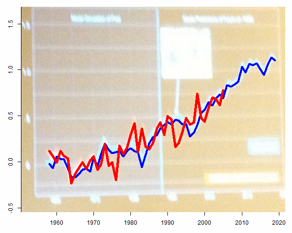
Figure 6. Excerpt from Mann’s AGU presentation. Loop 1- showing Mann’s actual diagram with GISS Land-Only to 2005; Loop 2 – showing GISS Land-and-Ocean to 2012.
Pierrehumbert Condemns Data Truncation
In a 2007 realclimate article, Raymond Pierrehumbert condemned use of non-updated temperature data, when the effect of the failure to use up-to-date data was that the image gave an entirely different impression to the reader. In that situation, Pierrehumbert even called into question the ethics of the author.
there is no legitimate reason — in a paper published in 2007 — for truncating the temperature record at 1992 as they did. There is, however, a very good illegitimate reason, in that truncating the curve in this way helps to conceal the strength of the trend from the reader, and shortens the period in which the most glaring mismatch … occurs.
There does not appear to be any relevant difference between Mann’s AGU technique and the graphic so vehemently criticized by Pierrehumbert, though, to my knowledge, Pierrehumbert has not taken exception to Mann’s AGU Trick.
Wingman Naomi
Mann’s AGU Trick appears to have wrongfooted his mini wingman, Naomi Oreskes.
Like Mann, Oreskes gave three AGU presentations (sessions PA13B – Countering Denial and Manufactured Doubt of 21st Century Science I; GC22B – Communicating Climate Science—Seeking the Best of Old and New Paradigms I; GC33F – Construing Uncertainty in Climate Science I). Oreskes’ starting point was that models had supposedly under-estimated relative to observations – a starting-point that seems oddly disconnected to the IPCC graphic shown above but, hey, Oreskes is an expert in manufactured disinformation. If Oreskes was not in fact wrongfooted by Mann, then one would like to know the provenance of her assertion that models were “underestimating” observed temperature increases.
Oreskes then purported to ponder on the institutional factors that supposedly caused such under-estimates by climate scientists. Oreskes had no doubt as to where the “blame” lay. Not with the scientists themselves. of course not. Oreskes placed the blame squarely on climate skeptics. According to Oreskes, their intimidation had led climate scientists to pull their punches and make forecasts that were too conservative.
[Note (March 2, 2013 4:22 pm.] While I was mostly offline, it turns out, as a reader below points out and as Pielke Jr has communicated to me by email, that Oreskes has published the argument outlined in her AGU presentation here. Pielke Jr has an excellent review of the Oreskes article here. Pielke Jr quoted the following from the Oreskes article – a quote which is very much consistent with the AGU presentation:
[O]ne possible reason why scientists may have underestimated the threat of anthropogenic warming is the fear that if they don’t, they will be accused by contrarians (as was Schneider) of being alarmist fear-mongers. That is to say, pressure from skeptics and contrarians and the risk of being accused of alarmism may have caused scientists to understate their results.
In other words – and this is the implication of Oreskes’ presentation not what she told the audience – were it not for the moderating influence of climate skeptics, the discrepancy between observations and the models that climate scientists would have presented in an Oreskes world, would have been even larger than the present discrepancy.
Surely this is an outcome that should cause Oreskes to thank skeptics, rather than condemn them. But, needless to say, no such thanks were forthcoming at the AGU of Oreskes, Gleick, Lewandowsky and Mann.
Update: As reader DGH observed in a comment below, Mann’s presentation at Rutgers also employed Mann’s AGU Trick to hide the divergence between Hansen Scenario B and observed temperature, not showing data after 2005. As noted above, not using up-to-date data in virtually identical circumstances was characterized by Pierrehumbert as “ugly” and “illegitimate”:

Figure ^. Excerpt from Mann’s September 2012 presentation at Rutgers.
As reader ZT pointed out, Mann also used his AGU Trick to hide the divergence in his TEDx talk
here.

As reader ^ pointed out, in 2006, Hansen did his own comparison of his 1988 scenarios to observations, a diagram that appears to be the iconographic predecessor of Mann’s AGU diagram, a diagram that clearly shows an important difference between Hansen’s ethics and Mann’s ethics. Hansen’s article included up-to-date temperature data. In contrast, Mann’s AGU diagram, over 6 years later, still used 2005 data. In addition, Hansen showed both Land-Only and Land-and-Ocean data sets, showing the greater divergence between models and Land-and-Ocean data (arguing, not entirely convincingly, for an intermediate.) In contrast, Mann only showed the most advantageous version.

Figure ^. From Hansen et al 2006 (PNAS)


308 Comments
Did you mean to say: “First, I’ll show that Mike’s AGU Trick does NOT result from using Hansen’s Scenario B” (my caps)
I’ve obviously been offline for a while. In part for personal reasons that most readers are aware. However, life has been returning to normal and I’ve been back in Toronto for a few weeks now. I’ve had business responsibilities that have taken time. The annual mining exploration convention is in Toronto this coming week. Most of all, it was bad enough dealing with people like Mann and Briffa, but one has to wonder about a field where attention is paid to people like Gleick and now Lewandowsky.
Today’s post mostly collates notes that I had prepared in December.
And Oreskes, I would say. Why does a non-scientist get so much air-time at a scientific meeting? Especially when she is so clearly fudging on the actual data.
For low entertainment, Mann now has a rant on his Facebook page, replete with silly adjectives while ignoring the main issues. Once can read his entire passage and not even know there was any possible issue about a “divergence” in trends. Dana N. and John Cook are quick to fawn over Mann’s irrelevant (dare I say bizarre) diatribe with their own forms of conspiracy-mongering:
Mann on his Facebook page
…And another thing:
Prof. Mann can invoke a harmless oopsie (omitting recent data and/or using 7 year old slides) as an opportunity to denigrate those who point it out (because they don’t already come up with a tame reason as to why it’s not a big deal), but then does that forever means he can’t besmirch someone else’s presentation because it stops at non-recent data point?
One or the other on both accounts, yes?
Also, was this the Fellows talk he was discussing a few months back? http://www.realclimate.org/?comments_popup=13674#comment-307984
Compare with new post by James Annan on “models running hot”
http://julesandjames.blogspot.com/2013/04/decadal-prediction-part-3.html
“… that climate models were under-estimating relative to models. …”
should be ‘relative to observations’?
Wellcome back!
Typo in first paragraph:
“…who asserted that climate models were under-estimating relative to models.”
I assume you mean relative to observations.
Oops. Didn’t reload :).
Welcome back. I’m glad you caught that snap
That has captured the PowerPoint crap:
With your catches, those peskies
Docs Mann and Oreskes
Can be shown to deserve a good slap.
But there’s more to the story here, no?
Observations aren’t just running low
But are warmed toward the last
And then cooled in the past
More than TOBs and such really should show.
===|==============/ Keith DeHavelle
Beauty…
Welcome back Steve and I hope all is well after your recent troubles.
Did anyone at the conference, those supercooled knowledgeable climate scientists point out Mann’s machinations?
Nicely demonstrated.
It certainly seems that in support of the global warming proposition, data truncation is being performed on a wholesale basis both at the temporal front end, at the temporal back end, and spatially.
“In addition, although GISS model results are obviously for Land-and-Ocean, Mann and Kump used Land-Only data (which runs hotter)”
They aren’t using a Land-Only index. They are using GISS GLB-Ts, which is met stations data only, but weighted on a global grid (GLB), so that the ocean is represented by island etc met data. It is in fact the Hansen/Lebedeff index of 1987, continued. And that is the index that Hansen used in his 1988 plot. There were no combined Met/SST indices at the time, and there’s no reason to expect that that is what Hansen was trying to predict.
Steve: The spatial distribution diagrams in Hansen et al 1988 clearly show predictions for ocean gridcells. The composites of Hansen et al 1988 are clearly averaged from the gridcells of the GISS model runs. If Hansen were trying to predict GLB-Ts … as you allege … then he would have been obliged to extract the GLB-Ts gridcells from his model runs. There isn’t a shred of evidence that he did so.
Fantastic Nick! You have surpassed yourself here. To think we thought for all those years that the scare and the need for action on CO2 emissions was based on Global Warming when all along it was about warming at land-based stations only! And nobody thought to correct the misunderstanding!
I love the idea, as seen in polar regions and immortalised by Steig, that an extrapolation from a station that gives the right answer should be preferred to real data that gives an inconvenient answer. Almost equivalent in spatial terms to what Mann does in temporal terms.
Chuckling at David, seeing how Steve took apart Nick’s argument with a few sentences.
Emily Litela
– Nick
Which data set did Gavin use here? By eye it looks more like Steve’s than Mann’s. http://www.realclimate.org/index.php/archives/2013/02/2012-updates-to-model-observation-comparions/
Also, any comment on the truncation of 2005-2012? Does the GISS GLB-T end in 05?
Steve: Schmidt used HadCRU which is their equivalent to GISS Land-and-Ocean. A convincing refutation to Nick the Special Pleader, if further refutation were required. It’s interesting that Schmidt didn’t use Mike’s AGU Trick. Though Schmidt’s realclimate has probably bred more skeptics than WUWT, Schmidt himself doesn’t seem to have as completely embraced Mann’s spiral into the realm of Mashey, Lewandowsky and Gleick.
Hansen very likely computed the global average from the bottom layer of cells in his model. That gives the air temperature at maybe a hundred metres or so above surface.
So what should be used to compare? We don’t have a measure of that. We have GISS GLB.Ts, which has sparse ocean coverage (and is not 100 m up), but is at least air temperature, or we have LOTI, which has good ocean coverage but uses water temperature.
There’s a case for either usage. And I think a good case for at least showing how Hansen’s graph would look if continued using his index.
Steve: Nick, let’s first try to agree on something simple. Do you find anything problematic with Mann’s use of data ending in 2005. If you don’t, can you explain a relevant distinction to Pierrehumbert’s condemnation of Courtillot’s use of obsolete data?
“can you explain a relevant distinction”
This is not a research paper. It was a talk. And as far as I can see from your link, “Mann and Kump” was an educational web site.
In these situations it is common to cite graphs from previously published papers. It saves time, but it also carries more authority. If you show a new plot, you don’t have a published paper to refer to if it is queried.
Steve: Nick -ever the Racehorse Haynes special pleader. As too often, you are quick to give total BS excuses for Mann, Gleick and their fellow travellers. Mann would be well aware of the effect of 2012 data on this graphic and chose not to use it. End of story. Nor do I believe that this AGU graphic was “cited” from a “previously published paper”. What was it? But even if there were such a graphic other than in Mann and Kump, which I doubt, that doesn’t justify such a misleading presentation. Of course, you were unoffended by Gleick, so it’s hard to imagine what fraud on the part of a climate activist would be sufficient to offend you. As a result, discussion of these issues with you is pretty uninteresting since your ethical compass is so elastic.
A similar graph appears in Mann’s book. He cites Pearson Education, Inc. 2009.
See here…
Click to access mann-hockey-excerpt.pdf
Page 16, “Figure 2.3: Testing Climate Models
A comparison of three diff erent simulations of global warming through 2020
made by James Hansen in 1988. The curve made up of weather station observations
(available through 2005 in this analysis) closely matches the curve of the
middle scenario (B)—the one that is based on the trajectory of an emissions scenario
that most closely matches actual greenhouse gas emissions over the preceding
twenty years. The upper and lower curves correspond to scenarios A and
C, which assume higher and lower emissions respectively.”
Oh Nick,,,,, Pllleeeeease. The topic was the divergence. If intellectual honesty was important to Mr. Mann would it not be somewhat important to include all the available data, even if it defeated his own assumption.
Hi ya Nick!
“So what should be used to compare”
First things first; you assume Hansen computed temperature from air 100 metres above the surface; why don’t you ask him?
If he didn’t then Mann is wrong; if he did then Hansen and Mann are wrong because the oceans are not warming at the rate of the land and in fact since 2003 have been cooling.
Make that call!
Racehorse Haynes
By Tom Russell
(Chorus)
Am Am7 Am F G
Somebody better call Racehorse Haynes
Somebody better call Racehorse Haynes
(Verse)
Am Am7 Am
I didn’t kill nobody, I never seen her before
Am Am7 Am
A man of my means, A Chinese whore
Am Am7 Am
I got a lawyer in Houston, with the juice and the brains
Am Am7 Am
Let the big horse run Racehorse Haynes
(Chorus)
Somebody better call Racehorse Haynes
Somebody better call Racehorse Haynes
(Verse)
He’s a thoroughbred lawyer, he ain’t no hack
He’s a Man ‘O War on any of your fairground tracks
He can run on the grass, on the mud when it rains
‘Ya put your money on Racehorse Haynes
(Chorus)
Somebody better call Racehorse Haynes
Somebody better call Racehorse Haynes
(Bridge)
F C
Down here in Texas you see money still talks
E Am
You murder your wife, you’re still gonna walk
F C
Your blacks and Chicanos, whoa ain’t it a shame
E E7
You’re goin’ up to Huntsville if you can’t afford him
(Chorus)
Somebody better call Racehorse Haynes
Somebody better call Racehorse Haynes
(Verse)
Show me the phone, lend the dime
I ain’t rollin over, ain’t doin’ no time
Ain’t coppin’ no plea, I’m hip to your game
I ain’t talkin’ to no one ‘cept Racehorse Haynes
(Chorus)
Somebody better call Racehorse Haynes
Somebody better call Racehorse Haynes
http://www.woodfortrees.org/data/gistemp/from:1958/plot/gistemp-dts/from:1958/plot/gistemp/from:1980/trend/plot/gistemp-dts/from:1980/trend
Trend since 1980
GISS LOTI (1200 km smoothing) 0.15 K/decade
GISS dTs 0.20 K/decade
Mann chose dTs. [GISS: “dTs…overestimates trends”]
2005: Scenario B about 0.7K above baseline; dTs 0.84 K
2012: Scenario B about 1.3K above baseline; dTs 0.74 K
Mann chose to stop at 2005.
Cherries jubilee.
Correction to my 9:23 post above: Scenario B in 2012 is about 1.1K above baseline (not 1.3). This does not affect the conclusion of cherry-picking.
Nick –
In 2007 Gavin discusses the selection of data for these comparisons here.
http://www.realclimate.org/index.php/archives/2007/05/hansens-1988-projections/
He concludes, “In Hansen’s 2006 paper, he uses both [the met station index (which does not cover a lot of the oceans), and a land-ocean index] and suggests the true answer lies in between. For our purposes, you will see it doesn’t matter much.”
I’ll note that your name doesn’t appear in the comments at RealClimate regarding this issue in any of the posts from 2007-2013. But you can certainly go over there and argue with Hansen and Gavin – go for it.
“you can certainly go over there and argue with Hansen and Gavin”
Why? What happened here is that Mann was criticized for using GLB-Ts. I said that it was a reasonable choice, especially as it was what Hansen had used in 1988. I’ve now had people loudly saying that Hansen said that perhaps the ideal lay somewhere between Ts and LOTI, and that Gavin had used LOTI. Now you quote Gavin again citing Hansen on in-between and saying that it doesn’t matter anyway.
OK, so what was Mann doing so wrong by using Ts again? And what would I argue about, and with whom?
Nick,
Hansen included the combined indices in Figure 2 of his 2006 paper. So apparently he thinks there is some “reason to expect that’s what he was trying to predict.”
If you still disagree, then there’s a better place to have that argument.
Nick Stokes: ” I said that it was a reasonable choice, ”
LOL.
“If Hansen were trying to predict GLB-Ts … as you allege … then he would have been obliged to extract the GLB-Ts gridcells from his model runs.”
No need. GLB-Ts gridcells cover the whole globe.
The point is that it’s the index Hansen used in his graph. And if you’re going to update it, it’s very reasonable to use the same index.
As to the timing, this was just a talk. And I assume Mann was simply showing a graph from one of his old papers, as people commonly do. And yes, the 2008 paper probably should have used 2007 data rather than 2005.
Steve: Nick, think about this for a moment. Forget your special pleading for a minute. If the observations had gone the other way, there is no way that Mann wouldn’t have incorporated the data into his talk. And “Just a talk”. The talk was Mann’s acceptance of his AGU fellowship. Of course, an organization and a “community” unoffended by Gleick’s fraud will obviously not care.
“The talk was Mann’s acceptance of his AGU fellowship.”
Was it? There is a video of a talk by Mann (there were a few) here. It’s a very interesting talk, but I couldn’t see this slide anywhere. From the intro, it does sound like the acceptance talk.
“This is not a research paper. It was a talk.”
Cool. Then folks have your permission to use misleading charts and graphs if
A) Its not a research paper
B) they are using old graphics and are too lazy to update them.
So. I expect you to be defending Monkton’s shoddy work, cause he just gives talks. And David Rose’s shoddy news articles.. cause its just an opinion piece. You can make up any manner of excuses you like on the spot based on ad hoc distinctions.
Hell, Mann was justified because it was his AGU fellow presentation and everybody KNOWS you get to fudge stuff in that. Look Everybody knows that outside of peer review a scientist can say anything he damn well pleases because it just a talk. So lets just say it clear. You have made it clear that OUTSIDE of research papers, scientists are not to be trusted, beacuse different rules apply.
you and I both know that any scientist can say any manner of nonsense, can lie, can cheat, can fake data, JUST AS LONG as it’s NOT a research paper. We both know and agree that outside peer review anything goes. That’s your position, just state it clearly.
arrg. needed a sarc tag on that last bit
No, Steven, I do not support the use of misleading charts and graphs. I simply point out that in talks people frequently show graphs from their (and others) past publication. They do. Usually not updated – you’d have another raft of complaints if they were altering them. This seems to have been from the DK “Illustrated Guide” of 2008.
Yes, it’s not a good choice – he could better have shown Hansen’s own version.
Mosher, no sarc tag needed as I suspect most of us “got it”.
+1 for calling out Nick. He speaks like our politicians in the US where there is no hypocrisy for saying anything that is false, misleading, racist, etc. as long as the speaker is on the correct side of the aisle. It is truly disgusting behavior whether in politicians or a scientist(???) like Nick or Mann.
I don’t know exactly who Nick is, (I guess I should) but I appreciate that he is part of this discussion. It would be nice if Drs. Mann or Hansen would weigh in from time to time, but Nick seems at least to be able to represent for them to some degree.
If not for Nick’s input, this discussion might be somewhat one-sided, even if that side was right.
Reminds me of a sleazy defense lawyer who knows his client is guilty but nonetheless leaps from corner to corner trying to distract the jury and cast even a figment of doubt about the truth. Troll personified.
Nick,
You’ll note that in the Rutgers presentation Mann took the time to drop the Scenarios A and C. Then he added a Pinatubo image with an arrow. There goes the authority of peer review.
Care to speculate why he wouldn’t update the observation plot at that point?
Actually, it looks similar to the slide above. But yes, I think if he’s using it frequently, as he seems to be, he should get the new info and get it up to date.
Nick,
Do you mean to say that if it’s used infrequently then it’s ok if it’s out of date?
John R,
As I’ve noted upthread, it’s very common for people in talks to show slides of graphs from past papers to illustrate some point or other. Those slides are as they first appeared, as generally they should be.
But if you’re adapting materials, they should then be kept up to date as much as possible.
Nick, be very very careful as you carve out exceptions and rules. There is a whole industry of skeptics using charts and graphs as they first appeared.
Hell in AR4 chapter 6 we argued that briffa should show his data as it first appeared.
moshe’s back on the scent, too.
=====
Steven,
All I’m saying there is that if you’re showing a graph that you imply is from a paper you’ve published, you shouldn’t alter it in re-presenting (at least not without proper explanation). Do you disagree?
Steve: if you update the data from a paper, you should note that the data is updated from the paper. No one has suggested otherwise.
If, as you argue, a graph is taken from a published paper, shouldn’t that publication be cited? In the present case, is it your view that Mann plagiarized the graphic in his various presentations from Hansen et al 2006?
Actually in the Rutgers talk he showed all three curves and then
on the next slide showed Scenario B with his interpretation of
the proper temp.’s to use. So, he’s not all bad ……..
Steve: Of course, he’s “not all bad”. Never said that. Indeed, I offered to support him against some of the more ludicrous charges against him – a point that he mentioned in passing in his book. But the graphic in question truncates observations in 2005, thereby hiding the divergence. That is bad.
Nick.
You most certainly do approve of presenting misleading data in a presentation as long as it is not a research paper. That was your distinction. You certainly do approve of mann’s using a chart that he has used before to convey a message that he knows is no longer true. That is ok, because it is just a talk and because people often just reuse graphics. Your logic is clear.
it is ok to mislead ( that is what mann has done ) when
1. its just a talk
2. you are re using old graphics.
Put another way.
Is it ever ok to re use old graphics when know the story changes with newer data?
“All I’m saying there is that if you’re showing a graph that you imply is from a paper you’ve published, you shouldn’t alter it in re-presenting (at least not without proper explanation). Do you disagree?”
You publish a paper that has a chart where you know adding more data changes the answer. You know your chart is in error.
Your argument is that you should not alter this chart when presenting it again. So, you can present data you know to be wrong. never mention it is wrong, merely because you published it before.
i would agree that if you change the chart you should mention it and to the actual POINT HERE, if you do not change a bad chart you should mention it.
‘here is a chart from our 2008 paper. it only shows data up to 2005. if I updated it, the message would change. but i want to use this old chart and fool you”
If mann said that i would have no problem. Do you disagree.
Nick Stokes:
“… it’s very common for people in talks to show slides of graphs from past papers to illustrate some point or other.”
I think this really gets to the heart of the matter. I assume that Mann was making the point in his talk that back in 2008 we thought we were going well with Hansen’s Scenario B (using observations to 2005), but more latterly the wheels have fallen off the train.
Or perhaps he wasn’t?
And if he wasn’t, what was the point of showing the graph?
Nick
FYI ijust had a closer look at the AGU picture that Steve posted. It”s the modified Pinatubo slide from Rutgers.
Re: Nick Stokes (Mar 2 16:36), Had me thinking I saw an appropriate quote… shore nuff… “I won all but two of those cases,” he says. “And I would have won them if my clients hadn’t kept reloading their gun and firing.” (Racehorse Haynes)
So if you can get him to stop not using data you might be able to get an acquittal. At least I think that might be the logic.
Steve: in actual legal proceedings, you are not allowed to argue that 1. you did not kill the victim; 2. in the alternative, if you did kill the victim, you did so in self-defence. You have to pick one. Unlike Nick who keeps all his Racehorse Haynes options in play.
“in actual legal proceedings, you are not allowed to argue that 1. you did not kill the victim; 2. in the alternative, if you did kill the victim, you did so in self-defence.”
Yes, you are, it just usually makes for a pretty crummy defense.
GISS contrasts its more generally used land-ocean temperature index (LOTI) with the stations-only index (dTs) used by Mann as follows (emphasis mine): “Note: LOTI provides a more realistic representation of the global mean trends than dTs below; it slightly underestimates warming or cooling trends, since the much larger heat capacity of water compared to air causes a slower and diminished reaction to changes; dTs on the other hand overestimates trends, since it disregards most of the dampening effects of the oceans that cover about two thirds of the earth’s surface.”
Nick,
I’m pretty sure this has been pointed out to you before.
Hansen et al. 2006
http://www.pnas.org/content/103/39/14288.full.pdf+html
Ref 12 is Hansen et al., 1988.
(And welcome back Steve!)
Steve: As I recall, the GISS Land-and-Ocean index uses marine air temperatures rather than SST. I don’t guarantee this.
John,
That’s almost exactly my point here.
Nick,
Why in the world would one compare a “scenario” based on land-ocean modeling with a station only temperature record?
Hansen himself couldn’t have been any clearer. You DO NOT use the station-only data to compare with the model outputs. Period.
John,
Hansen’s 1988 model was of atmosphere only. AOGCM’s came later. And far from
” You DO NOT use the station-only data to compare with the model outputs. Period.”
Hansen says in your quote
“Therefore, the best temperature observation for comparison with climate models probably falls between the meteorological station surface air analysis and the land–ocean temperature index.”
I don’t see a Period there. But the simplest answer is, that’s exactly what he did in 1988.
Steve,
Regarding the ocean component of LOTI…
Well, they don’t say it very clearly, but it appears to me that the “O” part of LOTI comes from SST (see steps 4 and 5).
http://data.giss.nasa.gov/gistemp/sources_v3/gistemp.html
Steve: This seems logical enough. Hansen’s GISTEMP webpage refers to “sea surface air temperature”, but it seems evident that he really uses SST.
At the top of their initial page they say, for example:
“2013-01-16: Starting with the January 2013 update, NCDC’s ERSST v3b data will be used to estimate the surface air temperature anomalies over the ocean instead of a combination of Reynold’s OISST (1982 to present) and data obtained from the Hadley Center (1880-1981). “
Not much doubt there.
Steve: Hansen’s GISTEMP webpage refers to “sea surface air temperature”, but, as you observe, it seems evident that he really uses SST.
And even the Columbia Uni web site can’t slap enough lipstick on this pig, even with the latest and greates “adjustments”.
C’mon Steve, you know damn well that the Lebedeff-Hansen surface temperature series is based on their (1980?) observation that temperatures out to 1000 km from a station are related by teleconnections. Met stations near coasts and on islands therefore, in their surface temperature record, imply temperatures well out into the oceans. It is still a station based surface temperature record.
C’mon Eli,
The provenance of the observation data is a sideshow. Seems to me that the greater issue is the failure to update the slides for AGU and speaking presentations seven years hence.
Fess up, even a Rabett would know better.
“Fess up, even a Rabett would know better.”
He might know better but would he say so?
Eli:
I don’t see how that’s marginally relevant, unless you just don’t understand how forecast modeling is done.
You are producing a model that is suppose to forecast future temperatures, you use the best available data to verify the models performance for the period you have data. When you look post hoc at the models performance, you use the now, best existing data to compare it to.
The only exception tot this is if your model specifically limited itself to being a forecast of that particular index. Hansen’s 1988 model in no way had the fidelity to make such a distinction, nor did he make such a distinction in his paper.
The fact Hansen’s new figure links to modern land+ocean shouldn’t be surprising.. he’s a competent researcher, and it is the right comparison to make.
I have an untestable prediction: Had Scenario B lined up with modern reconstructions of land+ocean, and were running too “cool” with respect to land only, neither Eli nor Nick would be arguing we should be using land only in that case.
(Nor can I imagine in that scenario anybody with more with sense than say Monckton making such a brain-dead argument. It’s only the fact that Scenario B fails to validate that leads people who are so inclined to cherry pick the data, looking for something that actually matches, when the obviously proper comparison fails.)
It is by the way okay to say “the model failed to validate because it was verified using flawed data.” It’s not okay to say “the model is correct because the data it was verified against were wrong”. The model, if it is supposed to be modeling quantity “A” is still wrong, you’ve just provided a narrative for why it left the rails.
But in any case, I don’t think even that is a particularly good argument here, as land only global temperature and (now) reconstructed land+ocean temperatures pretty much agreed with each other to 1988. I think the reality is, climate hasn’t been warming as rapidly as expected by the models for about a decade now, and we don’t know the reason why.
You’ll find a very clear version of Mann’s graph in this PDF. See page 11.
Click to access HSCW_Rutgers_Sep12.pdf
Nice catch and glad to see you back.
I am fascinated by the contempt Naomi expresses for climate scientists.
So Naomi will offer evidence that climate scientists have altered their results under duress?
Its the same denigration, I observed in the CRU emails.
And these two are hoping to uphold the integrity of current climate science?
Or is this the teams route to retreat on?
We are so easily intimidated, look what the IPCC made us do..?
We were bullied, our grants were threatened?
Sorry, snip at will, I know you resist the temptation to discuss motive, but what does Mann & Oreskes hope to accomplish with such absurd claims?
The Oreskes claim to have underestimated climate change is, I think, based on this paper:
Click to access esld.pdf
It was the one Roger Pilke Jr panned just before he got dropped as an editor at GEC. See here for the story.
http://rogerpielkejr.blogspot.co.uk/2013/02/science-is-shortcut.html
Good to see you back! Hope everything is well.
In figure 6, did you intend to say “Scenario B” rather than “Scenario 2”?
Pielke Jr’s article is a good one. Oreskes’ conceit that the professional drama queens of realclimate and elsewhere are “erring on the side of least drama” is, to borrow Clive Crook’s description of the Penn State inquiry, impossible to sufficiently parody. Pielke Jr quotes as follows:
Great to see this post, Steve. I hope all is progressing well for your daughter (I was an EMT in my youth and have an ER physician in the family so I have some idea of what could be involved in any C5 type injury).
The Michael Oppenheimer involvements over the past decade with Michael Mann (as seen in Climategate email activism) and now Naomi Oreskes form an interesting subtext. Before he was at Princeton he spent many years as Barbra Streisand’s favorite activist scientist with the radical Environmental Defense Fund. If we consider Mann, Gleick, Oppenheimer, and Oreskes in relation to the thesis of
this all gets rather funny, in a black humor kind of way….
In the phrase coined by Pielke, Jr., the science-activists too often ESTMD (“Err on the Side of Too Much Drama”):
Oppenheimer and Mann in July 2003
It is well worth remembering that Mann and Oppenheimer were working closely together on their July 2003 EOS article and related media blitz in close coordination with the activist Union of Concerned Scientists, in order to lobby the US Senate on climate change action. They were trying to crush any objection to “the science is settled” type of claim.
The risible idea that Michael Mann was forced into some politicized spotlight against his will is one of the sillier memes he has propounded. In the email linked above he is forwarding a UCS request for a new attack op-ed to a select group of activist scientists (Bradley, Briffa, Crowley, Jones, Oppenheimer, Trenberth, and Wigley). As an AGU pr email said in July 2003,
Welcome back, Steve, and I hope that your daughter’s recovery is progressing well.
Mann’s AGU Trick is no doubt in keeping with his recent elevation (along with Hansen, Pachauri and several other familiar names) to the U.K. Guardian Sustainable Business‘ wall of “dangerous climate change” abolitionists (I kid you not!) who are “fighting for a more sustainable world” **. Their “citation” of Mann includes:
From your perspective, would you say that with this AGU Trick Mann has gifted the world of science with more “new statistical techniques” or has he merely recycled one of his old “new statistical techniques” – just as Pachauri has recently been reduced to recyling his old “non-policy prescriptive prescriptions?!
** From the comments, it seems that Gleick is in the running for a plaque on the wall, as is Canada’s very own Saint Suzuki. But neither Oreskes nor Lewandowsky has yet made the cut.
Steve: Mann’s AGU Trick to hide the divergence is pretty much the same as Briffa’s deletion of inconvenient post-1960 tree ring data (hide the decline).
Is that closing quotation mark in the wrong place? 🙂
Thanks, Steve … I (obviously mistakenly) recollected that it was Jones who decided to use “Mike’s Nature trick” to hide the decline in Briffa’s data, in Jones’ WMO graph.
Divergences, declines … it’s not easy being a statistically-challenged observer such as I;-)
@John M. I did consider using your preferred closing quotation mark .. however, (unlike Hickman, Goldenberg and others of the Guardian ilk), I have scruples when it comes to using “quotes”.
Steve: “Mike’s Nature Trick” is a little different. Elsewhere I’ve described the deletion of inconvenient data as “Keith’s Science Trick”. Tricky use of non-updated data (when up-to-date data yields opposite results) might be termed Ben’s Science Trick in honor of Santer et al 2008’s use of data ending in 1999.
Thanks again, Steve … so many tricks, so little time … it’s becoming increasingly … uh … tricky to trace ‘n track the trove of tricks in tried ‘n true “climatology”.
Perhaps we need a one-stop (un-truncated) timeline of tricks, to help those such as I avoid the trials and tribulations in tracking trickery 😉
Roger has been a source of sanity on a number of topics during your absence. The story of his dismissal from the journal board suggests that not much has changed in the last 4 years.
There was a session at AGU: sessions PA13B – Countering Denial and Manufactured Doubt of 21st Century Science I??? Really? I used to attend the Ecological Society of America meetings, which is full of quite liberal people, and I do not recall any such session ever. This is hysterical political spin-doctoring. What place does it have at AGU?
Re: Mann’s slide: to put up a slide without clear provenance of the data while accepting an award…and a truncated one at that…when everyone knows the temperatures have been flat…it is incomprehensible to me at least.
Craig, you wrote:
“..This is hysterical political spin-doctoring. What place does it have at AGU?”
It has no place there of course. Sadly, it’s now largely woven into their inner fabric.
Yet hope springs eternal, and my guess is that the spin doctors have overstayed their welcome. A few years may tell.
Welcome back Steve, you have been missed. Trust that your daughter is well on the road to recovery.
What strikes me about the example you have cited is the arrogance and lack of insight that it demonstrates. Back when Mann first proposed the “hockey stick”, the level and credibility of scrutiny was very much less than it is today. Glaring errors in IPCC reports and the like were hand-waved away.
In 2013, the world has changed, although Mann, Oreskes et al don’t seem to have realised it. They have learned nothing from events like the disappearance of Gergis et al’s, or Lewandowsy’s, papers, when they were exposed as unscientific.
It is always fascinating to watch a paradigm shift, and no doubt even more interesting for someone like you, having participated in it.
It is getting harder and harder for data-fudging in relation to climate to be glossed over. I expect that the next IPCC report, whatever its shortcomings, will be considerably more rigorous than the last couple. Fudges like this one are less and less likely to pass through unscathed.
Johanna: it’s offal for the true believers, who are beginning to look a little malnourished these days.
Note that in Scenario B, the warming rate is a fairly moderate 2 deg C per century. So even if observations matched that (and they do not) it would not be convincing evidence of future catastrophe.
In Australia, we have major institutions like the CSIRO talking about “up to” 5 deg C by 2070. This figure was quoted by our Prime Minister as justification for the carbon tax that was introduced last year.
The trouble with you non-Climatologists is you cannot appreciate the amount of time we Climatologists have to spend carefully checking all the different angles, cherry-picking and caressing data and building a consensus in order to come up with a presentable story that can’t be nit-picked to death by the usual deniers.
It’s not that we don’t want to incorporate our latest and greatest discoveries, but rather it’s a problem of having the time to do so, what with handling all the FOI requests, seeing off the various Enquiries, briefing the media and lawyers, running blogs and scientific journals, preparing for and attending at short notice award ceremonies like the AGU, etc. All this takes critical time away from our important work on the computer models and we are incredibly under-resourced as a result. However you can rest assured we’re continually working diligently on the problem, despite all the unnecessary distractions that go with the territory.
“building a Consensus” is the root of the problem with climate “science”.
I put science in quotes there because of course consensus has nothing to do with science. Therein lies the entire problem. If the climate scientists would just NOT take this step they would have plenty of time to do actual science. Like, handling FOI requests and other things that go with the territory of being a scientist. And at the same time, perhaps they will realize that if FOI requests WERE taking up so much of their time they would just publicize all of their emails from 2 years ago and beyond and all of their data and methods along with notes. Once that is done, what is taking up too much time?
Obviously like we always know, its wasting time coming to agreement. No one is ever going to agree on everything. And that my friends is why we have an issue in climate science in the first place. I wish it were otherwise, but dang it reality is harsh!
Reblogged this on pindanpost.
Thanks for the post Steve!
Mann also uses this trick here: http://tedxtalks.ted.com/video/TEDxPSU-Michael-Mann-A-Look-Int
Here:
1) Mann truncated actual temperatures at 2005 (strange given the fact that the talk was recorded in late 2011)
2) Mann says that the ‘medium model’ was ‘pretty much spot on’. Actually the ‘low model’ was as close to observation as the ‘medium model’ – and including years after 2005 shows that the ‘low’ model is in better agreement with observation.
3) Mann misrepresented the ‘high’, ‘medium’ and ‘low’ models. These were actually assuming increased, constant, or reduced CO2 output. We have not reduced CO2 output since 1988 so the appropriate model for comparison would be what Mann calls the ‘high model’.
Steve: Scenario A includes strong growth in CFCs, which hasn’t taken place. Scenario B is the most reasonable comparandum to actuals. I looked very closely at this in CA articles a few years ago.
Ref. Scenario B being the most reasonable comparandum to actuals:
I disagree. Scenario A corresponds to 1.5% annual CO2 emissions growth. Actuals have been about 1.9% per annum since 1990, i.e., above Hansen’s Scenario A.
Hansen’s CFC growth rate for Scenario A was 3% p.a.
The additional 0.4% p.a. growth rate in CO2 would compensate for the lack of CFC growth rate, nest-ce pas?
Furthermore, Hansen’s Scenario B called for the growth rate of CO2 emissions to decline from 1.5% per year {1988} to 1% per year in {1990}, 0.5% per year {2000} and 0.0% per year {2010}. Clearly this didn’t happen.
From a cursory look at Hansen et al 1988 Appendix B, the estimated forcing due to both CFC’s mentioned (F-11 and F-12) rising from 0.0 to 2.0 ppb is about 1/4 that due to CO2 doubling (315-630 ppm). The lack of this should approximately cover the underestimate of CO2 emissions growth.
I’ll consider CH4 second order (and much tougher to calculate). Given all the media screaming about methane clathrates being “freed” due to unprecedented arctic warming, one would think actual methane emissions had exceeded Hansen’s worst fears.
So Scenario A is the closest to reality, not Scenario B (it would seem to me).
Either that, or the net UPTAKE by the atmosphere as a result of said emissions was poorly estimated. But that would be a different story. Hansen’s Scenarios are defined primarily by human emissions, not by atmospheric concentration per se.
Kurt in Switzerland
Hey, what’s 7 years data among friends?
Hello Steve,
good to have you back.
“For GISS observations, the difference between 1958-1977 and 1951-1980 centering is -.0175 deg C – the difference is not material to comparisons, but there’s no reason not to do it as precisely as possible.”
Just a small idea on that: Isn’t -.0175 deg C roughly the difference in warming if you would shift the data in respect to each other by one year?
All the best regards and I hope to see more from you!
LoN
Oreskes’s Countering Denial and Manufactured Doubt of 21st Century Science I course.
Translation : Reinforcing Credulous Acceptance of Climate Science I.
I’m told this course can be used as starting point leading to the the full Spin Doctorate Oreskes plans to offer. Accept no substitutes.
Two questions:
1.) When exactly was Mann’s AGU presentation ? One commentor said “late 2011”, do we have a precise date ?
2.) Until wich timepoint data would have been available (GISS, HadCRU) if Mann had chosen to include that into his presentation ?
Steve: December 2012. 2012 data to October was in by that point and 2012 could be accurately estimated. That’s what would be done in any business presentation comparing plan to actuals. Can you imagine a December 2012 business presentation (or university administration) presentation showing plan versus actual to 2005? People would think that the presenter was deranged. Mann used the most recent monthly data available in MBH99 when it was to his advantage.
December 2012
@Steve & Jit
Yes, if this was, as Jit pointed out, not only a precursor “this was our estimate 2005” followed
by current data, it is dishonest.
For what it is worth, my poster (somewhat on the skeptical side) at the same AGU conference, took a look in part at pdsi data (Palmer Drought Severity Index) and I used the latest values from referencable sources up to that very December.
My poster was partially about drought patterns not measuring up to to the hype, and yet by November and December of last year, drought was looking rather severe. Yet, I posted that data anyway. Why wouldn’t I, since this is supposed to be science and not spin-doctoring?
No excuse for what Mann and others who emulate his practices.
Yeah, Steve, I’m going to present planned sales/orders vs. actual up to 2005 for my next operating review with my manager. The over/under on how quickly I’m fired after is 30 seconds.
Steve: Yup. And suppose that you’d met plan up to 2005 and then had deteriorating results for the past seven years, but presented the plan-vs-actual to 2005 at your 2012 planning meeting as though you’d done a good job. Your manager would think that you’d gone off your rocker. It’s amazing that Stokes, who seems representative of the climate “community” on this point, doesn’t see how this looks to people who are not in government or academic jobs and why it is important for the community itself to be self-critical about such practices.
Yup. And I love Nick’s “people do it all the time in talks” defense. wow, just wow. You know, I give talks to customers all the time. If I used incomplete data they’d never buy anything.
Nick: come back to reality. Your world just ain’t representative of the real world. Huh, much like your models I guess. So at least you’re consistent!
Re: k scott denison (Mar 3 12:35),
Compare this truncation of data (this is proxy data so let’s not discuss OT here, but worth keeping in mind for evidence of …. curious…. truncations of data, and in a research paper!)….. last June when discussing the paucity and odd selections of long term proxy data in Gergis et al (20..????), Steve noted a very curious truncation of proxy data from Law Dome in Mann et al (2008)…. (my emphasis added):
Hyperlink Code
“Hey Boss, we want to mine this big area here based in drill results we took up to 2005. We’ve mined all around it and are getting short. We did some more drilling up to Dec 2012, but the results are ugly and you would not like to see them. Now would you like to sign off on the original %150 million plan we drew up in 2005?”
Nope. Does not happen. An occasional cowboy has tried it here down under. Some are out of jail by now, some might still be driving taxis with geology degrees. “Driving taxis” became a colloquialism for the fate of those few who tried and all who were caught.
BTW, this reminds me of putting values on maps by forms of extrapolation that leave you with an uneasy feeling. Is the dark brown blob in the inland, west of the WA-SA-NT border, plausible? Not much “drilling” there before or after 2005.
Steve wrote, “Your manager would think that you’d gone off your rocker.”
Your manager would first believe that you are hiding something; then think that you must be off your rocker to think he (the manager) wouldn’t catch it and then he’d fire you.
It seems that Mann doesn’t have a manager.
As the saying goes: Good/Close enough for government work.
There is nothing wrong the slide as used.
Provided it was immediately followed by an accurate, updated one, together with commentary along the lines of “looks like things aren’t as bad as we thought back in 2005.”
Scientists are supposed to report adverse data. Fairly basic tenet of science I’d say. Ok, you’ve got your story to present. But it ain’t a fairy story.
Ouch. He’s back and this time he’s not taking prisoners.
Correction. He’s as fair and as thought-provoking as always.
Steve writes: “Mann and Kump used Land-Only data (which runs hotter)…”
They definitely would not have wanted to present a sea surface temperature model-data comparison. During the satellite era, the simulated warming rate of CMIP5-modeled sea surface temperatures are almost twice the observed warming rate:

The graph is from my most recent model-data sea surface temperature comparison:
Regards
Steve: Bob, your articles and reviews are consistently interesting. My one regret with your analyses is that I wish you’d develop R-scripts so that readers can handle the data with you. I find myself wishing this when I read a particularly interesting analysis. Part of the problem is the KNMI interface. I experimented with pinging R-commands to KNMI at one point, but they made changes to the interface and none work anymore.
If ’twere fixed could be re-fixed.
========
Welcome back Steve!
Hansen’s scenario B assumes that greenhouse gases increase over time in the manner that they have actually done. Scenario C assumes a rapid decline in greenhouse gas emissions around the year 2000 – something that clearly has not happened.
Given that the real world temperatures are broadly in line with Scenario C would it be unreasonable to say that Hansen has demonstrated that greenhouse gases have no tangible effect on climate ?
Steve: Such a statement would be totally unreasonable. I don’t think it. BTW blog policies discourage efforts to try to prove or disprove AGW/CAGW in unrelated threads.
Welcome back Steve.
Martin, I’ve been saying that for years now…
“Demonstrated” is wrong, but “consistent with” is a fair call.
Steve, when will we get to see you or Anthony on TEDD talks to counter these alarmists? It would be refreshing to see the egg-heads at TEDD consume the truth on these matters.
I actually screen-scraped Hansen’s 1981 paper a couple of years ago and punched in the UAH LTT, matching the two as best I could over the overlap region in the early 1980s, and it looked even then more or less like the data up above with the current land/ocean temperatures added up to date. The interesting thing, which anthropogenic catastrophic “climate change” advocates (now that they’ve abandoned “global warming” as an obviously untenable party line) seem to be loudly ignoring is how nicely the temperature record is tracking Hansen’s option C. Indeed, scenario C appears to be almost dead on the money in the graphs above. Option C, IIRC, is the zero-feedback ~1.4 C warming to the end of the 21st century, of which we have already realized 0.3C.
The other oddity appears to me to be the scale in Mann’s figures above. He is showing almost 1C of warming from 1960 to 2013! Curiously, when I visit: http://commons.wikimedia.org/wiki/File:Instrumental_Temperature_Record.png and inspect GISS — essentially Hansen’s own record, complete with corrections that have improbably (from a strictly statistical point of view) invariably increased the warming of the present compared to the past) — shows 1C total warming from 1880 to the present, that would be 133 years. This, too, is almost precisely consistent with at best Hansen’s scenario C (or even with negative feedback).
rgb
Steve: a few years ago, I collected a number of older GISS versions. I’ll archive them some time.
Scenarios say nothing about feedback. Scenario C assumed that there would be limited further increase in GHG.
Mann’s plot is of GISS Ts. I believe it is accurate in the years that it covers.
Scenario C effectively assumed there would be NO increase in GHG. It assumed an equilibrium condition by year 2000. “annual growth rates are 0 .. by the year 2000” from page 9345 of the JGR paper in 1988.
Nick-
The plot from the link that you provided doesn’t match Mann’s plot. See 2000, for example. There is a 0.1 Deg C discrepancy.
Nick: Feedback is an excellent point. Hansen used 4.2-deg C for a 315- to 630-ppmv CO2 increase. The central value of it’s day was 3.0 +/- 1.5, but Hansen claims the 4.2-deg is central to GCM results published in 1984-1987.
I think the real disappointment here is the fact that Mann placed his thumbs on the scales to make his opinion “stronger”. The apparent pattern of data truncation suggests a modus operandi.
Instead, he could have presented a re-run of Hansen 1988 with the IPCC ECS of 3.0-deg C for doubling CO2 and shown that Hansen’s model scenerio B preformed well using a modern input assumption. At 2020 Scenario B is about 26% to EQ at +1.1-deg C. 26% of 3.0 is 0.8-deg C at 2020, when straight-lined back to 1988 gives about 0.6 to 0.7 for 2010… a much better match.
A rigorous confirmation of Hansen, et al 1988 basic model with the IPCC ECS of 3.0 would turn heads and would be hard to dispute. I’m sure the data, code and documentation is freely available on the NASA website.
Howard,
You have an odd idea of how GCM’s work. They do not “use” a sensitivity. They use the proper physics of fluid flow, radiation etc. The ECS is an outcome.
And yes, data, code and documentation of GISS Model E are freely available on the NASA website. Go for it.
Howard,
yes it would be good to rerun the 1988 model.
Contrary to Nicks assertion, ModelE is not that model. you can look at ModelE code and clearly see that it contains more code than whatever it was that Hansen ran in 1988.
@Nick.
Are you asserting that ModelE is the same as the 1988 model?
If not, its not relavent to the OP suggestion as I read it
Steven Mosher, according to Mark Chandler at this comment posted at Realclimate, the EdGCM is what Hansen used. http://www.realclimate.org/index.php/archives/2007/05/hansens-1988-projections/comment-page-1/#comment-32928
If you click on Mark’s name it brings you to the EdGCM/Columbia web page.
Eh, just read “Historical versions of Model II (e.g., the computer code used in the 1988 simulation runs) are not currently available. ” http://www.giss.nasa.gov/tools/modelii/
Nick
Thanks for your response. Obviously, you are correct that the ECS is the ultimate result of all the gears and belts grinding away in a GCM. Inputs, however, can be tweeked within the error-bars of reasonable estimates to change the ECS to 3.0, no? Sensitivity testing is a natural part of any professional modelling project. Perhaps these test runs are archived at NASA and can me made available to see what GCM assumptions made in 1988 calculated ECS most closely matched with the current temperature levels.
If that were done, it is possible that Hansen’s model is not as unreasonable as folks would like to believe.
Distorting the target to sway an audience, however, is unseemly. Thanks for pointing all that out so clearly.
snip – OT.
Nick,
You “believe” that it is accurate; but when there are competing, different versions, it requires more than “believe”. Would you like to elaborate on the data that give you this confidence? In other words, what datum are you using to compare the magnitude of bias?
Geoff,
I believe that Mann accurately plotted GISS Ts (up to 2005). That’s based on looking at his plot and GISS’s Ts plot.
Steve: I used an antique GISS Ts series to replicate Mann’s figure. I didn’t suggest that Mann altered GISS Ts. The issue – that you refuse to confront – is the legitimacy of using 2005 data in 2012, when 2012 data gives a different impression. You are seemingly unoffended by such conduct and have made a variety of excuses on Mann’s behalf. However, your excuses ring hollow to people who don’t have government or university jobs. Your response should have been simple: you should have conceded the point and asked Mann to address the criticism.
I recall a similar situation with the Durkin film – Durkin had also used obsolete data and was sharply and correctly criticized for this. Like Mann, Durkin had modified a graphic from an earlier publication, but had not allowed for the passage of time. I not only endorsed these criticisms at Climate Audit, but emailed Durkin expressing my endorsement of the criticisms and urging him to amend the graphic before any further use. He responded to the criticism and, as I recall, he fixed the graphic. Durkin is a controversialist, but on this point, his conduct was more professional than Mann’s.
Nick Stokes’ continued endorsement of unprofessional conduct makes for amusing blog exchanges, but is a sad commentary on standards within the “community”.
Nick,
I’ve already shown that the plot you provided doesn’t match Mann’s. Forget the data, it was off by eye enough to know that it was wrong. You didn’t bother responding and are now repeating the claim without providing a link to a different GISS T plot.
But in the end, as Gavin said, it doesn’t make a difference,- use whatever data you would like.
The larger issue is that in 2010 Dr. Mann debuted a chart in his presentations that wasn’t up to date. He stuck by the image as the observations continued to diverge from Scenario B. Then he modified the plot in 2012 and failed to update the observation trend with the most recent data.
He’s an invited speaker to undergraduate and graduate classrooms and he is telling his audiences that the observations continue to match the models. How does that not offend you?
I will say one thing for Dr. Mann. His “science” plays well on Facebook. I wonder if he baked cookies yesterday.
Not Mann 98/99 but Mann 2008/2009. You should separate out the effects of land+ocean and truncation.
Carry on digging, Nick.
In fact please use this bigger spade, made exclusively for you of the most carefully chosen materials- strip-bark pines, the Yamal One tree and upside-down Tilanjer sediment cores.
Steve: Thinking about Upside-Down Mann, the costumed vigilantes of the Climate Response Team and the various miniature climate scientists, I have the following refrain of a YMCA/Cubs song from the 1950s running through my mind (annoying me):
The song was sung holding your fingers over your eyes upside down. See here. I can’t help picturing Mann, Mandia, Oreskes, Gleick, Lewandowsky… as Junior Birdmen.
And sooner or later, they will do a very passable impersonation of Icarus
Talking about old things published over and over again:
http://en.wikipedia.org/wiki/Sing_A_to_Z
Track 31 is for the letter ‘U’ -> “Up in the Air, Junior Birdsmen”. I used to play this CD over and over again in the minivan, for my children when they were small. Now it is playing over and over again in my head. Thanks Steve!
Steve: Sharon, Lois and Bram were already popular for Toronto children in the 1980s. The 1990 album was after our kids so I don’t recall their version. I remember it from when I was child. The image of the miniature climate scientists in Junior Birdsman formation is hard to get rid of.
I did similarly when our daughter was young. I can’t get these things out of my head and she can’t remember them.
Mann reminds me of the Groucho Marx line in Animal Crackers: “my retirement would be the greatest contribution to science the world has ever known”.
Great to have CA back in action again. And just in time for ‘Climate Week’.
Thanks, Steve!
Just added my (modest) 2013 contribution to the tip jar. (And voted in the Bloggies.)
Sorry, these are probably questions that have been gone over before but…
1) Why is Scenario B preferred? Yes, methane didn’t do what anyone expected… but Hansen’s 1988 predictions weren’t predicated on concentrations, they were predicated on emissions, getting methane wrong should count against. Seems like Scenario A is the best fit.
2) Is any discussion of this sort complete without a graph including satellite measurements?
It has been a very long time since I looked at this issue but my memory of Hansen’s descriptions is the same as talldave. The actual differences between Hansen’s scenarios were based on policy decisions. The “emissions” and/or atmospheric chemistry predictions were intermediate predictions leading to climate predictions. He got the atmosheric chemistry wrong by getting the policy effects wrong. Then he got other stuff even more wrong.
I can understand somebody arguing that Hansen should not be judged on his intermediate predictions because he is a climatologist (or at least an astro-something) not an economist and, therefore, he was not qualified to judge the atmospheric chemistry effects of the policy choices. But that’s just another thing that makes predicting stuff hard. Hansen getting the atmospheric chemistry wrong shouldn’t be used as an excuse to select B over A when the actual policy we followed was the A policy.
a. Contrary to what a number of people have claimed, it was the one that Hansen preferred in his congressional testimony in 1988 and in the 1988 paper by Hansen, et al.
b. The forcing in B was pretty close to the actually total forcing for a long time, until 2008 last time Eli looked
Eli Rabett: “Contrary to what a number of people have claimed, it was the one that Hansen preferred in his congressional testimony in 1988 and in the 1988 paper by Hansen, et al.”
Only half right. In the paper, it seems clear that scenario A is intended to represent an upper bound to forcing, incorporating as it did continued growth in CO2, CH4 and CFCs, and also a completely unjustified allowance for “other trace gases” which was set equal to the (exponentially increasing) CFC forcing. Hansen et al. described scenario B as “perhaps the most plausible of the three cases.” However, in his congressional testimony, Hansen described scenario A as “business as usual”.
I speculate that Hansen found himself in Schneider’s “ethical bind”, wanting to induce immediate Congressional action, but fearing that scenario B would not be sufficiently alarming. Scenario A indicates about 2.2K increase (relative to 1960), about twice that of scenario B. /speculation.
But “preferred” in what sense?
I looked closely at the assumptions behind Scenarios A, B and C in several posts in 2008 and the expositions in these blog articles remain (IMHO) better elucidations of the scenarios than you can find elsewhere – regardless of your perspective. See
My conclusion was that Scenario B was the most reasonable scenario to employ for model-vs-actual, commenting for example:
Much of the forcing in Scenario A relates to CFC increases and is not relevant to the experience of the past two decades.
As others have observed, debating the Scenarios themselves is not relevant to the topic of this post. Please re-open comments one of the Hansen forcing threads if you are concerned about the topic.
Eli: In your comment above, you mentioned the “last time Eli looked” at Hansen’s projections at your blog. The 2008 post you linked contained a graph with observed temperatures only through 2002. Do you, like Mann, have difficulty confronting the fact that the recent decade+ of modest-to-negligible warming has made Hansen’s 1988 projections increasing inconsistent with observations? Do you think that ignoring recent data makes that problem go away?
You might debate the magnitude of the inconsistency and how it should be calculated. By almost any method we are far past the IPCC’s “more likely than not”, “likely”, and probably “very likely” to be inconsistent with observation. Which one of these terms would you choose?
Like Mann, your post also showed the misleading station (land) temperature record, but did have the honesty to also show a global (land-ocean) record to compare with Hansen’s global projections. (The fact that temperature records are correlated over a thousand kilometers doesn’t mean that coastal land stations properly report the magnitude of the trend over the ocean. In theory, changes on the coast and in the nearby ocean are highly correlated, but the amplitude of the changes over land can be twice as great as over the ocean and highly correlated.)
You also criticized the use of “MSU records that do not include the Arctic” Which “MSU records” don’t provide a global signal?
Why not beat Steve McIntyre over the head for the same thing Frank? His posts are from 2008.
Besides which anybunny knows what makes the 1988 model diverge at this point is the too high climate sensitivity (4.2 K?) finally showing an effect.
Steve: would you please discuss Hansen scenarios on a Hansen thread as I had asked before and as others have done? This thread is about Mann at AGU.
<snip – Hansen thread please.
OK. I’m trying to be objective. Our department’s single GW denier (UW Atmos. Sci.) suggested this link. Reading thru it, I began wondering if the GW scientists were “tricking”. But I went back to the NASA site and saw the temperature trends. Yes temperatures can be selected to emphasize the last decade leveling of global temps (altho the top 10 warmest years are in there! along with El Nino effects).
I could find NO evidence that ocean temps “haven’t risen since 2009”.
Finally, I prefer the professionalism (including Nick) of the climate scientists to the harsh, adamant and strident statements in this thread — turns me off.
Oh yeah, that’s being objective! I’d recognize an open mind like that anywhere.
Temperatures are not a sequence of independent variables fluctuating like a YoYo. They have a strong auto-correlated persistence. The temperature increased over the last century (and probably over the several centuries prior to that), but they have been reasonably flat during the last 15 years or so unlike what has been
predictedprojected through the models. I would think that someone versed in climate science as yourself would know better than to toss the lame 10 warmest years chestnut into the mix. Did you actually see the data for the last six or seven years there as well? Strange that Prof. Mann couldn’t find it …Professionalism is a failure to tell the whole story when it is inconvenient to do so? I didn’t realize that. You will forgive us for being “adamant” and “strident” on the umpteenth occasion where that has been done by the same bunch.
Gotta be a troll doc. This is not the droid you are looking for.
I’m sorry, I used the term denial which is explosive to some. We discussed this thoroughly some years ago in my blog at seattlePI.com. I recognize the problem, one of the authors I respect very much, Matt Ridley, The Red Queen, objected because of the association with the Jewish Holocaust Deniers.
It was decided that we can’t use the term ‘skeptics’ because in accordance with Carl Sagan: “All Scientists welcome all new ideas, with skepticism, pending validation with observations”, we are all skeptics. Similar problems exist with AGChange believers; ‘supporters’ doesn’t work for me since I’m also active in sports, hence in the group called jocks; and ‘believer’ is no good, most of us ‘skeptical scientists’ don’t ‘believe’ in most conventional beliefs, whereas we found that unbelievers in Global Change science often believe in those beliefs.
Anyway, it’s kind of trivial.
It was decided that we can’t use the term ‘skeptics’ because in accordance with Carl Sagan: “All Scientists welcome all new ideas, with skepticism, pending validation with observations”, we are all skeptics.
A major blunder. This, surely, is the whole problem in a nutshell – the Consensus is a rigid body that has lost (or never known) skepticism.
Phil Jones, leading Consensus light, said “Why should I show you my data when I know you’ll try and find something wrong with it”. And to this day virtually noone in the Consensus sees anything wrong with this.
This is why it makes sense to use the basic categories of AGW skeptics and (true)believers.
Professor Brown,
Thanks for commenting here. You will find that a lot of us take strong exception to the “GW denier” label, but I do appreciate that you took some time to look at this thread. If you stick around a bit you will find that there can be good discussions even with the occasional sharp elbows. For a lot of us asking whether the data and analyses to date are good enough, the point is not to “deny” any GW (never mind climate change), but to ask whether details and magnitudes, feedback s and sensitivities, etc. are well enough understood and accurately portrayed at the interfaces of science and policy.
Skiphil, I agree with you (see above comment). We use denier to refer to those who deny the validity of Global Warming or Global Change science in the academic/gov. community. I should use GC denier to be specific?
RAB
““haven’t risen since 2009”
Since that’s in quotes, I wonder who said it? Can’t find it other than in your comment.
RA Brown wrote: I could find NO evidence that ocean temps “haven’t risen since 2009″.
Not only is that a reference without visible antecedent, it’s incorrect. HadSST2 shows an OLS slope of -0.18 K/decade from Jan2009-Dec2012 (the last month available in the published dataset).
Recent 15- and 30-year SST trends are plotted here. One can see that the trend for the last 15 years is almost zero.
Willis extending Roy Spencer’s SSTs: Here
I see you have spent at least some of your time modeling non-linear systems associated with the atmosphere and sea. One of things that intrigues me is just how good those model might be, and how sensitive they are to initial conditions, the quality of the subsystem modelling and multi-scale model links and all the approximations within them. I assume you do too since I see you have had cause to question and seek to improve some of the sub-models used within GCMs.
So given all that, it is probably scientific to maintain a bit of a sceptical eye on the relationship between this modelling activity and observations.
It probably also pays to maintain a bit of a sceptical eye on those whose advocacy causes them to skate over the difficult (for them) stuff, rather than embrace it as the next challenge to understand(as you have obviously done in your career).
Did you even read the post? It had nothing to do w/ anything you commented about. It was about trends compared to model predictions. Are you really in a “science” department?
And then you get turned off by the comments? Do you understand that one of the most prominent pro-AGW scientists used seven+ year-old data to try to show that climate models performed well? And that he did not include updated data which would have countered his point? You think people aren’t going to be a bit upset about that?
Thanks for justifying every cynical view of (post-)modern academic science.
Prof. Brown,
Also, thank you for coming. Your comment about “professionalism”, however, comes across as self-serving and not very professional.
You could gain a lot by considering posts here.
RA Brown, Posted Mar 3, 2013 at 4:08 PM
I object to your characterisation and ask you to withdraw it, please.
An objective study by you should show that for me at least (the one most familiar with one side of the comments), the tone between Nick and myself has been civil and the question worthy of asking.
I’ve had private emails with Nick and we agree on a number of matters. Our approach to logic is a little different. He will take it down to the wire, where I’m more concerned with a demo of logical uncertainty that is easy understood by readers here.
So, unless you can quote words of mine that are harsh, adamant or strident, I’ll have that personal apology, thank you.
You ask in vain, of the vain,
Were it come, a strident bane.
==============
good find, John M!
Posted on this at BH, how interesting he refers to Marcott et al. (2013) as “IPCC study” and “IPCC report”
Thanks for noticing Skiphill, but alas, the comment you are referring to met a fate I’ve experinced before.
In these situations it is common to cite graphs from previously published papers. It saves time, but it also carries more authority. If you show a new plot, you don’t have a published paper to refer to if it is queried.
Nick if you are in the sciences at all you know this is horsepucky. The very purpose of conferences like AGU is to discuss your latest results, leaving seven years worth of climate data off of a presentation that is supposed to be about current trends is completely unethical. Why is it that at this point in time that no matter how egregious the affront to the truth that the supporters of a certain climate meme must equivocate, prevaricate, and justify what is otherwise unjustifiable.
If this had happened 400 years ago Kepler would have thrown away Tyco Brahe’s data that disproved his original perfect sphere idea of planetary orbits. He allowed the data to teach him rather than the other way around and thus we have Keplers laws of planetary motion, without which we would have never had Newton’s laws of gravity.
It is beyond time that this inexcusable behavior be called what it is, inexcusable.
I wonder if drug companies should be allowed to only present the drug trails that have a positive outcome to the FDA, and not bother showing the Febs the ones where the people got sick and died?
As Feynman said, a special kind of honesty is required of scientists, to be extraordinary careful not to fool people. And the easiest person to fool is oneself.
Mann’s “trick” is a humongous FAIL by that standard. No if’s and’s or but’s about it.
MrPete: Steve is being generous calling it a “trick,” although I realize he’s just building on the “Nature trick” quote of Jones.
It’s not really a “trick.” It’s lying by omission.
Or if it is a “trick,” it’s a “dirty trick,” ala “Tricky Dick.”
Steve,
Thank you for coming back. Thank you for caring.
We have been caring for you and yours.
Nick Stokes – It’s your lucky day! I have a once in a lifetime investment opportunity for you. Solid fundamentals, HUGE market, great projections. I’m happy to show you the stock price up through early 2008 – it’s amazing. Should I put you down for a $300K or $500K investment in this incredible opportunity? Think of your children and grandchildren – for their sake you can’t afford to not act!!!
+1…and LOL
This thread brings to the fore a number of points that I think need discussing.
The testing of climate models with out-of-sample observations of temperature is the only truly valid way of determining performance. That testing, in order to test the models alone and not a scenario/model combination, would require using the actual observed conditions and not be limited to scenarios that were constructed some time ago. Unfortunately I have not seen that type of testing published anywhere.
There are some drawbacks to this kind of testing such as when sufficient out-of-sample years have passed the model might well be considered out of date and not representative of the current best efforts. I suspect also that the original code gets misplaced in the ongoing efforts to make continuing improvements. Nonetheless every effort should be made to obtain out-of-sample test results.
When Mann zeroes in on a very specific model, scenario and data set that appears counter to the general picture that we can all judge for ourselves, I can only think that what we have here is another example of the climate scientist/advocate going a bridge or 2 too far in their advocacy. A more aware Oreskes should be pointing to this mixing of advocacy and science as perhaps a major problem in making the case for immediate AGW mitigation. It only gives the more informed and yet to be convinced crowd another reason to suspect the science of the advocate. She might also want to speak to those who are inclined to defend this misplaced advocacy and at least hint at perhaps toning it down.
Happy New Year Steve:-)
Mann and friends seem all too comfortable with presenting obsolete data when it fits the narrative. I’d think that scientific integrity would include striving to analyze and present the most up-to-date picture of data. Surely he would have rushed to include 2005-12 if that data told a story he wanted to tell. This is all too reminiscent of Mann’s paleo work where proxy records don’t need to cover recent decades and don’t need to be rigorously calibrated against available instrumental records:
I think Nicky should try the “it was the Colombian Drug dealers” defense.
Trick just refers to a clever way to deal with a problem.
As an economic policy adviser, I would always use the latest and most pertinent data, and reflect that in my analysis and advice. If it turned on its head my previous analysis and advice, so be it. Anyone who plays games like Mann can not be trusted, and should be totally disregarded by policy-makers. And by everyone else,except to discredit him as above so as not to have distorted data in the debate.
Of course, honesty and integrity have been my watchwords since early childhood, whatever the cost.
Faustino
This is beautiful. McIntyre’s post here has triggered quite possibly the most ridiculous posting by Mann, ever. It’s the latest post on his Facebook page, and I’m not sure how to post a link to it. It should be easy to find though, and it includes wonders like:
That’s right. Mann claims this post discusses “a great conspiracy.” Who does McIntyre think is involved in this conspiracy?
You heard it here first. Criticizing Michael Mann of using deceptive graphs amounts to believing in a conspiracy theory involving the AGU, IPCC and many scientists. It doesn’t matter if you say not a word about what anyone did aside from Mann, you are still accusing them of being in on it. And if you don’t believe Michael Mann, just look at what another prominent source on understanding conspiracy ideation, John Cook, says in the comments section:
Clearly, this is just another example of the same conspiracy ideation John Cook and Stephan Lewandowsky have been seeing in skeptics all along…
Why does the word “projection” come to mind?
yes.
of course projection is a defense for folks with NPD.
I’ve got a post cooking in my head..
Brandon,
I can see where he is coming from. If you quickly scan Steve’s post you will see:
Mike’s AGU Trick
IPCC AR5
AGU
Hansen
Mann and Kump
Mike’s AGU Trick
Pierrehumbert
Naomi
If you interpolate the data, do some infilling, it looks like Steve could be saying:
“Dr. Michael Mann, the most feared opponent of climate deniers, has been conspiring with the AGU,the IPCC, scientists like Pierrehumbert and Naomi, taking data from Hansen, Kump, and Mann (TMFOOCD) to prepare AR5.”
I have a comment awaiting moderation. While waiting for it to be released, I highly recommend everyone visit Michael Mann’s Facebook page to see what he posted on it about an hour ago. Words cannot describe the humor.
I think this link should go to the post in question. Forgive me if it doesn’t. I don’t use Facebook much.
Hansen’s photo reminds me a lot of Homer simpson. Wonder if Homer was based on Hansen?
Was this what made you think that?

The link works, Brandon. And you’re quite correct: “words cannot describe the humour”. Oh, that poor aggrieved little Mann … he seems to see “paranoid conspiracies” everywhere; and when he doesn’t he simply makes ’em up! Must be another “trick” he’s learned along the way!
Mann saying things that make him appear delusional doesn’t surprise me. What I can’t get past is the fact John Cook (and Dana Nuccitelli) immediately commented with favorable responses to it, as well as immediately sharing links to it on Twitter. These are people who routinely go around arguing skeptics are conspiracy theorists, and they promote this?
How insane is it to take McIntyre blaming everything in this post on Michael Mann as him promoting a conspiracy theory? And if this is an example of what we’re supposed to believe is conspiratorial ideation in skeptics, what does that say about John Cook, Stephan Lewandowsky and anyone else promoting that ridiculous argument?
everyone keep a copy of that nutty text Mann posted, because someone will finally get through to him about how silly it sounds, and then he will have to edit it without notice of the changes…..
He’s not even pretending to address the main issue, just droning on about preparing the actual publication of the Mann & Kump book with the diagram. It’s not the summer of 2006 anymore, Mr. Mann.
The problem here is that McIntyre’s post has buried the lede under the account of his detective work. So, Mann’s actual confirmation of the where/when of the data has obscured the fact that he is actually CONFIRMING the main point: Old data (I’ll leave it to others to assess the land/surface question in light of Mann’s assistance tracking that down)
land/surface question I meant “land vs. sea question”
I have to say that that is the most feeble response to an incisive critique of a public presentation by a scientist that I’ve ever read. From what I can see, he doesn’t even explain why and where Steve got it wrong.
Can anyone else figure out what he’s complaining about as it refers to Steve’s post? I’ll be damned if I can.
Remarkable.
Sorry, I must be a little slow tonight.
Is Mann saying he was justified in showing a graph that ends in the mid-2000s in 2012 because people were using a graph that ends in the mid-2000s in the mid-2000s?
Nick! Nick! We need your help.
LOL. I think this one might even be beyond Nick’s capacity to obfuscate, quibble, misdirect and excuse.
Re: Brandon Shollenberger (Mar 3 20:35),
Too funny.
A commenter brings up Lewandowsky. All I can say is these guys are drinking the koolaid of techniques such as those used by the guys who published the journal article proving that depending on the music you listen to, you can literally reduce your age…
… except that Simmons et al did so to demonstrate how awful such techniques are.
It wasn’t any random commenter, it was Lewandowsky co-author and fellow pseudo psych theorist John Cook of “Skeptical Science” infamy.
Mann entirely misses (or ignores) the main point of the CA article while Cook just babbles.
Oh, come on, Skiphil … be fair! Mann certainly did his own share of babbling in that 882 word self-exposé.
MrPete, as Skiphil points out (and I said in my comment stuck in moderation), it was John Cook who brought up Lewandowsky. The co-author of Lewandowsky, the primary person pushing the belief skeptics are conspiracy nuts, promotes this post which blames everything on Mann as an example of conspiracy ideation.
What does that say about people who believe as Lewandowsky does?
I keep tripping moderation. I think I need to figure out how to write my comments without setting off filters. As it stands, I think I’m up to three pending comments.
It’s probably that conspir*cy word you keep using.
Steve: Yup. It’s been on the watchlist of flagged words for many years. It’s a word that I’ve seldom, if ever, used in a CA post, other than to discuss Lewandowsky and which I’ve generally required commenters to avoid. I think that allegations of “conspiracy” are unhelpful and have therefore discouraged readers from such comments. Mann’s recent accusations therefore seem particularly unhinged. While I have my faults, “conspiracy ideation” doesn’t seem to me to be one of them.
Probably. It’s a ********** to prevent people from finding out about the **********, I tell ya.
Turbulent eddies,
Recursive paranoias.
Swirl into madness.
===========
I was disappointed that Mann did not splice onto 2005, then claim it was not done.
In a few years I expect Oreskes will do a presentation suggesting the the climate was intimidated into cooling by the skeptics. We will have to check where she truncates the data.
Right now Naomi might be somewhere claiming that Mike is too intimidated to show the recent data because it is so much worse than models have been predicting.
Leo Hickman is having a big go at the ‘anti-science’ aspect of ‘sceptic blogs’. (At least he says “sceptics” rather than “deniers”).
http://www.guardian.co.uk/environment/blog/2013/mar/01/climate-sceptics-capture-bloggies-science
But how can he, as an ‘investigative’ journalist ignore this, especially given his recent attack on the BBC for AGW alarmism on a David Attenborough programme?
http://www.guardian.co.uk/environment/blog/2013/feb/08/bbc-global-warming-attenborough-africa
Its interesting to watch Hickman dip his toe into the AGW-sceptic world. Like Monbiot, he clearly has some respect for some aspects of it. But just cannot bring himself to admit he has more respect than he lets on.
Leo Hickman is having a big go at the ‘anti-science’ aspect of ‘sceptic blogs’.
As usual, (deliberately?) misidentifying anti-CORRUPT-science as anti-science.
I noticed one of the early comments on Leo’s peice claimed that the skeptic blogs appeared to have far more traffic and infomration than they really do as everything is cross-posted and linked and re-tweeted so the volume appears much higher.
I also noticed that Leo had announced his article with a tweet – which Moonbat re-tweeted, and which Leo re-retweeted. So between the two of them 3 announcements of one arcticle. And they blame the sceptics.
I’d be interested in any future public sightings of this chart being used by Michael Mann. After his spirited defence of the propriety of its recent use I suppose he wouldn’t have any qualms about presenting it at his next conference. He has said he won’t be updating his slides until after AR5.
He’s speaking at University of Victoria, BC today and tomorrow.
With the time zone difference luckily he has lots of time to update his slides!
It would be interesting to know how he handles this in Victoria – will he amend the presentation, address the issue verbally, just ignore the current commotion or simply choose to speak about something else?
Anybody here going to see him?
A central figure in the controversy over human-caused climate change has been “The Hockey Stick,” a simple, easy-to-understand graph my colleagues and I constructed to depict changes in Earth’s temperature back to 1000 AD. The graph was featured in the high-profile “Summary for Policy Makers” of the 2001 report of the Intergovernmental Panel on Climate Change (IPCC), and it quickly became an icon in the debate over human-caused (“anthropogenic”) climate change. I will tell the story behind the Hockey Stick, using it as a vehicle for exploring broader issues regarding the role of skepticism in science, the uneasy relationship between science and politics, and the dangers that arise when special economic interests and those who do their bidding attempt to skew the discourse over policy-relevant areas of science. In short, I attempt to use the Hockey Stick to cut through the fog of disinformation that has been generated by the campaign to deny the reality of climate change. It is my intent, in so doing, to reveal the very real threat to our future that lies behind it.
http://events.uvic.ca/?view=day&cal=1082&day=04&month=03&year=2013#event_heading_89236
Well trick implies deception.
So who was the audience that was supposed to be deceived?
Every one here knows what the post 2005 observations look like. I would make a wild guess that most in the audience in the talk also knew what the observations up to the present day look like. The general public would not have viewed the talk so they were not deceived.
So who was deceived?
It is also not clear to me what the purpose of the talk was. If it was an acceptance speech then that is going to contain a review of past work and not necessarily contain the most recent results.
On the other hand if the express purpose is the compare the most recent results then it does not make any sense to omit recent observations.
I sense missing context.
The TED talk audience saw the same graph and by your (Lazy Teenager) reasoning, being a general audience, were not aware of temperature records, were deceived, and were therefore deliberately tricked by Mann. (Just following your train of thought).
Mind you, as most people in climatology are generally aware of the temperature trends, why not simply select temperature ranges appropriate to support preferred theories? Mann can use segments having a positive gradient, skeptics ranges with negative gradients, and luke warmers periods with gradients close to zero. This is not deceptive, as you point out, because the full trend can always be plotted (if need be). On reflection, I suppose this is indeed the essence of climatology (as distinct from science of engineering) and makes perfect sense to experts in the field.
Lazy teenager – Your nom de plume seems fitting.
You need to catch up a little. The word “trick” in the title is a reference to a comment by Phil Jones in the climategate e-mails regarding Jones’ use of “Mike’s Nature trick” to “hide the decline.” The “Mike” in both cases is Michael Mann. The “hockey team” position on the word “trick” is that it does not imply deception at all but merely indicates a clever way of manipulating data.
Of course, very few intelligent people actually believe that the “team” interpretation of the word “trick” is plausible (especially given the “hide the decline” context). So you are right to think that the word “trick” implies an attempt to decieve, but it is still a “trick” even if the attempt was unsuccessful.
Ah, teenage birdman.
“Well trick implies deception.”
No. trick does not imply deception. Deception refers to motive. One can perform a trick to deceive. one can perform a trick to impress. Trick implies presenting something that is not what it seems to be.
So who was the audience that was supposed to be deceived?
The unstated appeal here is that if one performs a trick that deceives no one, then it is not a trick. This relies on the faulty description of ‘trick’ conflating the means with the ends. Or, one can say that the people in the audience who were supposed to be deceived were those who didnt see the trick. Lazy teenager. I am 10 feet tall.
Now, that is lie and a lie implies deception. but since you are not tricked by this lie, therefore it is not a lie.
you see the path you are headed down with this special pleading.
“Every one here knows what the post 2005 observations look like. I would make a wild guess that most in the audience in the talk also knew what the observations up to the present day look like. The general public would not have viewed the talk so they were not deceived.”
Yes, that would be a wild guess. But let’s grant that no one in the audience was in fact deceived. Lets grant that they all sat there and said to themselves :
“Gosh, Mike’s argument falls apart after 2005. we all know that. We all know that he is not trying to trick us, because we are untrickable. What the hell is Mike doing then? he knows the data is old and that the story changes with new data. Does he think he can trick us?”
As for the general public being present. Now we have another lovely ad hoc rule. It is ok to present something that would deceive the general public just as long as they are not there. You see teenager, like Nick you like to carve out exceptions. But exceptions as everyone knows can be transformed into new rules. What you are saying is that a chart that could be deceptive to the general public is ok just so long as the general public doesnt see it. But they have of course see it now.
“So who was deceived?”
Lazy Teenager: “The holocaust never happened. Anybody here deceived by that? nope. I’m in the clear then.”
You need a lesson in ethics. If I intend to deceive you and fail, that doesn’t make it ok. And more importantly this case is not about deception. The case is about graphical tricks. Perhaps Orestes was tricked. We wont know and it doesnt matter.
“It is also not clear to me what the purpose of the talk was. If it was an acceptance speech then that is going to contain a review of past work and not necessarily contain the most recent results.”
Again, with the stupid special pleading. Everyone knows that in your acceptance speech it is REQUIRED to show bad data and out of date data. So, you stipulated that everyone in the room knew the chart was bogus. Everyone knew that the results were just the opposite of what he claimed. And so mike does what? in his acceptance speech he pulls up this old slide and says “oh here is some old work that you all know is wrong” right. Didn’t happen.
hint ( he also showed new work )
Good grief, Steven, 582 words to dis a comment by LT? You must be exceptionally bored today.
I was hoping to beat the lame ad hoc exception making out of the lad while he is still young and able to learn.
Making exceptions is fine. However, there is a simple test for exception making that he should probably learn.
If your exception makes a bad rule, its a lousy exception.
Well, look on the bright side…Doctor Mann has given a perfect example of the Latin expression “suggestio falsi et suppressio veri!”
And welcome back, Steve; we’ve missed you.
I should have been more specific. The 2 events are at the U Vic starting at 8:00 PM Monday March 4 and starting at 3:00 PM Tuesday March 5.
New post at WUWT. Mann says he will update the slides. Maybe he WILL splice some data.
Dr. Mann posted all of his 2011 and earlier power points presentations and links to videos here…
http://www.meteo.psu.edu/holocene/public_html/Mann/lectures/index2011.php
You’ll note that both his Hockey Stick and Dire Predictions decks include discussions and images of the plot in question.
Today he will be giving the Hockey Stick presentation. It’s unlikely that the slide will be updated; he relies on the “good folks at TED” to animate his slides.
But why is it that his pre TED presentations say “Author: Michael Mann”, “Last Modified By: Michael Mann”.
Mikey is selling himself cheaply.
For an hour at a community college near Montreal David Suzuki got 30 grand plus expenses. The college also cheerfully complied with the request to provide Suzuki with attractive female “bodyguards” and promised to facilitate some private time for the ladies at Suzuki’s penthouse hotel room. Hilarious!
Sun News got documented proof of this through an FOI request.
http://www.sunnewsnetwork.ca/sunnews/straighttalk/archives/2013/01/20130129-083258.html
And in another incident recently, the Sun was not allowed into the United Church to interview Suzuki.
The trick is not the really bad part. The really bad part is in attacking those who expose it and denigrating them for questioning the methodology. You can disagree with methodologies, but to attack the user merely shows a fear of being found out for the lack of his.
NASA admits bias, political pressure.
http://principia-scientific.org/supportnews/latest-news/98-breaking-nasa-u-turn-admits-global-warming-bias-on-sun-s-key-role.html
Humm.. Mike Mann does provide an almost unlimited climate comedy, not so grandiose ad Lord Monckton, but just as persistent. Perhaps it would be more generous to hold Mann only to the shameless standards expected of politicians, rather than Feynman’s “bending over backwards” admonition about deceiving people… never mind Feynman’s warning about the danger of self-deception by scientists. Escapades like this ought to make the climate science community cringe, but I have seen no evidence of that. Which ought to be, I think, considered ‘alarming’ in and of itself.
Nick Stokes,
Wow. You are making yourself look ridiculous; you ought to be more careful about who and what you try to defend… and stay away from defending willful deception.
Mann provides a sophisticated form of “happy” science. Monkton provides the morose version. It probably sounds reversed to some, but that is how it rolls to me.
Reblogged this on biting tea.
ZT says
Mann can use segments having a positive gradient, skeptics ranges with negative gradients, and luke warmers periods with gradients close to zero.
———–
Personally I am not impressed by tricks with graphs by anybody. I would prefer to see the whole graph and up to date.
At least Mann put down all of the data available on an old graph. Its not good that he is still using an old graph.
I have seen a bunch of short segments and scaling fiddles in skeptic land, with general approval and no moral outrage. Maybe it’s time for you guys to clean up your own house?
Steve: I challenge you to find any examples of “short segments” or “scaling fiddles” at Climate Audit.
Please note that Mann did NOT carry forward “all the data” from the Hansen et al 2006 graph that he used in his AGU and predecessor presentations without citation. Mann deleted the Land-and-Ocean series which showed greater divergence.
The first presentation on his website to use that plotwasin 2010 as far as I can tell. It wasn’t up to date even then.
But you are still missing the point. “Its not good that he is still using an old graph.” If the old graph showed the same result as the new graph, it would be “not good”. Given that the new graph gives exactly the opposite result, it’s more than not good; it’s an attempt to mislead.
Thanks Steve, those links were helpful, and your reasoning seems sound.
I do think one can debate whether they should be judged on the basis of forcings or emissions. But as you say, that is a debate for another day!
Opening page 144 of this site is asking for a username and password.
Mark Steyn should create a repository for the many examples of behaviour Mike is providing for the case.
Mark Steyn should present evidence that a complete search of all his writings up until 2005 reveals no libelous statements regarding Michael Mann.
JBS,
That could be a great shot across the bow.
But what if Mann’s lawyers know how to teleconnect Steyn?
LOL, thanks JBS
Then there is the Ben Santer perspective:
.
“We find that model/data agreement, like beauty, depends on one’s observational perspective.”
https://www.llnl.gov/news/newsreleases/2003/NR-03-05-01.html
Assume the position.
In fact the most recent Santer perspective is a a paper “Identifying human influences on
atmospheric temperature” written with 20 co-authors, that states quite clearly that CMIP5 models overestimate the warming of the troposphere. Maybe top climate scientist Michael Mann is unaware of this paper.
http://www.pnas.org/content/early/2012/11/28/1210514109.abstract
This interesting paper also seems to have been largely ignored in the blogosphere, except by David Stockwell, who wrote 3 posts on it last December. Santer et al do not cite MMH10, who said basically the same thing, or even their own earlier paper that had claimed consistency between models and observations.
When Mann shows us the 17-year period 1988-2005), Hansen’s global warming projections were consistent with observations of the LAND surface temperature record. However, we now have 24-years of data (about 1/3 more) and Hansen’s projections are clearly inconsistent with global observations. Even Schmidt agrees in this Real Climate post: http://www.realclimate.org/index.php/archives/2012/02/2011-updates-to-model-data-comparisons/
Santer et al find that the satellite record for 1979-2000 is not inconsistent with the projections of amplified warming in the upper tropical troposphere. Using the same methodology, McIntyre et al find that the satellite record for 1979-2008 IS inconsistent with model projections.
Briffa shows that tree ring widths correctly predict warming in the early- and mid-twentieth century. Data for the late-twentieth century shows a divergence.
Remember, if it was true in the past, it’s still true today … that it was true in the past.
Mike’s GISS comparison has improved recently. I had a copy of GISS land data from 2008 and recently downloaded the current data. The overall change is stunning. They have added about 0.3C to the trend since 1881 by lowering the past and increasing the recent decades.
Here’s a graphic of the evolution.

GISS now uses the GHCN adjusted data as the basis for its homogeneity adjustments. Prior to 2012 they used the GHCN raw data. One might be led think they were real screw-ups in the past and finally decided to get their act together by farming out the first cut of adjustments to GHCN. Of course that might not be true, maybe something else is going on. 😉
Bob, interestingly it is Nick Stokes who has done the most thorough study of this that I am aware of. He found that the GHCN adjustments added about 0.03C/decade, much the same as the numbers you quote, see
http://moyhu.blogspot.co.uk/2012/02/ghcn-v3-homogeneity-adjustments-revised.html
There are also dozens of posts on this at Paul Homewood’s blog.
Bob, all of that happened when they posted Dec 2012 data, just one week to get all the new warming.
I see on Mar 3 Nick linked to “Hansen’s own version” which includes the station data through 2012. Here are just the years shown by Hansen extracted from my graphic above.

The blue trace matches what Hansen shows using 1958-2012 data. The red trace is what GISS was showing for 1958-2008. The trend over the period has magically increased by about 0.13C over the last four years. It is really amazing how past observations refuse remain stable.
It appears Hansen’s own data is so unreliable that any comparison is futile.
Bob,
I have a gadget here which allows you to superimpose any of a variety of datasets on the original plot. It’s from a blog post of a year ago, and I haven’t updated the data, which was current then. It may help.
The recent rise that you refer to seems to be mostly due to the move to using GHCN V3 adjustments. I guess that move was Hansen’s decision, but it isn’t his data.
“Mann asserted that observations were running as hot or hotter than models.” Not what the Met Office people said to me when I met them at the Royal Society. Mann’s rant reminds me of a conversation in the Supermarket. I said to the assistant; “those anchovies are only £2.47, the weight of the jar is 100g, but you are showing a unit price of 4.90/100g”. In my naivety I thought she’d thank me for drawing her attention to the mistake. Instead, she asked ME TO WAIT, so that I could talk to the manager … who it then took several more minutes to convince that the unit pricing was wrong.
I was dumbfounded by the mathematical cluelessness of the shop staff. Likewise Mann. He’s arguing black is white. I’m sure that somewhere buried in his mind there is some logic to his argument … but it escapes me.
Does anyone have any info on Mann’s latest presentation in BC?
Camel bones discovered in the Arctic ? Does Mann have an explanation ?
http://news.nationalpost.com/2013/03/05/giant-ancient-camel-remains-discovered-in-canadian-arctic/
Mod.: please delete all my pending comments (apparently all off-topic).
Listen, Kurt; you’ve been honored. The Zamboni Driver of Epic Fame has returned, also.
==========
Speaking of Zamboni driver, sorry if I am off topic.
Welcome back Steve. Hoist one for the crew at the PDAC.
Long time lurker here. First comment. Glad to see you back, Steve.
I attended a presentation by M. Mann on March 4, 2013 8 PM local time at U Victoria. That’s in British Columbia for the geographically challenged. 🙂 The talk was in a fairly large lecture hall, has capacity for 350. It was at least 2/3 full, maybe more. Lots of students, but many others were older.
The presentation was essentially identical to this one, with the same slides.
http://freethoughtblogs.com/pharyngula/2011/12/12/michael-mann-explains-the-evidence-for-anthropogenic-climate-change/
The video is 15 minutes long, his UVIC talk to the same point was 41 minutes. There were extra slides at UVIC. The gist was the same. The slide showing the comparison of Hansen prediction to actual was exactly the same. It is at 2:35 in the video.
In the UVIC presentation, the time was broken in 3 sections after introduction:
Technical presentation, 14 minutes. Summary: well known that CO2 causes warming, earth has warmed, lots of proof of that (glaciers, arctic ice, polar bears, sea levels, etc), therefore first causes second, anyone who does not believe that is anti science, Hansen’s 1988 predictions are spot on, same graph as AGU presentation, future is grim unless we act now.
Political presentation, 27 minutes. Summary: Why have we not acted yet? Republicans bad, except a few good ones, all who deny truth are funded by special interests, oil and coal companies using same tactics as tobacco companies. Koch brothers fund Tea Party and all kinds of other nefarious activities, many direct personal attacks by name. This section is all about US political figures. Method is to mock “those who deny”. Hockey stick presented as indisputable fact, “hockey league” graph of the many other supporting independent studies all pointing at same result as HS. Stolen emails must be disregarded as all taken out of context. We are doomed unless we act now to stop carbon emissions. Effects of CO2 already felt. Talks of hot spell in a specific state as proof of something or other. Solutions on slide include solar, wind, 100 mpg cars, nuclear, and, apparently, Arnold. Nothing regarding rest of world.
Questions and answer, 38 minutes. No hard questions. This was a very pro-CAGW crowd. One commenter/questioner even said that this meeting is “preaching to the converted”. I have to agree with him. One very interesting point was the he feels the Keystone pipeline should be blocked as a symbol, even though MM admits it would have no effect on CO2 levels. This was fine here in BC, might not go over so well in Alberta.
I thought Mann spoke very well. Very clear, calm presentation meant to impress. He was better than the video I linked above, more folksy. He was among friends, and not rushed for time. There was no microphone for questions. Any skeptic questioner would have to shout to be heard, and it would be easy to make him sound less than serious. Good strategy to suppress dissent, but not likely required in this group. It was hard to hear questions, moderator repeated them if needed.
At about 7 minutes into the UVIC presentation, which would be at 2:34 in the video, he did add a little defence of the graph: “Now you can see that there are certain discrepancies and if you extend the record up to present, it does look like it might be coming a little bit closer to that lower scenario I showed you before.”
Then on to a discussion of Mount Pinatubo.
Excellent report, BC Skeptic. Mann is now much more of a campaigner than a scientist. “Technical presentation, 14 minutes. . . . Political presentation, 27 minutes.”
Everything he says needs to be considered in that light. He’s heavily invested in one version of the “truth” and has been for going on two decades. It’s always been the prime source of his livelihood and if the crowd at U Victoria was any indication, it will continue to be.
BC Skeptic, regarding hot spells in one state, he has previously said you can expect drought as a result of La-Nina like effects from global warming. He also said that this La-Nina like response meant that he thinks climate models vastly overstate warming. He thinks there is a missing negative feedback.
Thanks BC
“If you extend the record up to present, it does look like it might be coming a little bit closer to that lower scenario”
Michael Mann 3/5/2013
Is this a verbatim quote? If so it should go down in posterity.
That is a verbatim quote.
Nice summary. Many thanks. Sounds like MM is coasting on past glories.
Sounds like MM is coasting on past glories.
And the support of Naomi, Merchant of Credulity.
Not sure how Hansen’s scenarios are off topic but children’s songs are on, so this will probably get snipped…
I’ve been thinking about Martin’s post. Hansen’s predictions are important, Mann’s antics not so much. Predictions are a powerful aspect of the scientific method. The sin of commission documented here by Steve, the use of only the part of the data that supports the assertion, is perhaps of secondary significance to the sin of omission noted by Martin. The emissions track scenario B, while the temperature response to the sum of the forcings track scenario C. One imagines that if not for the burden of the paradigm, climate scientists would vigorously pursue this discrepancy. GCMs would be tweaked accordingly.
At Polar Bear Science, it is reported that “Updating the HB [Hudson Bay] breakup date graph would not have supported Stirling and Derocher’s premise that polar bears in WHB [western Hudson Bay] are starving due to increasingly earlier sea ice breakup, so they simply left the data out (see Fig. 1).”
Remarkably, the author then notes a Mann lecture she attended two days ago at the University of Victoria: “To my disbelief, Mann tried to argue that global temperatures predicted by NASA scientist James Hansen in 1988 have “closely resembled” actual temperatures since then – by presenting a graph of actual temperatures (observations) that ended in 2005, despite the fact that recent temperatures have not risen at the rate depicted in his graph (see previous post, #8).”
Mann isn’t in any great hurry to update his graph, and “corrupt” doesn’t begin to describe some actors in climate science.
Wow. Tom Curtis just raised things to a new level. I posted about the ridiculous post by Mann on a recent Skeptical Science page discussing the Lewandowsky paper to draw attention to the fact John Cook claimed this post was an example of conspiratorial ideation. Tom Curtis responded in a remarkable way. His entire comment should be read, but here are a couple highlights:
That’s right. People are defending Mann’s insane post with more insanity. For example, saying Naomi Oreskes appears to have been mislead by Mann means Oreskes was conniving with Mann. The mind boggles at one she could simultaneously be deceived and be part of the deception.
The purpose of Mike Mann’s post was to deflect from his use of outdated data. Skeptical Science continues to deflect… (with your help, by the way!) Just ask if Mike Mann should no longer use that graph in ANY upcoming presentations. UPDATE the data NOW Mike! Then he can be called out for it every time he uses the old data. Tom Curtis will back you up on that 😉
sue, as ridiculous as Tom Curtis may be, he already answered that question:
At this point, I think just about everyone can agree Mann shouldn’t use that graph. There isn’t much more to be said on the issue. If people are done discussing it, we can’t be deflected from it. As such, I think pursuing this angle is useful. If anything, pursuing it draws more attention to what Mann did and gets more people to see he was wrong (just look at Tom Curtis).
Besides, having things in a single narrative can help. By drawing the two issues together, people who look at one are made to pay more attention to the other. Just look at how many people thought the Lewandowksy topics were drawing attention away from issues with Mann and Team members. We’re now seeing that Mann is going to use Lewandowksy’s work to defend himself on various points. If that work never gets addressed, his tactic will work.
Re: Brandon Shollenberger (Mar 7 01:30),
Just read through that thread and I have to admire your composure and steadfast reasoning there!
Reading that thread confirms my impression that, whether designed* or not, Lewandowsky’s climate work’s real purpose in this world is to provide a refuge from which to provide pseudo-defences, and in which to hide when those defences fail.
Meanwhile the consequence is that Mann and their like, without attributing conspiracy or even malice, unhindered, get a free pass to make errors that support their favoured narrative and bolster their esteem.
Even ignoring any possible reason for Mann doing this – such as the most charitable an external error – the defence automatically prefer to conjure up Lewandoskian ideation to respond to any crticism.
It will be interesting to see how many and which climate scientist go the “Lewandowsky” route like this in future as part of their defence. If many do then I think this actually condemns a real science to purgatory by using pseudo science as a defence.
*yes I know the irony, it gets recursive 😉
Brandon: You made a good effort to bring some semblance of reality to the Cook/Mann conspiracy discussion. However, I agree with Sue that this is not worth the effort in that venue and the focus should remain on the question as to why Mann did not include temperature data after 2005. For Lewandowsky and Cook any criticism that attributes intent to an error or misstatement reflects conspiratorial ideation. Last year I read some material by George Lakoff, e.g., The Political Mind: A Cognitive Scientist’s Guide to Your Brain and Its Politics and, the explicitly partisan, Don’t Think of an Elephant!: Know Your Values and Frame the Debate–The Essential Guide for Progressives. Lewandowsky’s conspiracy metaphor fits right into Lakoff’s argument that you can win and maintain political power by creating, shaping and continually reinforcing the appropriate emotional content of simple ideas. For example, “spending cuts” have been defined by the WH so that most voters in the US assume it means immediate cuts in the current level of spending rather than what it actually means, namely, a slowing in the rate of increase in spending. Do you see how it works?
tlitb1, thanks. I find it interesting nobody from the SKS group has responded (well, a moderator did on formatting stuff) even though I imagine plenty of them have seen my comments. I think they’re just going to ignore the issue even though at least two of them are directly involved. It seems they’re not willing to defend Mann’s claims, but they’re also not willing to distance themselves from what he said.
Oh well. If nothing else, it should serve a purpose for anyone visiting that page of the site. I don’t think many people will read the comments of that page and be impressed. Plus, anytime that paper gets brought up from here on, this can be offered to impugn it’s credibility.
Especially if SKS chooses not to enforce its own rules on the people criticizing me. That’s pretty blatant bias.
Have the SKS folks already addressed the question as to why they are immune to this whole disposition toward “conspiracy ideation” label of Lewandowsky’s? They seem to be ideating a whole bunch of conspirational themes, even in that very post you are involved in.
From Mann’s original FB page response there’s
“Professional climate change deniers”
“Industry-funded climate change denial effort”
“Climate change denial campaign”
and yet also gets to say that McIntyre
“chose to invent a conspiracy theory”
“manufacture a nefarious plot”
Why is it that “Occam’s Razor” is only possessable by chief IPCC authors and contributors, and those who operate only certain climate science websites (like SKS)…
Brandon: I can’t believe you wasted time debating those people over terminology invented by Lewandowsky. Steve made valid arguments in this post. You should have forced them to refute Steve’s arguments, which are clearly stated, and not allowed yourself to be diverted into specious arguments over nonsensical conspiracy “findings” imagined by Lewandowsky.
The argument should be over whether Mann intended to deceive and not over whether Steve or anyone else is suggesting there was a conspiracy to deceive.
McIntrye’s criticisms of Mann’s graph weren’t the topic of that post. You’re saying I should have forced them to talk about an off-topic issue rather than an on-topic one. That’s silly. If I had focused solely on the issue of McIntyre’s criticisms, as you suggest, they’d have just deleted my comments. And they’d have been right to do so.
… For example, saying Naomi Oreskes appears to have been mislead by Mann means Oreskes was conniving with Mann. The mind boggles at one she could simultaneously be deceived and be part of the deception
If that is what Curtis was trying to say, he did a terrible job of it. Largely, because that isn’t what wrongfooted means, at all.
Yes, wow. I really wonder how ridiculous this SkS style defense can get.
Mann did not show the chart just just for fun. He had a message and the message (in December 2012) was – Hansen’s 1988 model is spot on. In order to prove the message was right he used wrong data (land only) that was 7 years old, KNOWING PERFECTLY WELL that using the right and up to date data would not be supporting the message. In fact, it would show quite the opposite. And after being exposed he DID IT AGAIN (at the lecture in BC)! How hard can it be to change one Powerpoint slide?! And for Tom Curtis to claim that it could have just been laziness or carelessness and to think something else would be conspiratorial ideation is beyond comprehension…
Tom Curtis seems almost reasonable compared to one user who violated SKS’s comments policy to say things like:
Of course, it is users who say things like this. SKS itself simply chooses not to moderate them and keeps quiet. I suspect they pretend that means they aren’t doing anything wrong. After all, how can they do anything wrong if they don’t say anything?
Oh well. I think it’s fair to say John Cook and SKS support Michael Mann’s claims. I’ve e-mailed Cook directly, and I’ve politely posted on his site. It’s difficult to imagine he is unaware of the issue I raised. And if he is aware of it, he is intentionally remaining silent.
It appears Cook is perfectly willing to support the fabrication of claims that support his views.
Mann’s motives and ethics were very well illustrated by Climategate. As such it’s not conspiratorial ideation to say that he knowingly used bad but convenient data – it’s realism. And to deny this is is just coverup ideation.
And Mann’s obsession on “industry-funded climate change denial effort” is not conspiracy theory ideation?!
I think we can fix this, can you give the data you used in
https://climateaudit.files.wordpress.com/2013/03/mann-agu-loop-loti1.gif ?
What I’d suggest is to take the land-and-ocean data 1955-2012, pad that series with the blue series 2013-2020, then smooth the combination using some zero-phase low-pass filter with very long impulse response. Finally, cut the resulting series to show only 1955-2012.
+1 to UC. Good to start my day off with a laugh. Thanks!
Re: UC (Mar 7 07:42),
Bravo! Now you can publish in Nature and Science. Would you like to be an AGU Fellow, too?
UC,
Can you line up the start point also?
Vaguely on-topic: the SI for the new paper “A Reconstruction of Regional and Global Temperature for the Past 11,300 Years” can be freely downloaded here:
http://www.sciencemag.org/content/339/6124/1198/suppl/DC1
Pay-walled.
Sorry 0 the “download supplement” link at the url I gave works for me.
Copy here: https://mega.co.nz/#!o9IVTZYJ!LrYLqEXwWzBCSyi-jfMAyG5v3M474NRWGZiyfJCuaM0
Here’s the database (with an ungodly number of sheets) if you can’t get above:
https://mega.co.nz/#!51xSTLLB!KYT6fUj1aLr8YMq4QnZS3Vv8nqF6VDO-0R2F2zDZ4Ms
So Mann stated that he was using observed data and the graph is clearly marked as ending in 2005. If its a trick, its a very obvious one.
The underhand SKS / Lewandowski tactic seems to be to try and suggest that conspiracy ideation is off-beam.
In so doing they are thus guilty of credulity ideation.
A recent comment by Dr. Gavin Schmidt may give a clue to Mike’s error. While having nothing to do with what the fellow said, it highlights the underlying mechanism…
Update 2: I’m told via Twitter that my chaos line is incorrect. Gavin Schmidt (@ClimateOfGavin) writes: “Chaos in weather systems is technically deterministic – it happens even without introducing random elements.”
So there you have it — his chaotic presentation was deterministic. No, his deterministic presentation was chaotic. Oh, I’m not very good at this — would one of you fellows do the analysis…
See “Forecasts and probabilities”, Posted by Joel Achenbach on March 7, 2013 at 10:25 am in the Washington Post…. Regarding a snowstorm forecast.
Cheers.
I have had a comment in moderation all day — please withdraw it; I had no sense it was concerning.
Nick Stokes,
I don’t think you are doing the consensualist position any favours with some of your posts in this thread. I think climate science is solid, but it doesn’t mean that all climate scientists are above criticism. Defending the AGW community against every criticism is counter-productive.
The problem with all of this passionate defense of Mann’s truncation is that:
1) What he did was wrong – a combination of laziness and a willingness to hide inconvenient data that is disappointing to see in a professional scientist. It doesn’t matter what side he is on. This would be wrong whoever did it. (I agree with what Mosher has said about all of your rationalisations for Mann’s slide, so I won’t go over that ground again.)
2) By defending it, you come across as unable to see why it is wrong.
3) By being one of the most vocal AGW supporters in the thread, you create the impression that you are a typical AGW supporter, and therefore create the impression that the majority of AGW supporters are similarly unable to see why sins of omission are wrong.
4) By defending it so strongly, you also create the impression that this is a very important line of defense, that Mann’s flaws cannot be conceded or the whole science of AGW will come crashing down. It implies a fragility in the AGW position that is not really there.
5) The end result is that you make AGW skeptics more convinced that AGW is rubbish, and may even push some fence-sitters towards an anti-AGW position.
Leto.
What Nick is about is damage control. To that end he will nitpick, quibble, overlook, ignore, divert, special plead, and go to ridiculous lengths to defend the indefensible.
He’s obviously a smart guy and I admire his tenacity, but I often wonder if he would not be more effective if he was actively engaged in research that might confirm the truth of the anthropogenic global warming hypothesis.
“By being one of the most vocal AGW supporters in the thread, you create the impression that you are a typical AGW supporter…”
Like most posters here, I am simply offerring my own view. It does not include the hostility to Mann that is usual here, and so is unpopular, and is sometimes termed unethical. But on this, at least, my view is not particularly passionate. I just can’t get excited about whether Mann should have used GISS.Ts or GISS.Ts+SST. In my original comment I simply point out that while there is a case for both, Hanson’s original plot used Ts, as Mann did.
And when Steve then quizzed me on the difference between Courtillot and Mann in this instance, I pointed out that Mann was giving a talk where using established slides from one’s published work to support points was customary. It is. But I did agree that if he was talking about Hansen’s plot frequently, he should make more effort to use up-to-date material, and suggested Hansen’s own plot would be suitable.
And pottereaton, I have indeed been engaged in scientific research all my career, though not on AGW. I am now retired, and do what I can on my blog.
Nick, you say
“But I did agree that if he was talking about Hansen’s plot frequently, he should make more effort to use up-to-date material, and suggested Hansen’s own plot would be suitable.”
You’re saying what he should “try” to make more effort in.
Another Happy Valley hero should have tried to make more effort to restrain himself too, Nick.
Nick I for one have no problem with what you say or how you say it.
For my advisor I’m climbing down/up the global thermodynamic tree backwards in time and outwards in space. To get there I have to navigate through Mann and Hansen and Jones and Briffa and i certainly appreciate much of what they’ve put together.
There’s a lot missing of course, and sometimes as you seem to acknowledge here, there’s no reason for those things to go missing.
Yet Mann’s omission is hardly surprising and we all have blind spots in any case. So what of it really, in comparison to a wholesale practice unveiling right before our eyes. Notably I speak of the Mannichaeans, Shakun and Clark. What does any one make of their recent work (and the corresponding titles)?
I still don’t know why Mann showed that graph. What legitimate purpose could there be, apart from illustrating the point that things had changed. But that didn’t seem to be the point being made.
Nick you felt it was legit. to show it. To what end given that it wasn’t to show the subsequent changes (or do you think Mann doesn’t appreciate that more up to date data diverges)?
HAS,
Again, this was a talk and the image was a visual aid. He probably said why he was showing it – we don’t know what he said. My guess is that he was saying that Hansen’s projection was pretty good (re scenario B), while in fact, from the perspective of 2013, it doesn’t look as good as it did in 2006 (or 2011). He noted that in BC, but that may have been because of the fuss here. An up to date graph would have been better.
Nick,
Instead of making up nonsense in defense of Mann why don’t you watch the video? http://vimeo.com/22759808
He said nothing like “it doesn’t look as good as it did in 2006 (or 2011).”
In the video he says very clearly, “…and that scenario actually matches remarkably well to what the instrumental record has shown since then.”
No mention about the divergence between Scenario B and the instrument record that was apparent in 2011 was made. The students of Mt. Holyoke College were mislead by a leading climate scientist, Michael Mann.
DGH,
What I said was “My guess is that he was saying that Hansen’s projection was pretty good (re scenario B)”. It’s a different occasion, but it seems that is exactly what he was saying then. Read what I said more carefully.
**What I said was “My guess is that he was saying that Hansen’s projection was pretty good **
So now Nick is “guessing” what Mann said. Why not stick with the facts instead of continuing the cover-up.
“Why not stick with the facts”
OK, what are the facts? We get the grainy papparazzi shots, but not the words.
@Stokes
“My guess” is hardly a fact, rather a daguerrotype.
Your ethical defense of Dr.Mann in this thread is admirable yet utterly hypocrite. Ever seen Steve McIntyre been slaughtered by the usual suspects on the warm side. Ever commented for Steve M like you did here for Dr.Mann?
Did you already joined the Gorebot Brigade?
***OK, what are the facts?***
Read DGH above. As he stated, what Mann said is clearly in the video. But you chose to ignore it and “guess” what Mann said. As well he used a truncated version of temperatures when the updated one was available. And yes he admitted so in his post after he was caught, indicating it might be time to update his slides. Again you choose to ignore the “facts” and make up an excuse that it is only a “talk” and it was a “visual aid”. So what you are saying is that it is OK to Bee Es to students. The facts are there and you ignored them. You should be able to find the video without my help.
Nick –
I was very careful when I read your comment. What you wrote was poorly constructed and if I interpreted it incorrectly you have my apology.
What I am struggling to understand is how you could possibly defend Mann’s behavior. He intentionally mislead a classroom of student. That’s not OK.
Here’s Mann at the American Chemical Society Presidential Symposium, September 2012.
Mann states, “I would argue pretty successful prediction for several decades, several decades in advance of the warming that would be expected.”
So let’s see. We have models we might all agree are imperfect. We have samplings of “global temperature” gathered in a variety of ways from near surface air and near surface water. In the models we have a likely scenario in 1980 or 1990 or 2000 or 2005 or even 2012, mostly all “too short” for a climate. A decade here, 30 years there, what have you.
Yet if you take your most likely model from the past of what “the temperature” will be doing in the future, and “the temperature” is near-surface (air and water). Then in 2013 you should be taking a commonly accepted data set of observations of near-surface temperatures of the air and water that have been gathered over the last year or ten or thirty or 50. And then you should be comparing that to the past likely model sorts of graphs that suggest what the future might look like, what with all the carbon dioxide and equivalent. And your ocean pH and tree rings and ice cores, and all the datum such as it will be and is and was, the information such as it was and is and will be. With all involved acknowledging that the models may not be perfect and that the land/sea temps are not either, but hey it’s all we have and it’s the best we can get. That in effect in many ways they are different things, the models and the sampled measurements, but that if either has any meaning, they might at some point give the same sorts of results, perhaps?
Regardless, there should be some sort of attempt to match entirety to entirety, the whole of the information and the whole of the time periods and more. Be that in a talk, a discussion, an op-ed disguised as a study, a cherry tree that’s a cheery tree, a paper peer-reviewed or refused or published, in a casual chat, or in some damning emails about fooling (in a purely scientific way, for science, of course) the chumps on the other side of your PR campaign.
Hey, Mike, yo, it’s 2013 dude.
To “hide the decline”, add “hide the flat line”. Or ignore & fail to present it.
milodonharlani
Posted Mar 12, 2013 at 7:17 PM
“To “hide the decline”, add “hide the flat line”.
I like that: “Hide de flatline”
Reblogged this on Climate Ponderings.
Dr. Mann has now added “hide the divergence” to “hide the decline” to his lawsuit against National Review and Mark Steyn.
Perhaps someone can clear something up for me. I have never understood the reliance on long term climate models, when they have been proven to be inherently unreliable by Edward Lorenz in his seminal paper “Deterministic Nonperiodic Flow,” Journal of Atmospheric Sciences, Vol. 20, p.130, http://journals.ametsoc.org/doi/pdf/10.1175/1520-0469%281963%29020%3C0130%3ADNF%3E2.0.CO%3B2
Has someone in the AGW community proven that Lorenz was wrong?
No! No one has ever.
Dr. Mann checks in from Maine where he continues to truncate his graphs. At 4:32 you’ll note that the “average predicted annual temperature” matches the “observed recorded annual temperature” in 2005.
In MBH, the rain in Maine fell mainly in the Seine.
Wheras the Spanish rain found itself in Tanzania.
One more version of the same truncation speech with a twist.
The speech is followed by a Q&A session. The first question, posed by a self described “denier” challenges Dr. Mann on Hide the Decline, the LIA and the MIA. Mann actually addresses the question. Others can comment on the quality of the responses.
http://www.sfu.ca/tlcvan/clients/pics/2012-02-19_VP_Research_PICS/
This one is nicely produced. The powerpoint is embedded into the video juxtaposed the image of Dr. Mann as he speaks. The graphics are quite clear.
Apologies if this was already posted elsewhere.
I’ve transcribed Dr. Mann’s response to the question about hiding the decline below. Of course he ignores his own Nature trick and his role in managing the presentation of the decline in the IPCC TAR, “I don’t think that doubt is scientifically justified, and I’d hate to be the one to have to give it fodder!”
At the presentation linked above Dr. Mann stated,
“So the decline in question actually has nothing to do with my work at all. It was, it’s called the divergence problem. It’s a problem that’s present in tree ring density records.
And these were records that were used the separate study by Keith Briffa and collaborators at the Climatic Research Unit of the UK. And so in their original work in Nature in 1998. The article was actually about this divergence problem, an enigmatic decline in the response of tree ring late wood density data to temperature after about 1960. And they were quite clear about the fact that these data should not be used to reconstruct temperatures because of this problem.
But it actually has nothing to do with our work. Our work did not use those data. Our work used a global data set of diverse proxy data – tree ring width measurements not density measurements – along with corals and ice cores and other types of proxy evidence. So actually the supposition of the question implied by your statement is incorrect.”
Steve: unfortunately, too many people ask Mann the wrong question. Hide the decline concerned the Briffa reconstruction. Mann’s role in the affair came through his role as AR3 Lead Author. In that role, he was complicit in the deletion in the adverse portion of the Briffa reconstruction, stating in Climategate emails that he did not want to give “fodder to skeptics”.
20 Trackbacks
[…] Mike’s AGU Trick (March 2, 2013 12:29:13 PM)There has been considerable recent discussion of the fact that […]
[…] Dog is back. Steve McIntyre, after dealing with family issues, is back with–what else–a blistering critique of Michael Mann’s AGU presentation, where Mann argued that observations really do match well with models. Umm, yeah […]
[…] Read more at Climate Audit. […]
[…] Read the full post here: https://climateaudit.org/2013/03/02/mikes-agu-trick/ […]
[…] MacIntyre has the details (Climate Audit or […]
[…] Steve MacIntyre has the details (Climate Audit or WUWT). […]
[…] Click here for full explanation on what is now being called “Mike’s AGU Trick”…. […]
[…] See Steve McIntyre’s observations on Dr. Mann’s graphic shortcomings here […]
[…] https://climateaudit.org/2013/03/02/mikes-agu-trick/ […]
[…] this post [pdf captured yesterday, here -hro] should garner. Specifically, Michael Mann refers to a recent posting from (the long missed) Steve McIntyre, […]
[…] Steve Mac is back! And, he picks up where he left off. You know, if I were an alarmist, I’d probably […]
[…] has been outrage recently over Mann’s use of out-of-date graphs here. Statistician Steve McIntyre draws attention to a scathing critique of a paper published in 2007 […]
[…] even if I had the time, I sure as shit wouldn’t spend it that way, but look at the brilliant post it made. The fakery of climate advocacy in full view […]
[…] McIntyre har nu framfört nästan precis samma kritik som min enligt ovan. Men McIntyres kritik utgår ifrån vad Michael Mann har sagt i olika föredrag […]
[…] […]
[…] https://climateaudit.org/2013/03/02/mikes-agu-trick/#more-17336 […]
[…] Read more at Climate Audit. […]
[…] This chart is from the Intergovernmental Panel on Climate Change (IPCC), with annotations by Steve McIntyre of Climate Audit. It shows that the alarmists’ computer models (the blue line) do not match reality (the red line). In other words, they have failed miserably. […]
[…] McIntyre of Climate Audit caught Professor Michael Mann of hockey stick fame misleading people about the quality of global climate […]
[…] McIntyre har nu framfört nästan precis samma kritik som min enligt ovan. Men McIntyres kritik utgår ifrån vad Michael Mann har sagt i olika föredrag […]