Jeff Norman draws attention to Figure 1 in a new Mannian tirade, a variation of Mann’s stump speech in which he, as usual, tries to blame his own errors and tricks (the censored directory, verification r2 of 0, upside-down Mann, hide the decline) on right-wing interests. Amusingly, his new Figure 1 unapologetically splices proxy and instrumental data, an issue that ties to a central issue in Mann v National Review et al.
First, here is Figure 1, entitled “Hockey stick graph” of rising global temperatures. Sharp-eyed readers will notice that the Figure goes to 1998 or so, and that it grafts the instrumental record after 1902 onto the proxy record before 1901, with the grafting not mentioned in the caption.
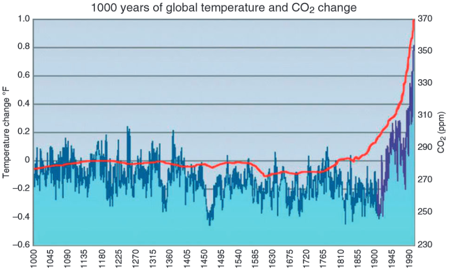
Figure 1. Mann 2015 entitled: “Hockey stick graph” of rising global temperatures
Next, here is a blowup of Mann 2015 Figure 1, confirming that it is a graft of the MBH99 instrumental data from 1902 to 1998 (plotted in yellow) to the MBH99 proxy reconstruction prior to 1901.
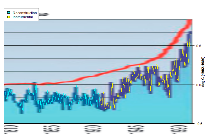
Figure 2. Excerpt from Mann 2015 Figure 1, showing MBH99 proxy reconstruction (cyan) to 1901; MBH99 instrumental version from 1902-1998 (yellow.)
CA readers will also remember Mann’s famous and vituperative denial that any climate scientist had ever spliced proxy and instrumental data in one of the earliest and most cited Real Climate posts Myth vs. Fact Regarding the “Hockey Stick”. A Real Climate reader had observed:
Whatever the reason for the divergence, it would seem to suggest that the practice of grafting the thermometer record onto a proxy temperature record – as I believe was done in the case of the ‘hockey stick’ – is dubious to say the least.
To which, Mann responded with a vociferous denial that such grafting had ever occurred:
No researchers in this field have ever, to our knowledge, “grafted the thermometer record onto” any reconstrution. It is somewhat disappointing to find this specious claim (which we usually find originating from industry-funded climate disinformation websites) appearing in this forum…
Often, as in the comparisons we show on this site, the instrumental record (which extends to present) is shown along with the reconstructions, and clearly distinguished from them (e.g. highlighted in red as here). – See more at: http://www.realclimate.org/index.php/archives/2004/12/myths-vs-fact-regarding-the-hockey-stick/#comment-345
When Climategate broke, the “trick” email obviously attracted much attention. The first explication of the trick email was Jean S’ Climate Audit post on November 20, 2009, a post which clearly demonstrated the grafting of instrumental and proxy data in the WMO 1999 diagram that was the subject of the trick email. Jean S also compared this technique to the splicing of instrumental and proxy data in construction of the smoothed MBH98 and MBH99 reconstructions, a technique that had been previously reverse engineered by UC here., but confirmed by the admission in the email that they had used “Mike’s Nature trick of adding in the real temps”. (In MBH98 and MBH99, Mann pared the hybrid smooth back to 1980, whereas the WMO1999 diagram continued the smooth to 1998). The effect of Mann’s hybrid smooth was that the smoothed reconstruction closed with a rhetorical uptick, rather than the downtick that would have resulted using the same smoothing technique on proxy data alone. Jean S acidly contrasted the hard evidence with Mann’s prior denial of ever splicing instrumental and proxy data.
The CA article prompted a Real Climate reader (citing http://www.climateaudit.org/?p=1553#comment-340175 and here
http://www.climateaudit.org/?p=7810#more-7810) to ask Mann about splicing (this was in the heat of Climategate and links to Climate Audit were temporarily not banned or tape delayed):
That leaves me with the simple question, “was the shape of a proxy record changed by including instrumental temperature record in in way that the proxy record was shifted from where it would have been in the 20th century?” Obviously, if the answer is yes, and this was bad science, then why was it done?
Even in the face of the Climate Audit demonstration two days earlier of splicing of proxy and instrumental data in the WMO 1999 diagram that had been the subject of the notorious email, Mann continued to deny that he and coauthors had ever grafted instrumental and proxy data into a single curve, the link below going to his original diatribe about “fossil fuel disinformation”:
The point that has been made a number of times is that the reconstruction (the raw annual values through 1980) has never been presented with the instrumental values (available after the end of the proxy record in 1980) as a single “grafted” curve by Mann and collaborators (here). Indeed, the instrumental values and proxy-reconstructed temperature values have always been demarcated and clearly labeled as distinct (e.g. in Mann et al ’98 and the extension back to AD 1000 in Mann et al ’99)
In the same inline comment, Mann opaquely conceded that instrumental and proxy data had been spliced in the smoothed Mann et al 1998, 1999 reconstructions:
In some earlier work though (Mann et al, 1999), the boundary condition for the smoothed curve (at 1980) was determined by padding with the mean of the subsequent data (taken from the instrumental record).
On November 24, 2009, in a press statement, one of Mann’s coauthors in the WMO 1999 graphic, Phil Jones of CRU, admitted the splicing in the WMO 1999 diagram, but Mann did not correct his previous denials.
Mann v Steyn
In the original Simberg article, under the word “data manipulation”, Simberg included a hyperlink to the Climate Audit article entitled “Mike’s Nature Trick”. Although lack of absolute malice almost certainly represents the easiest way of deciding Mann v National Review et al, in U.S. defamation law, opinions are protected if they are a supportable interpretation of disclosed facts. Hyperlinks are a recognized method of disclosing source facts. CEI argued (very convincingly in my opinion) that their use of the term “data manipulation” was a supportable interpretation of the facts set out in the hyperlinked Climate Audit post, Mike’s Nature Trick, and that these facts were “uncontested”. CEI included the Climate Audit post “Mike’s Nature Trick” as Exhibit 6(e) of the original CEI memorandum and is included in the joint attachments to the Appeals Court.
In response, Williams and Mann stated that the Climate Audit article preceded the NSF exoneration. (There is, however, no evidence in the NSF report that they considered the issues set out in the Climate Audit article. I have some thus far unreported documents that show directly that the Climate Audit post was not among the public documents considered by NSF or, for that matter, Penn State.)
Williams and Mann also argued that the assertion that there was “support in the articles hyperlinked to Mr. Simberg’s original post is simply without merit” and that “Mr. Simberg distorts the material he supposedly relies upon”. Williams and Mann conspicuously did not rebut or contest the “facts” set out in Exhibit 6(e), Mike’s Nature Trick, an analysis, which, to my knowledge, remains unrebutted to this day.
Is the term “data manipulation” a supportable interpretation of the splicing of instrumental and proxy data in the WMO 1999 diagram and the MBH98 and MBH99 smoothed reconstructions? Of course, it is.
In Mann’s most recent brief, Mann claimed that any criticism of his research as “misleading” was “demonstrably false” because Mann had supposedly “clearly labeled” both instrumental and reconstructed temperatures on a graphic – as though that were the only metric on which his research could be “misleading”. SKS has even attempted to re-frame Mike’s Nature trick as the technique of clearly labeling observations and estimates in a graphic – a standard and commonplace technique that existed long before Mann and one distinctly not observed in the WMO 1999 graphic. Or in the new Mann 2015 graphic, where instrumental and reconstructed temperatures are in slightly different shades of blue, but not labeled, let alone clearly labeled.
Most importantly, any suggestion that Dr. Mann’s research is misleading is demonstrably false. Dr. Mann’s hockey stick graph is clear regarding what it contains-both the instrumental and reconstructed temperatures are clearly labeled as such on the Hockey Stick Graph
Postscript
The splicing of instrumental and proxy data shown in the Mann 2015 is curiously similar to the splice in Al Gore’s Inconvenient Truth, as discussed at CA here.


95 Comments
Yes, exactly.
And, amusingly or otherwise, I realise as I read this that it’s just over ten years from Mann’s famous ‘No researchers in this field have ever…’ on RealClimate and just over five from the initial explanation of ‘Mann’s Nature trick’ by Jean S on CA. Is the latest Mann graph with clear splicing best viewed as an anniversary celebration? Or is the coming together with Al Gore the key driver?
“…no researchers in th8is field have ever..,”
Does this equate to. Mann and the others who HAVE done this are not “RESEARCHERS IN THIS FIELD”, making Mann’s statement true but EXTREMELY misleading?!?!?!?!
How real hockey sticks are made bears some resemblance to Mannian hockey stick manufacturing — cutting, splicing, gluing, etc.
https://video.search.yahoo.com/video/play;_ylt=A2KLqIUE065Upz0A9qP7w8QF;_ylu=X3oDMTBzc2M2MjdyBHNlYwNzcgRzbGsDdmlkBHZ0aWQDBGdwb3MDMTE-?p=making+hockey+sticks&vid=299383b43772def43595a5ae9d4344e8&l=5%3A24&turl=http%3A%2F%2Fts4.mm.bing.net%2Fth%3Fid%3DVN.608052199980273095%26pid%3D15.1&rurl=https%3A%2F%2Fwww.youtube.com%2Fwatch%3Fv%3DwL_CTR9omP8&tit=How+to+make+Hockey+Sticks+%7Bwww+downloadshiva+com%7D&c=0&sigr=11bp9sgdo&sigt=11hs69jtf&age=0&fr2=p%3As%2Cv%3Av%2Cm%3Asa&hsimp=yhs-001&hspart=mozilla&tt=b
This should include it inline, Zamboni-permitting
I’d like to see Steve’s opinion on this paper?
“Dendrochronological evidence for the Moffat Stick: Canada’s oldest hockey stick”
http://cdrg.geog.uvic.ca/cdabstracts/LaroqueDendrochronologicalThe.html
What exactly is grafting? Are they not shown in different colors?
Steve: Nick, the smell that you’re trying to fumigate is the absurd lie by Mann and SKS that Mike’s Nature trick is plotting instrumental and proxy data separately and clearly labeling both of them, as in the SKS statement here:
It’s amazingly arrogant to claim that clearly labeling graphics is a technique that Mann pioneered. It’s commonplace. Nor was what was done in the graphic that was the topic of the trick email – where proxy and instrumental data were splcied without clear labeling. So the above SKS statement and similar ones by Mann are fabrications. The present graphic is a bit amusing in that it does not compare instrumental and proxy data, but splices them without label or caption, the difference discernable only in a slightly different shade of blue that will be appreciated only by those who are familiar with Mike’s tricks.
“What exactly is grafting?”
What they are showing you by using different colors right here.
Do you want to make them cry “uncle” too?
Thanks for pointing that out. I hadn’t even noticed the slightly different shades of blue.
Nick, have you ever heard the phrase “plausible deniability”?
I am amused that on-line definitions of “graft” suggest “trick” as a synonym: “Mike’s Nature graft”?
They also suggest “fr*ud” as a synonym…
I’m a bit colour-blind and didn’t realise they were different until very closely scrutinising.
It isn’t helped by the fact that the graph appears to be an embedded JPG with some fairly nasty compression artefacts, further smearing colours around.
Grafting: it takes a sharp knife.
https://video.search.yahoo.com/video/play;_ylt=A0LEVje.GbBUpCwAb4APxQt.;_ylu=X3oDMTBsa3ZzMnBvBHNlYwNzYwRjb2xvA2JmMQR2dGlkAw–?p=tree+grafting&tnr=21&vid=868ECB6BB5A70777E42D868ECB6BB5A70777E42D&l=191&turl=http%3A%2F%2Fts1.mm.bing.net%2Fth%3Fid%3DUN.607996511434310204%26pid%3D15.1&rurl=https%3A%2F%2Fwww.youtube.com%2Fwatch%3Fv%3D7UC5Dr3tWDc&sigr=11b2tcuqf&tt=b&tit=Fruitwise+apple+tree+grafting%2C+the+saddle+graft&sigt=11f9kp856&back=https%3A%2F%2Fsearch.yahoo.com%2Fyhs%2Fsearch%3Fp%3Dtree%2Bgrafting%26ei%3DUTF-8%26hsimp%3Dyhs-001%26hspart%3Dmozilla&sigb=12piiej04&hspart=mozilla&hsimp=yhs-001
Nick: “What exactly is grafting? Are they not shown in different colors?”
The graft interface doesn’t have to be invisible for it to be a graft.
Nick: not only is there no label or caption, but the two series are lined up to match perfectly where they join and the underlying blue color unites them as a single data series.
The reconstruction went up to 1980, but is not shown in Mann 2015 after 1901. The graph without the instrumental replacement looked like this:
https://hiizuru.files.wordpress.com/2014/03/mbh99-scratch4.png?w=599&h=461
In the paragraph from RealClimate here where Mann claims that there never was any grafting, he has a couple of links to RealClimate posts that I thought would show graphs he is alluding to, but when you go to the links, you find descriptions of the graphics but not the graphics themselves. Not sure what it means, but I thought I’d mention it.
Mann has gotten away with it for so long he probably thinks he is teflon coated.
Odd though how when I searched for the names “McIntyre” or “McKitrick” in that document I don’t get a single hit. Voldemort strikes again. Mann’s cowardice at confronting his most effective critics will become the stuff of legend.
I was also thinking of He-Who-Must-Not-Be-Named again today – without even checking the tirade. I felt I knew the answer. He-Who-Must-Not-Be-Cited is the ultimate citadel. But best not even to mention the terrible two. As you say, legend.
Heh, indeed. I can’t stomach more than a few lines of the article at a time, but I’ve just reached the point where he goes on about the “just a theory” line. While I agree that some people exploit the difference between layman usage and scientific usage of the word “theory”, the example Mann gives of gravity as being “just a theory” is of course, stupendously wrong. Gravity is not “just a theory”, scientists consider it a “universal law”. You’d think someone with a physics background would be aware of this…
It’s a nitpick compared to his dubious graphing, but it does remind me exactly how limited Mann is as a scientist.
At the time, either JeanS or UC demonstrated that padding with the mean of the instrumental did not happen as Mann claimed.
“At the time, either JeanS or UC demonstrated that padding with the mean of the instrumental did not happen as Mann claimed.”
“MBH99 used 40-year filtering with 1981-1997 (not 1998!) instrumental padding. The smooth is cut back 20 samples from the end but not from the beginning.”
(and I think it took more than 15 minutes to reproduce, http://infoscience.epfl.ch/record/136640/files/VandewalleKV09.pdf )
In the comments UC posts a picture comparing padding with the mean of the instrumental vs instrumental.
My bad, didn’t know that Butterworth was not used in MBH99. Jean S got access to digital smooth and figured out that it was 499 long FIR.
How slimy to use slightly different hues of a color. I didn’t even notice it until I started reading. Plenty of options to clear it up – shade beneath the curves disparate colors, for example.
Indeed. I noticed this color shade game only after long time in the graph above. This is not post Modern science but post Kindergarten pranks.
I have said this before, but here it is again bright and open: these folks are emulating temperatures to fit the Etheridge 1996 & 1998 Law Dome CO2 concentration (not isotope) data. Perhaps with some South Pole Station Atmospheric or Mauna Loa spliced on at the end. No data in the Etheridge representations goes to 370 ppm. Note the data for this “2015” graph ends 20 years earlier, about 1995. Not only is this arguably “hiding the pause,” it is yet another fit with the Etheridge CO2 records.
The people who believed the recent CO2 record “had to be” near one in the same as temperature anomalies are a lot quieter these days than ten years ago, but never, to my knowledge, did they graph alleged temps and CO2 concentration together in a scientific paper. However one does see it in presentations made for the general public, notoriously in Gore’s AIT. The graphic rhetoric is to induce an “aha” type causation assumption in the average public viewer, while the speaker retains plausible deniability.
Regarding the Serengeti…does anyone have any recent pics of Mt Kilimanjaro? I sense it is currently abundantly gifted with snow.
Mann et al 2008 pioneered a different Serengeti strategy. As discussed at CA here https://climateaudit.org/2008/09/22/the-mystery-in-kenya/, the Serengeti strategy of Mann et al 2008 was to locate a Spanish precipitation series in the great plains of Africa.
The appearance of Spanish data in the Serengeti baffled the lions.
I’ve heard of ‘data mining’. Is this an example of ‘data manning’?
Data extrapolation (projection?).
Don’t worry, the lion sleeps tonight.
“The rain, in Spain, stays mainly in the (Serengeti) plain”.
I stopped an old Mann along the way
Hoping to find some long forgotten proxies or ancient temperatures
He turned to me as if to say, “Hurry boy, it’s waiting there for you”
It’s gonna take a lot to take me away from you
There’s nothing that a hundred men or more could ever do
I bless the rains down in Africa
Gonna take some time to do the things we never had
The wild dogs cry out in the night
As they grow restless, longing for some solitary company
I know that I must do what’s right
As sure as Kilimanjaro rises like Olympus above the Serengeti
I seek to cure what’s deep inside, frightened of this thing that I’ve become
I bless the rains down in Africa
I bless the rains down in Africa
His use of Spanish precipitation data from Spain is clearly justified by, and referential to, the work of Professor Henry Higgins:
“The rain in Spain stays mainly on the plains”
although somewhat at odds with the his subsequent clarification:
“And where are those blasted plains?
‘In Spain, In Spain.'”
It’s interesting that Mann reached back to 1999 for a reconstruction. I’ve read many times by Mann’s defenders that criticizing MBH98 or 99 is silly because (paraphrasing) those were early tries and techniques have improved since then. [Conceding the point tacitly.] However, in 2015 when Mann wants to make a rhetorical point, he doesn’t use his more recent work, but goes back to his “glory days”.
The article by Mann is published in the Bulletin of Atomic Scientists which is a nontechnical online magazine that covers global security and public policy issues. Even if the claim were to be made that the splicing of proxy and instrumental data in the graph and failure to acknowledge doing so in the text were not an issue given that this was for illustration purposes in a nontechnical article, Mann could not make that claim. He lists the article as “research” in the funding section which states:
“This research received no specific grant from any funding agency in the public, commercial, or not-for-profit sectors.”
If Mann considers this a research paper, hard to imagine how an op-ed written by him would read.
I notice they have a crime writer on their governing board….
http://thebulletin.org/governing-board
and James Hansen is on their Science and Security Board…
http://thebulletin.org/science-and-security-board
No need for confidence intervals anymore, I see.
Mann generously interprets the IPCC’s words to endorse his position. He says: “(In its September 2013 report, the IPCC extended the stick farther back in time, reflecting their conclusion that the recent warming was unprece-dented for at least 1,400 years.)”
The IPCC says: “For average annual NH temperatures, the period 1983-2012 was very likely the warmest 30-year period of the last 800 years (high confidence) and likely the warmest 30-year period of the last 1400 years (medium confidence).”
“Likely” and “medium confidence” – important qualifiers, one would have thought, particularly given “likely” can be as low as 66%, which is nothing to bet the ranch on. And no use of the u-word. All told, this is quite a noteworthy retreat from the hockey-stick’s heyday, not that you’d ever know it from Mann’s piece.
Incidentally, I love the way the IPCC parks the MWP/MCA by cherry-picking an 800-year period in order to crowbar the “very likely”/”high confidence” wording in. And by focusing only on the warming aspect of the series, they conveniently dodge the variability issue that results from the temperature drop between the MWP/MCA and the LIA, and the subsequent recovery.
In the Bulletin of the Atomic Scientists 2015 (linked above), Mann writes:
“It [the hockey stick] emerged as an iconic image of human-caused climate change, conveying a simple, straightforward message about the reality of [human-caused] global warming …”.
He states in his book The Hockey Stick and the Climate Wars: Dispatches from the Front Lines: “… whether conditions in past centuries might have been warmer than today, then, would not have a scientific bearing on the case for the reality of human-caused climate change …” but in the same book subsequently contradicts himself.
Even if it were a near accurate reconstruction it would have no bearing on the degree of human influence on the post WW2 climate (ref. IPCC) — the lower half of the ‘blade’ being before any human-caused emissions could have any significance anyway.
“In the Bulletin of the Atomic Scientists 2015 (linked above), Mann writes:
“It [the hockey stick] emerged as an iconic image of human-caused climate change, conveying a simple, straightforward message about the reality of [human-caused] global warming …”.
He states in his book The Hockey Stick and the Climate Wars: Dispatches from the Front Lines: “… whether conditions in past centuries might have been warmer than today, then, would not have a scientific bearing on the case for the reality of human-caused climate change …” but in the same book subsequently contradicts himself.
###########
Others have made the same mistake ( Brandon does on the first page of his book )
Lets start with the relevance of the HS to the case for AGW.
The case in chief for AGW does not rely on paleo studies.
snip
Steve: Mosh, as you know, there is a longstanding blog editorial policy against trying to prove or disprove global warming in a few paragraphs in unrelated threads. The purpose of the policy is to prevent all threads from being the same.
snip
–
see Mosher snip comment
“He states in his book The Hockey Stick and the Climate Wars: Dispatches from the Front Lines: “… whether conditions in past centuries might have been warmer than today, then, would not have a scientific bearing on the case for the reality of human-caused climate change …” but in the same book subsequently contradicts himself.”
I was commenting on the lack of a logical inconsistency not tryin to prove or disprove AGW, but rather shwoing that the perception of an inconsistency is wrong.
either way. no more comments
Steve Mc: Mosh, don’t have a temper tantrum. YOu may have intended something different but the post turned quickly turned into a standard exchange of single paragraph arguments about AGW.
Now if Steve would only drill a borehole over here in the outer badlands of the blog.
===============
Is there some standard how to scale and align temperature and CO2 to the same plot? Here 0 C = 280 ppm and 1 ppm causes 0.006 C raise in temperature. Somewhere else ( http://www.skepticalscience.com/images/co2_temp_1900_2008.gif , ) 0 C = 320 ppm and 1 ppm causes 0.009 C raise. Or can you always do a LS-fit? As in here https://www.youtube.com/watch?v=JSApTVSU_VY ( look only the red part )
When I click the realscience link, it doesn’t come up unless I delete the end of the link that says “#comment-345”
Then it shows 9 comments but the link doesn’t work. Were there originally 345 or more comments?. Anyway, I hope the realscience site has been archived in the webarchive site so it can be accessed in all its original glory. And thank you Steve for your work in detailing these items.
To me, the most obvious thing for a scientist to do is to graph the proxy data from the time the instrumental data starts to the present, and in a separate graph show the instrumental data from its start to the present. Then try to explain the differences, and scientifically justify why the proxy data predating the instrumental data can be considered valid. If the two, proxy and instrumental, diverge so much, then the proxy data from start to finish should be discarded and the reconstruction going back a thousand years should be considered junk.
snip – see Mosher snip comment
It is surprising how little Mann has learned. The longer his denial goes on, the worse the judgment of history will be.
Indeed! As I had noted a few years ago in Message to UN and enviro-activists: Try another way:
And, on a somewhat related note, Steve had cited Mann’s:
I haven’t yet found the time to verify the validity of the following, but …
Based on my recollections of Mannian prose in action over the years, it seems to me that whenever he chooses to litter his “criticisms” (for want of a better word) with phrases containing words such as “specious” (and/or reasonable facsimiles thereof), his usage is invariably a dead giveaway that he has absolutely no evidence to substantiate his claim(s)!
** “Try Another Way” is the work – and key exhortation – of the late Marc Gold; for many years this work was (in effect) the “bible” for those working in the field of services to people with developmental handicaps (formerly known as mental retardation).
And my many years of experience in that field strongly suggest to me that those so handicapped are miles ahead of Mann in grasping what I consider to be Gold’s (slightly modified but) major lesson:
Fair enough Steve..sorry about that.!
I find it amazing that when the initial Mannian graph/proxy data etc came out..it was trumpeted far and wide.
When other tortured proxy data sets came out that “appeared”(without scrutiny) to support mannian maths..that was also paraded.
Now the new “subtle retreat”amongst the faithful is..
“well..it MIGHT be wrong..but it doesn`t matter”
It appeared to matter when they thought it was hard science…
Is this “semantic trick”, which just popped up here in the thread.. being taught in Al Gore`s climate training classes or something..??
““well..it MIGHT be wrong..but it doesn`t matter”
It appeared to matter when they thought it was hard science…”
Never mind that IF it is wrong, all the stuff that “supports” it (by showing the same thing) might be equally wrong.That could be more “significant” than the paper itself…
Wow, Mann actually grafted his now-recognized as flawed 1999 paper to the temperature recored???
Just wow.
That is incredibly professionally embarrassing behavior on his part.
This guy is a complete train wreck. .
Further more he persisted in showing his reconstruction all the way back to 1,000 AD despite the clearly stated NAS recommendation.
Jeff Norman:
Personally, I’d recommend not using it before 1850.
“This guy is a complete train wreck. .”
And yet he still has a job and people take his work seriously.
This Twitter conversation is priceless from a Dendro and former Realclimate author:
Especially this money quote for Steyn’s defense: “Mann is an expert on dishonest presentations of science information, so he should know.”
Open warfare is a surprise, since he was defending Mann 2008 at AMacs.
Hopefully this link works better… I need a preview button 🙂
I wanna know how to get elevated from sowing doubt among the socks to top drawer delayerhood.
===================
kim, you are the James Joyce of CE and CA. Reading your work is humbling.
Kim, I especially liked the knock-off of Oliver in Scotland. Thanks.
-.- ..- –. — …
If only I could write ‘The Denizeners’. Sounds like a job for Level Head.
===============
I wonder if Steyn knows about Jim Bouldin’s opinion of Mann.
The night they drove Mann’s Sticksie down.
=======================
He knows.
From the tirade, when Mann quotes Santer here, I think he may be pointing to an issue that has saved Mann’s own work from more (needed) critical responses of his climate science colleagues. Depends on what you mean by “there are people” I guess.
Some years after his own experiences, Ben Santer stated: “There are people who believe that if they bring down Mike Mann, they can bring down the IPCC”
Why does the red line hover above the data since the 1850’s? What is it supposed to indicate?
Mariner,
It means that it is worse than we thought, just not the way he thought.
It’s now 10 years since this blog started and Mann is still making materially false statements to everyone who gives him a microphone or a opinion editorial. Every single part of his Hockey Stick has been torn to shreds and still people listen to him.
My only hope is that Steyn insists that Mann take the stand in court. What a joy that will be.
I am new enough to have a list of hockey stick questions that I hope the pros can answer.
1) Where are the followup studies to prove Briffa’s claim that the tree rings from 1960-present are invalid due to unprecedented environmental impact? This, Mann’s excuse for truncating the tree ring proxy plat at 1960, seems to be as central or more as to the veracity of Mann’s deletion and to the validity of the proxy period.
2) Mann and Briffa acknowledged that CO2 has a fertilizing effect on the high latitude trees from which the rings were being used. Does this not put a confounding influence on the proxy (and in the opposite direction to what was compensated for)?
3) How do Mann et al account for the proxy plot going flat through known climate change such as the Medieval Warming and Little Ice Age?
4) How is it known that tree growth does not have a feedback mechanism in roots, branches or leaves to adapt to climate over the centuries? This seems like what indeed is happening and invalidating their thermometerness.
Sorry R Graf meant to post below as a reply to your comment and questions.
Good questions. Tim Osborne actually attached Briffa’s complete, non truncated time series in one of the climategate emails. I looked at the complete data in a blog post at Jeff Id’s several years ago. The complete Briffa data set aligns almost perfectly with instrumental (both pre and post 1960) after addition of a mere linear trend. No sign divergence at 1960 as claimed.
“No sign divergence at 1960 as claimed.”
That seems to add to the mystery and, at the same time, give one caution on Briffa’s nicely instrumental tracking proxy data post 1960.
Googling images of Mann hockey stick graphs I see a hundred. The ones that have separate plots for each proxy study mostly have all studies getting truncated early, not just Briffa’s bristlecone pines. What is the story with coral, bore holes, sea sediment, glacial sediments, ice cores? I know this is a huge scope question but why are they all mostly truncated? And, shouldn’t the first focus be using algebraic matrix analysis on all the proxies to each other for validity before even thinking about using them?
For example, I read an CA blog on glacial lake sediments, varves, from a Dec. 2013 where Steve M. found they analyzed their proxy upside down in some of their papers, interpreting thick layers of sediment as warming when later it was corrected to the reverse. It seems that few of the proxies are producing a signal that can be matched and thus taken together they make a straight hockey stick handle. I must be missing something. Someone please help if you can.
The truncated Briffa series of “Decline” fame is not Bristlecone but a composite North Hemisphere MXD – many from Fritz Schweingruber.
Tree proxies, being annual frequency, should pass the Tambora, Krakatoa tests, and easily conform to a Little Ice Age test before hello, as well as be tested for CO2 sensitivity.
Steve: As an editorial policy here, I prefer that readers stay away from very general ruminations about proxies and limit themselves to comment on issues directly raised by the thread. This is out of consideration for the silent majority of non-commenting readers, for whom I’ve adopted an editorial policy of not re-litigating general issues about AGW and proxies on every thread. Sorry about that. Most general issues about proxies have been discussed on many occasions.
Perhaps you can resolve a couple of details. The caption of Mann’s figure 1 mentions global temperatures. But MBH99 was a reconstruction of NH temperatures, correct? Also, the vertical axis of that figure is labeled as change in degrees Fahrenheit, but it’s actually degrees Celsius, correct?
Steve: good spotting. yes, the caption in the journal is incorrect. My overplot is from original data in deg C and it matches the diagram, proving that the diagram is in deg C as well, despite the incorrect caption. And yes, Mann’s recon was of NH temperature. However, in subsequent work, Mann et al 2008, Mann used NH proxies to reconstruct not only NH, but SH temperatures, ensuring that the two reconstructions had a remarkable (TM) similarity.
.
Thanks Steve. One question more, if I may. What was the instrumental series against which MBH99 was calibrated — was it HadCRUT3 as of 1998? Because current HadCRUT3/HadCRUT4/GISS/NCDC series differ (slightly, to be sure) from your overplot.
Steve: it was a sui generis calculation from an early version of HadCRU – maybe 1 or 2, I’d have to check – it was an average of specified gridcells. See Mann et al 1998 dset at NOAA for archive index series.
Thanks again Steve. I had looked in the MBH98 SIs, but not the NOAA archive.
Many times the charts prepared for other publications were in degrees F to match the article.
May I add that the later work attributed to Mann, the NH–which looks like its SH–both appear to have substantial differences to the MBH99. For example, looking at the data as depicted at AR5 fig. 5-07, the year 1000 is warmer than the present. These AR5 graphs are two millenia range, and each shows, especially the SH and “global,” a first millenium AD broadly warmer than the present. This fact is partially obscured by not just one, but two modern instrumental records. Relevant here:
Often, as in the comparisons we show on this site, the instrumental record (which extends to present) is shown along with the reconstructions, and clearly distinguished from them (e.g. highlighted in red as here). –
These words are not well responsive to an assertion about the grafting of one set of data to another to shape a hockey blade, where such actually exists, as in the graph at the top of the present page. But the words would be somewhat responsive to a different and real criticism: the use of temperature records to obscure recent data from other records, and/or to imply the other records are in sync with the chosen instrumentals. This issue is different than grafting. The words, the instrumental record (which extends to present) is shown along with the reconstructions, and clearly distinguished from them , are truthy in some circumstances, but unresponsive to the precise criticism the “instrumental data” is represented too boldly. An assessment that the ends of the other data are thereby being purposely obscured is almost unavoidable. This obscuration is very apparent, to my eyes, in graphs such as AR5 fig. 5-07, and indeed, almost every other spaghetti graph with a “clearly distinguished” instrumental record I can presently recall. The obscuring of the ends does not preclude additional truncations of problematic data sets within these spaghetti graphs, the Briffa work would be a good example. However, I think the “obscuration” style probably has no overlap with the “grafting” strategy, they are two separate “tricks.” I think in individual instances the apologists are sincerely confused over which of their tricks is being criticized.
Steve:
What would Michael Mann’s hockey stick graph look like if you plotted temperature vs logarithm of CO2? (James Hanson’s formula in the IPCC report suggests that delta T and delta CO2 are linearly related).
Not much different, as the shape of log CO2 remains about the same. There are many degrees of freedom in those double-y plots. You can scale the data (wrt the other axis data) by selecting y-axis limit range. You can shift the data by shifting the limits. Mann’s figure shows that 1000-1400 was the normal climate, then some cooling happened, and now temperature is about to catch the disastrous levels, because temperature follows the red curve.
You can give other kind of message as well:

Maybe there should be a rule that there should be the same space above and below both curves? 🙂
Steve:
If the ocean temperatures before 1900 are not proxy data, where did they come from? What “instrumentation” was employed? Even now, we only have one ARGO buoy for each 100,000 sq kms of ocean.
Steve:
Sorry, I meant to say that delta T and delta the logarithm of CO2 are linearly related.
Steyn has a column in response to this post of Steve’s:
http://www.steynonline.com/6753/as-steyn-goes-so-goes-mann
While Mark Steyn may be crowing about his prescient snarking in 2001, I think you may find that numerous other peoples were expressing similar suspicions prior to this. John Daly et al come to mind.
Steve: that doesn’t mean that the 2001 critics necessarily got the point right. Steyn’s article is very nuanced on this point. It’s more that it’s really bizarre that the diagram in Mann 2015 does the splicing that Mann denied, rather than vindicating those people who accused Mann in 2001 of splicing instrumental and proxy data.
If a trial ensues as a result of the Mann lawsuit, a Watergate-esque question will likely arise during the course of the proceedings; i.e., “What did Steyn know, and when did he know it?” In his latest post, which references this thread on Climate Audit, Steyn appears to be laying the groundwork for stating that he was a critic of the Mann hockey stick as early as 2001.
Looking at the latest hockey stick graph as published in The Latest Mann Tirade, one has to surmise that the graphic was created by an illustrator employed by the Union of Concerned Scientists, not directly by Mann himself.
As far as public policy decision making is concerned, if this latest graph was all there was to rely upon, and if it was considered to be factually accurate, there would be every reasonable justification for taking very strong anti-carbon measures as quickly as possible.
In any case, as it might be perceived by an uninformed viewer, the latest graph succeeds in conveying a basic message above and beyond its assertion of no worldwide Medievel Warm Period.
The basic message being conveyed is that paleoclimate temperature reconstructions are as reliable as the 20th Century instrumental record in measuring the earth’s past temperature, and that the hockey stick is the quasi-official global mean temperature record for the past 1000 years, for all practical purposes.
Steve: I think that Steyn’s 2006 article (h/t David Appell) is more relevant on this count than anything that he wrote in 2001.
It turns out that the iconography of the figure in Mann 2015 goes back to the National Assessment Synthesis Team (NAST), “Climate Change Impacts on the United States: The Potential Consequences of Climate Variability and Change” – Overview document, USGCRP, June 2000. See here page 17 and that this figure had been excerpted and criticized by John Daly in 2001 here.
Daly, showing the MBH99 graphic, stated that Mann had “crudely grafted the surface temperature record of the 20th century (shown in red and itself largely the product of urban heat islands) onto the pre-1900 tree ring record.” Daly’s criticism has been popular with many “skeptics”, but is not one that has been at Climate Audit in respect of Mann et al 1998, 1999 – though grafting is a valid criticism of Mann et al 2008.
Daly said of the 2001 US GRCP graphic (shown below):
Figure 1. Graphic as shown at John Daly, excerpted from 2001 US GRCP report. Original USGRCP caption says :Records of Northern Hemisphere surface temperatures, CO2 concentrations, and carbon emissions show a close correlation. Temperature Change: reconstruction of annual-average Northern Hemisphere surface air temperatures derived from historical records, tree rings, and corals (blue), and air temperatures directly measured (purple)
If one directly compares the earlier iconography with the image in Mann 2015, the merger of instrumental and proxy data in Mann 2015 is more complete. In the original version, if you squint, you can see some post-1902 proxy reconstruction values, but these are not shown in the Mann 2015 version. The 2001 US GRCP diagram is part of a three-panel diagram, with one panel showing CO2. This has been plotted onto the Mann 2015 diagram.
Figure 2. Graphic in Mann 2015.
The 2001 US GRCP report stated:
I took some time this afternoon to skim through the NAST report from June 2000.
The report might just as well have been written in January 2015 as opposed to June 2000. Mann’s hockey stick, the potential for extreme weather events, the role of the GCMs in developing climate forecasts, the potential for adverse climate-related impacts on the oceans and on the biosphere, calls for more money to be spent on climate science research — it has it all.
It’s almost like M&M 2006, the Wegman Report, Climategate, Yamal, Upside-down Tiljander, the Texas Sharpshooter Fallacy, and The Pause never happened.
Steve – I need some further education. One of the claims is that the instrumental record tracked the proxie records from circa 1880’s through 1960 and/or 1980 at which point the proxie records showed less warming than the instrumental record, ie the divergence.
The question is there a good site or article discussing and or comparing the actual instrumental records with the proxie records through the entire time period.
Thanks
Steve: there is a voluminous literature. From the way that you are framing the question, you have to take care that you distinguish the MXD proxies (the Briffa 2001 reconstruction) which diverge around 1960 from bristlecone proxies (Mann 1998-99 reconstruction). The divergence in the bristlecone proxies after 1980 is a relatively newly observed phenomenon, see especially the recent CA posts. Mann has vehemently denied any divergence in his reconstruction.
Putsch per narrative.
============
Could this kind of mixed and selected data presentation be called Mannipulation?
Reblogged this on I Didn't Ask To Be a Blog.
“Mann’s figure shows that 1000-1400 was the normal climate”
What is the criteria for determining what a “normal climate” is? And who gets to choose what era and therefore what temps are the baseline for “normal?”
As an aside, wouldn’t it actually be quite abnormal for real temperatures to ever not diverge from the average or mean temperatures from any past time frame?
In recent times I’ve started to ask the question how many different climates have we had at the global level over the last 2000 years, what criteria are we using to distinguish them, and what do we think the next one is going to be?
It seems to me that answering the question is a precondition to answering the question “Is the climate changing?”
I find a reluctance to engage – the problem is in dealing with a basic methodological issue: getting some precision into the definition of climates at a global level and separating this from long-term weather.
It is easier to have some fuzziness here, with global climates being discrete categories in time for some uses, but part of a continuum for others.
“And who gets to choose what era and therefore what temps are the baseline for “normal?” ”
He who selects the shift of right y-axis numbers wrt left y-axis. I’ll rephrase: to me, Mann’s message is that 1000-1400 was the normal climate, then some cooling happened, and now temperature is about to catch the disastrous levels, because temperature follows the red curve.