Last spring, we offered to help UCAR locate the mysterious lost civilization of Chile. I reported:
If one goes to the ds570.0 location, http://dss.ucar.edu/datasets/ds570.0/data/ (you may have to register), there is a map of the world which appears to be comprehensive (i.e. all known oceans and continents are displayed.) Above the map is the following intriguing message:
Click region for station list. There are also non-WMO stations and stations with no location .
..
A number of the mystery stations came from the mysterious civilization known as “Chile”, whose existence has long been suspected. … Other lost civilizations include the mystery lands of Barbados and Argentina. I guess that it will be up to archaeologists to locate the intriguingly named “Bogus Station”. Is it in the depths of the Taklamakan desert, in an unknown oasis surrounded by a few hardy Dulan junipers known only to dendroclimatologists seeking temperature proxies? As noted above, CA readers are generous with their time and ideas. If you can solve these thorny problems, I’m sure UCAR will be very grateful.
CA readers suggested to UCAR that there were clues that the mysterious lost civilization of Chile was located in South America, but when I checked, UCAR still regarded Chile as being a lost civilization.
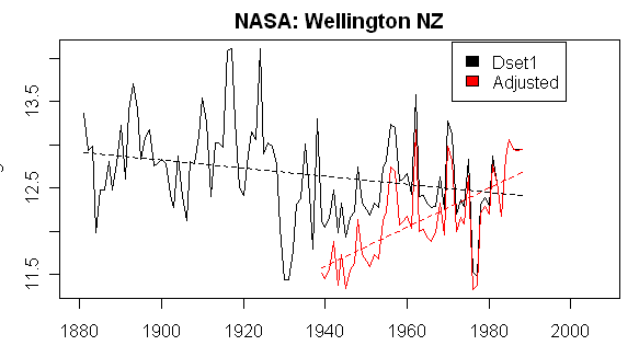
Today I invite CA readers to solve another mystery: help NASA locate the lost city of Wellington NZ. Here is a plot showing NASA dset=1 and adjusted data for Wellington NZ. As you see the data has not been updated since 1988! So let’s help NASA find the lost city and its mysterious temperature records. Again there are tantalizing clues that the records exist. If one googles “wellington NZ temperature”, one obtains todays temperature for a city that purports to be Wellington NZ. Perhaps NASA can see where these signals are emanating from and locate the mysterious “lost records” of Wellington NZ.
Even though the city appears to be lost, Hansen has nonetheless managed to adjust the data. If one looks at the raw data, there doesn’t appear to be any trend. But after Hansen has adjusted the data, there is a strong Waldo trend from 1940 to 1988 when the city appears to have been destroyed – perhaps by an invasion of Scythians.
UPDATE:
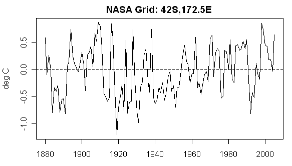
The gridded histories for this gridcell from CRU and NASA are shown below:


91 Comments
Any city with no net temperature trend, but showing population growth between 1940 and 2000 (or whenever), will end up with a positive late 20th century temperature trend if an automatic population-based adjustment is blindly applied to account for UHI effects.
A good test of whether the adjustments are fair (as opposed to accurate) is to see whether a downward adjustment of raw temperatures is made for cities of declining population. The population of Liverpool, for example, declined from 867,000 in 1937 to 393,000 in 2001, and between 1961 and 1991 the population of greater Liverpool dropped 19%. So, does Hansen’s adjustment add a declining trend to Liverpool’s raw temperature record?
Towns in western Oaklahoma (Altus, Woodward, Mangum) have been losing population steadily (if you don’t count new prisons). Are negative trends adjusted into their raw temperature records?
..if GIStemp met its Waterloo in Wellington! Sorry, too good to resist.
History begins in 1940.
#1. PAt, I would say that population is a type of proxy for the changes to the surface: i.e. buildings, asphalt, etc… There may be some asymmetry here, as it you build up a place, which then loses population, it still has the buildings and asphalt, so a simple population proxy is unlikely to suffice.
I am afraid that the whole New Zealand is somewhat lost. For example, their government has introduced the breathing tax
http://www.scoop.co.nz/stories/PO0709/S00255.htm
Average monthly temperatures in Wellington:
In January 2007, NIWA data was used to claim that New Zealand is not warming:
http://www.scoop.co.nz/stories/SC0701/S00003.htm
Wellington appears to be Wellington airport:
http://maps.google.com/maps?q=-41.33000183,174.80000305
Apparently. In this link it is named Wellington Aerodrome.
#4 Steve, I agree with you completely. The question is whether Hansen is applying an automatic UHI adjustment that blindly scales with population.
The adjustment looks bizarre enough. But even that aside, the truncated pre 1940 history could void the massaged positive trend.
#1 Pat Frank, you have the adjustments backwards. If a station had no observed temperature trend but had an increase in population over the 20th century, the adjusted record would show a negative trend. The UHI adjustment is downwards for an increasing population.
#1, #8, #9 – I am probably being stupid but I don’t understand why the correction should be in the way that you imply. To my way of thinking, if we consider UHI effects only and suppose that the surrounding rural temperature trend is zero over time, then the actual measured temperature in the city rises over time as the city grows, purely because of UHI. At some point in the past when the urban population was sufficiently small, the urban temperature equaled the surrounding rural temperature but today it is higher than the surrounding rural area. So to correct for that surely you have to subtract that UHI upwards bias from the recent measurements and leave the past ones alone?! The gradient of the correction trend is therefore negative with increasing time (for an urban area with increasing population). Correct me if I am wrong but the point of this is to try and deduce the large area rural (‘true’) temperatures even though what you have got is the measured temperature of a station in the city – isn’t it?
If the measured temperature by a station in the city has stayed constant over time (as the raw Wellington readings seem to have) then either – there is no UHI (for this particular city), or if there is UHI the surrounding rural temperature has to have decreased by exactly the amount of the UHI increase. Thus if Hansen’s adjusted data correction is to account for increasing UHI with time, then surely its in the wrong direction? If it ws correcting for UHI then the red corrected trend should give a negative trend not a positive one.
(So I deduce that the correction must be for something other than UHI?).
In the example of Liverpool given above where there has been a falling population then we (or at least I) would expect measured temperatures today to more closely resemble surrounding rural areas so the UHI correction should be less than in the past and in that case I would expect the UHI correction to have a positive gradient with time and the past to be revised downwards with less adjustment to today’s temperatures.
Or have I got entirely the wrong end of the stick? (ie the blade, LOL!).
I live in NZ about 300km from Wellington which is our capital city. It is the home of our parliament who yesterday introduced their cap and trade sysytem to combat global warming (zzzzzzzzzzzzzzzzz). I would be very grateful if you could stop looking for it and instead make it go away.
Well since Wellington clearly has a warming trend of 2.2C per century (the adjusted data), its obvious this is where Waldo is, and its about time NZ took appropriate action. /sarcasm
Or maybe Hansen’s adjustment is due to UHA (Urban Hot Air) from the Parliament.
Wellington? Where’s the beef?
Where’s the mutton? (We are, after all, talking about New Zealand! LOL!)
Could someone please do me a graph of New Zealand temperatures before and after Hansen adjustments.
Hilarous, Steve.
[As an Australian, I can confirm that on 7 March 1988, Cyclone Bola hit the north island of New Zealand. The whole place was wiped out. In fact, there was so much rain, the entire country sank! Looking back now, I can see that it was undoubtedly an early warning sign of AGW.]
#10 Geoff, you’re right, thanks.
http://www.metservice.co.nz/default/index.php?alias=wellington
http://www.nzweather.net/
http://www.metvuw.com/
http://www.springerlink.com/content/h3778n180u5548x4/
http://www.john-daly.com/graytemp/surftemp.htm (Dr from Wellington NZ)
http://www.john-daly.com/graytemp/surf-msu.htm
It is ironic that you have raised the subject of New Zealand this morning (our time of course). A national talkback station has spent the whole morning discussing the climate change scenario here with the governments introduction yesterday of a cap and trade system. Lord Monkton has just been interviewed and called the New Zealand government “silly” for its introduction. He suggested they might as well tax joggers because they produce more CO2 than the rest of us. Monkton clearly stated that Al Gore will announce he is to run for president at the start of next year and all of his globe trotting, fundraising and business dealings in carbon credits are to raise money before he declares his candidacy as he is restricted on his money raising after he has decalred. Fascinating stuff.
Paul, if Gore really thinks he has a chance against Clinton, he didn’t learn a thing in his 8 years with them.
I’m not even going to start on Gorebal Warning as I’ve been taken to task so many times before. 😉
It could be that Wellington was lost in an earthquake in 1988 — not surprising considering the fault line on which it is built.
Or it could be that when it’s name was changed to Helengrad in 1999, at which time Hansen’s records may have became somewhat confused.
Actually, if ever there was a city with minimal UHI effects, it would be Wellington.
1. The city is very constrained geographically, by the Harbour and surrounding hills. Urban expansion has tended to be along the flat (flattish) corridors north to Porirua and NE to the Hutt Valley. I suggest that the urban growth has been very dispersed.
2. The city is known as “The Windy City”. Strong southerly winds come in from the Southern Ocean which tend to cool the place down quite a lot.
3. Wellington airport is built on an isthmus quite close to the city. It is swept by those cool southerly winds. The airport, being very constrained geographically, has not increased in paved area for many years, and being a regional airport, generates relatively little traffic compared with airports in many other cities.
While clearly not a rural location, I would expect that the long term temperature record of Wellington would have been less affected by UHI effects than many other cities. It is worth looking at Wellington on Google Earth or Google Maps, and you will see what I am talking about.
I venture to suggest that there is a good reason that Dr Hansen seems unable to access the temperature record there post 1988!
Nice “suggestion” Trev, well ventured.
Many here may be Jesters, but when is the curtain going to be called on these clowns? Are his pay-masters aware at NASA and the Senate?
As someone who lives, there a couple of observations. Of course it is getting warmer – it is the centre of the universe so the hottest place anywhere man!
RE Trevor #24
It very much depends where you put your thermometer – temps vary quite remarkably around the city with some really varying microclimates beacuse of those same hills. One of the NZ Met service ones is about 250m up on a hill overlooking the city.
Indeed there is a legend that the local council, upset at reportedly low temperatures on the national weather forecasts and the implications for tourism, moved the weather station to a concreted plaza surrounded by tallish buildings so inducing an increase in temperature stats and a flood of tourists to our tropical beaches and shirts off lifestyle.
We are of course one of the sunniest cities in New Zealand both in nature and by nature.
I’ve just looked at teh NIWA NZ website. They list the wellington station as at Kelburn – I’m assuming that is the one beside the NZ Met Office. Perhaps it was at the airport and has been moved (in 1988?) http://www.niwa.co.nz/edu/resources/climate/station
Coincidentally I was there two days ago as it is in a public park I and noted a weather station. It is on top of a hill about 125m up (which shows how bad my estimate above is).
It is located by the Dominion Observatory/Carter Observatory and the Krupp gun (pic here http://www.wellingtoncity.govt.nz/services/arts/publicart/gallery.php?type=memorial&page=1)
surrounded by a chain link fence, it’s a grassy area about 10x5m and about 25m to the left of and slightly below the circled building in this pic http://www.carterobservatory.org/construct-tko.html.
Looks like Insider’s last link isn’t working. I presume the station is inside the chain link fence shown in this photo:
http://www.pbase.com/cwest/image/39920473
Can anyone identify a link to New Zealand station data in digital form?
Try Warwick Hughes Steve, I think he has an interest in NZ data.
Cherry picking again.
What is it about the word GLOBAL that people do not understand?
Re:#29, Peter
It would work if you removed the final period. Note to self and others, when putting a URL at the end of a sentence, leave a space before the period (or don’t use one at all) or it will be included in the link.
http://www.carterobservatory.org/construct-tko.html
re 30
access here http://cliflo.niwa.co.nz/
My beef about this (#14), and I think the important point of the thread, is – since we seem to have established that UHI corrections have the opposite gradient to the Hansen correction then:
Either – it is not a UHI correction, in which case what is the correction due to? What would require the temperatures back in the 1940s to be decreased? so giving an apparent trend up to today (or 1988 anyway!). It does not look like a station move since the correction looks to be smoothly changing over the ~48 years plotted, from a large correction in 1940 to zero today.
Or, if it is a UHI correction then is there a systematic problem with the way Hansen applies UHI corrections? That really would be big news!!
Whatever reason – this looks like a test case of measured slight cooling over a century transformed into scary global warming by an adjustment and potentially the NZ data could control an area of the globe in the global temperature data at least as large as the USA GISS data (I know that’s only 2% of the globe/sarcasm)
The ending of GISS data in the 80-90s for a lot of stations where data DO exist is absolutely puzzling. I know for sure Hansen does it for France and I see no reason for this truncation, sometimes of rather good stations (for example Mont Aigoual).
The problem of the last decade’s warming in W Europe is that it is made by a big jump in 1986. Don’t ask me why but it’s a pattern well observed in Europe (using KNMI’s data which are consistent with GHCN): see graphs here. In conspiration speak, I wonder now if GISS’s truncation has something to do with it. If Europe is found to warm by a big jump then a plateau, I assume somebody would have hard times linking it to a steady GHG warming theory.
Sorry for the full stop on the url.
PC is correct that is the chain link fence around the weather station. You can just see the top of the little white box the thermometer sits in just over the edge of the hillock.
For war geeks that is a German cannon captured by NZ forces in WW1 and the only one left in existence and played on by generations of Wellington children
Steve for NZ data try that NIWA site above or the NZ Climate Science Coalition – they have been monitoring the data I think. http://www.climatescience.org.nz/ – Vincent Grey or Owen McShane or Bob Carter if you know them.
It looks like NZ has been already doing an excellent job in combating global warming. The image below shows all stations in the GISS database that have at least 50 years of data continuing into the 1980s or later (raw data).
The adjusted data for Christchurch shown below is similar to that for Wellington (i.e. truncated to start at 1950, with temperatures reduced in the 1950’s to produce a warming trend, although not as extreme as for Wellington — adjusted shown in red).
dennis,
GLOBAL records are made up of individual records, such as Wellington. If the individual records are no good, then the global record made from them is also no good.
No cherry picking here, just exposing the fact that the King has no clothes.
#37. Could someone else try the suggestions in #37 and return with a URL as I’m a bit busy right now?
Re: #32 – dennis ward
Auditing the mess that is climate “science” is a work in progress. It is not “cherry picking” to point out the the errors as they are found. And, even as you admit when you say “again,” this is not the first error that has been found in the data used to promote global warming, and it certainly won’t be the last.
Re# 40: Steve McIntyre
I couldn’t find any temperature data on the website. I will send them an email and ask if they know how it can be acquired.
Re #40,
Steve,
NZ climate database description
Description of free subscription
Here’s something interesting on the urban adjustment at Christchurch – which is only one of 3 GISS stations with adjusted versions after he 1990s. The number of “rural” neighbors is less than 3 prior to 1951 and after 1988. The “hinge adjustment” appears to be calculated only during this period and thus there is no urban adjustment after 1988. The only available rural station after 1991 is Chatham Island.
If this pattern is what occurs in say China, then there are probably a number of cases where the number of rural stations after 1990 is 2 or fewer and thus there may be no adjustment whatever for the intense urbanization in the 1990s in China.
I understand that the urban adjustment in this case is calculated from surrounding rural stations but that a correction process can give a correction of shape like this should ring alarm bells! How can you get a negative correction in 1950 rising to almost no correction today? Its unphysical!
(Before anyone chips in to explain the details, I do understand how this arises because of the way the correction is done and due to changing rural stations down to zero correction today because of insufficient rural stations, but the result is a nonsense).
My former physics professor would have thrown me out if I came up with a process that is just patently nonsense like this. He would have said, look at what you have done, does it make sense? Of course, sometimes it doesn’t (at first) make sense and as you investigate further, you may have discovered something new or understood something better. But nearly all of the time, if it looks unphysical, it is – you’ve messed up.
This is messed up – big time.
Il, I completely agree:
I would like to tell you all that here in NZ we have had “global warming” shoved down our throats for the last two weeks. Every other item on the news or radio is AGW and the government is rolling out all sorts of “experts” to tell us all the different ways AGW is going to kill us. The government have just introduced a cap and trade system and in the last three days talk back hosts have been begging those who think it is a good idea to call them and explain why it is. No one is defending it except the government and there cronies. To top it off the main film on TV3 tonight is “the day after tommorrow”. Two nights ago a current affairs programme interviewed some geen explorer who claims both poles are melting!!! These are mainstream programmes feeding us “b……….s” and no one questions anything they say.
Our Climate Change Minister said, and I quote. “We think it is not unreasonable to put 4 cents a litre on the price of petrol to save the planet.” Gee, lets put a dollar on and save the universe!!
Re: 44
Chatham Island is not a typical rural site since it is a small island and more than 850 km away from Christchurch. However, the Chatham Island temperature trend is almost identical to that of Christchurch (except for the convenient truth of having the 1920s and 1930s missing).
Folks,
My apologies if you have already covered this topic on another thread, but what is with this “the records stop in 1988” stunt?
These NZ metropolitan weather stations will be amongst the best maintained anywhere, and NIWA – albeit captured like all government met agencies by IPCC warmaholics – is a thoroughly professional outfit.
It’s not just the omission of the post-1988 data (which is of course, readily available, though until recently you may have had to pay to spring it) that is queer, but the lack of any public comment about what that omission does to the credibility of the NASA GISS global curve, i.e. does the post-1988 portion of it have any meaning at all?
More specifically, who knows what length of record is used from each of the stations on the GISS list? NASA? Or only Hansen? And even if that actual information is on public file, has NASA ever commented on why – for a particular subset of stations – only partial historical records are used?
Given what Congress did last year to blow open the hockeystick scandal, it is surprising that there has as yet been no US move for a formal audit of NASA’s meteorological record keeping. Why not? Is Hansen’s teflon suit really that thick?
As our NZ colleagues have summarised earlier in this thread, they are currently embroiled in a tornado of political spin over a new carbon cap and trade system for which there is utterly no justification from either NZ or so-called “global” climate records. Part of this state of affairs has to be sheeted home to pusillanimous behaviour on the part of the many NZ scientists who know the truth of the matter, but remain silent, whilst the utter corruption of the NZ media on the issue is the other biggest contributory cause.
Depressingly, it seems likely that the NZ developments are just a harbinger (or microcosm) of what is coming shortly in Australia and, doubtless, even USA. If that is not the case, then I shall cheerfully stand corrected by whomever can either explain why not, or – better – propose a realistic circuit breaker for the current madness.
Our kiwi friends could certainly use all the tips that they can get!
Bob Carter
Amen to that Bob. It would be nice to see one of you guys help us all out here by perhaps giving us a rundown on what really is going on here with NZ temperatures. We may be one of the first to jump on this silly bandwagon of “saving the planet” but given the size of population and what I percieve to be a skeptical public it may well be that our little country could be an ideal place to make a real challenge to the current one sided debate. The nuclear free debate, though again silly in some respects, made people sit up and take notice and maybe we can do the same with the AGW argument.
HEre’s the Hansen “urban heat island adjustment” for Wellington (this is implicit in the graph shown above), where Hansen has added to 0.6 deg C to the Wellington trend before its apparent destruction by Scythians in 1988.
The reason why the Christchurch series looks like Campbell Island is because the HAnsen adjustment essentially coerces the Christchurch low-frequency to Campbell Island. It doesn’t look like Campbell Island would meet any USHCN crieteria for homogeneity, but, as Gavin Schmidt observes, the U.S. is only 2% of the world’s surface (and seemingly adjustments outside the U.S. are unconstrained by the need for any physical rationale.
What does this mean for New Zealand temperatures? Are Hansens adjustments being used in New Zealand temperature graphs used on the public here? Are these adjustments being used to show warming in NZ that does not exist?
This is a fantastic time to be able to bring this nonsense to the NZ public as they are currently up in arms over the governments cap and trade scheme given the minute contribution NZ makes in terms of CO2 emmissions.
Actually, Steve, I think it was the Wallabies that destroyed Wellington.
Echoing some of the comments above, the situation in NZ is just absurd. The Kiwis could slaughter all their farting sheep, pack up their industries and live in caves and it would make not a whit of difference. Much the same could be said about Australia. I could say more, but let’s not stray into politics.
It will be interesting when we get to Australian temperature records, as there are several very rural sites with very long records, and I haven’t been able to find a warming trend in any of them. There was a paper published here a few years ago that purported to link recent drought to global warming. I emailed one of the authors asking where this alleged warming trend came from, and he replied that the temperature data came from the Bureau of Meterolology “so it must be right”. I now suspect the BoM was simply handing on CRU or GISS, with their various “adjustments”.
(Al Gore is in Sydney as we speak, and predictably, it’s freezing).
Um Campbell Island is sub antarctic 52 s MT 6C
#54…maksimovich…umm…CHATHAM ISLAND NOT CAMPBELL DITO…
#54,55 Sorry maksimovitch my error …You were referring
to Steve McI’s post #51 while I thought of Alan Cheetham’s
#48…My humble apologies!
I’ve added the gridded histories for this gridcell from CRU (CRUTEM3 – land) and NASA to the post.
Re #53. According to the CRU (HadCRUT 3 series), average combined land and marine temperatures in the Southern Hemisphere in August 2007 were below those of the corresponding month nine years earlier for the 13th successive month. This series shows the average temperature in the SH for the 12 months to August 2007 as being 0.3 C below the average for the 12 months to August 1998.
RE #32:
Dennis,
As one who spent a lot of time in my youth in my family’s orchards in the Yakima Valley, I can assure you that if you pick enough cherries, you’ll get the whole tree.
#49 53 Bob & James
I’ve already looked at Australian data used by Hansen it appears he’s done the same here most of the sites that continue past the 90s appear to be at airports and aerodromes but that might be coincidental. If only had a cursory look spending only a couple of hours but it certainly appears some cherry picking is going on.
I know Steve discourages discussion of CO2, however I thought it interesting when looking at the annual CO2 change since 1959, there appears to be a pattern between temperature events and atmospheric CO2 levels.
http://www.esrl.noaa.gov/gmd/ccgg/trends/
Plotted out reveals this:
Wondering how the temperature record corresponds with the Mauna Loa data,
I did a quick and dirty average global annual temperature change since 1979 using satellite data:
http://vortex.nsstc.uah.edu/data/msu/t2lt/uahncdc.lt
I’m not sure if the data is aligned properly (read NOAA explanation of how they compile the data) or if my calculations are even correct, but it resulted as shown below. Unless CO2 is so powerful as to control volcanoes and ENSO events, it’s hard to find a)the 200 year life cycle quoted by AGW b)CO2 driving temperature c)a lockstep consistent even rise in anthropogenic CO2. I could be totally off base too and would not be offended by constructive criticism.
Is Segalstad right?
http://folk.uio.no/tomvs/esef/esef0.htm
The images didn’t didn’t display. Oh well.
Sorry, the previous post was unintended, please delete. Below are direct links to the images:
http://www.mediafire.com/imageview.php?quickkey=fldww9zkn2g&thumb=4
http://www.mediafire.com/imageview.php?quickkey=3ddmvqm02yt&thumb=4&r=nxenj
Any comments?
Jim C,
That sounds a lot like what Judith Lean was talking about in her 2005 paper.
Re: 52
I have added a summary of New Zealand to the Regional Summaries at http://www.appinsys.com/GlobalWarming addressing the NZ government report and IPCC assessment of the area regarding temp /precip / sea level / CO2. Looks like the forestry industry will benefit since they will now be able to replant and then sell their CO2 credits.
Re: 57
Hi Steve: Here is a plot comparing the Wellington unadjusted and adjusted mean annual temperature in the NOAA GHCN database. Although they don’t discard the older data it is adjusted to produce warming. (This graph is from the new climate data plotting program I am developing and will soon make available on my web site.)
The official site for Wellington, especially for the TV news temperatures, used to be Kelburn. It was about the Met Services offices on Google Earth at 41 17 01.06, 174 46 07.92. In the late 80s it was changed to the airport as that was supposedly warmer. I’m not certain where it is there, but the control tower is in a suburban street on a hill overlooking the runway at 41 19 16.52, 174 48 13.34
About the time of the change, there were articles in the paper discussing why Kelburn was so much “colder” than the rest of Wellington. The Met Service officials pointed out the urban heat island effect. Civic leaders were up in arms as they felt the official temperatures were driving tourists away. Reality is it is the regular strong winds that do that. Baring Head, on the other side of Wellington Harbour is used as one of the atmospheric sampling sites in a southerly, as there is nothing between there and Antarctica, except maybe Chatham and Campbell Islands. During the debate, Met Service also “discovered” that trees from the surrounding Botannical Gardens were shading the instrumentation and altering the micro-climate. I moved out of Wellington about that time so never did catch up on the outcome.
Here in Taupo, we have a similar data step. The weather station used to be at the bridge where the Waikato River exits Lake Taupo. Now it is at the Airport on an exposed scarp top. Surprisingly, Taupo’s official weather is less foggy but windier than it used to be. From the data I have of the overlap, we are actually now officially colder.
New Zealand has a lot of rural weather stations and the lighthouses should all still have weather sites. However, the only data they quote is from urban ones. A favourite is Ruakura. This used to be a farm research station on the outskirts of Hamilton. Now it is a suburb. The data from this station, especially the reduction in the number of frosts, is regularly touted as proof of GW (see http://www.rsnz.org/events/ipcc4/Renwick.pdf) Notice how in the pdf how half the glaciers disappeared before 1950? The Disraeli dictum about lies, damm lies and statistics still holds true.
A deafening silence from NIWA (National Institute of Water and Air Research); supposed to be the New Zealand responsible body.
Yes Vincent. How about you contact them for a comment or two. I would also be interested on your take on this latest information from Steve and are NIWA allowing Hansen to distort the picture for New Zealand.
A few words on NZ trends.


Raw data shows little overall long term trend, see my two graphics;
North Island
South Island
NIWA staff inserted corrections to construct a strongly warming trend from 1900 which they have promoted in various forms for decades. Seven long term stations are used to make their trend, Auckland, Masterton, Wellington, Hokitika, Nelson, Lincoln, Dunedin.
Scroll down to middle of,
http://www.warwickhughes.com/nz/land.htm
for the NIWA blue and red graphic.
Jones, in CRUT2 did not find much warming in NZ data despite using all the cities.
The page above traces who has done what over the years.
With the new CRUT3 the Hadley Centre has mainly gone along with the NIWA version of reality and have increased warming trends greatly over the Jones CRUT2 which note ends in 2005. The actual trends comparing CRUT3 and CRUT2 are shown in little tables on my blog post
http://www.warwickhughes.com/blog/?p=113
for two options of grid cell coverage of NZ.
It is time to put on record once again what some contributors here already know: Fitting a linear trend to the entire unadjusted NASA GISS plot for Wellington is physically meaningless. This is because as time progresses this unadujsted plot uses measurements from different sites at different altitudes.
Much of the data used by GISS comes from the site at Kelburn, which is in a park at about 125m above sea level. This data set does not start until January 1928. Before this, the Wellington measurements were taken much closer to sea level. For example from July 1912 until December 1927 they were from a site in Thorndon, at 3m above sea level. As you know, there is a drop off of temperature with height which occurs (on average) in the atmosphere.
We have made this point already to some people who continue to publicly misinterpret the unadjusted NASA GISS plot for Wellington in this way.
I should also mention here that there is a further data set from measurements 4 m above sea level at Wellington Airport, commencing in January 1962.
To find the real trend, you must make appropriate homogeneity adjustments which take account of the differences in height between the various measurement series and also use the time when the Kelburn and Wellington Airport temperature series overlap. When you do that, you will find a long-term warming trend for Wellington through the 20th century.
#72, David Wratt,
Please make the source code and raw data available that you used to create the adjusted time series so that we can understand what you did.
Thanks.
Re: David Wratt, NIWA.
I think the suggestion from Paul Linsay is a very reasonable one and given all the refusals by Mann, Jones and Hansen in the past it would be refreshing to see NIWA provide this information. Clearly they do not believe they have done anything wrong and that their adjustments are justified and therefore I am sure they will be happy to provide what has been requested.
Re: 72: “Fitting a linear trend to the entire unadjusted NASA GISS plot for Wellington is physically meaningless”
Is fitting a linear trend to GISS adjusted data more meaningful ?
The following figure shows the Wellington GHCN data (unadjusted and adjusted – same as in comment 66) plus the GISS adjusted data (in green – same as shown in Steve’s post at the top of this thread). According to comment #72, the Kelburn data started in 1928 – which is when the GHCN adjusted / unadjusted starts to match up again — but the GISS data starts in 1939 and still adjusted about 0.5 degree until the 1980s. The GHCN data shows a 1.5 degree difference between Thorndon and Kelburn. With no time overlap of those locations is this adjustment based simply on elevation difference ?
Re: David Wratt:
Can you provide insight into the Hokitika Aero?
The first figure below shows the adjusted GISS data – in this case they made no adjustments – if you plot the adjusted or unadjusted they are the same. The second figure shows the unadjusted and adjusted data from the GHCN database. The GISS data tracks the unadjusted GHCN data fairly closely. The GHCN data shows adjustments of about 2.0 degrees in the early 1900s.
Re 72, by your adjustment of 1.2 degrees for 122 metres height differential for Wellington, you are saying that the temperature decline with altitude is 10 degrees C per 1,000 metres. This is about three times what it should be. Please confirm what adjustment you have used.
David Wratt, do you have any idea why NASA has been unable to locate recent data for New Zealand stations?
It is possible to obtain the data directly as ASCII files without scraping it from the webpages?
I live about 30 min drive from Hokitika and would be interested to know why a 2 degree adjustment is required for the early part of the record. Hokitika is a town of about 4000 population, a figure that has been fairly static since around 1870. While the degree of urbanisation may have changed slightly, dirt roads replaced by sealed roads for instance, the effect should be relatively muted as the recording equipment will always have been within a few hundred metres from the sea. Temperature measurements at Hokitika ought to be almost as reliable as an isolated light house. The UHI effect is probably less than at Wellington Airport. Hokitika is a coastal settlement, with a prevailing wind directly off the Tasman Sea (essentially an extension of the Southern Ocean). On the landward side the landscape is entirely rural, though the vegetation will have changed during the period of the record. The town was established virtually overnight during the alluvial gold rush of 1865.
It would appear that the only reason for adjusting Hokitika downwards during 1860 to 1920, when there was obviously no urban effect, was to show a rising trend.
RE 72. Hi David Wratt. Nice of you to stop by and chat.
I’m glad you found CA. I have a practical question for you.
Giss Processing ( from my review of the released code ) does Not make adjustments for stations
that have a change in Altitude over their history. In the US they ingest a Data file from NOAA
that Already has been Homogenized for changes in altitude during the history of a site. This adjustment
is performed by the SHAP program. It applies to US sites only.
For sites outside the US, we are unclear as to whether
and How the data of sites are processed or modified before they are submitted.
All we know is this. GISS assume
that you have homogenized the site for changes in attributes like altitude. Also, In the US, GISS
ingest data that has been cleansed of outliers. Does NZ peform such a process? Finally, in the US
GISS ingest data that has been adjusted for instrument changes and changes in Time of Observation.
Does NZ peform these types of adjustments?
As you rightly pointed out, one cannot compare apples and Oranges.
1. We have a clear description ( and source code and intermediary files) of the Adjustments
made BEFORE NASA GISS INGEST the US data.
2. We have the source code showing what adjustments GISS make to ALL data, US and ROW.
3. Can you describe what processing you do before submitting your data to third parties like GISS?
I’m unfamiliar with your data sources or your practices in releasing data and methods for scientific
replication, or the legal obligations you are under in NZ to supply such data and methods. Could you
direct me to your data, methods, and the legal/ethical obligations you are require to uphold as a professional?
Re 81
NIWA station data has been published— see 34 this thread
The data is for approx 6000 stations and is completely raw and can be resolved down to 10 minute intervals for the automated stations. There are several stations with almost uninterupted records back to the 1860s and stil operating on their original sites.
NIWA cover page supplies some of the operating rules for the METservice which is a GOVT depatment and run on the same lines as Australia or the UK
neil, #82, you’re missing your link and what it’s to.
My, data that hasn’t been cooked yet. You know what you’re getting when it’s raw.
Oh, nevermind. Doh. #34 (140272)in this same thread has the link to the NZ data.
Re # 72 David Wratt
There are many, many sites in New Zealand with few temperature adjustments (if any) needed, over part or all of their terms. It seems a truism that adjusted sites show a warming trend greater than unadjusted sites in a majority of cases. That is, the adjustment process appears to be a major component of what is taken as warming and put to the public.
Do you agree with this or do you not? Evidence?
I have been following similarities with Australian data since the early 1990s so I speak with some experience.
By the way, given the abundance of sheep in the NZ countryside, can you please report suspect results as Baaa graphs?
Mark W
Yes it definitely IS cherry picking.
Why not mention all the many temperature stations where global warming IS definitely showing up and where any ‘mistakes’ have been on the ‘low’ side rather than the ‘high’ side?
Where are all these examples?
You just can’t take one part of the earth (in this case NZ) and use it to justify anything significant. You have to look at the TOTAL picture.
Climate science, like all other science, relies on data from human beings, who are fallible and machines that can malfunction. To suggest that this proves ANYTHING is just ridiculous.
Do you ignore medical science and stop surgeons from operating because one surgeon makes an error?
You must be getting really desperate to stoop to these low tactics.
Hi Dennis. You must be new here. Take the time to read not only current auditing but also past topics. Do not underestimate the ability of some of these people to know what they are talking about and remember the mind is like a paratute, open it and you’ll find it works better. This is not a denialist site, this is a site where enquiry is undertaken and people exchange ideas and knowledge. Your rant will do little good because you are not really saying anything. Many medicines have been withdrawn owing to a very small number of problems discovered after a licence was granted. So the climate models are fallible because they are designed by humans, but so what, it doesn’t prove anything. It does. It proves they are questionable and that is the whole point.
Campbell Island was a sheep farm until 1931 and the last sheep weren’t removed until the 1980s. As a result there has been substantial growth of shrubs on the island (since the sheep were removed) and as a post today at Watts Up With That shows shrubs cause significant warming. Chatham Islands have programs to remove introduced grazing species and regrow native forest. Revegetation could well be the cause of the observed warming.
http://www.blackwell-synergy.com/doi/abs/10.1046/j.0305-0270.2003.01029.x
Mmm! The SH is half the planet. The highly populated zones in the NH have no correspondence in the SH. In particular, the 38 to 60 degree zones in the NH with a population of a couple of billion people has no correspondence in the SH. All we have are obscure islands nobody has ever heard of (apologies to New Zealand). You may find these obscure islands insignificant but they represent as much of the Earth’s climate (record) as Europe, N America, Russia and most of China combined.
The vegetation on the Chathams is very low, most less than 5m high. It is also swept by strong winds, as befits its position as a solitary speck in the Southern ocean and it has about 600hrs sunshine a year. There has been a weather station on the island since before World War 2.
There is also a weather Station at Raoul Island a speck halfway between NZ and the equator.
The Chathams might have more trees but there is nothing substatial year. Its population is about 750. As these sites have weather that is dominated by the surrounding oceans, surely they would be ideal candidates for analysis of whether global warming is occurring.
As it is unlikely that the weather site locations have moved significantly in their lifetimes, there should be no need for adjustments. What does their raw data show, or is AGW only a north Atlantic effect?
I visited there once, a long time ago. My mother was born in Wellington.
It’s certainly sad to hear of such a fine city disappearing. Maybe they’ll find underwater remains.
Another effect is that the Russains shut down their monitoring stations in Siberia, some time ago when they ran out of money. Or maybe it was volunteers to man the stations.
It would be interesting to see if somebody could plot their data up to the last known.
Don’t worry, Wellington, NZ is still around. Google found it for me and if Google says it’s still around then it must be.
If your children were going on a plane journey and the chief engineer of the plane said there was a 10% chance of the plane crashing would you let them get on it?
And if a whole bunch of flight engineers said there was a 90% chance of it crashing, what kind of person would allow their children to get on it then?
Hello?
2 Trackbacks
[…] http://www.climateaudit.org/?p=2092 […]
[…] numbers stop mysteriously in 1988 because that’s apparently when the city of Wellington plunged into the sea. Just kidding. It didn’t plunge into the sea — but NASA did lose it. […]