Yesterday’s results connecting eigenvector patterns in the Stahle SWM network to Toeplitz matrices and spatial autocorrelation were obviously pretty interesting. Needless to say, I was interested to test these ideas on out some other networks and see how they held up.
There is a large literature on spatial autocorrelation and there appear to be well-known mathematical approaches (that I’ll take a look at at some point.) In a quick google, I didn’t notice any discussion that was exactly on point to the discussions here (other than my earlier post at CA which ranked first in my search), but the need to discuss the relationship of tree ring chronologies and spatial autocorrelation seems pretty obvious though the connection to eigenvectors could well not have been noticed in the tree ring literature.
Today I’ll report on applying this approach to the Stahle Texas-Oklahoma network also used in MBH98, the combination of the Stahle SWM earlywood network with the TX-OK network (for the purposes of a first-cut analysis, this was more tractable than carrying both earlywood and latewood series) and then the combination when 16 Stahle sites in the NOAMER network were added in. Exactly why the Stahle sites are strewn all over the place in MBH is a question you’d have to ask Mann. The pattern of spatial autocorrelation holds up well in the expanded networks. It’s not quite as strong as in the Stahle SWM series, but is statistically highly significant. As more networks are added in, the region becomes “squarer”: whereas there is a plausible “order” for the Stahle SWM sites, the larger networks are much more rectangular. But the patterns are highly geometric.
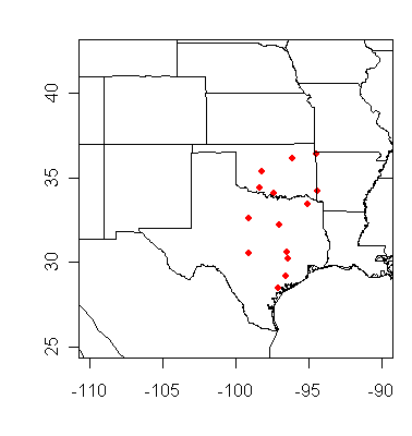
Stahle TX-OK Network
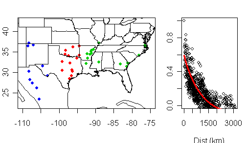
This is a network of 14 sites in Texas and Oklahoma with all sites available form AD1700 on. Because the sites don’t go back to AD1400, we’ve not discussed this network much. The locations are shown below.
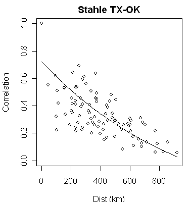
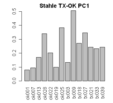
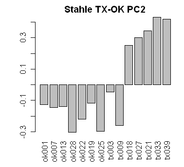
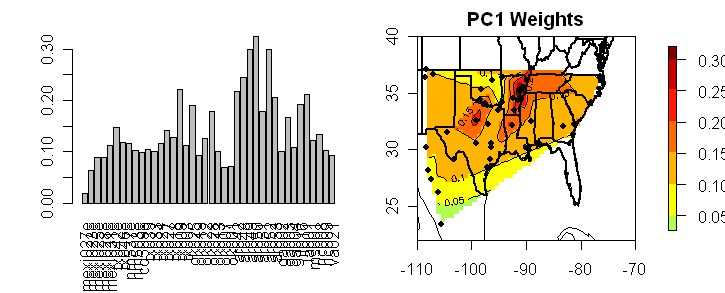
As with the Stahle SWM network, there is a strong pattern of spatial autocorrelation (see Top left). I’ve arranged the sites more or less from NE to SW and made barplots of the eigenvalues below, which show the distinctive Toeplitz pattern: the PC1 is sort of a weighted average with all coefficients positive; the PC2 is a gradient with one sign change; the PC3 has two sign changes. All of which indicates that the network can be approximated by a Toeplitz network – which is more restrictive than mere spatial autocorrelation.
 |
 |
 |
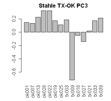 |
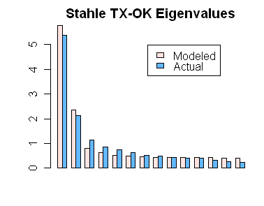
Again the pattern of eigenvalues can be replicated rather nicely with a simple Toeplitz model as shown below, with the observed eigenvalues being slightly more diffuse than the Toeplitz model. (Mann said that 3 were “significant”).
Combining the Stahle SWM and TX-OK Networks
No reason was given in MBH for not combining the SWM and TX-OK networks. But regardless, one would like to see how stable the eigenvector properties are under simple mathematical operations like combining networks. Intuitively, if the eigenvectors of each network separately represented an important and distinct property, one would presume that the pattern would be recovered from the combined network. Let’s see.
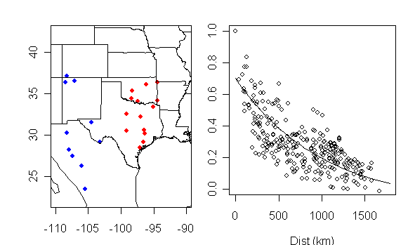
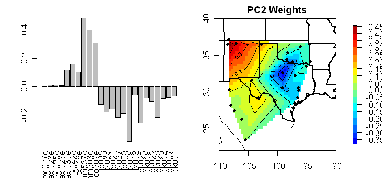
First here is a fresh location map on the left showing the SWM network in blue and the TXOK network in red, yielding a “squarer” overall span. On the right is a plot of intersite correlation versus intersite distance, again showing strong spatial autocorrelation (r-squared of about 0.7).
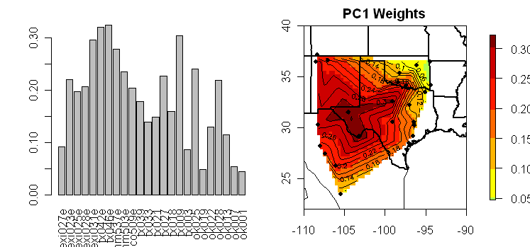
Next here is graphic showing on the left the barplot of eigenvector coefficients for the PC1 and the contour map. All of the sites are positively correlated and thus the PC1 is a weighted average. There is a concentration of weight at a few interior sites which is predictable in a spatial autocorrelation model on the basis that they are more correlated with sites on the perimeter than the sites on perimeter are to each other, due to shorter distances. Thus, any “accidental” properties of the interior sites in this network will get accentuated at the price of whatever signal may exist.
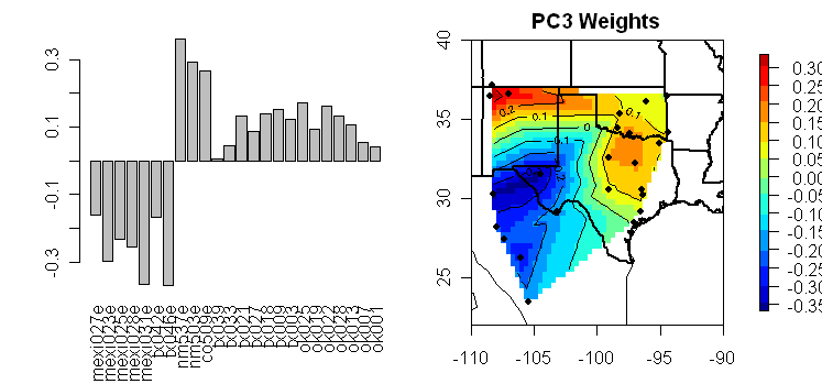
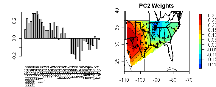
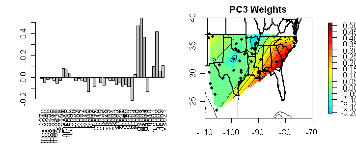
Next here are corresponding plots for the PC2 and PC3. In these cases, the eigenvector structure no longer has the simple patterns of the Toeplitz matrix though there are elements of gradient seeking. The PC2 has sort of a gradient from west to east, with low values in the south; while the PC3 runs from the SW to the NE with sort of a “valley”. It is my impression that these shapes are strongly controlled by the geometry of site locations combined with spatial autocorrelation; and that it is highly dubious that these eigenvector patterns have the faintest climatic significance. (Even if there was some second order information, it would be over-ridden by the geometrically controlled patterns anyway.)
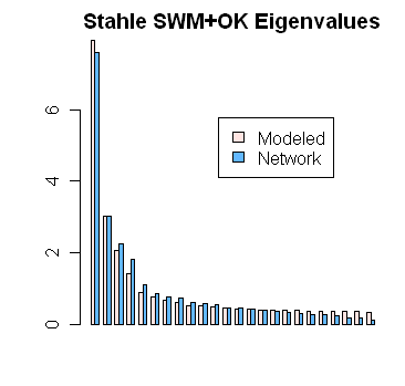
Again the simple autocorrelation model predicts observed eigenvalues very well as shown below:
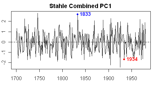
In case you were wondering what the PC1 of this network looked like, here it is, with warm 1934 highlighted. This area actually has a relatively distinct (negative) correlation of ring widths to temperature. Tamino may be able to discern a HS pattern here, but I’m unable to do so.
Expansion to Stahle NOAMER Sites
Next I experimented with an expansion to include the 16 Stahle sites in the NOAMER network (located in Arkansas and SE United States.) The hiving off the TXOK and SWM networks creates an odd discontinuity in the NOAMER network which is otherwise heavily oriented to SW United States sites. The strong pattern of spatial autocorrelation is preserved in the larger network.
Again because the sites are positively correlated, the PC1 is again a sort of weighted average with interior sites once again being much more heavily weighted. In this case, because of the changed geometry, a different set of interior sites are so weighted.
Next as before, here are the corresponding plots for the PC2 and PC3. The PC2 sort of looks for a West to East gradient in the present geometry, while the PC3 seems to pick out a few sites for highlighting.
Comments
When one is developing statistical methodologies, it’s really a bad idea to develop them on data sets where you’re also trying to obtain an important applied result. If Mann et al believed that principal components were a useful method of analyzing tree ring networks, then prior to incorporating output from such calculations into a complicated multiproxy study, the validity of the methodology itself should be demonstrated on relatively uncontroversial data sets. In the above figures, neither Mannian principal components nor bristlecones rear their ugly heads. And yet we can see many issues and questions arising from the simplest sort of technical analysis of principal components applied to uncomplicated tree ring networks.
In these networks, it seems certain that even a centered PC1 is a far from ideal estimator of whatever field is governing this particular network (and establishing a connection between that field and climate fields is a separate topic unto itself.) The PC1 is over-influenced by interior points merely from the geometry. It seems impossible to visualize any plausible meaning to the patterns of lower order eigenvector weighting other than the combination of accidental geometric availability and selection together with spatial autocorrelation.
Having said all that, I can see one useful outcome in terms of statistical testing, which may enable all but the most hard-core Mannians to appreciate the problems inherent in the Graybill chronologies. If tree ring chronologies are governed by spatial autocorrelation, it is highly unlikely, to say the least, that Graybill should uniquely have been able to detect shifts in 20th century mean from historic levels. The failure of Ababneh to replicate Graybill’s Sheep Mountain chronology is a very serious problem. It’s far more likely that Mann (and Tamino) are in possession of a flawed instrument rather than a magic flute.


41 Comments
I realize this may be slightly off topic, but wouldn’t the arctic extrapolation of surface temps also have the same problem as this:
That is, the anomalies of temps would also be shaped (or controlled) by the sites selected?
Snip if necessary.
#1. No. What I had in mind was that if the region was sort of linear (Chile), the eigenvector weights would have a Toeplitz structure; if the region had a sort of square shape or the sites were gridded, the eigenvector weights would be pushed by the simple geometry of the square towards a different pattern, with the difference in pattern having everything to do with the geometry of the grid and nothing to do with climate.
tammy plays the piccolo.
kinda a short shrill flute.
Steve — Very interesting! I’m learning a lot (slowly). Like Le Bourgeois Gentilhomme, I’ve been using Toeplitz matrices all my career without knowing it!
One question — in your plots of correlation versus distance, the curve hits the vertical axis below 0.8, yet there is always a point at (0, 1). Is this a real data point, or just an idealized limit?
In the case of treerings, isotope ratios, etc, two sites side by side should be highly correlated measures of whatever it is they measure, yet because of independent factors not perfectly correlated. So I would expect the curve to decay exponentially, but from a point short of unity. This would still be Toeplitz since the off-diagonals would all be constants, but not a pure AR(1) Toeplitz.
The strong spatial correlation seems to indicate that a true regional climate signal is being captured by the trees. I believe Stahle’s work in these areas has focused mostly on reconstructing precipitation, though, not temperature. It would be interesting to see if the low-frequency variability (say 50-yr means)in these sites displays the same pattern of spatial correlation.
#4. The unit values are the 0-distance correlations of a series with itself. In the spatial correlation literature (which is influenced by ore reserve calculations in mining – hence “kriging”), the loss of correlation at 0+epsilon distance is sometimes called a “nugget effect”. Sort of like the depreciation when you take a new car off the lot.
Hence the need for the Mann-o-matic.
This discussion is giving me some insights into what PCs mean and don’t mean, but I still am still groping toward the light.
Suppose we have a 10×1 vector of observations on temperature or whatever, with unit variances and a nice AR(1) correlation struture with rho = .8, so that the covariance matrix G is Toeplitz with g_i,j = corr(x_i, x_j) = .8^d, where distance d = abs(i-j). Then the eigenvalues and eigenvectors are
eigenvalues
5.502 2.071 0.890 0.478 0.302 0.215 0.167 0.114 0.139 0.122
eigenvectors (as columns)
0.550 0.641 -0.351 -0.741 -0.576 0.349 0.148 0.040 -0.152 -0.101
0.643 0.662 -0.261 -0.228 0.137 -0.294 -0.214 -0.110 0.303 0.245
0.715 0.572 -0.053 0.487 0.653 -0.336 -0.009 0.168 -0.209 -0.297
0.764 0.386 0.180 0.769 0.230 0.308 0.220 -0.210 -0.053 0.239
0.789 0.136 0.331 0.365 -0.524 0.322 -0.133 0.233 0.272 -0.091
0.789 -0.136 0.331 -0.365 -0.524 -0.322 -0.133 -0.233 -0.272 -0.091
0.764 -0.386 0.180 -0.769 0.230 -0.308 0.220 0.210 0.053 0.239
0.715 -0.572 -0.053 -0.487 0.653 0.336 -0.009 -0.168 0.209 -0.297
0.643 -0.662 -0.261 0.228 0.137 0.294 -0.214 0.110 -0.303 0.245
0.550 -0.641 -0.351 0.741 -0.576 -0.349 0.148 -0.040 0.152 -0.101
Unfortunately, WordPress doesn’t preserve the formatting very well, but the first two columns are most important, since only the first two eigenvalues are noteworthy by the >1 rule. The first eigenvector is almost flat, indicating that the first PC is roughly the average across all x values. The second is basically a tipped straight line (slightly curved), and so the second PC catches the incline of the realization. The others aren’t as important, but the third is basically a quadratic shape (“horseshoe”), the fourth is essentially cubic, etc, so these are basically capturing a Legendre polynomial approximation to the realization, and give a purely descriptive summary of its salient features in terms of deviation from flatness.
However, if we posit that x_i = mu + e_i, where the e’s have this covariance structure and mu is global average temperature that we want to estimate from this data, the GLS estimate is w’x, where
w = iota’ inv(G) / iota’ inv(G) iota,
and iota is a column vector of 1’s. The resulting weights are:
0.278 0.056 0.056 0.056 0.056 0.056 0.056 0.056 0.056 0.278
The interior points get small weights because they are all telling us more or less the same thing about the interior temperature or whatever. The first and last points get much bigger weights, because they are only correlated on one side. These weights don’t look anything like any of the eigenvectors, not even the first.
In a 2-dimensional network, the eigenvectors are richer, but still the perimeter gets the highest GLS weights. Suppose now we have a 10×10 network laid out on a square grid, with the same covariance as before, except now distance is measured by the Pythagorian theorem on diagonals. We now have 100 points, and a 100×100 covariance matrix that is not Toeplitz per se, but some sort of spatial generalization of Toeplitz. The first 12 eigenvalues exceed 1, and here are the first few eigenvectors, rearranged as 10×10 grids:
1.000 37.110
0.475 0.535 0.584 0.617 0.635 0.635 0.617 0.584 0.535 0.475
0.535 0.607 0.664 0.704 0.724 0.724 0.704 0.664 0.607 0.535
0.584 0.664 0.728 0.773 0.796 0.796 0.773 0.728 0.664 0.584
0.617 0.704 0.773 0.821 0.846 0.846 0.821 0.773 0.704 0.617
0.635 0.724 0.796 0.846 0.871 0.871 0.846 0.796 0.724 0.635
0.635 0.724 0.796 0.846 0.871 0.871 0.846 0.796 0.724 0.635
0.617 0.704 0.773 0.821 0.846 0.846 0.821 0.773 0.704 0.617
0.584 0.664 0.728 0.773 0.796 0.796 0.773 0.728 0.664 0.584
0.535 0.607 0.664 0.704 0.724 0.724 0.704 0.664 0.607 0.535
0.475 0.535 0.584 0.617 0.635 0.635 0.617 0.584 0.535 0.475
2.000 11.153
0.562 0.606 0.605 0.560 0.478 0.374 0.261 0.154 0.065 0.000
0.606 0.654 0.646 0.586 0.483 0.356 0.221 0.098 0.000 -0.065
0.605 0.646 0.627 0.549 0.428 0.281 0.132 0.000 -0.098 -0.154
0.560 0.586 0.549 0.454 0.316 0.157 0.000 -0.132 -0.221 -0.261
0.478 0.483 0.428 0.316 0.166 0.000 -0.157 -0.281 -0.356 -0.374
0.374 0.356 0.281 0.157 0.000 -0.166 -0.316 -0.428 -0.483 -0.478
0.261 0.221 0.132 0.000 -0.157 -0.316 -0.454 -0.549 -0.586 -0.560
0.154 0.098 0.000 -0.132 -0.281 -0.428 -0.549 -0.627 -0.646 -0.605
0.065 0.000 -0.098 -0.221 -0.356 -0.483 -0.586 -0.646 -0.654 -0.606
0.000 -0.065 -0.154 -0.261 -0.374 -0.478 -0.560 -0.605 -0.606 -0.562
3.000 11.153
0.719 0.747 0.707 0.602 0.448 0.269 0.089 -0.068 -0.183 -0.247
0.805 0.837 0.785 0.653 0.463 0.243 0.026 -0.158 -0.287 -0.350
0.842 0.871 0.803 0.646 0.424 0.172 -0.073 -0.275 -0.409 -0.464
0.831 0.847 0.761 0.582 0.336 0.062 -0.200 -0.410 -0.541 -0.580
0.777 0.775 0.671 0.474 0.213 -0.073 -0.340 -0.548 -0.668 -0.689
0.689 0.668 0.548 0.340 0.073 -0.213 -0.474 -0.671 -0.775 -0.777
0.580 0.541 0.410 0.200 -0.062 -0.336 -0.582 -0.761 -0.847 -0.831
0.464 0.409 0.275 0.073 -0.172 -0.424 -0.646 -0.803 -0.871 -0.842
0.350 0.287 0.158 -0.026 -0.243 -0.463 -0.653 -0.785 -0.837 -0.805
0.247 0.183 0.068 -0.089 -0.269 -0.448 -0.602 -0.707 -0.747 -0.719
4.000 4.872
0.472 0.490 0.428 0.291 0.103 -0.103 -0.291 -0.428 -0.490 -0.472
0.490 0.518 0.456 0.312 0.111 -0.111 -0.312 -0.456 -0.518 -0.490
0.428 0.456 0.403 0.276 0.098 -0.098 -0.276 -0.403 -0.456 -0.428
0.291 0.312 0.276 0.190 0.067 -0.067 -0.190 -0.276 -0.312 -0.291
0.103 0.111 0.098 0.067 0.024 -0.024 -0.067 -0.098 -0.111 -0.103
-0.103 -0.111 -0.098 -0.067 -0.024 0.024 0.067 0.098 0.111 0.103
-0.291 -0.312 -0.276 -0.190 -0.067 0.067 0.190 0.276 0.312 0.291
-0.428 -0.456 -0.403 -0.276 -0.098 0.098 0.276 0.403 0.456 0.428
-0.490 -0.518 -0.456 -0.312 -0.111 0.111 0.312 0.456 0.518 0.490
-0.472 -0.490 -0.428 -0.291 -0.103 0.103 0.291 0.428 0.490 0.472
5.000 3.666
-0.300 -0.289 -0.238 -0.177 -0.136 -0.136 -0.177 -0.238 -0.289 -0.300
-0.289 -0.252 -0.166 -0.070 -0.008 -0.008 -0.070 -0.166 -0.252 -0.289
-0.238 -0.166 -0.039 0.093 0.175 0.175 0.093 -0.039 -0.166 -0.238
-0.177 -0.070 0.093 0.254 0.354 0.354 0.254 0.093 -0.070 -0.177
-0.136 -0.008 0.175 0.354 0.463 0.463 0.354 0.175 -0.008 -0.136
-0.136 -0.008 0.175 0.354 0.463 0.463 0.354 0.175 -0.008 -0.136
-0.177 -0.070 0.093 0.254 0.354 0.354 0.254 0.093 -0.070 -0.177
-0.238 -0.166 -0.039 0.093 0.175 0.175 0.093 -0.039 -0.166 -0.238
-0.289 -0.252 -0.166 -0.070 -0.008 -0.008 -0.070 -0.166 -0.252 -0.289
-0.300 -0.289 -0.238 -0.177 -0.136 -0.136 -0.177 -0.238 -0.289 -0.300
6.000 3.427
0.000 -0.035 -0.080 -0.122 -0.147 -0.147 -0.122 -0.080 -0.035 0.000
0.035 0.000 -0.051 -0.101 -0.132 -0.132 -0.101 -0.051 0.000 0.035
0.080 0.051 0.000 -0.053 -0.087 -0.087 -0.053 0.000 0.051 0.080
0.122 0.101 0.053 0.000 -0.035 -0.035 0.000 0.053 0.101 0.122
0.147 0.132 0.087 0.035 0.000 0.000 0.035 0.087 0.132 0.147
0.147 0.132 0.087 0.035 0.000 0.000 0.035 0.087 0.132 0.147
0.122 0.101 0.053 0.000 -0.035 -0.035 0.000 0.053 0.101 0.122
0.080 0.051 0.000 -0.053 -0.087 -0.087 -0.053 0.000 0.051 0.080
0.035 0.000 -0.051 -0.101 -0.132 -0.132 -0.101 -0.051 0.000 0.035
0.000 -0.035 -0.080 -0.122 -0.147 -0.147 -0.122 -0.080 -0.035 0.000
The first eigenvector (with eigenvalue 37.110) is again pretty flat, with a gentle peak in the center, and falling off toward the edges. The second and third (with equal eigenvalues 11.153 because of the symmetry of the grid) are capturing the tilting in two dimensions. However, the fourth now has a saddle shape. The fifth raises the center relative to the edges. The higher order ones have increasingly complex standing wave forms.
But if we just want to use these readings to measure global temperature, the GLS weights are
0.102 0.023 0.029 0.028 0.028 0.028 0.028 0.029 0.023 0.102
0.023 -0.023 -0.010 -0.009 -0.009 -0.009 -0.009 -0.010 -0.023 0.023
0.029 -0.010 0.000 0.001 0.001 0.001 0.001 0.000 -0.010 0.029
0.028 -0.009 0.001 0.001 0.002 0.002 0.001 0.001 -0.009 0.028
0.028 -0.009 0.001 0.002 0.002 0.002 0.002 0.001 -0.009 0.028
0.028 -0.009 0.001 0.002 0.002 0.002 0.002 0.001 -0.009 0.028
0.028 -0.009 0.001 0.001 0.002 0.002 0.001 0.001 -0.009 0.028
0.029 -0.010 0.000 0.001 0.001 0.001 0.001 0.000 -0.010 0.029
0.023 -0.023 -0.010 -0.009 -0.009 -0.009 -0.009 -0.010 -0.023 0.023
0.102 0.023 0.029 0.028 0.028 0.028 0.028 0.029 0.023 0.102
Here, the corners and then the edges get the highest weights, while again the interior gets only very small weights. Again, these don’t look at all like the PC loadings.
So is even the first PC not providing a good summary of the data set in terms of global climate?
I for one would be quite happy if someone could provide a physical definition for “climate field” which is reasonably independent of the convoluted mathematics of Climate Field Reconstruction.
Here is the Palmer Index for the whole of the 20th Century:
taken from “A Review of 20th Century Drought Indices” by Richard Heim
Eyeballing with the PC1 above, I can see that the lowest growth coincides with the highest levels of drought. The peaks in the mid 1920s, the height of the dustbowl in 1934, the droughts of the mid 1950s are all represented in the PC1.
Obviously the Palmer Index presented represents the whole of the US, not simply the southern part where the Stahle network is based (perhaps a calculation of the Palmer Index just of those states would do a better job). But I would venture that a significant part of the “signal” of the PC1 is related to moisture.
Or maybe I’m seeing things…
Looks like Stahle is mostly in Texas and Oklahoma. The precipitation and temperature time series are here:
Texas precipitation
Oklahoma precipitation
Texas temperature
Oklahoma temperature
Source , which also offers seasonal series
Re John A #10 and David Smith #11
Taken with the previous related article on Tex-Mex, surely the conclusion is that the PC numbers as presented cannot relate to a past physical variable, such as rainfall or temperature, because they change relative patterns and relative intensities (as shown on the contour maps) as more or fewer data points are used. You would have to logically accept that temp or rain patterns also change relative patterns in the past according to the selection of data points and that is illogical. The exceptions are that the data are flawed, inadequate or wrongly interpreted.
Steve (snip if suck eggs stuff) we spent a long time on edge effects when defining orebody mining blocks. Drill holes so often inconveniently stopped short; and the surface often had true geological enrichment of grades from weathering, confusing the patterns from hard rock below. But at least climate figures do not have the wild swings from nugget effects, like several orders of magnitude for gold. I wonder about edge effects in the frequent location of ‘high quality’ weather stations in lighthouses.
Re #12: Geoff, I take the point. Having re-read Steve’s post its apparent that adding data (or subtracting for “a few good men”) changes the past in such a way as to leave one questioning whether there’s any climate signal there.
As far as I can see, there is no signal. Naive people (like me) can see patterns where there is none.
Re 13:
John A, I don’t think that you are necessarily barking up the wrong tree.
The PC1 graph that Steve M put in his fascinating post was the “actual” tree ring reconstruction.
As you know, many people have argued that to the extent that these proxies can exhibit anything it would most likely be moisture rather than temperature, I find the negative correlation to temperature in the middle of a drought quite interesting, but as you said a more local precipitation record would be more enlightening.
Some posters at Tamino’s blog indeed seem to want to reincarnate some of these erstwhile “temperature proxies” as precipitation proxies because they can be useful for thousand year ENSO3 reconstuctions (Mann, Cobb,JEG)?
To them I would reiterate the point made by Australian scientists previously engaged in ENSO reconstructions.
Just like the 1930’s in the U.S., it can get very hot but the trees can’t tell you because they are dying of thirst.
Cheers
Steve, do you plan to get this published? I have noticed a lack of participation in the comments section from the RC-appologists, which usually means you have something here….
Just how on earth could temperature be a critical variable in this region of the country. I thought the theory is that trees react to temperature only at the altitudinal/latitudinal limits of their range. The highest spots in the areas studied here are the freeway overpasses. Of course, they are precipitation proxies, if anything.
I could just mean they haven’t got their marching orders yet.
Or would that be barking orders?
re 16
I’m putting this up more as a question for laymen like me who are reading this exchange to see if we understand the issues.
As I read it, Mann has asserted that he can use PCA to detect multiple climate fields teleconnect various regions. So a set of proxies could have a PC at some level that represents ENSO or some other climatic phenomena that affects temperature in some part of the world. Thus the trees in the southwestern US could be temperature proxies for multiple regions in the world. This is not necessarily local temperature but could be precipitation, cloudiness or some combination of factors. Mann’s analysis is purely mathematical and does not determine or care about the physical causes of each PC.
The analysis of this posting shows that PCs are not representative of different climate fields (if such things exist) but of the geographic distribution of the proxies. Mann’s conjecture of being able to detect climate fields with PCA is thus incorrect.
To the people who understand the issues, does the above contain a germ of truth?
Re 1 & 2:
I understand that as the area changes, the weight changes (short/blocky vs. long/thin).
But what if it’s a gridded area in a circle, with middle missing (arctic ring)? Would it throw the weight to the inside of the ring, or to the outside?
This could be checked using the info you already have, just pick a center, choose only those sites that are X miles away from center and check.
Snip if this doesn’t make sense, I’ll understand.
#19. It’s a good question. I don’t know the answer. On the basis that the forms are likely to be elementary forms, my guess is that the “eigenfunctions”/eigenvectors will be sine/cosine functions around the annulus longitudinally multiplied in some way by similar functions over a line segment latitudinally. Perhaps related to spherical harmonic functions or Legendre functions or something like that – I know their names but am not in a position to comment on their properties.
I don’t know if CA’s challenge to the validity of the tree ring data has finally got to the climate modelling community but there is a remarkable admission by Peter Cox of the UK’s university of Exeter quoted in “New Scientist”, 22 March, that the Little Ice Age of 400 years ago: “…began with reduced solar radiation reaching the earth due to natural variations in sunspots.” (Original article:Geophysical Research Letters, vol 33, L10702). Re-examining the historic data, Cox implies that that the climate models have got it wrong.
Though Cox then argues that these errors will make no difference to future warming and that as climate-CO2 sensitivity is actually greater than thought, future warming will be even be more pronounced than previous predictions suggest, it is still, a remarkable volte-face.
Gavin Schmidt is later quoted as saying: “We are headed into unknown territory and and the only things we have to guide us are physics and our knowledge of the past.”
I wonder if that past will still include the Mann Hockey Stick interpretation of History. I’m beginning to feel it won’t.
Well done Steve, keep up the excellent work!
Steve M could you post (or let me know where to find) the numerical annual values for the Stahle Combined PC1 for 1900-1970? I’d like to compare those to some of the regional values, like May thru August precipitation. Thanks
Re#20 Steve, it looks like we are now in the world of partial differential equations since these now look like canonical harmonic functions based upon Laplace’s equation.
21 (Martin J):
I don’t know, but the GRL article’s ONLY reference to solar variability is this thin weasel statement:
Re 20, 23:
Then it MIGHT appear (just guessing, mind you) as a “spoke” arrangement. All depends on diameter and thickness of ring.
Re# 24 Thanks Lief; the original article is more circumspect. It will be interesting to know how Schmidt and Cox react to how they have been quoted.
Texas precipitation for May thru August is below:
A closeup of Steve M’s Stahle PC1 is here:
What I think I see are some broad similarities between Stahle and early-summer precipitaion, with the exception of the mid-to-late 30s and several other smaller periods.
Yes indeedy.
I rescaled manually to get the x axis to correspond to the period shown in the first, then arbitrarily scaled the y axis to match the precipitation range.
Thanks, jeex!
Oops, that’s “jeez”. Sorry. I’ll see if I can generate an east Texas east Oklahoma time series, which would be more appropriate for Stahle.
David Smith #27. It may be more appropriate to use March to September precipitation data. Due to the lattitude of the area, it is quite likely that the trees start responding to sunlight during this time. But the ideal would appear to be a weighted precipitation wrt early spring average temperatures above 40F for most species.
So its no more than a paleo rain guage? Is there any other organism that could be used as proxies? Insect patterns? moss? trees are the typically the longest standing , but even to get a reconstruction over the last 60,50,40? to calibrate to?
PCs for combined TX-OK and SWM earlywood (24 site) network at http://www.climateaudit.org/data/misc/stahle.combined.pc.dat in ASCII format.
Stan Palmer, #18:
The analysis of this posting shows that PCs are not representative of different climate fields (if such things exist) but of the geographic distribution of the proxies. Mann’s conjecture of being able to detect climate fields with PCA is thus incorrect.
As a “layman” myself, and thus not one who understands the issues in the way you asked for, that’s about what I get out of Steve’s amazing analysis. Except that Mann’s conjecture still could be correct – but would have to be astronomically lucky to be so, even as a mere correlation – especially since Mann appears to have not offered any proof whatsoever that his conjecture is correct, but has apparently relied only upon begging the question, which is about all I’ve seen the ipcc AGW “science” do so far, anyway.
The Stahle Combined PC1 versus Global Temperature is here
r-squared for this = -0.09
Re #35 Oops, that’s US annual temperature, not global. Global in a moment.
The Stahle combined PC1 versus global temperature (NCDC) is here . Sorry about the earlier error, which I caught one nanosecond after pressing “submit”.
The r-squared for Stahle vs global temperature is 0.007
Here are a couple of time series:
This one looks at Stahle and Texas temperature during May thru August. The mild negative correlation of growth with temperature is evident.
The second is Texas temperature and rainfall in May thru August, which may help explain the first time series. My conjecture is that wet years (lots of rain) are also (relatively) cool years (more clouds, rain-cooled landscape) in this region of North America and that tree growth is moisture-limited, not temperature-limited.
Re #38 I forgot to mention that the r-squared values are for the unsmoothed data.
David,
Re: #38
Why do the temperature time-histories in your two graphs appear to be so different?
Re #40 Thanks, H, for pointing out a problem. I erred on plot #2 – the line labels should be switched (“temperature” is actually rainfall, and vice-versa). The r-squared value, and conjecture, are unaffected by this.
Also, note that one plot goes to 1980 (the end-point of Stahle data) while the other goes to 2007 (end of available temp and rain data).