Here at Climate Audit, we occasionally try to solve mysteries that have vexed climate scientists for years. On a previous occasion, we helped UCAR locate the mysterious civilization of Chile, on another occasion the lost city of Wellington NZ and, most recently, helped NASA find the lost city of Cobija, Bolivia. Today we’ll help the climate science community identify the provenance of a graphic shown below, that was produced in 1990 by a mysterious organization known to insiders as IPCC.

IPCC 1990 Figure 7c.
At his blog last year, William Connolley, obviously impressed with then recent CA success in locating Chile and Wellington NZ, appealed for help in solving this outstanding puzzle, specifically challenging me to identify its provenance for the climate science community, even accusing me of being “curiously uninterested in the source [of this graphic], or lack thereof” and worried that I was “ignoring” the provenance of this graphic, leaving the wider community to fend for itself.
One of his readers, obviously of the view that it was not necessarily my responsibility to sort out this particular IPCC conundrum, asked Connolley why he didn’t just determine who the IPCC author was and ask him:
Where does the 1990 graph come from then? I presume the IPCC author didn’t just hand draw it? Who is the IPCC lead author responsible, and if he is still alive, couldn’t one just ask?
This seems like a logical method, but Connolley was uninterested:
AFAIK it was hand drawn – it looks like it was. Its certainly not a computer plot. Things were free-and-easy back in ’90 I suppose (thought as far as I know this is the only graph from the ’90 report that does not have a good source) -W
At wikipedia, Connolley expounded further on the lack of a clear source for this graphic:
A schematic (non-quantitative) curve was used to represent temperature variations over the last 1000 years in chapter 7. The vertical temperature scale was labelled as “Temperature change (°C)” but no numerical labels were given; it could be taken to imply that temperature variations of the MWP and LIA were each of the order of 0.5 °C from the temperature around 1900. The section specifically states recent climate changes were in a range of probably less than 2 °C. The 1990 report noted that it was not clear whether all the fluctuations indicated were truly global (p 202). The graph had no clear source (it resembles figure A9(d) from the 1975 NAS report, which is sourced to Lamb, 1966), and disappeared from the 1992 supplementary report.
To say that I was “uninterested” in its source was untrue. This is the sort of thing that usually interests me, but I can’t solve every climate science puzzle instantaneously and on demand. On an earlier occasion, I posted up an extended excerpt from IPCC 1990, which is not available to many readers. However, I didn’t then know the source of the IPCC 1990 graphic, just as I don’t know how Mann calculated the MBH99 confidence intervals or many other small climate science mysteries.
Today I’m pleased to report that I think that I can report a solution to this small mystery, which I propose below.
I recently re-read Lamb 1965. Its Table II provided a table of Central England temperature estimates in 50-year intervals. As an exercise, I manually transcribed the numbers from the table and plotted them as shown in the figure below. It obviously has some similarities to IPCC 1990 Figure 7c, though it is obviously not the same. I’ll discuss this below.
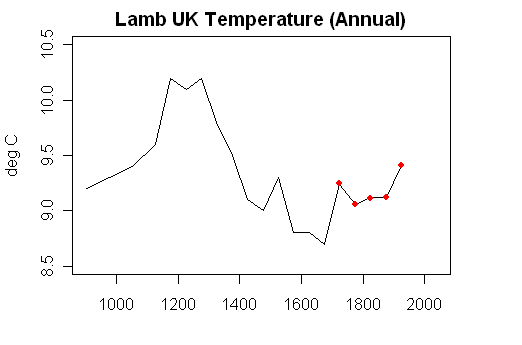
Figure 1. CET annual in 50-year intervals. Red- Hadley Center; black – Lamb 1965.
In the above figure, the red dots are 50-year annual averages from current Hadley Center data in 50 year intervals from 1700-1950, each shown in the midpoints (1725, 1775,…,1925). As one can see, for the period of overlap, Lamb 1965 values pretty much exactly match the Hadley Center 50-year CET averages. This is not totally surprising as Lamb said that he used Manley’s data, but it’s useful to confirm that the historical versions have remained essentially unchanged for these periods since 1965 (something that would obviously not be the case for Hansen’s data.)
Next here is a plot of the Lamb CET together with Hans Erren’s digitization of IPCC 1990 Figure 7c (this digitization interprets the hash marks on the IPCC 1990 diagram as degree C intervals, as is clearly indicated in the caption and commentary, though even this is contested by Connolley). On the left, I’ve denominated the series in anomaly deg C (as IPCC), while on the right I’ve denominated the series in deg C (as Lamb 1965). The zero appears to be the mean of the entire series; the dashed reference line appears to be the value circa 1900.
It is clear that the two series are closely related in the period after 1400 (up to smoothing), but, for some reason, are dissimilar in the MWP portion. From Hans Erren’s digitization, the IPCC figure definitely continues one more 50-year period with a value in 1975, even though the corresponding Lamb 1965 figure ends with the 50-year interval 1900-1950. I experimented a little with choice of end-point (considering the fact that the graphic was prepared for printing in 1990). In the figure below, the end-point
(open black dot) shows the the average CET value for the 35-year period 1950-84 – this matches very closely and I think that it’s safe to conclude that the end-point of IPCC 1990 Figure 7c was determined through some method very close to this. But the MWP period is still a mismatch.

Figure 2. Black – Lamb 1965 CET (with update); red – digitized IPCC 1990 Figure 1c.
Now look at the top panel of Lamb 1965 Figure 3 top panel, shown below. The more jagged graphic matches the values in Table II, while the rounded curve matches IPCC 1990 Figure 7c almost exactly from 900 to 1400 (with the IPCC curve receiving some additional rounding in the 1400-1700 period.)
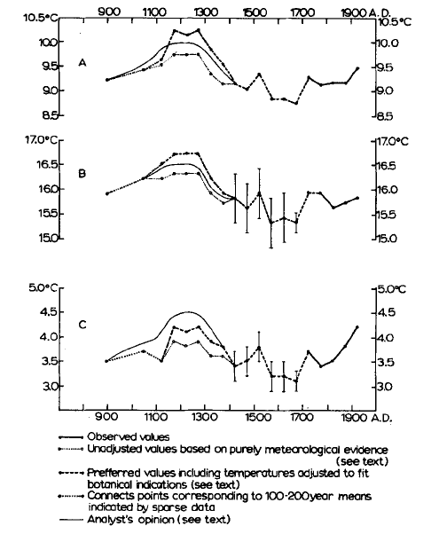
Lamb 1965 Original Caption: Fig.3. Temperatures (°C) prevailing in central England, 50-year averages. A: year; B: high summer (July and August), and C: winter (December, January and February). Observed values (as standardized by MANLEV, 1958, 1961) from 1680. Values for earlier periods derived as described in the text. The ranges indicated by vertical bars are three times the standard error of the estimates.
So I think that we have a solution to the provenance of IPCC 1990 Figure 7c. It is derived from the rounded CET from Lamb 1965 Figure 3 top panel, with portion after 1400 smoothed somewhat. It has been converted to anomaly deg C (using the average of the entire period) and extended to include the average CET for the period 1950-1984.
In Figure 7, IPCC 1990 used the CET estimates as a “schematic” for the global temperature, even though, as shown above, it was an estimate for the CET, which is taken from only one location. While one can reasonably criticize the use of CET as a “schematic” for global temperature, I’m not at all convinced that IPCC TAR reliance on Graybill’s bristlecone ring width chronologies (via Mann’s Hockey Stick) as a uniquely sensitive antenna for world temperature (or the AR4 spaghetti graph) represents much, if any, improvement, as I’ve discussed on many occasions elsewhere.
There are interesting issues pertaining to what Lamb and IPCC 1990 thought about the global-ness of the MWP. Lamb 1965 discusses climate change as associated with “global” wind circulation and clearly regarded the MWP as being a small-amplitude warm period of global extent (in my opinion, IPCC AR4 has misrepresented Lamb’s views, a point that I made as a reviewer, a point that was, needless to say, ignored). Lamb regarded the LIA as being a moderate-amplitude cold event, also related to global wind patterns. There’s little doubt in my mind that Lamb regarded these events as of global extent. That doesn’t make them so. But it’s interesting that Lamb at least tries to interpret the evidence in terms of global circulation.
IPCC 1990 (see longer excerpt here) stated:
The late tenth to early thirteenth centuries (about AD950-1250) appear to have been exceptionally warm in western Europe, Iceland and Greenland (Alexandre 1987; Lamb, 1988). This period is known as the Medieval Climatic Optimum. China was, however, cold at this time (mainly in winter) but south Japan was warm (Yoshino 1978). This period of widespread warmth is notable in that there is no evidence that it was accompanied by an increase of greenhouse gases.
There are interesting exegetical issues pertaining to this, as Zhang (1993) – see abstract here – argued soon thereafter that Zhu (Chu) 1973, a prominent source in 1990, had an incorrect understanding of the medieval Chinese lunar calendar, which had caused incorrect dating of phenological events (crops, blossoms) in the MWP and, in fact, that important crops had reached further north in the MWP in China than at present. Crowley and Lowery 2000 absurdly reverted to the use of the obsolete Zhu 1973 version – matters that I may return to on another occasion.
For now, I think that we’ve solved another climate science puzzle – the provenance of IPCC 1990 Figure 7c. Maybe one day we’ll be able to determine the provenance of the MBH99 error bars, so prominently illustrated in IPCC TAR.
Now that we’ve established that IPCC 1990 Figure 7c is derived from the Lamb 1965 CET, what would happen if Lamb’s figure were brought up to date. Here’s my calculation below. In this case, I’ve shown the 1950-1999 CET average, which is about 0.12 deg C higher than the value shown in IPCC 1990 due to the warm 1990s. I’ve also shown what the 2000-2049 average would look like if the 2000-2007 average were continued for the rest of the half-century. This would be about 0.25 deg C higher than the corresponding MWP maximum in Lamb Table II (though the last half 20th century was still below the Lamb maximum). Note that IPCC AR4 stated that it is “likely that this 50-year period was the warmest Northern Hemisphere period in the last 1.3 kyr”.

Reference:
H. H. LAMB, 1965, THE EARLY MEDIEVAL WARM EPOCH AND ITS SEQUEL Palaeogeography, Palaeoclimatology, Palaeoecology
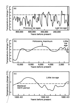
Updae: Here is triptych image from Crispin Tickell (British Antarctic Survey) 1977 mentioned in a post below (thanks for the ref) as compared to the corresponding full triptych in IPCC 1990.
 Original Caption: Figure 2: Temperature variations over the last million years. Courtesy of the British Antarctic Survey. |
 |


111 Comments
I am not an expert, so I might make a stupid question. You refer to the average 2000-2007 as a growing average, that supposedly will lead us to 1ºC (read in the graph) on 49 years.
1) What happened to the theory that 2000-2007 didn’t have any temp. growth? Was that only true when considering 1998 peak?
2) Is it reasonable to assume that, if the trend continues (that’s a big if of course), we will have 2ºC more in the end of 2100, clearly aligning with IPCC’s moderate answer?
3) How much “global” these graphs are? IPCC claims that they aren’t much global, but is there evidence of otherwise?
Thanks, and great blog. World Class research.
I didn’t realize that there was a mystery about this graph, I’m sure you’re right that it’s due to Lamb that’s certainly what I’d always believed.
There is a version of this sketch in, I think, Lamb H.H. 1985 Climatic history and the future. (First published in 1977) Exact reference not possible till the library reopens
#2. Connolley said that the graph “had no clear source” and reproached me for not tracking it down. So there was a mystery in at least one commentator’s mind and this is the current position at wikipedia, as noted above.
As I observed, the sketch from Lamb 1965 has been extended by IPCC to add another 50 years by including the CET average for 1950-1984 or so. So it’s related to, but not the same as the Lamb 1965 graphic.
Very similar to
http://www.gcrio.org/CONSEQUENCES/winter96/article1-fig1.html
with reference given as
Compiled by R. S. Bradley and J. A. Eddy based on J. T. Houghton et al., Climate Change: The IPCC Assessment, Cambridge UniversityPress, Cambridge, 1990 and published in EarthQuest, vol 5, no 1, 1991.
The wiki link to Connolly does not work for me. Please feel free to delete this after fixing.
And what about the icecores from Greenland? I thought one graphic was similar the one above?
Good job, Steve!
Note that while Loehle and McCulloch (EE 2008) have a warmish 13th century like Lamb’s, the real MWP in our numbers appears to have been distinctly earlier, in the 9th-10th c:
There is admittedly a lot of uncertainty in some of the published age estimates that went into our study, however, so perhaps the timing shouldn’t be taken too literally. Nevertheless, Greenland was settled already in the 10th c, and froze out already in the 14th.
Lamb’s diagrams show bars that he identifies as 3 standard errors. I wonder if this is 3 se’s each side of the point estimate, or if it’s 3 se’s top to bottom, i.e. 1.5 se’s each side of the point estimate. The one would be a 99.7% confidence interval, while the latter is only 87%. Either way, these are odd numbers.
Re #4
Evidently, it certainly looks like the sort of hand-drawn graphs we used to publish back then, if as Richard says it’s in Lamb’s book that will be where I’ve seen it before (that was my gut feeling but I don’t have Lamb to hand). The graph certainly could be an updated version from the second edition? Regarding Wiki I never take that as the last word on anything although it’s often very good.
Hu, I haven;t worked through Lamb’s calculations to see why he regarded the MWP max around 1200 rather than 1000. His discussions of Viking data support an earlier date. I’ve also looked back through some of Lamb’s sources, which give an interesting perspective on a pre-Hockey Stick world. Not that the earlier sources are “correct”, but their perspective differs. In particular, I found several articles by CEP Brooks, a generation earlier than Lamb, quite interesting. He wrote some articles about a very topical issue – an open or seasonally open Arctic Ocean, something that he believed to have occurred in the Holocene.
Phil #2 writes,
It is customary when lifting material from other people’s work to give them credit with a citation. The IPCC deserves at least a firm slap on the wrist for failing to do that in this case. Just listing Lamb back in the references is not adequate to give him credit for this specific graph. “After Lamb (1985 [?])” would have been adequate, given that IPCC added some smoothing and an additional point.
Neatly done and even more neatly explained. More evidence that you, Steve, should be recognized as being as much a climate scientist as Connolley – if that even deserves to be considered as a subject for dispute.
Isn’t Lamb’s non-GHG explanation of note? Has his thesis been disproved or simply ignored?
#5. I’m looking for Bradley and Eddy , Earth Quest vol 5.
Bradley’s webpage contains an article by Bradley and Eddy 1991 here but this doesn’t have the figure in question.
Earth Quest appears to be a UCAR newsletter. http://www.gcrio.org/DifHolding/GCRIO057.html
The discussed figure is actually 7.1C (instead of 7C).
The next figure 7.2 in IPCC 1990 is also very interesting. Worldwide retreat of glaciers started already in the middle of the 18th centry and accelerated about in 1850’s. This is definitly before any plausible effect of increased CO2. Independently of an anthropogenic factor there are pronounced natural factors that influence the temeprature.
Re #11
Hu, I agree 100%.
Re #1
Hi Luis, nice to see you at CA. Steve did not show a trend from 2000 to 2007, just an average for that period that was higher than the average of 1950 t0 2000 shown as 1975, or 1975 to present shown as about1993. If you review the past 2 years or so of CA you will see that all surface instrument global average temperatures for about the last 2 decades have probably been overstated due to several biases either in measuring or averaging, and the resulting “warming” increment might well be overstated by 30%. If adjusted by 30% the 2000 to 2007 average would be just in line with the 50 year smoothed MWP peak average. McKittrick estimates that the warming could well be overstated by 50%, with quite solid reasoning and inferences. After the flaming you gave me at TOD about 2 months ago for questioning AGW I’m glad to see you are now looking at the question more holistically. Murray
It’s interesting to note the error bars in Lamb 1965, though I haven’t examined how they were calculated, given that one of the distinctive innovations about MBH98 was its supposed introduction of error bars. New Scientist:
Scientific American:
Wikipedia has completely trashed their own credibility on climate.
I could have sworn the protocol police had declared that the use of sarcasm was a severe violation of the Geneva Conventions.
Yorick – 18
I’ll point out that Mr. Connelly has a hand in almost every climate related web page on Wikipedia. If you look at the discussion/talk tab you will see his presence in many such articles.
This is why Wikipedia fails at accurately referencing things that are controversial. It only takes one person with a strong particular viewpoint and time to force a view onto a page. For example Hillary Clinton and Barack Obama’s page change hourly. Many less controversial pages get changed with little notice. Wikipedia is easy to use and free, it’s also a train wreck of opinion for many pages.
To add balance for climate issues, every one of us who frequents Climate Audit should sign up at Wikipedia and help to broaden the view on many of these pages.
http://network.nationalpost.com/np/blogs/fpcomment/archive/2008/05/03/who-is-william-connolley-solomon.aspx
Re: “Things were free and easy in the 90’s…”
Not anymore. The next IPCC meeting will feature climate predictions made by “Blue Fire”, the latest model IBM supercomputer at NCAR.
It’s water-cooled, but I wondered if its use of “teraflops” make it a bit of a carbon footprint dinosaur. Those things don’t burn all that efficiently.
Re: The next IPCC meeting (above)
Should read: the next United Nations climate report, due out in about 5 years.
“2) Is it reasonable to assume that, if the trend continues (that’s a big if of course), we will have 2ºC more in the end of 2100, clearly aligning with IPCC’s moderate answer?”
The curious thing about the IPCC scenarios is that the way they are presented, people assume that it is a normal distribution with a value of 3ºC being most likely, but on the basis of the actual theory and observations the bottom boundary (1.1ºC) must surely be considered the most likely scenario since all the other projections are full of unproven positive feedbacks but without any consideration of counterbalancing negative feedbacks.
“The bottom boundary” is inflated thru exclusion of negative projections as “unrealistic”. The bottom boundary is the next ice age.
Anthony Watts (#20) writes,
While Wikipedia is great 90% of the time (eg for photos of the Great Auk or illustrations of map projections), it’s probably a lost cause for anything controversial. Imagine what chaos CA (or RC, etc) would be if every poster could edit the original post and all subsequent comments to his or her satisfaction! POVs are better presented by competing, privately controlled websites.
Like Anthony’s own Surfacestations.org, to take one excellent example!
Steve #13 writes,
Earth Quest is not in OSU’s libraries, nor in OHIOLINK, so you’d probably have to go to UCAR to find it — or else ask Bradley?
The 1991 graph in #5 adds a few wiggles to the IPCC90 graph, but otherwise is very similar. Are you just curious to see what Bradley was saying about it back then?
I tried. Connolly is an admin over there, and he’ll run rough-shod over anything that questions the climate change orthodoxy. Tellingly, RealClimate is considered a “reliable source” even though their own policy states that self-published sources cannot be “RS” as they call it. However, Energy & Environment is not considered an “RS” despite being a peer-reviewed journal. It’s really a joke, and probably the most productive thing to do is laugh when anyone cites Wikipedia in defense of anything climate-related.
If you look in the Encyclopedia Britanica Yearbook of Science and the Future, 1979, there is an article by Jack Eddy called “Climate and the Changing Sun”. One of the figures shows past solar variability compared with climate reconstructions. Curve T shows an estimate of mean annual temperature in England (probably from Lamb, but I don’t see an attribution; it may be CET). Curve T is smooth and looks almost identical to the IPCC figure that appears 11 years later.
Steve mc:
the line
Has the bad link “ttp://en.wikipedia.org/wiki/MWP_and_LIA_in_IPCC_reports” this should be http://en.wikipedia.org/wiki/MWP_and_LIA_in_IPCC_reports
[snip – please. a discussion of greenhouse effect principles has nothing to do with this]
There is nothing approximating the IPCC graph in Lamb, Volume 2. Climate: Present, Past and Future and I haven’t had a chance to look at the subsequent book Climate History and the Modern World. I had meetings with Lamb at East Anglia while working on my doctorate. Among many topics we talked about were Manley’s CET and the dates for beginning and end of the MWP and the LIA.
One question I had about the CET was how did Manley integrate a diverse set of records, some overlapping, some not, and covering quite a large area. He told me there was, to his knowledge, no record of Manley’s methodology, especially with regard to the actual locations and ambient conditions. He told me they discussed the results but not the methodologies.
I was especially interested in the dates of onsets and decline of the MWP and LIA because the latter had implications for my reconstruction work. His response was that the events occurred globally but were not synchronous. He said that the dates could vary by up to 100 years depending on regional conditions. He thought that was especially true of the two Hemispheres. He also said that the data for many parts of the world indicated that they occurred but were not precise enough at that time to determine accurate dates about beginnings and ends.
After Googling a while, I came accross this paper (see Figure 1):
Click to access tausch_93_JRM_thresholds_Legacy_quaternary.pdf
From there, apart from Eddy & Bradley (1991), I suspect that also the following reference is worth checking:
Webb, T. III, 1989, The Spectrum of Temporal Climatic Variability: Current
Estimates and the Need for Global and Regional Time Series, In
“Global Changes of the Past” (R.S. Bradley, ed.), Papers arising from
the 1989 OIES Global Change institute, Snowmass, Colorado, pp. 61-81
Lawrence Solomon has a nice article on William Connelley which explains why no-one is going to get an opinion on Wikipedia’s climate related pages that clashes with Connelley’s for very long:
Read on for a little more guidance about Connelley’s trashing of highly accomplished scientists like S. Fred Singer on the world’s most irresponsible encyclopedia.
I think Instapundit said “Never pick a web fight with somebody who has more spare time than you.”
Sorry Steve, just wanted to point out how misleading that intro paragraph is.
I always thought the MWP gave both the Vikings and the Mongols an edge with a gentle climate giving them more food.
http://www.springerlink.com/content/gh98230822m7g01l/
Or, are only bristle cone pines a valid proxy and not citrus trees?
LOL, 🙂 indeed
Since we have wandered onto Wikipedia in general, and Lawrence Solomon in particular, I would like to add to the discussion the latter’s own account of being persistently sabotoged by a Wiki insider, an editor no less.
This appeared last month in Toronto (The National Post), unbeknownst to most Americans. Quite shocking, but long suspected.
On checking the link above, just scroll down to “Wikipedia’s Zealots” and read on. Sorry.
Also Elephant seals
Ah! A google turned up the original National Post column by Solomon.
Re Orson, #38, 39, 41,
My impression is that Wikipedia “Discussion” pages are in the nature of an ongoing blog that cannot be modified, even if the articles themselves are more like kiosks whose postings can be torn down by the next passerby. Objections to content can therefore be permanently (if impotently) lodged there.
Incidentally, Solomon’s interesting Toronto National Post column is incomplete on the link provided at #41. Instead scroll down the Amazon link on #38, per #39.
Here’s a few uses of Lamb’s graph, starting with Biological Significance of Climatic Changes in Britain (1965), Climate, Past Present & Future, Vol 1 (1972), Climatic History & the Future Vol 2 (1977) (uses “upper” values), an unknown (to me) publication from 1981 (Lamb had several publications that year — don’t know which one this is), and the First Assessment Report (1990) which incorrectly labeled it “global temperature variations” and thus started this whole thing.
Click to access lamb.pdf
Except for the 1981 source (which was given to me), these can be found by tracing back from the FAR, which cited “Climatic History & the Future” (volume 2 of Climate, Past, Present & Future). There is another Lamb citation in the FAR, “Climate and life during the Middle Ages, studied especially in the mountains of Europe,” in Weather, Climate and Human Affairs (1988), but the library didn’t have it. All of these are books. None of them are papers.
Unless the IPCC used a version from the 1988 book, Connolley’s description that it “had no clear source” is obviously correct, and even if it is in the ’88 book, they don’t cite the source directly. You have to know in advance that it came from Lamb, and then which version (the ’77 version clearly isn’t it).
#43. Puh-leeze. No one contested the assertion that this graphic had “no clear source”. That was the POINT. IPCC should have provided a source for this graphic and didn’t.
I’ve suggested that the graphic came from Lamb but http://www.gcrio.org/CONSEQUENCES/winter96/geoclimate.html a 1996 article by Crowley, an authority in the field, uses a similar graphic, attributed to Eddy and Bradley, that is said to be based on a variety of proxy information (though perhaps this belief is incorrect.) It’s interesting to see this particular version in use as late as 1996 by one of the leading specialists – so it’s perhaps not unfair to say that this represented a view up to the Hockey Stick.
Of course, IPCC TAR also used a local series – Garybill’s bristlecone pine chronologies, dressed up as Mann’s reconstruction – a series which Ababneh was unable to replicate and which is unlikely to be a tmperature proxy. So we should not presume that any improvement occurred in IPCC TAR or AR4.
Oh yeah, that’s Lamb’s me thinks-but I’m curious why they are so vague as to where it comes from.There is a similar graphic here:

From an essay by Theodor Landscheidt, about which it is said:
#44 It’s my mistake Steve. Haphazard reading of these comments seemed to imply that Connolley’s article on this topic is somehow inaccurate, but I see now it is just random venting.
However, I will reinforce his point that the lack of attention given to the origins of this graph and its methods is conspicuous, given that it is probably the second most famous temperature reconstruction there is. Also, I don’t think the NRC panel would agree with your characterization of this cartoon as being the equal of the Hockey Stick or of AR4’s spaghetti graph.
Speaking of the Graybill series, could you relink that paper? It used to be on CA, but it has gone missing.
Steve: Still there. http://data.climateaudit.org/pdf/others/ . May I suggest that it would be helpful to you and others in this field to use quotations, rather than paraphrasing when you wish to discuss someone’s work. I attempt to quote original text at length in order that readers evaluate original words. My statement was:
I would suggest that it’s a bit perilous to try to read the mind of the NRC panel. Some people in the field interpreted their report as the most severe criticism that was possible under the circumstances (Zorita for one, but also others that aren’t prepared to be identified publicly). On no occasion did the NRC panel disagree with any of our specific findings and there would have been much incentive for them to specifically rebuke us.
#5 (Robert)
That same graph is used here http://www.geocraft.com/WVFossils/ice_ages.html
as well as some others that have the same ‘look’
#44 http://www.gcrio.org/CONSEQUENCES/winter96/article1-fig1.html doesn’t help much finding to origin as it comes from IPPC 1990 via Bradley and Eddy
Re 40
Also penguins:
Emslie, S. D., Coats, L. & Licht, K. 2007. A 45,000 yr record of Adélie penguins and climate change in the Ross Sea, Antarctica. Geology 35(1):61-64.
Figure 2: Temperature variations over the last million years.
Courtesy of the British Antarctic Survey
http://www.crispintickell.com/page80.html
The caption to this diagram in Crowley (1996) states:
If no one can come up with a copy of EarthQuest, I’ll write to UCAR(the publisher) and see if they have a copy.
In a way, the use of this graphic by Crowley in 1996 and by Bradley and Eddy in 1991 is even more interesting than its use by IPCC in 1990. This shows that this schematic represents the view of the most senior people in the field as late as 1996, right up to the MBH hockey stick – in which Mann introduced the Graybill bristlecone chronologies – previously avoided in temperature reconstructions.
Re: #51
Perhaps it is just me but I find this comment summarizes well the point being made by the introduction to this thread. It also demonstartes, in my mind, how quickly the IPCC reports can change direction and emphasis. I distinctly got the idea that temperature reconstructions were being deemphasized in favor of the climate models in AR4.
Wikipedia has completely trashed their own credibility on climate.
Anyone wanting relatively unbiased scientific facts on Wikipedia should stick to quantum physics, cosmology or mathematics.
Everything in between has been corrupted by politics.
One thing that has bothered me, is that the MWP and LIA have nothing to do with CO2 based AGW, yet the AGW advocates have made a point of tieing AGW to denial of the two. Such denial allowed for a time arguments that there are no natural components to the present warmth, and that the present warmth was unprecedented. These arguments are not needed to argue AGW, nor to argue that it can have negative consequences. But they do help make AGW look much worse than it is likely to be. Lately, it seems the opposite tack is being taken. Natural cycles of variation are being used to explain why the last decade has seen flat or declining temperatures counter to CO2 based AGW predictions. But, I have yet to see reports of CO2 based AGW advocates going back to their calculations to include those cycles in calculating CO2 based AGW.
Are the AGW advocates doing this and I have missed it?
Are others doing so?
Thank you Steve! After following paleoclimate for almost fifty years, I had always seen the recent past cliimate as depicted in IPCC 1990 graph. This depiction, or a very similar one, was still available as late as 2005 at the Page Science Center. When was it disproved? By whom? The flip from this presentation of climate to Mann’s HS and Hansen trying to make a HS out of GISS is either baffling or revealing depending on one’s perspective.
#50 is interesting: it seems to be virtually identical to IPPC 1990 Figure 7a b and c. So it was in Crispin Tickell’s “Climatic Change and World Affairs” second edition published in 1986 (not 1966 as the link suggests), sourced to William Connolley’s erstwhile employers the British Antartic Survey.
But was it in the first edition published in 1977?
Tickell’s argument seems to have that the climate was on a knife-edge, easily tipped into an ice age or a hothouse.
Re #Brent #50, Henry #56,
The second (1986 sic) edition of Tickell’s book is clearly the immediate source of the IPCC diagram, as it includes the smoothing of the post-MWA portion of Lamb’s CET graph. However, Tickell gives no indication that it pertains only to Central England, and attributes it to the British Antarctic Survey.
The IPCC has updated Tickell’s graph with data for the last half-century that shows a flat terminal trend. Tickell had terminated with a downtrend, identified as “Present Day Cooling since 1940’s”!
#50. Thanks for the ref to this image. I’ve inserted the full triptych into the post, together with the corresponding triptych for IPCC 1990. The first panel (million years) also matches almost exactly, but the middle panel has been edited. The smoothing pattern for Figure 7.1c in question does match the smoothing pattern in Ticknell almost exactly. Ticknell looks like a secondary source though and might have pulled this from a more primary source.
As I’ve noted, I’m as intrigued by the use of a version of this diagram by Bradley in 1991 and Crowley in 1996 as by IPCC in 1990.
Re #51 thanks, Steve for posting Tickell and IPCC90 side by side in the update to the post. Note that although IPCC’s a) and c) follow Tickell (not Ticknell) fairly closely (up to 1950 at least), panel (b) adds what might be called an “Amarna Cool Period” circa 3000 BC that is not present in Tickell’s graph, with or without smoothing.
Also, IPCC’s vertical scale for this panel doesn’t seem to agree with Tickell’s. In Tickell, the Holocene max is less than .5 dC above the zero line (which seems to be the same in both graphs), whereas in IPCC it is more like 1.5 dC above the zero line.
Gerald North asserts about 10 minutes in that this diagram was simply a cartoonist’s concept.
Somehow, this makes it’s inclusion in IPCC more appropriate.
Steve,Hu,Henry,
I’ve no doubt that Crispin Tickell is a secondary source. He’s was a diplomat however of particular note in AGW politics to the extent a new observatory is being named in his honour
World’s Highest Climate Observatory to be Named for Sir Crispin Tickell
http://www.crispintickell.com/page127.html
His involvement wrt Climate is extensively documented at his website
http://www.crispintickell.com/
I would be very uncomfortable with a Diplomat writing a paper in which he draws on a supposed scientific source, and in the process alters a graphic. A reasonable surmise is that the graphic was simply included in Tickell’s book and that he got the graphic from BAS as noted. That of course doesn’t mean the BAS was really a primary source either.
Although a Diplomat, Tickell indicates below a “family” interest in “science” (as an Huxley descendant)
The Global Warming Debate: Who Turned Up the Heat?
I had the opportunity during time off from the diplomatic service to do something completely different. I spent my year off as a fellow at what is now the Weatherhead Center for International Affairs at Harvard. I
deliberately chose a subject that bridged science and politics, and that was climate change. That was my first major foray into it, although, of course, I had been interested in the subject for many years.
http://www.vision.org/visionmedia/article.aspx?id=1424
CRISPIN TICKELL
Belief
Now you come from an Anglo-Irish family. Your great, great grandfather was T H Huxley – Aldous Huxley was in your background too. Now this is a legacy of seriously thoughtful, intellectual address, isn’t it?
Well T H Huxley was in many respects one of my heroes. Aldous was as well. In fact I think if anybody had any influence on me during my adolescence, it was Aldous Huxley
http://www.crispintickell.com/page65.html
A version of the graphic set was also referenced in:
Rational Readings on Environmental Concerns (1992)
By Jay H. Lehr
In this case the graphic set was attributed to a pamphlet issued by The Met Office in the previous year
http://tinyurl.com/3kjxcz
Steve–Doesn’t it seem odd that William Connelley would press you so hard and vociferously to find the origination of this particular graph, when Tickell, whom Connelley should know quite well from his work at the BAS, included this exact graph in his “seminal book” Climate Change and World Affairs?
Obfuscation or ignorance?
Re Steve, #60,
(See #60 for link to MPG of a talk by North.)
North also states, equally erroneously, that the graph has no vertical scale. In fact he actually shows it with the original bar representing 2dC and labeled as such.
There are some other issues with this graph over and above its provenance, which I’ll try to visit some time. The version in Lamb 1965 relies on weather indexes prepared by Lamb from historical documents. Subsequent to Lamb, according to Hughes and Diaz 1994, there were text criticisms of these documents, which diminish the validity of the Lamb calculation. I haven’t evaluated these issues, but note that the high point in the Lamb series is later than the Loehle-McCulloch network or than one gets from simple variations of Moberg, Esper etc.
Had the IPCC TAR or AR4 presented the Lamb diagram for the guidance of policy-makers, then Connolley would be entitled to criticize me for not inquiring into the detailed provenance of this figure. But they didn’t. I rather enjoy tracking this sort of thing down, but, as noted above, it’s the sort of thing that the climate science community should have been able to sort out without our assistance.
From 900 to 1400 is the “analyst’s opinion” which is a smooth line drawn by Lamb. The IPCC version smooths it still, removes the error bars and makes a huge assumption about the last part of the 20th century which has subsequently been shown to be wrong. Counts as a cartoon to me.
OF course, it’s a “cartoon” – no one said otherwise. And there’s nothing wrong with a good diagram. But North makes it sound like it came from Al Capp or Charles Schulz or Dilbert. It was used as a schematic by the most eminent specialists of the day – Bradley in 1991; Crowley as late as 1996 and IPCC in 1990. So it presumably represented the view of specialists at the time. NOt to say that they learned their lesson. :}
What exactly was “hugely” wrong with IPCC assumptions? In the post, I plotted up the corresponding Lamb graphic incorporating final 1950-1999 values and it is not “hugely” different from the IPCC post. If present values continue for the next 40 years, then temperatures will be 0.25 deg C than the Lamb MWP estimate for that period, as shown above, but IPCC 1990 did not opine on that in their diagram.
As it was presented in the FAR, it might as well have come from Dilbert.
Here’s a rough overlay (eyeballed) of the moving 50 year average and the 1990 graph. We still haven’t caught up to the end of graph, and look at how far we’ve diverged.
Re: #68
In retrospect, and in retrospect the HS surely could follow. The AR4 certainly did not feature the HS and in fact was, in my view, emphasizing climate models. I look forward to more surprises and changes for AR5.
RE: 69
Climate hand puppets?
#68. Try actually reading the post for a change before expounding.
You don’t need to speculate on the latter part of the cartoon or draw homemade squiggles. The IPCC cartoon ties in to the Central England time series based on 50-year averages – not rolling averages. The 1990 graphic used approximately 35 years of data and the next 15 years only changed the cartoon a little bit. If the 2000-2049 maintains temperatures to date, the graphic would like what I drew above.
#71 You can recreate the 1965 graph using 50 year averages. You cannot recreate the 1990 graph with the 50 year averages that Lamb used. You can pick any 50 year interval and the fit is lousy.
e.g.
(As you described, except with 1659-1699 as a datapoint)
#72. Are you trying to convince us that the authors of IPCC 1990 paleo were a bunch of goofs? Why don’t you check who there were? Maybe we’ll agree with you.
re 73. nice hip check! steve.
cce. dont lay on the ice. just skate it off, bud
#73 I’m trying to convince people that the 1990 graph cannot be recreated so easily and that the choice of smoothing greatly affects the shape of the curve, especially the last 50 years. Either someone just eyeballed one of Lamb’s graphs (likely), or they smoothed it differently. It wasn’t intended to hold up to intense scrutiny.
Whatever the case, the implication seems to be that because it is “pre-Hockey Stick” it’s untainted by orthodoxy. I’m sure that the graph did represent conventional wisdom at the time, but that is the result of few actually looking into this stuff. Regardless of their credentials, the authors should not have labeled it “global temperature.”
#75. The trouble is that the authors did the same thing or worse in 2001. To adopt your phraseology,
As in 1990, the authors have latched onto a local series. Or is it your view that bristlecones are a “unique antenna” for world temperature? Actually 2001 was arguably worse than 1990 in that there is negligible evidence that Graybill’s bristlecone chronology can be replicated or that it is a temperature proxy.
You say of 1990:
Surely the same can be said of 2001 or 2007.
In summary then…
Circa 1990 there was a graph that represented Lamb et al’s opinion of what climate history looked like based upon measured temperature trends in Central England.
Circa 1998 there was a graph that represented Mann et al’s opinion of what climate history looked like based upon measured tree rings in South Western North America. Subsequently this opinion was demonstrated to be unfounded.
Is that just about the size of it?
Interested in this post as I live in England and have plotted all the temperatures of CET back to 1659, then sliced them up every way possible. Before I even heard of this graph I had plotted one covering the same period as Lamb’s that is almost identical.
I live near Dartmoor which is in Southern England (up to 2000 feet high). Dartmoor has a fantastic record of antiquities ranging from the bronze age hut circles through to abandoned farmsteads dating from the medieval warm period. Drive just ten miles and we have Roman remains in Exeter (home to the Hadley Centre whose scientists I sometimes meet professionally)
Combine this heritage with the English obsession with the weather and record keeping, and we have something that is probably unique…We know what the climate was doing from Tacitus- a Roman general, through the Anglo Saxon chronicles (494 to 1154) the Venerable Bede, the Domesday book, Chaucer, Pepys diary, plus extensive church and estate records.
Taking all these sources into account we can reconstruct-from real people-a record of the climate that stretches from 4000BP right to the start of CET records in 1659.
We know what crops were being grown behind the bronze age hut circles that were abandoned as the weather cooled, we know how far north vineyards grew and what grape varieties were used in 1085. We know the names of the people who had to abandon their Dartmoor farmsteads as the weather cooled again in the MWP- we know what crops they were growing and how the yield dimished as the ‘habitation’ line dropped from 1400 feet to 1100 feet. We have engravings of Church scenes before the dissolution of the monsateries showing olive and lemon trees. We have the estate records where the owners discussed with their managers which exotic (to us today) fruits could be grown.
As a researcher/analyst and statistician who believes in solid facts, it baffles me when, in the face of the overwhelming documentary evidence, we have people who should know better deny the existence of the holocene maximum, the Roman warm period and the MWP etc. Instead they prefer to rely on computer models which are nothing more or less than utterly fanciful and uses information that has to be extensively reworked in order to arrive at the answer they seem to want.
What about a bit more reliance on factual evidence rather than theory? Why are we so keen to continually play about with computers?
Tony Brown
I am in ME grad student at OSU and attended your talk today. Well done, the presentation exuded integrity. You seemed to indicate that perhaps the academic community of climatology would benefit from engineering culture. I would certainly agree although I must say that there is a lot of junk work in the academic engineering community as well. Thankfully this seems to be filtered out fairly well by the time we get to engineering practice (faaaaaaar different from engineering academics.) Hopefully this same sort of filtering will begin to occur between climatology research and governmental policy. This filtering is done much easier in engineering, I simply put a monkey in the spaceship first! If that goes fine then I give Mr. Shepard a turn. Not so easily done with the climate and policy decisions which is unfortunate since I think our policy makers relate so well with monkeys, at least intellectually.
#78 Tony B
Thanks for you post. It was like a breath of fresh air! A complete reality check. Even though I’m a degree level educated scientist I’m also a keen student of history and my interest in the ‘hockey-stick’ and Steve complete and utter refutation of it (abysmal is far too kind a work to describe it Steve) stems from my interest in all periods of history from ancient through to modern.
The real ‘climate deniers’ are not the climate skeptics who frequent this and other blogs but rather the eco-theologically inspired AGW pedellers who choose to deny the overwhelming historical evidence that climate has also been subject to significant natural variability. To them sadly this is the real ‘inconvenient truth’. Some like David Milliband are even in such a state of denial that climate change has and always exist that they even go as far as to claim that they can halt climate change and even reverse it.
Playing our Part – fighting climate change together
What arrogance! What utter ignorance of past history.
Since you come from the same part of the UK may I also ask if you have had the misfortune to meet up with one of the regular ‘chicken little’ trolls here at CA whose initails are PH?
KevinUK
#77 Jeff N
Thats about the size of it yes.
However, one of the cases involved a CENSORED folder on an FTP server which contained files which clearly showed that the author was fully aware of the fact that his temperature reconstruction had no ability to produce a ‘hockey stick’ shape unless a novel statistical methodology used in combination with a tree ring series that was known to have a strong precipation (not temperature) signal was included. I think you probably know which was which?
KevinUK
#81 Kevin B
Thanks for your post. No I haven’t heard of PH. Who is he? The link was interesting-the trouble with our Labour government is that most seem proudly ignorant of history-most notably Tony Blair and David Miliband. They seem to think history began in 1997 when they won power. It would be interesting to know the awareness of history (other than 20th century) by other world leaders-I suspect that it is low and there you have the problem!
Some of the people at the Hadley centre like to deny history as well. At various times they have told me the MWP doesn’t exist, then when I have provided the evidence have claimed this current episode has happened faster than previously, which again is not true. I was then told the past climate episodes were different due to our orbit but I have come across no convincing evidence of this at all.
The basic fact is that both temperature and sea levels in this part of the world were higher 1000 years ago than today -not lower. Amongst other pieces of (UK) evidence are such castles as Harlech whose sea gate is some 2 metres above current sea level and it is completely marooned. This is not due to deposition and takes into account land movement.
Can anyone at CA tell me if;
a) there is a comprehensive academic peer reviewed study on factual evidence on climate that makes detailed reference to such sources as I originally quoted?
b) Is there a scientific graphic record showing sea levels for the past five thousand years? The extrapolated temperatures are cited frequently but I have never come across sea level estimates as a graph.
Tony B
Re #83
Perhaps you could explain how the church at Llandanwg near Harlech was built below sealevel according to your reconstruction?
#83 TB
At the risk of being snipped by our modest and far too polite host, PH is a certain Peter Hearnden who claims to be a ‘farmer’ from your part of the UK. He is a fully paid up member of the ‘Chicken Little’ club. Just search for Peter Hearnden using the site search tool top right and you’ll see how for a period, along with TCO, he was the resident troll.
There have been many of them on this blog and the ‘noise’ level on the blog created by them has usually correlated very well (without the need to invent a novel statistical technique and to have to borrow Al Gores’s cherry picker) with Steve’s often breathe taking discoveries that expose the utter incompetence of the so called climate (non-)scientists that as UK taxpayers you and I fund.
You are lucky to live close enough to Exeter to be able to question these deluded ‘history deniers yet climate model believers’ personally. Suki Manabe an James Hansen have a lot to answer for. I’d be happy to have just 10 minutes with either of them. In particular I’d love to spend some time with a certain Peter Cox who thinks that we are capable of killing off the Amazonian rainforest by 2050. See this link See this link .
Now you and I pay our hard earned taxes to fund this deluded idiot! As a fellow Physicist I’m utterly ashamed of someone who is clearly taking the piss by calling his work of fiction (and on which he has based his career) developing his ‘dynamic global vegetation model’ – TRIFFID. and that in the link above says
“The use of fossil fuels is so pervasive in our modern lifestyles that it is a great challenge for us to wean ourselves off these without compromising economic development. As a result, I think we have to hit the problem with everything we have (carbon capture and storage, renewable energy, nuclear power, and perhaps even consider developing emergency climate engineering options).
”
Well if you believe in the predictions of climate models and perhaps also the existence of fairies at the bottom of your garden then I suppose you would be deluded enough to consider ‘climate engineering options’.
KevinUK
Phil (post#84) I know the church very well as I used to live close by. We are not copmparing like for like though. Harlech castle is on solid rock whilst the church is in an area of deposition with defences against the river Artro and the dunes acting as a natural barrier. As you know it fell into virtual ruin and was rebuilt to a different spec in Victorian times to their ‘ideal’ of a medieval church. Any clues as to its status in the 13th/14th C are tenous.
If you are local to the area you will be familiar with the story of the lost city (overlooked by the church) that was overwhelmed by the sea. It would be interesting to know if this was climate change, or if the guards were not doing their duty as is claimed in the legend, or if it is just romantic nonsense. I know someone who dived there and brought up several artefcats but I am not aware of any concerted expedition.
Kevin (#85) There are a lot of farming Hearndens around here, some of who seem to be doing good stuff with various nature organisations. The hockey stick is alive and well at the Hadley centre but their knowledge of history seems limited, so they have that in common with our political masters
Tony B.
#85 This is an ad hom attack. Which parts of Cox’s science do you find to be in error?
#83 Yes, sea level history plots here.
87 Bender
Yes it is an ad hom but as a UK taxpayer who has to put up with financing this utter nonesense that cloaks itself as ‘science’ I think I have every right to bring up this topic and mention Peter Cox.
Based on your question do you really think that this type of clearly distorted application of a completely unverifiable computer model WELL beyond its validity of application can be called ‘science’? To find any of this work in error it would first at least have to be valid science. It clearly isn’t valid unless you consider dis-embowling the entrails of a sheep and consequent foretelling the future based on them science? The Amazonian rain forest some how or other manages to become a large POSITIVE feedback!! Utter, utter nonesense and as a UK taxpapyer I have no choice but to have to pay for the continued development of this crap.
KevinUK
If the work is junk, then calling somebody out on it is fine I would think. I believe the lack of specific scientific literature showing the work junk is what might be bothering bender.
KevinUK, it’s only an ad-hom if you’re wrong and he’s right. But it is a model, so you must be right.
#90 Sam
Without any shadow of a doubt in my mind (and I’m an ex computer modeller from UKAEA just as Peter Cox is), this work is, to use your phrase ‘a piece of junk’ – just as any prediction that is completely unverifiable as this is and which most of the GCM emsemble predictions are, are also ‘junk science’.
Based on what you’ve said any piece of work can by your definition considered to be ‘valid’ if there hasn’t been any criticism of it in the scientific literature? How long have you been visiting and contributing to this blog – quite some time? Surely then if Steve has demonstrating anything on this blog and perhaps nothing else, it is that just because a piece of work appears in the so-called ‘peer-reviewed’ scientific literature it doesn’t mean that it is ‘good science’. In fact its clear that on numerous occasions now that Steve has unequivocally shown that certain so-called ‘peer-reviewed’ works, some of which continue to influence policy (which this utter nonsense from Peter Cox has) are utter junk.
KevinUK
Firstly, thanks to Nick #88 for supplying sea level data. It was fascinating and led me into numerous related areas!
Next; Kevin UK, Peter Cox holds the Met office chair at Exeter and previously was involved at the Hadley centre. Exeter Uni has gained several up and coming scientific names in this field recently, no doubt due to the Met office/Hadley centre move to Exeter a few years ago who appear to be funding them-yes through our taxes.
In this they are merely following Government dictats, as are Defra and all other Govt funded departments and organisations. They are instructed that climate change and sea level rises are happening as per the IPCC reports and must factor this in to their planning accordingly.
As a newbie, can I make a few observations which are really extensions of my original posts #78 and 83?
Observation one. Just because somebody says something is true doesn’t make it true-even if they are a scientist. Just because lots of people say something is true doesn’t make it true either. But when one of this group want to add something else to a subject that everyone has already said is true, none of the people involved are going to diagree, as this would make their previous pronouncements look foolish. As far as I can see this is largely what peer review in climatolgy is about at present. To disagree with the status quo will not only make people look foolish but risk their funding. Hence the funding that could bring forward independent views that disagree with the status quo is not available. A classic Catch 22 situation.
The truth currently appears to be whatever the ruling group want to say it is, so we have truly entered Orwell’s ‘Animal Farm’ teritory. We see this Animal Farm effect every day in the UK, whereby the Labour govt constantly produces figures claiming something is wonderful and all their ‘peers’ (MP’s and Govt advisers) immediately agree, because if they don’t, the whole house of cards that supports them come tumbling down. The fact that the figures being produced are totally at odds with reality doesn’t come into it.
My second observation is that climatology is a very young and highly fragmented science. It consists of thousands of pieces of a jigsaw with everyone guarding their particular piece. The number who could genuinely call themselves a climatologist – in the broadest sense of knowing everything about the subject- and who could therefore assemble the jigsaw, is pretty small. I have the feeling we will look back on this AGW episiode in twenty years and realise just how little we knew of the science and just how much we stretched extremely implausible theories because;
a) We could-because of computers
b) We needed to- because of funding
c) We wanted to – because it all fitted into an extremely exciting theory which gave scientists genuine status and public acclaim.
Observation three concerns my dawning realisation that the knowledge of human history amongst our leaders is very limited. The fact that Mann tried to prove the earth has never been warmer than today and was not picked up earlier reinforces the point. Most people out there-politicans included- aren’t aware of the constantly changing climate and the documented proof we have to illustrate this. If it used to be cold in the winter when someone was a child twenty years ago but it’s not now, that is ‘proof’ that the climate is changing. It also must be ‘our’ fault as lots of clever scientists are telling us so.
My last observastion is that if peoples knowledge of history is vague, their awareness of what they are breathing is even more so. 400 parts per million for Co2. 0.040%. Of which man contributes 5% (much less if we properly include water vapour) In the UK we produce 4% of this total. Our Air travel contriubutes 6%. So air travel in the UK (which has an important commercial rationale as well as ‘frivolous fun’ implications) contributes 6% of 4% of 5% of 0.040%? Ask most people and they would say that Co2 is the major constituent of the atmosphere and we are responsible for ALL of it.
I suspect that if the IPCC started work now they would be quietly wound up after a few years. However, it takes an awful long time to turn a supertanker around, especially when there are so many on board with vested interests (and high minded purposes) who want to keep it on its existing course.
Sorry for this non scientifc set of observations which I hope hasn’t strained the patience of our host. Sometimes I feel we need to take a reality check and look at actual evidence rather than get so bound up by constructing clever theories that can only be proven by factoring in the most astonishing set of proxies and anomalies. If we still taught science and history in all our schools at a serious level and gave a crash course to our leaders, I think this whole debate would start to wither away.
Tony Brown
KevinUK #91 Read my #90 again. I didn’t say it bothered me. I’ll take your word for it, I remember you saying you used to do work at UKAEA, so you seem qualified to comment on it. I’m just saying if it’s junk, it’s not really an ad hom.
Just saying “the literature shows” or “the literature doesn’t support” doesn’t really impress me. Because the literature doesn’t always prove itself.
Tony #92 Nice observations.
This snippet of an article (a few paragraphs on perceptions versus measurements) might be interesting.
Sam #93 Thanks for the snippet. I guess that all over the world policy makers are being led by the nose by people with an agenda- whether quasi religious, financial, or through altruistic motives. It surely indicates groups such as this one consistently needs to try to lobby at a higher level than amongst a forum who disbelieve the science of AGW anyway! A whistle stop tour by Steve to those people who can influence the debate?
Tony B
Can you do a graph including the numbers to 2008?
There’s Appendix “Figure 7.1c of IPCC (1990)” in Jones et al 2009
Re: UC (#96),
Fig7 Caption:
Minimum roughness, so they actually compare 2007 CET value to smoothed Lamb version. Should update with 2008, t2007=10.48 and t2008=9.96. That’d make a difference..
Re: UC (#96),
http://www.eastangliaemails.com/search.php
Friday, 5 January 2007 12:38:40 : Filename: 1168022320.txt
From: Phil Jones To: William M Connolley ,Caspar Ammann Subject: Figure 7.1c from the 1990 IPCC Report Date.
For the source of the above figure, as discussed by the team, see the above file.
The following extracts give a flavour:
“The background is that the skeptics keep referring back to it and I’d like to prove that it is a schematic and it isn’t based on real data, but on presumed knowledge at some point around the late 1980s. If you think it is based on something real.”
“This is where Chris Folland knows it came from. He said it was shoehorned in at a very late date.”
“I think it was based on a diagram A2 in the national Academy of Sciences
boolet”
“I remember Tom Wigley commenting that only the first ( millions of years) and Last (instrumental record) had any credibility.”
“I believe this graph originated in a (literally) grey piece of literature that Jack Eddyused to publish called “Earth Quest”. It was designed for, and distributed to, high school teachers.”
“I may have inadvertently had a hand in this millennium graph! I recall getting a fax from Jack with a hand-drawn graph, that he asked me to review. Where he got his version from, I don’t know. I think I scribbled out part of the line and amended it in some way. In any case, the graph has no objective basis whatsoever; it is purely a “visual guess” at what happened, like something we might sketch on a napkin at a party for some overly persistent inquisitor.”
“They also seem to have fabricated a scale for the purported temperature changes.”
“What made the last millennium graph famous (notorious!) was that Chris Folland must have seen it and reproduced it in the 1995 IPCC chapter he was editing. I don’t think he gave a citation and it thus appeared to have the imprimatur of the IPCC”
“So, that’s how a crude fax from Jack Eddy became the definitive IPCC record on the last millennium!”
These are selected quotes – the bits in between make interesting reading too.
Here is what Jones et al (Holocene 2009) said about this diagram:
In an email to Santer 1226500291.txt on Nov 12, 2009, Jones writes:
On May 9, 2008 – the same day as this post – Jones wrote Mann including a mention of this issue:
Their article says: “Received 20 March 2008; revised manuscript accepted 29 August 2008”.
1219239172:
> > > At 17:28 18/08/2008, Michael Mann wrote:
> > > > 2. I’m also a bit confused and very concerned about the
> > > > description of smoothing in Appendix A Figure 1. It sounds like
> > > > the last 12 years were removed from the end of the series? If
> > > > so, that’s not a fair comparison because its really the past
> > > > decade that takes us into ‘unprecedented’ territory. I would
> > > > suggest one of two alternative approaches:
> > > > a. show the full smoothed curve without removing end data (I
> > > > don’t see any objective justification for doing that) or
> > > > b. show the raw annual data through 2006 so readers can see how
> > > > the most recent values compare w/ the MWP peak.
Fair comparison, interesting.
> > > > b. show the raw annual data through 2006 so readers can see how
> > > > the most recent values compare w/ the MWP peak.
Most recent raw values added:
> > > > a. show the full smoothed curve without removing end data (I
> > > > don’t see any objective justification for doing that) or
lowpassmin.m goes a bit wild if end data is not removed:
code:
load c2010.dat % http://hadobs.metoffice.com/hadcet/
c=c2010(:,end);
X=NaN(352,252);
for i=101:352
x=lowpassmin(c(1:i),1/50); % smooth from year c2010(1,1) to c2010(i,1)
X(1:i,i-100)=x;
end
close all
figure
plot(c2010(:,1),X) % plot all smooths
hold on
kk=plot(c2010(:,1),X(:,end),’k’) % plot 1659 to 2010 smooth in bold
set(kk,’LineWidth’,3)
To see why this happens, see comments in https://climateaudit.org/2008/09/02/uc-on-mann-smoothing/
Steve,
Unfortunately, the Jones comment could be interpreted to mean that he does believe that he found the issue before your did (the August revision not-withstanding)
Is there something specific in the paper that makes that sequence of events implausible?
Is it possible to request the original version of the manuscript from the journal?
Steve: It’s not implausible or even unlikely. The issue was in the air and not that hard to sort out. There are some details in my post that weren’t in Jones’ Holocene article and which might otherwise have been noted in the revision (except for the fatwa against Climate Audit.)
Yes, it could be interpreted that Jones found the issue first…but he didn’t “publish” it first.
Remember Gavin playing that card with Harry? https://climateaudit.org/2009/02/03/gavins-mystery-man/
OP quotes a commenter at Connolley’s blog:
“Where does the 1990 graph come from then? I presume the IPCC author didn’t just hand draw it? Who is the IPCC lead author responsible, and if he is still alive, couldn’t one just ask?”
.
Now, thanks to CRU leak 1168022320.txt, we know the answer. They had already asked, and, still, no one could verify.
my bad. I see aymap’s already noted this.
Jones09 figure 7 caption says “This has been smoothed with a 50-yr Gaussian weighted filter with padding (Mann, 2004).” Is it really 50-yr or 75-yr ? Difficult to find out without climate science background. I’ll try.
75-year fits better. None of the Mann’s paddings give perfect match, though. But I guess the last 12 years were included as he wanted.
Image misssing,
Still missing,
Tried to update this with new HadCET ( http://hadobs.metoffice.com/hadcet/ ), but it gets too cold:
Is “minimum roughness” dead now?
In the 1995 edition of his Climate, History and the Modern World, Lamb expressed doubts that the MWP was world-wide. Specifically, it did not seem to have occurred in the Far East. On the other hand, he did think that the LIA was a global phenomenon. Subsequent work that I’ve looked at (based on references cited in the 2011 NIPCC report) indicate that Lamb was being too cautious, since there is clear evidence now from China (and elsewhere) for higher temperatures in the early Medieval period.
New study on arctic temps has a graph VERY comparable
http://www.sciencedirect.com/science/article/pii/S0921818114000253?np=y
28 Trackbacks
[…] the real intellectual action has moved onto the net. Perusing a post at Climate Audit, I came upon a fascinating comment from CA reader Tony Brown. nterested in this post as I live in England and have plotted all the temperatures of CET back to […]
[…] Tatsache. So war auch im ersten Sachstandsbericht des IPCC von 1990 auf Seite 202 die Grafik 7c [12] zu finden, in welcher die Mittelalterliche Warmzeit eindeutig als wärmer dargestellt wurde […]
[…] Where did IPCC 1990 Figure 7c Come From? […]
[…] not like you'll believe anything I say anyway. Why not read it from Steve McIntyre himself, then: Where did IPCC 1990 Figure 7c Come From? Climate Audit Minus the snarky spin, the graph that most people refer to, when they say they they know the […]
[…] readers of the famous IPCC temperature curve (derived from Lamb) showing the MWP. See discussion at CA here which has many relevant figures. Here is Lamb 1965 Figure 4 showing the precipitation […]
[…] […]
[…] question. Climate Change, IPCC 1990, page 202. For a more detailed explanation of the graph, see Where did IPCC 1990 Figure 7c Come From? __________________ I would rather be exposed to the inconveniences attending too much liberty […]
[…] in 1965. I added recent CET in red.H. H. LAMB, 1965, THE EARLY MEDIEVAL WARM EPOCH AND ITS SEQUELhttps://climateaudit.org/ google_ad_client = "ca-pub-9698399351961651"; /* Real-Science.com Post Footer Text */ […]
[…] Earlier years in the reconstruction were quite speculative in nature. (Lamb's original graph is accessible here. Also Box 6.4 here for IPCC comment on […]
[…] one of the comments, reader Brent made an inspired find that placed the iconography in a new light (one that remains […]
[…] de cette courbe avant sa publication par le GIEC. Il a rédigé, à mon avis, le texte le plus complet sur cette […]
[…] of the source for this graph in the work of H H Lamb was first published by Steve McIntyre on Climate Audit 9 May 2008. My apologies to Steve for not noting this in the original posting. Note also this Wikipedia entry […]
[…] period of the 11th to 13th century, the Medieval Warm Period, was considerably warmer than today. The above graphic appears to be based on the publication from LAMB from 1965, H. H. LAMB, 1965, THE … The climate data were taken from Central England and extend up to […]
[…] temperature graph that appeared as 7c showed the Mediaeval Warm Period (Figure 3) was central. (McIntyre covered this extensively ) Secondary was the failure to make the link to humans, corrected by Santer’s rewriting of his […]
[…] war als heute. Diese Zeit wurde Medieval warm period, oder auch mittelalterliche Warmzeit genannt. Die gezeigte Grafik wurde, soweit sich das nachvollziehen lässt, in Anlehnung einer Veröffentlichu… Die Klimadaten wurden in Mittelengland erfasst und reichen bis ca. […]
[…] to offset material in the 1990 Report that contradicted their new agenda. Chief among these was the graph (7c) showing the Medieval Warm Period. The book appears to indicate the CRU gang still recognized that […]
[…] to offset material in the 1990 Report that contradicted their new agenda. Chief among these was the graph (7c) showing the Medieval Warm Period. The book appears to indicate the CRU gang still recognized that […]
[…] And if you look, over time, we have a graph here from just the year 1000 to today, we had the Medieval warm period, we had the Little Ice Age, big […]
[…] And if you look, over time, we have a graph here from just the year 1000 to today, we had the Medieval warm period, we had the Little Ice Age, big […]
[…] https://climateaudit.org/2008/05/09/where-did-ipcc-1990-figure-7c-come-from-httpwwwclimateauditorgp30… […]
[…] their claim that temperatures were the warmest ever. Their concern was to show it was inaccurate. McIntyre exhaustively examined the origin and travails of this […]
[…] their claim that temperatures were the warmest ever. Their concern was to show it was inaccurate. McIntyre exhaustively examined the origin and travails of this […]
[…] IPCC needed somebody to get rid of the Medieval Warm Period (MWP). This was part of the challenge posed by Figure 7c in the 1990 Report. Existence of the MWP contradicted the IPCC claim that the late 20th century was […]
[…] 1990 figure 7c that was subsequently “disappeared” from succeeding IPCC reports followed by the […]
[…] The 1990 figure 7c that was subsequently “disappeared” from succeeding IPCC reports followed by the infamous “hockey stick.” […]
[…] 1990 figure 7c that was subsequently “disappeared” from succeeding IPCC reports followed by the infamous […]
[…] The 1990 figure 7c that was subsequently “disappeared” from succeeding IPCC reports followed by the infamous “hockey stick.” […]
[…] If you open that PDF file you will notice a number of graphs and references including the graph from IPCC section 7 graph C. McIntyre speaks of its source here. […]