I’m working towards a post on the effect of Marcott re-dating, but first I want to document some points on the methodology of Marcott et al 2013 and to remove some speculation on the Marcott upticks, which do not arise from any of the main speculations.
In the graphic below, I’ve plotted Marcott’s NHX reconstruction against an emulation (weighting by latitude and gridcell as described in script) using proxies with published dates rather than Marcott dates. (I am using this version because it illustrates the uptick using Marcott methodology. Marcott re-dating is an important issue that I will return to.) The uptick in the emulation occurs in 2000 rather than 1940; the slight offset makes it discernible for sharp eyes below.
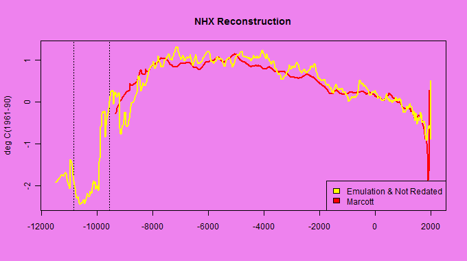
Figure 1. Marcott NHX reconstruction (red) versus emulation with non-redated proxies (yellow). The dotted lines at the left show the Younger Dryas. Marcott began their reported results shortly after the rapid emergence from the Younger Dryas, which is not shown in the graphics.
I have consistently discouraged speculation that the Marcott uptick arose from splicing Mannian data or temperature data. I trust that the above demonstration showing a Marcottian uptick merely using proxy data will put an end to such speculation.
The other “explanation” is that the uptick results from high-frequency swings in individual proxies. Marcott’s email to me encouraged such speculation. However, this is NOT what causes the uptick. Below I show the series that contribute to the NHX weighted average before and after the uptick. The proxy values shown below have been re-centered to reflect Marcott recentering: (1) by -0.66 deg C to reflect the re-centering from mid-Holocene to 500-1450AD; (2) by -0.08 deg C to match the observed mean of Marcottian reconstructions in 500-1450 AD.
Readers will observe that there are 6 contributing series in the second-last step, of which 5 are negative, some strongly. Their weighted average is negative (not quite as negative as the penultimate Marcott value in 1920, but you see the effect.) Only one series is present in the final step, one that, after the two rescaling steps, is slightly positive. Thus, the uptick. None of the contributing series have sharp high-frequency: their changes are negligible. Ironically, the one continuing series (Lake 850) actually goes down a little in the period of the uptick.
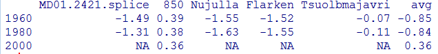
Marcottian uptricks upticks arise because of proxy inconsistency: one (or two) proxies have different signs or quantities than the larger population, but continue one step longer. This is also the reason why the effect is mitigated in the infilled variation. In principle, downticks can also occur – a matter that will be covered in my next post which will probably be on the relationship between Marcottian re-dating and upticks.
I have been unable to replicate some of the recent features of the Marcott zonal reconstructions. I think that there may be some differences in some series between the data as archived and as used in their reported calculations, though it may be a difference in methodology. More on this later.


73 Comments
Here’s a rough script that I will tidy to run trunkey later
###################### ###SETUP ######################## #GLOBAL AND REGIONAL RECONSTRUCTIONS loc="d:/climate/data/multiproxy/Marcott.SM.database.S1.xls" work=read.xls(loc,sheet=3,from=3,naStrings="NaN",colClasses=rep("numeric",48)) grep("Age",names(work)) ##[1] 3 21 29 41 45 #regional=work[,21:27] glb=work[,2+c(1,seq(2,16,2))] names(glb)=c("BP","Grid5x5","Grid30x30","Lat10","Standard","RegEM","RegEM5x5","Jack30","Jack50") glb=glb[!is.na(glb[,2]),] range(glb$BP) #10 11290 Glb=ts(glb[nrow(glb):1,],end=1940,freq=.05);tsp(Glb) #-9340 regional=work[,21:27] regional=regional[,c(1,2,4,6)] names(regional)=c("bp","north","trop","south") regional=regional[!is.na(regional[,1]),] work=cbind(regional[,2:4],glb[,2]) work=work[nrow(work):1,] work=ts(work,start=1950-11290,freq=.05); Regional=work mean.target=apply(window(Regional,500,1440),2,mean) # north trop south glb[, 2] #-0.08023252 -0.08023252 -0.08023252 -0.08023252 #PROXY METADATA Info=info=read.csv("d:/climate/data/multiproxy/marcott-2013/info.csv") Info=Info[,1:16] Info$start= sapply(Proxy, function(A) max (A$bp,na.rm=T) ) Info$end= sapply(Proxy, function(A) min (A$bp,na.rm=T) ) #PROXY DATA download.file("http://www.climateaudit.info/data/marcott-2013/proxy.tab","temp",mode="wb") load(temp); Proxy=proxy ######################## ###UTILITY FUNCTIONS ########################### source("http://www.climateaudit.info/utilities/utilities.txt") f=function(x) filter.combine.pad(x, truncated.gauss.weights(21))[,2] ############## ## EMULTATION ######################### #COLLATE AND INTERPOLATE TO TIMESERIES WITH 20-YEAR STEPS #function to collate and interpolate from list to timeseries with 20-year steps decadalf =function(tem,version="bp",year=seq(-11500,2000,20)) { K=length(tem) index=(1:K)[tem] M=length(index);M N=length(year) chron=ts(array(NA,dim=c(N,M) ),start=min(year),freq=.05) for(j in 1:M) { i=index[j] A= proxy[[i]] A$year=1950-A[,version] h=approxfun(A$year,A$deg) chron[,j]=h(year) } dimnames(chron)[[2]]=names(proxy)[tem] return(chron) } Chron.marcott=decadalf(tem=rep(TRUE,73),version="bp", year=seq(-11500,2000,20)) #this version uses redated series Chron.orig=Chron.sm= decadalf(tem=rep(TRUE,73),version="published", year=seq(-11500,2000,20)) #this version uses published dates as stored in M13 SI # CENTER ON 5500-4500BP #The records were then converted into anomalies from the average temperature for 4500-5500 yrs BP in each record, # which is the common period of overlap for all records. Data.marcott= scale(Chron.marcott, scale=FALSE, center=apply(window(Chron.marcott,1950-5500,1950-4500),2,mean,na.rm=T) ) Data.sm= scale(Chron.sm, scale=FALSE, center=apply(window(Chron.sm,1950-5500,1950-4500),2,mean,na.rm=T) ) #AREA-WEIGHTED MEAN #interpreted here as averaging series within a gridcell though other interpretations are possible #the weights here are from actual latitude but it is possible that M13 used zonal bands #We took the 5° × 5° area-weighted mean of the 73 records to develop a global temperature stack #for the Holocene (referred to as the Standard5×5 reconstruction) (Fig. 1,Aand B). #weighting for gridcell duplicates work1=jones(info$lat,info$long) # only a few cells with multiple cores count=table(work1) #-80 -60 -40 -20 0 20 40 60 80 # 4 2 6 3 17 12 13 15 1 work2 = count[ match(paste(work1),names(count )) ] #number of proxies in lat - zone info$w= cos(info$lat*pi/180)/work2## #CALCULATE ZONAL AND GLB AVERAGE #The records were then stacked together ...The mean temperature [was] #nd aligned with Mann et al. (2) over the interval 510-1450 yr BP (i.e. 500-1440 AD/CE), adjusting the mean, #but not the variance. Mann et al. (2) reported anomalies relative to the CE 1961-1990 average; #our final reconstructions are 101 therefore effectively anomalies relative to same reference interval. 102 work=apply(window(Regional,500,1440) ,2,mean); work mann_delta= mean(work)[1:3] nhc= info$lat>30; tropc=abs(info$lat)<30; shc=info$lat< -30 #define zones #utility function to return three zones zonalf=function(Data=Data.marcott,start0= -11500, delta=mann_delta) { Count= ts( cbind(south=apply(!is.na(Data[,info$lat< -30]),1,sum), trop=apply(!is.na(Data[,abs(info$lat) 30]),1,sum) , glb=apply(!is.na(Data),1,sum)), start= -10000,freq=freq0) Zone= cbind( north=apply(Data[,nhc], 1, function(x) weighted.mean(x, info$w[nhc],na.rm=T) ), trop=apply(Data[,tropc], 1, function(x) weighted.mean(x, info$w[tropc],na.rm=T) ), south=apply(Data[,shc], 1, function(x) weighted.mean(x, info$w[shc],na.rm=T) ), glb= apply(Data, 1, function(x) weighted.mean(x, info$w,na.rm=T) ) ,avg= rep(NA,nrow(Data)) ) Zone[abs(Zone)30& !is.na(window(Data.sm,1980,1980)) A=window(Data.sm[,temp],1960) A=round(A-mean.est[1] +delta,2) A=data.frame(A) A$avg= round(apply(A,1,mean,na.rm=T),2) ANice sleuthing. Considering that the metadata specifically stated proxy resolutions which were often 300 years or greater, the authors should have noted that they were physically incapable of slew rates shown in the conclusion. Had it been a downtick, which it easily could have, the points would have been vetted.
Not only is the end not robust, but it is completely erroneous.
Steve wrote, “Figure 1. Marcott NHX reconstruction (yellow) versus emulation with non-redated proxies (yellow).”
Perhaps one should be red.
As in red herring?
Nice work Steve.
If you are going to make cherry pie, you have to pick cherries.
In this case just one 🙂
In Fig. 1 you say both lines are yellow.
Cheers, Patrick Moore
But is it as “influential” as YAD06?
Would it be correct to term these as tempo-connections?
So if you just projected the trend by interpolating from the difference in the one series you did have Lake 850 ( .36-.38 = .02) to the other series you actually would see the temps continue dropping instead of an uptick. Not that that’s the correct thing to do, but it’s better than Marcottian averaging. Though last time I looked Nan + a number = Nan.
I can see the graph. I can understand little beyond. How can high-frequency upticks in one series be passed on the final mean?
Shub, look at the numbers in the table. Now take the average of each row.
I get the theory behind this, and I suggested exactly it a few days ago, but I don’t see how it works in practice. Weren’t there quite a few series that extended to the 1940 endpoint? I think I remember there being about ten for the NH stack alone. How can you get a large effect just from series drop-out if there are over a dozen still remaining?
I did a quick run of the algebra, and I don’t see how you could get a .7 C increase with more than four or so series remaining. What am I missing?
Steve: stay tuned.
I just did a quick count, and I came up with seventeen series that extend to 1940 or beyond. There are only a few more at 1920. I may be missing something, but as far as I can see, there is no way that handful dropping out could increase the average of the remaining 17 by .7 C.
Shub, imagine 3 series you are averaging together. the series are of different lengths.
Series 1 – 1 1 1 1
Series 2 – 2 2 2 2
Series 3 – 3 3 3 3 3
average – 2 2 2 2 3
Look! A hokey stick!
(typo intentional)
That’s bad. My interpretation was that the one (or two) influential proxies did contain an uptick which became prominent when the others ended.
A second reading tells me your example is more likely.
Re: JohnC (Mar 15 18:16),
yes this is a good illustration what is likely going on. It was also my first idea when I started looking this 1,5 days ago (*) … but I kind of abandoned it because of the discovery that there are no upticks in the thesis (with essentially the same methodology)! Now, these Steve’s two post made me think that maybe there were upticks (and downticks) also in the thesis version, but they were so late that they were cut off whereas in the Science version manipulation of the dating issues made the upticks appear earlier? Notice that in this Steve’s illustration the uptick is in 2000 whereas all Marcott’s series end in 1940.
Steve, I think you need to include the “age
Marperturbation” (Step 2) to the code. It should not matter in the middle, but it may be crucial to what series (and in what portion) get included in the 20th century (and even rather small changes in the re-dating may change this). I think the “temperature perturbation” (Step 1) is not that essential (cancels out on average), except for the Mg/Ca -series, which may result as enhanging the uptick effect. Here I think it is useful to notice the huge values in the “uncertainty” in the last values of the most profound hockey stick (Mg/Ca-stack), which I think indicates that the last value (1940) of the Mg/Ca-stack is likely based on very few inflated Mg/Ca-proxies (fewer than NHX at the same time step).(*) I think we should publish our bitcoin addresses ala Mr. FOIA. All those who originally reviewed this paper should make a donation. We are essentially doing what they should have done.
Beautiful.
As I read your post, the blade is due to which series survive into the post-1950 era. As simple as that? No normalization? Surely not! I await further developments with interest.
So far the uptick is fatuously bad. Unless, as you imply, there is more to it. This Marcott series of posts is written like a thriller, each ending on a cliffhanger.
I’ve got another 2 episodes of Spiral to look forward to on BBC4 later tonight – a great series, but taking second place at the moment.
Did they use one proxy for the northern hemisphere in the year 2000? And divide it by 1 to call it an average? Why even show data where there are obviously so few proxies? Why aren’t there more modern proxies available to use? My head hurts.
Steve snipped my suggestion to Willis on how to become a real Canadian so here is my plan B,
Just repeat 3 times a day “Competent statisticians are awesome EH!”
Old Mike
YAD06 is not quite an analog for this example. YAD06 had the strongest uptrend of all the living trees used for the blade in Yamal. Lake 850 is trending down slightly to the end of the series. This is more indicative of issues with the S/N ratio of single data point at the end of a series causing an offset. IIUC this is similar to an effect that Carrick and I have discussed of an “offset” bias which is demonstrated by comparing the coherence of spaghetti graphs of various reconstructions by standardizing wrt the common time overlap vs instrumental calibration.
This shows how a spike could be produced. But it’s not clear how it applies to the M et al spike. Their NHX results are given in Col V of sheet 3 of the SM spreadsheet, and they end at 1940. The table has entries for 1960, 1980 and 2000 but marks them NA.
I think Marcott plotted results with too few proxies. But it’s not clear they went that far.
Steve: As I clearly stated, I used this data set as an example of how a Marcott uptick can occur. The example is before Marcott redating. I said that I would get to Marcott data. Stay tuned.
As a caveat to my forthcoming post on Marcott redating, I note that I havent been able to replicate essential details of the reported reconstructions from the archived spreadsheet. I’m wondering if the archived spreadsheet was precisely the one used in the reconstruction,
Steve, your prowess continues to amaze, as does the odd fact that you seem to be over looked for the role of reviewer by journal editors for papers on palaeo temp reconstructions.
However from a spectators viewpoint, your post publication audits make for much better entertainment, and education.
Steve,
Nice. Thanks.
Anyone,
1. I am still not “getting” how one should combine the proxy series with different data point frequencies. In Steve’s NHX reconstruction above Steve’s series appears to have many more data points than Marcott et al’s.
2. Plotting annual data is pretty straight forward. How do you treat data with much smaller frequencies? If a proxy series has a data point every 100 years, what does the 2000 ybp point represent: 2100 to 2000 ybp; 2050 to 1950 ybp; or 2000 to 1900 ybp? Does a subsequent user of the data series get decide?
Brandon has a point. In the thesis, figure 4.3 C shows that 9 series carry out to 1950. Hank at Suyts identified them and graphed them. There is no hockey stick blade in them even after 1950, let alone before.
In Science, figure 1C for supposedly the same analysis using the same proxies shows zero series surviving to 1950. Yet supposedly the data is the same. I checked manually. All 73 series in both works are claimed to be identical. Something else unreported in the algorithms was changed so that these 9 series did not survive in the Science version. Or something else was going on with the post 1900 data as shown by S12.
The algorithms are reported to be identical. Compare SI figure S2 and thesis figure C6. If the algorithms are identical, and the proxy reconstructions are the same (the main ones are), yet the thesis has no blade but Science does, then the thesis data was altered in some fashion for the Science article. The article is silent on this.
Drop out proxies leaving unrepresentative remainders might explain a blade, but cannot explain the difference between no blade in the thesis and a huge blade in Science when the proxies and the algorithms are to all appearances the same. And cannot explain the disappearance of 9 carry through proxies in The Science version. Something else was going on.
Be glad to send you a complete write up including referenced images.
I basically accepted that the “published” dates in the proxies provided in the spreadsheet were to be accepted. Thus my selection of proxies were based on the published dates. My scaling or weighting was based on my personal preference to use 1,500 – 6,000 to measure variability across the selected proxies. So, my approach was more simplistic and where I was looking for a signal in the proxies keeping all other things constant. I think what Steve is pointing out is there’s a whole lot more gyrations available – results vary, depending on which particular gyration you choose. I can see how varying dates and scaling will produce an uptick but it’s like getting the right combination on a combination lock. But the whole concept of “dialing it in” bothers me.
The thesis issue is quite interesting.
Marcot didnt use the “published” dates. The redating is an essential part of what’s going on. Marcot completely rearranged the roster of proxies reporting in 1940. I’ve shown that the phenomenon described in this post can yield the sort of uptick. To reproduce the reported uptick, you need the exact network of proxies with the dates used in the calculation. I’m not convinced that we have that yet. I’ll outline these points tomorrow.
For now, I simply want readers to understand how the survivor phenomenon can yield upticks. And to put ideas of high-frequency fluctuations and splicing away for now.
Thanks Steve. I look forward to your discussion tomorrow.
This may also have caused the downtick before ?
I would have thought that not calibrating/screening data at all and instead using everything regardless of issues and non temperature influences would have biased the results to sum of noise – a flat line (what actually happened in the thesis paper and before the downtick).
I am in suspense. Can hardly wait.
Thanks Steve, great stuff. In the Marcott.SM.pdf file, the uptick appears to occur in all of the Monte-Carlo runs (Fig S.3 page 10). It appears to me the it must be something in how they set up the MC runs, or some additional manipulation before the MC runs. In fact, if I plot all of the proxy anomalies on one big chart, it just doesn’t look like the same data.
To my eyes the uptick has all the appearance of a computational artefact, as if the post-1950 baseline were fractional but the numerator still weighted as a full period.
Jeff –
Combining time sequences with different sampling intervals is fairly easy. You cannot average (for example) samples taken at different times (even IF at the same rate), but you can interpolate to find what the samples “should have been” at any missing times, by making for example, a bandlimiting assumption. (Simple linear interpolation is another possibility.) In the case of bandlimiting (a rectangle in the frequency) the time interpolation functions are (Fourier transform) sincs (Sin x / x). This is easy, particularly for sampling frequencies that are ratios of integers, which we have here. For example, one series might be sampled at 150 year intervals and another at 133 year intervals. In general, you would convert the faster sampling rate (133 here) to the slower rate. You shouldn’t try to go very far the other way (aliasing is possible). In the case of ratios of integers, the interpolation and infilling procedure becomes (surprisingly!) just a standard FIR digital filter.
The bandlimiting assumption, either implied by the sampling rate used (likely in consequence of estimated rates of physical processes), or imposed by the interpolating filter, means that a high frequency event (like the end uptick) is NOT expected or is expected to be greatly attenuated.
Because the sinc functions tail-off in both directions (the 1/x), as interpolation functions they contribute the most only locally, so samples far away aren’t too important. Thus the rate changing works quite well in the middle regions of the signals. There are however usually several “transient” problems inherent on the very ends, exactly similar to those we see when trying, for example, to achieve a moving average (itself interpolation) and running out of data points on the most recent end.
Any high-frequency uptick anywhere is probably (at least) inconsistent with the middle of the signal, and likely transient-related if on the end. The ends are not easy to match up. That is, there is no good way to stop. If we were rate-changing music, we just wait for the performers to stop, and then a few second more!
Any similarities with the method that produced De’ath’s 2009 coral calcification down tick?
Suppose, I have a sample of 100 people and recorded their ages in years. I make three age categories, young, middle aged, and old. Now, one of my subjects is over ninety. I want to show this remarkable subject to my public. Let’s add a category of ‘very old’ and change the boundaries of the former categories. The same data but another presentation. Nobody needs to know that in my last category there is only one subject. I have a gut feeling, Steve, that you are on the right track.
I got curious so downloaded the Marcotte data & databased it. No sign of an uptick. Only strange data is JR51GC-35 which varies by 1C/2C row to row — shows a nominal uptick 1850-1900 but so what, very noisy. The source data have no temperature uncertainties listed — I presume some systematic uncertainty is adopted from Muller et al 1998.
The UK’37 5×5 standard temperature stacks show a falloff to a low temperature plateau at 1860-1920, then a 1.3C rise from 1920 to 1940, with no subsequent data. I guess the 1920-1940 data are supposed to represent the dust bowl years? With no onwards data, it looks as though they have simply taken the dust bowl rise and projected that slope onwards to the 21st century? Surely they couldn’t have done that, right?
The data is noisy and very little of it is recent. Maybe it would have sufficed as a thesis, but as an onwards submission to “Science” — much less accepted by them? As I’ve aged, I’ve come to value simple competence more & more — it seems so rare nowadays. Evidently this extends to the highest circles as well, ugh.
I would like to know the whole timeline from thesis to paper. The thesis starts out with “To be submitted to Nature”. Presumably, it was rejected by Nature, and underwent a significant amount of change before being accepted by Science: redating the proxies, adding gridding, changing their Jack50 results (paper is uniform 0.4 deg window, thesis is 1 deg at endpoints). But most interesting, the uptick in the data existed at the time of the thesis, but Marcott chose not to show it. I wonder is the redating just happened to get an uptick into the 1950 window so it was used, or whether the uptick was necessary to get published.
About that Younger Dryas.
Obvious that the alleged strong temperature rise at the end of Younger Dryas is based on isotope in snow from the Greenland isotopes.
However skeptrics should become very skeptic if they take note of things like this:
http://geology.gsapubs.org/content/30/5/427.abstract
Anomalously mild Younger Dryas summer conditions in southern Greenland, Björck et al
…and the data imply that the conditions in southernmost Greenland during the Younger Dryas stadial, 12 800–11 550 calendar yr B.P., were characterized by an arid climate with cold winters and mild summers, preceded by humid conditions with cooler summers. Climate models imply that such an anomaly may be explained by local climatic phenomenon caused by high insolation and Föhn effects….
Rather than constructing models that can spherical cows make to fly in a vacuum, one can also challenge the validity of isotope as temperature proxies and guess what, they ain’t
Isotopes in precipitation are primarely proxies for the absolute humidity – not temperature – at the evaporation source.
Here is my essay on that:
Click to access non-calor-sed-umor.pdf
Steve: Andre, hard to imagine a Younger Dryas mention passing you by. 🙂 Didn’t happen here.
I have tried my hand at a very limited emulation of their 5×5 stack recon. Post and R code here. I don’t get their sharp spike at the end, and it’s a rougher curve generally, but it does track fairly well.
Link got messed – it’s here, I hope
Note the similarity to Nick’s graph and that provided by Lance Wallace.
I have since merged the metadata and added NHX, SHX, and tropics category so that someone using the Excel file available in Dropbox can look at how the three categories differ.
Also available in Dropbox is the result of using either the published age data or the Marcott “Marine09” age data to plot the hemispheric variation of temperature with age. (My plots do not weight by latitude, zone, or other Marcottian manipulations, so are unable to show the upticks.)
https://dl.dropbox.com/u/75831381/Marcott%20temps%20including%20METADATA.xlsx
https://dl.dropbox.com/u/75831381/Marcott%20puiblished%20age%20vs%20Marine09%20age.pptx
So the uptick is just the last man standing? What on Earth? If you will forgive my laziness (Im not sure where to find the data), it would be interesting to see JUST the Lake850 data. Not that it would mean anything but the way it has been seemingly manipulated by Marcott to achieve a desired result it would be interesting to see, i think.
Over at WUWT, http://wattsupwiththat.com/2013/03/13/marcotts-proxies/, Willis Eschenbach has plotted each of the proxies. The Lake850 can be found in the second set row 4 column 2.
Not having read the paper which seems to be hidden behind a paywall I’m unable to gauge the severity of the issues discussed here.
I’ve read the PR fluff but this is often at variance with the conclusions of the paper itself.
Is there anything which would affect the paper’s main conclusions and which would merit a retraction or correction ?
Messing around with this, 2 observations:
(1) I think the 4500-5500 BP “window” which is used as the baseline for each series (in order to convert temperature to anomaly) is identified from the C14 data (rightward columns in each sheet). Using that, the required proxy depths are identified from which to fetch the baseline temperatures.
(2) The uptick looks like a squashed fly, and I think it is being squashed against Marcotte’s perturbation method. He perturbs 1000x within the age error, but for the latest point the age error is zero (if it’s 1950 or later). That means the “uptick” point is written 1000x into the same year, instead of being spread out as is done for earlier proxied points. Squashed fly.
It’s 2:30 AM as I write this, and that’s my excuse. Good night.
One general question/concern – I hope its not too OT.
Why doesn’t the uncertainty get bigger as one goes further back in time ? Is this a proxy availability thing ?
It just seems a bit odd that the authors can argue that historical temperatures of 200 years back can be estimated with the same precision and accuracy as those of 10000 years ago.
Surely the proxies respond to more than just temperature and these extra variables are likely to be (a) far from constant over the past 10000 years and (b) more poorly determined as one goes back in time.
If certain uncertainties aren’t known its improper (in my field) to evaluate the rest, show an error bar, and hope for the best. Sure, one can make assumptions but these assumptions need to be stated very clearly when the work is disseminated otherwise the error bars are misleading.
I believe their uncertainty is based more on the number of proxies, which decreases in recent years due to issues with when the samples were taken and top of core slop that makes the top of ocean cores too unstable to core (too much water in them).
Figure C7 in Appendix C of the Marcott Ph.D. thesis provides the temperature uncertainties for each of the 73 proxies. Indeed there is no increase in the uncertainties with increasing age. They are simply constant throughout the up to 22000-year history. They are also very similar, at about 1-3 degrees C. Seems odd that the temperature uncertainties are not included in the 73 individual sheets in the SM1 Excel file, whereas the (horizontal) Marine09 age uncertainties are given for each data point.
In the “stacked” 20-year sheet, the anomalous temperature uncertainties are provided, but they are all well below the individual uncertainties for each proxy, at say 0.2 C.
Steve: Some other sites have speculated that the uptick is also caused by changing the resolution, from 130 years, to 21 years in the 20th century. The uptick disappears if the same resolution is used for the later data.
What I am appreciating most about Marcotte is the large number of individuals checking out the paper: In addition to Steve, there are: Jean S, UC, Brandon, Rud, Willy, Hank, Willis, etc (don’t mean to intentionally leave others out, but I have read commentary by these folks).
This bodes well for future “calamatology” reviews (yup, I stole that word from someone upthread and I’m keeping it).
On the basis of Marcott et al the Daily Telegraph had this headline: “Earth at its warmest since last Ice Age”.
Now it’s looking as if this headline depends on a ridiculous schoolboy error. It’s utterly sickening. I think I’ll be emailing the Telegraph in the next few days.
I’m sure many people are hoping the problems are serious enough to force a withdrawal of this paper.
Anyway, many, many thanks for doing this incredibly important work, and I look forward to the upcoming installments.
Steve, it’s great to see you back in the saddle and at the height of your powers!
Chris
“Earth at its warmest since last Ice Age”
Well, the Tele got it wrong – no surprise there. What M13 actually said was:
“Current global temperatures of the past decade have not yet exceeded peak interglacial values but are warmer than during ~75% of the Holocene temperature history.”
That’s not based on any schoolboy error, but on thermometer measurements of the last decade. It’s from their Fig 3.
Here is the proper way to handle dating error for their method (assuming you want to use their interpolation method):
1) Randomly perturb the dates
2) Interpolate as usual
3) Recalc zeros of the series to get anomalies
This will NOT work at the ends of the series when the series can be in/out depending on the random simulation. They have created a new method with NO testing of validity.
For other aspects of dealing with dating error, see:
Loehle, C. 2005. Estimating Climatic Timeseries from Multi-Site Data Afflicted with Dating Error. Mathematical Geology 37:127-140
How does one handle the situation where the perturbation switches the temporal order of two adjacent observations or is there a built-in mechanism to prevent this?
It would seem that this should not occur because it would violate the physical order of the sampled material.
Roman:
Would perturbing each point by less than half the interval work?
Although in the some of these data series the interval is not constant.
RomanM, normally one would set a limit at some value for the age between points, such as one or zero. The authors say they handled the uncertainty in dating time between points as a random walk. Since that would have been centered at some value above zero, it likely wouldn’t have needed a cap to avoid the problem you’re discussing.
As far as I know though, the authors didn’t use some package to do this so there’s no way to be sure there was a “built-in mechanism to prevent” points from having their order switched. We’d need their code to be sure. In the meantime, it’s an incredibly easy thing to implement so I’d just assume it was.
The paper states:
I would read that as the “age-control points” being the observed times for the series. The “random walk” (which appears to me as more of a “random growth”) model for modelling the deposition of substrate seems to have been used for determining the uncertainty of the behavior in between.
RomanM, I think your interpretation is the same as mine, but it seems like you might be offering it as a disagreement with what I said. Were you just clarifying things, or am I missing some point of contention?
Just sayin’. I didn’t see the reference to the random walk as an answer to my question.
My suspicion is that the perturbations were a somewhat ad hoc procedure.
I think the random walk does largely answer your question. It’d be difficult for a random walk to produce much variance given the length of the series involved. We could probably work out just how much there might be since we know the jitter value. I think if we did we’d find there isn’t enough variance to create the problem you asked about.
Regardless, it definitely seems like an ad hoc procedure. That why I said it seems “the authors didn’t use some package” for their process. It’s also why I said we’d need to see their code to be sure the problem you referred to doesn’t happen.
I think that Steve is intimating that this is hardly a schoolboy error. Fact one: the previous Marcott paper shows a reverse hockey stick. Fact two: the data provided with the hockey stick paper does not produce a hockey stick.
Perhaps at some point Marcott stumbled onto the fact that selective dropouts could dramatically alter the tail of the reconstruction and deliberately set out to alter drop out dates to match the instrument record?
In today’s data-rich world, we are awash with statistical-poor scientists. Even worse, this dangerous relationship exists in many public settings, to the point that school kids are labeled this or that based on nefarious statistical conclusions by people who should not be allowed to see data let alone work with data.
And it won’t change anytime soon. Steve, you will not be able to convince the authors of their errors. They will simply add new McIntyre epitaphs to the long list already carved in stone under your name. They will continue getting grants and getting published and their vitaes will continue describing their glowing accomplishments.
The three blind mice have a better chance of “seeing” than public-funded climate warmers do.
SteveM’s illustration here gives me pause in my abiding faith, as noted previously in putting together some individual proxies that appear not to be coherent with one another, and letting the averaging process rid the final series of that bad noise and thus producing a sensible reconstruction. In this case we have nothing to average against so I think we need to apply Rule 2 which says if you have nothing to average take the single result that makes the most sense given the upward trend of temperatures in the modern warming period. Rule 3 can also be applied which is if none of this produces an expected result tack an overlapping instrumental record to the end of the reconstruction series with the rationale that the instrumental and reconstruction are of equal validity.
This is getting a bit trickier for me and perhaps Nick Stokes can help me out.
Has their been any “blind” temperature reconstruction analyses i.e. all analysis details (including criteria for different conclusions) are decided before looking at the final results ? I realise this may be difficult in practice (eg reusing well known proxies) but is it even attempted in principle ?
Blind analyses are standard practice in my field and are a decent but imperfect way of removing human bias.
i wish that I could appreciate the science as much as I appreciate (love) the mischevious sense of humour in your analyses.
“UPTRICKS”
Priceless.
When I first saw the paper I too assumed that splicing had occurred. This post explains things!
So it’s simply a case of choosing some declining series that end early and combining them with a rising series that continues to the end. Surely a peer reviewer would have noticed that this isn’t really a fair representation of the data? It seems like such a basic error.
Reblogged this on Climate Daily.
Dear Sir,
The classic regression of Y on x will have confidence intervals differing from the intervals for the inverse regression of x on Y – which you are looking for (the calibration problem).
Some methods for calculating confidence intervals for this type of problems are discussed in: Thonnard, M., (2006), Confidence Intervals in Inverse Regression. Diss. Technische Universiteit Eindhoven Department of Mathematics and Computer Science, Web. 5 Apr. 2013. .
Re: quadef (Apr 5 11:28),
thanks for the reference! Calibration was discussed quite intensively here back in ~2006-2008, and Steve knows quite a lot about it.
13 Trackbacks
[…] Read his full post here: How Marcottian Upticks Arise […]
[…] How Marcottian Upticks Arise […]
[…] I spoke with someone that knows how to do very complex statistics. They said it turns out that the “hockey stick” arises from something interesting. […]
[…] How Marcottian Upticks Arise (climateaudit.org) […]
[…] This made me laugh, because Romm’s graph doesn’t have the instrumental record in it, only Marcott’s reconstructed temperature and Romm’s red line “projected” add on. Plus, as McIntyre points out, Marcott et al did NOT splice on the instrumental record: […]
[…] This made me laugh, because neither Romm’s graph, nor Marcott’s, has the instrumental record in it, only Marcott’s reconstructed temperature and Romm’s red line “projected” add on. Plus, as McIntyre points out, Marcott et al did NOT splice on the instrumental record: […]
[…] How Marcottian Upticks Arise (climateaudit.org) […]
[…] Andy, The ideas in Tamino’s post purporting to explain the Marcott uptick,http://tamino.wordpress.com/2013/03/22/the-tick/ which you praise as “illuminating”, was shamelessly plagiarized from the Climate Audit post How Marcott Upticks Arise. https://climateaudit.org/2013/03/15/how-marcottian-upticks-arise/ […]
[…] praised by RC and Revkin as “illuminating”, had been plagiarized from an earlier CA post. Although Tamino had previously conceded that he had consulted my blog post and had properly cited […]
[…] Andy,The ideas in Tamino’s post purporting to explain the Marcott uptick,http://tamino.wordpress.com/2013/03/22/the-tick/ which you praise as “illuminating”, was shamelessly plagiarized from the Climate Audit post How Marcott Upticks Arise. https://climateaudit.org/2013/03/15/how-marcottian-upticks-arise/ […]
[…] Marcott’s Zonal Reconstructions le 16/03/2013 (Les reconstructions zonales de Marcott) How Marcottian Upticks Arise le 16/03/2013 (Comment les lames marcottiennes se produisent) The Marcott-Shakun […]
[…] closed mind and I can't seem to be able to have an adult and reasonable conversation with you. https://climateaudit.org/2013/03/15/h…upticks-arise/ Try to follow some of what is going on there, and the later attacks by Tamino against McIntyre and […]
[…] How Marcottian Upticks Arise […]