A guest post by Nic Lewis
Introduction
A recent PAGES 2k Consortium paper in Nature,[i] Abram et al., that claims human-induced, greenhouse gas driven warming commenced circa 180 years ago,[ii] has been attracting some attention. The study arrives at its start dates by using a change-point analysis method, SiZer, to assess when the most recent significant and sustained warming trend commenced. Commendably, the lead author has provided the data and Matlab code used in the study, including the SiZer code.[iii]
Their post-1500 AD proxy-based regional reconstructions are the PAGES2K reconstructions, which have been discussed and criticized on many occasions at CA (see tag), with the Gergis et al 2016 Australian reconstruction substituted for the withdrawn version. I won’t comment on the validity of the post-1500 AD proxy-based regional reconstructions on which the observational side of their study is based – Steve McIntyre is much better placed than me to do so.
However, analysis of those reconstructions can only provide evidence as to when sustained warming started, not as to whether the cause was natural or anthropogenic. In this post, I will examine and question the paper’s conclusions about the early onset of warming detected in the study being attributable to the small increase in greenhouse gas emissions during the start of the Industrial Age.
The authors’ claim that the start of anthropogenic warming can be dated to the 1830s is based on model simulations of climate change from 1500 AD on.[iv] A simple reality check points to that claim being likely to be wrong: it flies in the face of the best estimates of the evolution of radiative forcing. According to the IPCC 5th Assessment [Working Group I] Report (AR5) estimates, the change in total effective radiative forcing from preindustrial (which the IPCC takes as 1750) to 1840 was –0.01 W/m2, or +0.01 W/m2 if changes only in anthropogenic forcings, and not solar and volcanic forcings, are included. Although the increase in forcing from all greenhouse gases (including ozone) is estimated to be +0.20 W/m2 by 1840, that forcing is estimated to be almost entirely cancelled out by negative forcing, primarily from anthropogenic aerosols and partly from land use change increasing planetary albedo.[v] Total anthropogenic forcing did not reach +0.20 W/m2 until 1890; in 1870 it was still under +0.10 W/m2.
It is not credible that a negligible increase of 0.01 W/m2 would have had any measurable effect on ocean or land temperatures globally; it is doubtful that an increase of 0.1 W/m2 would do so. Even a change of 0.20 W/m2 would have affected global mean surface temperature (GMST) by less than 0.1°C. Moreover, anthropogenic aerosol and land use change forcing was concentrated in the Northern hemisphere extratropics and the tropics, with little in the Southern extratropics, which would suggest that the onset of positive net anthropogenic forcing (and hence anthropogenic warming) in the tropics and Northern hemisphere extratropics would have been delayed until circa 1870. Yet it is in those regions that Abrams et al. find the earliest onset of anthropogenic warming.
It is possible that AR5 best estimates overstate the strength of anthropogenic aerosol forcing, with the result that total anthropogenic forcing became positive enough to have a measurable impact on temperatures at an earlier date than if those estimates were correct. However, if so, that is good news. It would imply that climate sensitivity – both transient and equilibrium – is lower than current best estimates based on AR5 forcing values suggest, since the observed warming over the industrial era would then have been produced by a larger increase in forcing.
The influence of volcanism on the diagnosed early onset dates of warming
How, then, are the study’s results to be explained? The study’s change point analysis, whilst interesting, seems to me an unsuitable method of detecting the onset of anthropogenic warming. One would expect to find a change of slope in global temperature somewhere – depending on natural internal climate variability – around the late 1830s,. That is because, although anthropogenic forcing did not become significant until much later in the 19th century, there was a big change in average volcanic forcing at that time. Over the industrial period (taken as 1750–2015) as a whole, on the AR5 best estimate basis volcanic forcing averaged –0.4 W/m2. Whilst it averaged close to that level during the last four decades of the 18th century, during the first four decades of the 19th century there was heavy volcanic activity,[vi] with (according to IPCC AR5 estimates) forcing averaging –1.0 W/m2. By contrast, volcanic forcing over the next four decades was small, averaging only –0.1 W/m2. The resulting +0.9 W/m2, change in average forcing is several times larger than the total change in anthropogenic forcing over the whole of the 19th century.
I would expect that pattern of forcing to produce, on a decadal mean basis, a depressed GMST level from circa 1800 to the late 1830s followed by a recovery. In the 1880s, when volcanic activity was again high (Krakatau), one might expect an interruption in the upward movement. However, Atlantic multidecadal variability is thought to have commenced an extended upswing during the 1830s, peaking in the late 1800s.[vii] That would itself have produced a warming trend during that period, particularly over the Northern hemisphere. Multicentennial internal climate variability might also have had a role. Moreover, by the late 1800s anthropogenic forcing had become non-negligible at 0.25 W/m2 per AR5, so would have produced a weak warming trend on its own (although not a strong enough one to counter the effects of Atlantic – and maybe Pacific – multidecadal variability becoming negative during the first two decades of the 20th century).
Warming from the late 1830s to the late 19th century due to recovery from the heavy volcanism earlier in the century and the upswing in Atlantic multidecadal variability would have been superimposed on a slow trend of recovery in surface temperature from the Little Ice Age (LIA), as the ocean interior warmed after the end of the particularly cold four hundred year period from (according to the paper) AD 1400–1800 – a process with a similarly long timescale. The resulting temporal pattern fits the global reconstructions of surface air and sea temperature trends shown in their Figure 1c and 1d, and would account for a change point being found in the 1830s or 1840s. But it does not at all imply that anthropogenic forcing had any measurable influence before the late 1800s. The change of GMST slope circa the late 1830s, and the rise in GMST from then until the late 1800s, was likely almost entirely due to natural factors.
Abram et al. claim that diagnosis using SiZer is little affected by temporary cooling episodes, such as those produced by heavy volcanic activity. This claim is based on the results of analyses of noisy synthetic temperature time series in which gradual warming commences at a known time. They show that a decade-long downwards excursion in temperature starting 25 or 50 years before the actual warming commencement date brings forward the diagnosed warming commencement date by only five to twenty years (Extended Data Figure 3a). However, heavy volcanic activity extended over the first four decades of the 19th century, not for a single decade. Also, the assumed AR(1) annual temperature time series autocorrelation of 0.1 looks light, certainly for sea surface temperatures, where the instrumental record suggests a figure of 0.4 or so would be more realistic. Moreover, their assumed ratio of 100-yr trend to 2σ noise of 1:0.5 looks optimistic to me. In the light of these factors, it seems plausible that the cooling produced by heavy volcanism during 1800–1839 might have brought forward the diagnosed second quarter of the 19th century warming commencement dates by up to several decades from when they would otherwise have been diagnosed.
Abram et al.’s evidence for early warming being anthropogenic
The paper’s conclusions about an anthropogenic origin of the early warming onset are based on evidence summarised in their Figure 3, reproduced here as Figure 1.
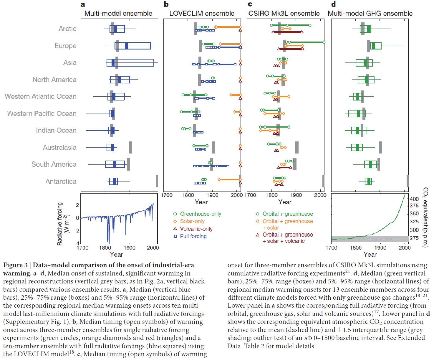
Figure 1. Reproduction of Figure 3 of Abram et al. 2016
.
I will discuss each source of evidence separately, in the reverse order from where it appears in their Figure 3.
Evidence in Abrams et al. Figure 3d
The paper’s authors comment that:
“Naturally forced climate cooling may have helped to set the stage for the widespread onset of industrial-era warming in the tropical oceans and over Northern Hemisphere landmasses during the mid-nineteenth century.”
which is very true, but then go on to say:
“Simulations suggest that recovery from volcanic cooling is not an essential requirement for reproducing the mid-nineteenth-century onset of industrial-era warming. Multi-model experiments forced with only greenhouse gases capture regional onsets for sustained industrial-era warming that are consistent with the tropical ocean and Northern Hemisphere continental reconstructions (Fig 3d).”
However, this is irrelevant. It is unsurprising that model simulations forced only with greenhouse gases, as used in their Figure 3d, produce sustained warming from quite early in the industrial period. But in fact the historical forcing that produced the warming was the net sum of greenhouse gas (GHG) forcing and other forcings, which were mainly negative. As I stated, the AR5 best estimate of the sum total of historical forcings is almost zero in 1840, and only rises slowly thereafter. On a rolling 5-year average basis, estimated global total forcing doesn’t exceed 0.1 W/m2 – enough to produce, within a decade, a very small warming of 0.02 to 0.05°C – until 1901. However, GHG forcing reaches a more material level of 0.2 W/m2 in the mid-1840s – at which point total anthropogenic forcing is only 0.05 W/m2.
Evidence in Abrams et al. Figure 3c
The only anthropogenic forcing included in CSIRO-Mk3L simulations used here is from GHG. Various combinations of natural forcings were employed in addition. Accordingly, the same objections – regarding the omission of negative non-GHG anthropogenic forcing – apply here as to the Figure 3d evidence.
Evidence in Abrams et al. Figure 3b
The LOVECLIM simulations used here are stated to include “Full forcing” ones as well as GHG-only, solar only and volcanic only forcing simulations. However, Full forcing includes only GHG, land use change, solar and volcanic forcing. It does not include aerosol forcing, the dominant anthropogenic negative forcing. Accordingly, essentially the same objections apply here as to the Figure 3c and 3d evidence, albeit with slightly less force since the minor negative land use change forcing was included. Perhaps reflecting land use change forcing, in the Northern hemisphere the diagnosed warming commencement dates with Full forcing are generally several decades later than those found using the PAGES 2k reconstruction and the multimodel ensemble used for Figure 3a.
Evidence in Abrams et al. Figure 3a
This is really the crux of the evidence supplied by Abrams et al. as to an anthropogenic cause of early onset warming. The regional warming onset dates from simulations given in their Table 1, which they claim are reasonably consistent with the dates they derive from their proxy reconstructions, are based entirely on the multimodel last-millennium climate simulations to which their Figure 3a relates. They claim that these simulations, by ten models, employed full radiative forcings, both natural and anthropogenic. However, this statement appears to be incorrect.
The simulations used cover 850–2005 AD in two parts: 1000 year CMIP5 last-millennium (past1000) simulations with forcings that are consistent with the PMIP3 protocol, extended by CMIP5 historical period simulations covering 1850–2005. There are two problems with using this data.
First, the forcings PMIP3 specifies for use in last-millennium climate simulations excludes anthropogenic aerosols.[viii] That will result in anthropogenic forcing, and warming, reaching a non-negligible level at a much earlier point in the industrial period than if all anthropogenic forcings were included at AR5 best estimate values. For about half the ensemble of ten (nine in practice) models used, it appears that the last-millennium climate simulations were continued to 2005 using the same set of PMIP3 forcings, producing a quasi-historical period simulation covering 1859–2005.
Secondly, it appears that for the remainder of the ensemble of models, the main CMIP5 historical period (1850–2005) model simulations, rather than continuations of the past1000 simulations, were used to extent the past1000 PMIP3-protocol simulations. That is important since, like the past1000 simulations, the main CMIP5 historical runs were initialised by branching off from preindustrial control runs. The ocean will be substantially cooler at the end of the past1000 simulations, following the long cold 1400–1840 period, than when the historical simulations were branched off the preindustrial control simulations (which generally do not have any volcanic forcing). As a result of this discontinuity, for such models there would be an immediate jump in temperatures (ignoring any influence of internal variability) between 1849 and 1850. Allowing for a 5–20 year early bias of the SiZer change point date in the presence of a burst of previous negative forcing (Extended Data Figure 3a), such as caused by the heavy volcanism over the first four decades of the 19th century, such jumps could account for finding warming onset dates in the 1830s.
Although the inclusion of negative anthropogenic aerosol forcing in the main CMIP5 historical simulations would result in them warming at a slightly slower rate after the initial jump in 1850 than if PMIP3-protocol forcings were included, the growth in negative anthropogenic aerosol forcing between preindustrial and 1850 is, unlike the rise in GHG, generally ignored in the CMIP5 historical simulations, so aerosol forcing would start from a zero base in 1850 and so have a negligible effect over the following few decades. Moreover, two of the models involved only included direct aerosol forcing – which per AR5 accounts for only about half total aerosol forcing– in their main CMIP5 historical simulations.
To illustrate my point, I accessed the data used and extracted the model simulated temperatures for Europe, one of the regions that has a diagnosed mid-19th century warming onset from the proxy-based reconstructions, with onset diagnosed later in the 19th century from the multi-model reconstructions. Figure 2 shows the various time series, averaged pentadally in order to reduce annual climate noise.
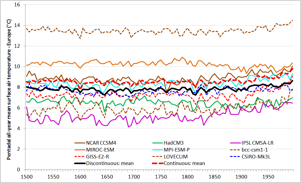
Figure 2: Multimodel simulated surface temperature in Europe (pentads starting in year shown)
.
Results from the four models that appear to have generated simulations over 1850–2005 by continuing the last millennium simulations are shown by dashed lines; the thick red line shows their mean. None of these models included anthropogenic aerosol forcing. Results from the five models that appear to have generated simulations over 1850–2005 by branching from the (warmer) preindustrial control simulation are shown by solid lines; the thick black line shows their mean.[ix]
Although difficult to see in the figure, the mean of the discontinuous models shows a jump from the 1840-49 average to the 1850–55 average temperature, of 0.23°C. By contrast, the mean for the continuous models shows an increase of only 0.05°C. I have chosen these periods as they are the longest ones straddling the start of 1850 transition from the last millennium simulations to the 1850–2005 ones that are unaffected by contemporaneous or very recent volcanic activity. Repeating the exercise for temperatures in Asia and North America, where the warming onsets dates diagnosed from the simulations straddled the 1840s, showed a mean excess for the discontinuous models, in the difference between the mean 1840-49 and 1850–55 averages, of 0.17°C, similar to that for Europe.[x] The much larger increase for the discontinuous models between the mean temperatures for these periods very much supports my argument that their historical simulations started from a warmer state than their past1000 simulations ended in.
Conclusions
It appears that the claim in Abrams et al. that the diagnosed early onset – about 180 years ago in some regions – of industrial-era warming is of anthropogenic origin is based on inappropriate evidence that does not substantiate that claim, which is very likely incorrect. Most of the evidence given for the anthropogenic origin claim, which is entirely model-simulation based, ignores the industrial era increase in aerosol forcing, the dominant negative (cooling) anthropogenic forcing; the remaining evidence appears to be invalidated by a simulation discontinuity in 1850. The only evidence provided that includes even the post 1850 increase in anthropogenic aerosol forcing – half of the Figure 3a multi-model ensemble simulations – is affected by the simulations from 1850 on being started with the ocean significantly warmer than it was in 1849.
Recovery from the heavy volcanism earlier in the century and an upswing in Atlantic multidecadal variability, superimposed on a slow trend of recovery in surface temperature from the LIA as the ocean interior warmed after the end of the particularly cold four hundred year period from AD 1400–1800, appears adequate to account for warming from the late 1830s to the final quarter of the 19th century. It is unlikely that anthropogenic forcing, estimated to be very low until the 1870s, played any part in warming before then. The heavy volcanism in the first four decades of the 19th century likely caused the warming onset dates diagnosed from the proxy data, at least, to be up to several decades earlier than they would have been in its absence.
Ironically, should the study’s finding of anthropogenic warming starting as early as circa the 1830s be correct, it would imply that anthropogenic aerosol forcing is weaker than estimated in IPCC AR5, and therefore that observational estimates of climate sensitivity (both transient and equilibrium) based on AR5 forcing values need to be revised downwards. That is because total anthropogenic forcing would only have become positive enough to have had any measurable impact on temperatures in the 1830s if AR5 best estimates significantly overstate the strength of anthropogenic aerosol forcing.
Nicholas Lewis August 2016
Correction: 1 September 2016
Nerilie Abram helpfully advises me that the HadCM3 1850–2005 simulation was in fact a continuation of its last millennium simulation; this was not evident from the details given in the paper’s Extended Data Table 2. In addition, she says that a mean offset was applied to the historical portion of the MIROC-ESM simulation to avoid an artificial jump in this dataset. This does not seem to have been mentioned in the main text, Extended Data or Supplementary Information, and I do not know the amount of the offset. However, it now seems inappropriate to treat this model as belonging in the discontinuous category (although it is not entirely clear whether it can properly be categorised as continuous). The classifications of HadCM3 and MIROC-ESM in Figure 2 are accordingly incorrect, as are the heavy lines showing means for each category, which should be ignored.
With these two models categorised as continuous, the discontinuous category models show on average a 0.19°C jump in Europe, relative to the change for continuous models, from the 1840-49 mean to the 1850–55 mean temperature, similar to that previously derived. I have now calculated the median increase across all seven land regions for each set of models (continuous and discontinuous simulation ones). With HadCM3 and MIROC-ESM categorised as continuous, the overall median increase is 0.30°C higher for the discontinuous models than for the continuous models; this difference was almost the same, at 0.31°C, when they were treated as discontinuous models. Although the proportion of discontinuous models is now smaller, the problem with aerosol forcing being either ignored, either entirely or save as to its increase from its level in 1850 (possibly from the 1820s for HadCM3) remains.
[i] Abram NJ et al. (2016) Early onset of industrial-era warming across the oceans and continents. Nature, doi:10.1038/nature19082. In archive FAQ_&_supporting_docs.zip available at https://cloudstor.aarnet.edu.au/plus/index.php/s/4pQheVzMddCXwJN
[ii] Around the 1830s in the tropical oceans and the Arctic, and around the 1840s in North America, Asia and Europe.
[iii] http://www.ncdc.noaa.gov/paleo/study/20083
[iv] The past1000 CMIP5/PMIP3 simulations used commence in 800 AD, and are extended from 1849 to 2005, but Abram et al only use the 1500–1999 AD portion.
[v] Per AR5 best estimates, total aerosol forcing was over four times as strong as land use change forcing (which was also negative) throughout the 1800s.
[vi] Very high volcanic forcing of –1.0 W/m2 in the decade to 1810 was followed by extremely high forcing of –2.1 W/m2 in the next decade due to the eruption of Tambora in 1815, which balanced out with the volcano-free 1820s, and forcing again very high at –1.1 W/m2 in the fourth decade due to the 1835 Cosiguina eruption.
[vii] Delworth, T. L., and M. Mann (2000), Observed and simulated multidecadal variability in the Northern Hemisphere, Clim. Dyn., 16, 661–676, doi:10.1007/s003820000075. ( A smoothed version shown in Figure 2(d) of Chylek P et al. (2011) GRL 38, L13704, doi:10.1029/2011GL047501.)
[viii] PMIP3 also excludes other anthropogenic non-greenhouse gas forcings other than land use change.
[ix] The tenth model, Fgoals-s2, did not generate the requisite surface air temperature data.
[x] The average across the three regions of differences in mean 1840-49 and 1850–55 temperatures based on taking multi-model medians rather than means is even larger, at 0.28°C.


110 Comments
The proxies relied on do not have the temperature resolution required to make the claim. Especially not by region as the paper does because the sample size decreases so the regional variance increases. Read the paper when it was first touted and concluded GIGO. Same problem admitted by Marcott when challenged about his 20th century spike. (When that was actually created via provable academic misconduct.)
Nic:
first thanks for bringing to our attention, and thanks for the analysis…
I am curious what you make of the concept of “multi model ensembles”
Any who read my comments know that I feel the very computation of these ensembles is a statistical abomination, but I am curious what your take on them is.
thanks
David,
I am likewise rather dubious about multi-model ensembles, and don’t regard their simulation output as representing independent draws from a normal (or any other) probability distribution, as they are typically treated as constituting. (Why normal rather than t-distributions are used to estiamte uncertainty ranges from multi-model ensemble data is beyond me, BTW.)
Also, unlike some practitioners, I certainly don’t consider model simulation outputs as being exchangeable, in statistical terms, with observational data on the real climate system.
This is but one practice that drives me nuts.
Another?
The use of PCA on proxies which are all hhypothesized to represent temperature variance, when the basic asssumption of PCA is that the principal components themselves are independent of each other (orthogonal, or at least somewhat othogonal).
I cant square that circle…how is it that all of the components both serve as reliable proxies for the same thing, yet are independent of each other…
Am I nuts?
woefully ignorant?
thanks in advance.
A similar thing puzzles me with temperature data. How can it be
both regionally correlated to be suitable for homogenization purposes
but also I.I.D for arbitrary precision improvements using LoLN.
At one point, even Naomi Oreskes agreed with you.
“Verification, Validation, and Confirmation of Numerical Models in the Earth Sciences”, Oreskes, et al., 1994.
Click to access 641.full.pdf
Nic’s comment in fifth paragraph – “It is not credible that a negligible increase of 0.01 W/m2 would have had any measurable effect on ocean or land temperatures globally; it is doubtful that an increase of 0.1 W/m2 would do so.”
The general concensus is that the LIA ended circa 1830-1850, though the cooling trend ended circa, the late 1700’s. (with contemporay evidence such as the documented start of the melting of the muir glacier in glacier bay national park circa 1790). To translate nick’s comment into a layman’s concept, I question whether a change from 280ppm of co2 to 281ppm would have a measurable impact on ocean or land temperatures.
Prior to the Keeling curve, there is no reliable and accurate data on global atmospheric CO2 levels. We have ice core data, notably Law Dome, but that is rather inexact approximation.
Mpainter – I agree – my point (however inept i made such a point) is that there was an end to the general cooling trend circa the late 1700’s when there was a very neglible change in the forcing (antrothopic forcing). (My mistake for the lack of clarity in my comment – just hope the general gist came across)
My comment was meant to re-enforce your point that posing a CO2 forcing at that time is ludicrous.
In summary
Nic – 0.01 W/m2 – too small of a forcing to make such a claim
Joe – 280ppm to 281ppm – too small of an increase to make such a claim
MPainter – Data doesnt not exist to make any such claim.
There is also data from leaf stomata frequency. Atmospheric CO2 fluctuatetions during the last millennium reconstructed by stomatal frequency analysis of Tsuga heterophylla needles; Lenny Kouwenberg, et al.; Geology, January 2005.
Ross McKitrick and Chris Essex’s story of the Ice Men vs. the Leaf Lady in their book may not be the answer, but just another piece of puzzle…
Having some familiarity with the forcing data used by IPCC, it seemed obvious that their result was impossible. It is nice to see, from Nic’s analysis, where their result comes from.
Nic,
Interesting analysis. I completely agree about the magnitude of aerosol effects…. these seem to me to be consistently overstated, especially on the high end of the aerosol uncertainty range, and would allow an earlier onset of significant GHG warming if they were in fact only half or so of the AR5 levels (which seems to me likely).
Steve,
Thanks. The evidence is still not conclusive as to aerosol forcing, but I agree it looks likely that the AR5 median is too negative – certainly the AR5 lower (most negative) bound looks well excessive. However, for the time being I think it makes sense to continue to use the AR5 median aerosol forcing as a common reference point, not least so that studies can be fairly compared with each other.
Nic, thanks as always for an interesting post. You say:
Even that is an underestimation. The measured lag-1 autocorrelation of the annual ReynoldsOI SST data 1982-2015 is 0.62.
The fact that they have used a value of 0.1 is a measure of just how little they understand natural datasets, because it is very rare to find any oceanic dataset with that little autocorrelation. The ocean is huge and swings slowly, meaning high autocorrelation no matter how you slice it.
It also means that they would have wildly overestimated the significance of their results … this is my shocked face.
My best to you, my friend …
w.
SiZer tests again white Gaussian? It shouldn’t be hard to modify it to any linear combination (AR, ARMA etc)?
Nice tool for visualization
I see that SiZer used by the authors of the paper being discussed on this thread is available in R
Click to access SiZer.pdf
Description: Calculates and plots the SiZer map for scatterplot data. A SiZer map is a way of examining when the p-th derivative of a scatterplot-smoother is significantly negative, possibly zero or significantly positive across a range of smoothing bandwidths.
I noticed that UC made some comments on SiZer above. His question marks confused me (which is not at all difficult to do these days) but I am wondering if he or anyone familiar with this function can give us their views on how it used and whether it was reasonably applied by the authors. It appears on a quick read of the R package that the function works on piece-wise or segmented linear trends – and, I think, using multiple series.
Ken,
The description of SiZer in the paper and the graphs in Extended Data Figure 3 suggest that SiZer also works on smoothly accelerating changes, not just piecewise linear ones. It would seem odd if the R package did not do so.
Seems ok, but I’m bit worried about AR(1) noise applied outside SiZer. For example, first derivative of AR(1) (smoothed or not) brings up negative correlation. Then, after AR(1)-caused cooling period there will (very likely) be a warming period and that gets mixed with true warming.
On further reading I see that SiZer in R uses various smoothing schemes in its analysis. Since SiZer is a change point analysis and appears to be capable of finding smoothly changing points, I am wondering if it would have any application in the algorithms used for adjusting station temperature series. A problem I see with change or breakpoint methods used in these algorithms is that slowing changing non climate changes affecting the station temperatures are difficult to detect. I think most of these algorithms use change point methods that work on linearly segmented series.
On still further study of the Sizer function I see that a linear regression calculation can only enter the function if the locally.weighted.polynomial function used in the SiZer function is of degree one and then it is only used for locally weighting the smoother. This change point method in my view uses an entirely different approach than those methods I have seen applied to the instrumental station temperature series adjustments.
UC, I think I see your concerns about ar, but cannot that concern be tested with simulations. I also want to use simulations to test the differences in sensitivity of the breakpoint method in R under the library strucchange and SiZer.
AR(1) 0.62 can produce easily something like this:
Median onset time for warming in North America is 1947:
Maybe relevant similarities, don’t know.
UC, am correct in assuming that Reconstructions 3 and 4 are simulations using ar1=0.62 and Reconstruction 4 has, by chance, a median onset warming at 1847?
I have found that R has several change/break point methods including SiZer, strucchange, ecp, bcp and WBS.
Upper is AR(1) simulation, lower with the one used in the article:
image missing

In the linked SiZer theory article (Hanning and Marron) there is nice example in Figure 1. SiZer finds jumps in the data, seen as significant regions going all the way down. MBH99 CO2 adjustment ( https://climateaudit.org/2010/02/03/the-hockey-stick-and-milankovitch-theory/ ) seems to get caught with this

UC, thanks for the explanations and nice graphs. That MBH CO2 adjustment reference and your application of SiZer to it could be fodder for a discussion of the validity of proxies for a temperature reconstructions for another time (probably off topic for this thread), but a more or less trendless reconstruction in the pre-instrumental period with a modern warming period enhanced by proxy selection after the fact and a spliced instrumental record says much about what is wrong with these temperature reconstructions and the manipulations to make the reconstructions fit an evidently preconceived pattern.
I have taken some time to better familiarize myself with the SiZer approach to estimating change points and to more fully digest some charted information that Nic has presented in this thread. I found a good paper on SiZer here:
Click to access 0706.4190.pdf
From this I have a couple questions and comments. First as UC has demonstrated the presence of autocorrelation in the series being analyzed by SiZer the confidence intervals (CIs) should be adjusted according the values of ar1. The authors in the link above comment on this issue and also (at least in my first reading of the paper) indicate that determining what is trend in time series is not a straight forward process. The ar1 to be used for adjusting the CIs should come from the detrended series residuals and not the series itself and that can make a difference in the value of ar1 used for the adjustment. I do not know how the Abram et al authors determined the ar1 value. Certainly the CIs would be considerable wider with an ar1=0.6 versus ar1=0.1.
The comparison of the onset warming between the temperature reconstructions and the model ensembles in the extracted Figure 3 in this thread – which shows wide vertical gray, blue and green lines that are actually what would be better represented by much thinner lines – are the median onset warming. The box and whisker plots of the model ensembles are evidently estimated from the individual model run medians from the ensemble. The whiskers in this case cover the 5%-95% of the range and not the entire range as is usually the case. My first point here being that the ensemble of model realizations to the single observed realization can be very misleading if the runs originated from different models and would have been better viewed by comparing individual runs from an individual model to the observed. What I would also like to see is the confidence intervals for the median onset of warming for the observed and individual model runs.
Since I have another post held up in moderation I’ll recopy it here with a reference to the paper title without the link.
I have taken some time to better familiarize myself with the SiZer approach to estimating change points and to more fully digest some charted information that Nic has presented in this thread. I found a good paper on SiZer here:
SiZer for time series: A new approach to the analysis of trends
From this I have a couple questions and comments. First as UC has demonstrated the presence of autocorrelation in the series being analyzed by SiZer the confidence intervals (CIs) should be adjusted according the values of ar1. The authors in the link above comment on this issue and also (at least in my first reading of the paper) indicate that determining what is trend in time series is not a straight forward process. The ar1 to be used for adjusting the CIs should come from the detrended series residuals and not the series itself and that can make a difference in the value of ar1 used for the adjustment. I do not know how the Abram et al authors determined the ar1 value. Certainly the CIs would be considerable wider with an ar1=0.6 versus ar1=0.1.
The comparison of the onset warming between the temperature reconstructions and the model ensembles in the extracted Figure 3 in this thread – which shows wide vertical gray, blue and green lines that are actually what would be better represented by much thinner lines – are the median onset warming. The box and whisker plots of the model ensembles are evidently estimated from the individual model run medians from the ensemble. The whiskers in this case cover the 5%-95% of the range and not the entire range as is usually the case. My first point here being that the ensemble of model realizations to the single observed realization can be very misleading if the runs originated from different models and would have been better viewed by comparing individual runs from an individual model to the observed. What I would also like to see is the confidence intervals for the median onset of warming for the observed and individual model runs.
As an aside I have always found in my simulations that a negative ar1 for a series residuals will always lead to a reduction in the confidence intervals for the trend and not like a positive ar1 which leads to increased confidence intervals. In the paper above the authors point to this same conclusion.
I almost mixed up this Nerilie J. Abram with John Abraham from the Climate Science Rapid Response Team. http://www.climaterapidresponse.org/matchmakers.php
Well Done Nic.
The wholesale discarding of natural forcing factors like Tambora and other early in the century volcanism is telling for confirmation bias, since it is so easy to spot.
They were looking for something they expected, rather than running a testable hypothesis.
Thanks, Anthony
Yes; maybe they thought it would make the paper more attractive to Nature if they played up anthropegenic rather than natural recovery-from-volcanic-forcing aspects of early onset warming.
Nic, it is unclear to me that the authors would be using the auto correlation of the series and not that of the the detrended residuals and relate how the trend was determined.
Also do the authors provide confidence intervals on where the change point occurs in time?
This is a good post in that we often at these blogs limit the discusses to talk about warming from natural climate events and GHGs.
I see in the SI that the change point in time around 1830 varies somewhat with region but appears to be unexpectedly (to me anyway) tight within the region. I wonder how independent the temperature reconstructions used in the paper are – not that I would expect the reconstructions to provide valid temperatures.
Ken,
Their Methods section gives details on the median change dating. It says, inter alia:
“we assess climate change-points from SiZer output by determining the median year of initiation for the most recent significant (P < 0.1) and sustained trends across smoothing bandwidths spanning all integer years in the range 15–50 yr." I can't see that CIs as such are stated, but ranges are shown in Extended Data Figure 5.
Given the generally small linear trends over 1500-1900 or even 2000, I'm not sure detrending would make much difference to estimation of autocorrelation?
My point with detrending is whether a longer term linear trend line is what should be used for detrending. This gets us into a discussion of what should be considered a trend for natural climate events/episodes and why we would assume such trends are linear. Obviously with the ups and downs of natural climate effects on temperatures those up and downs are considered noise in the temperature series if the longer term periods have little or no linear trends. If those up and downs are considered trends then the residuals would be modeled very differently and the resulting ARMA model would show much less auto correlation.
I personally like your approach in noting that the authors conclusion is based on apparently a low sensitivity of temperature to aerosols and what that implies for ECS and TCR. I would very much like to see you pursue this issue in more detail with the authors and others – if for no other reason than showing they cannot have their cake and eat it too.
I suspect there might be some contradictions in the use of the temperature reconstructions all showing change points around 1830. It has been my experiences that individual proxy responses are simply not that coherent over time. If SteveM were to see fit, I very much would like to see his analysis on these matter.
Such a study will not be taken seriously in the general climate community, in my estimation, except by the most activist and credulous of the warmers.
Nic, my only concern is that you seem to have accepted the “it’s the volcanoes, stupid” explanation without really investigating it.
In terms of the volcanic record, as I have repeatedly shown, the change in temperature following a volcanic eruption is weak, local, and short-lived. Yes, there are plenty of apocryphal stories about say Tambora, but when you look at even individual station records, the putative effect cannot be picked out by eye.
In addition, the correlation between the volcanic record and the temperature is abysmal, even when you allow for a lag in the effects.
As a result, I find your explanation, which rests on volcanoes as the cause, to be far from compelling.
The rude truth is this. Nobody knows why the earth warmed in Roman times. Nobody knows why the earth cooled after Roman times, or why it warmed from there until Medieval times. Nobody knows why the earth cooled into the Little Ice Age, or why it has warmed since then (in fits and starts) at about half a degree per century.
Given those huge lacunae, it amazes me when people claim to be able to explain recent warming.
Best regards, thanks for the work. I append my work regarding volcanoes …
Willis,
Thanks. I agree that volcanic forcing has a substantially smaller effect on the climate system than does CO2 (and almost all other forcings). But I don’t see it as having a negligible effect.
Based on the AR5 25x AOD volcanic forcing multiplier, I estimate that (stratospherically-adjusted) volcanic forcing has (relative to CO2) 0.5 to 0.55 as much effect. A recent study by Gregory et al., reached a value of 0.5, partly due to its ERF being lower than its RF and partly due to volcanic ERF having a low efficacy.
0.5x a volcanic forcing change of 0.9 W/m2 is still much larger than other forcings in the mid-19th century.
Thanks for the clarification, Nic. However, the only justification you’ve given for your numbers is the IPCC AR5 … perhaps you consider the IPCC to be adequate support for a claim. I’m obviously more skeptical.
As an example, AR5 Chapter 8 says
“To be important for climate change, sulphur must be injected into the stratosphere, as the lifetime of aerosols in the troposphere is only about one week, whereas sulphate aerosols in the stratosphere from tropical eruptions have a lifetime of about one year, and those from high-latitude eruptions last several months.”
I don’t see how you magically transmute a ~ 1-year-long reduction in incoming solar into some significant effect over decades.
Not only that, but for the first three Assessment Reports, the level of understanding of volcanoes was “Low” … but in a few short years it is now “High” and described as “robust” …
Really? Sudden insights have cleared up an entire field? How did we all miss that sudden surge of certainty? And yet despite that, the estimate of the volcanic forcing in AR5 is only slightly different from that of the SAR … were we just lucky?
I also couldn’t find your “25x AOD” anywhere in Chapter 8, where there are only 3 mentions of AOD. I may be looking in the wrong place … citing chapter and verse would be useful.
The final problem I have with the “it’s the volcanoes” claim is that as I have shown in the posts linked to above, there is only a very pathetic correlation of temperature with AOD. In order to even see it you need to stack up a bunch of volcanoes, and even then the uncertainty goes floor to ceiling.
Thanks for any further insights and directions. If you have ANYTHING that shows that global temperatures can be strongly affected by volcanoes, I’d love to see it. As I said before, while there are assuredly effects which can be observed and measured, the actual observational data I’ve seen says that they are local rather than global, weak rather than strong, and short rather than long-lived.
Of particular note is the AOD record from Mauna Loa which I discussed in “Volcanoes Erupt Again“. There, despite Pinatubo being near to the latitude of Mauna Loa, and despite the large drop in solar transmissivity due to Pinatubo, the net effect on the temperature was … well, either zero or too small to measure.
All of which makes me greatly skeptical of the volcanic explanation …
w.
Willis,
The 25x AOD figure is given in AR5 CH8SM: Table 8.SM.8. AR5 uses the Sato volcanic Aerosol Optical Depth timeseries (http://data.giss.nasa.gov/modelforce/strataer/) from 1850 on, IIRC. If you compare the Sato AOD timeseries with the AR5 Table AII.1.2 forcing best estimate timeseries, you will find that their ratio is (almost exactly) 25x.
The reduction in incoming solar affects the ocean mixed layer, which has a time constant of several years. Longer term effects are shown by AOGCMs, presumably because some heat gets transferred from the deeper ocean to the mixed layer before its temperature recovers. IMO AOGCMs substantially overestimate the longer term effects of volcanism.
Nic, regards for your quick reply. I’ll have to take a look at the “25x AOD” figure, and see where it leads me.
Thanks again for a most interesting post,
w.
Well, a quick look shows that on average, the nominal volcanic forcing (25 x Sato AOD) gives us an average volcanic forcing since 1850 of about a third of one watt per square metre. And if we assume your 2-3 year time constant, it peaks for Pinatubo at about 1 W/m2 … in a system where average downwelling radiation at the surface is about half a kilowatt.
I still gotta say, I’m still not seeing how a forcing that averages 0.35 W/m2 and occasionally peaks at ~ one W/m2 is gonna have more effect than a fart in a whirlwind …
w.
I can’t but agree with Willis.Studies that are poorly constrained by observations should be eschewed.
It is the rule, rather than the exception, that such studies fall to the ground when given close scrutiny. Climate science is full of such pitfalls.
Nic , I’d like to ask you a few questions. What warming has there really been per century since 1800 and 1850? Why does the IPCC prefer the HAD 4 data-base?
The Concordia Uni study found about 0.7c warming since 1800. Is that about 0.3c a century?
Had 4 warming since 1850 seems to be about 0.8 c. Is that about 0.5 c a century?
Just to finish, the Lloyd study found the average per century deviation in temp for the last 8,000 years was about 1 c. He used both G/land and Antarctic ice core proxies. So where is this unusual /unprecedented warming since 1800? And at the end of one of the coldest sustained periods for the last 10,000 years.
If Nic hasn’t the time can anyone else help out?
The rude truth is this. Nobody knows
================
+100
Nick, in reading the FAQ I found every answer to be making conclusions blind to known relevant facts. Your post mainly unveils question #4 which claims that the simulations used “all” natural and anthropogenic forcings. There are 12 questions; I will pick one at random to show.
1) Clearly, this is not for educated readers who would know that ecosystems have not been experiencing a flat temperature for all previous time for which the Earth has recently been given a fever whose early onset has not been detected. No mention is made in the FAQ of LIA, MWP, ice ages or Holocene optimum.
2) The answer leaves the impression that GHG forcing has a unique impact on temperature. Nowhere does Abram provide a relative impact of the rise from 280ppm to 285ppm as compared with natural variability in solar, volcanic, ocean currents and orbital. I think she just plain forgot about anthropogenic aerosols.
3)There is no way for the ecosystem to know if the warming or cooling is natural or anthropogenic. And, obviously ecosystems have survived extremely warmer conditions than exist today. Her ecology talk seems emotionally unscientific.
4) Not only does she feel she’s proven that “rapid and measurable response” to GHG, she assumes rapid “paybacks” on a regional basis for mitigation. When Nick points out that early response proves low aerosol forcing, which proves low ECS, he is way overthinking this paper. It’s just a story.
Ron,
I agree that the authors seem to focus on the effects of GHG forcing in isolation, rather than on the effects of all anthropogenic forcings. They did not perform a change-point analysis based on simulations with all anthropogenic forcings included from 1750 (or earlier) but no natural forcings. Had they done so, and it had shown early onset warming (with uncertainty ranges that were not huge), then that would have provided some evidence for their statement (at the start of the press release):
“An international research project has found human activity has been causing global warming for almost two centuries”.
As it is, I consider this claim to be unsupported by any of their evidence.
They avoid making the above claim explicitly in the paper, so far as I can see, but implicitly make it by stating “Our findings imply that instrumental records are too short to comprehensively assess anthropogenic climate change” and by emphasising the early onset of GHG warming.
Aren’t we told that CO2 is “well-mixed” throughout the entire atmosphere within a few PPM? How can only some areas experience anthropogenic “climate change” before others? Makes no sense.
Jeff
Although CO2 is well mixed, in some regions (particularly the Southern Ocean) surface warming due to CO2 forcing may be rapidly advected (transported) out of the region – in this case by northward currents – and/or mixed over a much larger depth of the ocean than in other areas, thus preventing or considerably delaying changes in the local climate. Also, in Antarctica the forcing from an increase in CO2 ppm may near zero or even negative. So the claim is not impossible in principle.
Nic, beware of rapid and sweeping arm movements when perusing climate studies. It is best to avoid studies that incorporate such gestures.
You say “the claim is not impossible in principle” is justification for rank conjecture. Many scientists conscientiously will eschew such conjecture in their formulations. Climate science is a showcase for practices to be avoided.
Nic, I have a comment in moderation and I think because it has a link in it. The link is to functions used in R with SiZer.
Ken,Thanks for pointing this out. Now released from moderation.
“Aren’t we told that CO2 is “well-mixed” throughout the entire atmosphere within a few PPM? How can only some areas experience anthropogenic “climate change” before others? Makes no sense.”
The concentration of c02 that matters is the concentration ABOVE the ERL not at the surface. and at the ERL it is well mixed. there is one exception and that is Antartica. The AGW effect works because we have negative lapse rate. More c02 raises the ERL and the planet radiates from a higher colder level, that is it radiates more slowly. In Antartica the surface is often colder than the stratosphere, so more c02, theory says,
will actually cool that area.
https://www.sciencenews.org/article/warming-culprit-co2-has-cool-side-%E2%80%94-and-it%E2%80%99s-antarctica
Nothing in theory dictates monotonic or uniform warming. That would probably be the last thing you would expect.
Jeff Alberts says:
Posted Sep 2, 2016 at 9:33 PM
First, CO2 is indeed well-mixed throughout the atmosphere, particularly compared to the main GHG, which is HO.
However, Mosher is right that that doesn’t mean that the warming needs to be “well-mixed” as well. That might be true on a planet which was 100% ocean with no continents and a perfectly smooth ocean floor … but in the real world heat is constantly being advected from one place to another in very different paths and manners because of mountains, ocean currents, continental placement, and the like. So there is no expectation of even warming—heck, look at the Sahara and the Southern Amazon, both warmed about the same amount by the sun, but the temperatures are totally different.
Regards,
w.
And so what are the particulars of this hypothetical differential warming? Is it more than conjecture or is it the usual case of maybe natural, maybe not, and is the data reliable anyway?
Ha. Need a reason to explain why Antarctica isn’t following the rules of global warming, especially after the Steig et al debacles. The latest Steig?
http://www.nature.com/nature/journal/v535/n7612/full/535358a.html
“…The Antarctic Peninsula has been warming for many decades, but an analysis now reveals that it has cooled since the late 1990s. Inspection of the factors involved suggests that this is consistent with natural variability…”
Hmm…published July 2016 and says it’s natural variability, not, “…In Antartica [sic] the surface is often colder than the stratosphere, so more c02, theory says, will actually cool that area…”
Reminds me of how Mann and others kept claiming hurricane frequency was increasing with global warming, but as data progressed to prove this wasn’t the case, “theory” said hurricanes would become less-frequent (but more intense).
“that doesn’t mean that the warming needs to be “well-mixed” as well”
This goes back to “the warming isn’t global”, which has been obvious for a long long time.
Andrew
“How can only some areas experience anthropogenic “climate change” before others?”
The definition of natural variability depends upon having a known pre-industrial observational record and a specified interval of influence. However, if she has located such a region it would be of keen interest to Nick’s work since observational ECS would have clear signal, free from natural variability interference.
I don’t think Nick is exciting by this claim nor the paper’s implication that anthropogenic aerosols have no effect. Just a hunch.
There is considerable overlap between the radiative effect of CO2 and water vapor. In drier regions like the poles, CO2 is the main GHG present, and thus has a stronger effect. Climate models show the poles warming more than the tropics in response to GHG.
I would add that Willis’ heat engine shows more dissipation of heat in the tropical ocean due to evaporation and transport, and thus less warming than expected.
Nic: IIRC, some of the papers used by AR4 and AR5 to demonstrate that at least 50% of warming SiNCE 1950 could be attributed to anthropogenic forcing also concluded that unforced variability was responsible for most warming fron 1900 to 1950 and that little could be attributed to man during this period. So Abrahms is claiming that warming around 1830 is attributable to a minuscule change in anthropogenic GHGs, while others can’t attribute 1900-1950 warming to a much larger change in GHGs. This doesn’t make any sense. Your post suggests an explanation. However, the bigger picture is that one can cherry pick a part of the record for analysis, reach a conclusion inconsistent with other attribution studies, and still get published in Nature.
Frank: agreed, but I think it also because Abram is answering a different question.
A detection and attribution study considers how probable it is that any part (for detection) or the whole or a specified part (for attribution) of the observed changes was due to a specified cause, given the uncertainties.
The SiZer analysis asks when is is most likely that a sustained change started. I would expect that to be at an earlier date than the change could be “detected” with reasonable confidence, but for the uncertainty range in the anthropogenic warming start date to be large. And the 5-95% ranges in Figure 3a (multimodel all forcings ex anthro non-GHG non-LUC) and 3d (multimodel GHG-only forcing) are indeed all over 100 years, except for Antarctica.
The uncertainty ranges derived from the regional proxy reconstructions are much narrower, perhaps reflecting not taking uncertainty in the reconstruction or internal variability adequately into account.
Nerilie Abram estimates a +/- 20 years uncertainty for their estimates for warming onset – I’m unsure at what confidence level. As I wrote, the finding of onset dates around the 1830s likely had to do with the timing of volcanic activity.
Nic,
At some point one needs to decide whether the data is of sufficient quality and reliability to yield sensible conclusions. Also, the logic of Frank’s observations precludes the possibility of AGW effects before 1910, most certainly, and probably before 1950. The Abram paper is no more than fantasy, if due weight is given to the understanding expressed in Frank’s comment.
mpainter,
Yes; I’m not defending the sensibleness of what Abram et al did – even for estimating a start date for sustained warming, let alone anthropogenic warming – just explaining how it differs from detection and attribution.
Nic: You say that a SiZer analysiis answers the question: when did a change most likely begin? Does this question have any meaning? AFAIK, the existence of unforced/internal variability in chaotic systems means that we will observe changes without apparent causation. How can one assign meaning to something expected to be encountered by chance? The 1925-1945 warming, for example, is due mostly to unforced variability according to the traditional D&A used by the IPCC.
I find it useful to refer to unforced variability (UV), naturally-forced variability (NFV) and anthropogenicly-forced variability (AFV). The authors appear to claim to have identified the start of AFV. You say they have missed volcanos (NFV). I say they have also forgotten UV..
Frank: I agree, the question “when did a change most likely begin?” seems pretty irrelevant to me, and the answer to it of highly dubious value. I agree that they appear to have have missed UV in relation to the reconstruction, although I think that NFV likely dominates the dating of warming onset dates to circa the 1830s.
In 1991, Lorenz publish a brief paper (conference proceeding.) that I find both illuminating and prophetic. “Chaos, spontaneous climatic variation, and detection of the greenhouse effect.” Worth reading, especially as it was written before climate science became highly politicized.
Click to access Chaos_spontaneous_greenhouse_1991.pdf
Do we know any better now?
=================
Frank,
Thanks for the link to the Lorenz conference proceeding, that is new to me. It is so clearly written and concise that I can stop trying to explain these points to folks and just tell them to read this paper!
Just as a point of interest, the Lorenz paper which Frank linked above was presented at a workshop in May 1989. See http://www.iaea.org/inis/collection/NCLCollectionStore/_Public/24/049/24049764.pdf for the full workshop proceedings. The Lorenz paper occupies pp.445-453. (Starts at page 443 of the pdf file.)
The three equations that Lorenz used to show chaos are nowhere near an accurate approximation of the full hyperbolic system used to describe the inviscid, unforced motions of the atmosphere. They are a spectral approximation based on only 3 waves.
The hyperbolic system that describes atmospheric motions has well understood mathematical properties, especially for the large scale slowly evolving motions above the planetary boundary layer. The problems with forecasts comes from the inappropriate treatment of the boundary layer via parameterization (Gravel et al.) and forcings that are inaccurate and discontinuous parameterizations of physical processes.
If these parameterizations were accurate and smooth (in Bounded Derivative Theory terms), one could prove that the numerical approximations would converge to the solution of the forced system as the grid is reduced in size for several days ( but not decades).
Anyone that makes any claims based on simulations is mathematically and numerical analytically naive. 🙂
Jerry
OT; sorry, nice write up for Stephen here: http://figures-of-speech.com/2016/09/mcintyre.htm
Mosh,
Thanks for the link, it gives information of exceeding interest:
1. Gives that TOA CO2 spectrum is emitted from the _stratosphere_, with reference. That refutes the “raise the ERL” meme of AGW as the stratosphere _warms_ with height. This also challenges the AGW hypothesis because this implies that all insolation absorbed by the surface and the troposphere is radiated to space from below the tropopause by water vapor, and that CO2 has no role in the emittance to space of the energy flux of the troposphere.
2. It gives TOA radiation spectra for central Antarctica, which has a surface elevation some 3-4,000 meters. That is the driest place on planet earth, with precipitable water vapor at 0.2 mm or less, at times. This spectra confirms the conclusion above, concerning the emittance of the CO2 spectra from the stratosphere and the non-role of CO2 in cooling the troposphere.
Also, the lack of a lapse rate, (negative GHE) means that the “effective radiating level” is the surface, in central Antarctica. This fact further confirms that CO2 has no role in emittance to space of the radiation flux of the troposphere.
By the amazing information in this study, the AGW hypothesis falls to the ground, if the above analysis and conclusions are correct.
no mpainter
it is the same physics as raise the ERL.
Show how, please and thank you, Mosh. We await your contribution to the general understanding.
Painter, Michael: There will be no GHE on a planet whose atmosphere whose temperature does not fall with increasing altitude. This is easy to prove using the Schwarzschild wan for radiative transfer. There is GHE in Antarctica and a small anti-GHE is the stratosphere where temp rises with altitude.
IPCC: GHE varies according to the concentration of ghg, which means water vapor since CO2 is well mixed.
TOA spectrum of CO2 shows it originates in stratosphere.
Mosh said: “In Antartica the surface is often colder than the stratosphere, so more c02, theory says,
will actually cool that area.
https://www.sciencenews.org/article/warming-culprit-co2-has-cool-side-%E2%80%94-and-it%E2%80%99s-antarctica”
Well I went to the link. What did it say?
“A chilling effect from CO2 in the atmosphere could explain some of that lack of warming, though further research is needed, Notholt says…
…This negative greenhouse effect, Notholt and colleagues propose…”
Hmmm. So it seems far from prevailing theory. It is just something the researchers in this one single paper propose.
I clicked on one of the links in that article, which took me to a Steig et al press release from 2013. Guess what it said?
“…The results were striking: West Antarctica has been warming along with the peninsula, about 0.17 degrees per decade since the late ’50s…
…Most recently, Bromwich, Julien Nicolas, also of Ohio State, and colleagues calculated a temperature rise for West Antarctica that’s almost triple what Steig’s team found…The team estimated that the region warmed an average of 0.47 degrees per decade from 1958 to 2010, for a total rise of 2.4 degrees. That puts both West Antarctica and the Antarctic Peninsula in the race for fastest-warming place on Earth, the researchers reported in February in Nature Geoscience. The global average is only 0.13 degrees of warming per decade over the same time period…”
So there you have it. CO2 cools Antarctica according to Mosh, as opposed to warming it on the rest of the planet, just as theory says it should. Of course, it is also warming parts of Antarctica faster than any place on earth, 180 degrees from the direction that this theory Mosh brought-up says it should.
Can it get any more ridiculous?
Reblogged this on Climate Collections.
I blame Prometheus, though perhaps there was also another Titan called Slash and Burn.
Unfortunately for their theory, the industrial revolution was in its infancy in 1840. There were only 95 miles of railroad track in UK in 1830, 1500 miles by 1840. In the US the numbers are 23 miles in 1830 and 2800 by 1840. By 1890 there are 20,000 miles of track in the UK,
167,000 in the US, 26,000 miles in Germany and 48,000 in Russia (the grain basket of Europe). With the development of the working steam engine, a vast expansion in communications took place including the development of steam-powered ships, giant steel works for the manufacturing of steam engines, train parts and then high rise steel structures (Mr. Eiffel, chip in here). This was driven by the development of coal mining on a large scale in the UK, Germany and the US. By the late 1800 you may have a noticeable increase in man-caused green house emissions, but 1840?, not so sure. This backs up the meager forcing data that goes into the models.
In onset of the 19th century coal was used for heating, pumping water out of mines, iron manufacturing, running textile mills etc. It is better to look at total coal mining output therefore over railway lengths. A 1906 book called “The coal question” by W.S. Javons shows numbers for the period 1860 to 1905 in plate II for the US, Britain, Germany and Belgium. https://books.google.co.in/books?hl=en&lr=&id=TlcNAwAAQBAJ&oi=fnd&pg=PR7&dq=world+coal+production+during+the+19th+century&ots=UmqfD-opQ_&sig=VVPHW-GhdWR_igbDWnJzwCudk_Y#v=onepage&q&f=false
Nic, I wrote a post with a link and it ended up in moderation. I then wrote a post with essentially the same information except I used the paper title and not a link to it. It is also in moderation. I hope this post makes it through to you.
Ken,
I’ve manually approved your first comment. No idea why the second one got into moderation. Would you like to repost the non-redundant part, in the place you want it? I think it was just “As an aside I have always found in my simulations that a negative ar1 for a series residuals will always lead to a reduction in the confidence intervals for the trend and not like a positive ar1 which leads to increased confidence intervals. In the paper above the authors point to this same conclusion.”
Since you included my aside I see no reason to post the second one. Thanks.
Nic
Is it appropriate to use an autoregressive scheme on a data set known to be pulled out of an uncoupled nonlinear system, one more chaotic than not?
It seems to me that the point of this paper is to cast doubt on the position that the similar warming prior to 1950 that is not explained in the models. They are simply trying to remove that argument from the library by claiming it was caused by the Industrial Revolution
I don’t buy the argument, as I suspect the Industrial Revolution occurred only BECAUSE the Earth was warming up. A result, not an effect of global warming.
However I expect more papers on this topic in the future.
(Sarc) Even though they do seem to have overlooked the human cause of the LIA – which was the Black Death wiping out so many people that the CO2 content of the atmosphere must have fallen by 0.x% (my brontosaurus theory) (/Sarc)
JR, I concur, except I object to the ‘only BECAUSE’. There are too many influences upon progress then to enumerate; certainly warming helped.
In ‘A Tour of the Whole Island of Great Britain’, Daniel Defoe describes coal seams exposed upon reaching the sea, used to make salt, to preserve herring caught in otherwise wasteful abundance.
=================================
This has been answered long ago, the recent warming is mainly solar originated. I wonder why it takes so many years to look at the facts. I have documented the exact mechanisms. I have also given a complete explanation of the solar wind phenomenon. And predicted an inwards wind too. A whole new discusion should open on the quality of the proxies used, the non existance of a maunder minimum etc. Many new topics arise.
This piece of clear propaganda came into my life recently: https://xkcd.com/1732/
Can one of you great climate auditors point out some of the flaws here?
Rip it to pieces!!!
-J
jrsteeves, I think this is where one parks political cartoons that have no clever humor. It’s a tragic reflection of decades of flawed science being reflected back through the lens of pop culture. I like how the Holocene optimum carefully never exceeds the current temperature and how the LIA is tolerated but the MWP is not. One wonders if those knowing nothing but seeing this cartoon may question why there should be a LIA since the cartoon only acknowledges CO2 and orbital influences.
I am a bit disappointed that this thread did not get more attention with regards to the method SiZer and the implications of the results of that method. I was not familiar with SiZer previously but now know that it is not determining change or break points in the sense that I think most of us are familiar. In this case it is looking at a smoothed version of temperature series and determining for the first derivative of that series where the confidence intervals do or do not include 0 and performing this calculation using varying lengths of the smoothing parameter. I would think from UC’s comments that he is familiar with what the Sizer method can produce in the way of analytical information about a series. The paper that best explained the SiZer method for me is linked here.
Click to access 0706.4190.pdf
I am interested in methods such as SiZer as tools for analyzing time series for trends. The linked paper above goes into the issues of determining what is trend and what is noise and the trade offs in making these determinations. I have used Singular Spectrum Analysis and smoothing splines to determine trends in temperature and proxy response time series (and the resulting residuals), but these approaches are subject to parameter choices. The utilization of Empirical Mode Decomposition is advertised as being free of parameter choices in determining trends but this is not entirely correct. Determining trends and noise in various climate time series like temperature is or at least should be a critical issue for climate science. It appears too often to me that scientists take the easy way out in assuming a straight line trend for associated variables from linear regression.
Of course, even after a deterministic trend is determined, the issue of what caused that trend still needs to be answered or at least considered – and that is the subject of this thread. I am wondering whether the paper under discussion here would have been so readily published if the inferences of a connection to early onset GHG warming had not been made and even with the application in the study of a method like SiZer which may be novel at this point to climate science. I also wonder how easily the paper would have been accepted if the implications for aerosols and the subsequent effect of lowering TCR and ECS estimates had been made by a reviewer with the questions that Nic Lewis presented here.
Thanks for an interesting comment, Ken, I’ll have to look at SiZer and read your link.
Regarding trends, you might be interested in Complete Ensemble Empirical Mode Decomposition.
And regarding the significance of linear trends, you might want to take a look at the statistics of high-Hurst-Exponent datasets. I discuss some of that here.
Best regards
w.
Nic, I have another post in moderation for inclusion of a harmless link.
Ken,
I’ve just spotted this comment and have now approved the one in moderation.
Off topic, but can’t help but observe that the NY Times Sunday sports page lead story today is a lengthy puff piece defense of the Exponent group’s deflategate science that scrupulously avoids any mention of Climate Audit’s debunking and by implication shows Paul Weiss in a probably false good light as well. I’m sure Steve has seen this, but just saying. So far the Brady suspension has only helped the Patriots, in an ironic final twist of fate, for those not closely following the NFL.
I had some time to look over the material from Abram et al. that Nic Lewis provided on this thread and to better understand the Sizer plots that were used extensively in this paper. I have not had access to the paper but I judge that my analysis that I will show in this post will not hinge on that reading.
I was rather surprised by the showing in the SiZer plots of the repetitiousness of positive trends emanating from the 1800s to near present time in numerous plots in the Abram paper. I was not surprised that the Northern Hemisphere (NH) plots would show similar plots in temperature reconstructions since I suspect the reconstructions would have used much the same proxies. I also have no confidence in these reconstructions actually showing good estimates of past temperatures due mainly to the lack of validation of these proxies as reasonably good or consistent thermometers and the use of post facto selection of proxies. My point here is not to show a problem with the NH reconstructions but rather to look at the results of what I’ll call a sensitivity test of the Abram use of SiZer plots.
Recall that the SiZer plot is produced by first smoothing the temperature series with a choice of several smoothing kernel types and smoothing at various frequencies by changing the window length, h, used in a locally weighted polynomial. In Abram the graphs show the SiZer plots using h from 15 to 50 years. The first derivative of the smoothed series is used to show significantly decreasing or increasing trends. In Abram a 90% confidence interval was used. The graphs are color coded to show a significantly increasing trend in red , a significantly decreasing one in blue, not significantly increasing or decreasing in purple and lack of sufficient data to determine significance in grey. The value of h used is shown in the SiZer plots on the y-axis and the time on the x-axis. The time intervals at which the first derivative is tested for significance provide vertical bands in the graph while the h values prove horizontal bands. The discrete bands are not seen in the Abram plots since the values of h used are continuous from 15 to 50 and the time intervals are for each year. I did the same for the SiZer plots shown here in my analysis.
I used adjustments to the R code for SiZer in attempting to emulate the Abram plots by changing the parameters available for the function. I suspect that the kernel type used in Abram was normal. That kernel does more smoothing than the choices of biweight, triweight and Epanechnikov. In my analysis shown here I used the normal version. I could come close to showing in general what Abram claimed for trends but did not replicate exactly the individual plots.
In my sensitivity testing I wanted to look at the results of a SiZer plot and the underlying smoothing series graphs using various ranges and specific values of h when the other parameters used were those that I suspected Abram used. The results are shown in the linked/shown graphs below. I used eight NA reconstruction series of which some were the same as used by Abram. For each of the eight series I calculated and graphed the locally weighted polynomial smooth of the series using h values of 50, 30, 10 and 5. I than plotted three SiZer plots for each series using three ranges of h incremented by 1 and consisting of 15 to 50, 38 to 50 and 3 to 15.
It is obvious from these plots that looking at the lower frequency part of these series that the reconstructions look much alike and that a positive trend tends to run from the 1800s to near current time as claimed in Abram. When the frequency emphasis is changed to higher frequencies a different picture is seen. In that case differences in individual reconstructions emerge and the long term trend from the 1800s to present time is either no longer seen or is much less obvious.
Since there are no rules that can be derived for the best way of presenting, vis a vis the smoother used, these plots, the implications of the plots must be considered. A long smooth positive trend run up from the 1800s to current time as claimed in Abram could, without the unconvincing evidence provided by Abram of early onset GHG effects and by itself, indicate a long natural trend that would greatly diminish the amount of modern warming due to GHGs. I do not think that argument would hold sway with the consensus or skeptic point of view on these matters. It could, however, explain why Abram went to the lengths it did to show early onset GHG effects once the authors wanted to show the low frequency plots.
My question in these matters is that suspecting the modern warming period coincides mainly with the rapid rise of GHGs in the atmosphere in the 1970s, why would plots using in the 50 year range of smooths be used. After all the mid 1970s to current time is only a bit more than 40 years. If the higher frequency smooths are closely observed in these eight reconstructions, a meandering series with little long term trending is seen up to around 1910 or so and then a sharp jump up to around 1950 and from there a leveling off to a somewhat meandering structure again. Again here I must point out that I have no confidence in the reconstructions reasonably reproducing past temperatures and the higher frequency analysis here is evidence of that – as is the low frequency analysis without contorting the GHG early onset forcing. My point is that entirely different pictures are painted when using low and high frequency trend analysis.
Nic I posted an analysis of the Abram paper using different values of h (trend frequency) and it has 5 links and will not post as it is in moderation.
Ken,
Sorry, I’ve not looked at this thread for a few days. Now approved.
Thanks, Nic for posting my analysis. I do not want to get off track of the subject of your analysis of Abram and while you have concentrated on the forcing issues used by Abram, I think there is a general issue here with Abram that is rather pervasive in plotting reconstructions and that is the smoothing used for the final reconstructed series. Those smoothed plots can produce very different views of the data depending on the smooth used. It would always be better for the reconstruction authors to show the results of various smoothing functions.
I have recently been looking at publicly available global temperature reconstruction data and found that most of the series as presented are already smoothed. In fact the Northern Hemisphere plot I showed above in my previous post has an obviously smoothed plot from Mann-Jones 2003 which is further smoothed in my analysis. It becomes a difficult to impossible task to show variations from different smoothing functions once the series is already smoothed.
I have also been looking at regional temperature reconstructions from Pages 2K where the Pages 2 K people have taken proxy data from previous reconstructions and used 3 different methods of reconstructing these data and to present in plots. The methods were: Composite after centering and standardizing, Bayesian hierarchical and PaiCo. Those methods for some regional reconstructions can produce very different looking plots of the reconstructions. I would like to show those differences in this thread if you are around, Nic, to take this future post with a link to my Dropbox out of the inevitable moderation. I also show some differences that can occur in plot appearances when the kernel type is change in the locally weighted polynomial function used in SiZer.
Below at the end of this post is a Dropbox link for locally weighted polynomial (LWP) smoothings of 7 regional temperature reconstructions from Pages 2K. It is best to look at the Excel file downloaded and not attempt to view it directly from the link. I want to once again emphasize here that I do not judge these reconstructions to necessarily be a valid representation of historical changes in temperatures but rather I have used the data to show how the various parameters used in presenting that data can change the view of it.
I have used values of h of 50 and 5 which gives a look, respectively, at low and higher frequency smoothing of the original temperature reconstructions for the regions of Arctic, Antarctica, Asia, Australasia, Europe, North America and South America. The series analyzed here were for the periods of 1500-2000 for first 5 series above and for 1500-1979 for North America and 1500-1995 for South America. It should be noted here that these reconstructions are for land only regions. Pages 2 K has rendered the data used elsewhere for these reconstructions into reconstructions of their own using 3 methods for reconstruction which are namely: Composite after centering and standardizing, Bayesian Hierarchical and Paired Correlation. This exercise by Pages allow us to see what differences can arise from the choice of reconstruction method. The Pages data is linked here: ftp://ftp.ncdc.noaa.gov/pub/data/paleo/pages2k/DatabaseS2-Regional-Temperature-Reconstructions.xlsx
I also added a presentation of the LWP smoothed series using the kernel type Epanechnikov in place of the normal kernel type that was used in all the other presentations. That provides 3 parameter variations in looking at temperature reconstruction data, i.e. smooth, kernel type and reconstruction method.
Here as like for the Northern Hemisphere analysis shown above and the claims in the Abram paper, the low frequency presentations of these regional reconstructions (h=50) shows a rather smooth trend from the 1800s time period up to the near present time – except for the Antarctica series which we might expect to be different. The higher frequency presentations (h=5) show structure in the series which in turn indicates a meandering series with upward and downward rises and dips into a time much closer to present time and then a regime change upward in some cases as early as 1900 or somewhat later followed in a most regions by leveling off of that regime trend upward.
The kernel type used differently for the PaiCo reconstruction shows that that choice can make a subtle difference in showing smoothed series structure.
I was surprised by the differences that the Pages 2 K application of the 3 different reconstruction methods could make in the final presentation of the reconstruction, and particularly with the longer term trends. I rechecked my calculations to insure I had not made an error here. The link here: https://www.blogs.uni-mainz.de/fb09climatology/files/2012/03/Pages_2013_NatureGeo_Sup.pdf explains the 3 reconstruction methods used in this comparison.
I have not thoroughly searched the literature about these method comparisons but I would be interested in explanations for the differences.
https://www.dropbox.com/s/11ssbozjyjfwb0t/Poly_Smooth_Reg_Recon.xlsx?dl=0
Completely OT:
Better late than never, but why didn’t someone listen to Steve?
“Tom Brady has done his time for Deflategate, but the science says he’s not guilty
QUICKLY
Deflategate is over, but the academic debate over the footballs in question rages on. Here’s the math that completely exonerates Tom Brady and the Patriots.”
http://www.si.com/nfl/2016/10/04/tom-brady-deflategate-ideal-gas-law?xid=aol_home&icid=maing-grid7%7Cmain5%7Cdl35%7Csec1_lnk2%26pLid%3D-1906906465_htmlws-main-bb
Nic, as expected my post went into moderation.
Ken
Just seen this. Now approved.
Nic
Nic, thanks for approving the posts. No major revealations in these posts, but I think it is important to show what is sometimes not shown in a publication – whether that be from lack of publishing space or a tendency not to do sensitivity tests by the authors.
Since becoming aware of the SiZer approach to looking at trends in Abram (2016) and thinking in more depth about what actually are deterministic trends in global and regional temperature series, I have done more of my own analyses and come up with more questions.
Analytically trends can be derived using various smoothing methods, and including linear regression, that will hypothetically allow separation of the trend and stochastic noise and reoccurring semi periodical features if present in the series and conditioned on the assumption that the noise has a stochastic origin. An interesting question arises here, for me at least, whether semi cyclical features are of deterministic or stochastic origin. I have found little evidence that semi cyclical features can be found in most global and regional temperature series, but if the series have these features I suspect it can be handled as noise.
The major problem in finding trends in temperature series, without a perfect, or at least well accepted, theoretical basis for the trend or good independent evidence for it, is that there are a multitude of smoothing methods available to separate the trend from the noise and without having the capability of choosing the optimum method. This situation was brought home on reading Abram and other papers on the SiZer methods. Abram further brought things home by selecting (arbitrarily in my view) a smoothing method in SiZer and the first derivative (difference) to show long term trends starting in the early 1800s to near present time. By taking this approach Abram has to attribute the long term trend to GHG origins or I think lose some credibility with the reigning climate science view of AGW. What struck me most about this paper was not their conclusions or evidence for those conclusions but rather that a paper was peer reviewed and published that deals with temperature trends that are much different than we are accustomed to seeing or explained by GHGs and AGW.
I have been looking at trends and comparing trends using various methods and techniques and with many of which are applied in the SiZer method and used in Abram. In the end the question always becomes one of which trend(s) make the most sense from a theoretical and evidential standpoint. Even an application of linear regression combined with segmented breakpoints for these temperature/time series can used for changing trends over longer time period. Here to there is an obligation to attempt to answer the questions of what did or could cause the breaks and regime changes.
In order to look at different smoothing methods and the interpretation of the results of those trends, I have used the Gergis (2016) 28 post facto selected proxies for a 1000 year temperature reconstruction and 210 GHCN mean temperature station series from the Australasia area that the Gergis authors were attempting historically reconstruct. The smoothing method I employed was a smooth spline function from R with df=7 and various values of spar of 0.25, 0.35, 0.50, 0.75 and 1.0 with the higher the value of spar giving the greater amount of smoothing. I determined the annual first difference of the various smooth applications and then determined the decadal average of those first differences and the rank of those averages for each decade for the individual stations and proxies. My intent here was to obtain a measure on a decadal basis of the trend tendency for each decade and in order to avoid conclusions based on a few years of making a large difference in the average first difference, I ranked the decades based on the first differences. I used the decades of 1900-2010 for the stations and 1900-2000 for the proxies. One would expect, I think, that the decades of the 1970s, 1980s, 1990s and 2000s should show the largest average first differences and rank the highest of all the 1900s decades. Below I show the decadal averages and ranking of decadal averages for all values of spar for varied levels of smoothing.
In observing the results below I suggest that the change in decades trends be observed on going from the lesser smoothing (lower spar value) to greater smoothing (higher spar value) while keeping mind significant differences between decades being approximately 2 times the standard error (se in the tables). For the GHCN stations the least smooth a span value of 0.25, the decade 1970-1979 stands out for trend while the other decades including 1980-1989, 1990-1999 and 2000-2009 hve significantly lesser and in some cases negative trends. As the smoothing increases with higher values of spar, the tendency is for more positive trending in the latest four decades. While the sensibilities of the physics involved with GHGs and what we think we know about natural variations in these temperature series, it might be concluded that the greater amount of smoothing is required to show these phenomena. It should be noted that with the greater smoothing positive trending starts back at 1900 and progresses through the latest decade. Now we have to explain that early onset trending just as Abram (2016) attempted to do.
With the 28 Gergis proxies the tendency to show more positive trending in the later decades with greater smoothing is apparent similarly to what was observed for the GHCN station series. The least smooth with spar=0.25 shows no stand out positive trending given the larger standard errors due to fewer degrees of freedom. The later decades do not show higher trending as a group until the values of spar are 0.75 and 1.0 are reached and then we see near the same trending for not just the latest four decades as seen with the GHCN station data but for the last six decades. In my view there is no reason to expect the proxy and station data to have the same decadal trending and even with post facto selection of the proxies used in the Gergis (2016) reconstruction. The exercise here is rather to see what happens to the trending as the smoothing increases and the apparent resulting dilemma in explaining the differences.
Various smooths of the composite series for the 210 GHCN station temperature series and the Gergis 28 Proxy reconstruction series are shown below in graphical form as a complement to the above analysis that dealt with individual series. It can be seen that both the lesser and greater smooths show differences between the observed station and proxy data. The proxy data show rather constant upward trends from 1930 through 2000 and the station data show varying trends depending on the smooth with the most smoothed series showing an approximately constant trend from 1960 through 2010. Notice also that the station trend from 1970-2010 is reduced significantly with the greatest smooth.
In all these exercises the greater smooths indicate an early onset warming trend for the modern warming period that trends in a continuous and progressive manner from a starting time earlier than we would commonly suspect when considering the changes in GHG concentrations in the atmosphere. With the lesser smooths some of the later decades show little or no trending where we would expect the increasing GHG levels to cause more of a warmer trending. Given the extreme results of the smoothing it might be expected to see a sweet spot in the middle of the smoothing range that is more explanatory of what we think we know about temperature variations from GHG and natural sources, but I think one would be hard pressed to select such a spot in the smoothing range.
I think in the end we have to accept that part of the trends derived from any degree of smoothing has to be attributed partly to natural variations and that puts us back to the question of what part is attributable to GHGs.
Nic, I have another post in moderation with four links to some graphs and tables I wanted to show and discuss that involve smoothing and the analytical interpretation of those smooths.
Sorry, Ken, I’ve not been looking at this for some time. Now approved.
Thanks, Nic. I have been doing some more work in greater depth attempting to derive and separate trend and noise for HadCRUT4 CW Infilled global and regional temperature series.
8 Trackbacks
[…] a critical analysis of the paper by Abrams et al. (2016) and published today at the influential Climate Audit blog, Nicholas Lewis, an independent climate researcher, demonstrates that the evidence that supports […]
[…] a critical analysis of the paper by Abram et al. (2016) and published today at the influential Climate Audit blog, Nicholas Lewis, an independent climate researcher, demonstrates that the evidence that supports […]
[…] la mia era poco più di una considerazione a latere. Ora però la ritroviamo in numeri sul blog climateaudit.org, la bestia nera dell’AGW, dove gran parte delle manipolazioni statistiche dei dati a fini […]
[…] poco più di una considerazione a latere. Ora però la ritroviamo in numeri sul blog climateaudit.org, la bestia nera dell’AGW, dove gran parte delle manipolazioni statistiche dei dati a fini […]
[…] Climate Audit: Was early onset industrial-era warming anthropogenic? […]
[…] Lewis provides a solid deconstruction of the article at Climate Audit. He […]
[…] https://climateaudit.org/2016/08/31/was-early-onset-industrial-era-warming-anthropogenic-as-abram-et… […]
[…] Lewis provides a solid deconstruction of the article at Climate Audit. He […]