PAGES2K (2013) unequivocally stated that the Arctic was “warmest during the 20th century”:
The Arctic was also warmest during the twentieth century, although warmer during 1941–1970 than 1971–2000 according to our reconstruction.
McKay and Kaufman 2014 did not withdraw or amend the above statement, instead reporting that the revision amplified the cooling trend prior to the 20th century and had only a “fairly minor impact on the relative variability” of the reconstruction . However, in the corrected reconstruction, the 20th century is only the third warmest. (I do not conclude from their data and methods that this is necessarily true, only that the assertion in the original article is not supported by the revised reconstruction.
Impact of Amendments
Although McKay and Kaufman provided a comprehensive archive of proxy data as used, they did not archive their actual revised reconstruction, making it impossible to directly plot or check the revised reconstruction at the time of my original post on the amendments (see here). I asked Nature to require Kaufman to archive the revisions. Initially, Nature asked me to try to obtain the data from the authors. In response, I asked Nature to enforce their own (commendable) policies on data archiving. A couple of weeks ago, McKay and Kaufman quietly archived the revised reconstruction (see here). None of the parties notified me and the availability of the data only came to my attention a few days ago when I was checking the NOAA archive for additions.
Below is an excerpt from the Arctic panel of the original Figure S2, with annotations. I’ve overplotted (in yellow) the 30-year average of the PAGES-2013 reconstruction, and overplotted the corresponding 30-year average for the PAGES-2014 corrected version in green. In the corrected version, the 11th and 5th century averages are both higher than the 20th century average.
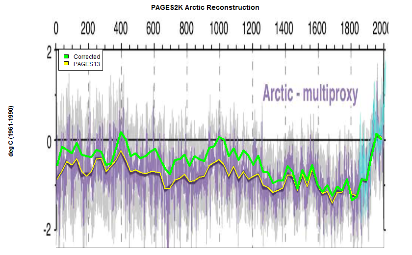
Figure 1. Excerpt from PAGES2k-2013 SI showing the PAGES2K Arctic reconstruction (yellow – 30 year averages), with the corrected version (30 year averages) shown in green.
In the original article, the following was highlighted about the Arctic reconstruction:
The Arctic was also warmest during the twentieth century, although warmer during 1941–1970 than 1971–2000 according to our reconstruction.
This is not true of the corrected version, in which the 20th century is only the third warmest (after the 5th and 11th centuries). I’ve shown code in the comments supporting this statement. Update (Oct 28). Reader MikeN observed that the above statement does not say that the 20th century is the warmest, but that it was warmest in the 20th century. Re-examining the paragraph, the authors were discussing 30-year periods, which are also the points shown in the graphic illustrated above. However, even with this interpretation, the PAGES2K assertion is no longer valid after the changes, though the authors would have been entitled to say the following:
According to our reconstruction, the Arctic was warmer during 1941-1970 than 1971- 2000, with AD1941-1970 values being only slightly lower than the record maximum in AD381-410 and AD1971-2000 values being only slightly lower than in the medieval periods AD981-1010 and AD1011-1040.
I do not conclude anything from these squiggles in terms of the actual past history, only that the above claim is untrue on their data. Because the Arctic reconstruction had the largest Stick of any of the components of the overall PAGES2K reconstruction, the overall average will also be impacted.
Discussion
Although the relative position of the 20th century to earlier centuries was highlighted in the original article, McKay and Kaufman did not retract or amend the highlighted assertion. Instead, they chose to report that the revisions have a “fairly minor impact on the relative variability” of the reconstruction – true enough, but this was not a point of particular import – and that the cooling trend was “amplified” – also true enough, but evasive of the required correction:
Overall, the database revisions have a fairly minor impact on the relative variability in the reconstruction, but they do affect the long-term trend (Figure 2). The primary change is a relative increase in reconstructed temperatures for most of the record, especially between AD 1-1300. This results in an amplified long-term cooling trend that preceded 20th century warming; 0.47 °C/kyr in the revised reconstruction compared to 0.29 °C/kyr in the original. Decadal-scale variability in the revised reconstruction is quite similar to that determined by Kaufman et al. 7; however, the variability is about twice as great in the revised PAGES Arctic 2k reconstruction (Figure 2d). This is likely due the averaging and scaling procedures used in the earlier study [7].
I will discuss their observation that their decadal-scale variability is “quite similar” to that of Kaufman et al 2009 in a forthcoming post, in which I will show that the assertion is tautological, rather than containing fresh information. It turns out that 16 of the 18 most heavily weighted proxies were previously used in Kaufman et al 2009 and that overall 80% of the weight of the PAGES2K reconstruction comes from Kaufman 2009 proxies. Thus, no wonder that their decadal variability is similar.
By far, the largest contribution to the very large changes comes from a single proxy – Hvitarvatn, the orientation of which was reversed in the corrections. (I’ll look at relative contributions in a forthcoming post.) I drew attention to this problem within days of publication of PAGES2K. (While I was writing this post, I noticed a contemporary ClimateBaller sneer at me for “obsessing with little details of individual proxies, ignoring the whole picture as usual”. However, the “little detail” of using Hvitarvatn upside-down had a dramatic impact on the Arctic reconstruction, quite aside from the importance of Hvitarvatn in establishing perspective on both Iceland and regional temperature history.)
Thus far, Kaufman has failed to issue a corrigendum, instead choosing (and being permitted by Nature so far) to report errors in a fresh publication. I can understand why academics prefer to have a new paper on their CV, rather a Corrigendum, but failing to correct errors in their place of publication distorts the research record. Mann got away with this in connection with the flawed no-dendro reconstruction of Mann et al 2008, where errors were acknowledged deep in the SI of a different paper (thus providing cover if challenged), but without any record of the error at the source, thereby permitting results known by the author to be erroneous to continue to be cited even in EPA documents.
In addition, McKay and Kaufman only reported the new paico reconstruction, but did not re-do the other PAGES2K Arctic reconstructions (e.g. “basic reconstruction”). Because the Arctic region is relatively highly weighted in the overall average and because it has the largest Stick, changes to the Arctic reconstruction will have knock-on impact on the overall average, which likewise needs to be recalculated by the authors. I’ve written to Nature, asking them to require a Corrigendum. We’ll see what happens.


45 Comments
As an observer of this debate, this kind of non-reporting of important results leads me to distrust the mainstream scientific reporting. I especially look forward to hearing what Nic and Steve have to say about this. Thank you for your work Steve. It is sobering.
“The Arctic was also warmest during the twentieth century, although warmer during 1941–1970 than 1971–2000 according to our reconstruction.”
Interesting that in the lower 48 states the period
1941 to 1970 is generally seen as a cooling period,
with a rebound in temperature from 1970 to about
1998, and then relatively flat since then. So, the
warmest period in 2000 yrs in the Arctic is………
a generally cooling period?
Understand, you are comparing proxy reconstruction vs instrument data.
The reliability of the proxies and their manner of employment (which way is up?) makes the reconstruction quite dubious and, as you point out, contradicted by extrapolation of instrument data.
As governments have enabling legislation and regulation in place regarding their preferred climate policies (outside of Canada and Australia for OECD countries), it almost seems as though it doesn’t matter how bad the papers are.
It really seems that if the drumbeat continues–enough to justify what has already on the books–it can serve as confirmation, more to comfort each other than to convince any with doubts.
I know that on almost every thread somebody says something similar to this, but I guess it’s my turn today. Mr. McIntyre, what you are doing is both good and important. It’ll probably take a couple of decades for that to be acknowledged outside the blogosphere, but it’s true nonetheless.
I can only second Tom Fullers remarks. Here in Denmark due to the comming climate meeting, Danish DMI and GEUS has filed a report stating that flooding above 1,7m will happen every year in Copenhagen, and every heavy rainfall is due to climate change and hence antropogenic, despite IPCC states the opposite.
This is madness on a grand scale. The only way is to expose the errors and bias one by one, as here with the now not-so-hockey-stick looking hockey stick.
Thanks, Steve.
Excuse my ignorance, but what exactly is a “Climateballer”?
Click on the link in the post and you will quickly understand what a “climateballer” is.
“…you make up the rules as you go.”
Thanks SteveM for the link to the corrected 2K reconstruction. I have been doing some detailed analysis on this reconstruction looking at the individual proxies and the relationships between those series and the instrumental temperature series. I am always fascinated by the revelations that result from even simple-minded analyses of the temperature reconstruction proxies.
In another world and another time, I would think that the Arctic 2K correction would be a major news item with some serious writing about the implications – given, of course, that one has already concluded that the proxies are valid thermometers which I have not. If a sufficient number of these reconstructions and the revisions thereof start going against the consensus thinking on the extent of modern warming, I would suspect there might be a move within the climate science community to look seriously at the validity of the proxies in these reconstructions. It would be motivated by the wrong reason, but nevertheless it would be a step in right direction.
Am I misunderstanding something? On the graph the 11th century does not look warmer than the 20th century to me. Or should we look at the average and not the peaks? Though the first is hard to estimate from a graph like this.
Oops… Just realized, it IS averages. But still, how’s 11th century warmer than the 20th?
For those who are doubtful about my claim, here is the script generating the results. Again, I urge people not to take the position that any of these squiggles are “right”, but offer the calculations only to show that the claims in the article no longer hold after the correction. According to the revised squiggle, modern values are very similar to values around 989-1040 and 380-440, but they are still only squiggles.
loc="ftp://ftp.ncdc.noaa.gov/pub/data/paleo/pages2k/arctic2014temperature-v1.1.txt"

download.file(loc,dest)

work=read.table(dest,skip=89,sep="\t",header=TRUE)

p14a=ts(work[,2],start=work[1,1])
average=function(x,K=30,del=0) { #average of time series in steps K with del being offset to even division
y= K* floor( (del+c(time(x))) /K) -del
return(ts( unlist( tapply(x, factor(y) ,mean,na.rm=T) ) ,
start= (K/2)+ min(y) ,freq=1/K))
}
sort(average( window(p14a,end=1999),K=100),decreasing=TRUE )[1:4]
# 400 1000 1900 900
#-0.1289 -0.1481 -0.1661 -0.2026
For those who asked about 30-year averages:
round(sort(average( window(p14a,end=1999),K=30,del=10),decreasing=TRUE )[1:10],3)

   380    1940     980    1010    1970     410     110     950      20     920

 0.172  0.141  0.061  0.012  0.010  0.007 -0.065 -0.142 -0.150 -0.169
Re: Steve McIntyre (Oct 28 11:41),
And with that observation, Squiggilian Logic, a new specialty area in the mathematical sciences, one specially adapted for use in climate science applications, is born.
Calculating the 100 year averages from their numbers I got for the last 100 years an anomaly of -0.1522 C. The period 401-500 was warmer -0.1409 C, but years 1001-1100 marginally cooler -0.1561 C. Shifting by one year to 1000-1099 makes the period warmer (-0.1488 C), but that way we cannot form 20 full periods of 100 years from their data.
Another check was now possible. I compared my calculation to theirs. Normalizing to minimize the difference gave almost identical results. Remaining differences may all be due to rounding. Comparing my calibrated results didn’t make sense, because I don’t have same instrumental data for calibration.
Steve: their 30 year structure was for thiry year periods 1971-2000, 1941-1970,….
Sven:
Remember, the 11th century is the century from 1001 to 1100. Even a “Mark 1 eyeball” suggests that the cool start of the 20th century pulls down the 100 year average – the 11th century is consistently warm-ish (no sharply cold periods).
Thanks David, that’s what I thought. Was looking at the peaks too much
“…changes to the Arctic reconstruction will have knock-on impact on the overall average…”
…with the overall average no doubt being consistent with CO2 warming, despite the fact that this reconstruction, in either version, stands as a refutation to any claim that CO2 is some sort of control knob.
But here is where the reconstruction is really important: if the original version had folks thinking that re-establishing dairy farming in Greenland might be profitable, this should get them to reconsider.
Question – both the corrected and the original (green v yellow) are based on 30 year averages. Is the tempature spike post 1850/1900 reflected in this graph also based on a 30 year moving average or on thermometer records with or without the 30 year smoothing. Same question with regard to MHB98, MHB 99, Mann2008
Steve: smoothing method depends on the article. PAGES2k appears to have simply used 30-year averages (not rolling). Gaussian smooths are common in Briffa’s work. Mann 2008 used butterworth filters as smoothers. MBH either used Hamming or butterworth filters. Forward padding methods also vary.
Steve – I probably should have added the second part of the question – Would the post 1850/1900 temp spike look as dramatic in the graphs if the various versions of the smoothing were applied through out the series, including after the point when the thermometer records we substituted for the proxies? thanks for any clarification.
Did MBH use both or is the filtering unknown?
“ClimateBaller” is a variation on “CalvinBall” from Calvin and Hobbes – which is a game in which the rules are whatever the player wants them to be at any time, i.e. “made up as you go along.”
http://calvinandhobbes.wikia.com/wiki/Calvinball
I normally just lurk since almost everything here is beyond me, but what is this recurring “upside-down” business? Is it seriously being claimed that some people think a proxy indicates the exact opposite sign of temperature change than other people think? How could such a controversy not totally invalidate the proxy as measuring anything at all, in any way?
What am I missing?
In a word, yes, though I don’t particularly like Craig’s explanation as the Hvitarvatn problem is different.
The Hvitarvatn (Iceland) varve thickness series was used by PAGES2K authors with thick varves being interpreted as evidence of warmth. However, Gifford Miller, the original author of the Hvitarvatn series, had interpreted thick varves as evidence of the glacier being nearby (cold in the Little Ice Age0 and thin varves as evidence of glacier being in retreat (medieval and earlier). Supporting this interpretation, Miller reported ice-rafted debris during the period of thickest varves in the early 19th century. I had written several posts on Hvitarvatn, even prior to PAGES2K, and pointed out the discrepancy.
My concern over whether the fundamental question of whether thick varves are evidence of cold or warmth has been sneered at by my critics as “obsessing with details”. However, it is an important detail, particularly when these varve series have been incorporated into most of the recent multiproxy reconstructions (ljungqvist included) without directly assessing the validity of whether thick varves indicate warmth or cold.
This is one’s first instinct, but I’ve actually found the Hvitarvatn series to be quite instructive in picturing regional climate. The Hvitarvatn varve series and the Big Round Lake, Baffin Islanf series have enough in common that I think that they show a common signal and can be used as building blocks in a coherent interpretation. The problem for the PAGES and multiproxy crowd is that presently they are interpreted oppositely: thick varves at Big Round Lake are interpreted as warmth. So Baffin Island and Iceland, by implication, have symmetrically opposite climate histories.
I find the coinciding of ice-rafted debris and thick varves to be a good signature. I think that one has to take care about leads and lags, since glaciers take time to respond to warmth. So thick varves require both that a glacier be nearby and that it be receding because of warmth. With care, I think that there is information. However, the handling of this data in Kaufman’s article is total nonsense.
I really appreciate your response, esp. since I suspect I speak for others of the “lightly informed” persuasion.
It still seems incredible to me that anyone could purport to plot a graph showing alleged temperature changes down to the tenth of a degree, where there is this level of disagreement as to the underlying physical processes. I imagine that the average lightly informed person thinks there is some equation relating the proxy to the actual change in temperature. Clearly that isn’t the case here. Whether you are right or others are right, the most it could possibly say is “this year was warmer than last”. I don’t see how if one party thinks it means warmth and the other party thinks it means cold, either party can think they know exactly how much growth or shrinkage represents exactly 0.01 degree Celsius.
And, thank heaven somebody is “obsessing over details”. Don’t really know how anybody thinks they have peer reviewed anything where that is a complaint.
You put your finger right on the problem, admkoz, with your inference that there be, “some equation relating the proxy to the actual change in temperature.” There isn’t.
The whole field is a negligent substitution of ungrounded statistics for non-existent physics. I have a paper coming out pretty soon in Energy & Environment discussing exactly that problem, among others.
The entire consensus AGW climatology runs on the same neglect of detail, when valid science, as Steve McI has both shown and implied, is all about the detail.
Re: admkoz (Oct 28 13:22), I predict that this statement will become a classic:
Re: Climate Science
The whole field is a negligent substitution of ungrounded statistics for non-existent physics
Pat Frank
just Sayin…
Energy Research is not much different.
RE: Steve McIntyre
” . . . My concern over whether the fundamental question of whether thick varves are evidence of cold or warmth has been sneered at by my critics as “obsessing with details”. . .
Has the varve thickness issue not been confirmed (or denied) by those scientists using shell/fish bone isotope ratios for temp proxies? I’m among those that (reasonably, I think) believe as far as varve thickness goes, as per temp proxy, it has to be one way or the other – everywhere – or not useful at all, if that’s not the case. But then again, as my wife points out (all too often) I’ve been wrong before.
There surely has to be a way through this that allows commonsense judgments to reign but still preserves the integrity of statistical science. I’m thinking of an analogous situation where one would read such statements as “Wednesday is the wettest day of the week” perhaps bolstered with some spurious statistical significance test. Inevitably the latter would be based on randomly drawn independent values and forget that one of the days has to be the wettest and there was no a priori or physical reasoning behind the hypothesis that it should be a Wednesday. Statistical bona fides are preserved by noting that the sample is that of the largest of seven randomly drawn variates, an entirely different population.
The same issue commonly arises with teleconnections where the time step, lead time, the sign and the location of the leading variable are again not prespecified or graced with any logic and is why so many teleconnections shine brightly for a while and fade into uselessness.
What might save statistics reputation in the current case would be to consider the multiproxy not to be just some random sample but test its significance as the post hoc maximum correlation of a large sample of possibilities with no a priori reason for preferring one over any other. So if a multiproxy was a combination of 5 proxies then the post analysis chosen one could be evaluated against a sampling distribution of the maximum of 2^5 samples with zero correlation with the calibration set.
“… it has to be one way or the other – everywhere – or not useful at all…”
Not in the speshul world of climate science. You’d also expect that all proxies of the same type would have to be selected a priori. In climate science, being speshul, we can drop the inconvenient series post hoc and everyone is happy as long as your result supports the consensus.
This is because we already have a large body of previously approved “evidence” to show who’s right.
Sadly, the above appears to represent the state of the art in climate science in the early 21st century. Alas.
They didn’t say the 20th century is the warmest, they said it was warmest in the 20th century.
Mike N said: “They didn’t say the 20th century is the warmest, they said it was warmest in the 20th century.”
Hmmm, re-reading the exact context, you are right that they are not talking about 100 year averages – in context, they are talking about 30-year averages, but this doesn’t help them as their statement is still incorrect as it stands.
Here’s a longer context for the sentence:
Re-stating their Arctic sentence in this vein, they would have been entitled to say:
I’ve added text to the main post to reflect this point. The overarching point is that the changes were not changes around the edges, but substantive changes. .
I suspect it is an error, but they said ‘consecutive 30-year periods’, which refers to 60 years. It has to be this interpretation, because otherwise they have not looked at ‘all consecutive 30 year periods’. You have 981-1040 warmer in this case as well.
My interpretation of their use of ‘consecutive’ is that they want to emphasize that the periods are not overlapping.
OK , that makes sense. They should have used a word like distinct or separate or nonoverlapping.
Are the proxies temperature sensitivity tested up against local historical measured temperatures to check correlation factor before they are used in a reconstruction?
I’ve downloaded the data that was linked via Steve’s article, and presume that it is the latest manifestation of McKay and Kaufman’s work, and that it represents the average that they have arrived at by their methods of treating the individual proxies. Very interesting reading/studying! The essence of the data is I suppose their column headed tempanom-ann rather than the 025 and 975 columns, which presumably represent a confidence region.
I attempt to describe what I hope are the large-scale features of the data, leaving aside the highly technical aspects of individual proxies, their orientation and their general reliability. They are too complex for me to examine in a competent fashion.
If you’ve made your own plots of this data column (against age_AD) you will have noticed that they show what looks very like a “hockey stick” pattern for the last 500 or 600 years. Prior to that there is a rather indeterminate period of generally rising temperatures.
What I recommend is first that you think in detail about the period of say 20 years before and after 1920. In particular, focus on 1922. Analysis of the complete data by generating its cusum (relative to its mean) will show a very sharp discontinuity at 1922, just recognisable in the original data when you know where to look. The cusum, backed up by linear regressions on both sides of 1922 reveals that at that date there was a change point of +1.0C. Since then up to the latest data (2000) there has been only minimal warming, statistically significant at way below the 95% criterion, approx 24%. Two stable periods – one having a highly significant and fairly steady decrease and the following one with a non-significant trend are separated by a step of about 1 deg C. by Prior to that dividing year the slope of the data is -0.0048C per decade, with standard error 0.00071, probability well below 10E-6. There is no hockey stick.
The 1922 change occurs in many other Arctic data sets. It is virtually inescapable though rarely noticed in the literature that I have read.
The data also disclose another time of sudden change, 1258, at which date an abrupt change of about -0.4C occurred. This perhaps associated with the real beginning of the LIA. The mysterious 535 “event” is also captured in this data. In the next period, up to about 1000, a brief cold period occurred, but for 200 years, 750 to 950, the grand scale pattern is of stability and relative warmth followed by an abrupt change to a stable even warmer regime lasting to about 1050.
These proposed interpretations of the Mann and Kaufman data can be readily verified by fitting regressions over the periods mentioned. My belief is that it is not informative to fit a linear model over prolonged periods that are clearly (graphically) not linear.
In my study of the individual proxies that were used in the 2K Arctic temperature reconstruction, I took to heart the suggestion that proxies can vary considerably because local temperatures and trends from which the proxy data is derived can vary over a considerable range. I do some checking in the Arctic zone with some station data from KNMI and found that indeed there is a wide range of temperature changes in this zone and that it is most pronounce from progressing from longitude to longitude. In fact when one does pair wise correlations of stations those stations separated over large longitude differences can actually have significant negative correlations. The correlations noted here are all without detrending or taking first differences.
With these above difference in mind, I looked at 2 stations in close proximity to each of the 57 individual proxy locations in the 2K Arctic reconstruction using the GISS adjusted mean temperatures from KNMI. I did pair wise correlations for the period 1880-2007 for one of the station series for each proxy in Group 1 and the same for the other station series for each proxy in Group 2. I then compared those pair wise station series correlations with those for the proxy pair wise series from the same locations. In effect the pair wise comparisons between proxy pairs are now taking into account the location differences. One would expect from an array of 57 valid temperature proxies to see a reasonable correlation of these station to station and proxy to proxy correlations. The results were not encouraging, however, with the Group 1 correlation of the station to station and proxy to proxy correlations having a correlation of r=0.017 with a p.value=0.56 for 1107 station to station and proxy to proxy data points. Group 2 showed nearly an identical result with r=-0.017 and p.value=0.55 for 1108 data points. The scatter plots for both Group 1 and 2 are linked/shown below.
It should be noted that the station and proxy data did not necessarily cover all the years between 1880-2007, but the average correlation was with 68 years of data. A correlation with less than 5 years was not made. Also to make the estimate conservative I used the absolute value of the correlations in order to avoid the issue of assigning the correct sign for a proxy.
In my continuing effort to better understand the temperature proxies used in the more prominent published reconstructions and in the context of the basic flaw of directly or indirectly selecting proxies based on the ex post fact measured correlation with the modern instrumental record, I have recently been studying the Kaufman Arctic 2K (A2K) reconstruction individual proxies.
I have compared the proxy correlations with temperature and pair wise amongst the individual proxies. It is easy to show that even the reasonably high and significant correlations between proxy and temperature series that exists for a small portion of the proxies does not necessarily produce a relationship whereby one could confidently expect that high correlation to be a useful indicator of decadal or longer trends. It is these trends that after all are the critically important use made of the proxies in reconstructions.
For the Arctic zone reconstructed in A2K the local temperature changes can vary over a wide range. I have compared the difference between the temperature series from close neighbor temperature stations and compared that difference to the difference I see in similarly situated proxies of the same types. In most cases the difference in the decadal structure of the proximate proxy series is greater than for the series of proximate temperature stations, however the variation of series from nearby stations remained a bit troubling for me.
In the end I decided to use data from the best behaved proxy with regards to higher correlations with temperature (at a nearby station) and other like proxies. The proxy I selected was the Grudd tree ring proxy. Tree ring proxies are in turn calculated using many data points from the measurements of individual trees and thus one has many individual proxy responses from the same location and with the reasonable assumption that the temperature changes over time are the same for all these trees. The Grudd tree ring data used in the A2K reconstruction were taken from the ITRDB linked here:
http://hurricane.ncdc.noaa.gov/pls/paleox/f?p=518:7:0::NO:::
ftp://ftp.ncdc.noaa.gov/pub/data/paleo/treering/measurements/europe/swed334.rwl
It should be noted that the tree ring data that I used in my analysis are derived as noted here from the Grudd meta data:
“Biological trends in the data were removed with autoregressive standardization (ARS) to emphasize year-to-year variability, and with regional curve standardization (RCS) to emphasize variability on timescales from decades to centuries.”
I have plotted all the individual tree ring series and found that on visual examination the basic structure of these series from the same time period could have 3 or 4 patterns with decadal differences in trends. What was a bit surprising was that the composite calculation using all the available tree data for a given year yielded a composite with relatively narrow confidence intervals. I started looking at 150 year periods and when I saw what appeared a very regular cycle in the data I took all the Grudd tree data from year 9 to year 1999 and did a spectral analysis using the ssa function in R (library Rssa) to decompose the composite time series. The results are summarized in the first link below and show two prominent and significant cycles (as determined by the spec.pgram function in R) at approximately 250 and 60 years. The residuals are white/red noise that can be best modeled by ARMA(5,0) (see the second link below which also shows the number of individual trees used in the analysis).
Now, I would not accept the conjecture ,without independent evidence, that these Grudd tree rings are responding faithfully to temperature and doing it consistently over time, but if, apparently like the authors of these reconstructions do, it is surprising that no mention is made in the literature that I have searched about this cyclical pattern in the Grudd data. It presents a picture of the climate in that part of the Arctic as being very predictably made up of repeating cycles and white/red noise and without evidence of the effects of AGW. Alternative views of the data might lead to conjecture about the cycles being an artifact of the standardization processes used on the tree ring data. A quick review of the literature on temperature cycles brings forth the Atlantic multidecadal oscillation which supposedly oscillates between 60-70 years. There are some rather far out there conjectures on a 250 year solar cycle but nothing reported seriously in the literature.
I want to next do the same kind of analyses on the other tree ring proxies used in the A2K reconstruction.
Continuing with my analyses of the Kaufmann Arctic 2K proxies(A2K), I have concentrated on the tree ring proxies and primarily since it is those proxies that have, as a group, the best correlations within the group and with the instrumental record. What I want to show here is that these proxies look very different in the decadal and centennial range of trends. Further the proxies appear differently in the frequency domain. I found the best measure of what I want to show can be derived from the use of Singular Spectrum analysis. I used the ssa function from R (library Rssa) with a window of 10 years for the 14 A2K tree ring proxies and a 100 year window for the composite of all 14 TR proxies. The analysis uses eigenvectors to decompose the series into cyclical, secular trend and residual white/red noise. My interest here was to plot the 14 proxy and composite series with the secular trend and then ARMA model the resulting white/red noise residuals. The result of those analyses are in the links below.
It is rather obvious that these proxies, while having reasonably high correlations on a pair wise basis, look very different under the closer scrutiny that SSA provides. I have searched for similar use of SSA analyzing tree ring proxies, or other types of proxies for that matter and have found the first link below referring to 0.4 to 0.8 degree longer term oscillations in various type proxy series – including tree rings. They conclude that those oscillations can be translated to historical temperature oscillations, but that holds only if it assumed the proxies are responding to a temperature signal. The second link below talks about SSA and composite tree ring lower and higher frequency cycles but that does not address the issue I raised here about differences amongst proxies. The third link below studies once again a composite and thus does not discuss the issue of differences in individual proxies. I need to do more literature searching in looking for the question I have posed in my analysis here.
http://onlinelibrary.wiley.com/doi/10.1029/97GL00319/pdf
Click to access D’Arr.Labr.pdf
Click to access CP-v_Sett’08.pdf
Kenneth Fritsch has presented some interesting information on correlations of proxy pairs.
Over time I have formed the view that ordinary linear correlation coefficients are seldom really useful in the context of climate, though correlation plots may give a useful impression of the associations between pairs of variables. What may be missing is that other vital component of climate data, the fourth dimension, time. These diagrams are I think, integrations over the time of the observations, and to me it seems probable that one would expect most correlations to be rather small. The data of most interest are surely those in the top right quadrant, and I’d guess that Kenneth has looked pretty closely at at these.
I wondered about the development of contours on the plot, indicating specific boundaries of significance level. These would presumably be a series of roughly arc-shaped lines at varying distances from the origin. Would this have some interpretative value?
Something else I’ve noticed is that the values of the data appear to be at discrete intervals along both axes. Am I right in this? This is only curiosity of course! It has no practical significance.
Robin, please note that the pair wise correlations of station to station locations are very dependent on the longitudinal separation of the station locations. Using the same proximate pair wise locations of the proxies to estimate a correlation one would expect that those station and proxy correlations should in turn have some reasonable correlation if we assume the proxies were responding reasonably well to temperature. That the correlation is not significant should tell us something about the proxy response. Further that we can see a higher correlation from proxy to proxy location where the temperature stations at the same locations have a low correlation indicates how easy it is to obtain a spurious correlation.
The upper right region of the graph consists mainly of pairs from some tree ring and dO18 proxies. I am currently doing some analyses on the best performing proxies with regards to correlation to local temperature. I am not sure I understand what you mean about time dependence but a significant and reasonably high correlation between temperature and proxy or proxy and proxy can be misleading in terms of what one sees when comparing the series of the temperature record and proxy response over an extended period of time. Those series can diverge from one another over decadal periods of time and yet have higher and significant correlations. That becomes problematic when looking at warming/cooling trends in comparing the modern and historical periods.
I am currently thinking about analyzing these proxy to instrumental data by using difference series and then looking for breakpoints and trends in the difference series.
I just wish that those doing temperature reconstructions would take a more detailed look at these relationships. I am sure they are capable of doing these analyses better than I.
Many thanks, Kenneth, for your reply and explanation. The world of climatology is replete with conundrums, some of which I suspect are due to the beliefs/wishes of investigators rather than clear thinking and unbiased exposition of observational science.
Yes, now that you point it out, I understand that the high correlation pairs are probably a result of fairly close relative positions. Seems obvious now!
Something that I have not yet found out is how many observations are involved in typical correlations. This is because I have not attempted to access the original numbers. For me it would be a considerable task, I think. Should they all have effectively the same numbers of observations, it would be possible to construct probability contours, which might just be enlightening.
In my trials, taking the Arctic 2K data in the link as being the considered outcome of McKay and Kaufman, I find it very difficult to believe that they had not noticed that since 1922 there has been no measurable increase in their data. Have you an opinion on this?
Steve: they reported that their 1941-1970 period had higher values than their 1971-2000 period.
I have a question. David Suzuki is in press today saying it looks like 2014 is going to be the hottest year on record. I google global temperatures and find most climate sites if not all seem to support him. Where I live, Ontario, the past two years have been the coolest I remember. Ever. Certainly in the summer. Are we being given a bill of goods here or is there general agreement on this year’s global temp?
The eyes in the skies
Cool the fever of lies.
=============
2 Trackbacks
[…] https://climateaudit.org/2014/10/27/the-third-warmest-arctic-century/#more-20170 […]
[…] mention the elephant in the room changes in their reconstruction (as discussed at CA here here), they reported with some satisfaction that “decadal-scale variability in the revised […]