In a recent RC post entitled “Ice Hockey” and a recent Nature article, Steig and coauthors have introduced a novel and very baroque “hockey stick”, one without a blade. A true Halloween of horrors: in addition to Gergis’ zombie hockey stick, the bladeless Hockey Stick of Sleepy Hollow is now at large.
The appearance of Steig’s bladeless hockey stick was apparently so horrifying that he dared not show it in the RC post. However, I believe that CA readers are made of sterner stuff and will be able to withstand the sight of even a bladeless hockey stick, which is shown below.
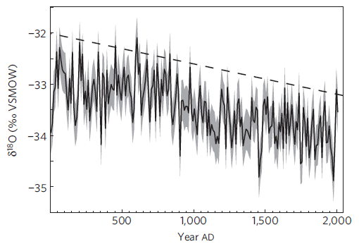
Figure 1. Steig et al 2013 Figure 3. Original caption: Decade-average d18O from the WAIS Divide ice core for the past 2,000 years. Grey shading shows 2 s.d. about the decadal mean, based on the upper 100 years of the multi-core d18O composite, providing an estimate of the 95% confidence range. The dashed line shows the 97.5 percentile value relative to the average linear trend.
Steig described d18O values in “recent decades” as “highly unusual”:
Our results thus show that, indeed, recent decades in West Antarctica, which have been characterized by very rapid warming, and very rapid loss of ice from the West Antarctic Ice Sheet, are highly unusual.
Steig also asserted that there was a “strong trend” in O18 values in the past 50 years, which was, according to Steig, “largely driven” by high values in the closing portion of the series. Here’s his exact language:
Our results show that the strong trend in δ18O in West Antarctica in the last 50 years is largely driven by anomalously high δ18O in the most recent two decades, particularly in the 1990s (less so the 2000s).
It seems odd to say that the supposed trend was “largely driven” by higher values in the closest portion: how would one get a trend without higher closing values. For comparison, here is a detail of the WAIS d18O record (plotted from PAGES2K data) for the past century. Values in the 1990s were locally elevated, but values in the 1970s were the lowest in the entire record, contradicting Steig’s claim about “recent decades“. Nor is the “trend” since 1950 even statistically significant. Indeed, the values in the 1990s appear more like a fluctuation, as opposed to a “trend” (let alone a “strong trend”), particularly given the subsequent downtick in the 2000s. Nor is this data set is one that any reasonable person would compare to a Hockey Stick.
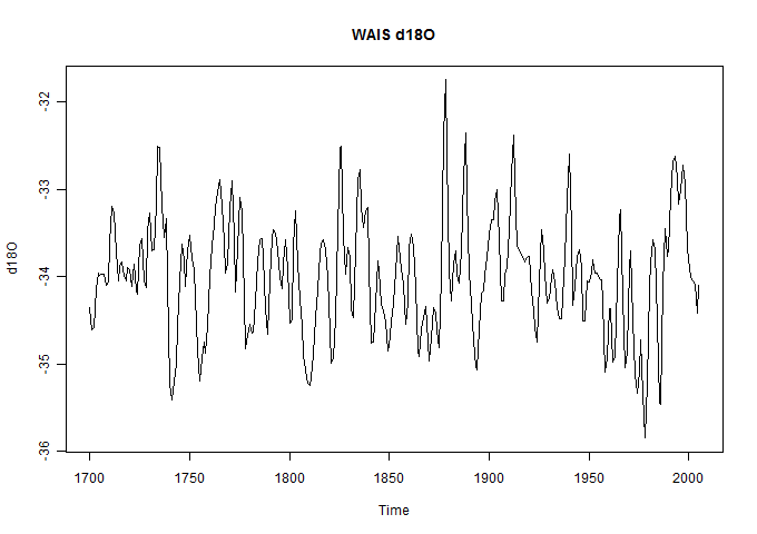
Figure 2. Modern portion of WAIS d18O.
Even with the most liberal allowance for imprecise language and lack of statistical acumen on the part of “real climate” scientists,
Considering decadal averages (as Steig did), the 1990s were far from being “highly unusual”. They were at the 77th percentile within the data set: slightly elevated but not “highly unusual”. The average of values to date in the 2000s were at the 15th percentile!
Although Steig conceded at RC that the recent results can’t be considered “unprecedented”, he purported to deduce from this data that similar results occurred only once per century and were “probably” a harbinger of ice sheet collapse in west Antarctica:
What we’ve observed is unusual, but it is also dominated by decadal climate variability, and can’t be considered “unprecendeted”…
Looking at the very long term record from the WAIS Divide ice core, it appears that similar conditions could have occurred about once per century over the last 2000 years. Hence our answer to the question, “are the observations of the last few decades a harbinger of continued ice sheet collapse in West Antarctica?”, is tentative: “Probably”.
While the 1990s did indeed have the highest value in their century, as noted above, they were far from being “highly unusual” in the context of the data itself. Even within the past three centuries, the slight downward trend persisted and the 1990s appear more as a fluctuation than a “trend”.
From this very unpromising bladeless hockey stick, Steig was hard-pressed to support alarm, but did his best. Steig even claimed that the long record showed that recent values were “anomalous” over the past two millennia:
Analysis of the long record at WAIS Divide shows that d18O in West Antarctica is anomalous not only with respect to the past two centuries, but also with respect to the past two millennia.
… Decadal-average 18O values comparable to the 1990s in the WAIS Divide record are reached on only four occasions in the past 1,000 years (Fig. 3). Before 1,000 years ago, modern decadal-average 18O values are reached more frequently, but these are superimposed on a declining trend attributable to the influence of Milankovitch orbital forcing and ice flow. Assuming that the decadal variability is independent of orbital forcing, we calculate d18O anomalies relative to the long-term trend (dashed line in Fig. 3). Anomalies in d18O similar to those of the 1990s occur just twice in the past 2,000 years; assuming sampling error estimated from the multiple shorter records, comparably elevated 18O values were reached about 1% of the time.
Watch the pea here.
Steig is not talking about the d18O values that people are actually interested in, but in values after subtraction of the long-term trend. These are plotted below. The residual for the 1990s is indeed relatively large, but there is nothing to suggest that it is “significant” – particularly allowing for the unexceptional nature of the residual for the 2000s.
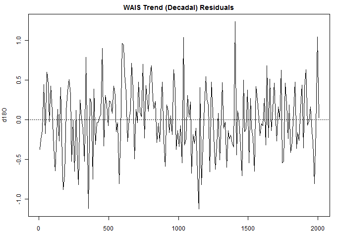
Figure 3. Trend residuals.
Steig’s RC post glossed over the long-term decline in d18O values. A commenter challenged him as follows:
1. Would it be correct to say your δ18O data indicates a decline over the past 2,000 years, thus the WAIS has cooled over the past 2,000 years?
2. The abstract says, “However, δ18O anomalies comparable to those of recent decades occur about 1% of the time over the past 2,000 years.” This appears to be only in relation to the declining δ18O trendline. Would it be correct to say that if compared to the mean δ18O of the past 2,000 years, the anomalies of recent decades would actually still be negative in comparison to the mean?
Steig responded testily that pointing out this relevant point was “tiresome” when the answers were given in the (paywalled) paper that few readers would have purchased:
[Response: Yes and yes. It is a bit tiresome answering questions whose answers are given unambiguously in the paper. Read it, please! The mean cooling is consistent with Milankovitch forcing, and is not particularly relevant to the question of atmospheric circulation and glacier anomalies.–eric]
The article itself made an armwaving reference to Milankovitch forcing as follows:
Before 1,000 years ago, modern decadal-average 18O values are reached more frequently, but these are superimposed on a declining trend attributable to the influence of Milankovitch orbital forcing and ice flow [13, Neumann et al 2008 JGR].
Unfortunately the citation did not establish that the declining trend was “attributable” to Milankovitch forcing and ice flow. Indeed, it contained no reference whatever to Milankovitch forcing.
Steig’s RC article also discussed a dataset from the Antarctic Peninsula which showed increased melt in the 20th century. Steig rhetorically asked
Why the difference between the Peninsula and the WAIS?
After all, both locations are warming at about the same rate.[linking to Steig et al 2009]
Of course, Steig et al 2009 is no authority at all for the proposition that the Peninsula and West Antarctica are warming at about the same rate. As discussed in blog posts at the time and in O’Donnell et al 2010, Steig et al 2009 had simply spread Peninsula warming to West Antarctica through faulty math. But even when confronted by his own adverse d18O data, Steig refused to raise the possibility of the correctness of the criticisms of his flawed math.
There are a few points on which I agree with Steig. Steig argued that there was merit in single proxy rather than multiproxy studies:
Amidst the continuous chatter in the blogosphere about the strengths and limitations about “multiproxy” studies, these studies may be a refreshing return to simpler methods relying on just one type of “proxy”: data from ice cores. While ice core data aren’t perfect proxies of climate, they come pretty close, and aren’t subject to the same kinds of uncertainties that are unavoidable in biological proxies like tree rings.
I substantially agree with Steig that there would be great benefit of focusing on single classes of proxy. Steig also pointed out the potential benefit of focusing on d18O data without translating it into temperature- a tactic that seems eminently sensible to me and which I’ve employed from time to time at Climate Audit. Reconstructions of past d18O seems like a very worthy enterprise to me.
Steig claimed that his paper placed recent changes in a “longer-term” context:
Both our paper and that of Abram et al. add to our understanding of recent climate, glacier, and ice sheet changes in Antarctica by placing them into a longer-term context.
Again, I agree that Steig et al 2013 places recent changes in a longer-term context though not necessarily with the conclusion that Steig desires.


80 Comments
Link to the RC post isn’t working. This seems better
Hi Steve,
I was the commenter at RealClimate noted above in your post who challenged Steig and received the “tiresome” reply.
I then attempted to post the following followup comment [twice], but Steig deleted it twice. Apparently too many inconvenient questions for the Team.
(Re #4)
1. Thanks for your reply and clarifying here that the WAIS has cooled over the past 2000 years. I did read your paper and did not find any mention of this, leaving it for the reader to infer from looking at the trend of d18O in fig 3.
2. If the WAIS has cooled over the past 2,000 years due to Milankovitch, and Milankovitch forcing will continue to decline at 65S for several thousand more years, why the cause for alarm about collapse of the WAIS?
2. The abstract says “d18O anomalies comparable to those of recent decades occur about 1% of the time over the past 2,000 years”, but fig 3 shows d18O anomalies comparable to the highest levels of the 1990’s have occurred at least 30% of the time over the past 2,000 years, and much higher percentages for d18O anomalies comparable to the average value of the past 50 years. Your paper states, “Before 1,000 years ago modern decadal average d18O values are reached more frequently” – perhaps around 50% of the time.
Likewise, the paper says “Decadal average d18O anomalies comparable to the 1990’s in the WAIS Divide record are reached on only four occasions in the past 1000 years,” but in actuality this happened many more times in terms of the absolute values of d18O.
3. Why isn’t the mean cooling “relevant to the question of atmospheric circulation and glacier anomalies”?
4. What do you calculate the change in annual mean insolation forcing at the WAIS was over the past 2000 years? Your paper does not mention this, and the single sentence mentioning Milankovitch references paper #13, which itself does not have a single mention of Milankovitch forcing.
5. d18O anomalies have declined since the 1990’s – what is the explanation for this despite a steady increase in greenhouse forcing?
“2. If the WAIS has cooled over the past 2,000 years due to Milankovitch, and Milankovitch forcing will continue to decline at 65S for several thousand more years, why the cause for alarm about collapse of the WAIS?”
A similarly powerful debunking of alarmist spin appeared on Tallbloke’s Talkshop on the 16th:
“If the negative phases of natural variations are sufficiently geo-effective in the 21st century to cancel the alleged effect of extra airborne co2 on surface temperature, how much did their positive phases contribute to the warming of the late 20th century?”
I would think the Milankovitch argument uses Insolation at 65N and not South, even for climate in Antarctica. You will usually find a Milankowitch 65N insolation plot with an Antarctic icecore temperature plot together.
Peak summer insolation at 65N has decreased by about 50W/m2 over the last 11000 years, it is now at a bottom but will not go up a lot in the next 20000 years.
Insulation at 65S actually increased by about 24 W/m2 over the last 11000 years but this appears to be less important even for Antarctic climate.
Synchronicity of Antarctic temperatures and local solar insolation on orbital timescales
http://www.nature.com/nature/journal/v471/n7336/full/nature09825.html
Hockey Schtick
I do wish you well-meaning folks would stop posting at RC. Go back and read your interaction with Steig as if you’ve never seen them. It will look like he wins and you are an idiot … and indeed, anyone who posts there gets the same treatment. ALL YOU ARE DOING IS ADDING TO THEIR PRESTIGE AND PAGE COUNT!
Discuss the issues here, and leave them to rot in obscurity. It’s not like you’re going to change Steig’s mind, or that of most RC denizens. They are there because they desperately want to believe … and seeing you (seemingly) vanquished by Steig just assists Steig in the flimflammery. You’ve reduced yourself to an extra in his script, my friend … your choice, but I wouldn’t do it …
All the best,
w.
Willis:
I can certainly see your point – on the other hand, if the poster (as is the case with Hockey Schtick here) retains copy of the deleted post, it can provide (additional) compelling evidence of their inability to debate on issues and questions of substance. The points raised seem more than fair in the context of the paper as delivered – Steig’s failure to address these issues(indeed, his active suppression of the questions themselves) is telling.
cheers,
Hockey schtick’s comment went to the bore hole, for all to see, but followers at Realclimate probably never go there. Or do they, maybe after being pointed in that direction from here, go there? 😉
The Borehole
Which part of Hockeysctick’s comment wasn’t sensible?
Of course they were sensible. They should change that description to: A place for sensible comments that would otherwise disrupt Climate Change Scientists’ conversations from staying on point for ‘the cause’.
I asked Dr Steig if Paul’s comment had been placed into the borehole by accident and if so could he reinstate and answer the comment or tell us why it was irrelevant or off topic.
Unsurprisingly, I found my comment in the borehole
you’ve got to laugh at them really
My follow up question was simply deleted
Willis,
Whilst I have some sympathy with your comment, comments posted on RC and other alarmist web sites are on occasion useful.
When I started to look into climate science, I was a warmist because of some good BBC documentaries in the 1980’s and early 1990’s. Climate Audit was the first site I came across. And by reference, I also found RC.
Evidence of people posting at RC and being deleted helped me to decide what was propaganda and what was real.
That and the fact that an open warmist, at the time, Judith Curry, was given space to post and comment here.
I owe a big vote of thanks to our host, Steve McIntyre, for opening my eyes and to the commenters here for educating me.
Thank you.
/ikh
Yes, indeed.
There’s a loss of statistical heft
And prestige when your warp and your weft
Are pushed far to one side:
We’re along for the ride
But your site here has shifted far left
===|==============/ Keith DeHavelle
Willis>
But then again, all he’s doing is adding to their page count and (dubious) prestige. That we’ve a pretty good idea how they’ll respond doesn’t mean we can’t take the moral high-ground and do things properly. The right thing to do is to give them a chance to answer polite questions, even when we know they’re going to throw it back in our collective face. The loss we suffer, or gain they accrue, is so minor as to be not worth thinking about.
I agree
Why would Willis even bother about the ‘impression’ left with the faithful followers as they try keeping their feeble narrative look as if it’s still ständing upright?
The days when RC mattered to the debate are long gone. Every one who wants to know, knows that RC need to delete comments and for that purpose. Let them keep doing it. ANd let’s remind them over and over again elswhere.
No scientist worth his salt will condone this practice instead of arguing a position on its merits or responding honestly to valid chriticism. Not in hte long run .. certainly not when they see the pattern
Steve’s latest demolishing of Steig is perfectly clear and properly aligned in my old version of Safari on a 2008 MacBook Air.
Re: Timothy Sorenson (Apr 23 20:37),
The problem is apparently not under our control. Nothing has changed in our theme or our CSS.
WP.com is working on it…
Your first sentence would appear to apply to more than just the appearance of this blog in web browsers 😉
I’ve got a barrel half full of bladeless hockey sticks in the garage. They work well as garden stakes and horse correctors.
The posts are now coming up properly-centered now on my Firefox.
The double down meme of “the warming is being masked by the cooling” continues.
In a previous post at RC, Steig stated that his data showed that the recent Antarctic warming was largely driven by increased arrival of storms from warmer climes. I pointed out that increased storms was not the same as polar amplification, which is the physical phenomenon predicted by AGW, and asked whether he could find support for polar amplification in his data. He responded that the patterns were way too complicated to shake out that level of detail. So the warming that is being masked by the cooling cannot even be attributed to AGW with any confidence!
Well, in case the major indices are flat in a year or so and the magic Santer 17 years of significance is reached, what’s the over under on Santer falling back on “it’s really warming, we just can’t see it with all the natural variability”?
Thanks everyone for your patience. (Obviously) the site display issue is solved. (Turns out a new setting was added. They guessed wrong in setting the default for our site, and didn’t inform about the change.)
Thanks, MrPete! So much easier, now that the “Recent Comments” are readable once again.
Now the mobile version isn’t working.
Appearance->mobile->enable mobile theme.
Re: jeez (Apr 23 22:18),
need to design a mobile version… need a few round tuits 🙂
It’s not just a checkbox? It is on Anthony’s and others.
Re: jeez (Apr 24 13:58),
The checkbox is already enabled. Behind the scenes, there has to be something connected to the checkbox. Our site is 100% custom (CSS) design… and when designed there was no such thing as a “mobile theme” 😉
I get it. It would be nice to get back though. I don’t think I’m unique in checking this site regularly on my phone.
The RSS feed for has stopped working for new posts
This feed used to be a bit hit-and-miss, but has been working consistently for a while up until now.
I find it remarkable that in Climate Science, all time series are no more complex than a linear trend plus noise, even responses to Milanković forcing. This line comes to mind: “There are more things in heaven and earth, Horatio/Than are dreamt of in your philosophy.”
Pete, thanks for fixing this.
I have serious doubt about the attribution to a ‘declining trend’ (over the last 2k years) to Milankovitch cycles. It is my understanding that total solar variation due to these cycles is bounded by .7% with the least cycle being 26k years. Hence the total solar variation over a 2k cycle is approx .07% Can someone explain expected delta C for such minimal variation? It can’t come close to being observable, is it?
Steve: Milankovitch has seasonal impacts on a 1-2000 year basis. The declining trend in NH proxies has been attributed to Milankovitch as has the declining trend in SH proxies. I haven’t parsed these arguments tho.
Esper et al 2012 observed that JJA high northern insolation increased since Roman times and that this ought to be noticeable in the proxies – an excellent observation that I’ve been meaning to discuss for ages.
As time flows down its lazy river, it is beginning to appear that the 90’s, the decade hosted the Super Duper Monster Ultimate ’98 El Nino, were an exception rather than the rule.
did you see in the comments where eric claimed that proxies were as well correlated with each other as temperature stations are..
Steven,

When BEST took many pairs of weather stations and did correlation coefficients of the temperature series between then, there were correlations above 0.5 at distances above 1,500 km. I can’t get this type of correlation coefficient by the simple dodge of taking one station and lagging the temperatures by a day (that is, simulating a temperature system moving one day further on.
Can you recall whether this graph used daily, monthly, annual, smoothed or unsmoothed data?
Was it an ordinary or rank correlation?
Intuition would place the correlation coefficients much lower. Autocorrelation within a single station series might exert an influence. Do you have any thoughts about why the correlations reach almost 0.9, which I think is improbable? It’s a reasonably important topic because weighting can be derived for between-station infilling etc.
When BEST took many pairs of weather stations and did correlation coefficients of the temperature series between then, there were correlations above 0.5 at distances above 1,500 km. I can’t get this type of correlation coefficient by the simple dodge of taking one station and lagging the temperatures by a day (that is, simulating a temperature system moving one day further on.Can you recall whether this graph used daily, monthly, annual, smoothed or unsmoothed data?

It would not be daily data. The first stage of data processing is to de-duplicate station iadata and then to construct monthly data from daily data where daily data is availble ( back to the 1800’s ). So before any processing is done on the data and prior to ingest into the system, daily in turned into monthly. The correlation is done on data where stations
have at least 10 years of overlap and after seasonality has been removed.
“Was it an ordinary or rank correlation?”
I’ll have to wait till I get home to check the actual code but I would guess ordinary.
“Intuition would place the correlation coefficients much lower. ”
well, the numbers we got were exactly in line with Hansen and with other studies ( CRU has 1 we discussed at Air Vent ).
“Autocorrelation within a single station series might exert an influence. Do you have any thoughts about why the correlations reach almost 0.9, which I think is improbable? It’s a reasonably important topic because weighting can be derived for between-station infilling etc.”
I’ve seen 99% correlations between stations within the same state. I will say that we’ve got some work underway to refine this bit looking at local scale
Geoff, relatively high correlations are common between weather stations. Correlations based on higher frequency variations such as monthly and annually data can be in the 0.70 to 0.90 range and yet the trends in the differences between these station temperature anomalies can be significant and large. It is easy to simulate series where this is the case. This phenonena is also seen in the debate about whether to use detrended correlations of proxy responses to temperatures. One can obtain reasonably good detrended correlations between proxy response and temperature and yet have a proxy divergence problem.
I think these observations should put less emphasis on correlations and more on trends – of course, depending how the analysis is being used and applied which is in turn based on the relative importance of low and high frequency responses and temperature differences.
Kenneth,
It’s almost as if there is a mathematical factor operating to enhance the correlation coefficient. I’ve racked my brains and can’t find it.
I tried this method for a single station:
Click to access Extended%20paper%20on%20chasing%20R.pdf
Seems to me that the low coefficients coming out of this type of study make it hard to get higher coefficients when you use two separate stations. As to 99% correlations between nearby stations as Mosh notes, maybe this is because one station was infilled from the adjacent station and nor clearly recorded that this was done. In Nature, 0.99 is very, very rare for a correlation coefficient.
geoff.. as I recall we published the correlation at length = 0 around .87 which gave us a monthly error ( all sources) at .46C .
yes .99 is very rare.. you have to hunt for it, basically long ago I used to look at california agri sites and test them against GHCN nearby sites. mind numbing.
I assume in Fig 2, 1878 is the highest peak?
HADCRUT4 certainly thinks a peak exists then.
It’s only a little bit unbladed.
From Steig on RC: “With δ18O data alone, it was possible to demonstrate only that recent warming on James Ross Island was “unusual”. The new paper, led by Nerelie Abram, adds a record of melt layers in the ice core to the assessment. The findings: a veritable Antarctic ice hockey stick.”
After this I commented #25 that this James Ross Island is very far from central continental Antarctica an closer to South America and its (marine) Drake passage: most people will confuse it with the well known Ross island with the US base McMurdo much closer to central Antarctica.
For me this destroy that hockey stick as “Antarctic”: the site is not representative at all.
In the same Penninsula tip neighborhood is Deception Island, a tourist spot for steamy volcanic bathing.
Palmer perspires.
==========
It is even “worse than we thought”: “James Ross Island, situated on the east (Weddell Sea) side of the northern tip of the Antarctic Peninsula (at c. 64°09’S, 57°45’W), is a large basaltic volcano with a shield profile. It has a basal diameter of 35-60 km and a summit (Mt Haddington) at 1500 m and it is the largest volcano by far in the Antarctic Peninsula region, and one of the largest in Antarctica. The island dominates the southern end of a large dispersed volcanic field composed of numerous satellite centres, mainly small monogenetic edifices of glaciovolcanic tuya type, whose products are known as the James Ross Island Volcanic Group (JRIVG).” See http://www.volcano.group.cam.ac.uk/volcanoes/james-ross-island/
Great location to monitor air or water temperatures!
More evidence that Steig’s favorite “Antarctic” hockey stick site is not representative:
“Early Pliocene cheilostome bryozoans are preserved in a glacigenic diamictite at Cascade Cliffs, James Ross Island, northern Antarctic Peninsula. Several different marine bryozoan genera were incorporated into the diamictite during Pliocene ice advance(s). Bryozoan zooid-size Mean Annual Range of Temperature (zs-MART) analysis provides estimates of seasonality which suggest
that mean annual marine temperatures for the James Ross Island region varied by at least 4.3°C and possibly by as much as 10.3°C during the Early Pliocene. This represents much greater seasonality for the northern Weddell Sea than seen at the present day (MART ca 2°C)” http://www.micropress.org/micropen2/articles/1/6/39670_articles_article_file_1689.pdf
Aaaaaaaaargh. Now I’m going into a crise du coeur. :))
Steig 09 is mentioned in the SI of the PAGES2k paper as the target for Antarctic proxies. Presumably different proxies would have been included if target was O’Donnell 10? (I know zilch about proxy reconstructions – I’m assuming the target is a temperature series with with the putative proxies are to be correlated?)
While it is on the other side of Antarctica, Mawson base would be subject to many of the same influences like Milankovitch cycles and altered circum-polar winds. Lat/long -67.6014, 62.8731, 9.9 m above msl.
The following graph (acknowledgements to Australian Bureau of Meteorology) shows that the maximum temperature at Mawson has scarcely changed over the period 1955-2012. The least squares linear fit is there to help the eye only, amid a lot of noise.
It would hardly make a blade on a hockey stick of longer term, to use the vernacular.
Climate Audit page format is centered just fine now, thanks. IE10, Windows 7 Ultimate.
I’m seeking permission to use a photo taken by another, showing a white iceberg with several deformed layers of deep jade green striping across it. One comment ascribes the green (which might be 500mm thick, but hard to tell) to the refreezing of melt water penetrating cracks. To me it looks more horizontal in its original emplacement.
To those with polar experience, either Pole – I have none – are plausible melt water refreezes a common sight in icebergs?
Sounds like layers of blue ice. Blue ice is ice that is free from air bubbles and consists of large ice crystals. It can form in several ways. Glacier ice at depth (>100 m) is usually blue ice, surface snow that has melted and refrozen to ice would probably form blue ice too.
Is the iceberg from the Arctic or Antarctica?
tty
From Antarctica. It’s the first time I’ve seen possible pictorial evidence for melt water there. I don’t think it’s the same as blue ice. The photographer has not responded but the image is on a web site at
http://www.panoramio.com/photo/7468792
I hope the photographer does not mind bypassing the courtesies I’d like to extend. He’s experienced in the Antarctic through work on supply vessels.
Thank you tty,JCM & Howard.
Beautiful photography.
My zero-in direction is towards coloured striations formed from ice on the elevated Antarctic Plateau, not from glaciers, but more plausibly from melt water. I’d thought it too cold for melt water to form on the Plateau, but I’m not experienced there. Such items might not exist and be known not to exist, So I’m probably looking for rare exceptions.
If someone talking warming postulated that ice is melting on the Plateau, we need some idea of what it looks like and whether it had happened in the past. This is but one way to look at that.
IMO, sublimation is likely to be more common than melting. If that is the case, then what happens to oxygen isotopes?
I have seen many bergs with the blue bands off Newfoundland. This link to bergs calving at Ellesmere Island shows ” Interesting color pattern from nearby icebergs calving from the main ice island; the striped pattern is caused by re-freezing of melt water layers.”
see :
http://www.ec.gc.ca/glaces-ice/?lang=En&n=ADDB6928-1
Thank you JCM. Has anyone seen this postulated melt water banding in the Antarctic? The photo of the berg I showed was at sea at 68° 34′ 28.57″ S 77° 56′ 43.49″ E East Antarctic, near Davis base.
It poses some problems if such features are found in ice cores. The time axis is messed because one does not know how long the melt layer or any other disconformity was exposed. The response axis, be it oxygen isotopes or whatever, is potentially messed up also, because the melt can come from a source with different isotope properties. (Note that an error of this type is not statistical and should be treated as bias).
The distortion of the layers is also a problem for those matching hole to hole, even close together.
I suppose that serious drill cores are taken where there is no evidence of melt layers or disconformities. This would mean drilling in very cold places, but then part of the purpose of the drilling is to discern how cold it has been, so there might be some circular logic. If you select a high altitude site to drill, there are other complications.
It’s beginning to look like the evolution of understanding of tree rings and their multiple response factors as Eric says – if the Antarctic is warm enough to allow these problems.
Iceberg p0rn
http://webecoist.momtastic.com/2009/12/08/freeze-between-the-lines-30-amazing-striped-icebergs/
Here’s some photos I took while cruising off the Antarctic Peninsula 20 years ago.
You can draw your own conclusions.
And this one just for fun (Yes I took this).
‘Nor is the “trend” since 1950 even statistically significant’ this is climate ‘science’ where such ideas , standard for any other area , are not needed .
All they need is ‘faith’ and the ‘right results ‘ and facts be dammed if facts don’t support ‘the cause ‘
I have this vision of the RC reader looking initially at the Steig bladeless Hockey Stick, much like vampires might view a cross, and involuntarily averting their gaze. I think, however, that RC readers are made of sterner stuff and will be able to zero in on that 1956 to late 1990s trend as some saving grace. Perhaps even Steig can reconcile Steig (09) with that late swing up no matter that those swings look like a natural pattern in that series. Do not sell the RCers short – if there is a hint or a sniff of a HS they will find it and they will sell it.
Let’s see if the following makes it through the censors!
“Adam Gallon says:
Your comment is awaiting moderation.
24 Apr 2013 at 11:47 AM
Care to show figure 3 from your paper too?, just to put this into context over a 2,000 year period, just to show how unusual the last few decades have been, of course!
Can’t have allegation of cherry picking being levelled at you.”
It seems altitude might give a fright
When the ice cores are analyzed right
Taken into account
Greenland core values mount
In the Holocene’s handle hump height:
===|==============/Keith DeHavelle
Geoff
From my 2 weeks trip to Antarctica (West) virtually all icebergs I have seen showed this green (actually more blue than green) coloration.
I haven’t seen any as large as the one shown on the picture but the smaller ones I have seen were mostly blue.
This cannot be easily seen on the continental ice sheet which is covered by snow but is clearly seen on icebergs.
So you are probably right, the structure of ice especially if it is near enough to the border (which is where the icebergs come from) to be submitted to thawing, contains actually layers of different physical properties.
Not being a glaciologue, I cannot say what influence this has on O18 concentrations but the phenomenon clearly exists.
It looks like whitish noise superimposed on the down trend. It would be interesting to spectrum analyze the detrended O18 data, then test for whether the noise is stationary.
This proxy flunks the scary proxy test. What you want to have is a proxy that gradually decreases in temperature over the last 1 to 2 kyrs. Check. You can say there is somekind of long-term cycle that is driving that. No problem. Notice that the temperature variations in the last 2 kyrs are about +/- 2 deg C from the local average. What you then want for a good stick is then a massive spike in temperature shooting up in the 20th century. Its good if one of the local spikes during the later 20th century even pops up as high or higher than anything in the past. The quickness of this rise is also important. If it takes 250 to 500 years to gradually make it back to the previous high temperature mark, it is likely that some natural process is driving it. If it happens very quickly then you can argue that it must be 1) man-made and 2) unprecedented and 3) dangerous. For this reason, you need to filter out the very slow, DC component in the first figure above, and go with the deviations. What you don’t want to see is any real large dips in temperature in the last part of the 20th century. Sorry about that. Unfortunately, this proxy is lacking in most of the above mentioned
attributes. No unprecedented recent temperatures, a big dip in temperature in the recent past. I think that 20th century instrumental temperature data from Phoenix
(pick your city) needs to be grafted to give it some fright. This proxy aint going out on the street come Halloween.
Looky what I found…
http://www.nature.com/news/announcement-reducing-our-irreproducibility-1.12852
Obviously targeted at Life Sciences so no need for a “Climate Science is exempt clause” until someone notices it should also apply elsewhere
The point is that Nature Slagazine has admitted that it has a problem with papers that depend on statistical analysis. Admitting that you have a problem is the first step to recovery. One brick at a time…
Yes but we know that Climate Scientists have had a compelling reason for exemption. It goes along the lines of
“Why should I make the data available to you, when your aim is to try and find something wrong with it?”
We also know that when journals have mistakenly forced data to be made available then amateurs make a huge fuss
over not much
On the other hand in the Life Sciences it is well known that small datasets and sample bias are a problem which Climate Scientists believe would not apply to Climate Science with its huge highly robust quality sample sizes and specially tailored statistical techniques
Click to access bmj00471-0011.pdf
Nice Sera! Hope others check this out. Can’t believe its true. Keep thinking its someone’s idea of a joke on followers of CA:)
Jason Scando commented on the announcement and asked the right questions:
http://www.nature.com/news/announcement-reducing-our-irreproducibility-1.12852#comment-57828
Amen!
Amen Brother!
Steve showed Steig’s straight stick.
Steig shall stay silent.
Stacey (Apr 27 03:52),
“Steve showed Steig’s straight stick.
Steig shall stay silent.”
Skeptics Scoff!
Interesting (albeit lengthy) NYT piece on a serial academic fraudster…a renowned social psychologist in the Netherlands.
Not sure the analogues are perfect to climate science, but I noticed more than a few passing similarities.
“… continued ice sheet collapse …”
A “continued collapse”? Not only do they torture statistics, they torture language as well. This emperor, no clothes he has – no statistical knowledge needed to see that.