In a twitter exchange among Jean S, Ronan Connolley and Tim Osborn, Ronan drew attention to an early spaghetti graph in a comment on MBH98 published by Phil Jones in Science on the day after (Apr 24, 1998) publication of Mann et al 1998. The Briffa reconstruction is in purple below. Like IPCC 2001, it hides the decline in the Briffa reconstruction (here a 1998 version) by deleting late 20th century values – here after 1950.
jones_comment-on=mbh98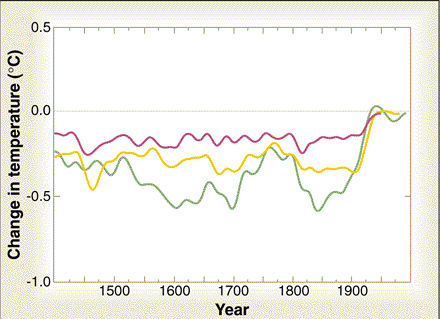
Figure 1. From Jones 1998 comment on MBH98. Orange – Mann et al 1998; green – Jones et al 1998; purple – Briffa et al 1998.
Jones stated that all three reconstructions “clearly show” that the 20th century is the warmest in the 600-year period, with the most “dramatic feature” being the 20th century rise:
Despite the different methods of reconstruction and the different series used, or alternatively, because a few good ones are common to all three series, there is some similarity between the series. All clearly show the 20th century warmer than all others since 1400. The dramatic feature of all three records is the rise during the 20th century.
Mann et al published a Reply to Jones’ comment in June 1998 (with Jones as coauthor of the Reply). They agreed that Jones’ spaghetti diagram “demonstrate[d] the the robustness of the conclusion that the 20th-century warming is unusual in the context of the past several centuries”L
The comparison shown by Jones between Mann et al.’s Northern Hemisphere temperature reconstruction (1) and two other recent estimates is useful in several ways. For example, it demonstrates the robustness of the conclusion that the 20th-century warming is unusual in the context of the past several centuries, on the basis of largely independent estimates.
However, these claims are based on hide-the-decline: Jones deleted post-1940 values of the Briffa reconstruction, slightly enhancing the effect of the deletion by smoothing with post-deletion values only. Jones noted this truncation in the caption to the figure, where he stated that “tree-ring density data show a decline since the 1940s unrelated to temperature [see (9 – Briffa et al, in press; 10 – Briffa et al 1998 (Phil Trans London)] for more details], and the curve from (9) ends at 1940”, a precaution not taken by Mann in IPCC AR3. In the next graphic, I’ve done a blow-up of the 1900-2000 portion of the graphic to demonstrate this. I’ve also shown the deleted values of the Briffa reconstruction (using the nhlmt version from Briffa et al 1998). This hide-the-decline incident is a year earlier than hide-the-decline in Briffa and Osborn 1999 and Jones et al 1999.

jones-science-1998-cropped
Figure 2. Blow-up of Jones 1998 comment on MBH98. Briffa version is nhlmt from Briffa et al 1998.
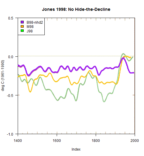
In the next graphic, I’ve plotted the complete series – no hide-the-decline. When the decline is shown, one feels that even a reviewer for Science or Nature would cavil at the assertion that the “dramatic feature of all three records is the rise during the 20th century” or that the conclusion that “20th-century warming is unusual in the context of the past several centuries” is “robust”:
jones-nature-1998-with-decline
Figure 3. Jones 1998 diagram, showing decline in Briffa et al reconstruction (nhd2 version rescaled on same ratio as nhlmt to nhd1 and re-centering to match visually.
Jones did make some sensible comments in his Comment that have not previously drawn attention. Jones observed that one should be able to easily extract relative importance of the various proxies, speculating that “much of their success, in a statistical sense” must come from tree rings:
The mathematical technique used by Mann et al. (3) to produce the reconstructions could easily be adapted to show which proxy series are the most important. Although Mann et al. (3) do not explicitly rank the various proxies, much of their success, in a statistical sense, must come from the large number of tree-ring width series used.
Jones’s observation was correct, but no one seems to have attempted extracting the contribution of different proxies types until I did so in 2004-2005. My analysis showed that the contribution of all proxies except bristlecones was little different than white-to-low-order-red noise and that the HS came from a very small subset of all proxies. The climate community has chosen to ignore this point.
Jones also made the sensible observation that each new class of proxy had to prove itself – a precaution immediately abandoned in favor of Mannian armwaving.
Each paleoclimatic discipline has to come to terms with its own limitations (6, 7) and must unreservedly admit to problems, warts and all. A particular issue for all ice core and coral series and some new tree-ring work is what exactly an isotope series (be it O, H, or C) tells us about past temperature. Sensitivity to temperature cannot be assumed; it must be proved with instrumental data on both interannual, and, where possible, on longer (more than 20 years) time scales (7).
I must say that I was a little intrigued to find an example of hide-the-decline a full year before Briffa and Osborn 1999 or Jones et al 1999, previously the earliest hide-the-decline example. In previous analyses of hide-the-decline, I’ve repeatedly emphasized that the technique of deleting data to hide inconvenient results originated with CRU (I’ve previously termed it “Keith’s Science Trick”). Mann knew of CRU’s deletion of the decline, but, as Lead Author of IPCC AR3, Mann willingly and enthusiastically participated in the hide-the-decline scheme, because he didn’t want to “give fodder to the skeptics” or “dilute the message”. But the technique originated with CRU and the “exoneration” of Jones, Briffa and Osborn on hide-the-decline by Muir Russell and Oxburgh was totally undeserved. (Nor does assignment of blame to CRU excuse Mann’s participation in hide-the-decline as Lead Author of AR3, where Mann and CRU both were culpable.)
Postscript: the twitter exchange also discusses the provenance of the Briffa reconstruction version in IPCC AR3 Figure 2-21. IPCC cited Briffa 2000 (QSR), while the actual version used in AR3 comes from Briffa et al 2001. Tim Osborn stated that the IPCC version matched the green LFD curve in Briffa (2000) Figure 5. This seems to be only partly true: the LFD curve has the same shape as the AR3 curve, but appears to be scaled differently.


122 Comments
Interesting that he wrote of the “success” of the tree ring proxies.
Steve: This seems to put Mann on the proverbial hot seat. As and when he is deposed by Steyn’s lawyers, wouldn’t they be at liberty to ask him what he knew about Jones’ “construction”?
Also I would certainly depose Jones on this issue among others to determine how much Mann knew about the modifications to Briffa’s data. It would be worth the expense.
I once helped win a lawsuit by having our lawyers depose a member of the Board of the company that was suing us because we knew that the board member understood the weakness of the CEO’s argument. It took less than two weeks for the case to be settled in our favor. I am pretty sure Jones would do anything to avoid such an exposure.
Phil could just move to Saudi Arabia to shelter himself legally, his new official affiliation on his latest up-adjusted publication announcing version 4 of the HadCRUT global average temperature plot being King Abdulaziz University:
http://mpc.kau.edu.sa/Pages-Prof-Philip-Jones.aspx
In and funded by a major oil exporting country.
Amusing.
There are many British in the Arab Middle East, including managing enterprises, so perhaps he’ll find help getting used to the society.
Goes back decades, a common term is “ex-pat” (ex-patriot, I suppose for those who stay a very long time).
Of course there were administrators in the Middle East when Britain was in charge of part of it after the Ottoman Empire was defeated in World War I (having sided with Germany), the “British Mandate” was in place from 1922-1948. They’d be retired by now.
But many are technical people who went more recently, I expect most are treated well, in contrast to labourers from areas like SE Asia who have little to go back to.
Actually, I missed that apparently he is just a visiting lecturer.
That’s common, of course hosts need to have the smarts to be careful who they invite.
“Center of excellence for climate change research”? Lol.
Sob. That’s Phil Jones’ tears, Steve.
==
The text of the figure does explicitly say:
” Tree-ring density data show a decline since the 1940s unrelated to temperature [see (9, 10) for more details], and the curve from (9) ends at 1940. “
9 is Briffa.
Steve: thanks for this. As you observe, in this original version, the truncation was noted in the caption. I’ve accordingly added the following sentence to the text: “Jones noted this truncation in the caption to the figure, where he stated that “tree-ring density data show a decline since the 1940s unrelated to temperature [see (9 – Briffa et al, in press; 10 – Briffa et al 1998 (Phil Trans London)] for more details], and the curve from (9) ends at 1940″, a precaution not taken by Mann in IPCC AR3.” Obviously, it’s even worse when the truncation is not even disclosed in the fine print (as in Mann’s section of AR3), but I obviously do not believe that hiding-the-decline is an acceptable technique in a scientific graphic. Had Jones shown the decline, even the seemingly credulous climate community would have placed an asterisk on the validity of the paleo reconstructions, which Jones, Mann and Briffa were then trying very hard to place on the radar of the climate community. Hiding the decline helped them do just that. AN implication of your observation is that Mann’s disclosure in AR3 was less prudent than in Jones’ original comment, but doesn’t vindicate hide-the-decline in either venue.
Re: Nick Stokes (Sep 7 00:43),
Nick Stokes, do you see how readily Steve accepted your comment and changed his post to reflect this. That is what a person of integrity does. My question to you is why do you seem to reflexively defend what everyone know is wrong? Is it that difficult for you to admit what is obvious to everyone?
I think we can stipulate that the Team fully disclosed their enterprise to their co-inventors. Further I think we can stipulate that the Team worked to improve the Trick over time — that early versions were relatively primitive and easy to spot. Certainly the early version of the trick were not ready to be sold to the public in Hollywood movies, UN art work or political campaigns. More engineering was required for those purposes.
The issue that keeps getting muddled in all of this is not whether the Team disclosed their ever-improving approaches to the rest of the R&D team. Rather, at issue is whether the Team was trying to trick the general public. That they could dress up their work to get it through peer review is not particularly important.
Were Steyn, et al justified to use a synonym for the word “trick” to describe Mike’s Nature Trick (among other things) in their articles?
Mann argues:
In effect, Mann argues that Steyn, et al made statements with “knowledge of their falsity or reckless disregard for their truth”.
Yet, with regard to Mike Nature Trick:
A. There is no controversy over the meaning of the phrases “Mike’s Nature Trick” and “hide the decline”
B. There is a controversy of the meaning of the phrases “Mike’s Nature Trick” and “hide the decline”
Statement A is objectively false, statement B is objectively true. Opinions vary. Mann’s argument fails as it related to Actual Malice, in my opinion.
Steve: little noticed is that word “manipulation” in Simberg’s post hyperlinked to the first CA article on Mike’s Nature Trick.
I wonder if it is possible to construct an evolutionary tree of the Trick from this newly discovered specimen Australopithecus Philicanus all the way to Modern Mann (IPCC AR3)? I know that Steve has written tons of articles about this, but a single graphic that shows how the trick evolved through genetic engineering rather than randon mutation would help.
Eoanthropus dawsoni
Graphus Erectus.
The text of the figure does explicitly say:
” Tree-ring density data show a decline since the 1940s unrelated to temperature [see (9, 10) for more details], and the curve from (9) ends at 1940. “
I’d really like to see any and all references why the post 40’s tree-ring density is unrelated to temperature, and all references about why the pre 40’s TRD is only related to temperature. Can you help me with that, NIck? Thanks!
It is curious that about three years later (2001), Jones, Briffa & Osborn make no comment about the truncation or the decline in their Science review-piece. Instead we have this caption:
A casual reader might think that the reason for the Briffa series to end in 1960 was given in the last sentence.
paging Mark Steyn’s lawyers
oh I forgot, Mann is exonerated because Jones is exonerated, everyone is nicely exonerated
IMHO, as I’ve said in other CA threads, Mann’s lawsuit is being pushed at the behest of the climate science community as a whole. Mann is their proxy plaintiff.
There is no “e” in Connolly.
You could have fooled me!
That the team got into ‘bad habits’ early is no surprise , it merely reflects their abilities. That this ‘bad habits’ where not caught out early , merely reflects how little interest, and money , there was in climate ‘science’ in those early days. That these ‘bad habits ‘ have not be corrected nor checked by those that should have acted has gate keepers , sadly reflects on the fact these ‘bad habits’ have proved very rewarding and the way ‘facts’ have lost out to ‘impacts’ in this highly politicised area .
When you get down to it , what would ‘the Team ‘ do without AGW, most would be lucky to get jobs teaching in a third rate high school so poor is abilities and so bad are their habits.
Excuse the dumb question but who is Ronan Connolly? I’m now following him on Twitter but a tweetstream can reveal someone pretty slowly and this appears to be highly significant find.
This is his website: http://globalwarmingsolved.com/about-us/
Thanks. I was ignorant indeed not to have known of them.
Would this be a good moment for an update to McKitrick & McIntyre Mar 2011?
I wish I could see the Twitter exchange. Sadly, blocked (like all your graphs) in China.
What did everybody say?
Here’s a copy on my Dropbox Tom. Does China have a problem with that? It’s time I knew 🙂
Have you looked into getting one of the secure VPN services like VyprVPN? They’re suppose to allow you to defeat this sort of thing.
Aside from keeping my enormous collection of selfies secure, Blackberry enables a bypass through the great firewall of China when you are connected to the BB network which functions as a type of proxy server for roaming data.I can use twitter and facebook with no problem in Fujian Province on my BB z10
Hi Steve
Would it be possible to have one summary article.. With all instances of hide the decline,etc
For anybody new(and not so new) it can be quite confusing.
A single summary article, graphics,who when and what happened would be very useful information.(for any passing journalist especially)
(Each instance Linking to each original analisis at Climate Audit)
Steve: I’ve been thinking about something like that. I looked at posts in the CA tags “trick” and “decline”, and I agree that there’s a need for a shorter and more focused exposition. This post distinguishes between Mike’s Nature Trick and “Keith’s Science Trick” but doesn’t really provide the sort of exposition you’re thinking of. My presentation to Heartland in May 2010 contained a lengthy exposition of the background to the “trick” – with many examples – but it’s not as concise as needed and, in addition, I’d revise it today in light of new information and analyses. If you look at CA tags “decline” or “trick”, you can locate many relevant posts, though my tagging is inconsistent. There’s a tradeoff between conciseness and comprehensiveness: a full exposition of the trick requires discussion of the Briffa bodge, but this goes well beyond clearing up the obfuscation.
It’s nice to see that the earliest truncation was so naively presented. It’s not even hidden.
There seems to be a nice progression of increased sophistication in presentation.
The earliest is direct truncation/display. Then there’s the more clever hide the surgery by plotting the truncated line behind another line. And do make sure to get the scaling just right.
Then there’s the even more clever Nature trick of adding the measurement record to the end of the truncation and smoothing the whole gemisch. It’s now hidden well under the bed, and no one can see it.
Now there’s real progress for you, climate-science style.
I think that in the ’90s, they never expected that any of this would ever be controversial. The increasing slickness of the concealment evolved as it started to become evident that there were curmudgeons who weren’t going to go along quietly with the program. The atmosphere was rather different back then, if you recall. It was “trust us; we’re scientists”. They had no reason to believe that that wouldn’t be enough.
I don’t want to confuse new readers any more, so if you don’t have already a clear idea about tricks, please skip this comment 🙂
But I think we should make an additional distinction to our taxonomy. Namely, Mann’s original trick was to extend the proxy series by the instrumental data but Jones did not only extend the proxy series in his WMO cover smooth (Phil’s combo trick) but he replaced existing proxy data values by instrumental values. Not only in Briffa’s series but also in his own series (for the interval 1981-1991, as can be understood from the original trick mail and confirmed from this). I’d propose naming this trick in honour of Tim Osborn, who wrote to Jones only 5 hours before the infamous trick mail:
Regarding all the misdirections spread by the usual suspects, I’d also like to draw attention to the email 0183.txt. From there it can be seen that Jones original proposal to Mann included already description on what they planned to do.
Mann seemed to have had no problem with that, instead of complaining he replied:
That was the time they barely had ZOD ready, but the lead author mike knew already what was going to be in the report.
Jean S,
even I wasn’t aware of Osborn’s email leading Jones into his notorious trick email. CG2 is still very incompletely assimilated. I don’t think that Osborn was ever interviewed separately by any of the investigations, even though he was very prominent in the emails.
I’d just come back to this thread to say thank you, with feeling, to Jean S. I’d been diverted by Matt Ridley‘s amazing “Will the real Jeffrey Sachs please stand up” postscript this afternoon. Sorry for the O/T reference but the wheels are surely coming off the casual-deception-for-the-Cause bus in both areas.
Of all the team members, Jones and Osborn always seem to me to be the ones most conscious of, most deliberate about, the improprieties they engage in. They seem to know what they are doing and seem to know that it is wrong. This makes them the best source for e-mails like the “Mike’s Nature trick.”
and yet now when they want to rationalize the hiatus, they are very quick to attribute the anomalous warmth in 1998-99 to El Nino.
re: 0183.txt
Isn’t one of the defenses (misdirections) about the Phil Jones cover graph for that WMO 1999 cover to say that it was an obscure and unimportant document? Yet, in this email we see Jones boasting about how important it is to get the data right because the doc will have wide circulation, more than twice as many copies as usual, etc. These guys can’t be honest about anything that might undermine their “narratives”….
Thanks Steve, and I don’t question that IPCC AR3 was far more influential; I was only pointing out that the “doesn’t matter” defense applied to the cover graphic of the WMO 1999 report is yet another instance of brushing away mistakes and misrepresentations with the “doesn’t matter” type of excuse.
Misdirection all the way down.
Another defense I’ve seen used is to assert that the WMO report is not a scientific document, ergo “no scientific misconduct”.
WMO is a scientific body under UNFCCC, I believe, and it’s publications are therefore considered scientific works.
thisisnotgoodtogo (1:27 AM):
I guess that’s true. “Established in 1950, WMO became a specialized agency of the United Nations in 1951” is one phrase that trips off google. There’s also this rather important factlet:
According to UNEP that is. Of course by 2001 the IPCC was making bigger PR waves than the other three acronyms put together, as Steve intimated.
Regarding the various “tricks” it strikes me that Briffa and Osborn look even worse when one considers their 1999 science article (quoted at link below) which contains an acknowledgement the lack of independence of many of the proxy records and studies. i.e., not only are they aware that they are up to dubious “tricks” but they are well aware of the weakness of the proxy records about which they are trying to be so misleading:
Briffa and Osborne, Science 1999
Steve,
I believe it would be highly useful to write a concise, easily understood summary. I have been reading climate blogs for about 6 years, and I originally thought that the divergence of the tree ring proxies was totally hidden by climate scientists in all of their papers. Didn’t realize that it was hidden in specific papers. (which is still a very dishonest practice)
The Hansenite wing of climate science is very skillful at obfuscation by switching topics in highly technical matters. This prevents people from focusing on simple basic acts of deceit and dishonesty. 99% of the public doesn’t have the time or inclination to parse out subtle distinctions, so there needs to be a simple, completely accurate, explanation of the more egregious acts and misrepresentations.
JD
Reblogged this on leclinton and commented:
Thank you for this Steve but really it is another HUMM moment in this sorry mess ;>)
IMO they do not even have the same shape, for instance, the LFD curve has a strong rising trend in 1400-1600 whereas the AR3 curve has declining trend. I can replicate both curves, and they definitely are not the same, and there appears to be no clear connection between the series (LFD curve data is in the “science3” tab here (h/t Steve) and the TAR series here).
Steve: I crosschecked these yeaterday to be sure. The green LFD curve is definitely a smoothed and rescaled version of the Briffa 2001 untruncated series (not available digitally until Climategate. As you observe, it doesn’t match the curve in the science3 tab of jonesdata.xls. I think that the jonesdata.xls version was used in Briffa and Osborn 1999, but I’ll need to check. The version in the Jones 1998 comment on MBH98 is definitely the nhd2 series, rescaled in proportion to the rescaling of nhd1 and recentered in some way that I haven’t figured out. I’ll try to do a quick housekeeping post on these versions while it’s relatively fresh in my mind.
How good is the correlation between the 3 curves? They appear to be demonstrating responses to very different stimuli.
Steve,
I’ve wanted to suggest something to you for a long time, but this may be the right time.
How about we bring back some of the oldie, but goodie, blog posts. A sort of walk down memory lane with the top ten posts. Perhaps some way to introduce the newly arrived folks to the posts that made Climate Audit world famous.
Just an idea for thought or discussion.
Thanks for everything you do!
Gregorio,
A desirable suggestion if it does not divert present effort too much.
Last week I revisited borehole temperature reconstruction. CA helps get to the meat more efficiently.
In order not to make it a new burden on Steve, what about having a new thread simply for reader nominations of “best post(s)” i.e., crowd source the effort to bring older posts to new scrutiny. That would not limit Steve or Jean S, et al. from anything they might choose to say about past posts; it would simply collate what long-time readers regard as posts they found particularly important, helpful, etc.
Readers with blogs might also consider creating a list of their own, easily linked, perhaps topical.
Certainly one can do much here from keyword searches, the “Categories” feature at upper left, etc., but this is more about highlighting a relatively limited number of past posts as most significant and/or explanatory to readers.
Yes, it would perhaps be better if people did their won summaries with links to top posts.
While I’m housekeeping, here is a script that shows that the Briffa nhd2 series from nhemtemp_data.txt, rescaled as its nhd1 series, with a centering bodge that I’ve done here by eye, matches the Briffa version in the Jones 1998 comment on MBH98.
#BRIFFA98 #MXD FROM NATURE UPDATED TO 1994
url=”ftp://ftp.ncdc.noaa.gov/pub/data/paleo/treering/reconstructions/n_hem_temp/nhemtemp_data.txt”
nhd=read.table(url,skip=58,nrow=653-58);
names(nhd)=c(“year”,”nhd1″,”nhlmt”,”nhd2″)
nhd=ts(nhd,start=1400)
fm=lm(nhd[,”nhlmt”]~nhd[,”nhd1″]) #reference 1881-1960
delta= mean(window(Briffas[,”CRU99″],1961,1990))-mean(window(Briffas[,”CRU99″],1881,1960))
fudgex=function(x) fm$coef[2]*x -.1
#fudge terminology adapted from CRU code. ,1 is manually calculated to match
#The purple line is from (9), the yellow line is from (3), and the green line is from (7).
#orange- 3. M. E. Mann, R. S. Bradley, M. K. Hughes, Nature 392, 779 1998).
#green- 7. P. D. Jones et al., The Holocene 8, in press.
#purple -9. K. R. Briffa et al., Nature, in press.
#from 1000 to 2000
library(XLConnect)
download.file(“ftp://ftp.ncdc.noaa.gov/pub/data/paleo/contributions_by_author/jones1998/jonesdata.xls”,dest,mode=”wb”)
A=readWorksheetFromFile(dest,sheet=2)
A[1,]
# Year Jones.et.al Mann.et.al Briffa.et.al
#1 1400 -0.4052 -0.425 0.2924
J98=ts(A[,”Briffa.et.al”],start=1400)
#smoothing utilities
source(“http://www.climateaudit.info/scripts/utilities/utilities.txt”)
f=function(x) filter.combine.pad(x,truncated.gauss.weights(50))[,2]
#Figure in png version
library(png)
loc=”http://www.climateaudit.info/images/multiproxy/jones_1998_comment/jones_1998_comment-on-mann.PNG”
download.file(loc,dest,mode=”wb”)
img98=readPNG(dest)
#setwd(“d:/climate/images/multiproxy/jones-1998”)
#img98=readPNG( “jones_1998_comment-on-mann.PNG”)
plot(0:1,type=”n”,xlim=c(1400,2000),ylim=c(-1,.5),axes=FALSE,yaxs=”i”,ylab=”deg C (1961-1990)”,xaxs=”i”)
rasterImage(img98,1309.7,-1.11,2011.7,.57)
axis(side=2,at=seq(-1,.5,.5),las=1);box()
axis(side=1,at=seq(1400,2000,200))
lines(f(trim(J98[,”Jones.et.al”])),col=”lightgreen”,lwd=1)
lines(f(trim(J98[,”Mann.et.al”])),col=”orange”,lwd=1)
#lines(window(f(nhd[,”nhlmt”] ),end=1950)-.1,col=”purple”,lwd=3)
#lines(window(f(nhd[,”nhlmt”] ),start=1950)-.1,col=”purple”,lwd=2,lty=3)
lines(window(f(fudgex(nhd[,”nhd2″]) ),end=1950),col=”purple”,lwd=3)
lines(window(f(fudgex(nhd[,”nhd2″]) ),start=1400),col=”purple”,lwd=4,lty=1)
legend(“topleft”,fill=c(“purple”,”orange”,”green”),legend=
c(“B98-nhd2″,”M98″,”J98”))
title(“Jones 1998: No Hide-the-Decline”)
#dev.off()
Jean S, here is an annotated version of Briffa 2000(QSR) Figure 5, of which Osborn said that the LFD curve is the same as the Briffa et al 2001 version used in IPCC AR3. In the graphic below, I’ve plotted the full Briffa 2001 series (Climategate version, not the amputated version archived at NOAA), changing reference from 1961-90 to the 1881-1960 of the diagram by adding the difference in the CRU temperature data in the contemporary version archived with Briffa et al 2001. I’ve shown this in the graphic below. The shape of the LFD curve more or less matches the shape of the B01 (CLimategate) version with a 50-year gaussian smooth, but the amplitude is reduced by 0.65. When the amplitude is reduced, the centering has to be bodged a little to match as well.
FIGURE 5 Briffa QSR 2000 An indication of growing season temperature changes across the whole of the northern boreal forest. The histogram indicates yearly averages of maximum ring density at nearly 400 sites around the globe, with the upper curve highlighting multidecadal temperature changes. Extreme low density values frequently coincide with the occurrence of large explosive volcanic eruptions, i.e. large values of the Volcanic Explosivity Index (VEI) shown #here as arrows (see Bri!a et al., 1998a). The LFD curve indicates low-frequency density changes produced by processing the original data in a manner designed to preserve long-timescale temperature signals (Bri!a et al., 1998c – Phil Trans Roy Soc Lond). Note the recent disparity in density and measured temperatures (¹) discussed in Briffa et al., 1998a, 1999b).
##SMOOTHING UTILITIES
source(“http://www.climateaudit.info/scripts/utilities/utilities.txt”)
f=function(x) filter.combine.pad(x,truncated.gauss.weights(50))[,2]
J98 DATA
#############
download.file(“ftp://ftp.ncdc.noaa.gov/pub/data/paleo/contributions_by_author/jones1998/jonesdata.xls”,dest,mode=”wb”)
A=readWorksheetFromFile(dest,sheet=2)
A[1,]
# Year Jones.et.al Mann.et.al Briffa.et.al
#1 1400 -0.4052 -0.425 0.2924
J98=ts(A,start=1400)
#Briffa 2001 Climategate version
############################
loc=”http://www.climateaudit.info/data/briffa/2001/recon_climategate.csv”
download.file(loc,dest)
work=read.csv(dest)
B01=ts(work[,2],start=work[1,1])
tsp(B01) #1402 1994
#reference 1961-1990
#B01 version for delta
###########################
url<-"ftp://ftp.ncdc.noaa.gov/pub/data/paleo/treering/reconstructions/n_hem_temp/briffa2001jgr3.txt"
Briffa<-read.table(url,skip=24,fill=TRUE)
Briffa[Briffa< -900]=NA
dimnames(Briffa)[[2]]<-c("year","Jones98","MBH99","Briffa01","Briffa00","Overpeck97","Crowley00","CRU99")
Briffa=ts(Briffa, start=1000)
delta= mean(window(Briffa[,"CRU99"],1961,1990))-mean(window(Briffa[,"CRU99"],1881,1960))
delta # 0.18758
B00(QSR) FIgure 5
############################
#setwd("d:/climate/images/briffa/2000")
#imgb=readPNG("figure_5.png")
library(png)
loc="http://www.climateaudit.info/images/briffa/2000/figure_5.png"
download.file(loc,dest,mode="wb")
imgb=readPNG(dest)
#reference 1881-1960
# setwd("d:/climate/images/briffa/2000")
#png("figure_5-annotated.png",w=720, h=560)
par(mar=c(1,1,2,1))
plot(0:1,type="n",xlim=c(1350,2010),ylim=c(-1.1,.3),axes=FALSE)
rasterImage(imgb,1364,-1.13,2022.6,.428)
abline(v=seq(1400,2000,200),lty=3)
abline(h=c(-.8,.2))
mtext(side=4,"deg C(1881-1960)",font=2)
title("Annotated Briffa 2000 (QSR) Figure 5",line=1.1)
mtext(side=3, "LFD Amplitude is 0.65*B01 Amplitude",line=.1, font=2,cex=.8)
work=ts(Briffa,start=1000)
bodge1=.65
bodge2=.1
#lines(bodge1*f(B01)+bodge2,lwd=3,col="green3") #1960
lines(f(B01)+delta, col="green",lwd=4)
legend("bottomleft", inset=c(.1,.3),fill="green", legend="Briffa 2001 unrescaled",cex=1.3)
#dev.off()
Re: Steve McIntyre (Sep 7 14:52),
VERY INTERESTING, see fig 5 here:
http://ecosystems.wcp.muohio.edu/studentresearch/climatechange03/elnino/Holocene%20trees.pdf
Jean S write:
For other readers, here’s what’s going on. There are two different versions of Briffa 2000 – with different Figure 5s in the two versions, each showing a different Briffa LFD version. That’s why Jean S and I were talking somewhat at cross-purposes: he was looking at one Briffa 2000 Figure 5 (in a published version) and I was looking at a different Figure 5 in what seemed to be the same article. How bizarre. The version presently at QSR has the Figure 5 that I showed, but the online versions of the article, including Jean S’ link show the other version. Here’s the other version”

it’s very odd. I wonder what went on in order to change the FIgure 5 after the article was seemingly published. Here is the “original” Figure 5 plotting the Briffa version from the Science3 tab of ftp://ftp.ncdc.noaa.gov/pub/data/paleo/contributions_by_author/jones1998/jonesdata.xls. The LFD curve is a rescaled and recentered version of this series: the plot is almost exactly 0.5 of the scale of the archived data.
As I discussed in a previous post, this version was also used in Briffa and Osborn 1999 and in the IPCC AR3 FOD diagram (late October 1999).
Re: Jean S (Sep 7 16:07),
As an aside, the conclusion of that paper gives an incredible opportunity to quote out of context, given revelations of the last few years.
However, as the above shows, the complete context is just more defensible, and not really that much better.
By way of a reminder on the significance of the CLimategate emails, it’s worth re-reading Clive Crook’s “conversion” experience in 2010:
http://www.theatlantic.com/politics/archive/2010/07/climategate-and-the-big-green-lie/59709/
“Climategate and the Big Green Lie”
“… the Climategate emails revealed, to an extent that surprised even me (and I am difficult to surprise), an ethos of suffocating groupthink and intellectual corruption.”
Joe Romm’s defamation of Clive Crook:
http://thinkprogress.org/romm/2010/07/21/206438/clive-crook-the-atlantic-michael-mann/
Romm, in defense of Mann, informs that “The Hockey Stick was affirmed in a major review by the uber-prestigious National Academy of Scientists (in media-speak, the highest scientific ‘court’ in the land),” and provides a link to RealClimate as a citation.
With comments, an excellent example of groupthink.
Also pertinent to the recent Mann vs. Steyn discussions here:
Crook notes,
“The Penn State inquiry exonerating Michael Mann — the paleoclimatologist who came up with “the hockey stick” — would be difficult to parody. Three of four allegations are dismissed out of hand at the outset: the inquiry announces that, for “lack of credible evidence”, it will not even investigate them. (At this, MIT’s Richard Lindzen tells the committee, “It’s thoroughly amazing. I mean these issues are explicitly stated in the emails. I’m wondering what’s going on?”) The report continues: “The Investigatory Committee did not respond to Dr Lindzen’s statement …”
“Moving on, the report then says, in effect, that Mann is a distinguished scholar, a successful raiser of research funding, a man admired by his peers — so any allegation of academic impropriety must be false.”[!!]
Quite remarkable. I hope Steyn and/or his lawyers are taking notes on the quality of Mann’s Penn State “exoneration.”
And the money quote:
” The climate-science establishment, of which these inquiries have chosen to make themselves a part, seems entirely incapable of understanding, let alone repairing, the harm it has done to its own cause. “
That’s a great column. As an objective authority, Crook is unimpeachable on this subject.
Pedantically, the 20th century increase seems to have happened. It did not depend on staying that way. A later decline did not eliminate the increase.
This comment does not condone the hide, but cautions against too much criticism of what was written about the increase.
I don’t recall any later discussion to explain the hide other than the ‘we did not use the data’ type comment. Was there ever a reasonable, published, scientific explanation for the decline?
We can but hope that ‘hide the decline’ publicity has reduced the number of copycat, later uses of this most undesirable manipulation.
Hi Steve,
Have you seen the follow up twitter discussion?
Steve: the original graphic used the version that was used in Briffa and Osborn 1999, which had a similar caption to the late 1999 Briffa (2000 QSR) FIgure 5. After Osborn and Briffa changed the LFD curve in Briffa (2000) to the version subsequently published in Briffa et al 2001, they notified IPCC Lead AUthor Mann that the series had now been published. Though the form of publication was very odd to say the least – an after-the-fact change to the pdf after publication.
Sue, that’s a tweet he sent after I notified Steve about it above and he had tweeted me:
Self snip.
BTW, he is yet to answer this tweet:
Here’s the email for the reference:
the fact that they would put the WMO graph (even as an “abstract” version of the unmarked curves) on their official CRU shirts does indicate that they considered that to be the “iconic” image for climatology at the time….
ofc Mann may claim that this iconic image has been vindicated by the so-called “exonerations” (sic) of CRU and of Mann himself, no matter how sketchy, incomplete, and dubious those inquiries turn out to be.
Steve: Mann’s position on the WMO1999 was that it was nothing to do with him and high outrage that he should be mentioned in the same breath. Neither CEI nor NR focused on Mann’s role in AR3 hide-the-decline as clearly as they ought to. Nor were they aware of Mann’s endorsement of WMO1999 and t-shirt request.
In referring to the use of the WMO graph on the CRU t-shirt as an effort to display an “iconic” image I was thinking of a statement made later (in 2005) by Ray P. at RealClimate. Just as CRU wanted the 3 modified curves on their shirt, Ray & co. wanted the hockey stick for purposes of persuasion. He praised the hockey stick as an “icon” for public education, while noting risks of simplification and the downside if any problems arise for such an icon. It seems that from MBH to CRU to WMO to IPCC to RealClimate (oversimplified sequence) there was a conscious effort to have a climate crisis “icon” in just the way the Ray P. describes as so useful for public “education.”
Ray Pierrehumbert on hockey stick as “icon”
The Mann is medium but the Stick is Extra Large.
=============
Regardless of what anyone on RealClimate or on any other climate science blog has to say about the Hockey Stick being just one line of evidence among many, it plays a crucial role in climate science in that it is being universally accepted within the mainstream climate science community as scientific fact for purposes of stating that recent warming is truly unprecedented.
When a mainstream climate scientist points the finger at carbon dioxide for recent global warming, and then has to defend the validity of the general circulation models, that climate scientist has the Hockey Stick to fall back on in saying, “Well, yes, there are problems with the GCMs, as we would expect of anything of this nature that is complicated and is a work in progress. But, we know for a fact that recent warming is unprecedented in the last 1000 years; and so far, nothing else but the increasing concentration of CO2 in the atmosphere offers a credible explanation.”
As an analysis product which serves the needs of the climate science community, the Hockey Stick is the perfect solution to the problem climate scientists face when acknowledging that the CGM’s are not producing accurate predictions, but then having to defend the further development of these GCMs by saying, “If it isn’t carbon dioxide, then what else is it?”
Michael E Mann:
Things have moved on a little since 2000.
The combination of Jean S and Twitter looks to be a game-changer.
Steve: I wonder if Mann uses his medium to discern teleconnections.
Ha, I was thinking of going there but drew back. Just for once. 🙂
Mann wears a medium? Judging by photos I would say this is yet another falsehood.
I wonder if CG3 might contain information that could close some gaps.
Steve: Even CG2 hasn’t been assimilated.
Has CG2 been read by anyone known here?
sorry.. cg3 was what I thought i was suggesting.
All Aboard!
=====
O/T
you never fail to give me a chuckle/smile 🙂
ps – All Overboard is the new thing.
better safe than sorry 😦
Jean S, something else interesting about the graphic. The plotted smoothed version of the Briffa reconstruction continues to go up at the end, while the actual smooth goes down. An unexplained loose end that we hadn’t parsed. We’ve had similar difficulties in closing Briffa reconstruction values in other graphics.
I had been starting an inventory of hide-the-decline and opened an old script on the “artificial adjustment” scripts, pondering whether to include something from them. (I strongly believe that the Briffa bodge of the 1992 Tornetrask chronology was the original hide-the-decline.) CRU denied that these various “artificial adjustments” had been used in any publications, including Osborn’s written testimony to the Parliamentary Committee. At the time, no one outside CRU knew the precise use of these scripts. I suggested to Muir Russell and the Parliamentary Committee that they investigate uses of these scripts, but neither did.
From one of the scripts, I extracted the following implementation of the Osborn bodge – here to the nhd1 version of the Briffa MXD reconstruction. CRU bodged the “densall” series to “densadj” in the program briffa_sep98.pro. The effect of the bodge is shown below.
I did a search for densadj in the osborn-tree6 directory and located the following programs:
[1] “orson_3ave.pro”
[2] “pl_multirecon.pro”
[3] “pl_multirecon_blowhandc.pro”
[4] “pl_multirecon_classic.pro”
[5] “pl_multirecon_forphil.pro”
[6] “pl_multirecon_grl.pro”
[7] “pl_multirecon_ipccar4.pro”
[8] “pl_multirecon_italy.pro”
[9] “pl_multirecon_kingston.pro”
[10] “pl_multirecon_nerc.pro”
[11] “pl_synthrecon.pro”
[12] “science99_fig1.pro”
I haven’t parsed these programs yet, but science99_fig1 looks like Briffa and Osborn 1999. So it looks like a bodged (artifically corrected) version of the Briffa reconstruction was used in articles after all – one name in the above list ought to stick out as well.
FWIW I think you should explore such mysteries more now and write up a layman’s guide to hide-the-decline later. A very simple chronology like the one I linked to above might be a helpful interim step. Understanding the bodges from CG source code sounds the ticket, especially if you can show this was the genesis of HtD in 1992.
Steve, I just reviewed the exchange between Mann (and Bradley) & CRU relating to Briffa & Osborn piece. Seems to me that Mann was very offended by the 2000y recon (no cooling trend). Don’t know what changes B&O did in order to satisfy him.
http://www.ecowho.com/foia.php?file=2560.txt
Steve: there are some other funny exchanges at this time.
I think this is the paper that Mann wrote to the editor after he found out and submitted his own unsolicited review to keep it from getting published. One of Mann’s coauthors apologized as well.
It’s concerning Briffa&Osborn (1999) commentary on MBH99. Briffa kindly offers the preprint for review, and Mann goes ballistic over a few lines/words, even sending his “corrections” directly to the editor (Julie). Upon returning from his trip, Bradley sends a letter to the editor disassociating himself from Mann and forwards the letter to Briffa (title: CENCORED). When finally the episode is over, we’ll have the famous “puke” letter from Bradley.
I’m now 99.99% sure that this graphic used an “artificially adjusted” version of the Briffa reconstruction. I get a nearly exact replication using the “artifical adjustment” described in harris-tree/briffa_sep98_e.pro.
Osborn’s statement to the Parliamentary Committee that these “artifically adjusted” series were not used appears to be Mannian.
I am not sure this comment belongs exactly here, but I sure hope Steyn and his lawyers understand the import of this thread along with the others. They will need to get Mann to say or explicitly deny certain things in his deposition in order to make it easier for them to ensure that the jury and the judge understand the level of data massaging that has actually taken place.
On page 11 of Mann’s recent brief, his lawyers state that :
“Most importantly, any suggestion that Dr. Mann’s research is
misleading is demonstrably false. Dr. Mann’s hockey stick graph is clear regarding what it contains-both the instrumental and reconstructed temperatures are clearly labeled as such on the Hockey Stick Graph.22
*****
22 See MBH99, supra note 8, at 761, Figure 3(a) (temperature reconstruction graph clearly labeling instrumental data and reconstruction data).”
Is this statement true with respect to MBH99? I strongly suspect that it is highly misleading, but I am wondering whether it is true. I skimmed the paper (which was very dense), and I couldn’t find the reference.
JD
Steve: Mann has separately labeled temperature and proxy data. I’ve never raised this as a criticism. However merely making such an elementary label distinction is a straw man and in no way precludes his work being misleading. Mann’s lawyer is making a stupid argument.
It is not true as the trick was used in the smoothed version. In other words, it is not true since the smoothed version of the reconstruction “contains” both the reconstruction and instrumental data although it supposedly only contains reconstruction data.
To clarify this in my own mind. 1. Did MBH99 explicitly state somewhere in the paper or in a note under a graph that instrumental data was replacing the proxies [from about 1960]? Did MBH99 explicitly refer to a previous study, where the divergence of proxy tree data was explicitly and clearly explained?
3. In the smoothed version (please bear with me as I am not a statistician), I assume that in a non-prominent place, some reference was made to use of temperature data spliced on to the tree proxy data. Or, is there absolutely no mention of the temperature data being used as part of the smoothed data? [and the graph is just presented as a representation of rising temperatures over a long period of time.] I realize that it is misleading to smooth the data and not prominently refer to the temperature data. However, the question is just how misleading was it, and I am trying to get to that.
JD
In MBH99, a composite reconstruction, the divergence shows up somewhat differently. MBH show it in PC #1 in Fig 1(a), with decline; he then dots in a correction, which he explains in detail thus:
“In the 19th century, however, the series diverge. As there is no a priori reason to expect the CO2 effect discussed above to apply to the NT series, and, furthermore, that series has been verified through cross-comparison with a variety of proxy series in nearby regions [Overpeck et al, 1997], it is plausible that the divergence of the two series, is related to a CO2 influence on the ITRDB PC #1 series. The residual is indeed coherent with rising atmospheric CO2 (Figure 1b), until it levels out in the 20th century, which we speculate may represent a saturation effect whereby a new limiting factor is established at high CO2 levels. For our purposes, however, it succcess that we consider the residual to be non-climatic in nature, and consider the ITRDB PC #1 series “corrected” by removing from it this residual, forcing it to align with the NT series at low frequencies throughout their mutual interval of overlap. This correction is independently justified by the fact that temperatures averaged over the NT region and western U.S. region dominating ITRDB PC #1 exhibit very similar low-frequency trends this century (not shown).”
Now I’m sure there will be local objections to this “correction”. But it is explained in detail, and clearly shown on the graph.
Instrumental data is shown with reconstruction in Fig 3a. Both are clearly marked.
Steve: Nik, the PC1 bodge in MBH99 is a different issue than hide-the-decline. It has been discussed at length here and, far from being “explained”, the mechanism and properties of the Mann bodge are not explained clearly at all. Several years ago, Jean S showed that the “Milankvitch decline” in the MBH reconstruction arises from the PC1 bodge in the 19th century. Jean S also showed that Mann had done several unreported bodging experiments before settling on the final bodge. The PC1 bodge is a long and sordid story. BTW I have never suggested that instrumental and reconstruction are not marked in these graphics. I get annoyed with readers who raise this issue, since it is easily disproved as though it dispels the odor of the underlying data manipulation.
Nick Stokes (Sep 10 09:28),
despite few words of your own, the comment is IMO very likely the most stupid comment you’ve made here, definitely in top 3.
No, that is not the divergence/decline discussed elsewhere. In the “divergence problem” certain trees are supposedly showing too little growth compared to the true temperatures, i.e., the tree ring series decline whereas temperatures go up. In what you have quoted, Manns NA PC#1 (nee Bristlecone pines) is rising too fast.
[notice the bolded freudian] Yes, that is what here is known as the Mannkovitch bodge.
The only problem is that he didn’t do it the way he described. Possibly he intended to do it that way, but after experimenting with at least two other bodges, he chose a different one.
Yes, I quote “local residents” Briffa & Osborn for starters:
Only that it wasn’t.
True, but shown also is a smooth, labelled “reconstruction (40 year smoothed)”, in which the trick of using also the instrumental series is undisclosed (anywhere).
It’s curious that in the early spaghetti graph, even with a hidden decline, a “pause” in the other curves begins circa 1940 and nobody seems to have commented on it despite the instrumental temperature record going up. Later grafting techniques covered over the problem, we know, but why not another preemptive footnote?
A couple of emails related to this Jones – MBHJ exchange (1998).
http://www.ecowho.com/foia.php?file=2824.txt
http://www.ecowho.com/foia.php?file=0926010576.txt
@jeans
Mann wrote to Jones,
“…That is what is distressing about commentarys [sic] (yours from last year,..”
My question, to which Jones comment is Mann referring? Perhaps this from the NY Times?
April 28, 1998, “NEW EVIDENCE FINDS THIS IS WARMEST CENTURY IN 600 YEARS”
“Other experts pointed to other caveats. One, Dr. Philip Jones of the University of East Anglia in England, questioned whether it was valid simply to extend the proxy record by adding the last 150 years of thermometer measurements to it. He said that would be a bit like juxtaposing apples and oranges. The Mann team says that it tested the validity of recent proxy data by comparing it with the thermometer record.”
PS My WordPress account keeps getting me pushed into moderation. Apologies if (yet again) I posted a duplicate.
Steve,
I carefully revisited your posts on the matter before posting that comment. Your position is clear and I agree that the juxtaposition is not the issue.
My (apparently poorly made) point was to underscore the Jones MBH exchange in context. Jones was skeptical of Mann before he was accepting of Mann before they jointly commented before….
The timing of all of these articles, comments and etc, was remarkable. Sorrry that the point was lost.
Steve: got it. Sorry, I misunderstood your point.The article that you mention has not attracted any attention and is new info. I get annoyed at the commentary complaining about the juxtaposition of proxies and temperature and misinterpreted.
Thank you. But my reply is a bit awkward siince your earlier in line comment disappeared. .
DGH (10:39 PM):
As hardened decipherers of CA we can live with it 🙂 Your point about the evolution of the expressed views of Jones and Mann is important.
Interesting piece! Can someone find the graph accompanying the NYT article?
Here’s another news article, whose figures I’d like to see:
https://web.archive.org/web/20030425152047/http://more.abcnews.go.com/sections/science/dailynews/warm980422.html
Also if someone has a subscription to Time magazine, it would be worth checking if this article has any figures attached:
http://content.time.com/time/magazine/article/0,9171,988302,00.html
The version in wayback appears to just have pictures of Mann and Hughes. They mispelled him “Micheal” a few times.
Time magazine has no chart, just an egg in a frying pan.
Excellent! That helped me to (likely) solve an open question regarding origins of the Mike’s Nature trick. But I need a bit help here, could someone with skills open this file and convert it to pdf or something:
http://www.meteo.psu.edu/holocene/public_html/shared/research/ONLINE-PREPRINTS/MultiProxy/nhem1400.ps
With my Ghostscript I’m only able to see the top part of it (which is enough) but it would be nice to get the whole picture (I believe that was also basis of graph in the NYT). Thanks!
Looks to me that the postscript is truncated. But the ’98 version of the image that starts to appear is on this page: http://www.ncdc.noaa.gov/paleo/ei/ei_reconsa.html
Jean S: That is not the same figure. There is a crucial difference that is important here. The figure I’m looking for (and what I believe the ps figure is) is MBH98 Press Release Figure 2, which is unfortunately not archieved by the WayBack machine.
For the NYT article, the graph may be on pg 118 of this pdf:
Click to access Fosterall.pdf
Jean S: Thanks! It was even worse than I thought!
Jean S
I’m not a postscript expert but I did spend some time with the image in that file.
It appears that the data is truncated and the balance of that image is missing (as opposed to corrupted and repairable). If I recall correctly this used to happen when emailing PS files.
As you know Googling the name of the file doesn’t help much since the WWW is polluted with the 1998 version – Hockey Stick gifs galore. And as you noted the Wayback machine doesn’t have a copy.
Hopefully that top quarter is enough. There are some interesting differences between that and the official version. I’ll look forward to reading what you’ve determined.
DGH, I’ve been corresponding with Steve about this issue (and some other, too, always when you start doing Mannian analysis you get side tracked…), and I’m still thinking significanse of these. Anyhow here are the key facts about the figures I noticed:
-the NYT graph is a splice of MBH98 (1400-1901) and Mann’s instrumental (1902-1997) (expressed in Fahrenheit departures from 1902-1980 mean)
-the press release figure does not have the instrumental (red) plotted for 1902-1980 (as in the main MBH98 figure and Mann’s later figures) only for 1981-1997.
Jean, I’m sure you already did this but have you checked the climategate files for the press release file? Named nature/figure96.jpg if you scroll over the press release figure at the wayback machine.
Jean: Are you saying that (a) it is an actual splice so that there is no common time period for the proxy and instrumental record? and (b) that in the PR the full range of the instrumental record is “disguised”? If so, Steyn seems to be prescient in his evaluation of Mann’s handling of his graphics.
Jean S: Yes, the NYT figure is an “actual splice”. Of course, it’s likely not produced by Mann, but the fact that they are using Fahrenheits indicates that whoever produced the figure had an access to the data. The key question is, if the figure had a blessing from MBH and/or if they protested afterwards. The PR figure does not have overlap either, but the instrumental and the recon have different colours.
Jean S
It sounds like you’re beyond this point. Just in case, here’s additional information regarding the nhem1400.ps file.
1. It was originally available via FTP. Perhaps Steve has an intact copy in that pile that he’s collected over the years.
It was here ftp://eclogite.geo.umass.edu/pub/mann/ONLINE-PREPRINTS/MultiProxy/nhem1400.ps
2. The UMass press release had an image (figure 2) which I think was the same image in a jpeg. The wayback machine didn’t retain a copy of the image.
https://web.archive.org/web/19990429164718/http://www.umass.edu/newsoffice/press/98/0422cli-photo.html
Is that the press release that you’re referring to?
Jean S: Yes, see what the caption for Fig 2 says about “raw data” (=instrumental). Thats what I was able to confirm from the broken ps-file. I’d like to see the whole figure as I’d like to see what the smooth looked like.
Jean S.
I was checking on some of the breadcrumbs and found this article. Some of the charts (Figures 6, 7 & 8) appear to have the same oddities that you mentioned. Hope it helps.
https://www.ncdc.noaa.gov/paleo/ei/ei_cover.html
Jean S: I’m aware of that, and m.t. already offered it. It’s not there.
confused by this from above link to AR3 –
“There is evidence, for example, that high latitude tree-ring density variations have changed in their response to temperature in recent decades, associated with possible non-climatic factors (Briffa et al., 1998a).2”
then –
“Carbon dioxide fertilization may also have an influence, particularly on high-elevation drought-sensitive tree species, although attempts have been made to correct for this effect where appropriate (Mann et al., 1999).”
the evidence from what i can find from “K.R. Briffa, P.D. Jones, F.H. Schweingruber and T.J. Osborn”
Summary:
A team of scientists has developed a circum-northern Hemisphere network of temperature sensitive tree-ring density data that was used to generate a 600 year record of Northern Hemisphere summer temperatures in this study. The calibration of tree-ring data to instrumental temperature records yielded a high-quality quantitative record of past hemispheric summer temperatures.
The data used in this study are distinct from the data used in other long temperature reconstructions, none of which have been based solely on tree-ring data. However, as with the other available state-of-the-art long temperature reconstructions, the results of Briffa et al. indicate that the 20th century is the warmest of the last 400-600 years. Many of the short (about 1-5 year) cold events during the last six centuries can be explained by the cooling effects of large volcanic eruptions.
The authors were able to compare (or calibrate) their density records directly against instrumental data; note that the tree-ring density records become de-coupled from temperature after 1950, possibly due to some large-scale human influence that caused wood densities to decline. Thus, the reconstructed temperature record after 1960 is considered unreliable.”
sorry to quote it all Steve but it was “state-of-the-art”
Has anyone here actually seen one of these T-shirts with the graph on it? Must be some chance they’ve stencilled it on upside-down.
Reblogged this on I Didn't Ask To Be a Blog.
OT: the statement below strikes me as going strongly against assertions of people like Mann that there are “many hockey sticks” re-confirming MBH results — it is an acknowledgement of Briffa and Osborn of how interdependent many of the proxy records and studies really are.
Briffa and Osborne, Science 1999
[emphasis added]
Click to access 103mann.pdf
has charts copied from an initial submission of MBH98, here listed as 97.
The RPCs look a little different.
Thanks! I had not seen that, and I thought I read pretty much all of his publications pre 2004. It’s known that they made some (last minute?) changes to the reconstruction. In fact, in Figure 7 they have “old” version of the recon plotted (along with the instrumental), see the Corrigendum.
While I checked why I had missed that article, Google directed me to Mann’s CV. Scroll down to “Other Publications”, and we have this entry:
🙂 🙂 🙂
I was there when this happened 🙂
fabulous, Mann claims credit for a “publication” which he has otherwise denied (with vehemence) that he had anything to do with???
WUWT has picked up the porky just twelve and a quarter hours after Jean discovered it *. Quick going Finlandia friend.
* Sorry Nick, I meant of course 12 hours and 16 minutes.
Considering that Phil is hiding the decline here, is this evidence that Mike’s Nature Trick was not used to hide the decline?
http://www.ecowho.com/foia.php?file=0691.txt
Briffa was prescient in the implications of not letting him change the figures.
Steve: ironic, isn’t it? 15 years later, Jean S and I were working off different versions. Although they changed the figure, they didn’t issue a Corrigendum as the editorial staff proposed. This would have been easy enough and better housekeeping. The email also says: “I now wish to cite this in a forthcoming WMO publication that will be widely distributed.” The WMO publication in question is the same one as the WMO Hide-the-Decline cover. In fact, Jones’ trick email was on the very same date as Briffa’s original complaint to the editorial assistant.
The figures have disappeared in the main post.
Steve: odd. Re-loaded.
Has this been covered? I’m not following what Mann is doing with two alignments.
>You will see how I have aligned the series based on a 1961-1990
reference period for the instrumental series, and a 20th baseline
adjustment for the alignment of all series. To me, this is the
most reasonable adjusment of the series if they are to be shown
together. It also shows the different that latitudinal variations
make EXPLICITLY by showing the difference between our
TRUE (0-90 lat weighted) NH annual mean temp series, and
an extratropical (30-70 deg lat) average from our pattern
reconstructions, which approaches quite closely the Overpeck…
The alternative is that true NH mean temperatures and
extratropical NH mean temperatures must be shown on separate plots,
because adjusting them the way Keith has provides a misleading
picture, and one that I don’t believe can be justified for the
purposes of IPCC, regardless of what you choose to do with your
Science piece.
umm, what is ‘science’ these days? What the heck?!?
” Bjorn Lomborg @BjornLomborg Sep 20
Depressing. Snail ‘wiped out by climate change’ is alive, but Royal Society won’t retract. Hurts science. https://www.facebook.com/bjornlomborg/posts/10152808379653968 …
Reply
Retweet
Favorite
There’s Physics @theresphysics Sep 20
@BjornLomborg Do you really think it helps science to retract papers that turn out to be wrong?
Reply
Retweet
Favorite
Philip Rock @rock2shark 21h
@theresphysics @BjornLomborg Well let me answer your question this way: do you think it helps science not to retract papers that are wrong?
Reply
Retweet
Favorite
There’s Physics @theresphysics
@rock2shark @BjornLomborg That’s not an answer, but no, I don’t think it helps science to retract papers that simply turn out to be wrong.
Reply
Retweet
Favorite
2:34 AM – 21 Sep 2014″
7 Trackbacks
[…] Full post […]
[…] S has spotted a highly amusing entry in Mann’s CV. The entry yields yet another porky in Mann’s […]
[…] Additional history is provided in a recent post at Climate Audit The Original Hide the Decline. […]
[…] https://climateaudit.org/2014/09/06/the-original-hide-the-decline/ […]
[…] WMO publication, and later in the IPCC AR3. The email is important on its own as it explains the troubles I (and George Kukla, see below) had 15 years […]
[…] over at The Telegraph. Unfortunately, such claims are given more credence since the infamous “hide the decline” emails were leaked during the Climategate […]
[…] over at The Telegraph. Unfortunately, such claims are given more credence since the infamous “hide the decline” emails were leaked during the Climategate […]