For a seemingly simple topic, the calculation of trends and their confidence intervals has provoked a lot of commentary (see any number of threads at Lucia’s). Today, I’m presenting what I think is an interesting approach to the problem using maximum likelihood. In a way, the approach builds on work that I did last year implementing Brown and Sundberg profile likelihood methods for proxy calibration. The techniques are very concise and, once stated, very obvious. It seems unlikely that there’s anything original in the approach, but, despite all the commentary on trends, I haven’t seen anything analyzing trends in quite the way that I’ve done here (but I’m probably re-tracing steps done elsewhere).
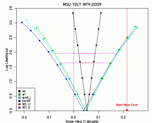
The following figure is one that I’ve used for looking at various time series, shown here for the UAH tropical T2LT series.
There’s quite a bit of information in this graphic. Four different autocorrelation structures are shown here: none (OLS), AR1, ARMA(1,1) and fracdiff. For each autocorrelation structure, the log likelihood is shown for a profile of different slopes.
The maximum likelihood (minimum log likelihood) is similar for each of the 4 autocorrelation models (though OLS is slightly higher than the others), but the confidence intervals are much wider for AR1 and other schemes. In this example, there isn’t much difference between AR1 and more complicated autocorrelation structures (but there are other cases in which the differences are very noticeable.) I’ve also plotted the Santer T2LT ensemble mean trend, which is well outside the 95% confidence interval (using maximum likelihood) – something that we had previously reported applying the (1-r)/(1+r) degrees of freedom adjustment used in Santer et al. (but they only reported results for obsolete data ending in 1999).
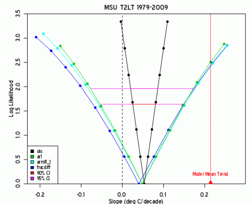
Figure 1. Log likelihood for MSU Tropical T2LT, with various autocorrelation models. Note: y-axis should be labelled as |z|.
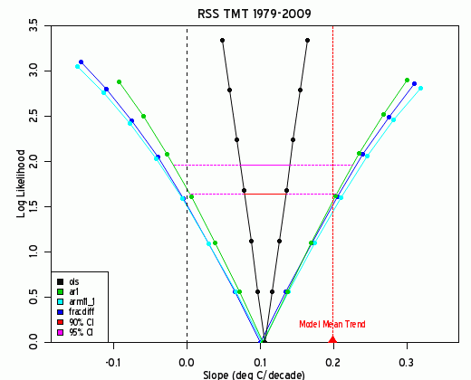
Here is a corresponding plot for the RSS T2 data. In this case, observations are about halfway between zero and the ensemble mean trend. If someone wishes to argue (a la Santer, Schmidt) that there is no statistically significant difference between observations and the ensemble mean, then they are also obliged to concede that there is no statistically significant difference between observations and zero trend even for RSS TMT.
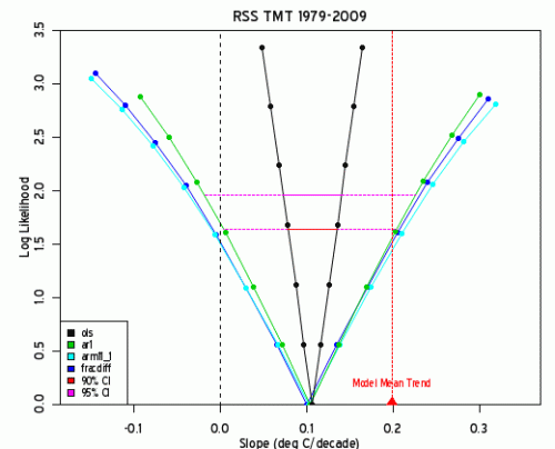
Note: y-axis should be labelled as |z|.
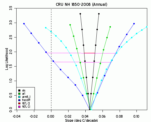
[Added May 7] Here’s a similar plot for annual CRU NH 1850-2008, showing more texture in the differences between the various autocorrelation models. Zero trend (under fracdiff autocorrelation) is not precluded at a 95% level. However, these graphs show more clearly than the bare statistic that this is a two-edged sword: double the observed trend is likewise not precluded at a 85% level.
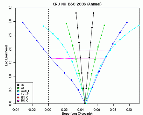 Note: y-axis should be labelled as |z|.
[end update]
Here’s how these plots are done (I’ve placed the method below in a wrapper function). The mle2 function used here is from Ben Bolker’s bbmle package (I suspect that the method could be modified to use the more common mle function).
First, get the MSU tropical T2LT series and then for convenience, center the data and the time series (dividing by 10 to yield changes per decade):
source(“http://data.climateaudit.org/scripts/spaghetti/msu.glb.txt”)) #returns msu.glb
x=msu[,”Trpcs”]
x=x-mean(x);year=c(time(x))/10;Year=year-mean(year)
The mle2 function works by calculating profile likelihoods; to calculate the log-likelihood of a slope, it requires a function yielding the log-likelihood of the slope given the time series. Here I applied a useful attribute of the arima function in R – that the log-likelihood is one of its attributes. I defined a function ar1.lik as follows (note the minus sign):
ar1.lik< -function(b,y=x,t=Year) -arima(y-b*t, order=c(1,0,0),method="ML")$loglik
To facilitate comparison with OLS methods, I also used the arima function with order (0,0,0) to reproduce OLS results (double-checking that this surmise was correct). The following calculates the maximum likelihood slope:
Model.ols = mle2(ols.lik, start = list(b=.01),data=list(y=x,t=Year) );
coef(Model.ols)
# 0.05363612
This is precisely the same as OLS results:
lm( x~Year)$coef[2]
#0.05363613
The bbmle package has a profile function that applies to mle2 output, which has a special-purpose plot attached to it (the style of which I applied in the above graph).
Model.ar1 = mle2(ar1.lik, start = list(b=.01),data=list(y=x,t=Year) );
Profile.ar1=profile(Model.ar1)
plot(Profile.ar1)
In the above graphic combining 4 autocorrelation schemes, I used 4 different likelihood schemes as follows (fracdiff requiring the fracdiff package):
ols.lik< -function(b,y=x,t=Year ) -arima(y-b*t, order=c(0,0,0),method="ML")$loglik
ar1.lik<-function(b,y=x,t=Year) -arima(y-b*t, order=c(1,0,0),method="ML")$loglik
arma1_1.lik<-function(b,y=x,t=Year) – arima(y-b*t, order=c(1,0,1),method="ML")$loglik
fracdiff.lik<-function(b,y=x,t=Year) -fracdiff(y-b*t, nar=1,nma=0)$log.likelihood
For convenience in making the above graphics, I collected the relevant outputs from the mle2 stages as follows:
profile.lik=function(x,method.lik=ar1.lik) { #x is a time series
x=x-mean(x);year=c(time(x))/10;Year=year-mean(year)
fm=lm(x~Year);
Model = mle2(method.lik, start = list(b= fm$coef[2]),data=list(y=x,t=Year));
Profile=profile(Model);
profile.lik=list(model=Model,profile=Profile)
profile.lik
}
The models and profiles for the 4 different autocorrelation structures were then collated into one list as follows:
x=msu[,”Trpcs”]
Model=list()
Model$ols=profile.lik(x,method.lik=ols.lik)
Model$ar1=profile.lik(x,method.lik=ar1.lik)
Model$arm11_1=profile.lik(x,method.lik=arma1_1.lik)
Model$fracdiff=profile.lik(x,method.lik=fracdiff.lik)
I then collected relevant information about the various models into an Info table (which is applied in the plot):
Info=data.frame( sapply (Model,function(A) coef(A$model) ) );names(Info)=”coef”
row.names(Info)=names(Model)
Info$logLik= sapply(Model,function(A) logLik(A$model) )
Info$AIC= sapply(Model,function(A) AIC(A$model) )
Info$BIC= sapply(Model,function(A) BIC(A$model) )
Info$cil95=NA;info$ciu95=NA;
Info[,c(“cil95″,”ciu95”)]= t( sapply(Model, function(A) confint(A$profile) ) )
Info$cil90=NA;info$ciu90=NA;
Info[,c(“cil90″,”ciu90”)]= t( sapply(Model, function(A) confint(A$profile,level=.9) ) )
Info$ci95= (Info$ciu95-Info$cil95)/2
round(Info,4)
# coef logLik cil95 ciu95 cil90 ciu90 ci95
#ols 0.0531 -54.1221 0.0200 0.0863 0.0253 0.0810 0.0332
#ar1 0.0459 198.5281 -0.0804 0.1698 -0.0577 0.1478 0.1251
#arm11_1 0.0453 198.8339 -0.0867 0.1743 -0.0626 0.1512 0.1305
#fracdiff 0.0430 198.2359 -0.0956 0.1773 -0.0700 0.1531 0.1364
I needed a little information Santer trends (already collated):
santer=read.table(“http://data.climateaudit.org/data/models/santer_2008_table1.dat”,skip=1)
names(santer)=c(“item”,”layer”,”trend”,”se”,”sd”,”r1″,”neff”)
row.names(santer)=paste(santer[,1],santer[,2],sep=”_”)
santer=santer[,3:ncol(santer)]
The plot was done easily given the above information. I made a short plot function to simplify repetition with other series:
plotf1=function(Working,info=Info,v0=NA) {
layout(1);par(mar=c(3,4,2,1))
Data=list()
for(i in 1:4) Data[[i]]=as.data.frame(Model[[i]]$profile) #profile.tmt$mle.profile[[i]])
xlim0=1.1*range(Data[[3]]$b)
plot(abs(z)~b,data=Data[[3]],type=”n”,col=4,xlab=””,ylab=””,xlim=xlim0,ylim=c(0,3.5),yaxs=”i”)
col0=c(1,3,5,4)
for (i in 4:1) {
lines(Data[[i]]$b,abs(Data[[i]]$z),col=col0[i]);
points(Data[[i]]$b,abs(Data[[i]]$z),col=col0[i],pch=19,cex=.7);
f1=approxfun(Data[[i]]$b,abs(Data[[i]]$z))
x0= info[i,c(“cil95″,”ciu95″)]; y0=f1(x0)
if(i==2) lines(xy.coords(x0,y0),lty=3,col=”magenta”,lwd=1)
if(i==1) lines(xy.coords(x0,y0),lty=1,col=”magenta”,lwd=2)
x0= info[i,c(“cil90″,”ciu90”)]; y0=f1(x0)
if(i==2) lines(xy.coords(x0,y0),lty=3,col=2,lwd=1)}
if(i==1) lines(xy.coords(x0,y0),lty=1,col=2,lwd=2)
legend(“bottomleft”,fill=c(1,3,5,4,2,”magenta”),legend=c(names(Working),”90% CI”,”95% CI”),cex=.8)
mtext(side=1,line=2,font=2,”Slope (deg C/decade)”)
mtext(side=2,line=2,font=2,”Log Likelihood”)
abline(v=0,lty=2)
abline(v=v0,lty=3,col=2) #Santer
}
The first graphic was rendered by the following command:
plotf1(Working=Model,info=Info,v0=santer$trend[11])
title(“MSU T2LT 1979-2009″)
text(santer$trend[11],.3,pos=1,font=2,”Model Mean Trend”,col=2,cex=0.8)
points( santer$trend[11],0,pch=17,cex=1.6,col=2 )
I think that this is a useful way of looking at information on trends. (I doubt that 30 years is a relevant period to test for long-term persistence under fracdiff – for example, there’s been pretty much one PDO for the entire period, but have rendered it here as well for comparison.)
As noted above, the application of likelihood methods to assess trend confidence intervals under different autocorrelation structures seems so obvious and is so easy to implement that one would expect it to be almost routine. And perhaps it is in some circles, but, if it is, it hasn’t been mentioned in any of the recent climate debate on trends.








 is the downhole temperature,
 is the temperature history, expressed typically as a vector (step function).
![E[j,k]= erfc( z[j]/2 \sqrt{\kappa* t[k-1]} ) - erfc ( z[j]/2* \sqrt{2\kappa*t[k]})](https://s0.wp.com/latex.php?latex=E%5Bj%2Ck%5D%3D+erfc%28+z%5Bj%5D%2F2+%5Csqrt%7B%5Ckappa%2A+t%5Bk-1%5D%7D+%29+-+erfc+%28+z%5Bj%5D%2F2%2A+%5Csqrt%7B2%5Ckappa%2At%5Bk%5D%7D%29+&bg=ffffff&fg=000&s=0&c=20201002)
 is heat diffusivity here converted to years,
 for surface heat flow density. I was unable to locate any information on what value was used and the value appears to get washed out in the coefficient. However, I located an interesting map of surface heat flow density
  wm-2 from the map coloring as an approximation.