I’m not sure McIntyre knows what ‘splicing’ is. To me it means cutting and joining two ends together. All Mann did was plot instrumental temperatures on the same axes, but he showed the whole record.
There still seems to be a lot of confusion among Mann’s few remaining supporters as to why Phil Jones credited the “trick of adding in the real temps” to Mann’s Nature article (MBH98). Today I will review that topic.
Let’s first see what the Great Master himself says about the issue in his book of Fairy Tales:
In reality, neither “trick” nor “hide the decline” was referring to recent warming, but rather the far more mundane issue of how to compare proxy and instrumental temperature records. Jones was using the word trick in the same sense — to mean a clever approach — that I did in describing how in high school I figured out how to teach a computer to play tic-tac-toe or in college how to solve a model for high temperature superconductivity. He was referring, specifically, to an entirely legitimate plotting device for comparing two datasets on a single graph, as in our 1998 Nature article (MBH98) — hence “Mike’s Nature trick.”
With that explanation in hand you don’t need to be Mosher to ask the right question: why on Earth would Jones even mention that “trick”, when he didn’t use it in the WMO cover graph? He didn’t compare reconstructions to the instrumental record as there was no instrumental record plotted in the first place!
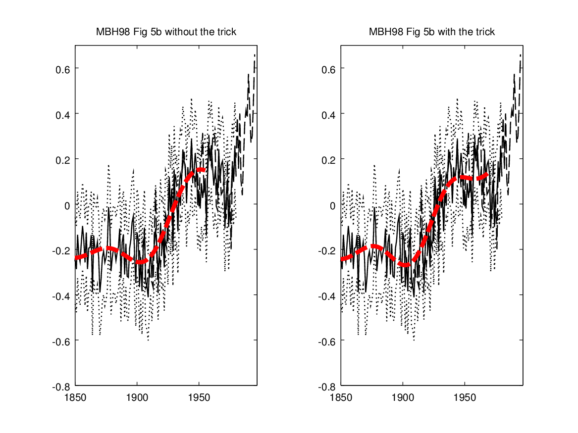
Let’s now see what was possibly known to Jones about the trick in MBH98 at the time of the email. The best known (at least for CA readers) example of the trick usage in MBH98 is obviously in the smoothed reconstruction of Figure 5b. This has been covered here so many times (for the exact parameters, see here), that I just show the “before” and “after” pictures as they seem popular. The MBH98 (Nature) plot (Figure 5b) is in B/W, and it is very fuzzy. That’s why I’ve plotted the smoothed curve in red, but otherwise I’ve tried to replicate the original figure as closely as possible. Here’s the relevant part without and with the trick:
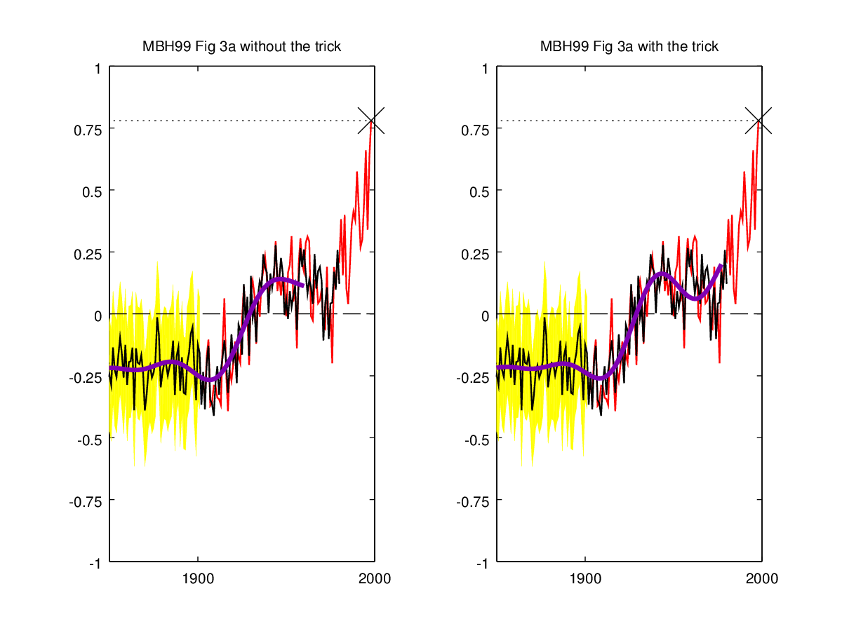
 Here’s also the same for MBH99:
 The MBH98 plot is so blurry that the usage of the trick is actually very hard to spot. It is therefore valid to question if Jones actually
noticed it. In fact, given his track record of technical sophistication, I believe he did not (at least not from MBH98). However, he didn’t need to notice it as there are other more observable cases where the trick was used.
As originally observed by Steve years ago Mann is also extending the proxy record with the instrumental series in the MBH98 Figure 7 (top panel):
That is even clearly stated in the caption:
‘NH’, reconstructed NH temperature series from 1610–1980, updated with instrumental data from 1981–95.
The splicing can be further confirmed from the corresponding data file. There is a slight difference in the plot between the proxy and the instrumental part (solid vs. dotted), but it is important to notice that the instrumental and proxy records do not overlap. Instead the proxy record is clearly extended (“updated”) with the instrumental data.
What is even more important is the use of this trick in the attribution correlations (plotted in the bottom panel). Mann used the extended series in his attribution analysis, which in essence is just windowed correlations between the extended record and various “forcing” time series. In other words, last 15 points in the correlation plot (bottom panel) depend not only from the values of the (uncertain) proxy series but also from the (more certain) instrumental series. So one really shouldn’t be comparing the last 15 points to earlier values as it is a kind of apples to oranges comparison. Especially, the observation in the paper that
The partial correlation with CO2 indeed dominates over that of solar irradiance for the most recent 200-year interval, as increases in temperature and CO2 simultaneously accelerate through to the end of 1995, while solar irradiance levels off after the mid-twentieth century.
seems to be somewhat dependent on the trick. However, there are other more serious problems with the MBH98 attribution analysis, which is likely the reason why we didn’t delve into this more at the time.
Jones didn’t have to notice even this correlation use of the trick in order to have grounds for attributing the trick to Mike’s Nature article! Namely, MBH98 may have been rather groundbreaking in that it had already an extensive Press Release along with press photos (and FAQ!). One of the photos (Figure 2) has the MBH98 reconstruction plotted. Unfortunately, it seems that the picture is not archived anywhere, and we only have a broken Postscript file available. Luckily the file opens just enough to confirm what is said in the figure caption.
Original caption: Northern hemisphere mean annual temperature reconstruction in °C (thin black line) with 95% confidence bounds for the reconstruction shown by the light blue shading. The thick black line is a 50 year lowpass filter (filtering out all frequencies less than 50 years) of the reconstructed data. The zero (dashed) line corresponds to the 1902-1980 calibration mean, and raw data from 1981 to 1997 is shown in red.
Here’s my replication:
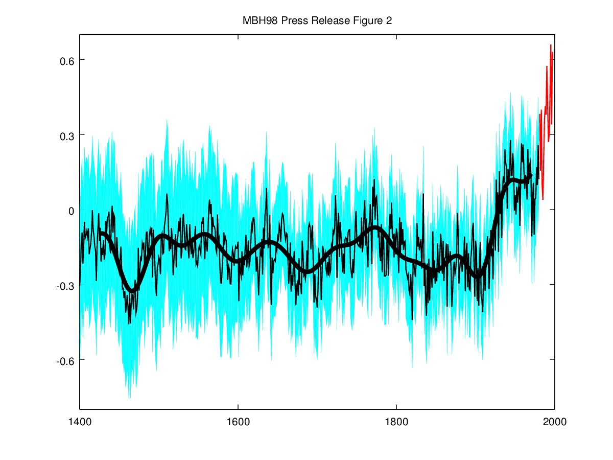
So Mann had plotted the reconstruction from 1400 to 1980 and again extended it (using different color) with the instrumental series for 1981-1997. In other words, as in Figure 7 but unlike in the later plots he did not plot the 1902-1980 part of the instrumental record alongside, i.e., there is no overlap between the reconstruction and the instrumental (and hence they can not be compared).
Additionally there exists one even more blatant use of the trick that is somewhat comparable to what Jones did (and Mann approved) in the WMO graph. Namely, five days after the publication of the MBH98, the New York Times published an article (by William K Stevens) titled “New Evidence Finds This Is Warmest Century in 600 Years” featuring the results. The article carried this picture:
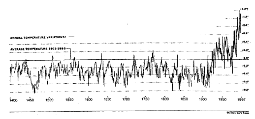
Original Caption: ”Warmer Weather, Recently, in Northern Hemisphere” Researchers used thermometer readings and proxy data like tree rings, ice core samples and coral records to trace climate patterns over the past 600 years. The annual variations for those years from the average temperature for the years from 1902 until 1980 for the Northern Hemisphere are shown in the graph. For example, the graph shows that in 1400, the mean temperature was about 0.5 degree Fahrenheit cooler than the average annual temperature from 1902-1980. ANNUAL TEMPERATURE VARIATIONS — FROM RECONSTRUCTED PROXY DATA — THERMOMETER MEASUREMENTS (Source: Dr. Michael E. Mann, Dr. Raymond S. Bradley and Dr. Malcom K. Hughes)
The plotted series has an incredible splicing of the MBH98 reconstruction (1400-1901) with Mann’s instrumental series (1902-1997)! In other words, the 1902-1980 part of the actual reconstruction (or the uncertainty intervals) is nowhere to be seen (replaced by the instrumental). The splicing together with the fact that anomalies are given in Fahrenheits indicates that whoever produced the graph had an access to the actual data (not available in the extensive press kit). It would be interesting, if the NYT journalists, some of them for sure reading this, would dig up their archives for the full story of how the graph was produced and if there were any protests from the authors about this grotesque splicing. Here’s again my replication of the figure without and with the splicing:

For sure Jones had seen the figure as he is quoted in the article.
Other experts pointed to other caveats. One, Dr. Philip Jones of the University of East Anglia in England, questioned whether it was valid simply to extend the proxy record by adding the last 150 years of thermometer measurements to it. He said that would be a bit like juxtaposing apples and oranges.
I don’t blame him for mistaking a 96 years splice with a 150 years splice, but I wonder what or who made him to do a complete U-turn in the validity of the splicing in one and half years time? Finally, it is always good to keep in mind the words from the Great Master a few years later.
[Response: No researchers in this field have ever, to our knowledge, “grafted the thermometer record onto” any reconstruction. It is somewhat disappointing to find this specious claim (which we usually find originating from industry-funded climate disinformation websites) appearing in this forum. Most proxy reconstructions end somewhere around 1980, for the reasons discussed above. Often, as in the comparisons we show on this site, the instrumental record (which extends to present) is shown along with the reconstructions, and clearly distinguished from them (e.g. highlighted in red as here). Most studies seek to “validate” a reconstruction by showing that it independently reproduces instrumental estimates (e.g. early temperature data available during the 18th and 19th century) that were not used to ‘calibrate’ the proxy data. When this is done, it is indeed possible to quantitatively compare the instrumental record of the past few decades with earlier estimates from the proxy reconstruction, within the context of the estimated uncertainties in the reconstructed values (again see the comparisons here, with the instrumental record clearly distinguished in red, the proxy reconstructions indicated by e.g. blue or green, and the uncertainties indicated by shading). -mike]
Here’s the turn-key Octave code for reproducing the figures in this post.


69 Comments
IMHO it seems as though the frequency of CA postings is not very uniform 🙂
The representation with and without splicing in the NYT (black and white) article does not appear (to me) to be such a lead-pipe-lock, only because there are so many ways to wriggle out of it (NYTimes editor may not have been all uptosnuff science-wise; went with a clunky legend that could have been clarified better; etc. etc.) Also, there’s also the valid thought that the key in this whole thing is to ascertain what the actual temperature anomaly was/is, not whether the two series diverge at a point where one set is known to be accurate– implying that only when both/all are known to be suspect is there any real concern. Ergo, proxies can quietly fade whatever their representation in recent times if some earlier time they were deemed accurate, and scientists can pick back up at their leisure the now-moot objective of figuring out why, for a brief moment in time, there wasn’t agreement.
However, this whole idea of actually adding on instrument data to the end of what had only been proxy data, and then represent the whole as honest-to-goodness proxy data is quite concerning/alarming. This, especially in light of how extensive the protesting is that it did not occur. How can they get out of it, I do not know– by challenging what the word ‘graft’ or ‘onto’ mean?
Since treemometers were selected for tracking historical temperatures, is it likely that none could be found which tracked the entire instrumental record?
Not only do they correlate the treerings to temperature record, in some papers they correlate the temperature record to treerings, to decide which months/ fortnights/ weeks/ pentads are being respresented by the treerings.
It should be noted that a high frequency correlation of a proxy to the instrumental record (annually) is possible and yet have dissimilar trends for these two series over that same time period. Using the corgen function in R one can readily see this important difference.
My thought maybe badly put was that if they had been able to find proxies which tracked the instrumental record after 1990, they would have used them and not needed the ‘trick.’
Maybe they didn’t spend enough time in the field, or………..
“..if they had been able to find proxies which tracked the instrumental record after 1990, they would have used them and not needed the ‘trick.’”
You make a good point and one that I have pondered. The flawed system of selecting proxies for reconstructions based, not on an a prior criteria, but rather on some measure of correlation with the instrumental record should hypothetically run out of candidates for biasing the results.
As an aside, there are a multiplicity of “tricks” (here I leave it to the reader to determine whether the reference to tricks is in the Mannian scientific sense or the more common usage) used by Mann and other scientists doing temperature reconstructions. Early Mann reconstructions used PCA manipulations, as noted by SteveM, RossM and JeanS at CA, to produce the hockey stick, and where ex post facto selection of proxies was less of issue, even though sensitivity testing would reveal that the hockey stick shape, without PCA manipulation, depends on a few proxies with rather extreme and unexplained upward ending trends. A number of reconstructions since early Mann have used explicit proxy selection and Mann’s later reconstructions used in addition to selection a number of manipulations of data rather unique to Mann in attempts to emulate the hockey stick. Attempts, in my view, that, while biasing the modern warming period, have gotten further away from the original.
The difference between a conversation and a comment on a blog is that the latter lives on forever. The former can disappear with the air it was uttered in.
it’s easy to make a reasonable hypothesis for Jones’ u-turn. Remember how Mann pestered Prof David Hand after the Oxburgh’s press conference, where Hand didn’t cover Mann with praise, so to speak:
Hand didn’t waver, but one would not be surprised if Jones, having received numerous emails from Mann after being caught out criticizing it, decided to cave in and join the trickster.
oops
criticizing HIM not it 😉
yes, I believe there were some “serious” correspondence between Mann and Jones in April-June 1998. Unfortunately, it is not covered by CG emails, where Mann makes his entry in a letter (with IMO interesting title) from Jones to Mann on June 17, 1998. Recall also that Jones wrote the comment on MBH98 (which hid the decline by truncation, but it was mentioned in the caption), which was then replied by MBH (+Jones himself!). In fact, Mann was so p**sed off by Jones’ commentary regarding MBH98 that a year later, in connection to Osborn&Briffa piece on MBH99, he wrote to Jones:
The “common effort” did not appear to be related to science.
There was some correspondence that started on 9/11/1999. CG2 0646.txt. grep the the subject line for ‘IPCC revsions’.
The term “common effort” is as revealing as “trick” and “hide the decline.”
april to June.
The Cleaver sisters.
Someday a psychologist needs to determine how this uncouth, unpleasant Mann of unimposing stature and mien as well as limited intellectual ability was able to bully so many supposed professionals into acceptance of his schemes. Maybe they all were jealous of his quick rise to fame?
Tom C, Do not assume that he is “alone”. First, Bradley was already a big name and he was Mann’s mentor. Second, there is the “team”. RealClimate was not simply a Mann creation. Third, there is the Ehrlich, Holdren and Schneider triad. The zero population growth crowd is large and well-entrenched. As was demonstrated by the Peter Gleick incident, it will take a significant scandal to have this crew reject and isolate Mann.
“…to have this crew reject and isolate Mann.”
Can’t be Donne. No Mann is an island.
Actually, one lesson of the scandalous behavior of Peter Gleick is that even a high degree of publicly admitted criminal and unethical behavior is not enough to get someone expelled from the Climate Elite.
It is difficult to know what kind of scandal will be big enough to get a vigorous reaction and house-cleaning from the scientific world. “They” would crucify a scientist with whom the did not share ideological sympathies for Gleick’s behavior. The hypocrisy and double-standards are breathtaking.
It could be the other way around; the supposed professionals used him as an expendable point man.
Tom C “was able to bully so many supposed professionals into acceptance of his schemes. ”
I read the comment somewhere that Jones (not himself the sharpest knife in the cutlery drawer) regarded Mann as a statistical and computing genius.
A reference and thus date when that might have been true would be useful, given the evidence Jean S is bringing forth that Jones was once sharply critical of Mann, then fell into line.
Richard (or someone else),
could you try that my code is running fine (should be turn-key). Thanks!
Am just in the middle of a move but will do later today. I need to get into Octave in any case! Thanks for all the good things you’re bringing out of the dross here.
Jean, I’ve installed Octave on Mac OS X (10.9.4) using Homebrew. Here’s what I’m getting:
Teething problems no doubt. Next up I’ll upgrade XQuartz which I know is two point versions out of date. Might it be best to do the rest by email? I’m rdrake98 on the gmail label.
Jean S: Thanks, that I was a little bit worried about (I didn’t test my script on Mac), also in my Windows version the exported figures didn’t look that good. But do you have a chance to try it in a Linux machine? I can be contacted at: jean_sbls(at)yahoo.com
Figs 2, 3 and 4 come up very nicely under Ubuntu.
Jean S: Thanks! Then there shouldn’t be really anything wrong with the script itself. I wanted to have it up as it is basicly my best effort of replicating the key MBH9X figures. Should be easy to modify if someone has a need for replicating those figures for whatever purpose.
Jean S, you said:
You say it is well known, but people’s memories are short (including mine!). I think it would be worth adding a link to where you explain exactly why the proxy lines go up at the very end in both papers (is this the best one?). As I understand it, the lines turn upwards because the instrumental temperatures have been used to ‘pad’ the smoothed reconstruction in the last few data points, significantly altering the slope of the reconstruction. If that’s so, it seems to me a much more egregious ‘trick’ than simply plotting instrumental temperatures alongside the proxies, as the instrumental temperatures are actually affecting the proxy reconstruction, in a completely non-transparent way.
Jean S: You have understood it correctly. I added the link to my Mannomatic post, where the exact details are given.
I will reiterate that as a layman and “member of the general public” I would never have recognized or understood the issue without Steve McIntyre, Jean S, and others here patiently describing it in detail over and over.
“Members of the general public” should understand the point of all this is not an esoteric, statistical disagreement regarding how to show proxies and actual temperatures on a graph. It is, importantly, Mann’s statement repeated above: “[Response: No researchers in this field have ever, to our knowledge, “grafted the thermometer record onto” any reconstruction. It is somewhat disappointing to find this specious claim (which we usually find originating from industry-funded climate disinformation websites) appearing in this forum…”
For emphasis I have purposely dropped the remainder of the quote, which appears in it’s entirety above. The remainder of the quote confirms that Mann understood the issue.
If you don’t understand why this is important, you have a lot more reading to do!
and that your Honor concludes the case for the defense.
Could you put up the data you are using for the comparison with and without Mike’s Nature Trick? When I made my own with UC’s data from a post here, I got different results.
Is it not a 50 year smooth?
Jean S: The code should be turn-key downloading all the needed data.
Also, about the first comparison graphs, why is the “trick” indicated by extensions from about mid-century to about 1975-80? The rest of the text indicates the instrumental replacement for proxy began 1902. Maybe my understanding is inadequate. Sorry!
Jean S: In MBH98 the reconstruction was extended first by the instrumental for the 1981-1995 (1981-1997 in MBH99) period, then smoothed as a single series with Mann’s 50 year (40 year in MBH99) filter, and finally 25 (20 in MBH99) , i.e. “half of the filter length”, was cut off from the end. I made the “no trick” plots exactly the same manner but without the instrumental extension.
That is a reference to the NYT figure.
I see that. And the 1902-80 data designated as “proxy” used in other representations may have be effected by “instrumental” data somehow too. My question being about the time points of the extensions showing a “trick” in the first two comparison graphs above re: MBH 98 and 99. My interest in that era is piqued by the AR5 WG1 fig. 5.12 regional graphs, four of seven of which show proxy temp reconstructions suspiciously identical to separately plotted instrumental during the 40-70’s cooling. But eyeballing the bar graph in the underlying PAGES2k paper does not show such a dip in that period. Also at Fig. 5.12 [b] there is a clear truncation of North American tree rings at about 1960, although the PAGES2k data goes into the late 90’s and 00’s and the PAGES2k bar graph indicates no such truncation. Cf. the NA pollen recon plotted on the same graph (smoothed black line), it terminates at 1950. The underlying study terminated with 1950 stating an issue with later atmospheric atomic testing. The PAGES2K bar graph for NA pollen indicates a lack of data at the end of the 20th.
Steve: I’ll look at this, though I’d be surprised if these issues are in this graph. However, Figure 5.7 definitely contains reconstructions in which proxies have been spliced with instrumental data. One of the huge ironies in this line of criticism – insufficiently emphasized – is that Mann et al 2008 regem spliced instrumental data from 1850 on. So by 2008, Mann had fully integrated the technique that he had so vociferously said that specialists did not ever use.
Thanks much J and S. Oh my, most of the NH proxies in 5.7 have blatant conformity in the 20th c. incl. my ‘dip.’ I am a bit miffed I did not detect that before. I guess I was distracted.
I used the data here.
Any first year graduate student with a ‘smidgen’ of time series analysis theory would appreciate that extending a filtered series by time shifting ‘to the right’ is simply bogus. Either end of the filtered series is shortened by one half the filter width.
Should we modify the Any True Scotsman fallacy to incorporate any first year anythings?
Jean S’s script (Octave) is at http://www.climateaudit.info/scripts/mbh/jean_s/NYtrick.m
Even by your own standard that was brief and cryptic. Care to elaborate? Was that a “hmmmm” or an “ahem”?
A reason why IMO this splicing should not be done, even if it done for the plotting purposes only and it is disclosed, is readily seen from the NYT figure comparison. The years 1953 and 1962 are 0.29 and 0.23, respectively, colder in the instrumental series than in the MBH98 reconstruction. Similarly 1976 is 0.24 warmer. Those years are in the calibration period, where there are most proxies available and the proxies are “tuned” to the instrumental record. It is impossible to observe this, if both of them are not plotted.
Edit: those values in Fahrenheits (as in the NYT figure): 0.51, 0.41, and -0.44.
Here’s an excerpt from a comment by Kenneth Fritsch on another thread that might be relevant:
That’s not relevant here, but it reminded me about another thing that should be revisited at some point (I know, the list is LONG). Kenneth mentiones the Briffa/Schweingruber MXD series (worst affected by the divergence), which were used in Rutherford et al (2005) (being the first study said by Mann to “vindicate” the MBH9x results). Long time ago Steve noticed that the MXD series were infilled, i.e., the post 1856 values of the proxy series were replaced by infilling the values from the instrumental series by their RegEM machinary, i.e., another way to hide the decline!
We now know from CG letters that this infilling of the MXD series was actually the first official co-operation with Mann and the CRU crew. Tim Osborn visited Mann in October 2000 (BTW, Osborn’s visit also resulted to Mann to release his MBH data to the CRU folks, and this the archive we have in the CG dossier). Originally, they only infilled the post 1960 values as it is seen from Tim’s report:
Steve’s old post reminded me about yet-another thing. Originally, Rutherford et al. code contained a horrible coding mistake (among many other problems) rendering the results to rather meaningless. I corresponded that in time with Steve, but we never actually wrote a post about it (we were busy with other things etc.). Then suddenly Rutherford took his code down. What likely happended is that as other researchers (e.g. Smerdon and Kaplan) started showing interest in Rutherford et al, they likely noticed the mistake on their own when revisiting the code. However, nowhere they have ever acknowledged that the original paper is based on totally flawed code. In that respect, the exchanges between Kaplan & Smerdon and Rutherford et al are funny to read: Kaplan & Smerdon do not realize that the main source for the problems they discovered is the flawed code and Rutherford et al is coming up with funny excuses why Kaplan & Smerdon is getting different results. I still have (and I think also Steve) the original code somewhere archived. BTW, the coding mistakes made the code to run really, really slow as it is seen from Tim’s report:
Another thing … this is of course pure speculation, but I believe the main reason for Mann et al (2008), which is still using MBH98 data and only a small (but rather inportant) change in the methodology (EIV) compared to Rutherford et al, is the fact that when corrected, the Rutherford et al approach does not produce the “right result”: the handle of the stick, which in MBH99 is artifically raised by the Mannkovitch bodge, is flat. Mann (2008) goes around that by 1) taking the target to be hemispheric mean not the full temperarute field 2) screening. The result is, as observed at the time, that Mann had to somewhat reintroduce the MWP that was missing in MBH99 and in Rutherford et al (2005).
Jean S, the discussion on the Mannkovitch bodge would be worth re-visiting. In re-reading the contemporary emails, the long-term declining trend of the MBH99 reconstruction was something that Briffa and Jones were pretty skeptical about. If they had known about the intimate and bizarre connection between the bodge and the declining trend, the outcome might have been different.
An exposition issue on the Mannkovitch bodge that would be worth elucidating. You showed the reconstruction without Mann-bodging the PC1 lacked the Mannkovitch trend. It’s hard to understand why bodging the 19th-20th century values of the PC1 should have the impact of introducing a declining Mannkovitch trend, though I trust your calculations. Can you think of a way of showing why there is a connection in a more direct way than before-and-after results? The before-and-after prove the result, but do not explain it.
Re: Mannkovitch
Even Bradley seemed to be somewaht skeptical about it. In the April/May 1999 Briffa&Osborn exchange, Mann contested that the (Milankovitch) cooling should be also visible in the 1. millenium of the new Briffa&Osborn 2k recon. Bradley responded:
Mann’s response next day shows IMO amazing arrogance:
The way I think about the effect of the Mannkovitch bodge is as follows. The NOAMER PC1 is dominating the AD1000 step. Now when you bodge the PC1, you are lowering the calibration part (1902-1980), which gets the zero mean in a later step. In other words, you’re lifting the earliear part (1000-1399) higher relative to the calibration part. Hence, in the final reconstruction the AD1000 step (1000-1399) gets higher than without the bodge, and you get the Mannkovitch declining trend (1000-1850).
Jean S,
it would be worth looking at CG correspondence at the time in connection with pcproxy.txt, the collation of proxies that Rutherford originally sent to us – about which Mann lied about Excel spreadsheets. pcproxy.txt had spliced the PC series in an awkward way and, in addition, had been one year off in the collation. At the time, we established that pcproxy.txt (and pcproxy.mat) had been saved in 2002, long before my request to Mann (one more proof of Mann’s lie that the file had been prepared specially for us.) I also noticed the term “pcproxy” in one of Rutherford’s graphics. When Mann made his MBH98 directories accessible to non-insiders in November 2003, it became clear that pcproxy had not been used in MBH98 – my surmise was that Rutherford (presumably, but perhaps inherited by Rutherford) had prepared it in connection with the regem project and it had been botched at the time. The link provided to us at the time was to one of Rutherford’s directories. They deleted pcproxy.txt and .mat in November 2003 (despite our protests), thereby removing important public evidence that the files dated earlier than our request. My recollection is also that some contemporary code for Ruther 05 contained a one-year-off collation, though I’m not sure that it was the same one-year-off as pcproxy.
Obviously, they must have quickly recognized the problems with pcproxy. In one CG email, Mann asked Rutherford for an explanation of what was going on, but Rutherford’s explanation does not appear to have been shared with CRU, as it is not in the CG files. It’s an email that is highly relevant to Mann’s lies about Excel spreadsheets and it’s too bad that it wasn’t produced under the FOI. It’s something that Steyn, CEI and NR should ask for.
Steve McIntyre,
“In re-reading the contemporary emails, the long-term declining trend of the MBH99 reconstruction was something that Briffa and Jones were pretty skeptical about.”
I’m not sure there is a connection, but that long-term decline may be comparable to that obtained by Jeff Id here : http://noconsensus.wordpress.com/2014/03/16/proxy-hammer/
By another method, I got a similar behavior. After some thought, I think that it comes from an issue not yet addressed in the literature (to my knowledge): the density loss of deadwood. This density loss primarily affects the outer ring, then, by a law of diffusion probably modelisable, older rings (http://oi57.tinypic.com/2luqioj.jpg). Apparently, this phenomenon is pretty quickly stabilized.
I am unfortunately not familiar enough with the work of Mann to estimate whether a problem affecting only tree ring densities can have such an effect on its own results.
Phi, Jim Bouldin I think has mentioned this while criticizing RCS.
You can put the Lutebacher series that appears in the Mannn 2008 temperature reconstruction in perspective vis a vis attaching an instrumental record to the end of a reconstruction by going to the link below that describe the production of the Lutebacher series or from the excerpts from that paper that I give below.
In this paper the instrumental record from 1901-1998 is unabashedly and without concealment placed at the end of a reconstruction that was from 1500-1900. The reconstruction consisted of a few tree ring and ice core proxies along with historical climate records (not necessarily temperatures but in the authors judgment capable of correlation to temperature) and some very old temperature instrumental data. That old instrumental data could not have been adjusted as is the modern instrumental and although there is some instrumental data in the reconstruction surely it cannot be correct to put the reconstruction and modern instrumental record on the same level as the graphs imply. Without the instrumental record at the end we are left guessing how the reconstruction would have performed in that time period. Of course, a precursory look at the CIs in the graph tells you that you really cannot say much with any statistical probability about the differences in historical and modern day temperatures for Europe.
http://www.sciencemag.org/content/303/5663/1499.full.html
“Here we present a new gridded (0.5° × 0.5° resolution) reconstruction of monthly (back to 1659) and seasonal (from 1500 to 1658) temperature fields for European land areas (25°W to 40°E and 35°N to 70°N) (19). This reconstruction is based on a comprehensive data set that includes a large number of homogenized and quality-checked instrumental data series, a number of reconstructed sea-ice and temperature indices derived from documentary records for earlier centuries, and a few seasonally resolved proxy temperature reconstructions from Greenland ice cores and tree rings from Scandinavia and Siberia (fig. S1 and tables S1 and S2). We discuss the evolution of European winter, summer, and annual mean temperatures for more than 500 years in the context of estimated uncertainties, emphasizing the trends, spatial patterns for extreme summers and winters, and changes in both extreme and mean conditions.”
This from a graph caption
“A) Winter (DJF), (B) summer (JJA), and (C) annual averaged-mean European temperature anomaly (relative to the 1901 to 1995 calibration average) time series from 1500 to 2003, defined as the average over the land area 25°W to 40°E and 35°N to 70°N (thin black line). The values for the period 1500 to 1900 are reconstructions; data from 1901 to 1998 are derived from (44)(reference to modern instrumental data – my parenthetic). The post-1998 data stem from (45); Goddard Institute for Space Studies (GISS) NASA surface temperature analysis is given on a 1° × 1° resolution (46). Temperature data from (44) and (45) are very similar and correlate at 0.98 for each season within the common period 1901 to 1998 for the chosen area; they do not indicate any absolute bias. The thick red line is a 30-year Gaussian low-pass filtered time series. Blue lines show the ±2 SEs of the filtered reconstructions on either side of the low-pass filtered values. The red horizontal lines are the 2-SD line of the period 1901 to 1995. The warmest and the coldest winters, summers, and years are denoted in blue and red, respectively. The winter y axis uses a different scale. Recon., reconstructed;
CRU, Climatic Research Unit (44); TT, temperature; wrt, as compared to.”
“Kenneth mentiones the Briffa/Schweingruber MXD series (worst affected by the divergence)…”
An important note (seems to me) for the general understanding of issues related to proxies:
MXD have excellent high frequency correlation with instrumental data. Apparently, whatever the type of proxy, the worst divergences are related to the best high frequency correlations.
Is it a completely dead issue to suggest that some famous papers should be withdrawn, as were Wakefield’s papers (after many years) on “vaccine causes autism”?
Even if the initial “peer reviewers” are mainly concerned with whether the content is both new and “plausible” (with no checking of computer data), surely it is relevant with sober second thought to consider whether a paper ever represented a serious effort to both find out the truth and tell it.
Certainly some should be withdrawn, but not effective with paper copies of journals and would require adjustment of online copies with appropriate clear identification of changes.
I added a fitting comment (from the secret SkS forum) by Dana to the beginning of the post
It might be worth adding a link to his comment so people can read it in its context. I don’t know if you know, but I uploaded a copy of the leaked Skeptical Science forum to a web server so it’s web-browsable. You can find it here. I believe your quote was taken from this page.
Jean S: Thanks! Done. A question about your copy: have you blocked search engines? I tried to google the quote, but got no hits.
I haven’t blocked anything, but I also don’t have a webpage up for the base domain of the site (http://www.hi-izuru.org/). I’d guess Google just hasn’t discovered the content yet. I probably ought to create an index/introduction page for the site (it also has the Cook et al data files I discovered).
Small request
Can Steve or Jean S provide a list of the various 1000/2000 year reconstructions and the authors ie MB98, etc going forward. Thanks
Jean S: I don’t think that is a “small request”.
I think this was asking for links to papers that you talk about in posts as you post them.
I would be happy with a listing most of the reconstructions and a link, or a listing on the more commonly known reconstructions. (nothing more than something resembling an index).
joe, I have a comment below which may help some. It got stuck in moderation for a while so you may not have seen it yet.
I wanted to have such a list for myself, but I’ve never gotten around to trying to make a complete one. I can provide a partial list to get you started though. Keep in mind, this list is only meant to have papers which offered new reconstructions. There are many papers discussing these reconstructions which aren’t listed.
I didn’t include all the authors, but you can look most of them up with little trouble. There are probably a number I missed, but I think I got most of the important ones.
Steve: for my own inventory keeping, i maintain a spreadsheet listing reconstructions with some information and keep a directory of reconstructions as R-objects for easy recall. I’ll try to remember to put this online at climateaudit.info.
That would be useful. I’ve been exposed to most of the reconstructions/papers at one point or another, but there’s no way I could hope to keep track of it all without referencing lists or the like.
” Jones was using the word trick in the same sense — to mean a clever approach — that I did in describing how in high school I figured out how to teach a computer to play tic-tac-toe or in college how to solve a model for high temperature superconductivity”
Interesting. its interesting to see how mann never misses an opportunity to remind us of his brilliance.
Imagine that in high school he “taught” a computer how to play tic-tac toe. Well, that would be a good
middle school task. maybe Mike should enter the middle school science fair
Click to access J1204.pdf
LOL, his trick is probably turning the board upside down to get things to look like something he has done before.
Hey, instruments are people, too.
I never intend to read the book of Michael or any similar latter day testaments, but did he really say:
“… describing how in high school I figured out how to teach a computer to play tic-tac-toe …”
He taught a computer? Just seems very infantile.
It is fairly basic learning, probably a common exercise in the days of TI-99/4A and Commodore 64. Computers have to be told explicitly step-by-step how to do things.
So basic learning, perhaps an indication that he has actually seen code though elementary, but not an accomplishment for an experienced scientist to bother with on a resume.
Teaching and programming a computer to do something are two different things. Programming a computer to play tic tac toe is nothing special (positive or negative). Teaching a computer to play tic tac toe is a bit more notable. Using a neural network or the like to explore game space and find optimal strategies is not trivial, even for a game as simple as tic tac toe.
I’m pretty sure that’s not what Michael Mann did though. He probably just programmed the game into his computer. That’s the sort of thing me and my bored classmates did with on our graphing calculators.
Yes, Mosher’s link is to a learning computer. I suspect Mann’s trick is to flip the board upside down where convenient.
Steve: 🙂
3 Trackbacks
[…] There still seems to be a lot of confusion among Mann’s few remaining supporters as to why Phil Jo… […]
[…] Jean S at ClimateAudit: Why did Jones attribute the trick to @MichaelEMann? Here’s the evidence [link] […]
[…] https://climateaudit.org/2014/09/26/mikes-nyt-trick/ […]