The strong El Nino has obviously caused great excitement in the warmist community. It should also cause any honest skeptic/lukewarmer to re-examine whether observations remain inconsistent with models. In today’s post, I’ll show two comparisons: 1) CMIP5 models (TAS) vs HadCRUT4; 2) CMIP5 models (TLT) vs RSS (UAH is only negligibly different). For this post, I’ve used the same scripts as I used in earlier comparisons.
Surface Temperatures (TAS)
First, here is an updated comparison of the 5-95% envelope of CMIP5 runs (TAS – surface) to most recent HadCRUT4 (black ), which, as of right now, goes only to October last year. Satellite data is available through December. Weekly Nino 3-4 data shows a slight downtick in the last half of December (see David Whitehouse here; original weekly data here). .
HadCRUT4 to October had not quite reached the transient of the CMIP5 model means, but it looks like it will. In the graphic below, I used RSS satellite data to estimate HadCRUT4 (+ signs) for December – simply adding the RSS deltas to the closing HadCRUT4 value. This slightly pierces the model mean transient. If the present El Nino is like prior El Nino’s, then we can expect a fairly sharp decline in GLB temperatures in 2016. We will see whether these levels will once again fall outside the 5-95 percentile range of CMIP5 models. My guess is that they will. To my eye, the El Nino peaks are gradually losing ground to the CMIP5 model mean: 1998 went above the envelope; the prior El Nino easily exceeded the model mean.

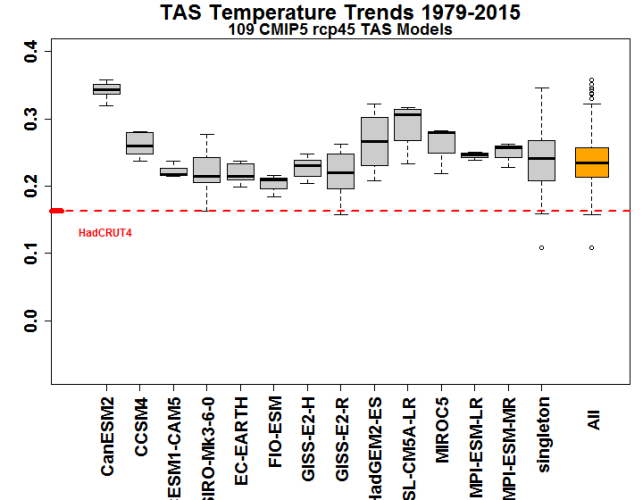
While a comparison of observations to a 5%-95% percentile envelope of CMIP5 models is important for orientation, the next graphic, in my opinion, is considerably more illuminating as it disaggregates the various models and focuses on the trend since 1979. In it, for models with more than one run, I’ve done boxplots of the trends, grouping singletons as one model class. On the right (orange), I’ve done a boxplot for all CMIP5 runs. All of the individual models have trends well above observations, with the CanESM2 model from Andrew Weaver’s group being a wildly overheating performer. There are now over 440 months of data and these discrepancies will not vanish with a few months of El Nino.
Lower Troposphere (TLT)
Next, here are corresponding graphics for the lower troposphere, using the RSS series preferred by warmists (data is available through December). The reference period for these comparisons is 1979-1990 (versus 1961-1990). While the El Nino peaks occur at the same time in both series, there is a dramatic difference in the trend of peaks, which decline not only relative to the model mean transient, but in absolute terms. Even December El Nino values only return the series to barely within the 5-95% envelope. About a decade ago, there was considerable controversy over the discrepancy between satellite and surface trends. Skeptics obviously have taken issue with the surface record, but it should be kept in mind that the possibility of systemic bias in the satellite data also needs to be kept in mind.

Be that as it may, there is great consistency to the corresponding comparison for surface trends in the boxplot comparison of trends for individual models against observations shown below. For all models, the model trend is more or less double the observed trend, somewhat more pronounced than for surface trends, but structurally very similar.

A Comment on Anomaly versus Temperature
The El Nino had a very dramatic impact on Toronto temperatures, which set records in December. The anomaly temperature would be a gaudy red on anomaly maps. How did we manage to survive? Experientially, it was a slightly cooler version of (say) San Francisco weather. It felt very pleasant for December, “good weather” rather than bad. The forecasters now say:
Following the extended bout of warm weather, it appears Toronto will return to more seasonable temperatures in the coming days.
“More seasonable weather” sounds good, but it means that we’re now going to see some brutal cold. Ryan Maue warns of the return of the polar vortex.

I mention our local weather because the negative impact of warmer winter weather is far from obvious to me. It did have a negative impact on high CO2 footprint local residents who, like Eric Steig, travel outside the city to ski, as the season is delayed, but a positive impact on reduced heating bills.


244 Comments
I get pretty similar results even when using climate model data adjusted to better match the observed HadCRUT4 coverage (via Cowtan et al., 2015). See here:
-Chip
Since hadcrut4 is the coolest record one wonders why a good analyst would not show all the records..
And brace yourself for a new product from hadcrut……
Steven,
I am making no claims about being a good analyst, rather just using the data provided by Cowtan et al. from their 2015 GRL paper. In it, they only adjusted the climate models to match the HadCRUT4 (the last I looked), so my non-analytical options were limited.
-Chip
“I get pretty similar results even when using climate model data adjusted to better match the observed HadCRUT4 coverage (via Cowtan et al., 2015). See here:”
Sorry Chip. I thought this sentence meant you did some work
Not much! Just added in a guess at 2015.
I’m no climate scientist, but perhaps you guys can help me understand something.
In all the model projections I’ve seen, the further into the future you go the wider the error bars get. This seems highly counterintuitive IF CO2 is the control knob for global temperature.
It seems to me that over time, as CO2 levels pass the various tipping points, they should begin to take a larger role, and the role of other natural variability must necessarily diminish. Why don’t all the climate models narrow to a greater precision over time, as the “pure physics” of CO2 that has been well understood for more than a century asserts a larger and larger role in determining the temperature of the globe? The greatest variability should be today and going backward where all the other natural variability has predominated, but now that we’re in the CO2-era, we should have much greater predictive ability.
Steve Mosher wrote: “Since hadcrut4 is the coolest record one wonders why a good analyst would not show all the records. And brace yourself for a new product from hadcrut……”
Steve and Steve: GMST is mostly SST. The SST record has been compiled from a changing mix of sources and the overall warming rate is dependent on the correction for bias between multiple data sources. I have no idea of whether ERSST4 is better than ERSST3. I am sure that global temperature trends are uncertain simply because there are many ways to approach correcting bias between multiple data sources. And those doing the correcting have personal biases. I don’t need to re-read your book on Climategate to be skeptical of this process.
What is the best temperature record that has been complied from a single measurement technology (and therefore isn’t subject to the ERSST3/ERSST4 dilemma)? Satellite measurements of the lower troposphere as analyzed by two competing groups? If so, I’d like to see model projections for the lower troposphere compared with UAH and RSS.
We have SST’s measured by satellites for the last few decades. Those records have problems with aerosols and surface wind, but at least they are homogeneous. Everyone seems to ignore them.
Finally, we have the land temperature record to compare with projections of warming over land from climate models. I have far more faith in comparing land observations to land projection, than global observations to global projections.
Steve: you say: “If so, I’d like to see model projections for the lower troposphere compared with UAH and RSS.”. Why don’t you read the above post, approximately half of which is devoted to that comparison.
The most recent ERSST adjustments are relevant to the measurement of the present El Nino relative to 1998. On the satellite scale, it seems to be not as strong, but under the new ERSST, it is slightly stronger.
Steve: I began by replying most to Steve Mosher – who was hinting that the Hadley global surface temperature record was likely to be revised upward for the same reasons are others – reprocessing the SST record.
My frustration with the uncertainty in composite temperature records from changing sources is no excuse for my not retaining the most important information in your post. My apologies. I only wish there were other homogeneous sources besides TLT that could be used. ARGO probably isn’t long enough. Satellite SSTs? Land?
Chip,
What about this paper which seems to be suggesting that if you do the comparison only with the models in which the internal variability (represented by the ENSO Oscillations) is in phase with the observations, the comparison is quite good.
ATTP,
Also consider Gavin’s 2014 paper which casts and ENSO signal on the model ensemble mean…so, the multimodel mean ought to tick up in 2015, which would keep observed 2015 in the lower half of the model distribution.
-Chip
Chip,
It depends what you mean by multi-model mean. In the 2014 paper, they do include an ENSO corrected form (which is the dashed blue line in Figure 1), but it’s not the same as the multi-model mean in the figure you’ve included. When they do include the ENSO correction, the comparison is improved, so I’m not sure what you’re really suggesting. We don’t expect the observations and multi-model mean to match at all times – that’s why there’s a range.
Steve: is this the sort of match between models and observations that you endorse?

I think ATTP’s contention is the trend chart Steve shows is not a strict apples-to-apples comparisons for reasons having to do with 1) model TAS is not the same as the observations contained in HadCRUT4 (addressed in Cowtan et al., GRL, 2015) and 2) the real-world forcings are not the same as the model-world forcings (e.g., Schmidt et al, NatGeoSci, 2014). The third issue, regarding ENSO effects isn’t really on-point (the multimodel range ought to include this).
In a post over at Climate Etc a couple of weeks ago, we addressed the first issue (see Figure 3 from http://judithcurry.com/2015/12/17/climate-models-versus-climate-reality/). I am not sure the second issue is on as firm footing (i.e., what the real forcings are).
The models still appear to run hot.
-Chip
No, what’s endorsement got to do with this?
A horse is a horse of coarse endorsement
And models they shun the observations.
=========================
you are aware that an ensemble mean, or a multimodel mean is indefensible and meaningless at best?
The models aren’t independent; the very notion of an ensemble mean lies outside of accepted statistical analysis, and is at best uninformative, at worst, misleading.
I must say I’m unclear what a 15 year trend in Nino3.4 being the same in a model and in observations is telling us. It is a very volatile and I’m not at all sure what selecting models on this criteria tells us, and in particular whether it tells us that these models are in phase with the observed Nino.
I note that the models selected presumably change for each separate 15 year selection so moving from one year to the next we potentially are comparing the obs to quite a different set of models.
Just to add an overnight rumination on this paper.
The intuitive thing to do in order to select on models that are more in phase with nino3.4 would be to create an index of the correlation coefficients between model nino3.4 and obs nino3.4 over the trend periods being evaluated. This would provide a much better test of the hypothesis being advanced.
The thing that I find depressing about papers like this (and the review process) is that if the authors went to that much work and thought about the subject that much, why not try the obviously better test and report on it? They had calculated the trend, no doubt their software also provided the corr. coef.
Without doing a replication to see what the result would be, one has to suspect a case of the dog that didn’t bark in the night.
Your cited paper, Risby (2014) (co-authors include Lewandowsky and Oreskes), had cherry picked four “best” and four “worst” models which they did not identify out of 18 which they did identify picked out of the CMIP5 52-56 coupled pairs, making critical analysis largely pointless as concluded by Bob Tisdale who reviewed the paper for WUWT. The paper did confirm that the ENSO cycles are randomly out of cycle in the models. This, in effect, washes ENSO’s influence out of the CMIP5 mean, unlike the volcanic forcing that is precisely administered once it is actually observed (appearing only post facto in trend plots). ATTP or anyone else who can find a paper that extracts the ENSOs out of each model and then re-distributes them to properly observed history would be doing a service. In that case one could critically compare models to land station indexes, sea surface indexes, vs. satellites’ TLT for clues in skill. In particular, it would be interesting to compare responses to the next major volcanic eruption to see if adjustments in ERSST4 and others have changed the response of past known non-GHG forcing spikes compared with future.
Steve: this timing issue is irrelevant to the comparison in the boxplot of trends over 37 years.
Also irrelevant to the comparison, but cool, is this animation of 24 hours in the life of the planet as seen by Himawari-8 in August.
Good to see the Canadian model pushing for the extra warmth it knows, in its heart of hearts, the country will benefit from.
Members of the Optimists of Canada.
I “threw out my back” in December. The lack of snow and ice in Toronto has been a gift from the heavens.
‘To my eye, the El Nino peaks are gradually losing ground to the CMIP5 model mean: 1998 went above the envelope; the prior El Nino easily exceeded the model mean’
Yes. All the ‘excitement’ that temperatures have for two months reached the model mean is ridiculous – exactly the kind of cherry-picking that supposedly should be avoided.
John Christy showed temps with a 5-year running mean in the last hearing.
It would be interesting to see that for the surface (eyeballing I’d say they are right at the bottom of the confidence interval).
The other problem with model hindcasts is that with so many low-certainty forcings you can get a very good fit just by playing around with the numbers. The most famous is aerosols but apart from that you have at least two positive forcings (tropospheric ozone, black carbon on snow) and two negative ones (deforestation, stratospheric ozone). The contribution of F gases also isn’t very clear.

http://escholarship.org/uc/item/902057fn
Red is ECS = 5C, blue is 2C. So very different results can be ‘consistent with’ observations.
When are models “wrong”?
Under the scientific method, when do we recognize “the models are wrong” – and the “emperor has no clothes”? Nobel Laureate Richard Feynman
vis Global Warming and the Feynman test Tom Trinko Sept. 11, 2014
The IPCC declares:
Steve’s Tropospheric Temperature graph shows ALL the models (5% to 95% ) exceed the temperature records over the satellite era which now extends longer than that 30 year period.
John Christy’s graph above shows the climate model mean prediction over the 35 year satellite error is now 400% of the actual satellite tropical tropospheric temperatures.
If that does not constitute “wrong” and “failed” what does?
“The strong El Nino has obviously caused great excitement in the warmist community.”
Before the Team schedules the victory parade, they should consider the old adage that even a broken clock tells the correct time twice a day.
Reblogged this on I Didn't Ask To Be a Blog.
Steve The key take away from your post is ” All of the individual models have trends well above observations, with the CanESM2 model from Andrew Weaver’s group being a wildly overheating performer. There are now over 440 months of data and these discrepancies will not vanish with a few months of El Nino.”
The latest Australian BOM analysis states “A number of El Niño-Southern Oscillation (ENSO) indicators suggest that the 2015-16 El Niño has peaked in recent weeks. Tropical Pacific Ocean temperatures suggest this event is one of the top three strongest El Niño events of the past 50 years. Climate models suggest the 2015-16 El Niño will decline during the coming months, with a return to ENSO neutral likely during the second quarter of 2016. ”
The peak in the natural millennial temperature cycle probably occurred in about 2003 following the peak in the solar driver at about 1991.The current situation is summarized in the following exchange with Dyson.
” E-mail 4/7/15
Dr Norman Page
Houston
Professor Dyson
Saw your Vancouver Sun interview.I agree that CO2 is beneficial. This will be even more so in future because it is more likely than not that the earth has already entered a long term cooling trend following the recent temperature peak in the quasi-millennial solar driven periodicity .
The climate models on which the entire Catastrophic Global Warming delusion rests are built without regard to the natural 60 and more importantly 1000 year periodicities so obvious in the temperature record. The modelers approach is simply a scientific disaster and lacks even average commonsense .It is exactly like taking the temperature trend from say Feb – July and projecting it ahead linearly for 20 years or so. They back tune their models for less than 100 years when the relevant time scale is millennial. This is scientific malfeasance on a grand scale. The temperature projections of the IPCC – UK Met office models and all the impact studies which derive from them have no solid foundation in empirical science being derived from inherently useless and specifically structurally flawed models. They provide no basis for the discussion of future climate trends and represent an enormous waste of time and money. As a foundation for Governmental climate and energy policy their forecasts are already seen to be grossly in error and are therefore worse than useless. A new forecasting paradigm needs to be adopted. For forecasts of the timing and extent of the coming cooling based on the natural solar activity cycles – most importantly the millennial cycle – and using the neutron count and 10Be record as the most useful proxy for solar activity check my blog-post at http://climatesense-norpag.blogspot.com/2014/07/climate-forecasting-methods-and-cooling.html
The most important factor in climate forecasting is where earth is in regard to the quasi- millennial natural solar activity cycle which has a period in the 960 – 1020 year range. For evidence of this cycle see Figs 5-9. From Fig 9 it is obvious that the earth is just approaching ,just at or just past a peak in the millennial cycle. I suggest that more likely than not the general trends from 1000- 2000 seen in Fig 9 will likely generally repeat from 2000-3000 with the depths of the next LIA at about 2650. The best proxy for solar activity is the neutron monitor count and 10 Be data. My view ,based on the Oulu neutron count – Fig 14 is that the solar activity millennial maximum peaked in Cycle 22 in about 1991. There is a varying lag between the change in the in solar activity and the change in the different temperature metrics. There is a 12 year delay between the activity peak and the probable millennial cyclic temperature peak seen in the RSS data in 2003. http://www.woodfortrees.org/plot/rss/from:1980.1/plot/rss/from:1980.1/to:2003.6/trend/plot/rss/from:2003.6/trend
There has been a cooling temperature trend since then (Usually interpreted as a “pause”) There is likely to be a steepening of the cooling trend in 2017- 2018 corresponding to the very important Ap index break below all recent base values in 2005-6. Fig 13.
The Polar excursions of the last few winters in North America are harbingers of even more extreme winters to come more frequently in the near future.
I would be very happy to discuss this with you by E-mail or phone .It is important that you use your position and visibility to influence United States government policy and also change the perceptions of the MSM and U.S public in this matter. If my forecast cooling actually occurs the policy of CO2 emission reduction will add to the increasing stress on global food production caused by a cooling and generally more arid climate.
Best Regards
Norman Page
E-Mail 4/9/15
Dear Norman Page,
Thank you for your message and for the blog. That all makes sense.
I wish I knew how to get important people to listen to you. But there is
not much that I can do. I have zero credibility as an expert on climate.
I am just a theoretical physicist, 91 years old and obviously out of touch
with the real world. I do what I can, writing reviews and giving talks,
but important people are not listening to me. They will listen when the
glaciers start growing in Kentucky, but I will not be around then. With
all good wishes, yours ever, Freeman Dyson.
Email 4/9/15
Professor Dyson Would you have any objection to my posting our email exchange on my blog?
> Best Regards Norman Page
E-Mail 4/9/15
Yes, you are welcome to post this exchange any way you like. Thank you
for asking. Yours, Freeman Dyson.”
Note the exchange was written last April- the cooling trend referred to is now temporarily obscured by the major El Nino but will return by 2017 -18 in the probably following La Nina.
A wonderful interaction Norman, thank you.
Unfortunately, pointing this out gets skeptics nowhere. I once posted a link to the IPCC itself, showing how little confidence it had in their models.
I had absolutely no comeback to the inevitable “Why would scientists use models if they didn’t work, you ignorant, oil-industry shrill liar idiot scumbag troll”. I may have amalgamated some responses for that last part.
I don’t follow the news all that closely, but how much coverage was there of the upcoming El Nino? Obviously, global warming or no global warming, you would think people would know not to make skiing plans in December in an El Nino year.
Steve: Ontario skiing is about a 90-mile drive from Toronto and does not require elaborate advance planning. most Ontario skiers ski throughout the winter, traveling north on the weekends, and a certain amount of unavailability is allowed for. Our family did this when I was a young teenager. The ski areas supplement with man-made snow.
The problem in Canada is that the English media is centered in Toronto. If there is no snow on the ground in Toronto, then there is no snow anywhere on the ground anywhere in Canada – even if you only need to get a few klicks north of the UHI that is the concrete jungle of Toronto to see snow.
I’m from Muskoka (which is just north of Ontario’s main ski area) which is in the so-called “snow belt”, (named because cold winds moving across the warmer waters of Georgian Bay (part of Lake Huron) bring large amounts of snow, often in huge “streamers” of snow squalls.)
This is only the second of my 51 Christmases that have been green (1982 was the other). We did note that going through an ancestor’s diary, there were green Christmases in the 1800’s. But that was before the Big Warming Scare…
I recall 1982 as well. One of my brothers got married in December and it was really mild. As I’ve mentioned on other occasions, one of my sons caught a frog near Collingwood on New Year’s Day.
This el nino has me puzzled. On the east coast of Australia it has been unlike any that I have previously experienced. Lots of rain and only a few hot days. Right now we have had 200 mm in the last 48 hr and still going. If this is el nino I’m not looking forward to the following la nina.
ColinD
Have a look at the 2015 Pacific temperatures at
http://weather.gc.ca/saisons/animation_e.html?id=year&bc=sea
Then check 1957-58
at
http://sabolscience.blogspot.com.au/2015/08/a-deeper-look-at-top-10-el-ninos-since.html
That wasn’t a drought year in my part of western Qld
Ian, the 57-58 looks much weaker than the current one, if I am reading the legend correctly.
ColinD (and Another Ian), I’ve been thinking the same thing. Whatever the reasonable expectations from El/La might be, the cycle has been presented (to Australians at any rate) as broadly El Niño => heat and drought; La Niña => cool and floods.
I was obligingly expecting a hot and dry summer here in south-east Queensland, but it hasn’t worked out that way. The ABC reported that “despite SA recording the hottest October and December on record” the year for Australia was (disappointingly) only the 6th hottest on record. SA and Victoria may have had their moments, but in Qld, things have been pretty damp.
So, as you say, ColinD, if this is an El Niño, watch out for La Niña. Although, of course, she might misbehave as well. Just when you get a nice nice solid hook to hang your predictions on, it falls off the wall.
BOM actually predicted average rainfall early on due to Indian Ocean influences overcoming El Nino effects. When it did not rain down South El Nino was quickly trotted out as the reason.
Here in the Great Pacific Northwest, we’re always told that El Niño brings warmer drier weather west of the Cascades, and La Niña the opposite. But I saw somewhere, can’t remember where, that historic data showed it was pretty much a toss up, either phenomenon could cause either warmer/drier, or colder/wetter, or some combination thereof during any particular occurrence.
The El Nino had a very dramatic impact on Toronto temperatures
I do not follow this. El Ninos effect the positions of the troughs and crests of the jet stream?
Steve: I guess so. In El Nino years, it tends to be warm here. One of my sons caught a frog on New Years Day in the 1983 El Nino (though we didn’t know it was an El Nino then).
Steve,
Thanks for this.
Dear Steve,
Just a question, in the box plots you indicate RCP45 but in the temperature vs time plots you indicate “5-95% envelope of CMIP5 runs”. Okay but also for rcp45 exclusively? Or maybe for all scenarios up to rcp85? Since climate talks usually take rcp85 as business as usual, maybe an explicit comparison for that would be interesting?
I tried that here for 30 year trends (ie every point on the graph represents the trend of the previous 30 years):
https://dl.dropboxusercontent.com/u/22026080/rcpvsground.xlsx
Just an aside RCP8.5 isn’t business as usual. It is an upper bound on the IPCC AR5 scenarios, in general reflecting the 75% upper limit of the scenario drivers. In IPCC-speak I guess that makes it unlikely.
75% upper limit of the scenario drivers or top of the scenario drivers?
but also business as usual.
It is the 50% marker as Business worse than usual which makes up the other 50% is not modeled [I thought].
Consequently any average of models is already missing 50% of predictions on the high side as they were never made.
Not business as usual. Riahi et al “RCP 8.5—A scenario of comparatively high greenhouse gas emissions” Climate Change (2011) describes it as “the upper bound of the RCPs” and “a relatively conservative business as usual case”. It is the latter reference that saw BAU get incorrectly applied to it.
Riahi et al further states “With few exceptions …. RCP8.5 builds … upon the socio-economic and demographic background, resource assumptions and technological base of the A2r scenario.” This A2r scenario is described in Riahi et al “Scenarios of long-term socio-economic and environmental development under climate stabilization” (2007) as aiming “to be positioned above .. the 75th … percentile … of the comparable scenario literature, but without all their salient scenario parameters necessarily always falling within this indicative range.”
Basically treat RCP8.5 middle projections as the upper bound of the likely scenarios.
Andy makes an important point. RCP45 assumes mitigation measures beyond anything visible today. RCP85 is the scenario behind almost every extreme climate forecast, used because of the fallacious labeling of it as the “business as usual” scenario.
Why did you choose RCP45 for this comparison?
Steve: I used RCP for the comparison when I did it previously a couple of years ago. For the period in question, there isn’t much difference between the two and it wouldnt impact the appearance of the graph. Plus I’ve been very sick and, since I had one consistent set of model runs, had zero interest in verifying another set.
Steve,
Thanks for the explanation! Best wishes for a speedy recovery.
Interesting to read this recent article by Michaels and Knappenberger looking at the infilled, homogenized surface temp data compared to the latest Watts et al study results using clean sites across the USA. The normal (?) sites show over 50% more warming than the new clean sites and the 1910 to 1945 warming doesn’t seem to support concerns about co2 enhanced warming either. And the cooling from 1945 to 1976 ( cool PDO ?) is problematic as well.
Of course we’ve been told that the US temp database is the best in the world, so how much more fiddled warming should we expect from the rest of the globe?
http://townhall.com/columnists/patrickjmichaels/2015/12/29/homogenized-us-warming-trend-may-be-grossly-exaggerated-n2097972/page/full
US is probably one of the worst. measurably so.
OT
So Steven, if the USA has some of the worse databases, can you please tell us what DBs are the best and why?
The better data comes from country’s, pick any you like, that did not go through changes like TOB. since there are only a few that did change TOB picking any country should be good.
Steven,
In fact, the real fault of the US temperature datasets is the spurious warming due to faulty siteing, as shown by the Watts et al study. It is a fair assumption that such siteing induced spurious warming is global.
Regarding MSU/AMSU temperature datasets VS surface datasets, these corresponded well enough until a few years ago, when surface datasets started to show a warming not seen in the MSU/AMSU data. What’s the explanation?
“It should also cause any honest skeptic/lukewarmer to re-examine whether observations remain inconsistent with models. ”
Got that right. I’m quite tired of people having entrenched views on a trend. If observations change, they change. In the meantime, global warming (old school term) is about long term accumulation of energy in the atmosphere. The atmosphere of the Earth has a huge energy capacity so looking at a single datapoint to see if it drops outside of a single datapoint CI of a variety of models is hardly a scientific comparison. It is the only thing the warmists have to hold on to but they don’t look very objective when they do so. I’ve made the same comment at tAV many times, the trend is what matters. The trend is the accumulation of energy and as Steve has pointed out here again, a small spike in data won’t shift a 40-ish year trend much.
If that small spike grows to something else, us who are considered skeptics must absolutely adjust our opinion.
If you aren’t willing to be wrong once in a while, you aren’t trying. If you can’t admit to being wrong, you aren’t a scientist. Fortunately for us evil skeptics, we weren’t wrong at all. CO2 appears to be much less effective at warming the planet than was estimated by models. More importantly, damage from CO2 warming is to-date literally undetectable.
Steve McIntyre,
Your wrote: “The El Nino had a very dramatic impact on Toronto temperatures, which set records in December.”
We maybe, but historically there is very little correlation between ENSO and northern winter land temperatures. Most correlation of ENSO with global average temperatures is due to the strong influence of ENSO on temperatures within the Hadley circulation (or roughly from 30S to 30N).
The correlation of November to March land temperatures with the state of the ENSO near 45N is very low. However, large anomalies in winter land temperatures, usually lasting a month or so each, and both positive and negative in sign, are very common near 45N, independent of the state of the ENSO. RomanM showed with a nice graphic how variable high latitude winter land temperatures are on his blog a couple of years back.
(Global precipitation patterns are a different story; ENSO has considerable influence outside the tropics.)
Steve: do you mean that the tree in my backyard isn’t a uniquely accurate thermometer for world temperature. What terrible news.
Chicago isn’t all that far from Toronto, and we’ve been quite warm too. It’s now back down to “normal”.
Of course, it’s not so easy to find good downhill skiing here due to the terrain. There is some kinda-sorta skiing. But really, not so much. I googled and found ice fishing is going on despite the recent warm weather: http://chicago.suntimes.com/sports/7/71/259449/chicago-fishing-ice-fishing . The page does say “Ice fish at your own risk” for an awful lot of locations. (That said, I thought one always ice fished at ones own risk. The hobby seems to involve lots of schnapps while sitting around in a cold hut.)
Maybe changing my ‘Public Display Name’ will help… (this is a test.)
Ah, and wormpuss is so endearing.
Steve: a strange avatar for the charming Lucia, to say the least.
Why haven’t the more extreme scenarios been dropped? How do the suite of individual scenarios go from observations today to their previous endpoints in 2100?
Sorry for being a pain, but I’ve asked this question many places, and never receive a reply. Is there something basic I’m missing?
The scenarios start from 1998. Most are above all the temp graphs from UAH to NOAA2015. If the science is known, and the parameters have been determined, then the energy in the system is represented by the temperatures at any given moment. The endpoints of extreme projections first have to add energy in the system to get from “here” to the point they posit should have already happened, before they can carry on to 2100. No scenario has a cross-cutting increase of system energy to do that.
If I were to create a projection for my Company revenue that said we were already twice as profitable as the CFO said we were, I would be declared incompetent and released to a health care facility. Why aren’t the IPCC modellers treated thus?
There’s a few climate graphs out there used by activists which have been badly in need of updating.
Anyone want to bet against the end of 2015 very rapidly becoming the end point for most climate-to-model comparisons — and remaining that way for many years?
Actually not.. Zeke and kevin Cowtan and some others have added improvements to the methods used to do the comparisons. Zeke presented at AGU on it.
So, sure I’ll bet. you already lost
Mosher,
I don’t think Zeke can be called an “activist”! But even if he could, you can’t win that best until he and Kevin post data including 2016 which hasn’t happened yet. Right now 2015 is the end point and it’s unlikely they have used a later end point yet.
Oh.. that’s me. I created a blog on wordpress to comment here. And I gave it the name “worm puss”. I’ll have to fix that. Lucia
So basically, this guy posted an obnoxiously dismissive, wholly wrong one-liner, was immediately shown to be wholly wrong, and never admitted it. Seems to be a pattern.
“Skeptics obviously have taken issue with the surface record, but it should be kept in mind that the possibility of systemic bias in the satellite data also needs to be kept in mind.”
The “bias” in the TLT record comes from analyst choices. In order to adjust the various records ( from 9 different platforms) the analysts make choices.
Meers has recently unveiled the impact of these choices by doing a RSS ensemble,
much like the hadsst ensembles.. The uncertainty is very large.. The structural uncertainty in TLT dwarfs the measurement uncertainty.
Expect a publication, and howling to follow…
Steve: why has it taken Mears so long to write up the structural uncertainties in splicing the satellites? Isn’t this something that he could have done years ago. Also, IMO, it would also be nice if he analysed the uncertainties analytically using known statistical methods rather than doing a zillion simulations. Also, some of the splicing uncertainties pertain to the early period. For the post 1998-period, the splicing issues are more finite. I’d be surprised if the more downward trend in RSS satellite relative to surface measurements in the post-1998 period will be mainly due to splicing uncertainty. If I were quadruple checking this data for a Challenger flight, I’d be more concerned about leakage of stratosphere into the troposphere estimates and how that was dealt with.
snip
OT. Rules here requiring on-topic are not the same as elsewhere.
I have confidence that the “keepers” of the satellite temperature datasets will correct any “systemic bias” that is convincingly demonstrated. However, I doubt that the “keepers” of the surface temperature datasets will address the faults shown to exist in theirs, such as the warming bias demonstrated in Watts, et al.
Not talking about systematic bias. talking structural uncertainty. or a way of accounting for the uncertainty in the large adjustments made to satellite records.
Funny of course to see skeptics decide which people to trust.
Tell me… when was the last time you saw the satellite guys post
A) the raw series
B) the adjusted – Raw
C) The code to explain the how and why
Well, Steven, UAH v6 was introduced by a post at Roy Denver’s website in a study authored by him, John Christy, and William Braswell, April 28, 2015. They discussed the problems they had to deal with frankly, it seems. They made it clear that improvements and modifications were expected to be an ongoing process. This is as it should be, in science.
On the other hand, what is done to to the surface datasets other than a continual, minute process of steepening a warming trend by modifying past data? I doubt that we will see many other studies of the Watts, et al, performed in other countries.
There will always be a sound basis for doubt in surface datasets until the keepers clean it up.
I think the two satellite temperature datasets are close enough as to give a high degree of confidence in either.
Correction, Roy Spencer, not Denver.
This is why I trust them:
Update 13 July 1999***********************
Recent research has shown that the time series of
t2lt is affected by orbit decay. This effect causes
artificial cooling on the time series when examined
in isolation. (Wentz and Shabel 1998)…
Update 7 Aug 2005 ****************************
An artifact of the diurnal correction applied to LT
has been discovered by Carl Mears and Frank Wentz
(Remote Sensing Systems). This artifact contributed an
error term in certain types of diurnal cycles, most
noteably in the tropics. We have applied a new diurnal
correction based on 3 AMSU instruments…
They acknowledge and correct mistakes, and credit the parties who identify them. No international men of mystery are involved.
Also, their code is available, as you yourself note nearby.
Steve Mosher,
“The uncertainty is very large.. The structural uncertainty in TLT dwarfs the measurement uncertainty.”
This puzzles me a bit. Presumably the same reasoning is used for all of the transitions between the 9 platforms, yet the divergence of the TLT from surface measurements is only apparent in the second half of the satellite record. I look forward to Meers’ paper.
Its more than just splicing..Imagine taking every adjustment you have to make ( oribital decay, diurnal drift, etc ) and instead of just picking a single adjustment number you actually look at the range of values the adjustment could actually be. Instead of just picking a single number you actually look at the range.
In any case it will be hilarious because skeptics will be arguing for LESS uncertainty in the satellite record.
Which is a bit like saying you should not be surprised if you lost all your money on a highly diversified portfolio of mid cap stocks because they can potentially all go bust. Even if the individual adjustment ranges are – by some criteria – “high”, I would expect the error covariances to rein in the larger impacts on the aggregate adjustment error, assuming there is one that is noteworthy.
The main issue surely is the trend (or sub-trend if you like) divergence with the surface series from the turn of the century or so onwards. How are we to interpret a newly-uncovered wider error range? That the satellite series’ relative concordance with pre-2000 surface temperatures was a statistical fluke? Are the adjustments less accurate now than they used to be, and not just becoming increasingly so, but in only one direction? And if so, what is the physical explanation for this? I await the release of Mears’ work with interest.
Igsy.
You should be asking Spencer and Christy for the same work.
That is a full examination of the uncertainty due to adjustments.
After all, the science isnt settled.
Except of course the “science” that suggests there is a problem with satellites and the surface records.. THAT science is sacrosanct to skeptics.. never question
THAT.
Steve Mc: Mosh, since you’re commenting here and not at WUWT, I don’t recall ever regarding any of this stuff as “sacrosanct”, let alone the inviolability of satellite splicing or inversions.
The true model uncertainty dwarfs everything.
I too wondered why Mears took so long and why Spencer and christy havent even done it.
Make no assumptions about where the uncertainty lies.. Its more than just splicing
there are a whole host of adjustments made. if you review UHA code ( available finally) you’ll be amazed.. It would be nice if RSS made code available.
In any case, when Spencer gets around to doing the same thing perhaps he can use some help.. and have a good story why he took longer than Mears
I will be curious to see what they come up with. I’ve always found this to be fairly convincing because the radiosonde used here comprises the trend at the proper altitudes. There are two datasets in agreement with satellite data rather than just one.
http://www.remss.com/measurements/upper-air-temperature/validation
My guess is that Steve McIntyre is right about problems with stratospheric contamination being a greater factor but the differences in trend between sat and ground may be more due to what is actually happening in the atmosphere than we realize. Also, the ground set, which I have also averaged into a global series well before BEST was published, is not terribly clean no matter which country it comes from.
You should look at all the adjustments made to radiosonds.. all sorts of changes.. and VERY sparse data..
But never question that science. radiosonds is settled science
Steve: Mosh, you’re getting carried away. While radiosonde has not been a primary topic of interest at CA, on the two or so occasions that I looked at it, I drew attention to the huge problems of inhomogeneity and adjustments, especially when the size of the adjustments were the same order of magnitude as the putative signal. I do not see any commentary at CA that warrants your jibe or sarcasm on this point.
For example,
The latter article , inter alia, observed:
This still seems fair to me seven years later.
Steve, you are being unfair to me. I have always changed my opinions in the face of new data.
I have spent time with radiosonde data. John Christy is quite experienced with the radiosonde adjustments that are primarily related to instrument changes and I’ve discussed them with him by email. Fortunately the adjustments don’t correlate well with the satellite changes, except in one particular instance…
Anyway, two datasets are the target not just satellites and that is real data we must all address rationally.
Jeff I dont think I am being tooo unfair.
I would just compare the volumes of ink poured onto the TOBS question with the small amount of attention paid to Sonds.
With a few exceptions ( perhaps yourself and Mc) skeptics swallow sonds hook line and sinker. When was the last time you saw a skeptic compare the raw and adjusted sonds? when was the last time you saw a congress person demand the emails of sond adjusters?
What I am saying is very simple. In general skeptics say very little about the adjustments to sonds or to satellites. Little ink is spilled on it. The daily Mail never makes charges of fraud for adjustments..
But in the case of the surface data, where all the dirty laundry is published, you get the loudest cries of fraud. You get 7 years ( my history here ) of people STILL going on about TOBS as an example.
Ask any skeptic to name an adjustment in the surface record and they probably can.
Do you have any idea how many skeptics were shocked to find out that RSS is adjusted by GCM output?
Steve Mc: Mosh, I don’t understand why you’re litigating this complaint at Climate Audit of all places. I have frequently expressed frustration at the preoccupation with station data. I looked at the TOBS issue in 2006 or so and had no particular issue with it. Indeed, I think that my parsing of TOBS was the first blog discussion of this topic. I have some concerns about the use of home-made breakpoint methods and think that it would be prudent to examine the statistical properties of these methods in a more abstract way.
Yes, mc it seems fair
I liked this
“Radiosonde adjusters take adjustment to extremes not contemplated in the surface record – ultimately even changing the sign of the trend. Sort of like Hansen on steroids.”
Steve Mc: hmmm, that was forcefully expressed. So you agree that I haven’t treated radiosonde adjustments as sacred.
Mosh, the big adjustments to radiosonde trends don’t typically happen at the same time as sat overlap.
Be skeptical.
I can’t work it out easily, how did you do it?
Steve Mosher,
I think that maybe my last reply was unfair. I think though that if you want to say satellite data has huge problems, you have to also make the same comment about radiosonde as they both produce very similar answers.
As an exercise, I have mapped the difference by latitude between UAH and RSS and you can see a clear imprint of the land masses of the globe between the two methods. This means to me that contamination by ground might also be a bigger factor with respect to trends than is understood. Another factor is at about 86 (from memory), there is a satellite overlap which is particularly problematic for both satellites and radiosonde. A lot of effort has been put into all of the transitions though.
I wonder though, rather than a black hat, white hat, sat bad, ground good type solution or the reverse, perhaps the problem is with climate models not taking into account atmospheric flow correctly in the bottom 10m of the atmosphere. The models are oversensitive as Steve Mc has shown here no matter what so we have one very glaring problem, the CAM model I read the code of, isn’t well constructed to look at ground clutter effects.. SO, maybe the actual situation is that near ground temps and sat/sonde temp observations are all reasonably accurate. Maybe there should be a differential trend and proper less sensitive climate modeling with some better modeling of the surface layer would bring everything back into alignment.
Finally, I have also taken ground temp data and randomly sub-sampled it. It is an interesting exercise when you realize you can get below 100 stations and represent global trends pretty repeatably. It says that whatever measurement we are making is very repeatable. Is there a larger UHI effect than is generally reported, my opinion is that Anthony has demonstrated that. I did play games by sorting the stations according to various factors and was unable to easily find a differentiation, but his method is vastly better. So WILL that change the temp trends much, NO WAY. The ocean overwhelms land data. The ocean data does stink though as does the loose rationale for the corrections so frankly I don’t trust global ocean surface temp to be the gold standard they are held out to be either.
I don’t see the good guy, bad guy that is being promoted by the various extremes in climate discussions – quite heavily by government funded science IMO but I tend to ignore uninformed people who don’t understand climate science so my opinion may differ from others. I do see oversensitive models and observations of climate that may be inconsistent with each other. Opportunities for improvement exist there and I’m not sure that pointing out uncertainty in the satellite record is going to improve understanding.
Santer’s longstanding strategy has been to argue that one can ignore the discrepancy between models and observations because of uncertainty in observations. Arguing that uncertainty in splicing satellites is merely one more iteration of the Santer meme.
There are 12 CMIP5 climate models with multiple runs and of these 12, five have median trends exceeding 0.3 deg C/decade. This is a very very large gap with observations and I have difficulty believing that there is enough uncertainty in splicing to resolve this discrepancy. While there is undoubtedly some uncertainty associated with the splicing of satellites, there’s a difference between uncertainty and bias. Unless it can be shown that there is bias in the splicing, then the satellite trends will remain the same.
In addition, I presume that the splicing uncertainties are greater in the earlier part of the record. However, if one takes trends from 1995 on or something like that, there is the same or greater discrepancy. Whatever the true cause of the discrepancy between satellite trends and models, I doubt that it will be resolved by saying “uncertainty”.
IMO if one were trying to attack the lower trend in the satellite record, it would make more sense to show that it is somehow incorporating more stratospheric data than assumed in present RSS and UAH algorithms and that that stratospheric data is declining.
Jeff,
I found the sub-sample analysis (comparing RSS/UAH/balloons only where there were balloon measurements are available) quite convincing. There is not much disagreement between them when apples are compared to apples. The implication (as you suggest) is that the Satellite TLT data is not far from right, and that discrepancies with ground data are due to real differences…. and perhaps due to an imperfect understanding of heat transport dynamics in the lower atmosphere.
First, thanks for reading my comment so carefully. Second, we might all be in closer agreement with an insignificantly small difference dT/dh of the atmosphere of near surface temp.
“The strong El Nino has obviously caused great excitement in the
warmist“real” scientists’ community.”Kevin Trenberth was so excited about the prospects last April that he gave an interview in which he predicted:
He could be right that this ushers in a new stair step rather than a peak but I would love to get his reaction in a couple of years if the pause continues. Trenberth continued the interview in his typical humble fashion:
The trouble with Abraham is that he disagrees with almost all climate scientists with his recent paper (co-written with Tamino) which tells them that they are all wrong about a hiatus even existing in the first place but that they were too stupid to realise it.
And since Abraham’s expertise is in fluid mechanics he is no more a climate expert than anyone else. As for ‘second-rate’, several skeptics predicted the hiatus which most scientists – either warmist or coolist, still insist is there despite dogged upwards adjustments and despite Abraham/Tamino or Karl pretending otherwise.
Moreover the blatant cherry-picking of an el nino year sits uneasily with the constant warmist refrain that skeptics prefer to start the hiatus at the el nino year of 1998. In truth we use a trend and that trend is virtually unchanged by 2015 or the expected cool year of 2016.
The latest UAH V 6 data for Dec 2015 is 0.44 C, up about 0.1C from Nov.
http://www.drroyspencer.com/2016/01/uah-v6-global-temperature-update-for-dec-2015-0-44-deg-c/
“About a decade ago, there was considerable controversy over the discrepancy between satellite and surface trends.”
Lots of blog posts but few papers in the p-r literature. And even less in the past few years. Any ideas why this is a low research priority?
US Rep. Lamar Smith is investigating this issue and Karl et al (2015) by way of congressional subpoena of NOAA (and help from the organization Judicial Watch). Yesterday’s article in CNS News quotes Rep Lamar Smith:
http://www.cnsnews.com/commentary/tom-fitton/judicial-watch-comes-rescue-congress-climate-change-scam
That article also give a tip of the hat to our host:
Satellite versus Surface?
One measures Air temp at 2m
the other estimates the temperature of a column of air that is kilometers thick.
First step would probably be to compare the Surface with radiosonds.
Steven,
Yes, that w/b a logical first step. Why has it not been taken? Is reconciling atmospheric databases useful, perhaps s/b a priority?
As McIntyre said, there was a flurry of papers. The last I saw was interesting, but not in a high-impact journal: “Reconciling observations of global temperature change”. Energy and Env, 2013.
Click to access 07-Douglass-Christy-EnE-2.pdf
For the situation in 2007, here is a report by Temperature Trends in the Lower Atmosphere: Steps for Understanding and Reconciling Differences. A Report by the Climate Change Science Program and the Subcommittee on Global Change Research, Washington, DC.
Click to access sap1-1-final-all.pdf
The Chief Editor was the all-purpose Karl.
Not Popper we take it.
Richard,
That points to a powerful question about model predictions — relevant to thinking about reconciling models with observations.
“Confirmations should count only if they are the result of risky predictions; that is to say, if, unenlightened by the theory in question, we should have expected an event which was incompatible with the theory — an event which would have refuted the theory.”
— Karl Popper in Conjectures and Refutations: The Growth of Scientific Knowledge (1963).
The world warmed in the century-plus before 1950 (per IPCC after which antropogenic warming dominated). Is it a “risky” prediction to say that warming will continue at roughly the same rate? Popper might say that a theory’s prediction should differ from that default scenario in order to be significant and testable.
Hey, I was joking! Don’t hold me responsible for any addition to the automatic moderation trigger words 🙂
A paper you and others might find of interest regarding GCM’s.
Click to access UKPC09_Synthese.pdf
Excerpt:
Abstract The United Kingdom Climate Impacts Programme’s UKCP09 project
makes high-resolution projections of the climate out to 2100 by post-processing the
outputs of a large-scale global climate model. The aim of this paper is to describe
and analyse the methodology used and then urge some caution. Given the acknowledged
systematic, shared errors of all current climate models, treating model outputs
as decision-relevant projections can be significantly misleading. In extrapolatory situations,
such as projections of future climate change, there is little reason to expect
that post-processing of model outputs can correct for the consequences of such errors.
Steve,
I have an architecture/engineering background, and I understand that yours is in Engineering as well. Have you ever made a post regarding the profound differences between empirical-based applied sciences models and first-principle climate science/geoengineering models?
Steve,
Thank you for the reminder to watch for bias in both the satellite temperatures and the CMIP5 ones, because both swing around. A one-sided view would remind me of this story –
… Paddy drove his mule along the tow path, under the foot bridge, many times a day. Most times, the mule shied at the bridge and Paddy had to drag it along.
One day, with a bright idea, he took a shovel to the path and took about six inches of gravel out from under the bridge.
His mate Patrick watched him work, then declared that the fix would not work. “Paddy, that mule, it’s his ears is too long, not his legs.” …
I’m still having conceptual problems re the meaning of the mean and variance of an assemblage of model runs. There is a lot of distance between the “mules’ ears” hanging down and pointing up.
I trust that you are well on the path to recovery.
Have the models in the comparison been redone with the updated forcings, as suggested in this paper.
CMIP5 has been used by numerous peer-reviewed papers so this question seems like another red herring.
Models are constantly being updated and modified. Surface temperature anomaly estimates (which, by the way, should always display an error range/confidence interval) are frequently revised as well. The snapshot comparison displayed in this post is useful, nonetheless.
I know the snapshot is useful, but the question of updated forcings is a valid question. As I undertand it, the original CMIP5 runs were done using forcings that we “known” (or that weren’t guesses) up until 2005, and then estimated forcings for the period after 2005. It seems that the actual forcings post-2005 (and some of the pre-2005 forcings) are, in reality, different to what was assumed. Given that the goal of the models is not to predict what the change in forcings will be, but what the response will be to the change in forcings, updating the forcings seems like an important thing to do if you want to do a proper comparison between the models and the observations.
“…updating the forcings seems like an important thing to do if you want to do a proper comparison between the models and the observations.”
This is a relevant point, the CMIP5 gets periodically adjusted, particularly for volcanic aerosol cooling. The 1991-1994 dip in plotted CMIP5 in the first figure at top is surely the adjustment post Mt. Pinatubo. The CMIP5 protocol is not to predict volcanic events. This leaves the projection always at worst case (intentionally?)for the future.
aTTP:
As you point out, CMIP5 is circa 2005. So the proper comparison is between observed temps (well, HADCRUT 4.4 and/or RSS) and post-2005 model projections.
Not by coincidence, that is approximately the period during which models begin to consistently overestimate warming.
The earlier years are just eye-candy for the unwary.
Actually, the sort of problem began much earlier. The first patch was Hansen’s “discovery” of aerosol cooling.
one of the large problems in forcings is trying to locate data on actual forcings (other than CO2) on a consistent basis with forcings in the underlying model. Can you tell me where I can find the aerosol forcing used in (say) a HadGEM run and then the observed aerosols. Also data for observed forcings that are published on a timely basis, and not as part of an ex post reconciliation exercise.
I’ve spent an inordinate amount of time scouring for forcing data. I’m familiar with the obvious dsets, but they are not satisfactory.
Steve McIntyre,
“I’m unconvinced that the “physics” precludes lower sensitivity models.”
Yes, modelers make choices for parameters, consistent with ‘physics’, which influence the models, and there for certain is a lot of room for different choices, as evidenced by the (comically) wide range of sensitivity values diagnosed by different ‘physics based’, ‘state of the art’ GCMs. The problem is that the modelers appear unwilling to incorporate reasonable external constraints on critical factors like aerosol effects and the rate of ocean heat accumulation. Seems to me a couple of very important questions are being neither asked nor answered: Do the individual model’s heat accumulations match reasonably well the measured warming accumulation from Argo? Do the aerosol effects which each model generates align reasonably well with the best estimates of net aerosol effects from ‘aerosol experts’ (say, those who contributed to AR5)? My guess is that were these questions asked and answered, it would be clear why the models project much more warming than has been actually observed… parameter choices which lead to too much sensitivity combined with too high aerosol offsets and/or too much heat accumulation.
Some feet need to be put to the fire… or the models ignored.
Yes SteveF, holding feet to the fire is called for. My informants tell me GCM’s are intensely political and not a career enhancement vehicle. DOE is building a new one by 2017 but have apparently been told in very clear terms to not stray too far from what existing models use. It is depressing and sad. By contrast, turbulence modelers are generally more scientific and open minded.
Ken and Steve, It seems to me that the main argument for constructing low sensitivity models is to understand the effects of the various choices and there are so many in a GCM that the sensitivity to these choices are I believe badly understudied and under reported. That is true of turbulence models too, modelers know these things but they are almost never reported in the literature. A careful and systemic study would be a huge contribution and such a study has been started at NASA. However, large resources will be needed to do a rigorous job.
The real issue is the uncertainty in the models and since all the models are strongly related in terms of methods and data used, the usual 95% confidence interval is surely an underestimate and possibly a bad underestimate. This is what we found for CFD. The models are closely related and yet the variety of answers can be very large. We did study some methodological choices as well. But it turns out that its really difficult to isolate the uncertainty in the underlying turbulence models and methods because there are so many other sources of uncertainty such as grid density, level of convergence, etc. I personally don’t see how it is possible to really rigorously tune parameters in a climate model given the incredibly course grid sizes and the limited time integration times that are achievable on current computers.
Potsdam Institute has a database (actually ATTP gave me the link). Not updated since 2011, apparently.
http://www.pik-potsdam.de/~mmalte/rcps/
I downloaded the concentration and forcing Excels for RCP6. The former says 400ppm CO2eq for 2014, which is 1.9w/m2 (assuming 3.7w/m2 per doubling of CO2). But the forcing Excel disagrees says 2.2w/m2 for 2014. So I wouldn’t trust this stuff very much…
Steve: that is not what I was asking for. I am completely aware of RCP projections. My request was for OBSERVED data in a format consistent with IPCC projections. Giving me back the IPCC projections is not responsive. It is too typical of people like ATTP to give an obtuse and unresponsive answer. Also there is an important difference between EMISSIONS and CONCENTRATION. AR5 seems to have taken a step back from SRES in not providing EMISSION scenarios.
Well shame on me, the Potsdam website has files created in 2011 but the actual concentration data is indeed only for pre-2005; since that year it shows RCPs. So everybody else ignore that link unless you have some fondness for historical methane forcing.
No, the models are attempting to determine what will happen for a given concentration/forcing pathway. If the concentration/forcing pathway turns out to be different to what was initially assumed, then this should be updated in the models before doing the comparison. Essentially the concentration/forcing pathway is conditional: the model output is really saying “if the concentration/forcing pathway is what we assumed, this is what we would predict”. Hence if the concentration/forcing pathway turns out to be different, doing the comparison without updating the forcings is not a like-for-like comparison.
Your herring is growing more red by the minute.
The various concentration/forcing pathways are not the only source of flawed model projections.
Model output is grounded in physics and not adjusted?
“The graph is from the NRC report, and is based on simulations with the U. of Victoria climate/carbon model tuned to yield the mid-range IPCC climate sensitivity.”
http://www.realclimate.org/index.php/archives/2011/11/keystone-xl-game-over/
Models can definitely produce low sensitivity outputs. Older version of one developed by Prinn, known for high-sensitivity models, had parameters you an set for oceans and aerosols and clouds, and certain reasonable levels of these would produce warming close to 1C by 2100.
It is reasonable to evaluate models based on updated emissions scenarios. I have advocated that models should be frozen with code to allow for such evaluations at a later time.
The concentration/forcing pathways aren’t model projections at all, they’re inputs. That’s kind of the point. It’s a bit like saying “I predict that if you drop a cannonball from the 10th floor of a building, it will takes 2.5s to reach the ground” and you claim that the prediction was wrong because it only took 2s when you dropped it from the 7th floor.
Steve: as I understand it, the scenarios are supposed to be relevant and realistic. And rather than CO2 emissions being at the low end of the scenarios, they are right up at the top end of the scenarios from the earlier IPCC reports.
ATTP:‘…the model output is really saying “if the concentration/forcing pathway is what we assumed, this is what we would predict”’.
This is the Gavin Schmidt game of separating projection from prediction. He didn’t invent it; economists did. It is not fair in science to say when predictions are correct that they are validation and when they are wrong that they were qualified projections. That is creates an unfalsifiable argument, which by Karl Popper’s definition is the opposite of science.
Steve: I’m considering putting “Popper” on my list of proscribed words.
Ron,
What? Let’s say I develop a model that is used to understand how some system will respond to some kind of externally imposed change. I then assume something about what that external change will probably be and I run the model. I then report that if the change is X, the model suggests that Y will happen. If, however, in reality the change that is imposed is different to what I assumed would happen, then if I want to check how good the model is, I should redo it with what the actual external change was.
The point is that climate models are not being used to predict what we will do AND what the climate will do. They’re really only being used to understand the climate. That what was assumed about what we would do (the concentration pathway) turns out to be different to what we actualy did, doesn’t mean that the models were somehow wrong.
If observed CO2 emissions have been at the top end of scenarios (as they have been) and observed temperatures have been at the very bottom end of scenarios, it seems reasonable to consider whether the models are parameterized too warm. From a distance, it seems like far more effort is being spent arguing against that possibility than in investigating the properties of lower-sensitivity models.
I didn’t say the pathways were projections, I said they were not the only source of flaws in model projections. Obviously, if the feedbacks and physics are poorly modeled you can project significant warming even with a lower concentration pathway.
Bottom line: If CMIP5 was “good enough” to demand global economic restructuring, I think it’s good enough for the purposes of this post.
opluso,
None of what you say is really an argument against updating the concentration pathway if you know that what actually happened is different to what you initially assumed.
Except climate sensitivity is an emergent property of the models. You can’t simply create a lower sensitivity model if the physics precludes such an outcome. As you have probably heard before, the model spread is intended to represent a region where the observed temperatures will fall 95% of the time. If the observed temperatures track along, or outside, the lower boundary for more than ~5% of the time, there would certainly be a case for removing some of the higher sensitivity models and trying to understand why the models tend to produce sensitivities that are higher than seems reasonable (or trying to construct physically plausible models with lower sensitivity). However, this doesn’t appear to be what is happening and, hence, the case for trying to artificially construct lower sensitivity models seems – IMO – to be weak.
I’m unconvinced that the “physics” precludes lower sensitivity models. In any other walk of like, specialists would be presently exploring their parameterizations to see whether they could produce a model with lower sensitivity that still meets other specifications. The seeming stubbornness of the climate community on this point is really quite remarkable.
there are dozens of parameterizations within the model. There is obviously considerable play withing these parameterizations to produce results of different sensitivity, as evidenced by the spread that includes very “hot” models like Andrew Weaver’s. The very lowest sensitivity IPCC models are still “in ore”. Opposition to investigation of even lower sensitivity parameterizations strike me as more ideological than objective.
Ken Rice says:
Actually, I haven’t heard that before. My understanding is that the models were independently developed and represented an ensemble of opportunity rather than being designed to cover a 5-95% spread. What, if any, is your support for claiming that the model spread is “intended to represent a region where the observed temperatures will fall 95% of the time”? Can you provide a citation to IPCC or academic paper?
Steve: in responding to Rice’s outlandish assertion, I expressed myself poorly above. There is no coordination among developers so that the models cover a space, but it is incorrect to say that they are “independently developed”. There are common elements to most models and systemic bias is a very real possibility, as acknowledged by Tim Palmer.
I didn’t say that they did preclude it, I simply said “if they preclude it”. The problem as I see it is that if we actively start trying to develop models that have low sensitivity then that’s not really any different to actively trying to develop ones that have high sensitivity. Even though there are parametrisations, they are still typically constrained in some way.
What makes you think there’s opposition? Maybe it’s harder than it seems to generate such models and maybe people who work on this don’t think that there is yet a case for actively doing so.
If the extraordinary and systemic overshoot of models in the period 1979-2015 doesn’t constitute a case for re-opening examination of the parameter selections, I don’t know what would be. In other fields e.g. the turbulence example cited by a reader, specialists would simply re-open the file, rather than argue against it.
In fact, I pointed out that in far more important situations (e.g., COP21), CMIP5 projections have been acceptable. Therefore, in the context of this post, there is simply no need to compile a CMIP6 database before examining the existing hypotheses.
I strongly suspect that even if SMc had satisfied your desire for an updated CMIP, you would say he should wait for HadCRUT 5.
Ecs is an emergent property just as boundary layer health is for a turbulence model. Developers of models who I know personally are much smarter than Ken Rice seems to believe. They know how to tweak the parameters or the functional forms in models to change the important emergent properties. For climate models where many of the emergent properties lack skill, one needs to choose the ones you care most about. According to Richard Betts for the Met office model they care most about weather forecast skill. Toy models of planet formation are not the same ballgame at all.
I’ve no idea why you would say this as I’ve said nothing about how smart, or not, model developers might be. All I do know is that no one can be as smart as you seem to think you are.
Steve: this is a needlessly chippy response. The commenter had made a useful substantive point: “They know how to tweak the parameters or the functional forms in models to change the important emergent properties” in response to your assertion that the models were grounded on physics. Do you have a substantive response to this seemingly sensible comment.
Having almost infinitely better understanding of CFD modeling than you Ken is more accurate. Modelers could produce low ECS models if they wanted to do so. I share Steve M’s puzzlement as to why. There are some obvious explanations having to do with things like the terrible job models do with precipitation that may be higher priorities.
Steve: I’d prefer that you and Ken Rice tone down the comparison of shall-we-say manliness.
Have the models had their concentration/forcing pathways updated? Have you considered sampling bias in the surface temperature dataset? Have you considered uncertainties in the observed trends? Have you considered the analysis where only models that have internal variability that is in phase with the observations shows less of a mismatch? Maybe your supposed gotcha isn’t quite as straightforward as you seem to think it is?
Oooh, I wonder who that could be?
I don’t know of anyone who’s specifically arguing against it. All I was suggesting is that it may be that it’s not as straightforward as it may seem. If a group of experts are not doing what you think they should be doing, maybe they have a good reason for not doing so.
perhaps. What is it?
On the other hand, there’s a lot of ideological investment in high-sensitivity models and any backing down would be embarrassing. Had there been less publicity, it would have been easier to report on lower sensitivity models, but unfortunately, this would undoubtedly be felt in human terms as some sort of concession to skeptics.
The boxplot comparisons deal with trends over the 1979-2015 period. This is a long enough period that precise phase issues are not relevant. Further, the comparison in the present post ends on a very large El Nino and is the most favorable endpoint imaginable to the modelers.
I rest my case.
I think there is a great deal of ideological desire for low-climate sensitivity too.
All I’m suggesting is that there are many factors that may be contributing to the mismatch and that it may not be quite as simple as it at first seem. To add to what I already said, there’s also the blending issue highlighted by Cowtan et al.
As for your 95% question that you asked. You’re correct, I think, that the models are intended to be independent, so I wasn’t suggesting that they’re somehow chosen/tuned to give that the observations would stay within the spread 95% of the time (although I do remember having discussions with some – maybe Ed Hawkins – who were suggesting that some models are rejected for various reasons). I was suggesting that if the observations stayed out for more than 5% of the time, then we’d have a much strong case for arguing that the models have an issue (given that the observations are outside the expected range for much longer than would be reasonable).
in responding to your assertion that the models were designed to cover a model space, I did not mean to suggest that the models are “independent” in a statistical sense. For example, I said that the ensemble was one of opportunity. The models are not “independent”, as elements are common to all of them – a point acknowledged by Tim Palmer somewhere. The possibility of systemic bias is entirely real and IMO there is convincing evidence that there is. I’ve added the following note to my earlier comment to clarify:
We recently did an analysis of CFD models for some very simple test cases and discovered that the spread of results was surprisingly large. These models also are all based on the same boundary layer correlations and data. This spread is virtually invisible in the literature. My belief is that GCMs are also all based roughly on common empirical and theoretical relationships. I also suspect that the literature may not give a full range of possible model settings or types and may understate the uncertainty, but this would be impossible to prove without a huge amount of work.
The argument that transient climate response TCR is an emergent property of the models is based on the assumption all the model parameters are constrained by lab-validated physics. “It’s just physics,” as I’ve heard said. What I believe is remarkable is that a scientific body approved a protocol that leaves the mechanics of the physics blind to outside review. The CMIP5 models in fact are such black boxes that TCR does not “emerge” but with the use of multiple linear regressions on the output of multiple realizations. In other words, one run gives a TCR the next run can give a different one. One can manipulate TCR not only by selective input but also by selective choice of output or ensemble mix and its method of analysis. If it were just physics why is there 52 model pairs, each producing unique responses?
“The concentration/forcing pathways aren’t model projections at all, they’re inputs.”
Indeed.
Aren’t the models in CMIP run using several scenarios – RCP8.5, RCP6 RCP4.5 and so on?
A valid comparison might then be: if real emissions between RCP4.5 and RCP6, then let’s compare those model runs to your preferred measurement metric.
As Steve says, if the model outputs using RCPs that are consistently low (real forcing was higher) and temps are consistently high (actual temps were lower) AND runs using RCPs that are consistently higher (real forcing was lower) project even higher temps (ie, more wrong), it is reasonable to assume that using actual forcing data would fall somewhere in between and that therefore, the models are running too hot.
I have no doubt that even should you agree this is correct, that you will then suggest that, eg, we should only use those model runs that get ENSO, PDO etc correct, or …
It would be nice if we had an a priori agreed method to evaluate model performance, because it certainly seems to me that when they appeared to be correct, it was evidence of goodness, but when they are wrong, it’s not evidence of badness.
One of the large problems in trying to assess the degree to which model overshooting can be attributed to forcing projections rather than sensitivity is that there is no ongoing accounting of actual forcings in a format consistent with the RCP projections.
This sort of incompatibility is not unique to climate. I’ve seen numerous projects in which the categories in the plan are not consistent with the accounting categories used in operations. This is usually a nightmare in trying to do plan vs actual.
But given the size of the COP21 decisions, it is beyond ludicrous that there is no regular accounting of forcing.
The RCP scenarios contain 53 forcing columns (some are subtotals). These are presumably calculated from concentration levels, which in turn depend on emission levels. But I challenge ATTP or anyone else to provide me with a location in which the observed values of these forcings are archived on a contemporary basis. To my knowledge, they aren’t. All the forcings that matter ought to be measured and reported regularly at NOAA (who report forcings for only a few GHGs and do not report emissions.)
1 TOTAL_INCLVOLCANIC_RF Total anthropogenic and natural radiative forcing
2 VOLCANIC_ANNUAL_RF Annual mean volcanic stratospheric aerosol forcing
3 SOLAR_RF Solar irradience forcing
4 TOTAL_ANTHRO_RF Total anthropogenic forcing
5 GHG_RF Total greenhouse gas forcing (CO2, CH4, N2O, HFCs, PFCs, SF6, and Montreal Protocol gases).
6 KYOTOGHG_RF Total forcing from greenhouse gases controlled under the Kyoto Protocol (CO2, CH4, N2O, HFCs, PFCs, SF6).
7 CO2CH4N2O_RF Total forcing from CO2, methan and nitrous oxide.
8 CO2_RF CO2 Forcing
9 CH4_RF Methane Forcing
10 N2O_RF Nitrous Oxide Forcing
11 FGASSUM_RF Total forcing from all flourinated gases controlled under the Kyoto Protocol (HFCs, PFCs, SF6; i.e. columns 13-24)
12 MHALOSUM_RF Total forcing from all gases controlled under the Montreal Protocol (columns 25-40)
13-24 Flourinated gases controlled under the Kyoto Protocol
25-40 Ozone Depleting Substances controlled under the Montreal Protocol
41 TOTAER_DIR_RF Total direct aerosol forcing (aggregating columns 42 to 47)
42 OCI_RF Direct fossil fuel aerosol (organic carbon)
43 BCI_RF Direct fossil fuel aerosol (black carbon)
44 SOXI_RF Direct sulphate aerosol
45 NOXI_RF Direct nitrate aerosol
46 BIOMASSAER_RF Direct biomass burning related aerosol
47 MINERALDUST_RF Direct Forcing from mineral dust aerosol
48 CLOUD_TOT_RF Cloud albedo effect
49 STRATOZ_RF Stratospheric ozone forcing
50 TROPOZ_RF Tropospheric ozone forcing
51 CH4OXSTRATH2O_RF Stratospheric water-vapour from methane oxidisation
52 LANDUSE_RF Landuse albedo
53 BCSNOW_RF Black carbon on snow.
Steve wrote:
“But I challenge ATTP or anyone else to provide me with a location in which the observed values of these forcings are archived on a contemporary basis. To my knowledge, they aren’t. All the forcings that matter ought to be measured and reported regularly at NOAA (who report forcings for only a few GHGs and do not report emissions.)”
I took a deep dive looking for this information as well for the essay I wrote for Climate Etc. If the IPCC were to serve one major useful purpose, it would have been to develop a global system for collecting and collating direct measurement data on forcings. I say “would have been” because this effort should have started in the ’90s, and here we are in 2016 with nothing more than scattered chunks of data in various formats.
Steve:
I think your point regarding the independence of the various iterations of current GCMs was well put.
Given that they all share data used as inputs, and although independently developed, have shared structural characteristics, its a misapprehension to regard them as independent
Anyway, the tests for statistical independence have nothing to do whatsoever with the provenance of the respective models…its their behavior that tells the tale, and they all exhibit a substantial degree of covariance, that is to say, they aren’t independent.
Ken Rice should know better than to peddle this tripe.
Matt,
I’ve said it before, if the IPCC truly cared about the future climate there would be a WG IV dealing with sources of error, uncertainties and recommendations for improving our climate knowledge. Very basic things like funding weather monitoring stations in those global voids.
Curry quote you on Popper in: Insights from Karl Popper: how to open the deadlocked climate debate
As ATTP comments in this threat show, there is great potential from re-running the GCMs with updated forcings. That would give us predictions from the models instead of projections (since the input would be observations of forcings, not *predictions* of forcings) — actual tests of the models.
We could do this with older models to get multi-decade predictions of temperature which could be compared with observations. These would be technically hindcasts, but more useful than those used today because they test the models with out-of-sample data (i.e., not available when they were originally run).
Working with an eminent climate scientist I wrote up such a proposal to do this: http://fabiusmaximus.com/2015/09/24/scientists-restart-climate-change-debate-89635/
These results might help break the gridlock in the climate policy debate. At least it would be a new effort to do so, since the debate has degenerated into a cacophony (each side blames the other for this, both with some justification).
Follow-up to my comment: this kind of test might be the best way to reconcile the gap between models’ projections and observations. As the comments here show, the current debate runs in circles at high speed. New data and new perspectives might help.
One of the curiosities to the assertion that actual forcings have undershot those in the model scenarios is that actual CO2 emissions are at the very top end of model scenarios. So any forcing shortfall is not due to CO2. The supposed undershot goes back once again to aerosols, which unfortunately are not reported by independent agencies on a regular basis. The argument is that negative forcing from actual aerosols has been much greater than projected, the same sort of argument made by Hansen years ago to explain the same problem.
Some time ago, I did this exercise using the simple relationship in Guy Callendar;s long ago article and subsequent forcing. In subsequent terms, it was low sensitivity. It outperformed all the GCMs when all were centered on 1920-40.
Steve,
Exercises similar to yours have been done several times, but with inconclusive results (no effect on the policy debate). Rightly so, since these seem inadequate evidence when discussing validation (projections vs observations) of the major evidence that the world is at risk in the 21st C, with remedies proposed ranging from spending trillions to revising our economic system. Why not run a comprehensive test of the models, as Pielke Jr, I, and now ATTP have proposed? {See Roger’s “Climate predictions and observations“, Nature Geoscience, April 2008).
Here are some papers with tests somewhat similar to yours:
“Evaluating Jim Hansen’s 1988 Climate Forecast“, Roger Pielke Jr, May 2006 — Compares Hansen’s assumptions about future emissions with the actual history.
“How Well Do Coupled Models Simulate Today’s Climate?“, BAMS, March 2008 — Comparing models with the present, but defining “present” as the past (1979-1999).
“Test of a decadal climate forecast“, Myles R. Allen et al, Nature Geoscience, April 2013 — Gated. Test of one model’s forecasts over subsequent 10 years. Doesn’t state what emissions data was used for validation (scenario or actual). The forecast was significantly below consensus, and so quite accurate.
FYI — here are some papers about reconciling models with observations (two of these already have been mentioned here):
“Overestimated global warming over the past 20 years” by John C. Fyfe et al, Nature Climate Change, Sept 2013.
“Reconciling warming trends” by Gavin A. Schmidt et al, Nature Geoscience, March 2014 — Ungated copy here.
“Comparing the model-simulated global warming signal to observations using empirical estimates of unforced noise“, Patrick T. Brown et al, Scientific Reports, April 2015.
“Robust comparison of climate models with observations using blended land air and ocean sea surface temperatures“, Kevin Cowtan et al, Geophysical Research Letters, 15 August 2015. Open copy here.
Steve McIntyre: Guy Callendar vs the GCMs comparing Callendar and HadGEM2 vs temperature etc.
The Canadian models are ridiculously overheated outliers. Look at the results for the tropical troposphere in Tim Vogelsang’s and my paper on trend comparisons. It’s easy to spot the 2 Canadian models:

Steve’s four figures provide a really clear picture of the model-obs discrepancy issue, which ought to be the focus of discussion, rather than the ‘pause’ (except insofar the latter arises in the discussion of the former). People doing short-term forecasting in any other field would look at the current El Nino spike as a prelude to a continued widening of the discrepancy between the central tendency of models and that of observations. If the graphs were, for instance, comparisons of internal revenue projections versus actual earnings, these companies would be heavily shorted right now.
Ross,
Maybe the Canadian models run very warm because Canadians would like their country to be a bit warmer than it actually is. 😉
If I recall correctly, the Canadian Model contributed to Environment Canada’s seasonal outlook which became totally useless for anyone like a farmer whose livelihood depended on having a grip on the weather.
For about a decade the seasonal outlook was warmer and drier (occasionally wetter) than normal. This was more wrong than right though I don’t know if it was formally tracked by anyone.
Of course there is also a hiatus in stratospheric cooling (SC) since 1995. SC is, of course, the most important fingerprint of anthropogenic warming according to the IPCC. See..
http://www.remss.com/measurements/upper-air-temperature
If Mears is planning to adjust RSS to match the surface adjustments then this will surely pose a problem. I presume the models are also diverging in the stratosphere too but nobody ever seems to mention this canary in the coalmine.
First time I see this mentioned and, wow. What are the chances that this would start at the same time as the trosposphere hiatus?
It should be pointed out that the two peaks correspond to first, El Chichon, and the second to Pinatubo. The trend line is spurious because there were two stepdowns, one after each volcano, with a flat trend following. The stepdowns coincided the clearing of volcanic aerosols from the stratosphere, apparently.
If climate science was working, this phenomenon would have been studied and explained by now. But climate science is broken.
It’s true and I hadn’t noticed, there isn’t any trend between Chichón and Pinatubo. And the couple years before are far too short a period to establish any trend.
Is there a radiosonde dataset for the stratosphere?
I would imagine, yes, but probably pretty sparse data. I consider these stepdowns as one of the most significant phenomena of climate science, and any plausible explanation for these can only constitute a refutation of AGW, imo.
Another model versus satellite comparison. From Santer et al 2013
.
Take from this what your own bias will force on you…
SteveM, those are clear cut graphs you show depicting model and observed global temperature series over time.
Having said that I have a some personal preferences I must state here.
I judge that comparing a mean of the CMIP5 historical global mean temperature series with the observed temperatures is not a best practice from the fact that the model realizations can be very different from one another and the observed with regards to not only temperature trends but levels of white noise and red noise and the ratios of South America to North America warming. I have been doing comparisons of the Historical CMIP5 model global mean temperature series with that of the several available observed global mean temperature series for the 1880-2015 period. Of the categories of trends, white and red noise levels and SA/NA ratio warming trends, all of the CMIP5 models have at least 1, and most have 2 or more, of these categories that is statistically significantly different than the observed. I realize that since we have only one realization of the earth’s global temperature a good comparison with a single model requires that that model have multiple runs and many models do not or have only 3 and thus the inclination to use all the models as if those models are homogeneous – when in fact the models are not. This situation makes a good case for (1) eliminating models in any trend comparison that are significantly different than the observed in other categories noted above and (2) use only those models that have many multiple runs. In fact a serious study of climate models would necessarily require some minimum number of multiple runs like at least 10 -in my view anyway.
Although you have not done trends here I will state my preference for not assuming trends are linear and further I would look for the recent slowdown in warming as a slowdown and not a pause. I have been communicating with the Karl 2015 authors about these preferences and showing them my analysis of their New and Old Karl Land and Ocean series. I have been using Singular Spectrum Analysis – library (Rssa) in R – to derive trends and simulations using an ARMA model of the residuals to obtain confidence intervals. Those analyses show that while the last 15 and 17 years to 2014, i.e. 2000-2014 and 1998-2014, can have significant trends the periods prior to those periods, i.e. 1976-1999 and 1976-1997, have very much larger trends that are significantly greater than those for the short recent periods. That signals a slow down but not necessarily a pause. I do not judge, but have not specifically investigated, that most climate models will not show that level of slowdown.
Finally, the model to observed comparisons are better made over an extended period of time and starting with the advent of the substantial increase in GHG levels in the atmosphere, i.e. the 1970s.
The model designers logically try to match observed climate periods as closely as possible. I personally think they do a reasonably good job in that regard. But the circa 2005 CMIP5 projections have been particularly relevant to policymakers. Therefore, auditing these specific projections is a valuable public service.
It seems to me that Steve Mc’s approach demonstrates that CMIP5, upon which many policy propoals were predicated, produced excessively warm projections.
What was the 1998 temperature anomaly reported in early 1999?
I wonder if the cumulative temperature adjustments have been accounted for in modeling work.
Does the R2 in MBH change?
Stephen Mosher, you would do well not to keep playing your image of some generalized skeptic stance on these issues for which to play on. You become less believable with this ploy. Stick to the specific facts and if you want to personalize your comments be specific to the individual(s) you have in mind.
I was reminded of the guy who used to post here at climate audit and whose name I can no longer recall who used to give SteveM a hard time, rail in general against the skeptic crowd and post while obviously drunk. I was reminded by your exchange with the rapid fire poster currently posting at the Blackboard. This guy whose name I cannot remember, who posted here and was continually referencing his navy career, used to rapid fire blog comments late at night with no one to reply to them. That is why that rapid fire poster at the Blackboard reminded me of this guy. Your generalized skeptic comments provided the finishing touches in reminding me of this guy.
OT, but I was thinking of TCO. His name finally came to me.
Hic.
I find it mildly interesting that Mosh irks me hardly at all compared to his toxic effect on some. He is sometimes irked by sceptics but I can cope with that. In this case the host may have been a trifle irked by the implicature Climate Audit has ever been guilty of the bias Mosh sees. Either way, I’ve learned more things to look out for in the climate mystery play – not least the need for full disclosure of code from the satellite and radiosonde balloon temperature extraction gurus. (I’d heard this from Mosh before but it’s a useful reminder. Even-handedness has to be our middle name.)
Steve: Mosher and I are friends. I disagree with some of his barbs, but I’m not bent out of shape by them. As CA readers know, I was very frustrated by “skeptics” coatracking issues related to the temperature record that were irrelevant to Climategate and which diverted attention from the Hockey Stick issues which were actually at issue in Climategate. Mosher and I are absolutely in agreement on such topics.
I never made the mistake of thinking ‘hide the decline’ referred to temperature but it was only by reading Climate Audit in November 2009 that I got the divergence problem. And that despite being an irregular lurker for perhaps five years before that. It must be irritating when some never to seem to want to learn. As the man said, it isn’t what we don’t know that gives us trouble – and lets climate miscreants off the hook – it’s what we know that ain’t so.
In his inline response, Steve McIntyre says:
Unfortunately, neither he, nor anybody else that I saw, expressed this frustration regarding the book Steven Mosher wrote about Climategate, which repeatedly portrayed the temperature record as a key issue in the affair. I don’t know just how it happened to be Mosher co-authored a book which emphasized the (supposed) importance of the modern temperature record for the Climategate affair yet feels frustrated people focused on it, but I think it’s rather bizarre for people to be frustrated about “skeptics” doing something they helped cause.
Perhaps fewer “skeptics” would have thought the modern temperature record was important for Climategate if the book Mosher co-authored hadn’t said it was, or alternatively, if McIntyre had spoke up and criticized the book for saying it was. I don’t know. Maybe it wouldn’t have made a difference.
Steve: Brandon, coatracking of temperature began immediately, long before Mosher’s book and entirely independent of it. IT occurred on both sides: Muir Russell on the one hand and the Endangerment appelants on the other. I’ve criticized temperature coat-racking over and over, including at the time. There was so much going on at the time for me and I have only so much time and energy and attention and I hadn’t noticed the aspect of Mosher’s book to which you draw attention – and which I’ll look at.
But seriously, I do not think it would have been the slightest difference if I had added this issue to my contemporary commentary. Unfortunately, I didnt comment on the books at the time – even Hockey Stick Illusion, which I would have liked to discuss more. Or Climate Files. If I could clone myself, I would have commented on the books more.
Brandon, I re-looked at Mosher’s book. It’s funny how one’s perspective changes on things over time. Hockey Stick Illusion – which was nearly all written prior to Climategate – covered topics that were my primary interest. (There are nuances and small points that I would have parsed, but overall I was amazed by it when Andrew quietly sent me an advance copy.) As both you and I are well aware, there’s almost nothing in the Climategate emails about the temperature record, it is nearly all about the Hockey Stick.
On the other hand, there does seem to be a connection between the hacking/release of Climategate emails and my contemporary requests for CRU temperature data. As I said at the blog at the time, I thought that the data would only show that CRU did astonishingly little work on their index, but would not be any sort of “smoking gun” as many skeptics surmised. I didn’t think that there was any valid reason for CRU to withhold the temperature data and, while temperature data was not a priority for me, I knew that it was a topic of interest for many readers and that it was something that I could help on. In respect to FOIA, I was substantively more interested in David Holland’s contemporary requests for IPCC information.
CRU’s responses were so mendacious that I followed up. This led to an odd series of events – were you around for the Mole Incident? Personally I think that there’s a connection between the Mole Incident and Mr FOIA’s obtaining the CRU emails, though precisely what the connection is, I don’t know. Clearly, things like Yamal were far more prominent in the emails than in Mosher’s book. The significance of Yamal was picked up by Fred Pearce in The Climate Files.
So even though the temperature issues were not important in the emails (or in my own interests), in fairness, they do seem very relevant in the run-up to Climategate.
It took a while for issues to be articulated. Mosher played a role in the articulation of issues: he had access to the emails for a few days before the story broke and others (including me) had access. He was the first person to draw attention to “hide the decline” and “delete all emails” and other salacious details.
If he were re-doing the book, he would probably make more nuanced distinctions between the unimportance of the temperature record in the emails (and my pressure) as compared with its apparent role in the lead-up.
But I do not believe that CRUTape Letters had any material contribution to the focus on temperature data, as compared to Hockey Stick issues. That arose entirely independently.
Steve, I know that book didn’t cause “skeptics” to focus on the temperature record, and I suspect to some extent it was inevitable they would. I do, however, have to wonder if silence, or even active encouragement, from known people contributes to how popular these ideas become and remain. If “skeptics” who picked up the book and not seen anything confirming their belief the temperature record was a key issue for Climategate, would they have perhaps reconsidered it? I don’t know.
I just know it is really weird to see Mosher criticize people for saying things which could have almost been taken verbatim from his book. The same is true when his name is brought up in comments referring to the issue. It’s my understanding the reason for the contradiction is his co-author, Thomas Fuller, wrote the parts emphasizing the importance of the temperature record and for whatever reason they didn’t get corrected. Maybe that’s wrong. Whatever the reason though, I know if the only thing I read about Climategate was that book, I’d be quite misinformed. I think that’s bad. I think people should have reliable and trustworthy sources they can go to understand the issues (I quite liked the Hockey Stick Illusion as an example).
As for the lead up to Climategate, I’ve never been able to draw much of a conclusion on that. I could make a case for too many possibilities unless/until the police investigating the matter share information about what was actually done. It may have been something along thelines of the Mole incident, or it may have been something completely different.
It’s interesting you ask if I was around for that incident though. One thing a lot of people may not realize is I was around before Climate Audit even existed. I stumbled across your original site (Climate2003 I think?) during a random internet search while in a high school class. I read a bit and was intrigued, and that day, at home, I went back to the site and read it and every post at RealClimate. I was dumbfounded because even though I didn’t understand the mathematics involved, I could easily follow the debate. Watching scientists do things like argue the hockey stick being in PC4 instead of PC1 didn’t matter made me realize for the first time the idealized view of science I had was way off.
I’ve followed Climate Audit ever since. I don’t remember exactly when I first commented, but I know for years I read the site but felt I had nothing to contribute so I just didn’t say anything. It didn’t help I had trouble convincing myself things were really as simple as they seemed since if they were, it was all too ridiculous. The idea that, in high school, I could know better than respected scientists seemed unbelievable (and then there’d be a post on algebra I couldn’t follow at all). I learned a lot though, and over time, I realized being a scientist doesn’t mean you have to behave scientifically.
“It took a while for issues to be articulated. Mosher played a role in the articulation of issues: he had access to the emails for a few days before the story broke and others (including me) had access. He was the first person to draw attention to “hide the decline” and “delete all emails” and other salacious details.
If he were re-doing the book, he would probably make more nuanced distinctions between the unimportance of the temperature record in the emails (and my pressure) as compared with its apparent role in the lead-up.”
yes I have tried to explain that to Brandon but he doesnt get it. On purpose he doesnt get it cause he needs me to talk about. go figure.
Historically what lead to the “release” of the mails was temperature related..
But the actual content of the mails?
ZIPPO in temperatures and all in the Paleo world
Steve: to be fair, Brandon’s very observant. Prior to him pointing it out, I hadn’t noticed how CRUTape paid relatively little attention to the paleo issues. I think that he makes a fair point. I understand how the emphasis arose, given the purpose and rapidity of trying to be topical, but his point about emphasis seems valid to me with 20:20 hindsight.
In terms of theorizing about Mr FOIA, I suspect that Mr FOIA located some sort of trapdoor into CRU, much as Brandon located a trapdoor into the SKS Nazi images. David Holland mentioned something like that at the time. You also mentioned passwords left in plain view, though I forget the details.
Steve, I’m afraid Mosher’s comment here is rather disingenuous. Mosher’s claim to have explained this to me and that I intentionally refuse to get it is nothing more than an approach commonly seen from climate scientists: make a claim and respond to any disagreement with it by saying people are just ignoring/denying it regardless of what arguments or explanations they may give.
The reality is I haven’t ignored or refused to understand anything. I simply don’t think the problem is as minimal as it has been portrayed. As I’ve noted on multiple occasions, the book repeatedly refers to the modern temperature in terms like “the principle focus of Climategate.” There is no reasonable way to read things like that as anything other than flat contradictions to things like:
Regardless of what role the modern temperature record may have had in the lead up to Climategate. Trying to portray these two depictions as not contradictory would require semantic tap dancing and misdirection on par with even the biggest whoppers told by the Team.
Nobody has even tried though. Mosher has waved his hands at the issue as though that makes everything the book says disappear, but I’d like to think people can read simple phrases like “the principle focus of Climategate” and understand they’re labeling the modern temperature record… the principle focus of Climategate.
Been awhile since I read the book, but I’m OK with declaring it the principal focus of ClimateGate because of the runup to the release and the name FOIA, except there is that issue of why did Phil Jones think it was about Yamal? That was also a recent issue, but is that enough to make him think that?
MikeN, I would genuinely enjoy seeing someone explain how there was only one story in the e-mails yet the principle focus of Climategate was something completely different.
Seriously, I would. The CRUtape Letters spent so much more time and effort discussing the modern temperature record than it did paleo issues. If the paleo issue was the only story in the Climategate e-mails, then why did the book basically not tell that story?
(Personally, I’m glad the book didn’t spend more time on the paleo issue as almost everything it said on the subject was wrong. This may have been a case where saying less was better.)
Time to give the in-depth reviews of the CRUtape Letters a rest? Considering the (very imnportant) subject of this thread six years later?
Sure, but friends of Mosher might want to reach out to him. https://andthentheresphysics.wordpress.com/2016/01/09/what-a-surprise-not/#comment-70828 Read all the way done… Now all the emails showed was willing to delete emails.
Richard Drake, I only discussed the issue because it was directly relevant to an issue being discussed by our host. I figure if our host talks about an issue in the comments section, there’s no harm in exploring that issue a little.
But I suspect everyone has said all they have to say on the matter here. I know I have. I think this particular fork had died even before you suggested it should.
I don’t see a satellite bias error. The satellite data from 1980 seems to be higher than the model mean value for quite some time, until staying flat for the last 18 yrs.
Even the HADCRUT has lagged model data somewhat in the last two decades.
““I’m unconvinced that the “physics” precludes lower sensitivity models.”
Anybody but me think it us crazy that the model uncertainty increases with towards the present? This is the opposite time relationship for any paleo proxy. Presumably this is because in an attack of good sense many lower sensitivity models have been added to the mix or their more sensible parameterizations have had time to develop.
The increase in grey uncertainty margins creates the appearance that the models are closer to measurements than they would be if the uncertainty remained constant or declined.
Steve
I have followed the climate discussion for a long time , but rarely comment because the data and discussion do not match my experience as a process engineer. Models for poorly understood processes were a common part of a semiconductor manufacturing engineers job. The question was always did the model capture enough of the physics to be useful. That is hard to prove so the effort was always to prove that the model had the physics wrong. If we failed at attempts to prove the model wrong we accepted the model and hoped that we had done a good job because a manufacturing line will quickly let you know when you have made a mistake.
My first problem is with averaging the predictions of several models. Once you have done the averaging you can no longer make any conclusions about the physics in the models. I suppose if you had just two models whose predictions were evenly spaced above and below the measured data you could say that they are both wrong, but with three or more models that possibility is lost. You can use the John Christy chart to say that the business process that funds these models leads to a warm bias, but I do not see how you can get at the model physics this way.
So Steve many thanks for showing individual model predictions compared to temp data sets. However, I do not see the point of showing the range of model runs. Can we conclude that a model whose range does not reach the data set mean has the physics wrong? The standard approach is to get the best model predictions and then compare to measured data. If the model predictions fall outside the scatter in the measured data then the model is wrong, it has the physics wrong.
The predictions of a model with the wrong physics have no value so we discard that model and move on.
Another problem I see is the use of anomalies when comparing models to data. I think I understand the use of anomalies in climate discussions, but in this case we are trying to prove that the models have the physics wrong and the offset of models to actuals is the first thing I would look at.
The last problem I will bring up tonight is the lack of model to data comparisons on rainfall. I read comments that models do a poor job with rainfall, but is it so bad that we can say the models to actuals or model predictions fall outside the scatter in the measured data? I do not recall ever seeing data comparisons. It seems to me that this very important as the warming concern is around water vapor feedback. The models would have to get rain fall correct to have any chance of getting water vapor in the air correct.
Sorry for the long post. It looks to be longer than I am usually willing to read. Many thanks for your Climate Audit efforts. Since retiring this is the only place where I can count on seeing good data analysis.
Thanks again, Cary
I’m unconvinced that the “physics” precludes lower sensitivity models.
The pricing of human behavior precludes lower sensitivity models.
As can often happen, some of this discussion could have been avoided if the correct (=factually honest) estimates of uncertainty were attached to the data shown. Somebody might be able to educate me as to how one carries forward the errors of model runs to this unusual ‘average of all models’ step, because surely there is a huge unstated uncertainty arising because model runs can be excluded from further consideration if their results do not please the operator. That is, there is an uncertainty driven by personal, subjective choice. Or so I understand, please correct if wrong.
Now, I would be one of the last men standing when it comes to calls for more regulation. Maybe I can call for a review of the regulatory actions of various governments and a replacement of some other regulatory action with the most important items on a new list. As Steve notes, these averaged CMIP results were important enough to be taken to the Paris IPCC COP. One wonders if there would have been a more perfect world there if the estimates of uncertainty of both the CMIP runs and temperatures had passed through a prescribed method of calculation and expression of uncertainty and had been signed off by a neutral regulator as ready for more expenditure (if needed), or for the scrap heap, or acceptable for policy use.
In future years as people write the history of climate science, there seems to me to be a linking topic to carry readers from one chapter to another and that link is mathematical expression of uncertainty. It pervades the whole climate field.
Steve and I with mining backgrounds know the importance of expressing uncertainty in ore resource estimations and I know of some regulatory steps applied in Australia. If those maligned miners have accepted this discipline, can climate scientists be far behind?
The following seemed such a fundamental point (among much interesting and legitimate debate of exploration of low-sensitivity model space and various temperature adjustments) that I tweeted it. (I hope removal of definite articles is OK with the original author, despite use of quotes. One of a number of dubious Twitter habits picked up during the 140 character era. I’ve never ever asked before. Reported expansion of tweet length this quarter should hopefully help.)
It’s OK, but you might suffer a bashing from a different blogger. You should be in the clear if you don’t include it in a book of quotes.
I’m blocked already by all the best climate scientists, including Peter Gleick, AGU ethics supremo, I noticed again, with satisfaction, the other day.
Being blocked is common, but know you might get your own series of posts explaining how horrible you are.
I feel entirely secure in my obscurity and insignificance. What matters here is the glaring chasm Steve points to between the multi-trillion-dollar ‘size of COP21 decisions’ and complete lack of interest in maintaining the key data required to properly verify the models on which such doomsterism has been based.
“If the present El Nino is like prior El Nino’s, then we can expect a fairly sharp decline in GLB temperatures in 2016.”
Very good chance for that. Like in 1998 and 2010. In the second half of the year that is. So year with lower temperature will probably be 2017. Not 2016. There is a good chance tha 2016 will be warmer than 2015 and above the model mean. So wait a year for this:
“We will see whether these levels will once again fall outside the 5-95 percentile range of CMIP5 models. My guess is that they will. To my eye, the El Nino peaks are gradually losing ground to the CMIP5 model mean.”
The feverent hope of the warmers is for an El Nino followed by a step-up, such as the step-up which followed the ’98 super (so called) El Nino, circa 2000-02.
That particular step-up was good for a 0.25-0.3 ° boost, this boost the difference between two flat trends. This is best seen on the UAH plot, with its 13 month smoothing, at Roy Spencer’s site.
Nothing to do with hopes. This nino could perhaps theoretically be a freak event with lower temperature in the year starting with nino conditions. I consider that unlikely. Compare 1997-98, 2009-2010 etc.
Even Spencer says TLT (or his new TMLT) is not a good proxy for surface temperature.
http://www.drroyspencer.com/2015/12/2015-will-be-the-3rd-warmest-year-in-the-satellite-record/#comment-203356
You have misread your link. From your link, Roy Spencer:
“The bottom line is that boundary layer vapor is not a proxy for tropospheric temperature…but it is a pretty good proxy for SST.”
Nowhere does Roy Spencer discuss UAH as a proxy for surface temperature.
I agree with mpainter’s comment here.
Trying to figure out whether the present Nino is like 1998 depends to a considerable extent on satellite vs SST data sources. The present Nino is as strong as 1998 according to the revised ERSST data, but not according to the RSS/UAH satellite data. The inconsistency is surprisingly large given that there seems to have been a consensus that the satellite-surface discrepancies had been reconciled.
ehak seems to have some sort of history at Spencer’s site, where it was speculated that he was a disgruntled former employee of RSS.
Exactly. Water vapor is a good proxy for surface temperature. Tracks surface temperature. RSS TLT and UAH TMLT do not track surface temperature the same way after 2000. Same for water vapor vs TLT/TMLT. TLT/TMLT are the outliers
The same divergence can be seen in RSS vs sampled radiosondes:
http://images.remss.com/msu/msu_amsu_radiosonde_validation.html
It is not so long ago Spencer & Christy argued that RSS was biased low because of incorrect diurnal drift adjustment
http://www.drroyspencer.com/2014/10/do-satellite-temperature-trends-have-a-spurious-cooling-from-clouds/#comment-155414
Now they have applied a drift adjustment that produces the result they thought was wrong. Interesting developments.
So the surface-satellite discrepancies have not been reconciled. There are also discrepancies between satellites and satellites; Water vapor vs MSU/AMSU. AMSRE vs MSU/AMSU. AATSR vs MSU/AMSU. Re AMRE SST have a look at this from Spencer:
http://www.drroyspencer.com/2009/08/somethings-fishy-with-global-ocean-temperature-measurements/
Non-bias adjusted SST running too low…
Anyhow: The strength of this nino can best be compared by using MEI. According to that index this nino is 3rd strongest. Even so also TLT/TMLT are at a higher level than in 1997.
McIntyre’s disgruntling theory is just too funny to mention. Conspiracies everywhere.
ehak says:
Isn’t that what I said?
you comment on various disputes between RSS and UAH. Interesting as these disputes may be, how are they relevant to the discrepancy between model TLT and observed TLT. Trends in both RSS and UAH are far below models.
It seems like you are coat-racking these disputes into these comments. Can you connect them to the model-observation discrepancies?
ehak stated:
RSS[,82.82] TLT is not higher than 1997 as shown below. Nor are RSS[,20.20]. Anything that is higher must be very localized.

Here is the MEI index showing high 1982 and 1998 Ninos.

McIntyre:
“It seems like you are coat-racking these disputes into these comments. Can you connect them to the model-observation discrepancies?”
TLT/TMLT are probably biased low. There are not only discrepancies between TLT/TMLT and models but between TLT/TMLT and mostly everything else. For TMT there are discrepancies between the different TMT products as well (Star, Po-Chedley etc).
Steve: I haven’t looked much at TMT and haven’t commented on it recently, only TLT. IT seems possible to me that TLT is low, but, if so, I would suspect stratospheric leakage, rather than the splicing issues that Mosher highlighted. On the other hand, both RSS and UAH are similar on this point so, if that’s an issue (and I have no way of knowing) it affects both parties.
McIntyre:
“RSS[,82.82] TLT is not higher than 1997 as shown below. Nor are RSS[,20.20]. Anything that is higher must be very localized.”
You must mistake 1998 for 1997.
Globe Tropics
1997 1 -0.062 -0.239
1997 2 -0.017 -0.143
1997 3 -0.067 -0.125
1997 4 -0.225 -0.310
1997 5 -0.085 -0.141
1997 6 -0.052 -0.041
1997 7 0.144 0.518
1997 8 0.148 0.368
1997 9 0.128 0.436
1997 10 0.144 0.413
1997 11 0.104 0.406
1997 12 0.221 0.692
2015 1 0.279 0.140
2015 2 0.186 0.022
2015 3 0.178 0.110
2015 4 0.102 0.051
2015 5 0.280 0.268
2015 6 0.362 0.438
2015 7 0.277 0.563
2015 8 0.317 0.609
2015 9 0.301 0.642
2015 10 0.409 0.673
2015 11 0.278 0.680
2015 12 0.373 0.790
Steve: Yes. 1998. Which, if any guide, indicates some high 2016 values still to come.
I should have specifically commended SteveM for the second graph in the lead in to this thread. It shows individual models with multiple runs versus the observed and further uses an extended time period for comparing trends. It is important to note that using extended periods zeros out differences between various observed temperature data sets and also obviously overcomes complaints about natura
L variation obscuring differences.
I have contemplated using noise models to compare single model results versus the single observed and only realization we can ever have. I always come up against the fact that we have to know the middle of the model distribution and I have not found a way to do this.
OT and personal
Regarding model independence, if you read a paper about an individual model, for example EPPA 3, they generally have a section describing how they agree with other models.
The models share input data, share code, structure, provenance and the like…and are trained on the same data sets…most importantly, the are highly covariant, a key indicator of a lack of independence, given these factors.
There is simply no way that these models are independent of each other.
The spread observed across the various projection produced by members of the ensemble force one to conclude that not all are correct; to then average them, the crappy ones included, and somehow think that the result will be any closer to reality is a fool’s errand.
The chimera that is a model ensemble mean is an abomination.
Robert Brown PhD, a professor of physics at Duke has posted extensively about this type of malfeascence.
Its indefensible to promulgate this type of “analysis”.
Just a small reminder.
RSS was originally set up to independently challenge the obviously wrong information coming out of UAH. After a concerted effort they identified minor errors that the UAH acknowledged and incorporated into their analysis. It is remarkable that the RSS and UAH results are as close as they are, surely an indication of the reproducibility of the methodology.
Steve : ” Also there is an important difference between EMISSIONS and CONCENTRATION. AR5 seems to have taken a step back from SRES in not providing EMISSION scenarios.”
There is a simple explanation why IPCC took a step back from SRES emission scenarios : they are based on explicit economic scenarios where people become richer as they emit CO2 (i.e as they consume fossil fuel)
To give you an idea, in A1 scenarios (high emissions, high temperature), the average GDP per capita in Africa in 2100 is 66000 $90, so about three times richer the current Americans.
It’quite obvious that the richer you are, the less sensitive you are to any climate/meteorological impact (who would be the climate refugees?).
So it makes you think twice about cost/benefit analysis behind climate policies…
Another problem with the SRES was they had multiple emissions scenarios within each family. Ian Castles pointed out how scientists get it wrong when they followup by averaging the emissions scenarios together. The individual scenarios are declared as having no probability, so the scientists would argue this means they are equally likely and can be averaged.
https://agu.confex.com/agu/fm15/meetingapp.cgi/Paper/59333
Depends on the validity of their simulations? Based on a quick look, their methodology isnt straightforward to parse. One of the reasons for archiving code is so that people can more readily figure out what one does. It’s too bad that they chose not to fully document their work.
Also, I don’t see any reason why they couldn’t have analysed the uncertainties analytically. Some of the uncertainties are presumably independent, making that sort of breakdown helpful to illuminate the problem. Do you know why they didnt?
No.. I am awaiting the publication.
Suffice it to say some folks may or may not be put in a position of trying to
argue that a climate record is better than it’s producer claims.
Click to access Mears_JGR_2011_MSU_AMSU_Uncertainty.pdf
For those of us in the cheap seats, were you aware of this paper when you wrote what you did above?
It seems counterintuitive that the uncertainty in 1980 is smaller than the uncertainty in 2010.
there is a new publication.. but this one helps
Just like “we have to get rid of the medieval warm period”, there seems to be a concerted effort to kill the satellite temperature records. And for some reason Mosher seems to want to have a lead in the project.
nope.
Just understanding the uncertainty. that is how I started with land stuff
Are you claiming you understand the uncertainty of land temperature measurements?
Rather than archiving the individual GLB average, RSS only archived the gridded data for each reconstruction – 17 MB per year. While it’s nice to have the gridded data archived as a backup, it makes far more downloading than makes sense for someone interested in the trends. Rather than downloading a single microscopic table of 100 simulations 420 values x 100, one has to download 1.7GB of data.
Thanks for posting the chart. At first blush this appears to be something of a Pyrrhic victory. Sure, the sat uncertainties are 5x surface equivalents, but El Ninos aside, the uncertainty range is mainly to the lower side. It can’t be that simple, can it? Am I reading the thing the wrong way up?
The surface data uncertainties, as given in the chart, are questionable. I am dubious.
For example, these appear at about +/- 0.01° at circa 1985, as per eyeball. Doesn’t go down.
One suspects the uncertainties of the MSU record is scrupulously calculated while the uncertainties of the surface record are merely reported.
No group has ever provided anything even attempting to fully account for the uncertainties in the surface temperature record. Some of the uncertainty calculations that have been used in the past have been laughably bad. Even the newest group on the block, BEST, has sources of uncertainty it knows it doesn’t include in its calculations.
Needless to say, none of the groups have been up front about the fact their uncertainty levels are misleading.
Then, this could get interesting as the keepers of the surface datasets will be called on to produce verification of their claimed accuracy in a controversy about satellite vs surface records. The keepers might not want to be caught in such position. All those hard questions asked in a public controversy.
Also, far too much energy has spent on the land temperature data.
In order to calculate uncertainties in the global surface record, one has to come to grips to with the SST data, for which there are many uncertainties not represented in the HadCRU composite. Start with bucket adjustments: what is the uncertainty attached to the assumption that ships moved instaneously from buckets to engine inlets in December 1941, following Pearl Harbor. If one looks at SST measurements under the microscope, there are differences in practices between one nation and another, with biases larger than the signal being measured.
Much of the recent ERSST controversy (which I admit to not being up to date on) concerns biases between buoys and ships.
I find it hard to believe that anyone can seriously argue that the uncertainties attached to historical SST are less, much less an order of magnitude less, than satellite data (Whatever its warts.)
I have to confess to knowing less about the satellite records than I probably should. People have focuses on the land record, and I’ve paid attention to that one so I could understand what the discussions were about. I know I would expect satellites to be able to, in theory, do a better job than the ad hoc approach we have for the land+sea record, but I wouldn’t know enough about the implementation to know if that is true in practice.
The one thing I really like about the satellite record is it seems to have a relatively clear meaning for what is being measured. That’s not true for the land+sea record. I was surprised when I first started looking into the terrestial record because I hadn’t realized it isn’t trying to measure temperature like the name suggests. It is merely an index with some unspecified relation to temperatures that is… called a temperature record.
The semantics of that didn’t bother me, but the idea we don’t even have a definition for what is being measured did. I was naive enough at first to think there had been analysis of points like the fact the hotter something is, the more energy it takes to achieve similar increases in temperature (due to things like increased radiative loss of energy). An area warming from 0 to 2 degrees on average is not the same as an area warming from 25 to 27. I thought that would be something which had been accounted for. It isn’t.
In fact, there isn’t even an accounting for the fact land and ocean records measure entirely different things. Land based records measure temperatures of the air about two meters off the ground while ocean records use measurements of water from various depths. There is naturally going to be some uncertainty about the relationship of these things, which one might naively expect to be included in uncertainty estimates for the global temperature record.
It isn’t. In fact, far simpler issues which would increase calculated uncertainties aren’t included either. One interesting example comes from BEST, which estimates a climatological baseline for each part of the globe as part of its methodology. The choice of baseline period affects the uncertainty in their results. They were well aware of this, having estimated the size of the effect, but they chose not to include it in their stated uncertainty levels. They didn’t even inform people of it, making no mention of the issue until they were publicly criticized over it. At that point, a couple of the BEST members acknowledged it was real and that they had been aware of it, but hand-waved it away because it was small (~10% of their stated levels).
So yeah, I’m skeptical of comments about how the satellite record (supposedly) has far greater uncertainty. I’m sure they’re true when even the most trivially easy to account for sources of uncertainty can be ignored, but…
Mosher,
Wrong!
Don’t draw trend straight lines when it is not appropriate.
Reading graphs is difficult, I know.
See: http://www.nature.com/ngeo/journal/v7/n3/fig_tab/ngeo2098_F1.html#close
Translate it to Giss…………
same answer
Well now, a very interesting comparison.
According to Mears, the UAH data shows an uncertainty of up to five times that of GISS. Yet the two datasets do not seem to vary by much on the plotted land data.
Yet the trends are different: GISS at 0.8°/century and UAH at 0.6°/century. Note that the two trends (as figures) are superimposed at the upper right. Note also that the trend line, plotted in UAH blue, shows about 0.75°/century…. ?
If one scrutinises the chart, the step-up at circa 2000-2002 can be seen: 0.25-0.3° connecting two flat trends. The trend line in fact mischaracterizes the temperature time series and hence is spurious, imo.
This step-up cannot be explained in terms of CO2.
John Bills, thanks for the link. The “corrected” global t-anomaly plot is about half fabricated. Fabrication seems to be fashionable among climate scientists of late. Look who put their name to it.
Mosh, where did you get the plot?
From Roy Spencer’s April 28, 2015 discussion of the new UAH v6:
“The gridpoint trend map above shows how the land areas, in general, have warmed faster than the ocean areas. We obtain land and ocean trends of +0.19 and +0.08 C/decade, respectively. These are weaker than thermometer-based warming trends, e.g. +0.26 for land (from CRUTem4, 1979-2014) and +0.12 C/decade for ocean (from HadSST3, 1979-2014).”
Mosher,
I know this is probably not the kind of thing you would be interested in but it would be interesting to me to compare changes in these time series over time. If memory serves, GISS used to run hotter than UAH on a fairly consistent basis. Now, it appears that GISS has cooled the past to the point that UAH seems to have been running a little hotter up to very recently. Of course, it might be that UAH changed the history as well. Do you happen to know?
Do not forget that the troposphere is expected to warm 20 percent faster then the surface. Additionally UAH is expected to be more volatile to El Nino / La Nina, and is in until about 2011; afterwards the GISS surface record surges ahead, accounting for most of the difference in trend. (The divergence is shown and the evidence is the warming is not GHG related.)
too funnny
Click to access AlgorithmDescription.pdf
Mother,
I don’t get it. Are you saying that prior to 1998 UAH was always running cooler than GISS?
Obviously, Mosher, not Mother.
“Final results have been validated by comparing them to other MSU/AMSU datasets, measurements made by radiosondes, and by comparing changes in temperature to changes in total column water vapor.” UAH is also compared to radiosondes.
Giss/Hadcru/Best meanwhile are compared to what? Each other? We all assumed they’d be compared/corrected wrt the satellites because that has proper ocean measurements (70% of the globe remember) rather than sporadic & unreliable engine intake and bucket measurements. Anyone can falsely claim low error bounds but the obviously poor data quality speaks otherwise. The only truly objective comparison of Giss/Hadcru/Best has been done by Watts et al. recently with class 1/2 stations and that identified an underlying artificial warming.
Neither did Mears of RSS display much objectivity with his recent blog essay on the cause for the model/reality divergence, peppered with the word ‘denialist’, where he fails to admit that his preferred excuses all amount to ‘natural variability’ that the models did not account for; ie exactly what skeptics have been correctly saying all this time. His odd notion that a lack of real warming is ‘bad luck’ also hints at motivated reasoning: He clearly rubbishes his own product because it tells him what his pre-conceived dogma prefers not to believe.
I’m confused by the argument that the simulation projections are mostly out of phase with ENSO. They must have been largely in phase (on average) for the hindcast portion to match that so well. It is very unlikely that they were in phase and then so quickly most of them aren’t. I suspect that if they take these models and adjust their ENSO phases to improve forecast performance (after the fact BTW), they will negatively affect what had previously appeared to be a close match of the hindcasts.
Bob Tisdale posts @ WUWT saying that El boychild has peaked. Great wailing and gnashing of teeth among the faithful.
But premature, imho. ’98th had a double peak; all should be clarified in a few weeks.
Mpainter,
You are, of course, right that more time is needed to see if this El Nino has peaked.
NOAA’s CFSv2 model predicted that this El Nino would peak in December — and that looks like it might be accurate (or very close). NOAA consistently predicted that this El Nino would be among the 3 strongest on record (i.e., since 1950) — with no mention of Godzilla or record-breaking. That looks correct, too. No record in the MEI; no statistically significant record in SST in the Nino regions (+- 0.3C error bar).
Looks like a good record for the US climate agency!
This El Nino was strong in the ENSO 1-2. I expect a strong La Nina rebound as the meridional ocean circulation is restored (upwelling). We could see the strongest La Nina of this century. If this occurs, we could see the lowest global anomaly of this century. How interesting to speculate.
“To my eye, the El Nino peaks are gradually losing ground to the CMIP5 model mean”
It’s an interesting point in relation to the ‘walking-a-dog-on-a-lead’ analogy for GMT change. So if ENSO is one of the important year-on-year sources of temp variability then it does question whether the top end of projections are plausible, as you suggest.
Type B Systematic Error
When will Climate “Science” conform to international standards and highlight the systemic “systematic bias” of Type B Error of this enormous difference between model predictions (aka projections) and the reality of satellite temperatures, or even surface temperatures?
See GUM: Guideline to the Expression of Uncertainty in Measurement BIPM.
10 Trackbacks
[…] wasn’t really that long ago that a day with substantial posts from Steve McIntyre, Real Climate and Judith Curry would not have been […]
[…] Steve McIntyre has an informative model-obs comparison through 2015 [link] […]
[…] Steve McIntyre has an informative model-obs comparison through 2015 [link] […]
[…] For more technical details on the divergence of models from reality, see Steve McIntyre’s excellent post. […]
[…] https://climateaudit.org/2016/01/05/update-of-model-observation-comparisons/#more-21593 […]
[…] average surface temperatures have been at the bottom of the envelope of climate model simulations. [link] Even the very warm year 2015 (anomalously warm owing to a very strong El Nino) is cooler than […]
[…] average surface temperatures have been at the bottom of the envelope of climate model simulations. [link] Even the very warm year 2015 (anomalously warm owing to a very strong El Nino) is cooler than […]
[…] putting “Popper” on my list of proscribed words.” — Steve McIntyre’s reaction at Climate Audit to mention that Popper’s work about falsification is the hallmark of science, an example of […]
[…] putting “Popper” on my list of proscribed words.” — Steve McIntyre’s reaction at Climate Audit to mention that Popper’s work about falsification is the hallmark of science, an example of […]
[…] considering putting “Popper” on my list of proscribed words.”— Steve McIntyre’s reaction at Climate Audit to mention that Popper’s work about falsification is the hallmark of science, an example of why […]