The last thing that I should be doing is working on new proxies without finishing off work in hand, but this new data is interesting and, with it in hand, Thompson et al [2002] is even more frustrating. There are some weird splices that you don’t notice at a first read, but start to stick out when you have some data to compare it to. Here’s some more curiosities. See also a previous post here.
First, here is an excerpt from Thompson’s Figure 3 (in which he compares Kilimanjaro dO18 to other series, especially Soreq Cave, which is in the same general area and well-dated). Notice that Thompson splices KNIF3 and KNIF2 – why the hell would he do that? Remember that he’s already re-scaled KNIF2, so you’re potentially multiplying errors like crazy.

Thompson et al [2002] Figure 4 Excerpt. Soreq Cave and splice of KNIF2 and KNIF3
Here’s another little trick that Thompson did. If you look at his Figure 2, which I posted up in my last post, you’ll see, if you look closely, that the "mean" dO18 for the KNIF2 and KNIF3 core histograms is different: why would he do that? The cores only meters away from one other. Is there some physical basis for assuming that dO18 in one core is running at different mean level than the other. So here’s his Figure 2 (A and C panels) plotted with a common "mean" of -9.75. The look is different than Thompson’s Figure 2 in important particulars.

Re-drawn Form of Thompson et al [2002] Figure 2A, 2C with "mean" of -9.75.
For the period from "400" to "3593" BP, I can persuade myself that I can see corresponding patterns at roughly similar depths (without any re-scaling). It’s easy to persuade oneself of patterns, but if they are from holes that are reasonably close and the depths are reasonably close, this sort of identification seems to make more sense than one which posits (as in Thompson et al 2002) thousands of years of missing core in KNIF2 only meters away from KNIF3, but with extra compression in KNIF3 so that the lengths of the two cores almost exactly match. This seems hokey as soon as you say it.
You get two periods of seeming dO18 mismatch if you try for identification of corresponding depths. One is in the core in the last "400" years – quotations marks used to indicate the questionable nature of the dating. On the face of it, KNIF3 runs "warmer" than KNIF2. This is disguised in Thompson Figure 2 by the change in benchmark, but, in the absence of a justification for changing the benchmark between cores, it begs an explanation – especially since there seems to be a decent match for a very long period without requiring a different benchmark. The other very puzzling feature is that KNIF3 indicates that the period from ~1500 AD to ~1900 AD was the "warmest" since the Holocene Optimum. Is this explained by Thompson? Of course not. Because he’s spliced KNIF2 onto KNIF3, this oddity of KNIF3 is expurgated. More "rogue ice" effect.
Arguably you have a similar sort of effect in the "Holocene Optimum". Maybe the differences between KNIF3 and KNIF2 below 30 m (older than "3593" BP) are versions of the same effect in the modern period. Who knows? But surely it’s ridiculous just to splice these cores.
Local Geography
Here’s a map from Thompson et al [2002] showing the locations of KNIF2 and KNIF3 – I haven’t seen a map or informaiton which enables a determination of the scale. The depth of NIF3 is 49m, NIF2 50.8 m. As noted above, the similarity of depth in two nearby cores certainly indicates that the two cores should be considered more or less coeval throughout their history. I’m not impressed by the dO18 wiggle matching without an explanation, as noted above.

Thompson et al. Figure 1.
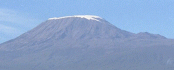
Thompson points out the seemingly linear shrinkage of the glacier. There is some evidence that the glacier shrinkage is not monotonic. Here are some views of Mount Kilimanjaro taken from the same angle in 1976, 1983 and 1997, the first two from here. James Lane points out completely reasonably that the 1983 picture may simply reflect snowfall without any implication on the size of the glacier. Thompson has mentioned heavy snowfall in 1961-62, but did not mention 1983. Barker et al [Science 2001] mention that 1961-62 was a strong El Nino, which led to the high snowfall. 1983 was also a strong El Nino so it is highly probable that there was heavy snowfall that year as well.

View of Kilimanjaro, 1976 original here

View of Kilimanjaro, 1983 original here

View of Kilimanjaro, 1997 original here
Thompson mentions a Cl-36 horizon at 1.6 m in KNIF2. He equates this to the 1.13 m horizon in KNIF3 by dO18 wiggle-matching? Wouldn’t it make more sense to look for Cl-36 in KNIF3: if there’s no such horizon, maybe it’s wasted away ahead of KNIF2. Note that the downspike in KNIF2 (the most negative reading in the entire core) occurs at 0.522 m – after 1952. Needless to say there’s no explanation of this. Arguably this corresponds to an El Nino event – more on this tomorrow.


5 Comments
Couldn’t the anomolous 1983 photo simply represent recent heavy snowfall? You could take similar photos of any high mountain in the Australian alps in different months (or even the same month on different years), and there aren’t even any glaciers there.
RE #1: James, sounds quite possible. I’m not making much of this particular point; the shrinkage of the glacier is inarguable. On the other hand, Thompson cites the role of particularly heavy snowfall in 1961-2 as having some explanatory value in explaining the non-ablation of the 1952 layer in KNIF2. I’m going to post up some info saying that 1961-62 was a strong El Nino. 1983 was a strong El Nino, so it would be very likely that there was heavy snowfall in the year of this picture. That would be consistent with your post. I’ll edit this up to reflect this.
Steve, according to the scale on the map, KNIF1 and KNIF2 are about 85 metres apart, and KNIF2 and KNIF3 are about 110 metres apart. So yes, you’d expect them to be very closely related, certainly nothing that would require such a radical “rescaling”.
Also, the contour lines on the map don’t make any sense … unless half of the 5000m line has been erased, which is of course quite possible.
w.
Put those two cores together, Steve. Now tell me if that thing can be distinguished from noise.
The glacier melts, so what?
Hans Oerlemans (and Georg Kaser) in Vrij Nederland 3 dec 2005
http://www.vn.nl/vn/show/id=45983
Using Babelfish http://babelfish.altavista.com/