In the past few weeks, I’ve been re-examining the long-standing dispute over the discrepancy between models and observations in the tropical troposphere. My interest was prompted in part by Gavin Schmidt’s recent attack on a graphic used by John Christy in numerous presentations (see recent discussion here by Judy Curry).  Schmidt made the sort of offensive allegations that he makes far too often:
@curryja use of Christy’s misleading graph instead is the sign of partisan not a scientist. YMMV. tweet;
@curryja Hey, if you think it’s fine to hide uncertainties, error bars & exaggerate differences to make political points, go right ahead. tweet.
As a result, Curry decided not to use Christy’s graphic in her recent presentation to a congressional committee. In today’s post, I’ll examine the validity (or lack) of Schmidt’s critique.
Schmidt’s primary dispute, as best as I can understand it, was about Christy’s centering of model and observation data to achieve a common origin in 1979, the start of the satellite period, a technique which (obviously) shows a greater discrepancy at the end of the period than if the data had been centered in the middle of the period. I’ll show support for Christy’s method from his long-time adversary, Carl Mears, whose own comparison of models and observations used a short early centering period (1979-83) “so the changes over time can be more easily seen”. Whereas both Christy and Mears provided rational arguments for their baseline decision, Schmidt’s argument was little more than shouting.
Background
The full history of the controversy over the discrepancy between models and observations in the tropical troposphere is voluminous. While the main protagonists have been Christy, Douglass and Spencer on one side and Santer, Schmidt, Thorne and others on the other side, Ross McKitrick and I have also commented on this topic in the past, and McKitrick et al (2010) was discussed at some length by IPCC AR5, unfortunately, as too often, deceptively on key points.
Starting Points and Reference Periods
Christy and Spencer have produced graphics in a similar style for several years. Roy Spencer (here) in early 2014 showed a similar graphic using 1979-83 centering (shown below). Indeed, it was this earlier version that prompted vicious commentary by Bart Verheggen, commentary that appears to have originated some of the prevalent alarmist memes.

Figure 1. 2014 version of the Christy graphic, from Roy Spencer blog (here). This used 1979-83 centering. This was later criticized by Bart Verheggen here.
Christy’s February 2016 presentation explained this common origin as the most appropriate reference period, using the start of a race as a metaphor:
To this, on the contrary, I say that we have displayed the data in its most meaningful way. The issue here is the rate of warming of the bulk atmosphere, i. e., the trend. This metric tells us how rapidly heat is accumulating in the atmosphere – the fundamental metric of global warming. To depict this visually, I have adjusted all of the datasets so that they have a common origin. Think of this analogy: I have run over 500 races in the past 25 years, and in each one all of the runners start at the same place at the same time for the simple purpose of determining who is fastest and by how much at the finish line. Obviously, the overall relative speed of the runners is most clearly determined by their placement as they cross the finish line – but they must all start together.
The technique used in the 2016 graphic varied somewhat from the earlier style: it took the 1979 value of the 1975-2005 trend as a reference for centering, a value that was very close to the 1979-83 mean.
Carl Mears
Ironically, in RSS’s webpage comparison of models and observations, Christy’s longstanding adversary, Carl Mears, used an almost identical reference period (1979-84) in order that “the changes over time can be more easily seen”. Mears wrote that “If the models, as a whole, were doing an acceptable job of simulating the past, then the observations would mostly lie within the yellow band”, but that “this was not the case”:
The yellow band shows the 5% to 95% envelope for the results of 33 CMIP-5 model simulations (19 different models, many with multiple realizations) that are intended to simulate Earth’s Climate over the 20th Century. For the time period before 2005, the models were forced with historical values of greenhouse gases, volcanic aerosols, and solar output. After 2005, estimated projections of these forcings were used. If the models, as a whole, were doing an acceptable job of simulating the past, then the observations would mostly lie within the yellow band. For the first two plots (Fig. 1 and Fig 2), showing global averages and tropical averages, this is not the case.
Mears illustrated the comparison in the following graphic, the caption to which states the reference period of 1979-84 and the associated explanation.

Figure 2. From RSS here. Original caption: Tropical (30S to 30N) Mean TLT Anomaly plotted as a function of time. The the blue band is the 5% to 95% envelope for the RSS V3.3 MSU/AMSU Temperature uncertainty ensemble. The yellow band is the 5% to 95% range of output from CMIP-5 climate simulations. The mean value of each time series average from 1979-1984 is set to zero so the changes over time can be more easily seen. Again, after 1998, the observations are likely to be below the simulated values, indicating that the simulation as a whole are predicting more warming than has been observed by the satellites.
The very slight closing overlap between the envelope of models and envelope of observations is clear evidence – to anyone with a practiced eye – that there is a statistically significant difference between the ensemble mean and observations using the t-statistic as in Santer et al 2008. (More on this in another post).
Nonetheless, Mears did not agree that the fault lay with the models, instead argued, together with Santer, that the fault lay with errors in forcings, errors in observations and internal variability (see here). Despite these differences in diagnosis, Mears agreed with Christy on the appropriateness of using a common origin for this sort of comparison.
IPCC AR5
IPCC, which, to borrow Schmidt’s words, is not shy about “exaggerat[ing or minimizing] differences to make political points”, selected a reference period in the middle of the satellite interval (1986-2005) for their AR5 Chapter 11 Figure 11.25, which compared a global comparison of CMIP5 models to the average of 4 observational datasets.

Figure 3. IPCC AR5 WG1 Figure 11.25a.
The effective origin in this graphic was therefore 1995, reducing the divergence between models and observations to approximately half of the full divergence over the satellite period. Roy Spencer recently provided the following diagram, illustrating the effect of centering two series with different trends at the middle of the period (top panel below), versus the start of the period (lower panel). If the two trending series are centered in the middle of the period, then the gap at closing is reduced to half of the gap arising from starting both series at a common origin (as in the Christy diagram.)
|
|
|
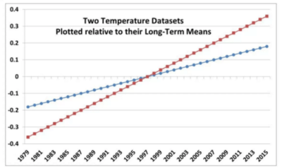
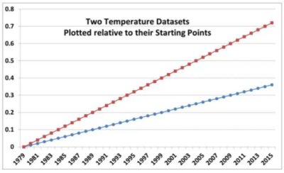
Figure 4. Roy Spencer’s diagram showing difference between centering at the beginning and in the middle.
Bart Verheggen
The alarmist meme about supposedly inappropriate baselines in Christy’s figure appears to have originated (or at least appeared in an early version) in a 2014 blogpost by Bart Verheggen, which reviled an earlier version of the graphic from Roy Spencer’s blog (here) shown above, which had used 1979-83 centering, a choice that was almost exactly identical to the 1979-84 centering that later used by RSS/Carl Mears (1979-84).
Verheggen labeled such baselining as “particularly flawed” and accused Christy and Spencer of “shifting” the model runs upwards to “increase the discrepancy”:
They shift the modelled temperature anomaly upwards to increase the discrepancy with observations by around 50%.
Verheggen claimed that the graphic began with an 1986-2005 reference period (the period used by IPCC AR5) and that Christy and Spencer had been “re-baseline[d]” to the shorter period of 1979-83 to “maximize the visual appearance of a discrepancy”:
The next step is re-baselining the figure to maximize the visual appearance of a discrepancy: Let’s baseline everything to the 1979-1983 average (way too short of a period and chosen very tactically it seems)… Which looks surprisingly similar to Spencer’s trickery-graph.
Verheggen did not provide a shred of evidence showing that Christy and Spencer had first done the graphic with IPCC’s middle-interval reference period and then “re-baselin[ed]” the graphic to “trick” people. Nor, given that the reference period of “1979-83” was clearly labelled on the y-axis, it hardly required reverse engineering to conclude that Christy and Spencer had used a 1979-83 reference period nor should it have been “surprising” that an emulation using a 1979-83 reference period would look similar. Nor has Verheggen made similar condemnations of Mears’ use of a 1979-84 reference period to enable the changes to be “more easily seen”.
Verheggen’s charges continues to resonate in the alarmist blog community. A few days after Gavin Schmidt challenged Judy Curry, Verheggen’s post was cited at Climate Crocks as the “best analysis so far of John Christy’s go-to magical graph that gets so much traction in the deniosphere”.
The trickery is entirely the other way. Graphical techniques that result in an origin in the middle of the period (~1995) rather than the start (1979) reduce the closing discrepancy by about 50%, thereby, hiding the divergence, so to speak.
Gavin Schmidt
While Schmidt complained that the Christy diagram did not have a “reasonable baseline”, Schmidt did not set out criteria for why one baseline was “reasonable” and another wasn’t, or what was wrong with using a common origin (or reference period at the start of the satellite period) “so the changes over time can be more easily seen” as Mears had done.
In March 2016, Schmidt produced his own graphics, using two different baselines to compare models and observations. Schmidt made other iconographic variations to the graphic (which I intend to analyse separately), but for the analysis today, it is the reference periods that are of interest.
Schmidt’s first graphic (shown in the left panel below – unfortunately truncated on the left and right margins in the Twitter version) was introduced with the following comment:
Hopefully final versions for tropical mid-troposphere model-obs comparison time-series and trends (until 2016!).
This version used 1979-1988 centering, a choice which yields relatively small differences from Christy’s centering. Victor Venema immediately ragged Schmidt about producing anomalies so similar to Christy and wondered about the reference period:
@ClimateOfGavin Are these Christy-anomalies with base period 1983? Or is it a coincidence that the observations fit so well in beginning?
Schmidt quickly re-did the graphic using 1979-1998 centering, thereby lessening the similarity to “Christy anomalies”, announcing the revision (shown on the right below) as follows:
@VariabilityBlog It’s easy enough to change. Here’s the same thing using 1979-1998. Perhaps that’s better…
After Schmidt’s “re-baselining” of the graphic (to borrow Verheggen’s term), the observations were now shown as within the confidence interval throughout the period. It was this second version that Schmidt later proffered to Curry as the result arising from a “more reasonable” baseline.
|
|
|


Figure 5. Two figures from Gavin Schmidt tweets on March 4, 2016. Left – from March 4 tweet, using 1979-1988 centering. Note that parts of the graphic on the left and right margins appear to have been cut off, so that the graph does not go to 2015. Right- second version using 1979-1998 centering, thereby lowering model frame relative to observations.
The incident is more than a little ironic in the context of Verheggen’s earlier accusations. Verheggen showed a sequence of graphs going from a 1986-2005 baseline to a 1979-1983 baseline and accused Spencer and Christy of “re-baselining” the graphic “to maximize the visual appearance of a discrepancy” – which Verheggen called “trickery”. Verheggen made these accusations without a shred of evidence that Christy and Spencer had started from a 1986-2005 reference period – a highly questionable interval in the first place, if one is trying to show differences over the 1979-2012 period, as Mears had recognized. On the other hand, prompted by Venema, Schmidt actually did “re-baseline” his graphic, reducing the “visual appearance of a discrepancy”.
The Christy Graphic Again
Judy Curry had reservations about whether Schmidt’s “re-baselining” was sufficient to account for the changes from the Christy figure, observing:
My reaction was that these plots look nothing like Christy’s plot, and its not just a baseline issue.
In addition to changing the reference period, Schmidt’s graphic made several other changes:
- Schmidt used annual data, rather than a 5-year average.
- Schmidt showed a grey envelope representing the 5-95% confidence interval, rather than showing the individual spaghetti strands;
- instead of showing 102 runs individually, Christy showed averages for 32 models. Schmidt seems to have used the 102 runs individually, based on his incorrect reference to 102 models(!) in his caption.
I am in the process of trying to replicate Schmidt’s graphic. To isolate the effect of Schmidt’s re-baselining on the Christy graphic, I replicated the Christy graphic as closely as I could, with the resulting graphic (second panel) capturing the essentials in my opinion, and then reproduced the graphic using Schmidt centering.
The third panel isolates the effect of Schmidt’s 1979-1998 centering period. This moves downward both models and observations, models slightly more than observations. However, in my opinion, the visual effect is not materially changed from Christy centering. This seems to confirm Judy Curry’s surmise that the changes in Schmidt’s graphic arise from more than the change in baseline. One possibility was that change in visual appearance arose from Christy’s use of ensemble averages for each model, rather than individual runs. To test this, the fourth panel shows the Christy graphic using runs. Once again, it does not appear to me that this iconographic decision is material to the visual impression. While the spaghetti graph on this scale is not particularly clear, the INM-CM4 model run can be distinguished as the singleton “cold” model in all four panels.
Figure 1. Christy graphic (left panel) and variations. See discussion in text. The blue line shows the average of the UAH 6.0 and RSS 3.3 TLT tropical data.
Conclusion
 There is nothing mysterious about using the gap between models and observations at the end of the period as a measure of differing trends. When Secretariat defeated the field in the 1973 Belmont by 25 lengths, even contemporary climate scientists did not dispute that Secretariat ran faster than the other horses.
Even Ben Santer has not tried to challenge whether there was a “statistically significant difference” between Steph Curry’s epic 3-point shooting in 2015-6 and leaders in other seasons.  Last weekend, NYT Sports illustrated the gap between Steph Curry and previous 3-point leaders using a spaghetti graph (see below) that, like the Christy graph, started the comparisons with a common origin. The visual force comes in large measure from the separation at the end.
If NYT Sports had centered the series in the middle of the season (in Bart Verheggen style), then Curry’s separation at the end of the season would be cut in half. If NYT Sports had centered the series on the first half (in the style of Gavin Schmidt’s “reasonable baseline”), Curry’s separation at the end of the season would likewise be reduced. Obviously, such attempts to diminish the separation would be rejected as laughable.
There is a real discrepancy between models and observations in the tropical troposphere. If the point at issue is the difference in trend during the satellite period (1979 on), then, as Carl Mears observed, it is entirely reasonable to use center the data on an early reference period such as the 1979-84 used by Mears or the 1979-83 period used by Christy and Spencer (or the closely related value of the trend in 1979) so that (in Mears’ words) “the changes over time can be more easily seen”.
Varying Schmidt’s words, doing anything else will result in “hiding” and minimizing “differences to make political points”, which, once again in Schmidt’s words, “is the sign of partisan not a scientist.”
There are other issues pertaining to the comparison of models and observations which I intend to comment on and/or re-visit.


282 Comments
The Verheggen and Spencer links go to the same place, Spencer’s.
Steve: fixed.
The Consensus of 97% of the Models is that the Earth is flat out wrong.
or
The Consensus of 97% of the Models is that this is the wrong Earth. 🙂
Of course it’s all political. Statistics allows a person to twist the data to whatever whim you’re chasing. The problem for Gavin Schmidt is that historical context is irrelevant to where we’re going. Looking backwards results in nothing because we can’t change the past (unless you work for NOAA). Divergence, whether or not it’s by 50% as great as some other researchers’ conclusion, is still a divergence.
There are more differences between the left and right panels of figure 5 than a simple baseline change. For example, looking at the model-mean (dark black) curve, on the right panel, years 2005/6/7 form a “v” shape, while on the left, the curve increases over that interval. Or consider 2004, which is the bottom of a small “v” in the satellite series — on the left the model-mean curve shows a corresponding “v”, while the right panel lacks that feature. Etc.
Steve: you’ve got sharp eyes. I noticed this as well and have been trying to reverse engineer. You did well to spot so quickly.
Also, Gavin seems to have mixed up his data labeling. For example, he shows RSS 3.3 as warmer than UAH v5.6 when in fact the reverse is true: RSS has been cooler than UAH v5.6 this century. The whole of Gavin’s plot seems of dubious accuracy. Tweet science.:-)
In the Figure 1 caption is there supposed to be a link in the word “here”. “This was later criticized by Bart Verheggen here.”
It reads that way to me.
Unless you mean Bart Verheggen criticized the graph at Climate Audit?
On balance – seems like a link is missing (to me).
Steve: thanks. fixed.
Lessons from Lysenko; the Russians have the best model, and it is obvious why. But the lesson is not about models, but about narrative.
==============
Advances in climate science: moved on from “hide the decline” to “hide the discrepancy.” Great article, thanks. Can anyone point me to a discussion of the differences among the models? Wondering why the Russian one runs cooler.
Better clouds, better oceans. Mebbe better aerosols and water vapour feedback.
=================
Ron Clutz did an analysis. Bottom line is more ocean thermal inertia, less water vapor feedback.
Thanks, Rud. Ron Clutz was my source but I neither remembered his name nor accurately his findings. See my bias on display?
============
Steve, Any idea why the grey envelope in the two Schmidt charts that you presented are visually different? It looks much more than rebaselining to different time period means should account for.
Steve: Masterful exposition.
I second that! Even I can understand this, and I will now be sure I understand the “baseline” used when I am viewing such comparisons. I was being fooled!
Thank you!
Reblogged this on CraigM350.
I really can’t believe that a scientist with peer-reviewed papers to his name, like Gavin Schmidt, would stoop to trying to hide the gap in such a way. In a race with error-prone observations, the only thing at issue is how to fairly draw a line between the runners at the start of the race. It is not whether the correct time to draw that line is at the start of the race or in the middle of the race.
Rich.
Got this from Gavin Schmidt on Twitter re: this article
Steve: the issue of observational uncertainties was discussed at length in McKitrick et al (2010) pdf and the rejected MM commentaries on Santer et al 2008. pdf pdf. As I noted in my post, I plan to discuss other aspects of the comparison in forthcoming posts.
But it was my understanding that Schmidt held that the Christy baseline was not “reasonable”, while other warmists (Sinclair, Verheggen) accused Christy of “trickery” in connection with the baseline. If Schmidt does not agree with such accusations and believes that the issues lie elsewhere, then it would be helpful if he says so.
Observation Error, not Structural Uncertainty?
Structural uncertainty, aka model inadequacy, model bias, or model discrepancy, which comes from the lack of knowledge of the underlying true physics. It depends on how accurately a mathematical model describes the true system for a real-life situation, considering the fact that models are almost always only approximations to reality. One example is when modeling the process of a falling object using the free-fall model; the model itself is inaccurate since there always exists air friction. In this case, even if there is no unknown parameter in the model, a discrepancy is still expected between the model and true physics.
Experimental uncertainty, aka observation error, which comes from the variability of experimental measurements. The experimental uncertainty is inevitable and can be noticed by repeating a measurement for many times using exactly the same settings for all inputs/variables.
Qualitatively, what the MSU and RAOB measurements indicate is that for the MSU era, the Hot Spot has not appeared. Exactly why and what that means with respect to AGW would appear to be open to conjecture.
One problem with assuming large error with the upper air obs is that
the obs tend to agree qualitatively with each other and with models:
1.) in the lower, mid, and upper stratosphere globally
2.) in the lower troposphere globally
3.) in the lower, mid, and upper troposphere over the Arctic
That the RAOBS and MSU tend to agree everywhere,
and that they tend to agree with the models everywhere but the mid and upper sub-polar troposphere
tends to strengthen the case for the observations.
Radiative forcing is occurring, the earth’s surface is warming.
But are sub-grid scale parameterizations are unlikely to harbor predictive power in GCMs?
more missing the point
??? The real “point” was not missed by Mr. Schmidt previously. For purposes of politics and partisanship and obtaining money, graphic representations are important. Such is what is shown to the politicians and public–not tables of data. It is partisanship and calling it “science” while calling the opponent “partisan” is just part of the game. Schmidt’s no fool, he knows how to keep the money coming. Of course, he has to follow through with the “structural uncertainty in the ‘obs'” line successfully because if he cannot, he has stepped into a trap of his own instigation.
Structural uncertainty
Latest buzzterm of the faithful. Fits well in tweets. Lends itself to a multitude of expressions and is vague enough to gain currency with the AGW crowd. In short, pseudoscience at its best. Mosh loves it.
funny. When I talked about structural uncertainty back in 2007, skeptics thought it was great to talk about.
It’s not that hard to understand. It’s basically model inadequacy. In the data analysis of observations
there are often times where we make adjustments. These adjustments are based on models. Those models themselves are sources of potential bias.
Take RSS for example.
1. Satellites do not sample the earth at uniform times.
2. To “shift” all the observations to a standard time (local noon ) the measurements must be adjusted.
3. To do this adjustment a model is created ( ie, if its 34F at 9AM whats the temp at noon.
4. RSS used a SINGLE GCM to create this model.
5. Given THAT GCM you get one collection of “shifts”
So the question is “Is that model good? or how much does that arbitrary choice of using one GCM impact
the final answer?
To look at that you then do a sensitivity analysis by picking other GCMs..
And BAM! what do you see?
You see that the choice of GCM can change the answer. BIG TIME!
Or Take all the “re calibrations” that have to be done to sat data.
1. The sensors are calibrated in the lab.
2. The calibration gives you two datapoints: One for “cold space” ( say 700 counts) and one for the
hot target ( 3500 counts ).
3. You then generate a non linear calibration curve. Without this curve you cannot transform
sensor counts into temperature.
4. The satillite launches and then you find out… OPPS.. the in field “counts” for cold space are 1800!
Jesus. You have to generate a different non linear calibration curve. That is, you have to create
a new MODEL for transforming counts into temperature.
5. You guessed it! that model itself is a source of uncertainty.
Most skeptics are not skeptical enough.
S.M. – I do not see how your comments about data analysis of observations impeach McIntyre’s comments re: Schmidt’s comments re: reference periods. I.e., one could cavil or find major fault with one or more or all sets of observations, and the same for one or more or all of the model runs. Such is not fundamental to a discussion here about reference periods in these graphical representations.
Mosh, Gavin tweets “structural uncertainty in the ‘obs'”. What do you think, satellite bashing?
Could be. Lot of that going around today. Christy and Spencer seemed to have stuck a harpoon deep in AGW with their graphics. I predict that satellite bashing will increase. Funny that Mears leads the charge, but remember, RSS depends entirely on public funding: grants from NASA, NSF, NOAA. And of course, they stand to lose that if the election goes the wrong. By the way, Santa Rosa is not far from Berkley, right? About 50 miles, I think. How’s ehak?
“S.M. – I do not see how your comments about data analysis of observations impeach McIntyre’s comments re: Schmidt’s comments re: reference periods. I.e., one could cavil or find major fault with one or more or all sets of observations, and the same for one or more or all of the model runs. Such is not fundamental to a discussion here about reference periods in these graphical representations.”
I’m responding to mpainter. Not to Steve’s analysis, which seems spot on.
These are the unaddressed issue with comparing Sat “observations” to model outputs is that few
have described in clear enough detail to know how exactly they actually get and process the “model” data.
1. What source do they use? do they use the data as generated by the models? Or the data AS archived
at the official data archives? or do they download from a source like KNMI which does not
document its process of archiving data?
2. What hPa do they use? How do they reconcile that with satellite data which is a proxy for
the entire column ?
3. How do they treat the time of observation? satellite data is for local noon, what about GCM data?
4. Masking. All the satellite data has gores, at the poles and at various regions ( Tibet and Chile)
do they mask appropriately?
Once folks are clear on the source data and how it is acquired, then you can address the chartsmanship issues.
I dont have any fervid interest in the chartsmanship issues or the baselining issues until the basics are addressed.
first things first. Where did you get the data. when did you get it. how did you get it. how did you process it and THEN how did you present it.
That’s just how I do everything. chartsmanship is always last for me and the most uninteresting, cause its basically politics and rhetoric. Its OK to be interested in that, manyfind it fun. I dont so much.
I agree, there’s a lot that goes into the MSU stew.
But RAOBs and multiple MSU analyses all tend to agree qualitatively, with height, with maxima and minima, and location.
And they tend to confirm the model predictions in areas other than the Hot Spot.
“Mosh, Gavin tweets “structural uncertainty in the ‘obs’”. What do you think, satellite bashing?”
Err no.
When HADSST was redone using an ensemble approach ( multiple adjustmeent approaches ) my sense was this
was a good thing. It wasnt bucket bashing.
When Thorne stressed the importance of structural uncertainty in early drafts of Ar5 I thought it was a good thing.
When Mears published his analysis of structural uncertainty I thought it was a good thing. When I posted
about that here, some folks said “Its about Time!!” its a good thing
Since 2007 a few people have been asking for the code and data especially for satellites. google magicjava.
Now that the code is available ( but hard to find ) you can expect folks to look at it and question
the assumptions of data analysis. That’s a good thing. I dont care about the politics.
Long ago (2012) At berkeley earth we had one guy dedicated to looking at satellite data. So I sat through
a bunch of rocket science presentations. My take away? Both sides were putting waaay too much faith
in the measurements. tons and tons of assumptions.
It’s not an issue of bashing. Its a simple issue of understanding every step and every decision made in the process and then looking at how those choices shape the answer.
you are welcome to defend the “observations” but I’d suggest looking at the sausage factory first.
Steve Mosher: “Once folks are clear on the source data and how it is acquired, then you can address the chartsmanship issues.
I dont have any fervid interest in the chartsmanship issues or the baselining issues until the basics are addressed.
first things first. Where did you get the data. when did you get it. how did you get it. how did you process it and THEN how did you present it.”
I think this subject is O/T for this thread, but I agree with your comments. I have never seen it aggressively argued that the GCM’s may be right because observational uncertainty is so great! Seems like a good way to get hoisted on a petard.
Mosh, far be it from you to bash satellites? You describe them as a
“Sausage factory”.. and you don’t call it satellite bashing to say that?
Would you describe Berkeley earth as a “sausage factory”?
####
Also, if Gavin did not mean satellites, what could he have meant?
###
Also, Spencer, Christy, and Braswell are about to publish.Sit tight and then have at. But Mosh,you surely consider it possible that they know their business better than you do.
### Good to know that your and Gavin’s and Mear’s motivations are unsullied by any base political considerations. I think.
Regarding the sniping against the Spencer, Christy observations vs models graphics, I’m fine with satellite data, which I consider to be more reliable than the surface datasets, even though these depend on satellite data, to some extent, such as infilling. The real discrepancy between satellite and surface data is in the last four years, more or less. When Spencer, Christy, and Braswell publish (soon, hopefully), there will be intense interest. Then Spencer, Christy, and Braswell will have their say. It should be good.
Mosh, your own BEST product has been criticized a lot. I have never seen you address the sitting issues (spurious warming), nor such issues as raised by Willis Eschenbach, nor your assumptions in your algorithms. But the best defense is a good offense. I predict that you will continue to ignore these criticisms and join in with Mears, Schmidt, and the rest in attacking the UAH product.
“Mosh, far be it from you to bash satellites? You describe them as a
“Sausage factory”.. and you don’t call it satellite bashing to say that?
Would you describe Berkeley earth as a “sausage factory”?”
1. and you don’t call it satellite bashing to say that?. Nope. It is a sausage factory.
Look at the code. Judge for your self. It might be tasty sausage. I like tasty sausage.
2. Would you describe Berkeley earth as a “sausage factory”?. Of course. There are many moving
parts. Again, be more skeptical and go look for yourself. List the assumptions and decisions
made in all the approaches. Compare, explain, quantify.
It still amazes me that no one wants to look critically at the adjustment processes of the satellite
data. It’s actually quite stunning. For years I told folks that RSS adjusts their data with a GCM.
did folks care that physics they dont trust (GCM) is used to adjust “raw” data? Nope. That might be
because they like the “observations”. me? every dataset gets the same treatment. Show me the source data.
Show me every step and every decision. It seems weird to suggest that I put my skepticism aside.
“Regarding the sniping against the Spencer, Christy observations vs models graphics, I’m fine with satellite data, which I consider to be more reliable than the surface datasets, even though these depend on satellite data, to some extent, such as infilling. The real discrepancy between satellite and surface data is in the last four years, more or less. When Spencer, Christy, and Braswell publish (soon, hopefully), there will be intense interest. Then Spencer, Christy, and Braswell will have their say. It should be good.”
“I’m fine with satellite data, which I consider to be more reliable than the surface datasets, even though these depend on satellite data, to some extent, such as infilling. The real discrepancy between satellite and surface data is in the last four years, more or less. ”
1. Err No. the “discrepancy” is limited to specific times and regions.
2. During the MSU period, there is little to no discrepancy.
3. During the AMSU period, the vast majority of the discrepancy is over land.
4. the discrepancy over land is focused on Areas of the globe that exhibit temperature inversions
5. the discrepancy over land is focused on areas of the globe where the surface characteristics have
changed.. namely changes that impact emissivity, like snow cover.
6. For RSS the calculation of temperature assumes a constant emissivity of earth.
“Mosh, your own BEST product has been criticized a lot. I have never seen you address the sitting issues (spurious warming),”
1. We published a paper on it.
2. in July 2012 here on Climate audit I asked Anthony for his “newest data” he refused. I argued
That he could just sit on the data for years and that I would sign an NDA to see it.
I was informed that my concerns about delays in releasing the data were unfounded.
That data is still unreleased.
3. The actual siting criteria have never been field tested properly. The only test I know of
( Le Roy co worker) indicated really small biases.. on the order of .1C.
So I guess you could say that no one ever responded to my criticism of SITING RATINGS.
basically, the site rating system (CRN1-5) has never been tested as a valid rating system.
of course, Since we wrote a paper using his system, you can expect that we would have written
to him and asked for the field test data that backed up the rating approach..
Like I said, skeptics need to be MORE skeptical. You’all just swallowed the CRN rating approach
cause NOAA did. you never actually checked its history.
“nor such issues as raised by Willis Eschenbach, nor your assumptions in your algorithms. But the best defense is a good offense. I predict that you will continue to ignore these criticisms and join in with Mears, Schmidt, and the rest in attacking the UAH product.”
1. splitting stations was WILLIS’S idea.
2. the second criticism I am aware of is his criticsm of using 500meter data for UHI studies
a) I’ve re looked at classifications using 300 meter data. No difference.
b) the chinese have just posted 30 meter data. Processing all that will take time.
c) I have a standing offer to anyone who wants to suggest a better metric for urbanity
3. The “sawtooth” critique.
a) Looked for this phenomena. Doesnt exist
b) the critique itself doesnt understand how adjustments are done. Anyone who read the code
can see that.
4. Assumptions in the algorithms. There are tons of assumptions. They are all listed in the Appendix
those that could be tested via sensitivity were tested. As an example, how to do breakpoint
So, I havent ignored the criticisms. What I do find is that when I answer one
“what about micro site?”
answer: read our paper.
the answer is typically ignored.
the best criticisms of the implemetation belong to
A) mwgrant
B) brandon and Carrick
5. Attacking the UAH product? Since when is writing about RSS an attack on UAH?
And since when is looking at uncertainty an attack?
Err, yes, the real discrepancy has occurred in recent years, as I stated. Of course I meant the global anomaly and I think that you knew that.
You repeatedly ignore comments that address perceived faults in BEST methods, practices, etc. This is the impression that you project universally. So your complaints about others have no force, don’t you see?
Please show how land discrepancies are not the result of spurious warming via siting issues, fallacious infilling, and data fiddling of the sort that has been copiously documented. You see, if you wish to compare land datasets with satellite, you are going to have credibility
You never made it clear that you were not including UAH in your criticism of “satellites” (you used the plural repeatedly). So now you say that you meant RSS, not UAH? This discussion has come to this.
Err, yes, the real discrepancy has occurred in recent years, as I stated. Of course I meant the global anomaly and I think that you knew that.”
1. You said “The real discrepancy between satellite and surface data is in the last four years”
2. I said the AMSU period. That starts in 1998. Longer than 4 years.
3. The details in the grid cells tells you more. A real skeptic would push down
to the DETAILS. like I said, be more skeptical
“You repeatedly ignore comments that address perceived faults in BEST methods, practices, etc. This is the impression that you project universally. So your complaints about others have no force, don’t you see?”
1. You cited microsite. We wrote a paper on that. That is not ignoring.
2. Willis had 2 complaints that I recall. UHI 500 meter issues. I addressed that
‘Sawtooth” I could not find anything like that in the data.
3. JeffId had an issue about how we calculated CIs. We did it his way and the CI
got SMALLER.
4. Brandon and carrick had an issue with smoothing. We acknowledged the possibility
in fact we raised the issue ourselves first
5. carrick had an issue with Correlation being different east to west. We had already
noted that in our paper.
6. Rud had an issue with an antarctic station. We had already noted that antartica was
problematic. I think the issues are related to temperature inversions and told Rud
as much.
7. mwgrant has issues with the description of climate as merely a function of latitude
and altitude. That’s a real issue but we’ve found that adding other variables to
the regression didnt help.
I am sure there is no end to objections. One simple answer is this. If you have a problem
we have provided all the tools and data you need to SHOW how changing our assumptions
will change the answer. So, if you think microsite matters, go get the data. remove
all the bad stations and DEMONSTRATE that there is a problem. In short we give
you all the tools to prove how our decisions skew the answer. You think “sawtooth” is
a problem? go find one. Generally the approach is this: A guy says
“what about airports?” I tell him “we looked at removing all airports” we looked at
airports versus non airports” he says.. what about heliports? what about unicorns?
what about every other tuesday? you see the “making work” is endless. Folks know
how this works. This is what was done to Odonnells work on antartica.. where the reviewers
just forced him to do endless work. In any case, you have the code. you have the data.
THOSE are the best tools to actually demonstrate a point. you know, like when SteveM shows
how the answer changes when you make decisions differently than Mann did.
“Please show how land discrepancies are not the result of spurious warming via siting issues, fallacious infilling, and data fiddling of the sort that has been copiously documented. You see, if you wish to compare land datasets with satellite, you are going to have credibility”
1. Spurious warming due to siting has never been demonstrated. the last attempt was 2012.
That “paper” was withdrawn by Anthony. the data remains unavailable.
2. We dont infill.
3. When comparing Land to Satellite in my mind neither gets PRIORITY. I will note
that the various versions of UAH and RSS have dramatic differences. That is structural
uncertainty. lets put it this way. OR..If you accept that CRN stations are a gold standard
then the bad stations match them exactly over the last 15 years.
“You never made it clear that you were not including UAH in your criticism of “satellites” (you used the plural repeatedly). So now you say that you meant RSS, not UAH? This discussion has come to this.”
UAH is subject to the same TYPES of objections that RSS is subject to. Their next gen product differs materially from their last gen product. THAT should tell you something about structural
uncertainty. If tommorrow I said I had a new way of calculating temperatures and my
trend increased by 5% you’d kinda wonder now wouldnt you?. Satellites is PLURAL
because there are Multiple satellites used. For christs sake you didnt even know the switch over to AMSU was in 1998. Again, be more skeptical. More skeptical about siting issues, more skeptical about satellite adjustments, more skeptical about method changes that yeild vastly
different answers.
In the end here is what we have.
1. GCM models: and Statistical models of the data they put out.
2. Models of satellite observations
3. Models of surface observations
4. Models of Sond data.
None of those models ( physical or statistical) are perfect. they are all subject to error and bias. the best place to start is to compare them all with a clear understanding of all the uncertainties. Then you might START the process of figuring out which was most reliable.
Again, you need to be more skeptical.
Mosher, sophistry is your forte.
By the way, Mosh, satellite bashing is the new style with the AGW hard core, as I’m sure you know.
You say Gavin Schmidt was not satellite bashing with his tweet “structural uncertainty in the obs” but you offer no alternative meaning for his tweet. You probably have none. It’s a safe bet that he was sniping at UAH, Christy, Spencer.
Mears is satellite basher #1. That is, when he is not bashing “denialists” (his word).
Funny that. The RSS website still claims that their product is “research quality data”. Should the conscientious citizen compare that claim with what Mears has recently published on MSU/AMSU data reliability? Or, rather, unreliability? Seems to be a big discrepancy. Perhaps the RSS funding sources (NASA, NOAA, NSF) should be alerted. Certainly they would be concerned if public funds were being wasted.
I stick with my prediction that satellite bashing will intensify among the AGW hard core. And that UAH will be the main focus.
As for Mears and RSS, if they do not produce “research quality data”, I do not see how their funding by the public can be justified.
In the end here is what we have.
1. GCM models: and Statistical models of the data they put out.
2. Models of satellite observations
3. Models of surface observations
4. Models of Sond data.
Yes.
And all four tend to agree ( within noise ) everywhere except for the Hot Spot ( which may or may not appear later ).
Confirmation of all, except the GCM Hot Spot?
Mosh and his RSS-GCM obsession appears again.
It’s a valid point…just like criticisms of the adjustments to the surface record, which seem to happen much more frequently and with much greater magnitude.
Steve: please do not coat-rack discussion of the surface record onto the issue of baseline-shifting. I know that there have been prior comments, but enough.
This is probably true in certain quarters. Undoubtedly Monckton will have chosen the data which suited his argument. Though he is smart and correct about many things, he is no more an honest broker then Gavin Schmidt.
Again UAH does not use GCM, and this is a good reason to prefer their extractions.
It was interesting that the warmist RSS showed less warming the sceptical UAH, that was reassuring about the objectivity of both efforts. – snip about motives
Don’t know what WordPress did the markup there. I closed the ‘strong’ tag and inserted a strike out. The last sentence was NOT as strikeout:
Steve: it should have been. blog policies discourage attribution of motives to people, especially base motives. It also discourages reference to public political figures, except in sanctioned threads. I regard both parties named as political figures.
-snip
BTW, Mosh always forgets to mention this in regard to satellites…
=======================================
“The weights applied to the pressure level temperatures are determined by radiation code that has been empirically tested. We’ve tested such results with controlled radiosonde measurements and found them to be virtually identical – this was all published in our papers years ago (see Spencer and Christy 1992a,b, Christy et al. 2003, Table 2 of 1992a and Table 7 of 2003 show regional correlations of 0.95 to 0.98)”
=======================================
Mosher writes
This is a weather adjustment, not a climate adjustment. There will be no accumulated errors in making these adjustments, its a straightforward less than 24 hour calculation which we are quite good at.
Compare that with a GCM projecting out say 100 years where the energy accumulation errors accumulate with every 24 hours of calculation that “passes”. That kind of bias obviously impacts temperature slopes whereas its not so obvious that the errors introduced by a weather calculation will impact the temperature slope.
Gavin is moving the pea again!
what happens when we rebase the global twmp anomaly,1850-2016
and centre it it around -cough- 1934??
1934 eh? That is the problem with all base periods. They are constantly changing as the surface record is constantly being adjusted.
1934 was warmer in 1980 then it is in 2016.
Reblogged this on TheFlippinTruth.
Translation for MSM journalists:
Most (OK, many) people are familiar with statistical deceptions that involve fiddling with the starting point of numbers at the base of a graph (things going upwards or downwards).
Lo, and behold, similar tricks can be done using the axis on the left-hand side of the graph (things going sideways).
When someone (hint?) produces an update of Darrell Huff’s famous 1954 book “How to Lie with Statistics”, Gavin Schmidt will merit a passing reference in the first chapter.
Most of the argument would-be resolved by using actual temperatures, as proper scientists do, instead of this anomaly contrivance so loved by the climate researchers.
But then, worse problems would be revealed.
Is it science or illusion?
Geoff.
1. Satellites dont give you actual temperatures.
2. RSS DOES provide data tables of an estimated temperature. UAH? if you search roys blog
I think he provided some help in a comment somewhere to help folks go from anomaly to temps
3. Working in real temps has some advantages, but you have to articulate them on a case by case basis.
blanket statements about “use real temps” are not very insightful
4. Even when you use ‘real ‘ temps with satellite data there is an element of arbitrariness: see
RSS ATBD and the references to baselining everything to NOAA-10
“1. Satellites dont give you actual temperatures.”
Nor do liquid-in-glass thermometers, they simply allow you to observe two points on a linear scale, which is not a temperature.
And resistive thermometers give you the change in current through a resistor – an even greater abstraction than the liquid-in-glass thermometer.
yes.
I have made this point several times.
However.
1. The scale on the LIG is linear ( within the temperatures we are talking about and for mercury )
2. The transformation of ‘digital counts” to temperature is Non Linear.
3. The assumptions that are required for LIG amount to this: The liquid inside will expand when it warms.
The amount of expansion will be roughly linear within the range of the device.
4. The asssumptions required for satellites? let me list a few
a) the surface emissivity is constant
b) humidity profiles dont change over time
c) Radiative transfer physics is correct.
d) cloud emissivity doesnt change over the POR
Now most interesting is 4c. You realize that the physics required to turn digital counts into brightness temperature IS THE CORE OF AGW theory?
Mosh, you say
“Now most interesting is 4c. You realize that the physics required to turn digital counts into brightness temperature IS THE CORE OF AGW theory?”
###
But in fact, AGW is principally a hypothesis that puts positive feedback of increased atmospheric water (as vapor and clouds) as an amplifier of CO2 forcing which itself would be inconsequential without such amplification. The whole AGW debate is an inverted pyramid with its tip balanced delicately on the assumptions regarding increased atmospheric water (vapor/clouds). Thus, the crux of the AGW issue is not so much radiative physics as you suppose, rather, it is the poorly founded assumptions concerning atmospheric water.
####
Also, “4. The asssumptions required for satellites? let me list a few
a) the surface emissivity is constant
b) humidity profiles dont change over time
c) Radiative transfer physics is correct.
d) cloud emissivity doesnt change over the POR”
Again, you leave to the reader to determine that you do not refer to UAH but only to the RSS methods. A little clarity would greatly improve your commenting style. In this case, you might have made it clear that your “assumptions required for satellites” did not include UAH.
Mosher wrote about Liquid in Glass thermometers:
“3. The assumptions that are required for LIG amount to this: The liquid inside will expand when it warms. The amount of expansion will be roughly linear within the range of the device.”
There are lots of other additional assumptions required for LIG records.
a) The LIG thermonmeter level must be converted by a fallible human into some specific number.
b) The archiving of that number must be done without error.
c) The 10s of thousands of fallible humans that collect the records are all reading the thermometers in the same way.
c) Time of observation errors.
d) Siting errors.
e) Thermometer enclosure errors (aspiration vs no aspiration).
f) Urban heat island errors.
I’m sure readers could think of many others.
Some of these problems may occur more generally than for just LIG thermometers, but they are still embody assumptions that must be made about the LIG records.
I find that Godel’s incompleteness theorem provides useful context here: any non-trivial logic argument requires an INFINITY of postulates. The vast majority of those postulates may be trivial (For instance, that the universe will not vanish over the time period of interest.), but there are always going to be a lot of important assumptions that must be made. This does not undercut the value of science and mathematics, but should be a caution to all that practice it.
Certainly, it does not appear that the exceedingly complex collection and collation of human LIG observations is likely to be less error prone than a small number of closely monitored satellites.
“But in fact, AGW is principally a hypothesis that puts positive feedback of increased atmospheric water (as vapor and clouds) as an amplifier of CO2 forcing which itself would be inconsequential without such amplification. ”
1. first things first. DO you accept that the effect from c02 alone will be 1.2-1.5C?
2. Yes feedbacks play a role in getting responses up to 4.5C
3. Do you deny there is a possiblility of positive feedbacks?
“The whole AGW debate is an inverted pyramid with its tip balanced delicately on the assumptions regarding increased atmospheric water (vapor/clouds). Thus, the crux of the AGW issue is not so much radiative physics as you suppose, rather, it is the poorly founded assumptions concerning atmospheric water.”
1. No. Its not an inverted pyramid.
2. As long as people agree that 1.2-1.5C is the low estimate established by a no feedback
case THAT is enough to have a dialog about feedbacks. You seem to think its settled
science that there cant be positive feedbacks. I’m skeptical. I think they could be positive.
####
Also, “4. The asssumptions required for satellites? let me list a few
a) the surface emissivity is constant
b) humidity profiles dont change over time
c) Radiative transfer physics is correct.
d) cloud emissivity doesnt change over the POR”
Again, you leave to the reader to determine that you do not refer to UAH but only to the RSS methods. A little clarity would greatly improve your commenting style. In this case, you might have made it clear that your “assumptions required for satellites” did not include UAH.
UAH uses radiative transfer codes that they themselves wrote. dont be stuck on stupid.
The weighting functions they use also assume a) and b)
Go read their documentation.
“Mosher wrote about Liquid in Glass thermometers:
“3. The assumptions that are required for LIG amount to this: The liquid inside will expand when it warms. The amount of expansion will be roughly linear within the range of the device.”
There are lots of other additional assumptions required for LIG records.
a) The LIG thermonmeter level must be converted by a fallible human into some specific number.
b) The archiving of that number must be done without error.
c) The 10s of thousands of fallible humans that collect the records are all reading the thermometers in the same way.
c) Time of observation errors.
d) Siting errors.
e) Thermometer enclosure errors (aspiration vs no aspiration).
f) Urban heat island errors.
#####################
First, I am talking about the PHYSICAL THEORY that gets you from the expansion ot liquid to a temperature. Recall, the reader objected that LIG was a PROXY.
a) The LIG thermonmeter level must be converted by a fallible human into some specific number.
Yes, and you can estimate this error. It is tiny.
And the same goes for Any instrument even a satellite
b) The archiving of that number must be done without error.
yes. same goes for a satellite. I find errors all the time.
c) The 10s of thousands of fallible humans that collect the records are all reading the thermometers in the same way.
yes and you can test for consistency same with satelittes
c) Time of observation errors.
Satillites have larger TOB errors. In fact RSS uses a GCM to correct for them.
d) Siting errors.
Satellite gores. Sensor drift. deteriorating sensors
e) Thermometer enclosure errors (aspiration vs no aspiration).
Hot target errors.
f) Urban heat island errors
You can test for this. remove the urban stations. No difference.
For satellites, errors in removing surface reflections from high altitude
parts of the world. Changing water content of the soil. changing snow
changing tree cover. all of those changes impact the return from the surface
This return must be subtracted OUT so that the returns from the atmopshere are
clean. The number of assumptions is huge.
Some of these problems may occur more generally than for just LIG thermometers, but they are still embody assumptions that must be made about the LIG records.
Yes and we can test the assumptions by comparing subsets of records.
We can compare LIG to other methods.
NONE of those assumptions drives the record.
I find that Godel’s incompleteness theorem provides useful context here: any non-trivial logic argument requires an INFINITY of postulates. The vast majority of those postulates may be trivial (For instance, that the universe will not vanish over the time period of interest.), but there are always going to be a lot of important assumptions that must be made. This does not undercut the value of science and mathematics, but should be a caution to all that practice it.
playing the GODEL card in a pragmatic discussion is a losing move.
“Certainly, it does not appear that the exceedingly complex collection and collation of human LIG observations is likely to be less error prone than a small number of closely monitored satellites.”
All you have to do is look at the change in the last two versions of UAH.
or look at RSS ensembles. The uncertainties they admit to are huge.
Your argument from complexity is backwards. Many little mistakes in the LIG record
basically sum to zero.
One mistake in the satellite record gives you huge errors. Just look at past versions.
Mosh: “1.first things first”
###
As you insist. First, in order that the discussion might proceed in accordance with sound scientific principles, please give support to the assumption that measurements obtained in the laboratory can be applied in a straightforward way to the dynamics of the atmosphere.
Steve: Please don’t. editorial policy at this blog encourages comment on the narrow issue of the thread, as otherwise every thread quickly generates the same arguments.
“…yes.
I have made this point several times…”
Except in this case, you pointed it out as if it were only a shortcoming of the satellites.
Nice touch linking to ATTP from here. Good Lord.
Steve: ATTP made a civil comment upthread. I am encouraged by any breaks in the long-standing fatwa against commenting at CA and prefer that readers are polite.
““…yes.
I have made this point several times…”
Except in this case, you pointed it out as if it were only a shortcoming of the satellites.
Nice touch linking to ATTP from here. Good Lord.”
1. Huh? Your esp is off. as if.
2. ATTP? I read everywhere. I also post everywhere. Did somebody appoint you as link nanny?
Steve: Mosh, I’d prefer that you walk by potential food fights.
There is no guarantee they sum to zero. There have been many changing practices and many “corrections” applied. 70% of the surface record is SST, and that’s a whole other kettle fish ( no pun intended ). LIG may be a more direct proxy of the temperature of hte bulb of the thermometer but the problem, sadly, does not end there.
Mosher writes
IMO the problem for a lot of people is that they see the ~1.1C increase from a doubling of CO2 and then consider what happens from there. Obviously a warmer atmosphere holds more water vapour and so the natural thing for far too many people to think is that the feedback is positive.
– snip-
Steve: Blog policies discourage efforts to argue CAGW from first principles in every thread. I realize that Mosher initiated this (and he ought to know that I discourage this sort of discussion in order to maintain readabliity), but I’m picking up the editing this morning here.
I suppose that if the aim is to pinpoint differences in trend rather than in timelines then a cleaner solution would have been to extract an index of trend, such as slope of the best fit line, to each model or ensemble realization. These could be plotted as a histogram or cumulative frequency curve on which the corresponding points from the observations could be marked. It is at least arguable that if you plot the time series then it is the time series as a whole that you seek to compare rather than one property of the time series. One could take the matter a stage further and ask what is the chance that the observations could derive from a population that can throw up a sample such as the histogram incorporating the uncertainties in the observed trend.
Steve: such analyses have been discussed in the past in connection with Santer et al. In addition, I’ve used boxplots in this way. Also, as I said in my post, I have other posts in the works. Gavin Schmidt also presented a histogram, but did not analyse the results. I intend to analyse this.
Wasn’t meaning to teach Grandma how to suck eggs and look forward to your analysis focused on trend or other properties of the data.
Reblogged this on ClimateTheTruth.com.
It’s the liberal way. Let’s not hurt the models’ feelings so let’s have a “handicap” race so they all finish equal.
LOL – that’s one of the best comments I’ve ever seen!
Yeah, tweeted. Thanks to Steve for such a clear exposition of the baselining dispute, with help from Secretariat and Steph Curry. I’m sure I’ll have much to learn from other installments in the series.
Reblogged this on Tallbloke's Talkshop and commented:
.
.
Still hiding the decline. They never learn.
Thanks, I saw the spat on Twitter and it looked trivial – but then again, I suppose you don’t become an alarmist without being able to build up the smallest thing into some mountain of an issue.
However, I really wish people would use 1990 as the start date because in the 2001 IPCC report, the IPCC said that warming would be at least 1.4C from 1990-2100. This would then allow the comparison of models, official prediction and actual temperatures.
“The trickery is entirely the other way. Graphical techniques that result in an origin in the middle of the period (~1995) rather than the start (1979) reduce the closing discrepancy by about 50%, thereby, hiding the divergence, so to speak.”
I think one could argue to display two sets of results with the average of both removed so as to compare gradients. I could argue that the baseline should be an average of the period, but I would need the curve to be averaged over that period — so it couldn’t start before the average and would not run to the end.
1986-2005? What! If you are using that starting point you should use a twenty year average otherwise it is deceitful.
… On reflection I would like to remove my comment that “it looked trivial” and instead I think Gavin ought to apologise for his appalling graph …. there’s no reason for his average …. it’s not a total average, there’s a massive discrepancy between baseline period and the averaging period shown in the graph. In short, he is showing apples with a baseline to cheese.
The 2 figures from the Schmidt tweet shown above can be compared under simple graphics to save the eye doing it.


Method: Copy the right pane, use a colour invert, overlay the invert onto the left pane then change the transparency of the inverted pane to 50% or so.
Black becomes white, other colours become their RGB inverse and it looks like this –
While there are still separate objects, base + overlay, before you compress into one, you can toggle up/down, stretch X or Y axis etc to match the chosen reference points.
Here, I have simply made the year dates match and the horizontal zero lines match (now less visible with white overlain on black to give mid grey like the background.)
There are more cases of difference than match really.
Not good images to compare by eyeball.
Thanks Geoff. Transparency (with or without inversion) is a great method for comparison.
While we are at it, I wonder if model runs can be equated to pilots to give more problems with their average.
http://www.thestar.com/news/insight/2016/01/16/when-us-air-force-discovered-the-flaw-of-averages.html
Geoff.
Verheggen’s criticism is entirely reasonable. If you baseline on short periods, the result depends a lot on what period you choose. That’s undesirable anyway, and of course lends itself to cherry-picking. As he points out, if you baseline from 1986 to 2005, you get a fairly good correspondence throughout, with a peak in about 1979-1983. If you choose the latter baseline, it just moves evrything down, in the historical and the RCP’s. You can see that the blue curve, especially, dives down over the first three years which creates a discrepancy that is maintained through the historical. A bad match. Shifting that base period forward three years would undo this, to considerable effect. And there is no basis for saying that one or the other is right, as a start period. The “start of race” analogy is juvenile.
To me, the more interesting question is what the climate model numbers actually are? He compares them with temperatures in two different places. Lower troposphere and surface land/ocean (SST). Do the CMIP numbers correspond with one or the other of these? Or something else again?
There’s a fallacy in here somewhere. If the race were tortoise and hare, it makes a great deal of difference where the slice you look at is taken. If the models are zeroed to measured at some date, why isn’t that alignment point their start and a reasonable place to start the performance comparison?
“If the models are zeroed to measured at some date”
They certainly aren’t zeroed at 1979. Christy did that. Models are generally initialised at some remote past date. The reason is that it is well acknowledged that they aren’t solving an initial value problem, so it is more important to attenuate artefacts from initialisation than trying to specify a recent initial state.
Steve: you avoided the following: Do you agree with Verheggen’s accusation of “trickery” against Spencer and Christy? If so, on what grounds do you believe that Mears did not also engage in “trickery”? Or do you also believe that Mears engaged in “trickery”?
Okay, Nick, here’s the problem:
There is a discrepancy between observations and the products of the models.
How should the faithful deal with this glaring efficiency of the models?
Simple enough, just divide the discrepancy into two parts, stick one part at the beginning of the time series comparison and the other part at the end.
Now you can argue all kinds of inanities about “comparison of means”, “model initialization”, “baseline error”, etc. Really there is no limit to the smoke and fog one can generate. Such a clever fellow, that Gavin Schmidt.
Roy Spencer calls the whole debate “silly”, and he is right.
Deficiency, not efficiency.
Oh, yes, mpainter. That’s EXACTLY how it looks like. And the fact that Nick Stokes finds it necessary to defend this “silly” action is also revealing
Nick,
Do you really think Spencer/Christy “Forced” the graph to begin at 1979… Or somehow intentionally “Did” it for any reason (what-so-ever) other than the fact that the satellite era started in 1979..?
This seems to smack of the same sort of charges of nefariousness so condemned in the mainline climate community, you know, the one where they claim that every single argument made is no longer valid because the arguer brought up the idea that whatever was done had an ulterior motive rather than some innocuous Occam’s-Razor type explanation.
“Do you really think Spencer/Christy “Forced” the graph to begin at 1979”
They forced, by offsetting, the CMIP runs to all have 1979-1983 averages equal to 0. That was in the version Verheggen was criticising (Fig 1), and is a rather unnatural thing to do to CMIP. You can see in the more recent plot shown small at the top that uses trendline matching, that there is a scatter in the same period. That is a more reasonable approach.
Nick, you continue to dance around. The hard truth is that it is the trends of the models that depart so egregiously from observed trends. But you won’t admit this.
Nick, you state,
=================
“If you offset to force the error to be zero at 1979, then of course it will grow..”
===================
Why “of course”? Are you saying it will grow because more time is given to show the over warming in the models? Is this not desirable if you wish to improve your marksmanship?? If you are making a consistent error in one direction, then more time will clarify that error will it not?
If, over longer periods the models do not predict to much warming, but are just off over short time frames should not more time demonstrate this, and likely correct it? Therefore your “of course” is not of course” at all.
BTW some skeptics say the models are not informative. but actually they are. If they were all over the park, some very much over warm, some very much over cold, then I would say they are not informative.
Because they are all wrong in ONE DIRECTION, they are highly informative, likely of some general errors in C.S. to CO2.
1979 was when the satellite record began. If I wanted to compare the trend from the beginning of satellite readings to how well models trended over that same period, of course I’d “zero” everything to the start date of the satellite record! Why WOULDN’T I??????
Especially if those models were calibrated using the satellite data themselves!
The idea that the models wouldn’t match up with, or be close to, “observations” means by default that the models can’t simulate reality! If those model runs were hind casts that included the actual satellite data that started in 1979, IOW, they were preprogrammed with specific 1979 data, and they STILL didn’t get 1979 “right”, then they are worthless!
Taking a chart Christy (or anyone) made for a specific purpose, data charted to demonstrate a specific comparison, and attacking what you presume or assume the author’s motives were, because YOU personally do not like that chart for some reason is simple ad hominem-logical fallacy, which has NO place in science.
Calvin’s chart shows the models don’t track reality just like Christy’s does. Normal, rational observers wonder why the leader of NASA’s “climate science community” isn’t discussing THAT instead of bickering over chart centering.
“Really there is no limit to the smoke and fog one can generate.”
That’s right. You never see these pseudotechnical criticism toward the graphs generated to support decadal-scale AGW conjectures, Schmidt and Marvel’s Bloomberg graph, for example. They always flow in one direction
The problem is one of compounding annual error in the models. If you start in 1995, rather than 1979, you allot fewer years for the error to grow even though the ultimate trends are the same.
If one assumes the models accurately recreate global climate one might argue that it makes no difference. Yet the evidence does not suggest that is the case (compounding error).
If one is interested in the likelihood that model projections will be accurate 30 or 50 years into the future it seems that the earlier baseline provides a more appropriate graphic.
“you allot fewer years for the error to grow”
No, that’s just playing games. If you offset to force the error to be zero at 1979, then of course it will grow. That’s just a result of that artifice. The fact is, you have a whole lot of curves that claim to represent climate in the historic period, and you want to add offsets so that they will, as best you can get, be on the same basis for projection into the RCP period. That is, the best fit to the knowledge you have, not the best fit restricted to a five year period.
Steve: you avoided the following: Do you agree with Verheggen’s accusation of “trickery” against Spencer and Christy? If so, on what grounds do you believe that Mears did not also engage in “trickery”? Or do you also believe that Mears engaged in “trickery”?
Nick,
You write, “of course [the error] will grow” if one moves the alignment back to 1979. So you’re conceding that there is a difference in slope?
Nick, do you agree that Mears used essentially the same reference period (1979-84) as the Christy-Spencer reference period(1979-1983) criticized by Verheggen? Do you agree with Verheggen’s accusation of “trickery” against Spencer and Christy? If so, on what grounds do you believe that Mears did not also engage in “trickery”? Or do you also believe that Mears engaged in “trickery”?
No, it’s the result of excessive warming in the models. The error is not random, therefore it accumulates over the length of the projection.
You are asserting an offset error when, in fact, the error is inherent in the models. You may prefer to hide this gap but it exists and is not an artifice.
“Nick, do you agree that Mears used essentially the same reference period (1979-84)”
Yes, and I think the use of a narrow base is subject to the same general objection, that the outcome is likely to depend on the period chosen, and creates an opening for cherry-picking. This does not apply so much to the tropical plot shown, as there doesn’t seem to be a pronounced peak in the observations at this time (1979-84). It didn’t turn out to be a cherry. That may be aided by the use of ensemble for RSS.
It does give the same somewhat misleading impression that both the models and the ensemble have increasing error as you go forward from 1984. That is an artefact of the narrow base.
Nick says “It does give the same somewhat misleading impression that both the models and the ensemble have increasing error as you go forward from 1984. That is an artefact of the narrow base.”
###
That is exactly the case, Nick. The discrepancy increases with time. Yet you say no it does not. You are a wonder.
HarroldW,
“So you’re conceding that there is a difference in slope?”
I’m saying that if you force differences to be zero somewhere, then as you move away, they won’t be zero – ie will increase. Trend differences will exist and will be part of that. Nothing special about that point.
Christy’s new way of using trendlines to fix a comparison is in principle good, and clarifies the issue. If you fix at 1979, you get the best picture of differing trends, but when you come to the RCP period, it makes it hard to see what is happening there. If you want to know about the RCP period, you should fix the trends at the starting point of that. I use a similar method here for comparing spatial maps of present temperature anomaly.
I think Nick has a point. You have to go back to what the models are saying and pick through from there. The actual output of the models is a range of absolute average (1961-90) temps that are from IPCC AR5 WG1 fig 9.8 ~14C +/- 1.5. The models have been spun up and forced to track the instrumental period as I recall.
Using the scenarios to describe what the world might look like in 50 to 100 years time in absolute terms has all the basses covered. The models would be almost impossible to falsify. So we aren’t testing actual model output.
What happens next is that IPCC say we can transform the model output to anomalies from each of their 1961-90 average temp. This forces them all back to zero at that time, and any projection and comparison can really only made against that base. The average of 1961-90 being zero is an essential feature of the claimed accuracy of the projections. It is, using the analogy some have used, the starting line in the IPCC universe. No handicapper in sight.
I’ve got to tell you HAS that you make very little sense.
Nick Stokes: “I’m saying that if you force differences to be zero somewhere, then as you move away, they won’t be zero – ie will increase.”
The only way you can bet on *increasing* (as opposed to changing in either direction) as you move away is if there is a trend difference. That’s simple math. Twice now you’ve said that the difference will increase the further back one sets the baseline. A logical inference from your statements is that you accept that the models run hotter than observations.
mpainter I trust it was only my saying that Nick has a point that caused you to instinctive respond that way, but in case you genuinely didn’t understand:
The model produce absolute temps. Any genuine comparison with actuals should be with those (the system is non-linear with temp so arguing that the slope irons out these problems doesn’t wash).
If you do a test with absolute temps the models project a range so wide they are unfalsifiable. (But equally they provide no useful information about the future for policy makers).
To transform the model output into something roughly consistent the IPCC adds a further step in the modelling, reduction to anomalies from the 1961-1990 averages.
Therefore the only legitimate test of the anomaly output can be with actuals as anomolies that are normalised to 1961-1990.
HAS you do not make any sense. Go tell it to Gavin Schmidt and see if he understands you.
“Do you agree with Verheggen’s accusation of “trickery” against Spencer and Christy?”
Well, as always I encourage proper quoting. Verheggen referred to Spencer’s trickery graph. He made no such accusation against Christy. One tricky thing is that the graph (Fig 1) seems to compare CMIP atmosphere average measures (unspecified) against HADCRUT surface. This is something of which John Christy said on this thread:
“I don’t compare surface vs. troposphere in such plots though some folks seem to be confused”.
But on the specific issue of baselines in Fig 1, what I said was that use of a short baseline gives results dependent on choice and lends itself to cherrypicking. Spencer did indeed come up with a cherry. The zeroing period turned out to be a peak of the observations, which were therefore later displaced down. Mears did not; his short period did not show as a peak in his different data. It is possible that that was just luck, by either party, but that was the effect. The luck aspect is why it is at least not good practice. In principle, John C’s trend usage is at least more stable, and so better.
Verheggen: “But rather than doing a careful analysis of various potential explanations, McNider and Christy, as well as their colleague Roy Spencer, prefer to draw far reaching conclusions based on a particularly flawed comparison: They shift the modelled temperature anomaly upwards to increase the discrepancy with observations by around 50%. Using this tactic, Roy Spencer showed the following figure on his blog recently:”
###
Nick, has anyone ever questioned your honesty?
Nick Stokes:
You suggested above that centering to zero in 1979 was more misleading than leaving “scatter” at 1979 (as in Fig 1).
Although they are comparing different things (e.g., UAH vs combined sat avg) it appears that your preferred “scatter at 1979” plot shows a much larger divergence between averaged models and obs in 2013 (last year of “zeroed” plot).
Is that more, or less, “misleading”?
Sorry, switched the “Fig 1” ID, but point remains the same.
‘Is that more, or less, “misleading”?’
You’re not looking carefully at what is being plotted. Fig 1 is HADCRUT surface and UAH TLT (v5.6) vs presumably (unclear) TLT-weighted CMIP. Christy’s fig is TMT weighted CMIP vs TMT (average of 3) and TMT-weighted ballon data.. Any difference in divergence is likely due to the different data rather than plotting style.
The bickering here seems to be about wheter the presentation of what the models and observations show, compared side by side, if only anomalies are shown. Particularly, if you should be allowed to recalibrate them time and time again if those two diverge.
That’s bad enough
Here is what the models are saying/predicting about the actual temperatures:
I think it is fair to say that these models are unfit to describe the climate and temperature to an extent one order of magintude larger than what that whole AGW-brouhaha has been about so far. And this after decades of ‘the foremost expertes and scientist’ doing their absolute (and lavishly funded) best!
Jonas N
Even that graph is misleading. The models don’t all suddenly revert to ~14C to give an orderly narrow range of projections. They continue on their respective trajectories. As you can imagine the range of temps forecast by the models across all scenarios becomes very wide indeed, and as I noted above, they are unfalsifiable (and not much use).
Now if you imagine your graph with each individual model’s projection shown there would be no basis for moving the actual temps up or down relative to model projections (at least not without including a relabled Y axis.
What the IPCC does is transform this output by normalizing it to each dataset’s 1961-1990 average temp. This is the basis of its projection (and shown on your graph).
My point above is if you are testing the IPCC model-based claims there is no basis for moving the actual temps relative to the models’ temps by further transformation, just as there is no basis for transforming it further if we were looking at the actual absolute model output.
What the IPCC used and presented is what should be tested. Temps normalized to 1961-1990, whether model or actual.
HAS
I sure hope that nobody interpreted my graph as as all the models suddenly falling into lockstep agreement (depending on RCP-scenario) after ~2000. Of course they don’t.
The vast disagreement among them implies that those models, mutually among them don’t agree on such central non-linear transitions as the freezing temperature of water, dew point etc. And this to the same magnitude with which they disagree on actual temperatures.
Gavin has attempted to deflect from and do away with this ‘inconvenient truth’ at their propaganda outlet RealClimate.
I’d say it is a pretty lame effort: He says essenially ‘It doesn’t matter .. and anyway, we are more eager to show you the thrends’. He introduces a complete bogus ‘argument’ that anomalies are better suited since they tend to correlate better. While at the same time admitting that all this does, is to shift the whole series by a fixed amount.
Most oultandish is the ‘argument’ that his simple 1D formula with one feedback term gives (almost exactly) the same feedback term if it were slightly off to then correspond to a different surface temperature. Nonsensical circular reasoning, claiming that if the formula captures everyting, it still contains everything.
But this is what I expect there … they know it all, and if its wrong, it doesn’t matter, since they still know .
HAS you say “My point above is if you are testing the IPCC model-based claims..”
###
Was the purpose of Christy and Spencer the testing of IPCC claims? No, they meant to show the discrepancy between the product of the models and reality, i.e., the temperature record (or observations).
Gavin Schmidt is well aware of this discrepancy, regardless of what he might tweet for public consumption. Schmidt, the NASA GCM modeler, sees no problem with centering model output advantageously so to obscure this discrepancy.
It also should be pointed out that the Christy/Spencer charts begin in 1979, the beginning of the satellite temperature era.
It is quite a legitimate purpose to compare model output vs observations during this particular interval, since the satellite dataset does not lend itself to the various forms of corruption that the surface temperature datasets are subject to.
Schmidt understands this, hence his tweet “where’s the structural uncertainty in the ‘obs’?”. This occasioned my comment above and led to Mosh’s subsequent fusilade against satellite datasets (Steven Mosher is employed by Berkeley Earth whose product is BEST, one of the surface datasets). But the Christy/Spencer charts show that the discrepancy between models’ product and surface datasets is of the same magnitude as the satellite. The hubbub about “structural uncertainty” is simply another red herring meant to divert attention from the awful truth of the Christy/Spencer charts.
Nick,
Can you clarify the end of your comment. Are you suggesting that we don’t really know if the comparison is actually like-for-like? My understanding is that, for example, the TLT data is not really for a specific altitude in the atmosphere, it is more a distribution that peaks at some altitude (i.e., it actually goes from the ground to just above 10 km, for example the figure on this RSS webpage.). Therefore, a correct comparison would seem to require that something comparable be extracted from the models. It’s not clear to me that this is actually what has been done in any of the comparisons.
Steve: the models used in the comparison contain results at specified pressure levels (taz). To get the model TMT values, Christy applied weights to these pressure levels. I haven’t parsed this step, but I have extracted taz values for the pressure levels for the 102 models and intend to look at this.
Steve,
Okay, thanks. Would be interesting to know how the weighting in the models actually compares to the RSS weightings, for example.
recall that the RSS weightings are a function of surface emissivity. They assume that surface emissivity
does not change over the entire POR.
problem is we know this to be false for the land surface.
FWIW
That said it would be nice if RSS and UAH output estimated temperatures at different pressure levels
It would be great to document the process used to generate Christy’s graph. And Schmidt’s, for that matter. At some point, Christy’s TMT graph was discussed at Climate Etc. and at that time I looked at his website but couldn’t find any description of his method.
Just noticed that weights are provided below by Dr. Christy.
HaroldW,
“Just noticed that weights are provided”
They are the TMT weights for the small lo-res plot shown at the top. The weights for Fig 1 are still unclear. That is the one that compares CMIP with TLT and with HADCRUT (surface). I would expect the intent is to apply TLT weighting, though I understand that is more complicated than TMT.
“Can you clarify the end of your comment. Are you suggesting that we don’t really know if the comparison is actually like-for-like? My understanding is that, for example, the TLT data is not really for a specific altitude in the atmosphere, it is more a distribution that peaks at some altitude (i.e., it actually goes from the ground to just above 10 km, for example the figure on this RSS webpage.). Therefore, a correct comparison would seem to require that something comparable be extracted from the models. It’s not clear to me that this is actually what has been done in any of the comparisons.”
YUP
You have a similar problem comparing sonds with satellites.
The question is how do you extract something similar from the models?
Also, there is the issue of TOB that needs to be addressed.
Nick, it is my understanding that GCMs use backcasting to set their model parameters. In other words, they use historical data sets to adjust the model so that its output matches what is known. On that basis, the model’s future predictions are considered reasonable.
So, your point about changing baselines is entirely moot. Any time period before the actual model was run is equally valid for setting a baseline for comparison of model outputs.
The IPCC use this methodology when presenting updates to GCM runs across their various assessment reports, but in their case, they keep rebaselining the models to the actual observations to keep the GCM predictions close.
Given that all GCM models use backcasting, the period used for comparison of predictive ability shouldn’t matter. For accurate comparison of multiple GCM runs, models, and versions, the time period for that baselining has to finish before 1991.
As to the ongoing inability of GCMs to accurately predict anything, here is another nail in their coffin:
https://www.researchgate.net/publication/300372625_Northern_Hemisphere_hydroclimate_variability_over_the_past_twelve_centuries
“In other words, they use historical data sets to adjust the model so that its output matches what is known”
I don’t know of any that would juggle parameters to match historic global mean temperature records. There is a detailed description in Mauritsen et al 2012. Basically parameters are tuned to the observations most sensitive to them. The nearest they come to what you describe is in Sec 2.1, where they use sea ice and SST. But they don’t try to match the whole history. They first try to match just a few months as a sort of sanity check, then a period 1976-2005.
A point people forget is that the models aren’t meant to match the historical record in detail. They are physics-based models of a climate system. They model the many different ways that system might unfold with given forcings – the historical record is just one such. Why it is this way follows from the recognition that they aren’t trying to find a solution determined by initial values (although there is now a decadal prediction project which is trying to do that).
Sea ice and SST? Oh puleease Nick.
“[4] The need to tune models became apparent in the early days of coupled climate modeling, when the top of the atmosphere (TOA) radiative imbalance was so large that models would quickly drift away from the observed state. Initially, a practice to input or extract heat and freshwater from the model, by applying flux-corrections, was invented to address this problem [Sausen et al., 1988]. As models gradually improved to a point when flux-corrections were no longer necessary [Colman et al., 1995; Guilyardi and Madec, 1997; Boville and Gent, 1998; Gordon et al., 2000], this practice is now less accepted in the climate modeling community. Instead, the radiation balance is controlled primarily by tuning cloud-related parameters at most climate modeling centers [e.g., Watanabe et al., 2010; Donner et al., 2011; Gent et al., 2011; HadGEM2 Development Team, 2011; Hazeleger et al., 2012], while others adjust the ocean surface albedo [Hourdin et al., 2012] or scale the natural aerosol climatology to achieve radiation balance [Voldoire et al., 2012]. Tuning cloud parameters partly masks the deficiencies in the simulated climate, as there is considerable uncertainty in the representation of cloud processes. But just like adding flux-corrections, adjusting cloud parameters involves a process of error compensation, as it is well appreciated that climate models poorly represent clouds and convective processes. Tuning aims at balancing the Earth’s energy budget by adjusting a deficient representation of clouds, without necessarily aiming at improving the latter”
BTW, Gavin really dropped the ball on this one. He should have baselined from say 2010 through 2015.
“Sea ice and SST?”
So where do you see tuning against a measured temperature history?
As I said, they tune parameters against the observations most sensitive to them. That’s what the para describes.
I suppose you can continue to play semantic games in responding to questions but most of us would call the process of altering discrete parameters until your overall results match global records to be a form of tuning to observations. From Mauritsen, Fig. 1:
http://onlinelibrary.wiley.com/store/10.1029/2012MS000154/asset/image_n/jame66-fig-0001.png?v=1&t=inehzpjf&s=304a9278d2c0d6df02b6921af476863d8ca2155f
The point of this commentary by Gavin et al is not to discredit any particular usage, but rather to discredit the person with whom he disagrees. By showing that changing baselines etc changes the visual impact. And it does. So it would be interesting to perform the same gymnastics on a graph Gavin feels has “appropriate” impact – maybe Arctic Ice Extent. Re-baslining that graph to change the visual impact in the same way Gavin did. Would be interesting to observe his reaction.
What is the point of this hand-waving? It’s a tu quoque argument without the quoque. If you think that sea ice would look different with an equally justifiable baseline, show it.
Nick wrote:
“What is the point of this hand-waving?”
Opluso already answered that question:
“If one is interested in the likelihood that model projections will be accurate 30 or 50 years into the future it seems that the earlier baseline provides a more appropriate graphic.”
We are trying to figure out whether it makes sense to believe the model projections as to what will happen in the future by determining whether they have yielded accurate predictions to date. What are you doing?
By using a shorter time frame Nick is trying to minimize the error. If the models were accurate it is more likely that a longer time frame would help them. (Correct short term flux in ENSO cycles for instance)
By Nick saying the longer frame accentuates the error he is correct, only if the errors are systemic to the observations in one direction, too warm in this case, which is what you want to do if you want to test your model.
OTOH, if you want to perpetuate the alarmist nature of CAGW you will do anything you can to hide systemic errors in your projection of C.S. The IPCC, by promoting the use of the wrong in one direction model mean in harm projections, demonstrates that their objective is political, not scientific.
“What is the point of this hand-waving?”
As per the original question : “Would be interesting to observe his [Gavin’s] reaction.”
As in, assuming it made a different visual impact, and if that different impact lessened the case for alarm, would we be hearing the same case for which baseline is appropriate? That is to say, is Gavin’s choice of appropriate baseline dependant upon whether or not the impression such re-baselining gives supports his position or undermines it? If it did rely on such dependencies, then I would suggest that the arm-waving is coming from his side – if not, then not.
IOW, it gives one an idea of the validity of the claims of “misleading” that Gavin is making. I have my own opinion of what would happen, based on previous experience with Gavin, but finding out what would really happen would be useful to me – it may indicate my opinion is wrong, or it may indicate the opposite. I’d like to validate my theory, and this would be an indicative, if not conclusive, test.
When both sides make the claim (as here) that the other side is using chartmanship to shape public opinion, then this seems to me one method of gaining insight into who is biased by their preconceptions. It won’t prove anything one way or the other, let alone suggest who is “right”, but as a non-expert it gives me some insight into who’s “fair” and who’s not.
Steve: If you view the observations as one “realization” of many possible paths the earth’s climate might have taken, Christie’s approach is problematic. Suppose the proverbial butterfly had flapped its wings in Brazil in 1978 or the state of ENSO varied slightly in the spring of 1978 causing a vastly different evolution of ENSO by beginning of 1979. Then Dr. Christie’s graph would look quite different. This problem can be minimized using aligning after averaging over enough years to damp out the effect of ENSO (perhaps for a decade), but that approach introduces other distortions.
Suppose we consider the observations to be lines of the following form:
y = mt + b + e
and model projections to be lines of the following form:
y_n = m_n*t + b_n + e
where e is auto-correlated noise and _n refers to the nth model. There is significant uncertainty in these values when they are calculated by linear regression. The uncertainty in these y-intercepts lies at the heart of the controversy. This is an unnecessary complication because we don’t care about the y-intercepts.
What we really want to know, however, is the incompatibility between the trends m and m_n?
Null hypothesis?: What is the likelihood that the difference between the observed trend m and the modeled trends m_n is zero or greater given the confidence interval for m (adjusted for auto-correlation) and the population of projected trends m_n?
Is this an argument for running models every year and baselining to the present each time?
Regardless, you’ve introduced a hypothetical (ENSO or butterfly wings) that seems to cut both ways. Yet if the goal is to damp the effect of ENSO (or some other cycle) why isn’t that better accomplished by longer periods (i.e., Christy’s approach) rather than shorter (i.e., Schmidt’s approach)?
Bingo, Longer term runs smooth out ENSO cycles and other short term variables, and are thus more informative.
Indeed, the 2010 El Nino reasonably balanced out the 97 El Niño.
One could argue that it would take a weak sun – low sunshine hours, negative PDO, AMO, and strong La Niña combined to balance out the positive AMO, PDO, 98 El Niño, and increasing sunshine hours, that were experienced in the run up.
We really do not know the cause of the step up in GMT, but such a negative series of events could conceivably initiate a step down.
Only if
We are modelling ENSO correctly. We aren’t.
ENSO itself doesn’t change. It probably will.
Steve: snip – over-editorializing
How many of the 100+ model ‘realizations’ have slopes which are equal to or less than the observational data? A lot less than 5%; the chance the models are able to accurately simulate Earth’s response to GHG forcing is low. More likely is that they are simply too sensitive to forcing due to “structural uncertainty” (AKA, errors). The sensible response is to figure out why they are wrong, not to argue about the visual effects of baseline choices. I won’t hold my breath.
Are the internal parameters of the models tuned, based on observations, in some common time interval? If so, it might be interesting to see a graph with centering on this period. Also, I think it would be nice to have the centering interval shown on the graph.
Seems clear enough that Gavin is trying mostly to minimize visual differences with baseline choices. Doesn’t change that the trend slopes are very different, no matter how baselined.
Two other things stand out:
1) The models show a large and long lasting “Pinatubo” drop/recovery, while the data sets show little or none.
2) The model projections through 2022 show a very rapid rise, one that would be truly ‘unprecedented’ if matched by the data.
Both of these things are consistent with the large difference in trend slope if the models are simply too sensitive to forcing. William of Ockham might raise an eyebrow at the suggestion the models are in fact not too sensitive. If the current trends continue, by 2022 the suggestion the models are ‘A-OK’ will be scientifically laughable. Politically, they may still serve their purpose, of course, especially if centered on 2000 to 2015.
The exaggerated model ‘Pinatubo’ effect is because one of the parameters adjusted to make decent hindcasts is aerosol ‘cooling’. Else the models hindcast too hot because they are too CO2 sensative. So when they are run on actual past aerosols, they ‘overreact’ and overcool.
One of the main reasons they run hot is explained in AR4 WG1 black box 8.6: roughly constant water vapor feedback. That is wrong. Can be shown in carefully calibrated sonde data (Paltridge 2009) and in various satellite observations. Lindzen adaptive infrared iris impact on cirrus is one specific mechanism. The Russian model that best tracks observations has a lower water vapor feedback and less aerosol feedback.
In the past, whenever the Russians (aka, “Soviets”) out-performed us there was a hue and cry for catching up and passing them asap (sputnik, nuclear warheads, chess grandmasters).
Yet when a Russian model out-performs the West’s best and brightest at climate modeling … crickets.
As Roy Spencer points out, the kernel of truth is in the slope of the curves that is, models vs observations. The difference in the slopes does not change, no matter what sort of gimmicks Gavin Schmidt employs nor what sort of inanities are uttered by the faithful.
What does this mean, Mosher? That you claim an uncertainty of 0.1°C for Best products, like in your unattributed chart? And we are supposed to believe that?
what does it mean?
Simple: RSS makes various choices ( so does UAH) when they adjust their data. These choices are not certain. You could make other choices. To asses the impact of these choices on the observed trend they calculate and publish an ensemble. That ensemble represents the structural uncertainty. See their 2011 paper. Or go download the data. Here is the poster on the approach
Click to access mears_AGU_Fall_2011_Poster_discover_uncertainty.pdf
The chart above compares the STRUCTURAL uncertainty of the RSS approach with the measurement uncertainty of the surface. The point is this. When you compare models to observations you need to take ALL uncertainty into account. Your comment was about models and observations.
Several things are missing that need to be filled in before folks rush off doing comparisons
1. The structural uncertainty of surface observations has only been calculated for SST.
You can get a sense of it for SAT by comparing various land records. In short the surface observations are more uncertain than is normally depicted ( folks only show measurement uncertainty– us too )
2. the structural uncertainty has been calculated for RSS but I find no data for UAH.
Bottom line as I said before. You have multiple datasets. The uncertainties in all of them are under appreciated. Whats missing? structural uncertainty for surface products, structural uncertainty for UAH.
I know some folks would like to think the uncertainty of RSS and UAH is a settled science kinda thing. Its not. Same goes for the surface.
Mosh, your buzzy “structural uncertainty” does not convince. Nor does your unattributed chart that shows an uncertainty range of 0.1C° for the surface datasets vs 0.5°C for satellite.
Once again, Mosh, do you claim that 0.1°C for BEST?
Oh, Mosh, you might explain why you tagged your non-sequitur chart to my comment above.
It is the difference in slope (trend) that is the critical factor in these comparisons and discussions. That trend need not be estimated from linear regression. It could be estimated using methods that allow non linearity like those calculated from a Singular Spectrum Analysis (SSA) or Empirical Mode Decomposition (EMD) or a simple spline smooth. It is also better to compare the observed temperature trend against individual climate models and not the spaghetti created from all the runs. The models are not all created equal and the variations that the spaghetti shows does not in any way, shape or form represent the noise (natural variations) in a meaningful manner.
What my own calculations for surface temperatures trends, using either SSA or EMD, have shown is that if one compares the “slowdown” in the observed recent warming using the periods of 1976-1998 or 1976-2000 to the respective following years of 1998-2014 and 2000-2014 the trends for the later periods are statically smaller than those for the respective earlier periods. Comparing that change in trends with those for the CMIP5 models using the RCP 4.5, 6.0 and 8.5 forcing scenarios for 25 year periods followed by 15 year periods shows that, even though in general the natural variation the models series is greater than that in the observed series, the slowdown in the observed series almost never occurs in the climate model runs. For these comparisons I have used the New Karl global temperature series and included the variations due to sampling and measurement errors.
Okay, you say that explaining these comparisons at a congressional hearing would fall on deaf ears and for the most part you would be correct. Next best would be the method of Spencer given that the models and observed series are accurate representations of what is stated for the graphics. It would also be informative to talk about the variations in the climate model runs and show the variation in the observed temperature series due to sampling and measurement errors and point to the problem of making policy decisions based on those large uncertainties.
mpainter – I agree. Isn’t this just a matter of avoiding a comparison of slopes?
I finally gave up trying to find a starting point everyone could agree on doing this type of analysis. I have had the same trouble with Hanson’s forecasts to Congress in 1998. I have finally decided it is far easier just to compare implied warming rates than to compare the lines side by side, e.g. here
franktoo, I would think the proper comparison of the observed to the models would require multiple runs of a given model that would be used to calculate the noise(natural variations) and then determine whether the observed result fell in or outside the distribution used for the null hypothesis. Alternatively one could estimate the noise in the observed series using a model such as for example an ARMA model based on the detrended residuals which would allow comparisons with a model single run if that run was similarly modeled. The sampling and measurement error for the observed series could be included when it is available or otherwise estimated.
kenfritsch,
Absolutely right. The only reasonable estimate of each individual model’s accuracy is an estimate of run-to-run variability from multiple runs of each model, followed by a comparison of that model’s dispersion of runs with measured reality. Does measured reality fall within the plausible range of histories for that model? If not, then that model is simply wrong. And clearly by that test nearly all of them are clearly wrong.
The idea that variation in the individual runs of a pool of different models, each with significantly different mean behaviors, somehow represents the ‘true Earth’, is so illogical and so bizarre that it is difficult to treat the idea seriously…. yet that is the only way AR5 looks at it. In my darker moments I actually consider that there may be politics involved in selecting such a weird data analysis. Like nobody wants their model de-funded because… well…. because it is demonstrably wrong.
They intend to hang together.
That is what Christy did. Plotted model ensembles. An ensemble is just average of multiple runs of one model. Gavin plotted all the different runs to widen the model range and reduce the discrepancy. Steves fig 1.
Two things are given:
1) As many have noted, the “observation” is a slope, not a specific value.
2) “Baselining” is a meaningless term in the context of displaying and/or evaluating slope.
I suspect that there’s another way to display this analysis, that entirely eliminates the baselining aspect. I’m noodling about that… other people’s thoughts welcome…
Mr Pete,
Several are discussed here:
Histograms are good (just be careful how you handle the CIs).
-Chip
A graphic that is related to histograms, but containing additional information, are boxplots by model, as for example in CA post here, shown below:

I’ve updated this diagram to show the asserted uncertainty in observations.
To draw conclusions from a histogram, statistical analysis is required, something not provided in Schmidt’s tweet.
With reflection, I noticed recently that Gelman’s textbook discourages the use of “significance tests” in favor of more informative techniques:
In retrospect, this had been my very first instinct in looking at the arid Santer dispute: see
I’ve done some experiments recently on this and intend to discuss them in connection with Schmidt’s histogram, for which Schmidt has provided no interpretation.
A very helpful CA post in January that I’ve used on Twitter frequently since, including in the last week.
I was thinking of Update of Model-Observation Comparisons on 5th January 2016, which includes an update on the boxplots by model, reflecting the latest El Nino data. (Steve’s link above is to the original post explaining the boxplots from September 2013.)
Steve, I’m thinking…
While that graphic does accomplish separation of trend from baseline… it loses the aspect of informing the viewer of how that works out over time.
What I wonder:
a) Revisualize (in your mind) your current box-whisker plot as a set of line segments, with little 2-D antennae floating above a line.
b) Now expand that to 3-D: a surface, with thickness (a big pancake? 😉 ) floating above a plane.
Z front to back is time. X and Y are as-is. Or perhaps we spin it so time runs left to right and different models are in the front-to-back dimension.
In any case, the key is that the observed measurements in your graph are essentially normalized to a flat plane, and the models are a volume that sometimes intersects, sometimes falls entirely above the plane.
If they were the same, you could easily encapsulate the entire zero-plane in the modeled surface. That fact that we can’t is very telling.
That was all a mind-game… I wonder how hard to assemble it in a real visualization system!
Steve McIntyre,
May I recommend the book “A Comparison of Frequentist and Bayesian Methods of Estimation” by Prof Francisco Samaniego?
Short take-home message: the asserted superiority of Bayesian methods depends on the accuracy of the prior. He calls it a “threshold” that must be met for the Bayesian method to be better than the frequentist. He provides a Bayesian metric for assessing goodness.
Also, it may or may not be true that that a 0 value for a parameter is highly unlikely; but it is demonstrably true in many settings that parameter values really, really close to 0 are sufficiently accurate. Take, for example, the effects of most gene expression levels on most measures of health and disease: it might be called a vast desert of true nil null hypotheses.
I read CA now and then. You write at a uniformly high standard. Please keep up the good work.
As I commented above, I think the base period is intrinsic to the model projections and any testing of them.
Many questions here are answered in my testimony of 2 Feb 2016: https://science.house.gov/sites/republicans.science.house.gov/files/documents/HHRG-114-SY-WState-JChristy-20160202.pdf
In particular I provide a plot of the trend-lines only, in other words ALL 37 years of data points were used to identify the start point rather than say the first 5 years over which a couple of folks seem to have unnecessary indigestion. Using all points seems to me to be the most robust way to find a starting point – no issues with interannual variability, cherry-picking a base-period, etc.
Note too, that in plots I create, everything is apples to apples for whatever metric is being examined (i.e. I don’t compare surface vs. troposphere in such plots though some folks seem to be confused.)
The weights applied to the pressure level temperatures are determined by radiation code that has been empirically tested. We’ve tested such results with controlled radiosonde measurements and found them to be virtually identical – this was all published in our papers years ago (see Spencer and Christy 1992a,b, Christy et al. 2003, Table 2 of 1992a and Table 7 of 2003 show regional correlations of 0.95 to 0.98)
For TMT, the Static Weighting Function applied to zonal-mean values (since we are dealing with long-term trends applied to large-scale anomalies, the static weighting function is sufficient. When dealing with short-term, gridpoint comparisons, we calculate the simulated MSU value from the full radiation code including humidity.)
TMT Bulk temperature values from the Static Weighting Function applied to zonal mean temperature anomalies.
For Radiosonde 13 pressure levels:
LEVEL WEIGHT
SFC 0.08050
850 0.08693
700 0.15381
500 0.17566
400 0.13205
300 0.10080
250 0.06432
200 0.06014
150 0.05510
100 0.03867
70 0.02090
50 0.01444
30 0.01674
For CMIP-5 models 17-pressure levels of TMT
LEVEL WEIGHT
1000 0.0674
925 0.0301
850 0.0699
700 0.1039
600 0.1045
500 0.1210
400 0.1321
300 0.1008
250 0.0643
200 0.0601
150 0.0551
100 0.0387
70 0.0209
50 0.0144
30 0.0091
20 0.0048
10 0.0030
TMT data are here http://vortex.nsstc.uah.edu/data/msu/v6.0beta/tmt/uahncdc_mt_6.0beta5.txt
Thanks for posting this info, John. This should serve to quiet some of the lesser informed critiques.
-Chip
Chip,
Your optimism makes me smile.
Thanks for providing those weights, Dr. Christy.
“I don’t compare surface vs. troposphere in such plots though some folks seem to be confused.”
Well, confusion is understandable. It is done in the Fig 1 under discussion, which the caption describes as the 2014 version of the Christy graphic. I agree that it should not be done.
Should not compare, should constrast, at least for the Hot Spot region ( 60S to 60N ).
GCMs: Surface < LowerTrop LowerTrop > MiddleTrop ( increasing lapse rate, positive feedback )
Does this disprove global warming? No. In fact, in all other regions, OBs tend to corroborate the GCMs.
Will this continue? Let’s see. Lapse rates are bound at the very least by the auto-convectiverate.
Did this always pertain? Maybe not – there’s a faint hot spot for the full RAOB era ( since 1958 ).
Of course, earlier RAOB instruments ( and I have some experience with these ) were the crappiest.
And, of course, there was global cooling from 1945 through 1975, and 1958 lies smack in the middle of that.
What’s causing this? Maybe the cooling Eastern Pacific ( not predicted by the GCMs either ).
There is a fainter hint of a hot spot in the RATPAC data if one excludes the Eastern Pacific.
The Hot Spot represents a large negative feedback as understood ( the Lapse Rate feedback ).
But it occurs because of modeled increase in convective heat transfer, including water vapor.
Perhaps it’s not surprising there are issues, because models can not resolve individual thunderstorms
which accomplish the transfer, nor can they resolve the radiance emerging from such storms.
Nor can they predict the cold fronts which impinge upon the tropics to create the ITCZ.
And the models have a notorious common problem. That’s the so called Double ITCZ problem
in which the models create two ITCZs ( on either side of the equator ).
This happens some times in nature ( some times during strong El Ninos ),
but much more often there is a single ITCZ.
Take away half of the modeled Double ITCZ and what happens to the convective heat transport?
The lack of a Hot Spot may be due to the faulty Double ITCZ in the GCMs.
Damn it! – the blog interpreted the angle brackets I used for less than or greater than.
Should not compare, but should contrast, at least for the Hot Spot region ( 60S to 60N ).
GCMs: Surface less than LowerTrop less than MiddleTrop ( decreasing lapse rate, negative feedback )
OBs: Surface greater than LowerTrop greater than MiddleTrop ( increasing lapse rate, positive feedback )
Eddie, if you want gt lt signs, try HTML ampersand….semicolon sequences:
Surface < LowerTrop (hopefully correct)
OT but since models are involved:
“Zorita then tells Spiegel that the results of the study should be seen as a “warning signal“, elaborating:
It shows that we need to do a better job testing the climate models. They have been hardly able to model the water cycle, the crux of the climate phenomenon.”
Zorita comes with several other confessions concerning the poor performance of climate models
http://notrickszone.com/#sthash.gVGGwcTA.dpbs
Someone above mentioned showing temperatures at their real value.
Way back in 2009 Lucia put up the post below with a graphic of non-anomaly temperatures comparing models with Giss. Most of the models simulate Little Ice Age temperatures with a few being too hot. They seem to be flailing around trying to properly simulate the real world. Among whatever other problems they may have modeled, ice coverage and albedo values can’t be accurate.
http://rankexploits.com/musings/2009/fact-6a-model-simulations-dont-match-average-surface-temperature-of-the-earth/
Essay Models all the Way Down has that plotted for both CMIP3 and 5. Mauritsen,,Tuning…, J. Adv. Modelling Earth Systems 2013. Judith Curry has a version in her blog archives. Bottom line, models don’t do absolute temps well, so must get water phase changes wrong. The large average discrepancies (+/- 3c, 6C range) are hidden by comparing only model anomalies.
In comparing climate model and observed trends where the models have sufficient multiple runs for obtaining a reasonable estimate of the variation, accounting for the noise in the observed series is not necessary and only the variation due to measurement and sampling error (MS) in the observed series is required. (The model series, of course, have no measuring and sampling errors). Using the observed variation other than MS would be double counting in this instance of comparison.
Another aspect of comparing global climate model and observed surface temperature series trends is that the comparison is often made between the air temperatures for land and ocean for the models and air temperatures for land and SST temperatures for the oceans. It can be readily shown using all the CMIP5 RCP scenarios that where the Land temperature is trending that there is a significant divergence between the Land, Ocean SAT and Ocean SST series, with the Land trending at a considerably faster rate than either Ocean SAT or SST and Ocean SAT series trend at a somewhat faster rate than Ocean SST series. It can also be shown that these rates of divergence are proportional to the land trend. In the observed series the Land and Ocean series show this same trending relationship. The divergence in the observed Ocean SAT and SST is less certain and depends on the particular observed series compared.
Anyway it is important to consider this phenomena when comparing model and observed global temperature series. In the trend comparison that I made using 1976-1999 and 1976-1997 to 2000-2014 and 1998-2014 time periods the divergence effect had very little to no affect. As Cowtan et al. (2015) shows this effect can make a small difference when comparing longer term GMST trends (1975-2014) between climate models and observed series.
“In sum, a strategy must recognise what is possible. In climate research and modelling, we should recognise that we are dealing with a coupled non-linear chaotic system, and therefore that the long-term prediction of future climate states is not possible.”
IPCC Working Group I: The Scientific Basis, Third Assessment Report (TAR), Chapter 14 (final para., 14.2.2.2), p774.
When people get paid to strategize, what is possible or impossible is only a technicality.
Here is a comment that cites your work, Steve, and finds another case of NASA moving the goalposts: http://www.mikesmithenterprisesblog.com/2016/04/more-climate-science-moving-goalposts.html
Trend comparisons with error bars for the tropical troposphere from 1958 to 2012 were plotted at CA here https://climateaudit.files.wordpress.com/2014/07/mv-fig3.jpg
See the post about the Environmetrics paper by me and Tim Vogelsang. Note that choice of base period doesn’t play a role. The models fail the comparison to the observational data. They not only overestimate the trend but they also fail to identify the step-change in the data.
The choice of a common initial base period doesn’t strike me as problematic since the purpose is to display a trend discrepancy visually. It is easier to comprehend it in the form of gap opening up wider and wider over time, rather than as a gap initially narrowing and then widening, or simply narrowing over time.
Secretariat won the Belmont by 31 lengths. Which furlong calls did you center his performance on?
I stand corrected. I listened to the Youtube race call and it said 25 lengths. I guess that there was uncertainty in the observations of the race caller. Perhaps Gavin Schmidt will argue that this uncertainty makes it impossible to declare Secretariat the winner.
There was considerable Canadian content in Secretariat’s team. Both Ron Turcotte and Lucien Laurin were from Canada. Horse-racing was a much bigger component of the sports calendar back then and I was familiar with both names from sports pages in Toronto. I went to see Secretariat’s last race, which was in Toronto in November.
Surprising the bookies paid out at all given the uncertainty once furlong timing anomalies, with adjustments, were taken into account.
Maybe that’s the answer to all the bets going around in cyberspace: get a real bookie to hold hold the money. They are fairly, shall we say, mercenary in their appreciation for ensuring all is on the up and up (except, of course, when it isn’t).
That’s one big difference between horse racing and climate science…once the results are in and made “official,” it’s a done-deal for wagering.
There actually was a timing anomaly in Secretariat’s Preakness. The official track timer was apparently damaged and malfunctioned. Of course, this issue was raised almost immediately, continues to be a noted controversy (even though a revised time was eventually assigned), and did not require the adjustment of times to other races throughout history.
Maybe Secretariat started 6 lengths behind? Or if Gavin was the Caller, 15.5 lengths behind 🙂
Secretariat stayed within the rails (boundaries, parameters) established by officials too. 🙂
Secretariat ran in a field of five. $2 tickets paid $2.20; 5,610 of these were never redeemed, I wonder what these fetch today. The time still stands as a world record for 1 1/2 miles on dirt- 2:24. Sham placed second, as he did at the Derby (2 1/2 lengths) and the Preakness (2 1/2 lengths!). He would have won the Triple Crown but for Secretariat.
Them’s the facts; have at, baseliners.
Good summary, but you are mistaken about Sham and the Belmont. He was second most of the way, but fell back at the end due to the tremendous pace he’d been trying to follow. He actually finished last. Twice a Prince was second.
https://news.google.com/newspapers?nid=1356&dat=19730610&id=SAYkAAAAIBAJ&sjid=_AUEAAAAIBAJ&pg=6608,2219029&hl=en
I still think you’re right: Sham might well have won the Triple Crown without Secretariat.
You’re right and I was mistaken. Sham apparently lacked the stamina for a longer race like the Belmont and the claim that he would have won the Triple Crown “in another year” does not seem sustainable.
Secretariat usually started last and accelerated throughout the race. In the Derby, he ran each successive quarter mile at at faster rate, running the last the fastest. Amazing.
Secretariat’s Bob Beamon in 1968 moment.
I remember Beamon well, and his collapse in emotive astonishment when the distance was announced. It just so happens that I viewed this on YouTube last week. Glorious feat.
Sham was run into the ground by Secretariat in the Preakness and Derby. Might have been a different horse in the Belmont.
Secretariat’s 10f Derby stands not only as the Derby record but as the track record…it is the same distance that the Breeders’ Cup Classic is run, which has taken place a number of times at Churchill.
If you accept the revised Preakness time due to timer malfunction, he set the track and stakes records in all three Triple Crown races. The Preakness Stakes and Pimlico track record has subsequently been broken.
Practically impossible for a race-caller to estimate that distance accurately.
Yes, his last race was in Canada…against some outstanding turfers. Remarkable career
http://www.secretariat.com/past-performances/
From here, the comparison of model predictions to reality is pretty simple.
Just look at the IPCC AR4 unequivocal prediction of 0.2 degrees C per decade for the early part of the current Century versus what’s happened since. QED.
Christie’s graph shows a temperature rise in the models averaging 1.2 degrees, Schmidt’s show a temperature rise in the models averaging 0.5 degrees. They are clearly not the same graph. Since Schmidt offered his graphs as a replacement for christie’s, then he should indicate if he made the effort to show the same data or whether he chose to show some other data. In fact, the top of Schmidt’s error bars line up with the average in Christie’s graph. They are not showing the same thing at all.
(1) One of the Christy graphs is global, not tropical. Gavin’s graph is tropical. Make sure you are comparing the right ones.
(2) Christy’s show model run projections well into the future. Gavin’s don’t. Make sure you are looking at the same timeframe.
(3) Christy’s y-axis starts at zero. Gavin’s doesn’t. Make sure you account for this and don’t just look at the 2015 value.
It looks to me like both Gavin’s and Christy’s graphs for the tropics show the same trend for model runs.
The 1.2 deg you claim for Christy looks like model runs to 2025.
Very interesting post indeed. I did find Gavin’s Twitter usage hilarious – are
we sure it’s really Gavin and not a 13 year old girl? e.g. #specialpleading
However, can someone explain to me what a ‘model ensemble’ is actually supposed
to represent? It seems like a fudge to try and smear model tracks as wide as
possible to create some false confidence in correlation?. Bearing in mind
these models are supposed to reflect a physical reality, to my eye we have
~102 models which are all wrong. The ensemble mean is a fiction and any
correlation of that to observations is, in my opinion, spurious.
Yes. So how do they get away with it?
I like it when they narrow it to a “95% ensemble,” as if to convey a 95% confidence interval…
Offtopic tipoff on statistical innovations…
Hey Steve, how’s this attribution method looking?
“A new statistical approach to climate change detection and attribution”
Aurélien Ribes, Francis W. Zwiers, Jean-Marc Azaïs, Philippe Naveau.
http://link.springer.com/article/10.1007%2Fs00382-016-3079-6
As a kind of meta-model, it still sounds like it is limited to the rather undersized set of climate forcings that the studied models included. Even if their new statistical diagnostic method is defensible, the final conclusion is fixed from the choice of input variables, which would not include solar activity or geomagnetic field strength because none of the AR5 models did. i.e. GIGO.
But would their attribution technique produce valid results on more complex climate models with a realistic set of variables?
Steve: to my knowledge, there is no attribution article in which there is data and a set of equations or code to track what they did. In one IPCC assessment, they pompously announce that fingerprinting is linear regression, in which case it should be easy to follow. I made a couple of requests to specialists for data/code that could be tracked, but was rebuffed. Until it’s possible to replicate in detail, I’m not going to spend time trying to parse these articles.
Steve, there is some D & A code here: http://web.csag.uct.ac.za/~daithi/idl_lib/detect/idl_lib.html. But it is written in the horrible, expensive to run, IDL language, and I have found it to be of limited use. Replicating the pre-processing of data seems to me a more difficult task than performing the regressions – D & A studies mainly convert gridded data to a spherical harmonic representation to filter out small spatial scales, and they deal wiith missing observational data in a variety of different ways.
The fullest method explanations I have found of what was done are in Jones et al (2013): Attribution of observed historical near surface temperature variations to anthropogenic and natural causes using CMIP5 simulations, and in its SI. Gareth Jones was quite helpful in filling in gaps in the explanations. I can dig out what he told me and send it to you if you wish.
“https://en.wikipedia.org/wiki/GNU_Data_Language
Nick Stokes Posted Apr 20, 2016 at 12:42 PM | Permalink re cherry picking
Nick,
A wise old mathematical dog like you should be able to create cherry picking as well as you detect it.
Can you create a cherry pick that shows models to underestimate warming compared to observations?
Do show it here if you can.
Geoff.
(-; One thing is certain, the shorter the period Nick selects, the better his chance is of accomplishing this trick.
Climate models are essentially the CAGW hypothesis. The data is, for better or worse, real world observations. Nick and Gavin appear to arguing that less observations over a shorter period make for better science.
“less observations”
###
Good catch, David A. Gavin’s method is in fact a sly technique of ‘ob’-viating the pestiferous ‘obs’.
Indeed, the fewer, the better.
For them:
ideal science = no observations.
In any event calculating frequentist confidence intervals of a collection of models with pseudo-Bayesian inputs is just plain wrong. Pretending that the midline between these intervals is meaningful is doubly wrong. Santer & Schmidt make this deception all the time, sometimes combining it with the daft argument that because the obs uncertainties clip the model uncertainties then the models ain’t so bad. Christie is correct to just plot the actual model outputs. The true error margins of these models would be off the scale in both directions should anyone ever bother to do a proper Monte-Carlo based sensitivity test to the input errors. Gavin has written that this exercise – common in every other scientific discipline – would “not be useful”. Well only politically!
Mosher’s continual repetition of ‘satellites based on models’ is also a boring deception. He knows very well they are all calibrated against radiosondes. Satellites use this calibration to get a spatially correct representation – something impossible with the models or BEST(since 70% of the globe has no reliable data before 2005 and even that data is disbelieved by the nonsensus because it flat-lines).
But at the end of the day everyone knows that the models are inadequate for policy. The notion that only those who point this out are playing politics is risible.
This is their main deception technique. I notice that Bart Verheggen and Nick Stokes haven’t complained about such “trickery”. That it has been as successful as it has, demonstrates the low level of statistical understanding in the climate science community. I’ve done a simulation estimating the distribution of the difference between model and observation, based on the uncertainties of both and will report on it. I did a similar exercise as my first reaction to Santer et al 2008 in October 2008 and it’s interesting to update.
I’ve gotten in several arguments with modelers who think that the variability of their model runs _is_ the variability of nature. Which is of course, a circular argument.
And it also benefits a lot from the obviously off-base models they keep in the ensemble. The really bad ones expand the CI, which: a) allows them to threaten us with far worse possibilities, b) allows their over-estimates to appear reasonable in comparison, and c) keeps nature from moving outside of their CI’s.
Why did I laugh out loud when I read this? Painfully on the mark, thanks.
Curious that these modelers cannot grasp that the models tell you what you tell them to tell you. It is all the reflected image of your assumptions. And they imagine it to be nature: “The models tell us…” as in the Oracle speaks.
I’ve occasionally asked if you would accept a drug study where most of the patients dies, but the company pointed to the survivors as evidence the drug was safe and effective.
Mosh says one thing that totally resonates: that all source code by which temperatures are derived from satellite data should be openly available. From UNEP and IPCC down this should have been insisted upon for all results used to guide policy makers.
Mosh adopts a slurring style to insinuate that UAH code is not available, or is hidden, or inaccessible. This is hardly commendable, imo, because UAH v5.6 has been publicly available for years. The new version v6 is currently in publication.
OK, I’ll run that past him. In fact, I think you just have 🙂
Ahh know.. The UAH code has not been available for years.
Neither has RSS.
They were both published without fanfare as part of the CDR
“Published without fanfare”
##
Tsk, Tsk, imagine that Roy Spencer, publishing without fanfare. Is that your proof?
I recall that Roy Spencer posted something on his blog concerning the way to access the code. Why don’t you email him and ask?
Maybe Dr.Spencer runs an advertisement in the New York Times the next time he publish the code?
Mosh:
Which years have they not been available exactly? Do you mean the latest version hasn’t been?
What year(s) was the NOAA Climate Data Record released with the UAH and RSS code? Was the problem that they didn’t keep the released code up to date?
Code published w/out fan-fare,
say ’tis better than code not
published at all despite those
mul-l-l-l-ti-tudinous requests.
The divergence between the models and the measured data continues to grow with time. Note that should there be another 30 yr dip in temperatures, like that seen from 1940 to 1970, the divergence would be even more graphically shocking; especially since one would wonder—why did the models not predict it (assuming no Pinatubos). At some point it will be clear that the measured data method is broken, and needs to be fixed to align with the model data, Sarc off.
The problem would be solved if the models could work with real temperatures instead af changes from an arbitrary reference.
We are told they are based on real physics, so why not show real temperatures.
It could also help in areas where the temperature comes below the freezing point. It is important for an anomaly if the real temperature it reflects crosses 0C.
Steve: GCMs work with real temperatures, not anomalies.
NOAA argues: Anomalies vs. Temperature
taking the considerable changes in number and location of stations over time i would suggest they remember that works both ways. unfortunately as this topic shows ,things only tend to go one way in climate science.
DLH,
By your quoted logic, the addition of a station could likewise skew the result.
Is it really mathematically possible to minimise the skew by reverting to the anomaly method? Or does the error envelope around those station popping in and out suddenly tighten when the anomaly form is used?
Geoff Is the meteorology the same at all stations so that all give the same anomalies? Especially when distant stations are added/subtracted?
That does not sound valid to me. e.g. compare the Atacama desert, nearby glacier covered mountains with clouds, and large lakes! I expect vastly different cloud responses between them – and consequently different day/night temperature patterns and differing responses to changes in humidity consequent to changes in CO2.
Contrast the Himalayan foothills which receive 200 inches rain/year (Darjeeling) to 400 inches of rain/year (Cherrapunji).
Perhaps meteorological experts can add some professional perspective.
Should not the point here be that while climate models work with absolute temperatures, comparisons with observed results, while not agreeing well, do agree more with anomalies than for absolute temperatures and thus comparisons are almost always with anomalies? Some observers judge that by models not getting the absolute temperatures correct can lead to further errors with temperature dependent processes like snow and ice melt.
Does anyone get the opposite impression from Roy Spencer’s charts of red line vs blue line. I feel the difference is more impressive in the intersecting chart. Primarily because one is colored red, and by comparison the other one looks flat, while in the other chart, they are both increasing and one less so.
yep, for me it highlights the difference in slope of the trends much better.
“As an aside, people are often confused by the ‘baseline period’ for the anomalies. In general, the baseline is irrelevant to the long-term trends in the temperatures since it just moves the zero line up and down, without changing the shape of the curve. Because of recent warming, baselines closer to the present will have smaller anomalies (i.e. an anomaly based on the 1981-2010 climatology period will have more negative values than the same data aligned to the 1951-1980 period which will have smaller values than those aligned to 1851-1880 etc.). While the baselines must be coherent if you are comparing values from different datasets, the trends are unchanged by the baseline.” – gavin http://www.realclimate.org/index.php/archives/2014/12/absolute-temperatures-and-relative-anomalies/
Has, this is true, except when the baseline itself is fluid and the past is changed, thus the 2016 baseline for say 1951-1980 is vastly different then it was in 1980.
I don’t quite think that is what he had in mind when he objected to the baseline used by Christy and others. His objection is that it shows a larger anomaly.
He can’t really have it both ways, baseline choice irrelevant to trend analysis in 2014, but a cardinal sin in 2016.
Having said that I think there are technical reasons why a 1961-1990 baseline should be used in this case, and even then it is a reasonably unsatisfactory test of the output of the of CMIP5 models.
Yes, Gavin is inconsistent Also such a statement as this;
===============
“While the baselines must be coherent if you are comparing values from different datasets, the trends are unchanged by the baseline.” – gavin
==============
While trivially true, is irrelevant. Of course the model trends are unchanged, but the divergence is. If the baseline is the same time frame, but always changing, then naturally the divergence changes with it. They have changed their own records beyond their formerly published error bars. Take the 1951-1980 period. In 1980 global records showed a .4 degree cooling and a .6 degree NH cooling, since then the cooling has mostly vanished. In this case the divergence is lessened by the changes.
The past continues to change throughout the record on a monthly basis, often .001 degrees at a time, with no reason given. Details available.
Steve, One factor here is just the scales chosen by Schmidt and Christy
With regard to Schmidt’s tweeted figure (Figure 5 in this post) one thing that jumps out is the difference in vertical scales. Christy’s figure (final Figure 1 in this post) has vertical scale of -0.3 to 1.5. Schmidt’s figure has vertical scale of -1.5 to 2.0. Schmidt’s figure is quite compressed in the vertical direction too. Thus the effect is at least partially graphical. Stretch Schmidt’s figure in the vertical direction and it will “look” more like Christy’s figure. Once again, there are many ways to present the same data and Schmidt has chosen a graphical representation that makes the divergence appear visually smaller than Christy’s representation.
For a given model run, does it not have a well-defined point in time from which the model is predictive, and before which the model is a hind cast/fit/whatever? Or is there some kind of possibly unknown period over which it is both?
(*** and I’d only be imagining what it would mean to be “both” predictive and hind cast, in terms of a some weighting of real and predictive data)
JS, yes. Per the published CMIP5 ‘experimental design. All models were to be initialed either with Jan 1 2006, or the average of Dec. 2005. The first mandatory run to be archived was a 30 year hindcast. So that is the parameter tuning period. Forecasts are from start 2006 forward.
What this set of comments has overlooked is how poorly the tuned hindcasts did from 1979 to YE 2005. The models cannot even provide the Texas sharpshooter fallacy. And Gavin must know this.
All models were to be initialed either with Jan 1 2006, or the average of Dec. 2005. The first mandatory run to be archived was a 30 year hindcast. So that is the parameter tuning period. Forecasts are from start 2006 forward.
If it really is this straightforward, then why isn’t Jan 2006 the obvious starting point of comparison (in both directions)?
The only thing you have to know about the discrepancy between models and observations.
This baseline shifting trick is at the heart of alarmist climate science. Using Verheggen’s logic, it is wrong to zero graphs of global warming at the left hand end, e.g. the start of the 19th century.
No, Verheggen’s enlightenment shows us that instead these “global warming” graphics should of course be centered in the middle, in the 50’s or 60’s. When we do this, the reality of recent climate change becomes at once obvious, and quite different. The second part of the 20th century warmed, but the first half, going backward in time, actually cooled!
Steve: please don’t get over-enthusiastic. AGW does not stand or fall on “baseline shifting”. Schmidt and Verheggen made it an issue of topical interest.
This horse race analogy is only appropriate insofar as we speak of the speeds of the steeds. The charts are nothing more than inaccurate representations of a partially understood truth.
The part we do understand is that the two ‘horses’ are moving, with time, at different speeds. We can call that ‘velocity’ or plot the velocity as a ‘slope’ but plumping them together onto a chart is literally a distraction.
The models predict the horse runs fast. All forms of measurement show the horse canters along quite a bit slower.
The rest is visual noise. The objections to the alignment of the ‘starting point’ are vacuous. There is nothing in that claim from which to learn. The charts are not telling us something we do not already know before plotting them, which is the speed. The ‘visual’ aspect is a decoy. Whether it is centered, ended, or in-betweened makes no difference to the fact that one says the horse runs fast and the other shows it doesn’t. Fiddling the placement of the only information of importance doesn’t change that information.
I am big fan of the Hotspot. When they find it, if they find it, if they stop homogenising the data until it is no longer good enough to find it (as per AR5) then I will convert, upon that great day of Hotspot Revelation, to the church of GCM’s. Until then I will not believe any projections coming from Tinkertoy atmospheres.
Crispin where ever you are: What, still no hotspot? Should show up after some infilling.
Paul C
I think that hotspot isn’t. The reason I think that is because I was told by one of the AR5 authors (no doubt breaking the protocol for suppression of evidence) that the hotspot was clearly not present in the measurements (balloon data).
What they did, those clever prevaricators writing AR5, was to ‘homogenise’ the data vertically through several iterations until it was a mess, and then reflecting on the mess they had just created, concluded that ‘the data quality isn’t good enough’ to find it, but never mind, they had confidence it is ‘probably there’.
Everyone and his dog knows that the hotspot is needed to make AGW ‘work’ and millions of measurements show is not there. So the best they could do was to hide the evidence by messing up the data then claim the hotspot probably exists.
It reminds me of the Pogo comic strip in which Alligator is playing checkers and when things are going badly. He tosses the board into the air and shouts, “Earthquake! Earthquake!” to avoid the inevitable loss.
The AR5 authors kicked the can down the road. The Green Blob wants to get their hooks so deep into the economy that they can claim they are too big to fail. We saw already how well that worked for Spain and the UK, sort of.
Hi.
The average of the sum of the squared residuals (discrepancies between observations and predictions) will be the same no matter what the baseline year is. Sand can be said for the members within the set of baseline values computed for some ‘x’ number of years.
Or put even simpler: the sum of the absolute discrepancies between observations and model will be the same no matter what the baseline is.
Go ahead and pick a baseline year. Then pick another. Plot the residuals as function of X (time)… Then plot a line of best fit for each plot. The lines will be positive and of same slope no matter which baseline year you choose.
Minor controversy over. Skeptics 1. Alarmists 0.
Steve: it’s not quite as simple as that. This thread did not attempt to survey all strands of the dispute.
[previous post got binned, can’t see why.]
Indeed this is all disengenuous attempts to hide the failure of models. When the models were run it was known what the hindcast should have been and the models are tuned to get that as well as they can.
It is risible of Gavin to suggest that shifting the model results down push half of the divergence problem into the calibration period is “reasonable”.
Bottom line is that, which every way you cut it, models are warming twice as fast as they should be.
They are over-sensitive to volcanic aerosols and over-sensitive to GHG. When both were present these tended to cancel. Since 2000 AD it all falls apart due to the lack of major volcanic activity.
Schmidt : “…..the sign of partisan not a scientist. YMMV.”
It’s no wonder the team are world leaders in projection.
@Steve Not sure what you mean in your response/comment on my post.
Are you suggesting that the ‘he said she said’ back and forthing you detailed in your blog post trumps fundamental issues in curve-fitting?
The graphs you posted are clear instances of curve fitting: Each graph fits a straight line to a time-series data set. At issue is, “how far-off are the model’s predictions from the known, observable facts”. Yet you, Judith, et al. are concerned (to say the least) over what value to use to centre the data set with?!
As I said and maintain, examine the residuals and your back and forthing is trivialised. No one graph trumps any other. They all have the same total error. The residuals for all of them increase over time no matter what constant value you add or subtract from each point in the data set.
All graphs like the ones you’ve shown are half-stories without the complimentary graph of the residual error as a function of the criterion variable (time in this case).
C’mon. This is basic stuff here. Nothing you can’t get out of a text book. If there’s nothing substantive to add then let’s move on to something new.
Steve.
Just for the record, that was a talk Judy was preparing not congressional testimony. To quote Climate Etc.:
Steve: point taken. I’ll amend.
I see a problem with the choice of 1979-1983 (or 1979-1984) as base period for model/obs-comparisons. It includes a Super el Nino (1982-1983), with a strength that only occurred twice during the 20th century. This el Nino was masked by the el Chichon eruption, thus not very prominent in the observational record.
The CMIP5:s include el Chichon forcing, but how many of the model runs had a super el Nino in the base period? 10%?
Also, the TMT-layer commonly used for comparison is quite artificial, and does not follow any boundaries with relevance for atmosphere physics. TMT is both troposphere and stratosphere. The stratosphere is cooling faster than expected from the models, eg TLS by RSS (TLS by UAH is cooling even faster):
Thus, what about the troposphere share in TMT? Is it really warming slower than the models? To prove this, the stratosphere share of TMT has to be removed. This is at least partially done with the TTT-index. The new RSS v4 TTT-product has a trend of 0.174 C/decade globally, and 0.189 in the tropics, actually more than the surface indices (proof of hotspot?)
The use of RSS v 3.3 and UAH v6 for comparisons is also problematic. RSS does not recommend the use of TLT and TMT v3 anymore:
“The lower tropospheric (TLT) temperatures have not yet been updated at this time and remain V3.3. The V3.3 TLT data suffer from the same problems with the adjustment for drifting measurement times that led us to update the TMT dataset. V3.3 TLT data should be used with caution.”
UAH v6 is a beta product and hasn’t passed peer-review and been published yet..
Olof says “The stratosphere is cooling faster than expected from the models,..”
###
Nope, the stratosphere is not cooling a bit. Look closer at your chart. There was a step-up down following the Pinatubo warming, then a flat line. So much for the modelers, who say that it’s all CO2.
Note the other step-down after El Chichon. Note the permanency of these volcanic-induced stepdowns. More observations to be missed (as Olof) or ignored by the would-be scientists.
_step-down_ (¥%#!! spell checker)
If the debate is over methods of comparing model trends to observations I don’t see how admitting most models are flawed helps Dr. Schmidt’s position.
“…but how many of the model runs had a super el Nino in the base period? 10%?”
If any of the model runs did have a super el Nino in the base period how did their trend compare? Just curious.
The model runs produce ENSO but they don’t replicate the timing of ENSO-events in the real world. Global “weather” is subject to the chaos theory, showing up in a different sequence for every single model and model run. Hopefully the strenghth, distribution, and return times of ENSO-events in the models mimic those of the real world…
10% is just a guess, ie the chance of a fifty year event to show up in any five year period..
There are potential issues but:
1. there isn’t a worrying spike, perhaps because, as you observe, the volcano offset the El Nino;
2. Christy’s current trend-based centering would appear to avoid that issue
3. centering in the middle of the period, as advocated by Verheggen, or over the entire first half of the period, as advocated by Schmidt, mathematically reduces the closing discrepancy. The amount of this distortion is much greater than the amount in play with either 1979-83 or Christy’s trend centering.
4. even if one disagrees with Christy’s approach, there is no basis for alleging bad faith, as Verheggen and others have done. It was and is a plausible approach. It is equally hypocritical of Verheggen, Schmidt and others not to recognize that Mears did exactly the same thing. Therefore, they should either make the same charges against Mears or drop the hyperbole against Christy.
Well,
1. Look at Fig 2 in the blog post. The excursion of RSS TLT above the 5-95% model bounds is as large in 1982-1983 as in 1997-1998. I estimate that the strong el Nino in the base period, pushes down the TLT-anomalies with about 0.1 C versus the models.
2. A strong el Nino in the first five years of a 37 year trend would most certainly lower the trend afterwards. I would feel more confident when the satellite series are 40 years old in 2019. Then they will have balance with respect to natural variation, one strong el Nino four years into the series, one in the middle, and one four years before the end.
3&4 Data can be interpreted and presented in different ways. Climate data for such “short” periods as 37 year may be subject to natural variation, that only equals out on longer time scales. The satellite data would likely have been interpreted differently if they had begun five years earlier (during the cold period in the mid-seventies.
Using the short satellite record, with all it’s structural uncertainties, etc. to dismiss climate science in general, is IMO stretching the thin evidence way too far..
There is still development in the satellite record. I took the liberty to paste RSS TTT for the tropics into fig 2 (same base of course but only 25N-25S):

TTT v4 follows the models much better than TLT v3.3, but I know that it still has a slightly weaker trend than corresponding radiosonde data after year 2000 (the AMSU-period)
Olof R:
You seem to suggest that certain criticisms of the models are premature or yet unproven. Given that current model projections are being used to drive international policy, would you also argue that policy decisions should be placed on hold until the questions you raise can be answered?
After all, but for the policy implications, the debate over models diverging from observations would be relegated to a few small corners of academia.
Olof, you say: ” A strong el Nino in the first five years of a 37 year trend would most certainly lower the trend afterwards. I would feel more confident when the satellite series are 40 years old in 2019.”
###
There is every reason for confidence in the 37 year interval. The present El Nino is diminishing rapidly. Already La Nina conditions obtain in the critical ENSO region 1 & 2. The present expectation is for neutral ENSO conditions by mid-summer and La Nina conditions during 2017-18. This prediction can be made with confidence. Thus your 40 year interval ends on a strong cooling note, with an ever greater discrepancy between models and observations.
Perhaps you are hoping for another step-up, as in 2000-2002. A similar step-up would certainly change the slope of the observations trend, but there is no basis for assuming such an occurrence.
It is a reasonable conclusion that the discrepancy between model products and observations will only grow larger with time. It is hardly reasonable to maintain that the interval of 37 years is insufficient for making valid comparisons.
I’m mathematically illiterate, but it seems to me that the essential information that cannot be disguised by “baseline trickery” is in the slopes of the red and blue lines in Figure 4. By all accounts, the models are predicting faster warming than the observations reveal, and a comparison of the slopes tells us how much faster. Presumably there is a statistical method of determining whether the difference between the two slopes is significant or not. If the difference in slopes is statistically significant, it doesn’t matter how they are centred; if it isn’t, it doesn’t matter how big the gap is at the end.
Grant, I love the very simple truth you brought out of all of this: the gap at the end is what it is. Period. I came up with the following analogy:
Imagine the scene of a horrible train wreck at a busy automotive intersection. Shattered glass, twisted metal, burning gas, and injured people lay everywhere around the convergence (impact) site.
Now, someone like Verheggen,Schmidt or Mears comes along and takes your chin and tries to turn your head so that you gaze down the tracks away from the impact telling you “Focusing on the impact site makes things look worse than they are…look over there where there’s fewer bodies and glass and exploded metal…see…much better right?”
And then EVERYONE else starts bickering over the most appropriate way in which to view or focus on or discuss the train wreck!
And you just want to scream at the top of your lungs….THERE IS A FREAKING TRAIN WRECK FOR CRYING OUT LOUD!!!
Looking away from the actual wreck at all the pieces that “diverged” from one another at some point in the past, doesn’t erase the FACT that those pieces were once a whole lot CLOSER to each other. How far apart they are now, after their divergence, does not change AT ALL if you just “center/focus” your gaze somewhere else. It does not make the actual dispersion radius of the debris smaller or less important if you “just don’t “center/focus” on the actual impact”!!!
The “end result” is the end result. The facts, the details, the evidence itself does NOT CHANGE, whether you look at the evidence through your left eye, your right eye, both eyes, upside down hanging from a bridge, or by parading a flock of geese dressed like cabaret singers in front of it!
And “scientists” who act like “other people” might “get the wrong impression” if they are allowed to see everything, give people “the impression” that they are being insulted, manipulated, and that the “scientist” is trying to hide something. They demonstrate a cognitive bias that should result in getting their “scientist” card revoked, or at least hole punched.
Funny thing is, it’s the whole “Don’t look behind that curtain over there!” act that made me start digging into Earth’s climate behavior for myself. Mickey Mann’s hockey stick became less exciting when I examined Earth’s past beyond his parameters. “Unprecedented warming in recorded history” became idiotic in respect to everything that occurred prior to recorded history. And no one here would be looking at or discussing the evidence and truth of Christy’s graph AGAIN, if Gavin hadn’t freaked out and gone into full panic mode by the mere mention of the man’s name in relation to HIS graph.
I hope this makes a point to someone other than me. 🙂
Statistical significance is not what you think it is.
Even if true, your comment is not helpful. (But you already knew that.)
Lending any significance to the spread in the model ensemble is already the biggest mistake. I call this “climate model sociology”. Policy requires knowledge about the climate, not about what the various research groups have been doing in relation to climate.
The uncertainty in observations, on the other hand, is a real issue, and can to some extent be quantified (at least for the monitoring systems we reasonably understand). With the error bands around observations, every prediction can be compared against the observations. Or instead, the median of the predictions of a group models can be compared, or whatever one wants to evaluate.
But the spread in the model ensemble is utterly meaningless. For example, if, say, some young children are asked to draw curves with colour pencils and these lines are added to the “model ensemble”, a total mismatch is likely to turn into a satisfactory fit. But it means absolutely nothing.
I disagree that the spread is utterly meaningless. (All models are wrong, but some are useful)
If all the models are “tuned” or initiated with specific data points observed in the past in common, but individually differing other factors or weights, or assumptions, then how those models spread out over time should provide vital information necessary for bringing them all closer to alignment in the future.
The spread shows that only a few of the models actually come close to producing reality, and how those differ from the others, especially the ones that are their complete opposites, is very meaningful.
If the uncertainty in observations alone, is significant enough to alter the projections of all those models by that wide of a margin, then NASA and NOAA etc have NO BUSINESS declaring “record year warmings” based on tenths, or hundredths of a degree based on those observations!
Exactly, by the fact that virtually all the models run wrong in ONE direction, to warm, they are indicative (very informative) of one or more fundamental misconceptions, most likely in the C.S. to CO2.
And you are very correct, Gavin is in check mate, but will never surrender. If he wishes to proclaim the error bars of the observations to be so large, then there is no relevant information from either the wrong models, or from the GMT observations upon which to base any public policy Further, as the predicted harms are not manifesting, but the benefits of CO2 are, we are as a global group, wasting trillions of dollars ineffectually limiting a primarily beneficial trace gas.
snip -Off topic editorializing
For what you are aiming to do, which is sensible, the spread is not useful: rather, you would take each model one by one, compare it to the observations (taking the uncertainty in the latter into account), and decide whether to keep it or toss it in the bin. After this, you can go back to the models and see what factors may have contributed to their fate, and learn from it.
But this has nothing to do with the spread in the ensemble and more importantly, the spread in the ensemble has nothing to do with whether “models in general” match the observations or not. And that is the point I am making.
Reblogged this on Canadian Climate Guy.
So Gavin blustered Judith into altering her presentation? I think that is deplorable, and should tell you that Christy’s graph is a huge pain in the butt to Gavin, et al. This means it is hitting home hard.
I am also disappointed that Judith would change her mind like that, is she not sure of the data or message or?
Using it post-Gavinwhine would produce instant dismissal of anything she said from ClimateOfGavin and pals. The entire focus would be, “Stupid climate denier woman presents chart to US government that US government official already told her was wrong.”
The correct way to do the baselining is to use the start period, and normalize both datasets over the period being compared.
Why not just plot the absolute temperatures with the bottom(top) of the plot at the lowest(highest) temperature reported or simulated. Then neither Gavin Schmidt nor God almighty can gripe about the”baseline” period. If the discrepancies in the overall trends are rendered invisible by excessive ordinate range in such a format, well thats telling you something else now isn’t it? I do not want to be offensive, but I find it frankly incredible that this trivial an issue has become a pre-occupation of trained scientists.
But then the lines would be so far apart and the y-axis soooo large that no one would be able to discern any differences.
This is just a political discussion which has only a little to do with science. It is just a visual effect aimed at affecting general public subjective opinion. Too bad that Gavin is wasting time on this. The choice of baseline is determined by what you wish to say. In our recent Journal of Climate paper (Chylek et al 2016) we have used in Fig. 1 four different baselines to emphasize four different features of the observed and model simulated Arctic temperature. At the same time the warming between two time spots or warming trend does not depend on the baseline.
Link to paper:
http://journals.ametsoc.org/doi/pdf/10.1175/JCLI-D-15-0362.1
I particularly appreciate that you tested the regional impact of 1200-km vs 250-km temp data infill/smoothing and confirmed that the 1200-km version increases apparent warming trends in the Arctic. However, most will be interested in your findings regarding models’ treatments of aerosols in future projections.
Note model INM-CM4 in that study, too.
===============
I tried twice before to show how the 1200 km smoothing increases “the observed” Arctic temperature compared to stations data or compared to the 250 km smoothing, but was not able to get through the gatekeepers. Here it was not a direct object of analysis and it got through.
Wandering a bit o/t, and without knowing much about the different models, I’d be interested in how the 3 outlier AA models on deltaT2 (GISS-E2-R-p3, ACCESS1-0, CSIRO-Mk3-6-0) differ from the other AA ones.
I heard from some that the heat transport by ocean towards the Arctic is smaller than in other models. But have not investigated or confirmed.
What I’d like to see is for the modelers to use only the rss and uah temperature data sets along with the known climatology from 1979 to the present,then back calculate to the 1880s, where we apparently know the average global temperature to one hundredth of a degree.
Maybe compare it against the radiosonde data sets first as far back as they go, just for kicks.
No tuning to the older (pre-1979) surface or sea Temps allowed,because that should not be necessary.
Interesting discussion. I do think it misses the point. The models should represent reality and the GCM should measure reality. If you keep changing the base line or the GCM of the measurement you lose all sense of the trend which given an imperfect world is all you can really do. If the trend, no matter how measured does not match the model than the model is incorrect and why should I as a taxpayer spend my money to do something when you have no evidence the modeling is correct to a high degree. Looking at the models they go all over the place which means they are horse pucky even if all you guys have PHD’s who made them.
I was in Graduate school when computers were invented. We modeled everything we could count. We modeled lava flows, crystal growth, sedimentation, igneous classification, and meandering streams and set the bar for most future science. If the model did not describe reality, it was deleted. Our mentors knew the difference between a model and reality.
If all the models erred in the same direction, we knew the database was corrupt. There have now been several generations of climate warriors who believe models even when they do not track reality either forecast or hindcast. Am I missing something or have the mentors lost the script of simple science? Tell the truth. Stop writing potboilers.
“There have now been several generations of climate warriors who believe models even when they do not track reality either forecast or hindcast. Am I missing something or have the mentors lost the script of simple science?”
###
The modelers put theory before observations. They seem incapable of assimilating observations to their theoretical views. They, in fact, seem incapable of making observations. One thing is certain: they are not scientists; Gavin Schmidt has no founding in any science. And they have hijacked climatology.
If the model did not describe reality, it was deleted. Our mentors knew the difference between a model and reality.
A current reality is the models usefulness for pricing carbon dioxide. That is happening, for real.
It’s about the money. If the models under-reported temps rises shown by instruments, with alacrity the modelers would tweak forcings estimates upward. On the other hand, downward tweaks to seem to correlate with physical reality, i.e., the actual world, cannot be done because that would reduce the reality, in the financial world, that higher priced “carbon” is more profitable.
The price of carbon was set by EPA fiat last year – I noted a paper that made a calculation based on it. The currently cited figure is $40 per ton of CO2, just spotted recently in a paper plotting the opening of a sluice gate of funding for cooking stoves.
The current ‘value’ of the ‘social impact’ and ‘damage’ from CO2 emissions is supposedly $1.5 trillion per annum. That is approximately the conversion at $40 per ton. $40 per ton is supposed to render a host of uneconomic technologies viable through a subsidy mechanism.
There is no visible plan to count the benefit of CO2 such as electricity, cement, food, shelter and life as we know it, though this principle has been established in several articles. The way it has been discussed is the ‘damage’ of Black Carbon and the off-setting cooling effect of organic carbon co-emitted species. The net effect of burning biomass is forcing-negative (cooling). The argument that it is, has been based on consideration of the positive and negative aspects.
Thus in order to assess the impact of anything, the precedent is established that there are co-benefits to emissions. With CO2 the benefits are that the entire biome is more water-efficient, more productive, and has a higher rate of return on energy investment. The damage, if any, is supposed to be the negative effects of increased temperature with constant humidity. In fact the regaining of the Sahara as grazing lands, should the temperature rise 2-3 degrees as per the Minoan Optimum, would offset any possible loss of land on the fringes of continents.
I do not believe for a moment that humanity is capable of increasing the temperature of the globe by 3 degrees C but is it fun to speculate.
$40 per ton is supposed to render a host of uneconomic technologies viable through a subsidy mechanism.
The pricier technologies and the idea they will limit harmful pollution is mostly pablum for the suggestible believers and and maybe some of the planners that can’t see the scale and ambition of the scam in which they are participating.
The much bigger money is in finding the highest price industries and people will pay not to alter their conduct, and $40 is what the lobbyists who lobby the EPA think it is. That pricing is “cap and trade” working at peak efficiency. The EPA will reveal the nation-wide trading mechanism soon, or has already, or the admin will force it in by “executive action” while the people are distracted by the election, I predict.
RE: Gavin Schmidt and Reference Period “Trickery”
What am I missing here? The models are programmed to show an increase in temperature with an increase in CO2. Full stop. All the other forcing factors (and stuff, including whatever baselines are used) are to make the wiggles in the graphs but the models are still programmed to show temps go up when CO2 goes up. What difference does the baseline chosen make when it’s already known what the models are programmed to output?
OK. I get it now. Visual representation. As I’ve been paid to show how a 3% increase over competitors was a major deal (and visually it was) and how a 40% drop in value isn’t such a big deal compared to last year, or better, the year before (and visually it wasn’t) I understand the thinking. It’s all about scale . . . not about honesty.
Yes, I have some regrets but the money was good. As for any alarmist scientists reading this please feel free to quote me later . . .
The more model runs the more likely that any particular model mean will deviate from the expected mean.
This is true and is an expected outcome in statistics.
It would be much more remarkable if any model or model mean actually faithfully [correctly] modeled the single observation in this case or the exact model mean.
Note that this virtually impossible occurrence does actually happen with extreme frequency in the real world.
As in smartest and least smart students both getting identical test answers for example.
Bridge hands with 13 spades.
With models this can be seen in the inability of any model to have an overall negative trend, ever.
–
Gavin said “the formula given defines the uncertainty on the estimate of the mean – i.e. how well we know what the average trend really is. But it only takes a moment to realise why that is irrelevant. Imagine there were 1000’s of simulations drawn from the same distribution, then our estimate of the mean trend would get sharper and sharper as N increased. However, the chances that any one realization would be within those error bars, would become smaller and smaller.”
–
In practice the probability would remain exactly the same [Help please from the roomful of mathematicians]. Statistically the probability of the particular run falling within range of the observation or expected mean can be described by standard normal distribution.
Thus it is far more likely that any one model run will fall within one standard deviation [64.3%] and 95.4 fall within 2 standard deviations. There should in fact be 50% of the possible distributions below the actual observation in most model runs.
Perhaps the inability to incorporate larger Natural variation parameters is the reason for the model divergence.
Reblogged this on 4timesayear's Blog.
Apart from quoting Feynman and explaining Gav knows better than Feynman on physics, all in the same post, I translated the following.
I quote “Flaws in comparisons can be more conceptual as well – for instance comparing the ensemble mean of a set of model runs to the single realisation of the real world.
Translation: Determing the worth of combined model outputs weighed against observations is “a conceptual flaw”.
“Or comparing a single run with its own weather to a short term observation. These are not wrong so much as potentially misleading”
translation : Validating a single model output against observation is “potentially misleading”.
Am I wrong here, am I reading what I am reading between the lines?
Steve, a model ensemble spread is not a confidence interval in any meaningful sense. Regardless of your criticism of presentation, the spread only tells you “what range of data was produced by selected groups of modellers”. And those data are not even “predictions”; rather, hindcast, produced with full knowledge of most of the observations.
A confidence interval is a measure of uncertainty due to sampling. The ensemble spread is nothing of that kind.
The ensemble mean and its associated” variance” is a chimera, an abomination and a gross perversion of the CI.
It is indefensible to use the model spread for anything that a CI would be used for.
This cannot be overemphasized.
8 Trackbacks
[…] Read more at climateaudit.org […]
[…] is a second example example of changing goalposts. Over atClimate Audit, the invaluable Steve McIntyre has a case involving comparisons to climate computer […]
[…] New post from Steve McIntyre: Gavin Schmidt and reference period ‘trickery’ [link] […]
[…] bit of a technical post – which, of course, it is – but it is also also very funny and well worth reading. It also inspired the cartoon […]
[…] New post from Steve McIntyre: Gavin Schmidt and reference period ‘trickery’ [link] […]
[…] https://climateaudit.org/2016/04/19/gavin-schmidt-and-reference-period-trickery/ […]
[…] befinner sig i. Att sedan GISS leds av Gavin Schmidt, vars närmast barnsliga beteende och ovetenskapliga argumentation, och tidigare av klimataktivisten James Hansen, gör att det ä svårt att ta dessa […]
[…] « Gavin Schmidt and Reference Period “Trickery” […]