Ammann’s April Fool’s Joke

Yesterday, the Economist had an amusing April Fool’s joke, announcing an “Econoland” theme park that “combines the magic of a theme park with the excitement of macroeconomics”.

AS PART of a strategy designed to broaden the revenue base, leverage content over new platforms and promote The Economist brand to a young and dynamic audience, The Economist Group is delighted to announce the development of a public-entertainment facility that combines the magic of a theme park with the excitement of macroeconomics.

Sort of like the contradiction of trying to write a popular blog on paleoclimate and statistics. The combined excitement of dendrochronology and multivariate calibration. And the hair-raising adventure of going where no explorer from the civilized world has ever gone before – into the dank world of RegEM TTLS.

It reminded me of last year’s clever joke from Caspar Ammann – the Paleoclimate Challenge, aptly titled the PR Challenge announced in a webpage here, discussed at CA here (inter alia). They diagnosed one of the “PR” problems of paleoclimate as being lack of replicable data and methods, as for example here

Most concerns regarding available climate reconstructions arise from:
– The small number of proxies of acceptable quality
– Changes in proxy sensitivity to climate over time
– Small sample sizes
– Uncertainties in the ability of statistical algorithms to recognize and reproduce climate variations against the noise at various timescales.
– Differences in implementation of the “same” reconstruction algorithms
– ‘Tuning’ of algorithms and/or choice of proxy networks in order to achieve a desired result.
Such criticisms cloud efforts to provide an extended record that forms a crucial basis for climate change predictions. The paleoclimate community needs to find ways of reassessing its methods to build confidence in the reconstruction efforts.

and here

Broader community goals and benefits”
– Transparent discussion on the state of knowledge about climate of the last 1 – 2 millennia.
– Open access to reconstruction codes, documentations, data and validation methods and stimulation of use of NOAA Word Data Center for Paleoclimatology as the repository for proxy data.
– Enhance interaction between proxy-paleo, modeling and statistics communities.
– Enable the development of novel methods through well-documented presentation of current status (including successes and deficiencies).
– Emphasize the need for new approaches in hand

The PR Challenge promised that they would “build an open reconstruction access point web site” by April 2009:

Year 1 (June 2008-April 2009)
– Form Challenge Steering Committee and launch communication for the 3 key groups.
– Broad announcement of Challenge to paleo, modeling and statistics communities (e.g., EOS, BAMS, PAGES, CLIVAR, PaleoList, AmStat, EGGS, Nature Reports).
– Collection of reconstruction codes, documentation, and related data.
– Collect existing model run data and prepare for pseudo-proxy calculation.
– Identify networks and develop forward models or off-line regression models for pseudo-proxies in consultation with key specialists. Pre-implementation review.
– Solicit input on reconstruction targets from reconstruction community. Review.
– Build Open Reconstruction Access Point Web Site.

Interestingly, in May 2005, Ammann made similar promises when UCAR announced the submission of Wahl and Ammann (to Climatic Change) and Wammann and Wahl (to GRL). As previously discussed here, Ammann and Wahl was rejected by GRL (twice) posing a bit of a conundrum for IPCC 2007 relying on then unpublished Wahl and Ammann, which relied on the rejected paper for key results. (They solved this by a bait-and-switch in a new “Ammann and Wahl” was submitted well after the IPCC acceptance deadline with all the references in the “accepted” Wahl and Ammann switched to the new paper – a history well told by Bishop Hill in “Caspar and the Jesus Paper.”) In several UCAR webpages here, here here, Ammann promised four years ago (May 10, 2005) to deliver “Community Codes in open source, incl test data” listing here the suite of paleo reconstructions regularly discussed here.

At the time of the original announcement on May 10, 2005, Ammann published their code for MBH emulation, which I reconciled to ours within a few days. Nearly four years later, the only new source code archived by Ammann is their adaptation of our RE benchmarking code here, which uses our archived code right up to the nomenclature of minor variables (my nomenclature is a bit better now than then, but variables like NM, Data1,.. which occur in the Ammann code also occur in our archived code.) Not a lot of production.

Needless to say, the PR Challenge doesn’t mention either Climate Audit or M&M though we’ve obviously been the major forces in raising these issues. Nor have they “solicited input” from the active community here. It’s also pretty obvious that Climate Audit represents by far the largest effort to collect source data and replicate results and had already established substantial interaction with a highly interested segment of the statistical community.

We’ll see how Ammann fares in getting his website up after working on this for years. Most of the work is already done at Climate Audit. I wonder if NOAA would fund me to do what they’ve failed to do.

A Shout Out to Dennis Wingo

CA reader and commenter Dennis Wingo laconically mentioned the other day that he’d managed to reconstruct early images of the Earth from the moon. The story has received some excellent and very favorable publicity.

Dennis wrote to CA:

I have been doing some reconstructions of lunar images from the mid 1960’s and reconstructed the famous image of the Earth as seen from the Moon on August 23, 1966. This is contemporaneous with the Nimbus 1 images, though this one is in visible light. I have used an Earth political boundary overlay and “think” that I have identified the Antarctic ice pack for that year. If so, it is pretty big for that year.

The Earth as Seen from Lunar Orbit, August 23, 1966.

There is a terrific profile of this story in today’s LA Times here, which was covered by Anthony here.

Spirit Cave, Thailand

A delayed report from Thailand on our trip to the Spirit Cave near the Burma border. Speleothems have become a popular proxy in the past decade, making up many new contestants in Mann et al 2008. We’ve discussed speleothems on numerous occasions, making reference to Jud Partin’s speleo in Borneo, a number of Chinese speleos (Dongge, Wanxiang, Shihua, Hulu) and to a couple in Oman/Yemen. The usual speleo proxy is dO18, though Mann et al 2008 uses dC13 (without bothering to ensure that it’s a temperature proxy).

In the location map below, I’ve shown the location map of speleos in east Asia where I’ve located data plus the location of Spirit Cave. In addition, I’ve shown the locations of Asian ice core sites with dO18 analyses, most of which are execrably reported and archived Lonnie Thompson effusions. There are a few Indian speleos (not shown) where, like Lonnie Thompson, squiggles have been published in dead tree literature, but without archiving of sample results. Looks to me like this would be a relatively interesting location for a speleo study.

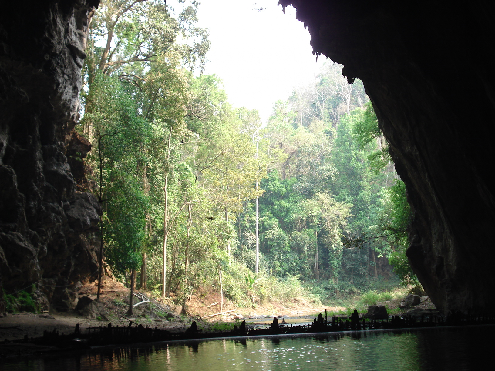
The cave itself was pretty interesting to visit. Here are a couple of pictures – one looking out the cave, showing that it’s a pretty cave; one with a picture of a couple of stalagmites. Stalactites (the ones from the top) tended to be long and pointy; impressionistically, stalagmites (the stumpy ones on the bottom) seem to be the ones used in dO18 studies, though I don’t guarantee this.


So this might be an interesting location for a Jud Partin expedition. It’s easily accessible from Pai, where there is good coffee (though no Starbucks) and there’s even a lodge at the cave. There are other caves in the area as well (e.g. Chiang Dao).

Googling Spirit Cave, Thailand turned up a number of interesting references. Our tour was done on bamboo rafts with local hill tribes people as guides. We were shown some very old rock paintings; according to url, archaeologists have dated occupation (the Hoabinhiam people) here as some of the very earliest civilization in the world.

As Gorman excavated the floor of Spirit Cave, he made several surprising discoveries. Amongst the dirt and stone lay the remains of several plant species including two probable beans, a possible pea, a pepper, a Chinese water chestnut, betel seeds, and bits of bottle gourd and cucumber. Carbon-14 dating of these remains placed them between 9000 and 6000 BC. Some of these plants could not be distinguished from wild varieties, but others such as gourds, water chestnuts, and betel seeds had probably been domesticated. The early dates of these plant remains places the domestication of plant life in Southeast Asia at least as early as the domestication in the Middle East and possibly earlier….

In a layer dated to approximately 6600 BC, well-developed pottery, stone tools, and small slate knives were found. The pottery was burnished and marked by the woven cords used to make it and many of the pots had plant fibers used as a temper to reduce breakability and improve workability. The stone tools, called adzes, were rectangular and partially polished. These tools challenged the then accepted theory that the Chinese introduced polishing to their more primitive neighbors in Southeast Asia in 3000 BC. The stone tools found at Spirit Cave, some dated as early as 7000 BC, predate discoveries from northern China by several millennium. This lead Gorman to hypothesize that the Chinese may have learned stone polishing techniques from the Southeast Asians and not the other way around. The discovery of these tools also supported the hypothesis of an early agricultural society as similiar tools were used elsewhere to harvest rice.

I don’t vouch for this,; I’m merely reporting.

Southeast Asia was a very interesting location in the post Ice Age period. Much lower Ice Age sea levels resulted in much presently submerged area being land (termed “Sundaland” in some literature.) One site suggested that some rivers deriving from Himalayan glaciers were much larger in the post Ice Age period than at present, which would provide an interesting explanation for the Saraswati River of the Vedas, which is placed more or less in the location of the moden dry Gharggar.

AR4 Models and the Ross Sea

I noticed something interesting in AR4 about Antarctic models, that no one mentioned in the initial commentary on Steig et al.

When Steig et al 2009 came out, commenters had some fun teasing the clergy over at realclimate over Spencer Weart’s article the prior year. Pielke Jr Lucia CA

Speaking for myself, I went to some pains to remind those readers who were piling on to this issue that there were sui generis aspects to Antarctica modeling and, even if models missed some detail of Antarctic behavior, that certainly didn’t imply to me that models were WRONG(!), a conclusion that some readers wanted to jump to. Having said that, I agree with Lucia’s comments below:

It may well be that the Antarctic is doing precisely what models predicted. But in that case, it would have been better if Weart had written a more nuanced article that explained more precisely what they predicted, in what way the predictions were consistent or inconsistent with data as thought to exist back in Feb 2008. He could also have discussed the uncertainty in data which arises from poor spatial coverage. He could have said the models predict warming– but so slowly it would be difficult to detect. He could have said many things.

Had this more nuanced article been written, RC could now write an article that explained how the discovering that parts of the continent formerly thought to be cooling are actually warming, and told us if the new knowledge about the warming compares to model predictions.
But, as it stands, the impression given by Weart article at RC published in 2008 was this:
a) Denialists say Antarctica has been cooling.
b) Scientists believed that Antarctica has been cooling.
c) Models predicted this cooling and had done so for decades.
Now, we learn it’s warming.

I’ve no doubt we will be told the warming is also consistent with model. But, if both warming and cooling both said to be consistent, people are going to wonder what modelers mean by “consistent”.

Let’s review the press releases accompanying Steig:

Antarctica during the last 50 years, with the dark red showing the area that has warmed the most. url


(Credit: Image courtesy of University of Washington)

Or at RC:

The paper shows that Antarctica has been warming for the last 50 years, and that it has been warming especially in West Antarctica (see the figure)

In each case, note that the supposed locus of observed warming in West Antarctica includes the Ross Ice Shelf (not labelled in either cartoon, but it’s the notch to the right of the legend “West Antarctica” in the above diagram, where Steig, Mann et al discovered previously unknown warming.

Curiously, AR4 had opined on model predictions for the Ross Ice Shelf in particular, noting that models predicted a local minimum in expected warming in this area:

In 20th- and 21st-century simulations, antarctic sea ice cover is projected to decrease more slowly than in the Arctic (Figures 10.13c,d and 10.14), particularly in the vicinity of the Ross Sea where most models predict a local minimum in surface warming.

I wonder what would happen if one RegEM’ed the models.

Sea Ice 2009

For sea ice devotees.

Beckers and Rixen 2003 – Another Infilling Approach

Beckers and Rixen 2003 url is an interesting read in two respects:
1) they present a non-RegEM infilling approach. The method appears to be exactly the same as one that I (independently) implemented and illustrated about a month ago – what I termed “truncated PC”. This was actually the very first thing that I did in climate science, as I used this sort of method in 2003 to try to calculate temperature PCs when there was missing data, in that case applying notes from Sam Roweis.

2) their key example is infilling of missing AVHRR data for the Adriatic Sea.

Beckers and Rixen infilling proceeds as follows. They do a trial infill of missing data with monthly means from the available data. They then do a PC decomposition of the trial matrix. They retain k PCs and eignevectors and expand these to obtain an estimate of the full matrix. In the next iteration, they infill with the estimates of the missing data. The process converges quite quickly and stops when the matrices are close enough together. RegEM operates line-by-line with a huge expansion of the number of operations. I find it hard to understand what advantages line-by-line RegEM truncated TTLS has over truncated PC. There’s nothing in Schneider that deals with this specifically.

For reference, I noticed that there are now a number of canned packages in R for imputing missing values and a website devoted to this issue, which provides many references, including Schneider 2001, though not the Mannian corpus.

The Beckers and Rixen example of Adriatic data is shown below – and, in this case, there is quite a bit of cloud data to be infilled. I presume that something similar had to be done in the Antarctic by Comiso.

Comiso appears to have done a series of Antarctic cloud masking exercises, with substantial changes from version to version and with Steig et al 2009 being the most recent version (assuming that Comiso did it). The Antarctic infilling seems to be a bit more complicated than the Adriatic because it seems that cloud temperatures can be higher than surface temperatures, adding a substantial layer of complexity to the problem of deconvolving cloud and surface measurements.

Beckers and Rixen, J Clim 2003 url
Kondrashov and Ghil url

RegEM Impact on Peninsula Correlations

There has been a good deal of discussion regarding the correlation between temperatures at various locations throughout Antarctica. Several people have looked at the relationship between correlation and distance by creating graphs linking the two. IMO, one of the difficulties in interpreting these is that they are affected by a variety of factors, including the shape and topography of the continent and by the fact that the place is completely surrounded by a large pool of water.

I think that it is informative to pick several locations and to see how the AVHHR series at that location is related to all other locations. I selected two points: the tip of the peninsula (Steig series 1) and the obvious interior point: the South Pole (grid point 1970 is the closest).

For a selected site, after calculating the 5509 correlations, we graph them using a color scale to represent the correlation (as usual red is positive and blue is negative and white areas represent zero correlation). The location of the grid site is represented by a green +. Keep in mind that these are correlations measuring relationships between temperatures at the grid point, not positive or negative trends.

First, we take the latest revelation from Steig, the cloud masked AVHHR data. The grid point is on the tip of the peninsula.

Several things stand out in the graph. Obviously, the region immediately adjacent to the grid point is strongly correlated, but what is somewhat surprising is that the correlation drops off fairly becoming negative while still in the Western Antarctic area. The relatively low correlation continues to the rest of the continent.

Next, we take the original reconstruction: ant_recon.txt. This was supposedly reconstructed from the previous data using RegEM and the manned surface stations:

The correlation has strengthened dramatically in the Western Antarctic so that now the pattern exhibited by the reconstruction at the tip of the peninsula seems to be reflected by the entire west. As well, the Eastern portion has now become more strongly inversely correlated with the peninsula.

I have also looked at the two other reconstructions (detrended and PCA) created by Steig as well as the looking at the South Pole and how its temperatures correlate with the rest of the grid points. These can be found at my statpad site . The R script can be found in a Word document here.

Downloading UWisc Data

The Jeffs have been exploring the UWisc AVHRR data which is stored as a lot of gzipped ncdf files. I couldn’t figure out how to download and open this data into R. So, as I usually do in these cases, I asked CA reader Nicholas who, as usual, has a solution. I edited this slightly to make a function which downloads and unzips the file into a temporary file which can be opened in ncdf and treated in usual ways. The call url can be structured to scrape data.

download.gz.cdf=function(url,tempname=”temp.gz”) {
download.file(url, tempname, mode=”wb”)
# decompress the gzipped data into RAM
gz < – gzfile(tempname, "rb")
data <- readBin(gz, "raw", 104857600)
close(gz)
# write the decompressed data back to the temporary file
tempfile <- file(tempname, "wb")
writeBin(data, tempfile)
close(tempfile)
}

For example:

year=1982; hour=”0200″;tempname=”temp.gz”
library(ncdf)
url=paste(“ftp://stratus.ssec.wisc.edu/pub/appx/Antarctica/”,year,”/”,hour,”/mean_”,year,”0199_”,hour,”.params.cdf.gz”,sep=””)
#this creates a structured url; structures vary
download.gz.cdf(url,tempname=”temp.gz”)
nc < – open.ncdf(tempname)

Then you have to parse the netcdf object to try to find things, but this is standard parsing.

…-omatic Correlations

Update Mar 28: Here is Luboš version replacing my much less pretty monochrome version showing the spatial decorrelation of the “Comiso” version of the data recently archived a couple of days ago by Steig.

Figure 1. Spatial Correlation for Sample of “Comiso 2009” Antarctic Gridcells

Jeff Id has compared this to corresponding surface stations at his blog and is complimentary to the Comiso versions; I haven’t had an opportunity to check this.) Luboš also shows the following version of my monochromatic figure below showing the spatial decorrelation of the RegEM’ed version of Comiso data (as reduced to 3 degrees of freedom.)


Figure 2. Spatial Correlation for Sample of RegEM’ed Antarctic Gridcells

This shows the effect of the RegEM on spatial decorrelation rather nicely. See Luboš here.

Having said all that, the quantity of ultimate interest is an Antarctic average, which has only 1 degree of freedom.

Continue reading →

Steig’s Secret Data

I checked in at Steig’s webpage to see if the long-awaited AVHRR had finally materialized.

Update (Mar 26, 2009 aa am Eastern) This is now released.

It had the following new paragraph (without any change notice to show that this dataset had not been there from time immemorial):
cloudmaskedAVHRR.txt contains the monthly-averaged cloud-masked satellite data used in the reconstruction presented in the main text (and shown in Figures S1c and S1d). The 300 rows are months, starting with 1982 (January) at the top, and ending in 2006 (December) at the bottom.

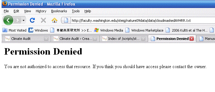
I tried unsuccessfully to download thecloudmaskedAVHRR.txt”> data – access denied.

I guess you have to be the “right” sort of researcher to get access to the data. Maybe Steig makes “Special Decisions” for special researchers.

Or maybe Steig’s trying to make sure that he’s archiving the “right” data. You’d think that they wouldn’t need to be sorting this out for a Nature cover story – now over two months after the publication.