The Kaufman Backstory

The backstory to the development of the Kaufman et al 2009 reconstruction is pretty interesting. A few years ago (after the MM criticisms of paleoclimate reconstructions), the US National Science Foundation sponsored the sampling of 30 Arctic lakes in a standardized way. It’s remarkable to compare the original population to the data sets used in Kaufman et al.

The objectives of the original NSF sampling program are described here as follows:

Fourteen collaborative PIs will generate standardized, high-resolution (annual and decadal) proxy climate records from 30 lakes across the North American Arctic. The four-year project (2005-2008) is funded by NSF’s Arctic System Science Program.

The methods of the sampling program are described here in further detail. This sets out a standardized program that meets the sort of standards advocated at Climate Audit – the same three measurements are going to be made on 30 lakes. On paper, this is excellent:

The last 2000 years of sediment for each lake will be analyzed to extract quantitative estimates of past summer temperature and other climate parameters. We will rely on three established proxies widely used in similar reconstructions of Holocene climatic change for quantitative estimates of climate: chironomid assemblages, oxygen isotopes, and lamination characteristics. In addition, as part of our multi-proxy approach, we will analyze other biological, geochemical, or sedimentological paleoenvironmental indicators from each lake. These “secondary proxies”, including diatom and pollen assemblages, or biogenic silica and organic carbon contents, often carry important signals of ecological and geomorphological processes that provide context, crosschecks, and comparisons for the primary proxies. In addition to varve counts where possible, age models for each sediment core will be based on 137Cs, 210Pb and 14C measurements.

The 30 sites are listed here and extend from Alaska to Svalbard.

Minutes of three project meetings are online and make an interesting read. Most/all the project PIs and associates attended each meeting. The first meeting in Tucson in May 2006 reviews the status of all the sites. A couple of replacements are noted: Hudson Lake for Twin Lake and Hallett Lake for Greyling Lake. The latter substitution is explained as follows:

Laminations are visible on core face, but thin sections show diffuse layering unsuited for further analyses. Efforts will shift to Hallet Lake this summer (2006)

The next meeting of PIs took place in Iceland in May 2007. These minutes record some caveats:

We need to be very careful that all data included in the synthesis are publicly available, and preferably peer-reviewed. We will be SCRUTINIZED. Ideally as many *published* records as possible… We may be a lightning rod – and therefore need to be extremely careful to document our decisions and be ready to publicly defend them.

The idea of a multiproxy reconstruction using data generated outside the NSF-program is considered. One PI sensibly asked (a sensible idea discarded in Kaufman et al as noted below):

But shouldn’t we aim to do a synthesis that is only lake seds (at least as first step)?

Bradley of MBH attended the meeting and, in case other PIS had not noticed, reported (presaging later decisions):

Murray lake varve thickness shows a hockey stick pattern – new data from last decade indicate warmer temps

The third meeting was at AGU in December 2007. By this time, the roster of proxies under discussion had departed fairly considerably from the original NSF30.

At the San Francisco meeting, a special edition of J of Paleolimnology was contemplated for the sites in the NSF program. This edition reported on 14 sites, listed here. Of the 14 sites, only 6 (!) came from the original NSF network of 30 site (one of which was Hallett Lake, substituted for Greyling Lake.)

The standardized program described in the program prospectus (chironomid, O18 and laminations) was completely abandoned. Not a single site has a complete archive according to the program description. Despite all the opening talk of a complete archive, only 10 of 30 sites have any sort of NCDC archive at present – the six J of Paleolimnology sites plus 4 others. In my quick survey, I noticed only one of 30 NSF sites where O18 isotopes are archived (Squanga Lake – a site used neither in Kaufman 2009 nor reported in the JPaleolim edition). Only a couple of the NSF 30 sites has chironomid temperatures and neither of these appears to have been used in Kaufman. Only 5 of the NSF30 sites have archived varve thickness – three of these are used in Kaufman, including the series said by Bradley to have a HS shape. One of these series is Kaufman #1, one of only 4 series that contribute to the final HS shape. Three of the NSF30 sites have archived BSi (biological silica), including Kaufman #2 (Blue Lake), one of the 4 series contributing to a HS shape.

Kaufman uses only 6 of the NSF 30 sites (5 of the 6 are archived. Bradley’s C2 remains unarchived.)

While the original NSF program had objectives that met CA scruples – uniform sampling methodology and archiving of all data prior to publication, Kaufman et al 2009 abandoned these objectives for reasons that are not discussed in the article.

Instead of standardized sampling procedures for all 30 sites, each archived site has an ad hoc pattern of test results – some report varve thicknesses, some BSi, a couple chironomids, one delO18, but none carry out the program set out in the original NSF description. Instead of a complete archive, 20 of 30 sites remain without any archived data whatever.

And Kaufman et al did not calculate some sort of index based on the NSF 30 sites. Instead of compiling and reporting the NSF 30, Kaufman selected only 6 of the NSF 30 sites (including the series said by Bradley to have a HS-shape) and added 17 sites from outside the NSF program – including, of course, Briffa’ Yamal tree ring site, one with a known HS shape and which is the strongest contributor to the Kaufman HS.

Kaufman stated in Iceland that they “need to be extremely careful to document our decisions and be ready to publicly defend them”. It would be nice if they did so.

UPDATE:

Darrell Kaufman responded to my email inviting his participation here and offering him a password to create his own account:

I did log onto the Climateaudit website about a week ago. I have no desire to engage in vicious commentary. If you would like to discuss the study professionally and courteously, then I would be happy to talk with you. I am at: 928-523-xxxx

Kaufman et al: Obstructed by Thompson and Jacoby

A CA reader sent me an email, noting the following entry in minutes of a meeting.

M Loso inquired about Lonnie Thompson’s ice core data. These data are not presently available but will be investigated by Caspar.

This comment is minuted in a meeting of PIs leading up to Kaufman et al 2009 – a meeting of no fewer than 28 people (sponsored by the US National Science Foundation.) The minutes are online here. It would be highly interesting to see Ammann’s report on the Thompson obstruction. A novel role for the Texas Sharpshooter. Caspar Ammann, PI (Private Investigator). I wonder how thorough his investigation was.

Later in the meeting, they discuss the “High Canadian Arctic”, where they comment:

Tree-ring sites from Jacoby might be of use. R[ob] Wilson might have longer tree-ring records but needs to check with D-Arrigo

Yes, of course, tree ring sites from Jacoby might be of use.

Both of these problems – Thompson failure to archive and Jacoby’s incomplete archiving – have been repeatedly publicized at Climate Audit. See the Thompson category for prior discussion of Lonnie Thompson. The Alaska ice core in question is, of course, the Bona-Churchill, Alaska ice core, drilled by Thompson in 2002, press releases issued, AGU notice and then dead silence. A few years ago, I speculated that this dead silenced presaged “bad” drill results – “bad” in the sense that the drill results did not show that things were “worse than we thought”. Indeed, I speculated that the Bona-Churchill drill results would show that delO18 went the “wrong way” in the 20th century at this ice core. Bona-Churchill remains unpublished to this day, but there was a graphic in a workshop showing that Bona-Churchill delO18 did, in fact, go the “wrong way” as reported at CA here. So in case, Caspar Ammann PI didn’t report to Loso on Lonnie Thompson’s ice core, Loso can at least consult the above CA post.

Jacoby’s incomplete archiving has also been a topic of commentary here. In this case, unlike Thompson, Jacoby has archived a lot of tree ring measurements. The frustration is that he hasn’t consistently archived all the sites. Problems with Jacoby archiving were the topic of one of the very first CA posts here. In the influential Jacoby and D’Arrigo NH treeline reconstruction, they reported that they had collected cores from 35 sites, using 10 plus Gaspe in their reconstruction. I asked Climatic Change to require Jacoby to provide the data for the 24 sites collected, but not reported in the paper. Jacoby’s response needs to be read in full, but is excerpted below:

The inquiry is not asking for the data used in the paper (which is available), they are asking for the data that we did not use. We have received several requests of this sort and I guess it is time to provide a full explanation of our operating system to try to bring the question to closure.

We strive to develop and use the best data possible. The criteria are good common low and high-frequency variation, absence of evidence of disturbance (either observed at the site or in the data), and correspondence or correlation with local or regional temperature. If a chronology does not satisfy these criteria, we do not use it. The quality can be evaluated at various steps in the development process. As we are mission oriented, we do not waste time on further analyses if it is apparent that the resulting chronology would be of inferior quality.

If we get a good climatic story from a chronology, we write a paper using it. That is our funded mission. It does not make sense to expend efforts on marginal or poor data and it is a waste of funding agency and taxpayer dollars. The rejected data are set aside and not archived.

As we progress through the years from one computer medium to another, the unused data may be neglected. Some [researchers] feel that if you gather enough data and n approaches infinity, all noise will cancel out and a true signal will come through. That is not true. I maintain that one should not add data without signal. It only increases error bars and obscures signal.

As an ex- marine I refer to the concept of a few good men.

A lesser amount of good data is better without a copious amount of poor data stirred in. Those who feel that somewhere we have the dead sea scrolls or an apocrypha of good dendroclimatic data that they can discover are doomed to disappointment. There is none. Fifteen years is not a delay. It is a time for poorer quality data to be neglected and not archived. Fortunately our improved skills and experience have brought us to a better recent record than the 10 out of 36. I firmly believe we serve funding agencies and taxpayers better by concentrating on analyses and archiving of good data rather than preservation of poor data.

In the older posts, you’ll also see correspondence with Jacoby and d’Arrigo about the Gaspe update – the Gaspe series used in MBH98 has a huge HS, but an updated version did not have one. The Gaspe update was never reported. Despite their failure to report the update, I became aware of the existence of the update (and had a graphic of it); but when I requested the data, it was refused on the basis that that it did not give the right signal. See http://www.climateaudit.org/?p=182.

In 2005, I tried to get the NSF to intervene and require Jacoby to archive his data completely. They refused.

The Jacoby category is worth re-reading.

Thus, several years later, not just me, but young Arctic scientists are frustrated by data obstruction by Thompson and Jacoby. Unfortunately, these young scientists are unable or unwilling to record these frustrations in public and the records remain incomplete to this day.

The greater fault lies with the acquiescence of senior scientists and senior institutions. The US National Academy of Sciences was asked by the House Science Committee to look at this problem in climate science. Instead of providing any useful reports, two consecutive panels refused to look squarely at the problem, merely re-iterating platitudes that had been agreed to 20 years ago. The fault also lies with senior climate scientists who have likewise failed to speak out. It’s an issue that realclimate should have been able to agree with climateaudit. realclimate has an opportunity and a forum to speak out against data obstruction by Thompson, Jacoby etc, but have never risen to the challenge. Nor for that matter have other senior climate scientists uninvolved in the blogosphere – there’s nothing to stop Jerry North or Kerry Emanuel or Carl Wunsch or people like that from writing to Thompson and Jacoby and others and asking them to mend their ways.

Unfortunately the problem remains to this day. And here we have an example where it is not simply Climate Audit objecting to the data obstruction, but young field scientists trying to respond to the public desire for improved Arctic proxies.

There are many other interesting aspects to the minutes of this meeting, other PI meetings and indeed to the entire process leading to Kaufman et al 2009, which I’ll discuss on another occasion.

Kaufman's Stick: Iceberg Lake Varves

In the first post on Kaufman et al, I observed that, like other Team multiproxy studies, its HS-ness is contributed by only a few series. As shown below, a composite of 19 out of 23 Kaufman proxies does not yield an “unprecedented” late 20th century (tho it yields an elevated late 20th century.) A composite consisting only of ice cores shows nothing unusual about the 20th century. However, four proxies ( 1: Blue Lake (Alaska) varves, 4: Iceberg Lake (Alaska) varves, 9: Big Round Lake (Baffin Island) varves and 22: Briffa’s Yamal tree ring chronology) have a very pronounced HS and in the Kaufman CPS, these 4 series are the “active ingredients” in the Kaufman HS.

Figure 1. Left – composite of 19 Kaufman proxies; right – composite of 4 Kaufman proxies. (The three Finnish sediments are used in native orientation, rather than the Kaufman orientation, which is inverted from the original orientation e.g. the Tiljander series discussed in the previous post.)

Briffa’s Yamal series is almost as notorious at CA as Graybill’s bristlecone pines and the consistent Team selection of this series rather than the nearby Polar Urals series has been noted unfavorably on many occasions.

Rather than dealing further with the tired Yamal series one more time, today I want to discuss one of the new “ingredients” – Loso’s Iceberg Lake reconstruction, which, in Kaufman’s rendering, also has a notable HS shape – in this case, limited to the last 4 decades of the 20th century.

Loso’s original article was in the form of an actual temperature reconstruction. Here is the Loso reconstruction (decadally averaged) in the original units – left scale – and as re-scaled by Kaufman into SD Units. Note the impact of changing from deg C to SD Units. Variation in the original reconstruction was very small – the step change in the 1960s was a couple of tenths of a degree. But in Kaufman’s SD Units, this small step change becomes a step change of 4 sigma – one which, together with Yamal and a couple of others, ends up having an impact on the overall reconstruction. (Kaufman’s Yamal version closes the 20th century at an astonishing 7-sigmas. )


Figure 2. Loso Iceberg Lake series in Kaufman version (left scale: Loso deg C; right scale – Kaufman -SD Units).

While Kaufman’s re-scaling obviously warrants attention, I’d prefer that readers not dwell on this step at this time, as there are some very interesting aspects to the Loso data that shed light on the properties of varve thicknesses as a temperature proxy. Here is the underlying Loso varve “chronology” (using this term as in tree ring networks), plotted from original data. A couple of points here. First, the varve chronology doesn’t look much like a plot of temperature data – it’s far too spiky; the distribution is clearly not a normal distribution and visually looks like it is a fat-tailed distribution (which proves true). Secondly, there seems to be a step change in 1958, with an actual discontinuity in the original data in 1957. One wonders whether there is some sort of inhomogeneity. Also worrying is what seems to be a sort of “divergence problem”: the trends since the 1960s seems to be down, even though temperatures have been going up, with the HS-ness of the series perhaps resulting from some sort of 1957 inhomogeneity. I looked at data from individual cores to assess this troubling visual appearance.


Figure 3. Loso Varve Chronology

Given the visual appearance of a non-normal distribution, I did a qqnorm plot of all the varve width data (left panel) and, on the right, a similar plot for the logged varve widths. (Loso’s temperature reconstruction is log-transform of his varve width chronology.) As you can see, the original varve widths are remarkably fat-tailed; indeed, even the log-transformed varve widths are far from normal and remain fat-tailed. This creates major complications for simplistic efforts to average a few measurements in making a varve chronology or to “standardize” data as we shall see below. The combination of wildly non-normal fat tails and probable inhomogeneity makes this a very problematic raw material for construction of a temperature index, as I’ll further show below.


Figure 4. QQnorm plots for varve thicknesses and logged varve thicknesses.

Loso Cores
One advantage of mineral exploration experience is that one understands the importance of examining individual cores. Fortunately, Loso provided some raw information on this. The modern portion of the Loso reconstruction is calculated from only 1-3 cores (A,K,M), shown below over the period 1000-2000 in both linear and log scales. Core M has a discontinuity of nearly 400 years – I haven;t examined the cross-dating of this core, but I wonder how they established this discontinuity which seems troublingly long. You can see that Core A and Core K have very different contributions to HS-ness: Core K shows no modern HS-ness. The entire HS-ness of the Loso reconstruction, one of the two largest contributors to the Kaufman HS, comes entirely from Loso Core A, where there seems to be an inhomogeneity around 1957.


Figure 5. Loso Cores A,K and M

I noted above that it was not easy to make an average when confronted with wild distributions such as the one observed here. Loso attempted to mitigate the wild non-normality by the expedient of simply deleting some of the larger excursions in his calculation of the chronology average. (In 1957, all three values were deleted and that’s why there is no value for that year.) This is explained as follows:

Scattered among the other well-dated sections are isolated strata that record episodic density flows (turbidites), resuspension of lacustrine sediment by seismic shaking and/or shoreline-lowering events, and dumping of ice-rafted debris. The case for excluding such deposits from climatologically-oriented varve records has been made elsewhere (Hardy et al., 1996), and we accordingly removed measurements of 82 individual laminae from these other sections. Those removed (mostly turbidites) include many of the thickest laminae, but sediment structure (not thickness) was in all cases the defining criterion for exclusion from the master chronology.

I examined the calculation of the “average” varve thickness from 1860 to 2000 and identified excluded varves (by figuring out which varves, if any, were excluded in order to yield the reported average as opposed to the average using all the varves.) In the figure below, I’ve plotted varve widths for the 3 cores from 1860-2000 in both linear and log scales, marking the excluded varves in red. Loso says that “sediment structure” rather than thickness was the basis for exclusion, but one can’t help but wonder how solid this classification really is. Regardless, the high values in Core A clearly result from some sort of inhomogeneity in the Core A data starting around 1957-8 – and seemingly settling down in more recent values. If this data was revisited in a few years, I wonder whether it would have reverted back to a more average value.


Figure 6. Showing excluded varves in chronology calculation.

The construction of a sediment “chronology” has much in common with a tree ring chronology. Indeed, it looks quite a bit harder to me that for tree rings, since there seems to be considerably more inhomogeneity between cores and local sedimentation conditions having a substantial impact. The number of cores used in the varve chronology (1 to 3) are FAR less than minimums required for construction of a tree ring chronology under far less trying circumstances. To my knowledge, this is not confronted by the varvochronologists.

After excluding a few series, Loso constructed a chronology by averaging the remaining values. This is done at the native value stage (pre-logging.) Since non-excluded outliers from the extreme fat-tailed distribution are not “cut” (a precaution common in mining exploration to mitigate “nugget” effect), even after averaging with 1-2 other values, such outliers can still have a dramatic impact on a chronology. The Loso chronology is still fat-tailed. Loso’s temperature reconstruction is a re-scaling of the log of the varve chronology.

This partly mitigates the non-normality, but, at first glance, this seems both a step too late and, given the non-normality of the logged varve widths, not necessarily an adequate precaution. I haven’t pondered all the issues of how to deal with such refractory raw ingredients, but it would be worth examining the effect of a non-parametric standardization of the actual distribution to a normal distribution (with a relative low ceiling – maybe 2 sigma – on the contribution of any one varve.)

This would still not mitigate the apparent inhomogeneity of Core A. Here one would welcome a far more expansive exposition by Loso than the one actually provided. One would also welcome the adoption by varvochronologists of some of the precautions developed by dendros over the years – which Loso’s chronology doesn’t meet.

As matters stand, the second ingredient to the Kaufman Hockey Stick (after the Yamal substitution) is the Loso Iceberg Lake varvochronology – where, unfortunately, there is evidence that the HS-ness of this series is a result of an inhomogeneity in Core A (one not shared by Core K).

Sea Ice – Sept 2009

Continued from here .

On August 19, 2009, NSIDC published the following August forecast of sea ice minimums by the leading climate modelers around the world. The majority of modelers predicted that 2009 sea ice minimums would be below 2008 and one (Arbetter et al) even predicted that 2009 would break the 2007 record. The range was 4.2 to 5.0 million sq km. Detailed report is here.

While I don’t usually get involved in guessing outcomes of various climate situations (where no one has any real basis for their guess), I do occasionally. I called a low 2006 hurricane season very early. And on August 7, two weeks before the publication of the modelers’ forecasts, I observed:

2009 is now slightly behind 2008. My prediction is that 2009 will end up over 500,000 sq km behind 2008.

That prediction didn’t look all that great a couple of weeks later, but right now it looks pretty much right on the money. As of today, 2009 is 470,000 sq km behind 2008 and the chances of 500,000 seem pretty realistic.

That my guess was so close was due more to good luck than acumen, but there were some reasons for it. Canada has some exposure to northern weather and it has been a cool summer here and very cool in northern Ontario. 2008 had not been as big a melt as 2007 and presumably there was presumably a bit more two-year ice in 2009 than in 2008. While 2008 and 2009 were about even at the time, the trajectories looked different and it seemed to me that 2009 might stabilize at a higher level than 2008.

And yet in early/mid August, these factors didn’t seem to be on the minds of the official agencies since, as noted above, EVERY official agency substantially over-estimated the melt.

Kaufman and Upside-Down Mann

Kaufman et al (2009), published at 2 pm today, is a multiproxy study involving the following regular Team authors: Bradley, Briffa (the AR4 millennial reconstruction lead author), Overpeck, Caspar Ammann, David Schneider (of Steig et al 2009), Bradley as well as Otto-Bleisner (Ammann’s supervisor and conflicted NAS Panel member) and “JOPL-SI authors” who are various contributors of sediment series.

One of the few proxy data contributors not listed as a coauthor is Mia Tiljander, whose data was used upside down in Mann et al 2008. Amusingly, the Kaufman Team perpetuates Mann’s upside down use of the Tiljander proxy, though they at least truncate the huge blade (resuling from modern sediments from bridge-building and farming.)

The graph below shows the original data from Tiljander (oriented so that warm is up.)

Figure 1. Excerpt from Tiljander Boreas 2003 Figure 5 – rotated to warm is up orientation. The increased sedimentation in 19th and 20th centuries is attributed to farming and bridge construction and is not evidence of “cold”.

Mann et al 2008 series #1064 can be seen to be an inverted version of the Tiljander series, as shown by the plot below.


Figure 2. Mann et al 2008 proxy 1064 plotted reverse to Mann orientation (showing that the author’s original orientation is achieved only by inverting the Mann orientation.)

Kaufman et al make decadal averages of their proxies. The graph below shows the Mann 2008 data (Mann orientation), converted to 10 year anomalies, truncated to 1800 and then scaled. Mann orientation is upside-down to the orientation in Figures 1 and 2.


Figure 3. Mann et al Series 1064 (in Mann orientation) converted to 10-year averages, truncated to 1800 and scaled. Mann orientation is upside-down to the orientation in Figures 1 and 2.

Next here is a plot of Kaufman series #20 (lake Kortajarvi) from their SI. This was presented in an exceedingly annoying format – it was available only in a photo form and thus the data was not available digitally. I transcribed series 20 manually and may have a couple of discrepancies as the data format was very annoying. (I’ve uploaded my transcription) In addition, data was missing in the SI from 1225 to 1105. Unlike Mann et al 2008, Kaufman et al truncated post-1800 data. You can readily see that this closely matches the Mann version and is thus also upside-down relative to Tiljander’s intended orientation.


Figure 4. Plot of Manually Transcribed Kaufman series #20.

The continued use of upside-down data by the Team is really quite remarkable. It’s not as though they were unaware of the issue.

The upside-down use of Tiljander data was originally observed at CA http://www.climateaudit.org/?p=3967). We know that Mann and Schmidt were monitoring CA because changes to Mann’s SI (always without attribution) were made soon after CA posts.

The use of upside-down data in MAnn et al 2008 was even published at PNAS earlier this year (McIntyre and McKitrick PNAS 2009 see here). In their response at PNAS, Mann et al described the claim that they used the data upside-down as “bizarre”, notwithstanding the fact that the correctness of the observation could be readily seen merely by plotting Mann’s data (and even in the data plots in the Mann et al 2008 SI).

The Team is exceptionally stubborn about admitting even the least error. We had seen an amusing illustration in Mann et al 2007, where the incorrect geographic locations of MBH98 proxies was perpetuated: the rain in Maine still continued to fall mainly in the Seine.

It is even more amusingly illustrated by Kaufman’s perpetuation of Mann’s upside down use of the Tiljander proxy (rather than conceding Mann’s error and using the data in the right orientation.) Also note here that Bradley was involved in both studies.

I’m sure we’ll soon hear that this error doesn’t “matter”. Team errors never seem to. And y’know, it’s probably correct that it doesn’t “matter” whether the truncated Tiljander (and probably a number of other series) are used upside-down or not. The fact that such errors don’t “matter” surely says something not only about the quality of workmanship but of the methodology itself.

[Update Sep 8] – Last week, I notified Kaufman about the use of Upside Down Tiljander, asking in addition for various “publicly available” data sets that do not appear to actually be available anywhere that I know of. He replied yesterday attaching a graph indicating that it doesn’t matter whether Tiljander is used upside down and unresponsively referred me to the decadal values of the data already available.

What does “matter” in these sorts of studies are a few HS-shaped series. Testing MBH without the Graybill bristlecones provoked screams of outrage – these obviously “mattered”. Indeed, in MBH, nothing else much “mattered”. The Yamal HS-shaped series (substituted in Briffa 2000 for the Polar Urals update which had a high MWP) plays a similar role in the few studies that don’t use Graybill bristlecones. The present study doesn’t use bristlecones, but Briffa’s Yamal substitution is predictably on hand. (See the latter part of my 2008 Erice presentation for some discussion of this.)

Further analysis will require examination of the individual proxies. Kaufman et al provide 10-year decadal averages in their photo SI, promising that data will be made available at NCDC, but it wasn’t as at the time of writing this note. While they say that all data is public (other than annual versions of some series that they obtained from original authors), but I could only locate digital versions of some of the series.

The problem with these sorts of studies is that no class of proxy (tree ring, ice core isotopes) is unambiguously correlated to temperature and, over and over again, authors pick proxies that confirm their bias and discard proxies that do not. This problem is exacerbated by author pre-knowledge of what individual proxies look like, leading to biased selection of certain proxies over and over again into these sorts of studies.

We’ve seen this sort of problem with the Yamal tree ring series (22), which has been discussed at CA on many occasions. (See for example the discussion in the latter part of https://climateaudit.org/wp-content/uploads/2008/09/mcintyre.2008.erice.pdf ). Briffa originally used the Polar Urals site to represent this region and this data set was used in MBH98-99 and Jones et al 1998. This data set was updated in the late 1990s, resulting in an elevated Medieval Warm Period. Briffa did not report on the updated data; it has never been reported. The data only became available after quasi-litigation with Science in connection with data used in Esper et al 2002. Instead of using the updated Polar Urals version with an elevated MWP, Briffa constructed his own chronology for Yamal, yielding a hockey-stick shaped result. The Yamal substitution has been used in virtually every subsequent study (a point noted by Wegman et al 2006) and is used once again in Kaufman et al 2009. In other studies, a simple replacement of the Yamal version with the updated Polar Urals version impacts the medieval-modern relationship and this needs to be considered here.

On the other hand, a long Siberian tree ring series known to have an elevated MWP is not used: the Indigirka River (Siberia) tree ring series was used in Moberg et al 2005, but is not used in this study, though it is a long chronology in the same sort of region.

They use Briffa’s version of Tornetrask (as a leading component of their Fennoscandia (#18). Tornetrask is used in virtually every reconstruction, a point made on many occasions at CA (also see Wegman et al 2006). An updated Tornetrask version (Grudd 2008) had an elevated medieval warm period – see discussion in https://climateaudit.org/wp-content/uploads/2008/09/mcintyre.2008.erice.pdf).

Notable omissions are the Mount Logan ice core and Jellowbean Lake sediment series. (See http://www.climateaudit.org/?p=2348, http://www.climateaudit.org/?p=806 for discussion of the Mount Logan proxies.) The Mount Logan ice core delO18 values decrease in the 20th century, contrary to the presumed increase. Although Mount Logan isotopes are as well resolved as the ice core isotopes used by Kaufman et al, they are excluded (along with a candidate sediment series) on the basis that the “bad” results for these proxies are due to changes in “moisture source” rather than temperature.

We excluded the isotope-based records from ices cores in the Saint Elias Mountains (S4) and from Jellybean Lake carbonate (S5), both in the Yukon, because the proxies are more strongly controlled by changes in moisture-source and atmospheric moisture transport patterns than by temperature.

The problem with this sort of reasoning is: if changes in moisture source cause isotope values to go down, they will also cause isotope values to go up.

Worsening this particular situation is the failure of Lonnie Thompson to report “adverse” results at Bona-Churchill (see the CA posts mentioned above.) Bona-Churchill, an ice core site near Mount Logan, was drilled in 2002. The unseemly delay in reporting results led me to speculate several years ago that these results were “bad” for Lonnie Thompson’s advocacy. This prediction was confirmed in a diagram presented in a workshop; the data itself remains unpublished to this day.

I note that the Dye-3 isotopes (#12) have been “corrected” to account for ice flow. In my opinion, the place for such adjustments should be in the original articles and not in multiproxy compilations. This will need to be assessed.

As has observed on many occasions at CA and on other critical blogs (it’s been independently noted by Jeff Id, David Stockwell and Lubos Motl as well as myself), when data sets are selected ex post according to whether they go up in the 20th century – as opposed to all the data sets, the results are subject to a very severe HS bias. David Stockwell published this result in 2006 (see here) (an article cited in McIntyre and McKitrick PNAS 2009) illustrating it as below (similar illustrations are available at Jeff Id’s and Luboš’):

The most cursory examination of Kaufman et al shows the usual problem of picking proxies ex post: e.g. the exclusion of the Mount Logan ice core and Jellybean Lake sediment series; or the selection of Yamal rather than Polar Urals – a problem that is even pernicious because of the failure to archive “bad” results (e.g. Thompson’s Bona-Churchill or Jacoby’s “we’re paid to tell a story”). Until these problems are rooted out, it’s hard to place much weight on any HS reconstruction.

Update: Here are interesting layers extracted from Kaufman showing the respective contributions of the respective proxy types clearly rather than the typical spaghetti graph. This shows nicely that the seven (of 23) ice core proxies make no contribution to the HS-ness of the result and that they do not show 20th century uniqueness. The biggest HS comes from the Briffa tree rings (and I’m sure that the Yamal series will contribute the majority of the HS-ness in this composite.) The 12 sediment series are intermediate: here we still need to examine the orientation of these series and which sediment series contribute to HS-ness.


Excerpt from Kaufman et al.

Update: As noted by a reader in the Loso thread, compaction is a problem with this sort of data. The Murray Lake data includes density information, which is plotted below. Density stabilizes at a mean of about 1.09, but less compacted recent sediments are less dense.

Reference: Kaufman et al Science 2009. SI Data is supposed to be at http://www.ncdc.noaa.gov/paleo/pubs/kaufman2009 but isn’t there as at Sep 3, 2009 6 pm when the article was published.
Tiljander, Boreas 2003 https://climateaudit.org/wp-content/uploads/2009/09/tiljanderetal.pdf

Erice: The Feedback Session #1

Today, I’m going to give the first of a series of reports on the Feedback Session at Erice: I’ll try to do a post on each of the presentations – Lindzen, Choi, Kininmonth and Paltridge. I’ll also try to do reports on the presentations by Essex and Swanson in a different session.

I’ll do a quick overview today. However, I’d prefer that people don’t jump the gun on discussing themes until materials from the specific presenters are provided. To try to forestall that, in addition to an overview, I’ll provide a brief profile of the first part of YS Choi’s presentation, in which he provided some quite startling results on clouds from recent satellite data.

In addition to taking notes on the presentations, I spent a lot of time at lunches, dinners and breaks, talking to each of the speakers about their issues, and probably learned as much or more in these sessions as the presentations themselves. In addition, I’ve had considerable follow-up correspondence with Choi, who promptly and cordially provided supplementary information and scripts.

Overview
In no particular order. And once again, I plan to post on each presentation so please reserve comments on other presentations until its turn.

William Kininmonth’s presentation was similar to his Heartland presentation. His thesis is that GCMs are systemically under-estimating the proportion of incoming radiation in the tropics to evaporation and that this makes the models increase surface temperature too much, resulting in a too high climate sensitivity.

Garth Paltridge argued for lower-than-IPCC feedback on a different basis. He observed that high-feedback models required a moistening trend in the upper tropical troposphere. As he had observed in a recent paper together with Albert Arking, he noted that such a trend could not be observed in available radiosonde data. He noted that inhomogeneities in the radiosonde record were substantial and large enough that a reasonable observer could choose not to place a lot of weight of this point, but nonetheless that’s what was on the table.

Lindzen presented the results of Lindzen and Choi (GRL 2009) on ERBE, amplified by some new results using CERES data. This analysis argues that the sign of the feedback evidenced by ERBE/CERES data is opposite to the sign from corresponding analyses of GCMs.

Choi is a Korean post-doc at MIT, studying under Lindzen. His website here has a lengthy list of publications for a young man and, interestingly, even a few patents. The second part of Choi’s presentation was on aerosols, in which he presented new analyses of the most recent satellite data, showing that aerosol properties were different from those commonly attributed to them.

Choi on Clouds
The first part of Choi’s presentation was on the properties of clouds as shown by the most recent MODIS satellite results. One could not help returning from Choi’s presentations with much increased awareness of the major differences between old and new satellite data – 21st century satellites are providing a lot more data and a lot better data than 1980 satellites – a point that people sometimes lose sight of when presented with “homogenized” series.

Here is an astonishing table from Choi’s presentation on global cloud cover from MODIS as compared to earlier estimates. As you see, the most modern data shows global cloud cover at nearly 78%, as compared to estimates of 51% from the early NIMBUS satellite and 61% from ISCCP2.

The bulk of the increase is in thin clouds, not picked up in the coarser analyses. Choi showed that a time series of ISCCP2 measurements showed decreasing cloud cover, thus the MODIS difference was related to more accurate measurement and not to trends in cloud cover.

I’ve noted to CA readers on earlier occasions that Bony et al 2006 had reported that the major difference between high-sensitivity and low-sensitivity models related to their handling of thin marine boundary layer clouds and that it appeared that all GCMs under-produced thin clouds (and over-produced “thick” clouds). Since the impact of thin -vs-thick clouds is highly non-linear, such differences impacted overall GCM production.

Choi mentioned that this problem with clouds has been known in the remote sensing community for a while, but it doesn’t seem to have been assimilated by the climate modeling community thus far. As I understand it (and I do not claim equal expertise in these comments as comments on proxies), the analyses cited in AR4 all used older versions of cloud data. So if there was under-production of clouds using the older ISCCP2 data, the situation is obviously “worse than we thought” using modern MODIS data.

Erice 2009 – A Quick Synopsis

This year’s Erice International Seminar was the 42nd. All recipients received an interesting book of memoirs of the seminars (edited W. Barletta and H. Wegener) from which I’ve scanned two interesting pictures (the pictures in the book were mostly recovered by Bill Barletta, an MIT physicist).

The first shows Paul Dirac on the right talking to Edward Teller on the left at the first Erice Seminar. A stylized logo of the Dirac equation adorns the front of the speaker’s platform. Every Erice conference attendee receives two articles by Antonino Zichichi, a very prominent physicist himself and the organizer of the seminars, explaining why he thinks that Dirac (ranked 8th all-time in a Physics Today poll) made more important contributions to modern physics than Einstein’s (ranked 1st). (The argument is that Dirac’s postulation of antimatter has been the ongoing project of modern physics, whereas Einstein’s discoveries, notwithstanding their fame, haven’t led to important new work – BTW I do not hold any view on this “issue”.)


Figure 1. Paul Dirac talking to Edward Teller.

The second picture below is from the Cold War period during Reagan’s administration while the Star Wars project was in full swing and animosity between the U.S. and the U.S.S.R. had intensified. Notwithstanding this animosity and mutual suspicion, the most eminent nuclear scientists of the day met one another at the Erice Seminar. Here is Edward Teller, then Reagan’s science adviser, on the left, talking to Evgeny Velikhov, then chief science adviser in the U.S.S.R. It’s interesting that, at the height of the Reagan Cold War, Russian and American scientists could meet; in contrast, James Hansen and his disciples have a more jihadist approach, Hansen setting the example by refusing to appear on panels with John Christy despite the latter’s extensive publication record.


Figure 2. Teller and Velikhov, chief science advisers.

Erice is a very picturesque medieval town on a hill (about 1000 feet high) overlooking the Tyrrhenian Sea. Original facades and structures have been mostly preserved. Streets are cobblestoned; lanes are narrow. Cars are left on the outskirts of the town and you walk everywhere. It’s supported by tourist trade and there are numerous excellent restaurants.

Days at the Erice seminar are about 16 hours long. A typical day for me was pretty much like this:

Get up at 8 or so, Italian breakfast at 8.30: coffee, good salami-and-cheese on a good panini; fresh local fruit grapes, pears, peaches. Breakfast was at the Eugene Wigner Bldg – buildings are named after famous physicists who were active at Erice seminars in the early going. This was a refitted medieval/16th century cloister. Breakfast was in a common area and there was always someone to talk to.

9:30 Morning sessions at the Paul Dirac lecture hall. This is a modern lecture hall in another refitted medieval/16th century building. Morning sessions go till 1.30 or 2. Sessions cover a wide variety of topics. The seminars originated in concerns over nuclear war, but have since diversified to cover a gamut of “planetary emergencies” – a phrase which covers a wide range of issues, ranging from energy supply, nuclear proliferation, cyber-security, vector-borne disease and, yes, climate, tied together by the general concept that there was a connection to human well-being. Above the lecture hall is a coffee break area with a spectacular view over the Tyrrhenian Sea. There would be one coffee break per session – again, always someone to talk to.

2 or so – Lunch. We could choose from a list of about 7 restaurants, who provided 3-course meals: a pasta course, a fish course and fruit. Beer/wine was comped. It took all my will power not to have wine or beer at lunch (both for weight and afternoon snoozing reasons) and for the most part, I resisted. I also resolved to eat only about 50% of the available portions – I’ve worked very hard to lose weight and I could see myself giving most of it back in a week. Again, I pretty much stuck to my resolution.

4 to 7/7.30 – Afternoon sessions were pretty much like morning sessions.

7.30 – Walk back to our room, shower and change for dinner. Meet up with my wife who’d been on spouse activities for the day. (Spouses are very well-treated and this is one of the strengths of the conference. My wife liked many of the other wives. They visited archaeological sites, the beach, shops etc. and were busy. ) Try to nap for 15 minutes.

8.30- 12.30 – Dinner. There was a 5 or 6-course banquets every night. Pre-dinner wine and hors-d’oeuvres. Then a pasta course, a fish course, a dessert course, a cheese course, plus good Italian bread – bread being a weakness of mine. Plentiful wine. Again, I stuck to 50% portions and still feared the scales when I got home. I also drank lots of water at dinner as sort of a wine extender, to avoid paying too severe a price. Tables were round tables seating 12 or so and the dinners offered a chance to socialize. As anywhere else, people tend to fall into seating patterns. This year, there were some climate people that I was anxious to talk to, so I didn’t mix quite as much as I did last year. Also, the wives had their own groupings, which didn’t necessarily have anything to do with their husbands’ patterns and this helps the mixing process. On most nights, there was after-dinner entertainment from Sicilian folk singing-dancing groups. My wife tried to get a picture of Richard Lindzen folk dancing – confident that Gavin Schmidt and realclimate would pay top dollar for this piece of papparazzi enterprise, but the picture didn’t turn out.

12.30- 2+ – the Marsala Room. I regret to say that we didn’t go to the Marsala room. I’ve closed down a few bars in my day and, in the next morning’s light, seldom reflected that this was a good decision.

There were about 10 presentations directly related to the sort of climate science issues covered here. There were many presentations on energy supply and such, which touched on science issues, but which stretch a bit outside the scope of issues covered here, though I find them interesting as a citizen and it’s stimulating to be exposed to issues that do not arise in more specialized forums.

In my preview of the Erice Seminar, I posted up the schedule of the Water Cycle session. Albert Arking hurt his back and was unable to attend. The presentations of Lindzen, Kininmonth, Paltridge and Choi (Lindzen’s post-doc) were all interesting – and I’ll discuss them separately.

Other climate science -related presentations which I’ll allude to only briefly right now were ):
– John Haynes of NASA outlined the various NASA satellites including a preview of satellites scheduled for launching in the next few years. His own interests were directed towards using satellites for public health information.
– Judith Pap of U of Maryland surveyed solar irradiance issues, reviewing the ACRIM/PMOD issues and the problems in establishing an irradiance time series, and previewing planned future solar irradiance satellites.
– Chris Essex of U of Western Ontario discussed fundamental conceptual problems with GCMs relying on parameterization as a sort of pseudo-physics (my label, but one that Essex would probably not disagree with.) Zichichi is very supportive of this line of argument. (As I’ve observed before, I don’t understand why AGW expositions don’t spend far more effort on the impact of doubled CO2 using non-GCM analyses at a level more advanced than grade school – analyses that would shed insight into processes as well as results.) Chris showed some very pretty ‘solargraphs’ that I’ll discuss some day.
– Kyle Swanson of Wisconsin discussed a multivariate method for extracting trend information related to principal components, but a little different. This is scheduled for publication and I’ll keep an eye on this.
– Mike MacCracken, a long-time IPCC participant, talked about greenhouse gas emission scenarios. I chatted with him about my ongoing frustration with the apparent lack of a systematic A-toB presentation of how doubled CO2 leads to 3 deg C; he sent me a recent paper outlining his attempt to provide such an exposition. I haven’t had a chance to review it yet, but will do so.
– Yuan Daoxian, in a session on China, made an interesting presentation on the uptake of atmospheric CO2 by karsts (a geological formation), suggesting that this sort of uptake may account for a portion of the ‘missing’ CO2 uptake. Herman Shugart of U of Virginia, in a different session, reviewed CO2 balances, emphasizing the significant size of the unaccounted-for CO2 sink and urging that this be pinned down; BTW his own analyses of forest CO2 uptake did not suggest that a forest in a “steady-state” mode was a CO2 sink.

I’ll report on many of these papers. Readers absorbed in climate issues need to realize that climate, while an important and topical issue, is only one of the issues covered at this seminar. In that respect, it’s a lot different than going to AGU or EGU, where you are overwhelmed with the sheer number of climate papers.

In addition, I certainly had a far more “quality” socialization than at AGU. Of names that readers know, I had the opportunity to spend a lot of time with Lindzen, Kininmonth and Paltridge, none of whom I’d ever had an opportunity to do more than shake hands with before, though I’ve corresponded with them from time to time and they’re all familiar with CA.

More to come on this.

As I mentioned before, we spent a couple of days in Siracusa on the east coast of Sicily before the conference and a few days in Florence after the conference. We got home yesterday. While I suspect that Toronto would not necessarily collapse as a city if it’s weather were more like Cleveland or Columbus, nonetheless I’m a Canadian and am happy to return to some cooler weather.

The Lodgepole Pine: A Case Study

Every year, the Statistical Society of Canada has a case study competition for statistics students in Canada. The problem and the data are posted about six months before the annual meeting. Teams of students analyze the problem and then present their results at a poster session at the meetings.

One of the two topics for this year’s competition was “The Effects of Climate on the Growth of Lodgepole Pine”.

The Question of Interest

To what extent do climate, position on the tree bole, and current foliar biomass explain cross-sectional area increment and proportion of early and late wood?

Primary objective

The primary objective is to determine to what extent climate, position on the tree bole (trunk), and current foliar biomass explain cross-sectional area increment and proportion of early and late wood.

Secondary objectives

It is also of interest to learn the following:

1.How have temperature and precipitation affected the annual cross-sectional growth and the proportions of early and late wood in lodgepole pine?

2.Is annual growth best explained by average annual temperature or do monthly maximum and/or minimum values provide a better explanation? Do early and late wood need to be considered separately?

3.Does the use of climate variables to predict the growth and proportions of early and late wood provide more reliable estimates than the use of the growth and density measurements from previous years as measured from the interior rings?

Further information and the data are available on the SSC website here. Data on temperatures and precipitation from the two British Columbia sites are included as well as a variety of variables from the sampled trees.

The winners were two students from the Department of Mathematics and Statistics at University of Victoria in Canada: Eric Cormier and Zheng Sun. Their winning poster does not contain a great deal of details (how much can you fit on a poster?), but it does indicate the models and types of analysis they used. It may be of interest for anyone interested in trees as proxies.

Hey, the stat community is starting to pay some attention to climate science.

Spline Smoothing

The 2009 Climate Dynamics paper “Unprecedented low twentieth century winter sea ice extent in the Western Nordic Seas since A.D. 1200” by M. Macias Fauria, A. Grinsted, et al. discussed already on the thread Svalbard’s Lost Decades pre-smooths its data with a 5-year cubic spline before running its regressions.

There’s been a lot of discussion of smoothing here on CA, especially as it relates to endpoints. However, splines remain something of a novelty here.

A cubic spline is simply a piecewise cubic function, with discontinuities in its third derivative at selected “knot points,” but continuous lower order derivatives. This curve happens to approximate the shapes taken by a mechanical spline, a flexible drafting tool, and minimizes the energy required to force the mechanical spline through selected values at the knot points. The “5-year” spline used by Macias Fauria et al presumably has knot points spaced 5 years apart.

While splines can generate nice smooth pictures, they have no magic statistical properties, and have some special problems of their own. Before performing statistical analysis on spline smoothed data, William Briggs’ article, “Do not smooth time series, you hockey puck!” should be required reading. His admonition,

Unless the data is measured with error, you never, ever, for no reason, under no threat, SMOOTH the series! And if for some bizarre reason you do smooth it, you absolutely on pain of death do NOT use the smoothed series as input for other analyses!

is as valid as ever.

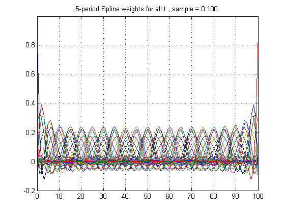
A function y(t) that is a spline function of time t with knots at t = k1, k2, … is simply a linear combination of the functions 1, t, t^2, t^3, max(t-k1,0)^3, max(t-k2,0)^3, … Given data on n+1 values y(0), y(1), … y(n), the coefficients on these functions may be found by a least squares regression. The smoothed values z(t) are just the predicted values from this regression, and these in turn are simply weighted averages of the y(t) observations.

Figure 1 below shows the weight each z(t) places on each y(t’) when n = 100 so that the sample runs from 0 to 100, with knots every 5 years at k1 = 5, k2 = 10, etc:
Spline weights

Figure 1

Continue reading

NASA: Sea Level Update

Yesterday, at 2:07 PM CA time (4:07 PM EDT), Rob Spooner posted the following comment in the Unthreaded n+2 thread:

http://www.climateaudit.org/?p=5978#comment-353931

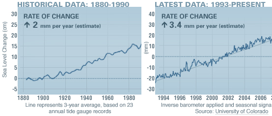
I’ve been asked to move a comment to this thread (or unthread), so here it is. I have run into a small problem with some NASA methodology. Looking at http://climate.nasa.gov/keyIndicators/ and just eyeballing the graph on the right, Sea Level Change 1993-present, I find that the data corresponds very closely with a straight line that they helpfully provide. The straight line begins at 1993.0 and end around 2009.5. It rises from about -23 mm to + 20, or 43 mm during a period of 16.5 years.
The caption reads “3.4 mm/year (estimate).” Now my methodology for getting the average would be to divided the rise of 43 mm by the 16.5 years, but that gets 2.6 mm/year. NASA would seem to be using some other methodology. Not division? I guess it’s something so important I wouldn’t understand.

My curiosity led me to look at the link indicated in the comment, and I happened to download the graphic to which he was referring to examine it more closely:

[For whatever reason, the right hand side of the graphics was clipped when downloaded despite the fact that they looked normal on the NASA website.]

Rob was in fact correct that his assertion that the trend listed in the graphic did not reflect either the slope of the trend line nor the change calculated using the two endpoints of the series.
Normally that would be the end of the story, however, I happened to visit the site again this morning. To my surprise, the graph now looked like this:

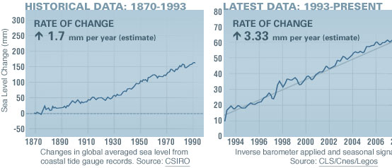
There was an indication that the graph was updated 08.20.09, but no other indication that anything had changed. I don’t know if Rob had informed them of the error or whether they had “coincidentally” discovered it themselves.

The changes in the graph are interesting. The rate for the historical data on the left dropped a remarkable 30% 15% overnight from 2 mm/year to 1.7 mm/yr and the latest data trend dropped a more modest amount. The vertical scales changed in both graphs (150mm does seem more impressive than 15 cm). The source for the latest data plot also seems to have changed presumably accounting for the change in scaling.

Anyway, I am glad to see that the sea levels are not rising as fast as they were yesterday…