Visiting St Peter's, Rome

While we were in Italy this summer, my wife and I did the usual tourist things in Rome, visiting the Roman Colliseum and Forum and the Vatican. I noticed something at St Peter’s which is reported first here at Climate Audit. Continue reading

Manchester United

It’s Sunday and I was just watching the sports reports while surfing financial crises. A trivia question only for people who do not know the answer and PROMISE to simply guess. The answer is easy if you know it and equally easy to find if you research it, so please don’t spoil the guesses.

What corporate logo is on the front of the jerseys of Cristiano Ronaldo and the other Manchester United players? (Yes, we get European soccer on many Toronto sports news reports.)

Mann Sediments and Noise Simulation

Both in climate blog world and the financial world, there has been much talk recently about the interaction of models and data distributions. Linear regression models assume normal distributions. What happens to models when the data distributions don’t meet the assumptions. Sometimes it doesn’t matter much, sometimes it does. But it seems like an important thing to study. Continue reading

Mann's PC1 in Esper and Frank 2008

On previous occasions, we’ve noticed some strange appearances of the Mann hockey stick under different disguises. In Inconvenient Truth, a splice of Mann’s hockey stick and CRU instrumental data is described as “Dr Thompson’s thermometer”. Today, I noticed another peculiar incident, where Esper and Frank (Clim Chg 2008), who one would think would know better, identify Mann’s PC1 as originating from Lloyd and Graumlich 1997.

Esper and Frank 2008, entitled The IPCC on a heterogeneous Medieval Warm Period, is fairly critical of IPCC conclusions. They discuss the proxies in IPCC AR4 Box 6.4 Figure 1 (interested readers may also look at my Erice presentation where this figure is discussed.) They list the proxies as follows:

Proxies shown in the AR4 include an ice core record from W Greenland (Fisher et al. 1996), a multi-proxy record from E Asia (Yang et al. 2002), and six treering records representing: SW Canada (Luckman and Wilson 2005), W USA (Lloyd and Graumlich 1997), N Sweden (Grudd et al. 2002), NW Russia (Hantemirov and Shiyatov 2002), N Russia (Naurzbaev et al. 2002), and Mongolia (D’Arrigo et al. 2001)…. Importantly, all tree-ring records shown in AR4 were detrended using a method known as ‘Regional Curve Standardization’ (RCS; Esper et al. 2003).

Now Esper himself produced a chronology from Graumlich foxtail measurements, which is actually quite similar to nearby Sheep Mountain bristlecone measurements and which I’ll discuss briefly below. First I simply want to show that IPCC used Mann’s PC1 and not the Graumlich series.

IPCC AR4 Second Draft
First here is the figure from the IPCC second draft. The Mann PC1 is not labelled as such, but is the orange series (“WUSA”) with one of the most distinctive closing uptrends. The Graumlich series (light purple), also labeled “WUSA”, also has a closing uptrend, but does turn down a little at the end. The data is noted as coming from the Osborn and Briffa 2006 collation (which I’ve used in my plots below).
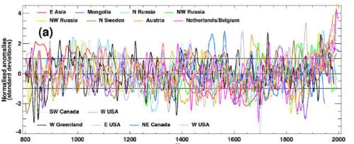

SOD Legend: Box 6.4, Figure 1. (a) The heterogeneous nature of climate during the MWP is illustrated by the wide spread of values exhibited by the individual records that have been used to reconstruct NH-mean temperature. Individual, or small regional averages of, proxy records used in various studies (see Osborn and Briffa, 2006), (collated from those used by Mann and Jones (2003), Esper et al. (2002) and Luckman and Wilson (2005) but excluding shorter series or those with an ambiguous relationship to local temperature).

To highlight the differences between the two series, I’ve replotted them below, Mann PC1 in red, Graumlich in light grey.

In Review Comments on the Second Draft, I objected to the inclusion of both Mann’s PC1 and foxtails. Here’s the comment on the PC1 (see the source for the next comment criticizing the foxtails):

6-1143 B 29:14 29:14 One of the most prominent series on the right hand side of Box 6.4 Figure 1 is Mann’s PC1, which uses his biased PC methodology. It is so weighted that the series is virtually indistinguishable from the Sheep Mountain bristlecone series discussed in Lamarche, Fritts, Graybill and Rose (1984). These authors compared growth to gridcell temperature and concluded that the bristlecone growth pulse could not be accounted for by temperature, hypothesizing CO2 fertilization. Graybill and Idso (1993) also stated this. One of the MBH coauthors Hughes in Biondi et al 1999 said that bristlecones were not a reliable temperature proxy in the 20th century. IPCC Second Assessment Report expressed cautions about the effect of CO2 fertilization on tree ring proxies, which were not over-ruled in IPCc Third Assessment Report. At a minimum, the relationship is “ambiguous”. In addition, I tested the correlation of this series with HadCRU2 gridcell temperature and obtained a correlation of 0.0. Osborn and Briffa say that they themselves did not verify the temperature relationship for this data. Why not? At any rate, in this example, the authors have not excluded an important series with a well-known “ambiguous” relation to temperature. [Stephen McIntyre (Reviewer’s comment ID #: 309-39)]

This comment was rejected as follows (but the rejection acknowledges the use of the Mann PC1):

Rejected – the purpose of this Figure is to illustrate in a simple fashion, the variability of numerous records that have been used in published reconstructions of large-scale temperature changes. The text is not intended to give a very detailed account of the specific limitations in data or interpretation for each. Furthermore though there is an ambiguity in the time-dependent strength of the response of Bristlecone Pine trees to temperature variability, there is other evidence that these trees do display a temperature response . Right or wrong, Mann and colleagues do apply an adjustment to the western trees PC1 in their (1999) analysis to account for possible CO2 fertilization. Other authors ( Graumlich et al ., 1991) assert that the recent rise in some high elevation conifers in the western U.S. could be explained as a temperature response (she can not confirm the LaMarche et al findings). The issue is clearly complex , as will be noted in a new papragraph on tree-ring problems that will be added to the text

IPCC AR4 Final Draft
In the final draft, the number of illustrated proxies was pared down, with the Graumlich foxtails being dropped. Here’s the graphic with the caption. Comparing captions, one notes two interesting changes. First the attribution of versions to Osborn and Briffa 2006 is deleted. This is unfortunate as the versions illustrated here can at least be traced in Osborn and Briffa 2006, but cannot necessarily be spotted in the citations provided here. Second, notice the change in criterion – the earlier version used an “ambiguous” relationship to temperature, this one uses “no” relationship.

Looking at the form of the one remaining WUSA series, it clearly has the shape of the Mann PC1 going up at the end, rather than the foxtail series, which is similar but with a slight downtick at the end. So we can safely conclude that the series illustrated in the IPCC document is definitely the Mann PC1 (Sheep Mountain) and not the Graumlich series.
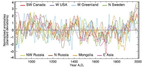

Box 6.4, Figure 1. The heterogeneous nature of climate during the ‘Medieval Warm Period’ is illustrated by the wide spread of values exhibited by the individual records that have been used to reconstruct NH mean temperature. These consist of individual, or small regional averages of, proxy records collated from those used by Mann and Jones (2003), Esper et al. (2002) and Luckman and Wilson (2005), but exclude shorter series or those with no evidence of sensitivity to local temperature. These records have not been calibrated here, but each has been smoothed with a 20-year filter and scaled to have zero mean and unit standard deviation over the period 1001 to 1980.

Although the foxtail series is attributed to Llloyd and Graumlich 1997, neither this chronology nor any similar chronology appears in that article, which I’ve placed online here. Nor does Lloyd and Graumlich even say that their foxtail series records medieval temperatures; quite the opposite. They conclude that their foxtails were limited in growth by medieval drought.

The period from 950 to 550 BP illustrates the extent to which water balance can reverse treeline response to temperature. Whereas climate appears to have been warm when treeline forests expanded, warmth does not necessarily lead in subalpine forest expansion.

Graumlich reported a number of other treeline sites, which did not have HS shapes. Indeed, she opposed Graybill’s CO2 theory largely on the basis that she could not replicate his results.

I discussed strip bark at these foxtail sites here, obtaining confirmation from Andrea Lloyd on a concordance of names. She also provided an interesting confirmation from Andrea Lloyd about Pete Holzmann and my strip bark theory. I identified several trees whose growth patterns looked a lot like Almagre strip bark and asked her to check if these trees were strip bark in her notebooks. Bingo. They were.

There is one other notable mis-identification of provenance in Esper and Frank – one which is endemic. Briffa’s Yamal version is attributed to Hantemirov and Shiyatov 2002, which actually has a non-HS chronology from that site. Juckes made the same incorrect identification.

Nassim Taleb on Black Swans

Bob Carter sent me a link to the following interesting article and profile on Nassim Taleb. Taleb is a statistician with practical risk experience. We’ve talked endlessly at Climate Audit about weird and inappropriate statistical methods, with frequent mentions of Mandelbrot, fractals and odd distributions. So does Taleb. In a financial context, but Mandelbrot sought fractals both in finance and nature (even analysing earlier versions of Mann’s tree ring data.)

The introduction to Taleb’s article is as follows:

When Nassim Taleb talks about the limits of statistics, he becomes outraged. “My outrage,” he says, “is aimed at the scientist-charlatan putting society at risk using statistical methods. … As a researcher in probability, he has some credibility. In 2006, using FNMA and bank risk managers as his prime perpetrators, he wrote the following:

“The government-sponsored institution Fannie Mae, when I look at its risks, seems to be sitting on a barrel of dynamite, vulnerable to the slightest hiccup. But not to worry: their large staff of scientists deemed these events “unlikely.” “

Taleb recently accepted an academic appointment in an engineering department, describing the appointment as follows:

And Professor Bernanke [the present Federal Reserve chairman] indeed found plenty of economic explanations—what I call the narrative fallacy—with graphs, jargon, curves, the kind of facade-of-knowledge that you find in economics textbooks. (This is the kind of glib, snake-oil facade of knowledge—even more dangerous because of the mathematics—that made me, before accepting the new position in NYU’s engineering department, verify that there was not a single economist in the building. I have nothing against economists: you should let them entertain each others with their theories and elegant mathematics, and help keep college students inside buildings. But beware: they can be plain wrong, yet frame things in a way to make you feel stupid arguing with them. So make sure you do not give any of them risk-management responsibilities.)

Taleb has even had to resist demands to provide his own “reconstruction”.

Now you would think that people would buy my arguments about lack of knowledge and accept unpredictability. But many kept asking me “now that you say that our measures are wrong, do you have anything better?”

Here’s another paragraph about “self-published” negative results:

Go to a bookstore, and look at the business shelves: you will find plenty of books telling you how to make your first million, or your first quarter-billion, etc. You will not be likely to find a book on “how I failed in business and in life”—though the second type of advice is vastly more informational, and typically less charlatanic. Indeed, the only popular such finance book I found that was not quacky in nature—on how someone lost his fortune—was both self-published and out of print. Even in academia, there is little room for promotion by publishing negative results—though these are vastly more informational and less marred with statistical biases of the kind we call data snooping. So all I am saying is, “What is it that we don’t know”, and my advice is what to avoid, no more.

“Less marred by statistical biases of the kind we call data snooping.” My, my.

The U.S. Financial Crisis

The U.S. financial crisis should be on everyone’s mind. It’s a serious situation. A private investor simply can’t hold money market paper right now. So added to the mortgage mess is a liquidity crisis that’s never happened since the run on banks in the Depression. So you can’t do nothing. The liquidity situation has to be dealt with.

We’re getting an object lesson over the next few days on making decisions under uncertainty. And the uncertainties faced by Chris Dodd and the other congressmen are of the type that are characteristic of real decisions. No one’s going to be able to put “error bars” around anything other than in a wild-eyed guess sort of way.

While we got intimate details on the politics and theatre of the “deal”, explanations of exactly how one gets from A to B are less available, or for that matter, what A and B are. We all know that there’s a problem. We know that there are a million non-performing mortgages and that no one wants to hold money market paper right now. I don’t really understand how the dots connect; I’m prepared to believe that they do, but it would be a good idea for someone to stand up and show how they connect. I know that the bailout plan is priced at $700 billion, but after watching CNN almost all day yesterday, I don’t know what the plan actually is. I know that nerves are frayed, but surely there are some people that can start explaining what the plan is and why Main St should support it. If it’s a good plan, I’m sure that Main St will, but explanations of the concepts and why it’s a good idea should be out there so that public opinion can be mobilized.

If I were in the room charged with making a decision, if I had my druthers, I think that I’d seek out the opinions of Warren Buffett, George Soros and Boone Pickens – three very different and highly successful people knowledgeable about markets, but not directly involved in the fiasco. And someone from a Wall St firm who’s steered clear of most of the mess. I guess J.P. Morgan Chase seems to have done better than most. Wouldn’t it be nice to see some of these guys on CNN saying what they think? [Note – again, I’m not saying that these guys are angels, I’m just saying that I’d like to know what people who haven’t been in the mess, think of the solutions.]

[Note: here’s an interesting take on the situation earlier this week by Conrad Black from his jail cell. Regardless of past hubris, Black is also a very smart guy, knowledgeable about markets and history and well worth listening to. I agree 1000% with his point about China. Also, to keep the $700 billion bill in perspective, Black says that the annual US current account deficit is $800 billion.]

The first people that the committee has to listen to are Paulson and Bernanke, but it would be awfully worrying having to rely on anyone who’s been directly involved in the supervision of the failed institutions.

At the end of the day, the people in the room, regardless of their past histories, have to make decisions and it must be very hard for Chris Dodd and people charged with making the decision to figure out who to trust. [I mention Dodd here, because, after watching hours of this on CNN yesterday, he struck me as the person in the game that seemed both willing and able and I’d personally go along with whatever he decided. [Note: many people have observed that Dodd is part of the problem and he may well be/probably is. Having said that, until someone else is running the committee, that’s who’s there. And if a decision has to be made, the incumbents have to make it. Only one decision is going to be made, even if it’s a decision to do nothing or to hoist the thing until the next administration. This comment doesn’t mean that I think that he is free of responsibility in this mess or that I “endorse” him or that he has the “solution”. I have no idea on the matter; indeed, I don’t know for sure that there is a solution or even exactly what the problem is, other than serious people say that there is one. People have observed below that Freddie Mac and Fannie Mae have been huge lobbyists and contributors in Washington and that may well be part of the problem. But we’ve been told by politicians in both parties that it is a crisis. And the collapses of AIG, Washington Mutual, Bear Stearns and Lehman Bros are sure evidence of a crisis. And this is in an economy with GM and Ford on deathwatch. I don’t know whether there’s a solution or even, as I note below, exactly what the problem is. If I was in the room, I’d want to understand the problem better than I do right now. But at the end of the day, somebody has to make a decision, even if the decision is to do nothing. Doing nothing might be a rational decision, but it’s a decision that should be made intentionally. And while the people in the room may have created the mess, until new people are there, they’re still the people that have to make a decision. So any decision that’s made right now – even a decision to do nothing – is by definition going to be made by people who presided over the mess.]

Another Interesting Correlation Graphic

In my last post, I observed an interesting bimodality which almost certainly appears to originate in Mann’s pick two procedure on low-correlation tree ring networks. Some readers may recall the interesting bimodal distribution that we reported in MM 2005 (GRL); the introduction of bimodality into a distribution seems like a sure sign of a picking operation like the absmax procedure (“pick two”).

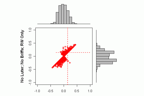
The next graphic shows a further remarkable bimodal aspect to Mann’s correlation coefficients – this time, we’re dipping our toes in the murky waters of “low frequency” correlations. The x-marginal distribution is the rtable correlation (“high frequency”) calculated in a usual method (given Mannian RegEMed proxies and temperatures); the y-marginal distribution are the rtable “low frequency” correlations, calculated after smoothing somehow. (See also Matt Briggs’ recent thoughts on this.) I’ve color coded this to show the truncated Briffa correlations in green and the ring width correlations in red and orange – red showing ones that in the Passing 484, orange are Failing. Some points we’ve already noted e.g. the very high reported correlations of the truncated Briffa data. We also previously observed the bimodality of the high-frequency rtable) correlations which I am currently attributing primarily to the pick two effect.

The new point here is that the bifurcation of the low-frequency correlations is noticeably more pronounced than the bifurcation of the high-frequency distributions. I presume that this is related somehow to the Slutsky-Yule effect (a well-known effect in economics time series, where repeated averaging makes series increasingly sinusoidal), but I’m still experimenting. For now, I merely observe that these bifurcated distributions are definitely not the sort of thing that you want to see in sound statistical practice and that there is an eerie deja vu developing, since we’ve already seen weird bifurcated distributions in connection with MBH that even Jolliffe hasn’t grappled with.

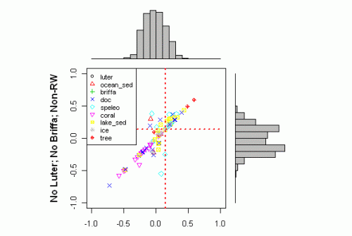
This is the same plot for the odds-and-ends series (only 104 of them). At a first glance, the relation between low-freq and total correlation seems straightforwardly linear, but when you look at the x- and y- marginal distributions, you see that the y-distribution (low-freq) has developed a noticeable bimodality not present in the x-distribution.

Mann 2008 – Replication

Do not post anything other than programming comments. Absolutely no piling on please.

Mann 2008 Correlations – A New Graphic

I’ve adopted a graphic from the R-gallery to better illustrate the issues that we’re working on with the Mann proxy correlations. I think that this should help.


Figure 1. Scatter plot of calculated gridcell correlations to Mann SI correlations, color coded by “proxy” class, together with marginal histograms. The dotted red lines show r=0.14, a 95% benchmark according to Mann et al SI.

This graphic shows several important data analysis points.

First and most importantly, the SI correlations are not random by “proxy” class, but are highly stratified. There are marked differences in average correlation for each of the three main classes (Luterbacher, Briffa MXD and ring widths). The Luterbacher series (article here; SI here) have very high correlations, but they are not really “proxies” as they use instrumental information to reconstruct European gridded temperature back to AD1500. Luterbacher states:

This reconstruction is based on a comprehensive data set that includes a large number of homogenized and quality-checked instrumental data series, a number of reconstructed sea-ice and temperature indices derived from documentary records for earlier centuries, and a few seasonally resolved proxy temperature reconstructions from Greenland ice cores and tree rings from Scandinavia and Siberia (fig. S1 and tables S1 and S2).

Examination of his SI shows clearly that the post-1850 Luterbacher series rely almost totally on instrumental data and thus, a high correlation to CRU instrumental data is hardly remarkable or representative of the ability of “proxy” networks without instrumental data e.g. the proxies available for MWP comparison.

The Briffa MXD series form a second stratification, also with very high correlations. This data set has been discussed on a number of occasions as they are the type case for divergence. In this case, Mann has deleted post-1960 values and substituted RegEM values prior to calculating the correlations. This can hardly be considered representative of other proxies. Re-doing the analysis with original data is currently impossible as Mann deleted the post-1960 values from the “original” data as well and the “original” data, originating from another RegEM publication by Mann and associates (Rutherford et al 2005) has never been archived (despite representations to the contrary.)

The bulk of the proxy series (red) are tree ring width series. Here the Mannian distribution of correlations has a bimodal distribution not present in the gridcell correlations. The Mann et al SI mentions a highly unusual procedure (which I called ‘pick two daily keno’ in an early post. Pick Three Daily Keno is a lottery in Ontario.) Instead of using the correlation to the actual gridcell, Mann calculates the correlation to the two nearest gridcells in his network. I am presently unable to fully replicate this calculation, but can do so for many series. (My guess is that there is some difference between the instrumental version used in rtable calculations and the version archived with WDCP, but these things are always difficult to sort out in Mann articles.) I’ve done some experiments with random data and simply picking the value with the highest absolute value from two random data points will introduce a bifurcation in the distribution.

The pick two procedure has another interesting result: as you can see, there are a lot of ring width series that fail the Mannian correlation test to the actual gridcell, but are bumped into “significance” by the pick two daily keno procedure. (Note: compare this graphic to the plot of random white noise in Comment #15 below.)

The handling of autocorrelation is another issue entirely. The dotted benchmarks here assume i.i.d. distributions, while actual series contain highly varying degrees of autocorrelation. Mann asserts that there is “modest” autocorrelation, but this assertion is untrue for many series. The “minor” proxy classes e.g. ice cores, sediments, do not show clearly in the above series and will need some further analysis. These proxies typically have enormous autocorrelation and autocorrelation benchmarks derived from tree rings have no bearing on their analysis, which I’ll get to on another occasion.

I’ve managed to replicate Mann’s correlations in R for the vast majority of series as shown in the graphic below comparing my emulation to the archived rtable values. Given the exact replication of so many series, the inability to replicate the other results remains a bit of a puzzle, but I’m hopeful of getting a precise reconciliation so that analysis is clarified. The difference between this graph and the top one is that both scatters incorporate pick-two methods.

Sept 25.
Here are a couple more versions in which I stratify RW series by themselves (excluding Luter, Briffa MXD and the odds and ends – ice cores, sediments, corals,…). This very much has the appearance of simply random data with some autocorrelation spreading out the distribution of correlation coefficients. Looks a lot like the random data in Comment #15.

Next here is a plot of the odds-and-ends. Over and above the issues shown in this graphic, there is another shoe to drop. The SI values for many of these proxies are different from the rtable values. This difference comes from another ad hoc procedure applied to some, but not all, of these proxies: “low frequency” correlation. Matt Briggs has written recently on this (see his recent post on smoothing). I haven’t assessed this little bag of snakes yet. I’ve examined autocorrelations on many of the odds-and-ends proxies and they tend to be very large, much larger than allowed for in Mann’s rule of thumb/

Adjusting Pristine Data

On September 15, 2008, Anthony DePalma of the New York Times wrote an article about the Mohonk Lakes USHCN weather station titled Weather History Offers Insight Into Global Warming. This article claimed, in part, that the average annual temperature has risen 2.7 degrees in 112 years at this station. What struck me about the article was the rather quaint description of the manner in which temperatures are recorded, which I have excerpted here (emphasis mine):

Mr. Huth opened the weather station, a louvered box about the size of a suitcase, and leaned in. He checked the high and low temperatures of the day on a pair of official Weather Service thermometers and then manually reset them…

If the procedure seems old-fashioned, that is just as it is intended. The temperatures that Mr. Huth recorded that day were the 41,152nd daily readings at this station, each taken exactly the same way. “Sometimes it feels like I’ve done most of them myself,” said Mr. Huth, who is one of only five people to have served as official weather observer at this station since the first reading was taken on Jan. 1, 1896.

That extremely limited number of observers greatly enhances the reliability, and therefore the value, of the data. Other weather stations have operated longer, but few match Mohonk’s consistency and reliability. “The quality of their observations is second to none on a number of counts,” said Raymond G. O’Keefe, a meteorologist at the National Weather Service office in Albany. “They’re very precise, they keep great records and they’ve done it for a very long time.”

Mohonk’s data stands apart from that of most other cooperative weather observers in other respects as well. The station has never been moved, and the resort, along with the area immediately surrounding the box, has hardly changed over time.

Clearly the data collected at this site is of the highest quality. Five observers committed to their work. No station moves. No equipment changes according to Mr. Huth (in contrast to the NOAA MMS records). Attention to detail unparalleled elsewhere. A truly Norman Rockwell image of dedication.

After reading the article, I wondered what happened to Mr. Huth’s data, and the data collected by the four observers who preceded him. What I learned is that NOAA doesn’t quite trust the data meticulously collected by Mr. Huth and his predecessors. Neither does GISS trust the data NOAA hands it. Following is a description of what is done with the data.

Continue reading