Caspar Ammann, Texas Sharpshooter

The Texas Sharpshooter fallacy is a logical fallacy where a man shoots a barn thirty times then circles the bullet holes nearest each other after the fact calling that his target. It’s of particular concern in epidemiology.

Folks, you are never going to see a better example of the Texas Sharpshooter work itself out in real life than Caspar Ammann’s handling of Mann’s RE benchmark.

I introduce you to Caspar Ammann, the Texas Sharpshooter. Go get ’em, cowboy.

Continue reading

North versus South

John A writes:

I’ve installed the “unfancy quotes” plug-in which now means that code published on this blog can now be cut/pasted into R without any further messing about (try the code below, for example).

For previous R codes, the plug-in does not change the fancy quotes, unless Steve just opens the post for edit and then saves it again immediately.

Hope this helps.

——————————————————————————————————————-

July 2008 RSS numbers are out (as a poster mentioned). I expect MSU tomorrow and will post them up together. When I plotted up NH and SH sea ice, I thought that it would be interesting to plot the difference between N and S extratropics (20-80N versus 20-70S) – I plotted RSS TLT (version 3 through July 2008) as I had the file open. Here are the results, which I find pretty interesting.

In general terms, the relative warming of the NH relative to the SH is something that we’re aware of, but isn’t the strength of the trend in the 30 years of satellite record astonishing? And this is nothing to do with UHI.

We’re talking 0.75 deg C in 30 years here!
august40.gif

Figure 1. TLT 20-80N minus TLT 20-70S. (Version 3)

I don’t recall this having been mentioned in advance a particular fingerprint of GHG forcing. It’s so prominent that you’d think that it would deserve a little comment in AR4 – has anyone noticed such a discussion – maybe they can point us to a page.

Update: Here’s the corresponding graphic from UAH which is pretty similar. One thing caught my eye in the difference between the two, which may or may not be relevant to the ongoing disputes between the two parties. The UAH differential seems less like a trend and more like a changepoint in the late 1980s, with a new level established in the 1990s and 2000s. RSS nets out about the same, but the transition is more gradual. I have no views on whether one makes more sense than the other, but maybe the explanation of the difference would be interesting. It will be interesting to do similar graphics on the surface records, which I’ll do at some point.

august41.gif

Also here’s the same plot from GISS annual data (24-90N minus 24-90S). Seems to me like I’ve seen a plot like this somewhere before and it caused apoplexy in Team-world.

august42.gif

Update: Atmoz has observed at his blog that wondering about the strength of this trend shows that I must be about the stupidest person in the world and that everyone knows from Meteorology 101 that land warms faster than ocean; that there’s more land in the NH than the SH, so duh!!!

In order to illustrate his point, I have plotted the land-ocean differential in NH and SH extratropics (MSU), which shows that NH extratropical land has warmed by 0.02 deg C/decade relative to NoExt oceans, while SoExt land has cooled by 0.04 deg C/decade relative to SoExt oceans. I’m not sure exactly how this proves Atmoz’ point; I think that Atmoz must be leaving out a step in his proof.

august46.gif
august47.gif

Script:

url=”http://vortex.nsstc.uah.edu/data/msu/t2lt/uahncdc.lt”
fred=readLines(url);N=length(fred)
msu<-read.table(url,header=TRUE,nrow= N-4)
msu<-ts(msu,start=c(1978,12),freq=12)
msu.glb=msu[,”Globe”]

layout(1);par(mar=c(3.5,4,2,1))
ts.plot(msu[,”NoExt”]-msu[,”SoExt”],ylab=”deg C”,xlab=””)
title(“Extratropics: North vs South (UAH)”)
mtext(side=1,paste(“Source: “,url),line=2,cex=.6)
fm=lm(I(msu[,”NoExt”]-msu[,”SoExt”])~time(msu));summary(fm)
# 0.2308 per decade
lines(c(time(msu)),fm$fitted.values,col=2)
abline(h=0,lty=2)
text(1980,0.9,paste(“Trend: “,round(10*coef(fm)[2],2), ” deg C/decade”),pos=4,font=2,cex=.8)

url=”http://www.remss.com/pub/msu/monthly_time_series/RSS_Monthly_MSU_AMSU_Channel_TLT_Anomalies_Land_and_Ocean_v03_1.txt&#8221;
tlt3<-read.table(url, skip=3)
dimnames(tlt3)[[2]]<-c(“year”,”month”,”70.80″,”20.20″,”20.80N”,”20.70S”,”60.80N”,”60.70S”,”US”,”NH”,”SH”)
tlt3=ts(tlt3,start=c(1979,1),freq=12)
tlt3.glb=ts(tlt3[,3],start=c(1979,1),freq=12)

# year month 70.80 20.20 20.80N 20.70S 60.80N 60.70S US NH SH
#1979.000 1.000 -0.268 -0.249 -0.498 -0.045 -0.246 -0.392 -3.339 -0.376 -0.156

layout(1);par(mar=c(3.5,4,2,1))
ts.plot(tlt3[,”20.80N”]-tlt3[,”20.70S”],ylab=”deg C”,xlab=””)
title(“Extratropic TLT: North vs South (RSS)”)
mtext(side=1,paste(“Source: “,url),line=2,cex=.6)
fm=lm(I(tlt3[,”20.80N”]-tlt3[,”20.70S”])~time(tlt3));summary(fm)
# 0.2308 per decade
lines(c(time(tlt3)),fm$fitted.values,col=2)
abline(h=0,lty=2)
text(1980,0.9,paste(“Trend: “,round(10*coef(fm)[2],2), ” deg C/decade”),pos=4,font=2,cex=.8)

July Monthly Seaice (NSIDC)

July monthly seaice data from NSICD is shown below. I have no idea how this reconciles to the JAXA versions that we’ve been following or to the daily binaries. Both extent and area are shown. The SH anomaly has declined markedly with SH winter and the GLB anomaly is slightly negative.

august37.gif

august38.gif

Updating Briffa 2000

Briffa 2000 is one of the canonical “independent” reconstructions in the IPCC AR4 spaghetti graph, the Wikipedia spaghetti graph and similars. I’ve discussed it in the past, but I’m going to revisit this in light of the new information on Tornetrask and I’m going to run Brown’s inconsistency statistic on it.

Briffa used 7 series: Tornetrask, Taymir, Alberta (Jasper), the Jacoby North American composite, Yakutia, Mongolia and Yamal (replacing Polar Urals). Most of these series have been updated since Briffa 2000: indeed the updates were available. Tornetrask was updated in Grudd’s thesis; Taymir is relatively up-to-date; Rob Wilson updated Jasper, Alberta; Yakutia is updated – it;s the Indigirka River series in Moberg; Mongolia is updated; the Jacoby composite should be updated, but important series from D’Arrigo et al 2006 remain unarchived. Although there are hundreds of measurement data sets at ITRDB, these measurements are, for the most part, conspicuously absent: Tornetrask(other than a subset archived by Schweingruber); Taymir; Luckman’s Jasper, Alberta; Yakutia; Yamal. JAcoby’s Mongolia is archived and some of the Jacoby data.

Replication
The chronologies used in Briffa 2000 are available and I could exactly replicate the “normalized” composite as shown in the top panel below. The Briffa 2000 “reconstruction” was archived in connection with the Briffa et al 2001 but does not match the normalized composite, though the methodology is supposed to be only a linear transformation. When I reproduce the reported method, I get a somewhat different answer. I have no idea how Briffa got from his normalized series to the archived reconstruction. For replication purposes, I’ve used the replication algorithm that yielded the bottom panel, which is the best that I can do right now and works adequately enough for sensitivity.

ca_aug26.gif
Figure 1. Top – emulation of normalized series (exact!); bottom – emulation of archived reconstruction, Not exact.

Sensitivity
For a sensitivity analysis of the impact of updating, I did the following updates (Taymir is pretty up-to-date. Only the Jacoby NOAMER series is not millennial. )

Tornetrask – the Grudd version;
Yakutia – the version used in Moberg, which extends to a millennium series;
Polar Urals – Esper’s Polar Urals update, rather than the Yamal substitution;
Mongolia – updated version used in Osborn and Briffa 2006
Alberta – Luckman-Wilson updated version used in Osborn and Briffa 2006

This yielded the following two panels – the top being the normalized composite in the same style as before and the bottom being the temperature reconstruction.

In this rendering, the maximum is in the 11th century, with an elevated modern period in the 1930s. The sensitivity version and the archived version are very close through the 19th century but their early trajectories increasingly diverge. Whereas the modern period was the warmest using older data, the 11th century is “warmer” here. This result is not “independent” of a similar result for the Jones series as key series overlap – but this non-independence existed already. Also the “divergence problem” is noticeable, especially recently where ring widths have not responded to very warm recent temperatures, raising questions about the ability of these proxies to record possible past warmth. Replacing the Polar Urals update with Yamal attenuates the MWP relative to the modern period.

ca_aug35.gif

Brown-Style Statistics
Next here is a plot of Brown’s Inconsistency R(b) for the original Briffa network over the period of 100% representation (1601-1974). This shows rather dramatic inconsistency in the 19th century (and not so much in earlier periods). What does this signify? Dunno.

ca_aug32.gif

Next here is the same thing for the 6 series network of millennium series (here from 950 to 1990). Again this shows far more coherence in the modern period than in earlier periods. Prior to the 20th century, the inconsistency values are running at levels consistent with random data (the red line), with coherence existing only in the 20th century. Why is this? Dunno. These results certainly indicate that efforts to “reconstruct” past climate from this data are doomed, but I’m still feeling my way through this style of looking at the data.

ca_aug33.gif

“Reconstruction”
Here are maximum likelihood and GLS reconstructions (smoothed 21 years).ca_aug36.gif

Well, well. Look what the cat dragged in.

We seem to be having occasional success in getting things archived. CSIRO was shamed into providing the data for their Drought Report and David Stockwell has now reported on this.

Earlier this year, we reported a form of academic check kiting by Ammann and Wahl, where they had referred to Supplementary Information for key results, but failed to provide the Supplementary Information. Flaccid peer reviewers and flaccid editors at Climatic Change either didn’t notice or didn’t care. Given that RE significance had been a major issue both in the original MM articles and in the twice rejected GRL submission by Wahl and Ammann, you’d think that someone would have spent a couple of minutes checking out whether the argument in the SI actually worked. But, hey,…

The editors of Climatic Change didn’t have any information about the SI. When I contacted Caspar Ammann for the SI, he replied early this year in the typically ‘gracious’ Team style:

why would I even bother answering your questions, isn’t that just lost time?

So this became one more issue on the blog. Some readers get tired of the litany of non-compliance. Look, I get tired of the non-compliance too. Ammann’s case was particularly egregious because the article actually referred to and relied on the SI, which was then withheld. In some cases, sunshine works. CSIRO grudgingly archived their drought data and, a couple of days ago, I noticed that Ammann had grudgingly put up his Supplementary Information (without notifying me despite my outstanding request.)

I’ve been criticized for not replying to Wahl and Ammann, but, unlike, say, IPCC section authors considering this material, I actually like to be able to examine the Supplementary Information and this has only been available for a couple of weeks (and, in my case, effectively only a couple of days.)

Some of the results in this SI are simply breath-taking. I hardly know what to say or where to begin.
Continue reading

Stockwell on CSIRO Drought Report

David Stockwell has posted up an analysis of the CSIRO Drought Report, using the data grudgingly made public by CSIRO after public pressure. Key claims of the CSIRO report do not pass obvious statistical test for “significance”. Please visit David at his blog.

Jones et al 1998: Impact of New Versions

We keeping hearing the incantation from the Team that all the reconstructions on the Jesuit Index show a warmer modern than medieval period. I reported that I recently obtained a digital version of Grudd’s revised Tornetrask reconstruction and I’ve been anxious to test out its impact on the Jones et al 1998 reconstruction (together with the impact of the Polar Urals update.) I’d experimented a little with this previously using my own unwinding of Briffa’s “adjusting” of the Tornetrask series, but this analysis is obviously much stronger using Grudd’s version.

In doing so, I took the opportunity to re-visit and tidy my emulation of the Jones 1998 reconstruction methodology, which includes an implementation of the “variance adjustment” procedure of Briffa and Osborn (Dendrochronologia 1999), the eminent statistical successors of Sir Ronald Fisher (J Royal Statistical Society). Previously, I’d been able to directionally replicate these results – most of the series overlapped with MBH and I used the MBH versions in my emulation where available. However the replication was not nearly as precisely as I wanted; I asked Jones for a copy of the data as used (which was never archived) in order to try to reconcile results. Jones (“we have 25 years invested in this”) refused.

I caught a little break when Juckes et al was published. Although Jones had refused to provide me with the data as used in Jones et al 1998, it turned out that he was willing to provide the data as used to other Team members (though not to potential critics.) When Juckes archived his data, I noticed that the version of the Greenland dO18 data was different than the MBH version and so I was also interested in seeing the impact of changing these versions on my replication.

If you’ll bear with me, I want to document a couple of these points, before showing the impact of the new series versions. The black series in the top panel shows the difference between the archived reconstruction and my emulation. As you see, the early portion is pretty much bang on up to rounding, while the later portion isn’t bad, but the change in variance indicates that I’ve probably introduced the wrong version of one of the series. Looking closely, the change in amplitude occurs around 1659, when the Central England series (MBH annual version) was introduced.

jones122.gif
Figure 1. Jones 1998 reconstructions, with Crete dO18 version and MBH C England annual.

As some of you may recall, the Central England version was an issue in MM03 and the MBH Corrigendum, as it turned out that, instead of using annual data as they had said in their original SI, they used a summer version starting in 1730, previously used in Bradley and Jones 1993 (though the truncation was also unreported there.) I substituted the MBH truncated JJA version and re-ran with the results shown below, this time matching before 1659 and after 1750. My guess is that there is another version of this data around somewhere, probably a summer version which coincides with the MBH version after 1730, and starts in 1659, suggesting that the explanation of the inconsistency in the Corrigendum was itself incorrect. The reconciliation is now pretty good in any event.

jones123.gif
Figure 2. Jones 1998 reconstruction, using C England version starting in 1730.

I then made two updates to this data set: 1) replacing the Briffa version of Tornetrask, where, as discussed elsewhere, Briffa bodily adjusted the 20th century results to match his expectations; 2) using the updated Polar Urals chronology from Esper et al 2002. Using the same methodology, this yields the following result. (I have not substituted the Yamal series for Polar Urals, as Briffa did, as I am unaware of any report showing any defects in the Polar Urals update. While the Team didn’t like the results, in my opinion, that is insufficient reason to withhold the results.)

jones124.gif
Figure 3. Jones 1998-style reconstruction, using updated Tornetrask and Polar Urals versions.

Chucky and the U.S. CCSP

Last year, I reported on the resurrection of Chucky, with even Mann’s PC1, repudiated by Wegman and the NAS Panel, being illustrated in IPCC AR4. Chucky is back with a vengeance in the U.S. CCSP report, entitled “Unified Synthesis Product Report by the U.S. Climate Change Science Program and the Subcommittee on Global Change Research”, released in July 2008 for comment here , full report pdf here (33 MB); comment submission here.

The report states that it is classified as “highly influential”:

This Synthesis and Assessment Product described in the U.S. Climate Change Science Program (CCSP) Strategic Plan, was prepared in accordance with Section 515 of the Treasury and General Government Appropriations Act for Fiscal Year 2001 (Public Law 106-554) and the information quality act guidelines issued by the Department of Commerce and NOAA pursuant to Section 515 ). The CCSP Interagency Committee relies on Department of Commerce and NOAA certifications regarding compliance with Section 515 and Department guidelines as the basis for determining that this product conforms with Section 515. For purposes of compliance with Section 515, this CCSP Synthesis and Assessment Product is an “interpreted product” as that term is used in NOAA guidelines and is classified as “highly influential”.

The term “highly influential” triggers the peer review standards described in the OMB Bulletin here.

On the second page of the running text of the report (pdf page 19, following the executive summary and many colorful pictures), we see the following graphic with the caption shown beneath it:
benefi11.jpg
Original Caption: This 1000-year record tracks the rise in carbon emissions due to human activities (fossil fuel burning and land clearing) and the subsequent increase in atmospheric carbon dioxide (CO2) concentrations and air temperatures. The earlier parts of the Northern Hemisphere temperature reconstruction shown here are derived from historical data, tree rings, and corals, while the later parts were directly measured.

No source is given for this graphic, but CA readers will recognize this as, using Hu McCullough’s phrase, “MBH with whiskers”.

It is the Mann reconstruction spliced with CRU temperatures in an interesting way. The graphic below shows the splice of the MBH98-99 proxy data up to 1901 with the CRU version archived in connection with MBH98, which opportunistically included instrumental data from warm 1998 after the actual publication of MBH98 (see script in first comment for splicing).

benefi15.gif
Figure 2. Splice of MBH Recon with Instrumental Data

Aside from the resurrection of Chucky, there are a couple of other interesting aspects to this graphic. You recall Mann’s outraged repudiation of the idea that climate scientists would splice proxy and instrumental records. An RC reader had written in to say:

Whatever the reason for the divergence, it would seem to suggest that the practice of grafting the thermometer record onto a proxy temperature record – as I believe was done in the case of the ‘hockey stick’ – is dubious to say the least.

To which Mann responded with outrage:

[Response: No researchers in this field have ever, to our knowledge, “grafted the thermometer record onto” any reconstruction. It is somewhat disappointing to find this specious claim (which we usually find originating from industry-funded climate disinformation websites) appearing in this forum. Most proxy reconstructions end somewhere around 1980, for the reasons discussed above. Often, as in the comparisons we show on this site, the instrumental record (which extends to present) is shown along with the reconstructions, and clearly distinguished from them (e.g. highlighted in red as here).

The “reasons” for not updating the proxy records “discussed above” were something that we’ve discussed in connection with the Starbucks Hypothesis.

Obviously this graphic in a publication classified as “highly influential” not only does not “clearly distinguish” the instrumental from the proxy portion, it merges them, although I presume that Mann would not regard the site originating this graphic as a “climate disinformation site.”

We’ve noted similar splicing on other occasions in the past – in Crowley and Lowery 2000, the splice being discussed at CA here, together with an assessment of evidence as to whether Mann was aware of this prior splice here . The Mann reconstruction was also spliced with the Jones temperature reconstruction in Inconvenient Truth, where to further complicate matters, it was identified as Dr Thompson’s Thermometer (discussed here).

In a commentary at RC, Pierrehumbert (who incidentally has not corrected his untrue statements about Courtillot not deriving data from a Jones data set), stated:

there is no legitimate reason in a paper published in 2007 for truncating the temperature record at 1992 as they did.

However, I guess that in Team-world it’s OK for a paper published in 2008 to truncate the temperature record in 1998.

Friends With Benefits
The document is directed primarily to an assessment of the regional impact of climate change on the U.S. When you think about iit, it’s interesting that, while one sees many discussions of future impacts (nearly all said to be negative), one sees relatively little discussion of regional impacts over the past century when dramatic changes in CO2 levels have already taken place. This is discussed sometimes in the proxy literature where past and present photos frequently show advancing tree lines. The use of treeline trees for reconstructing past temperatures is premised on the hypothesis that increased temperatures have led to thicker ring widths, something that isn’t mentioned anywhere in the CCSP report.

I did a word search on “benefits” to see whether climate change in the U.S. was such an ill wind that it brought no “benefit” to anyone. Well, there were a few exceptions: “weeds, disease and insect pests” were noted as benefiting from warming and, in the case of weeds, also from higher CO2 levels. Nothing about bristlecones benefiting.

Weeds, diseases, and insect pests benefit from warming, and weeds also benefit from rising carbon dioxide, increasing stress on crop plants and requiring more pesticide and herbicide use….

Agriculture: Weeds, diseases, and insect pests benefit from warming, and weeds also benefit from rising carbon dioxide (CO2), increasing stress on crop plants and requiring more pesticide and herbicide use. [ a second mentino]

Weeds benefit more than cash crops from higher temperatures and carbon dioxide (CO2) levels[21]…

Kudzu and other invasive weed species, along with native weeds and vines, disproportionately benefit from increased carbon dioxide compared to other native plants.

For the most part, other “benefits” were said to be by-products of adaptation or mitigation strategies e.g. making cities more walk-able would benefit personal fitness. Here are the “benefits” mentions that I noticed – an ill wind indeed. I make no comment on the validity or non-validity of any of these observations, other than to note that the “benefits” of climate change are said to be very meager for anyone that is not a weed or a pestilence.

While there are likely to be some benefits in some sectors of society in the early stages of warming, most impacts are projected to be detrimental, in part because society and ecosystems have developed and evolved based on historical climate. Impacts are expected to become more detrimental for more people and places with additional warming.

In addition, some mitigation and adaptation options also produce other benefits to society, such as reducing health risks, and creating jobs or other economic benefits.

And while there are likely to be some benefits and opportunities in the early stages of warming, as climate continues to change, negative impacts are projected to dominate.

Lost opportunities for beach trips and fishing trips are projected to result in reduced recreational benefits totaling $3.9 billion in that state over the next 75 years8.

Cities can reduce the heat load through reflective surfaces and green spaces. Some actions have multiple benefits. For example, increased planting of trees and other vegetation in cities has been shown to be associated with a reduction in crime20, in addition to reducing local temperatures.

Making cities more walk-able and bike-able would thus have multiple benefits: personal fitness and weight loss; reduced local air pollution and associated respiratory illness; and reduced greenhouse gas emissions.

Offshore oil exploration and extraction will probably benefit from less extensive and thinner sea ice, although equipment will have to be designed to withstand increased wave forces and ice movement9.

Transportation: The increase in extreme heat will limit some operations and cause pavement and track damage. Decreased extreme cold will confer benefits.

Longer construction seasons will be a benefit in colder locations18.

Airports in some areas are likely to benefit from reduction in the cost of snow and ice removal and the impacts of salt and chemical use, though some locations have seen increases in snowfall. Airlines could benefit from reduced need to de-ice planes.

However, regions that experience increased streamflow will have the benefit of pollution being more diluted.

As a result, conserving water has the dual benefit of conserving energy, and potentially reducing greenhouse gas emissions if fossil fuels are the predominant source of that energy.

Without the opportunity to benefit from snowmaking, the prospects for the snowmobiling industry are even worse.

The City of Chicago produced a map of urban hot spots to use as a planning tool to target areas that could most benefit from heat island reduction initiatives such as reflective or green roofing and tree planting.

A longer growing season has potential economic benefits, providing a longer period of outdoor and commercial activity (such as tourism). There are also downsides, as white spruce forests in Alaska’s interior are experiencing declining growth due to drought stress5 and continued warming could lead to widespread death of trees6.

A pretty meager harvest of benefits to anyone other than weeds and pestilence.

Conflict and Confidence: MBH99

Here’s a first attempt at applying the techniques of Brown and Sundberg 1987 to MBH99. The results shown here are very experimental, as I’m learning the techniques, but the results appear very intriguing and to hold some possibility for linking temperature reconstructions to known statistical methodologies – something that seems more scientifically useful than “PR Challenges” and such indulgences. Ammann and the rest of the Team are lucky to be able to mainline grants from NOAA, NSF etc for such foolishness.

One of the strengths of Brown’s approach is to provide some tools for analyzing inconsistency between proxies. This has been an issue that we’ve discussed here on an empirical basis on many occasions. Let’s suppose that you have a situation where your “proxies” are somewhat coherent in the instrumental period (say 1856 on), but are inconsistent in their earlier history – a possibility that can hardly be dismissed out of hand. And you can analyze your data in the instrumental period till you’re blue in the face – you can call part of it “calibration” and part of it “verification”, but it still won’t prove anything about potential inconsistency in earlier periods. You have to have some way of measuring and analyzing potential inconsistency in the earlier periods – even if you don’t have instrumental information to calibrate against.

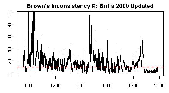
Brown’s “Inconsistency R” (which I’ll call Inconsistency Rb” here) to try to avoid confusion with R^2 is one way of doing so. To motivate interest in details of this statistic, the figure below shows the Inconsistency Rb for the MBH99 network (14 series). Brown and Sundberg 1989 (p 352) says that this statistic has a chi-squared distribution with q-p degrees of freedom (here 14-1=13); the red line shows the 95% percentile value of this statistic (a benchmark used in Brown’s publications.

In my opinion, this is a very dramatic graph and should give pause even to the PR consultants and challengers hired by NOAA and NSF. There is obviously a very dramatic decrease in the Inconsistency Rb statistic in the instrumental period and particularly in the calibration period. This is a vivid quantification of something that we’ve observed empirically on many occasions. This change begs for an explanation, to say the least. This graphic raises two different and important questions: 1) what accounts for the change in inconsistency R statistic during the instrumental period relative to the pre-instrumental period? 2) what do the very high inconsistency R values in the pre-instrumental period imply for confidence intervals?

brown_11.gif
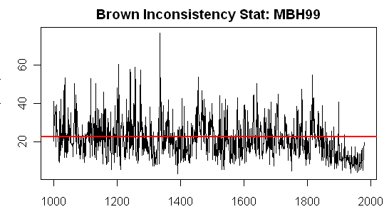
Figure 1. Brown’s Inconsistency Rb Statistic for MBH99 Network (14 series).

For the first question, the change in Inconsistency Rb levels from the pre-instrumental to instrumental period, one hypothetical explanation would be that the changes in the instrumental period are “unprecedented” and that this has occasioned unprecedented coherence in the proxies. An alternative explanation is that the “proxies” aren’t really proxies in the sense of being connected to temperature by a relationship and that the reduced inconsistency in the calibration period is an artifact of cherrypicking, not necessarily by any one individual, but by the industry.

Interesting as this question may be (and I don’t want a whole lot of piling on and venting about this issue which has been amply discussed), I think that we can circumvent such discussions by looking at the 2nd question: the calculation of likelihood-based confidence intervals in the period where there is a high Inconsistency R statistic.

High levels of the Inconsistency R statistic mean that the information from the “proxies” is so inconsistent that the 95% confidence interval is so wide as to be uninformative. The graphic below shows a plot in the style of Brown and Sundberg 1987 showing likelihood based 95% confidence intervals for three years, selected to show different Inconsistency Rb statistic levels.

The highest value of Inconsistency Rb was in 1133, where the Inconsistency stat exceeds 50. The “proxies” are very inconsistent and a likelihood-based confidence calculation from the MBH proxies tells us only that there is a 95% chance that the temperature (in anomaly deg C basis 1902-1980) was between -20 deg C and 20 deg C., a result that seems highly plausible, but uninformative. By comparison, the MBH99 confidence interval (the basis of which remains unknown despite considerable effort to figure it out by UC, Jean S and myself) was 0.96 deg C.

The year 1404 had an Inconsistency R of 26.6, slightly above the 95% chi-squared value for inconsistency. The Brown-style confidence interval was 2.2 deg C, as compared to MBH99 CI of 0.98 deg C (again using an unknown method) and an MBH98 CI of 0.59 deg C (based on calibration period residuals).

brown_14.gif

The graphic below compares confidence intervals calculated in the Brown-Sundberg 1987 style to those reported in MBH99 (red) and MBH98 (green). Note the similarity in shape between the CI widths here and the Inconsistency Rb statistic (a similarity which is more pronounced between the log(CI) and the Inconsistency statistic, which are related.

brown_15.gif


Calculation of the Inconsistency R Statistic

The underlying assumption for these calculations if that there is a statistical relationship between proxies (Y) and temperature (X) can be modelled. Yeah, yeah, I know all the arguments about tree rings (of all people in the world, I don’t need readers to remind me that these relationships are precarious), but mathematically one can carry out calculations as if there was a relationship – just as one does in mathematics arguments even if one’s objective is to show a contradiction. The model is simply:

(1) Y= XB+E  where the errors E have some sort of structure.

What’s important here is that the model is from cause (X-temperature) to effect (Y – tree rings etc), something that is not always observed in Team methodologies and that there are residuals from this model for each proxy providing a lot of information about the model that is not used by the Team (“thrown away” perhaps).

The matrix of regression coefficients \hat{B} , which I usually denote simply as B to simplify notation but it’s important to keep track of this, is calculated (for now) using garden variety OLS methods. In my calculations, everything’s been centered in the calibration period. This is OK for regression, though not a good idea for principal components. The matrix denoted here by B consistent with Brown’s notation is Mann’s G . Thus,

(2) \hat{B}= (X^TX)^{-1}X^TY

This fit in the calibration period yields a matrix of calibration period residuals S . This is very important for statistical analysis as this matrix of residuals S is a workhorse in analysis by statistical professionals. (By contrast, I’ve never seen this object analyzed or mentioned even once in any Team publication!) Brown divides S by (n-p-q) to define his \hat{\Gamma} as follows (his equation 2.11):

(3) \hat{\Gamma}=S/(n-p-q)

He then calculates the garden variety GLS estimate (as follows where y is a vector representing proxy values in one year):

(4) \hat{\xi} = (B\hat{\Gamma}^{-1}B^T)^{-1} B\hat{\Gamma}^{-1}y

This yields a vector of GLS-estimated proxy values \hat{y} given the calibration model and the GLS-temperature estimate \hat{\xi} calculated in the usual way:

(5) \hat{y}= \hat{\xi}B

and defines the inconsistency R (a scalar) from the residuals:

(6) R_b= (y - \hat{y}) \hat{\Gamma}^{-1}(y-\hat{y})^T

UC has consistently emphasized the similarity of MBH methodology to “Classical Calibration” other than its idiosyncratic ignoring of the residual matrix and its ultimately arbitrary re-scaling of series to make them “fit” – a procedure that is then said in climate literature to be “correct”, although the only authority for the “correctness” of the procedure would be appear to be Mann himself, a nuance which doesn’t appear to “matter” to IPCC – and UC has been very consistent in objecting to this procedure.

What’s important for readers here about this statistic is that it’s relevant to the temperature reconstruction issues discussed here and that a statistical authority has derived a distribution for this statistic and has used it to consider problems not dissimilar to ones that interest us. For example, Brown and Sundberg ponder questions like whether the calibration model is still applicable in the prediction period, or whether, heaven forbid, new data and new measurements are needed.

In this case, the MBH Inconsistency statistics are in the red zone from the early 19th century to earlier periods, suggesting that this particular network (the AD1000 network) is not usable prior to the early 19th century. The reason why the MBH results are unstable to seemingly slight methodological variations (e.g. Bürger and Cubasch) is because the individual series are inconsistent. Any PR Challenge analyses which purport to replicate “real world” proxy behavior of MBH type have to have this sort of inconsistency, something that is not done in standard climate pseudoproxy studies, where the mere addition of standard amounts of white or low order red noise, still leaves data that would be “consistent” according to this statistic.

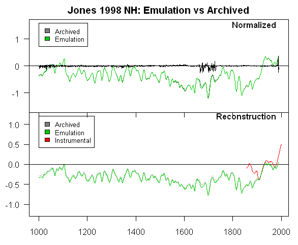
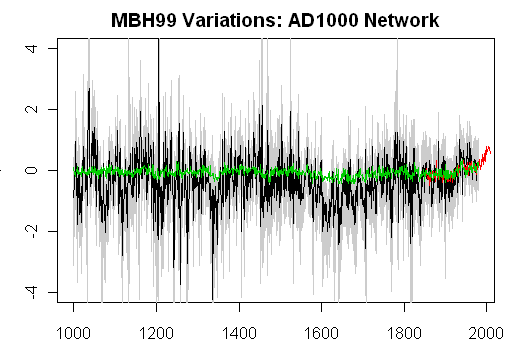
Oh, and what do the “reconstructions” themselves look like done this way? The figure below shows the maximum likelihood reconstruction (black), confidence intervals (light grey) together with the CRU NH instrumental red and the MBH reconstruction (here an emulation of the AD1000 network using the WA variation (green), the WA variation being separately benchmarked to be 100% file-compatible with Wahl and Ammann in the AD1400 network).

brown_16.gif

A closing comment about continuing to use MBH networks for statistical analysis. It is very common in statistical literature to use rather archaic but familiar data sets to benchmark and compare methods. The paint data of Brown 1982 has no intrinsic interest, but has been considered in a number of subsequent multivariate studies. This sort of thing is very common in statistics, where one specifically doesn’t want to introduce “novel” methods without benchmarking them somehow. So there’s a valid reason to study the MBH network in the same sense; it has the added advantage of not being a particularly consistent data set and so it’s a good way to study weird statistical effects that are hard to study with sensible data.

Aside from that, as we’ve observed, the MBH98-99 data set continues in active use -used without modification in Rutherford et al 2005 and Mann et al 2007 without changing a comma, no concession whatever to the incorrect PC1 calculations or even the rain in Maine. So there hasn’t been a whole lot of “moving on” in the Mann camp anyway. And as we shall see, it’s baack, brassy as ever, in the most recent U.S. CCSP report, which I’ll discuss in a forthcoming post.

Brown and Sundberg: "Confidence and conflict in multivariate calibration" #1

Introduction
If one is to advance in the statistical analysis of temperature reconstructions, let alone climate reconstructions – and let’s take improving the quality of the data as the obvious priority – Task One in my opinion is to place the ad hoc Team procedures used in reconstructions in a statistical framework known off the Island. The reason is not to be pedantic, but that there has been a lot of work done in statistics over the past 2 centuries and you’d think that some of it would somehow be apply to temperature reconstructions. This is a theme that we’ve discussed here from time to time.

One of the many frustrating aspects about conferences like Kim Cobb’s Trieste workshop and/or the PR Challenge is that this sort of issue is nowhere on their horizon. In my opinion, the parties involved are thrashing around rather aimlessly, in part because no one in the field has successfully connected the reconstruction problem to known statistical problems. UC, Jean S, Hu McCulloch and myself have reflected on this from time to time and it is our shared view that advances will come by applying known results from multivariate calibration to the particular and difficult problems of proxy reconstruction. UC has an interesting but cryptic post and here last summer on this matter.

Had Kim Cobb asked for my advice on her workshop, I would suggested trying to put multivariate calibration experts and their doctoral students looking for topics in the same room with people familiar with the empirical nuts and bolts of the proxies and see if they could connect. It’s hard to see the point of re-assembling the same old faces – what are Briffa , Mann and Ammann going to say to one another that they don’t already know? Who wants to hear about some other “moving on” method that is nowhere connected to the relevant calibration literature. A complete waste of time and money. Well, they went to a nice place.

Framing the problem in this way is actually a long step towards solving it. Some of you may have noticed references to various important references in multivariate calibration literature (Brown 1982, Brown and Sundberg 1987, 1989, but the literature is very large.

Multivariate Calibration

The multivariate calibration literature originates in a proxy problem that has many points of similarity to temperature reconstructions – with the helpful advantage that the “proxies” are known to be valid. In each case, one establishes a relationship between cause (X) and effect (proxy-Y) in a calibration period and then seeks to use Y in the prediction period (or verification period) to obtain information about X. Indeed, as I’ll mention below, it’s possible to directly compare the MBH method (once its orotund rhetorical description is reduced to something coherent) to a known calibration method, as UC and myself have discussed from time.

The prototype case in calibration literature is how to use cheap and efficient near-infrared (NIR) reflectance information from many (q) frequencies (the Y-matrix) to estimate p values of interest (the X-matrix), the X-values in these cases being chemical measurements which are expensive and time-consuming. NIR calibration uses a direct and known relationship (Beer-Lambert Law) as opposed to the more exotic, speculative and probably non-linear relationship in which (say) Graybill bristlecone ring width chronologies act as an integrator of world temperature across 7 continents.

But for now, we’re not going to question the existence of these relationships. Let’s stipulate for a moment that there are relationships – maybe very noisy and with complicated noise. If so, then many of the issues in temperature reconstructions parallel examples in multivariate calibration literature. In any event, before dealing with more difficult problems of non-proxy proxies, it is helpful to try to understand what’s going on in relatively “tame” situations, which, as it turns out, are not without their own perils or interest.

Unfortunately the original literature (e.g. Brown 1982, Brown and Sundberg 1987, Brown and Sundberg 1989 and many others) is not easy; nor am I aware of software packages that implement the procedures and diagnostics in a way that can be transferred to topics of interest to us; nor am I aware of textbook level treatments of the material. Often the terminology in the original articles is not very clear; notation that looks the same in two articles often means different things and for someone trying to apply the literature to a novel situation, the meaning can often only be elucidated by patient experimenting with examples. Brown and Sundberg 1987 url in particular gives just enough results on a case where original data is available for benchmarking so that one can, with considerable patience, get a foothold on the methods. For me to make sense of it, I have to work through example by example, line by line, which is very slow going, but I’m pleased to report some headway.

I’ve organized my notes into a post, both to help me keep track of things when I re-visit the matter and in case they are of interest to others. I’ve also placed a set of functions used to implement this methodology online together with the small data set used as an example in Brown and Sundberg 1987.

While some of the text will be dense for many readers, the problem that’s going to be illuminated from this methodology is how to measure “inconsistency” between proxies – something that should be of keen interest to anyone in this field and then how to estimate confidence intervals in calibration problems. Readers often complain about climate articles not providing error bars as though that were some sort of panacea. This has not been a particular theme of mine because, in the paleoclimate field, authors often do provide error bars. The problem is that the error bars have no statistical meaning and provide a faux confidence in the results.

A justified calculation of confidence intervals in calibration is not straightforward; counterintuitive results in univariate calibraiton have been known for many years. Procedures in the field don’t appear to be settled. However, any person who’s read this literature is IMO very unlikely (in the IPCC sense) to conclude that the discussants of paleoclimate confidence intervals in IPCC AR4 or in Wahl and Ammann have any idea of the nature of the problems or any familiarity with the relevant literature. Continue reading