New Information on the Penn State Inquiry Committee

In today’s post, I’m going to report for the first time on information on the Penn State Inquiry Committee from an inside source (PS) who was familiar with the activities of the Inquiry Committee. PS agreed that the Inquiry Committee didn’t do their job, but pointed me to different reasons than those discussed in an earlier post on the matter. Continue reading

Lasaga – From Penn State to Yale and Back

In 2002, Antonio Lasaga, an extremely eminent scientist then at Yale, was sentenced to 20 years on charges of possession of child pornography and sexual assault against a minor. Given the focus of the present controversy on the Penn State football program, it is instructive to revisit the handling of a scandal involving a star academic. Lasaga had relevant connections to Penn State, as it was at Penn State that he achieved academic stardom in the late 1970s. At his sentencing, no one from Yale stood up for him, but three professors from his past, two from Penn State and one from Harvard, spoke on his behalf (all three being described by the prosecution as the most out of touch he had ever encountered). After his imprisonment, Lasaga has continued to publish academic articles with Penn State associates and presently lists his academic correspondence address as State College PA. It’s a remarkable story that deserves a serious look by someone. Continue reading

The EPA and Upside-Down Mann

In a recent post, Keith Kloor worried about what would happen when a “bad paper spotlighted on a popular climate blog” is not debunked. In fact, even when a “bad paper spotlighted on a popular climate blog” is debunked, that doesn’t prevent subsequent reliance in policy discussions, as we see in EPA citation of the Mann et al 2008 no-dendro reconstruction. This reconstruction, as CA readers know, used the contaminated Tiljander sediments upside down. EPA described this as a “more sophisticated” methodology than averaging of upside-up proxies as done in Loehle and McCulloch. Continue reading

Wendell Courtney’s Last Day

Last year, I reported that the “Mann Inquiry Committee has probably made about as many procedural errors as it’s possible to make in the compass of a short report”, also noting that not all of them were to “Mann’s benefit”. Wendell Courtney, much in the news this week, advised the Inquiry Committee. Continue reading

Penn State President Fired

On the same day that Nature published yet another editorial repudiating public examination of the conduct of academic institutions, Penn State President Graham Spanier was fired from his $813,000/year job for failing to ensure that a proper investigation was carried out in respect to pedophilia allegations in Penn State’s hugely profitable football program. The story is receiving massive coverage in North America because the iconic Penn State football coach, Joe Paterno, was also fired today. Continue reading

Un-Muddying the Waters

A few days ago, in a comment at CA, NASA blogger Gavin Schmidt stated that, over land, the ratio of lower troposphere trends to surface trends in the GISS ER model was 0.95 (+- 0.07) and thus there was no downscaling over land of tropospheric trends.

Schmidt linked to a November 2009 realclimate post, “Muddying the Peer Reviewed Literature”, which criticized Klotzbach et al 2009 for using an amplification factor of 1.2 over both land and ocean in their similar downscaling of satellite trends to surface for comparison to surface trends. (The realclimate post was published just before Climategate and not previously discussed here.)

Schmidt waxed eloquently against the Klotzbach et al article for being “heavily promoted”, containing “fundamental flaws” and wasting “a huge amount of everyone’s time” – a criticism that one feels would be more aptly directed at (say) Mann et al 2008, which “heavily promoted” their supposedly groundbreaking no-dendro reconstruction using upside-down and contaminated Tiljander sediment, with a “huge amount of everyone’s time” being wasted in dealing with the seemingly wilful obtuseness of both Schmidt and Mann in failing to retract or amend the original article and realclimate posts. But that’s another story.

Schmidt’s 2009 realclimate article also reported that the overall GISS ER amplification factor was 1.25 and, over ocean, was 1.4. describing the calculation as follows:

First I calculated the land-only, ocean-only and global mean temperatures and MSU-LT values for 5 ensemble members, then I looked at the trends in each of these timeseries and calculated the ratios. Interestingly, there was a significant difference between the three ratios. In the global mean, the ratio was 1.25 as expected and completely in line with the results from other models. Over the oceans where most tropical moist convection occurs, the amplification in the model is greater – about a factor of 1.4. However, over land, where there is not very much moist convection, which is not dominated by the tropics and where one expects surface trends to be greater than for the oceans, there was no amplification at all!

The land-only ‘amplification’ factor was actually close to 0.95 (+/-0.07, 95% uncertainty in an individual simulation arising from fitting a linear trend), implying that you should be expecting that land surface temperatures to rise (slightly) faster than the satellite values.

In response to Schmidt’s criticism, Klotzbach et al re-did their calculations in a correction, in which, instead of an overall amplification factor of 1.2 applied to both land and ocean, they used an amplification factor of 1.1 over land and 1.6 over ocean. (Re-reading Schmidt’s original post, one becomes aware of what Schmidt didn’t mention: he had drawn attention to and taken umbrage with Klotzbach’s too-high amplification factor over land, but not to the too-low amplification factor over ocean.)

Klotzbach et al (2010) stated that that they got similar results to the original article with these corrected amplification factors and did not retract the article as Schmidt had called for.

The discrepancy between the amplification factors used in Klotzbach et al 2010 and those reported by Schmidt at realclimate in November 2009 is an inconsistency that one feels that, purely as an empirical point, should be possible to resolve merely by trivial calculations on GISS ER runs.

Fresh Calculations
I’ve re-calculated tropospheric and surface trends over land, ocean and combined for the GISS models (including GISS ER) using Chad Herman’s excellent collation of A1B models (including GISS) that I placed online last week. Chad took care with land-ocean distribution, and, for the GISS runs, used the GISS land mask (see Chad’s documentation at climateaudit.info/data/chadh/src.rar.

The script for my calculations follow. These calculations closely replicate the amended values reported by Klotzbach et al 2010</a (note – see here for a discussion of these calculations, done by Ross McKitrick. I either wasn’t aware of this exchange or lost track of it during Climategate.)

For the period 1979-2008 (used by Klotzbach et al), I obtained an average GISS ER amplification factor over land of 1.10, exactly matching the Klotzbach et al 2010 results and outside the confidence intervals reported by Schmidt in November 2009 and re-iterated in his CA comment last week (0.95 +- 0.07). I experimented with other trend periods to try to match the Schmidt results and was unsuccessful. For the period 1979-2002 (which seems to have been used in Schmidt 2009), I got 1.057. For the A1B period 2010-2040, as an experiment, I got 1.107.

The methodology of my calculation matches Schmidt’s verbal description:

I looked at the trends in each of these timeseries and calculated the ratios

Nor does the discrepancy appear to arise from differences in gridcell allocation between land and ocean, since discrepancies in the same direction arise over ocean, where Schmidt reported an amplification factor of 1.4 (Klotzbach’s amended value was 1.6). I got 1.56 for the period 1979-2008 used by Klotzbach and 1.59 for the 1979-2002 period used by Schmidt, values that were close to those of KLotzbach et al 2010 and considerably higher than those reported by Schmidt.

On a combined based, Schmidt reported an amplification factor of 1.25, while I obtained a value of 1.36 for the 1979-2008 period (1979-2002: 1.345).

In summary, none of Schmidt’s results (land – 0.95; ocean – 1.4 and combined 1.25) were reproduced despite considerable care in the calculation. It would be nice to see the precise provenance of Schmidt’s results.

Update: Nov 7 11.30 am . Pielke Jr writes:

On your post today, you may want to look at this, in which Gavin explains his methods:
http://rogerpielkejr.blogspot.com/2009/08/exchange-with-gavin-schmidt-on.html

Our response to Gavin:
http://rogerpielkejr.blogspot.com/2009/11/response-to-gavin-schmidt-on-klotzbach.html

McKitrick on amplification ratios:
http://rogerpielkejr.blogspot.com/2009/11/mckitrick-on-amplification-ratios.html

Update Nov 8: Gavin Schmidt explained in a comment below that his result was calculated as follows:

Secondly, I calculated the amplification factors via linear regression of the annual anomalies of MSU-LT and SAT (1979-2005; GISS-ER only). You are calculating the ratio of two OLS trends.

There were two reasons why I calculated the ratio of the two OLS trends. It is what Gavin had said that he had done in the realclimate post. And it’s the right way to do the calculation. From Gavin’s comment, it seems that he regressed TAS~TLT or TLT~TAS. By experimenting, it seems evident that he regressed TAS~TLT as this yields “amplification factors” in the reported range. However, this is an incorrect approach to the problem.

First, extending the script below, here is evidence that Gavin got his 0.95 through TAS~TLT regression:

input=land$anom
temp= Info$model=="giss_er"; sum(temp)
year= seq(1850,2099.99,1/12)
indexy= (1:3000) [year>=1979 &year<2005]
input= input[indexy,temp,1:2]; dim(input)
fm=list() #TAS~TLT
for(i in 1:5) fm[[i]]= lm(TAS~TLT, data.frame(input[,i,])  ) 
	round(sapply(fm,coef),3)[2,] # 1.059 0.977 0.920 0.932 0.951
	round(mean(sapply(fm,coef)[2,]),3) #0.968

fmi=list() #TLT~TAS
for(i in 1:5) fmi[[i]]= lm(TLT~TAS, data.frame(input[,i,])  ) 
	round(1/sapply(fmi,coef),3)[2,] # 1.369 1.313 1.249 1.166 1.295
	round(1/mean(sapply(fmi,coef)[2,]),3) # 1.275

As discussed in comments, this is not the correct approach to the problem. The correct approach was the straightforward one said to have been used: the ratio of the trends. This can be seen in the diagram shown below where the blue (“pseudo-TLT”) series goes up at a higher trend (0.1 units/year) than the green (“pseudo-TAS”) series (0.05 units/year) – an “amplification factor” of 2, but has a lower variability (both have the same rnorm error, but the blue series has an amplitude of 0.25 of the green series).

If you take the trends of each series and divide, you get a value of around 2 (1.96 in the example that I did.) However, if you regress “TAS” against “TLT”, you get a coefficient of 0.598. If you regress “TLT” against “TAS”, you get a value of 0.91. Neither value is remotely close to the true (by construction) value of 2. Actually, it seems to me that the reciprocal of the coefficient from Schmidt’s regression of TAS~TLT would be less bad than the coefficient that he seems to have used. In this case, it would give a value of 1/.598 = 1.672, much closer to the true value than the estimate from Schmidt’s method. In the original case, the reciprocal of Schmidt’s value of 0.95 gives a value of 1.05, which is less than the actual ratio of trends, but again less bad.

But it’s easy enough to calculate the ratio of trends. I think that this small problem can now be said to be resolved.

Script
First download the collated runs. The script below collects previously collated data from by 3 satellite levels for 57 A1B runs of 24 models into three matrices (land, ocean, land-and-ocean) of dimension 3000 x 57 x 3.

get.data=function (zone="GLOBAL",firma="land",dset="sat") {
   	loc=paste("http://www.climateaudit.info/data/chadh/",zone,"/",dset,"/",firma,".tab",sep="")
	download.file(loc,"temp",mode="wb")
	load("temp")
	Runs=list()
	Runs$raw=runs
	for(k in 1:3) runs[,,k]= apply(runs[,,k],2,anom)
	Runs$anom=runs
	return(Runs)
}

year= c(time( ts(1:3000,start=1850,freq=12)))

anom= function(x,start=1961,end=1991){
	temp= year>=start& year <end
	  x-  rep(unlist(tapply(x[temp], rep(1:12,30) , mean, na.rm = TRUE)), length(x)/12)
}

	land=get.data(zone="GLOBAL",firma="land",dset="sat")
	ocean=get.data(zone="GLOBAL",firma="ocean",dset="sat")
	loti=get.data(zone="GLOBAL",firma="loti",dset="sat")

Next calculate trends for the various windowed periods.

trend=function(x) if(sum(!is.na(x))>10) lm(x~I((1:length(x))/120))$coef[2] else NA

get_trend=function(input, start=1979,end=2008.99) {# function to output trends from R-tables collected in previous step
 	N=dim(input)[[2]];K=dim(input)[[3]]
	Out=array(NA,dim=c(N,K) )
	h = function(x) anom(x, 1961, 1990)
	for (k in 1:K) {
          work= ts(input[,,k],1850, freq=12) 
	  Out[,k]= round(apply( window( work, start,end),2,trend),3) 
	 }
	dimnames(Out)[[2]]= dimnames(input)[[3]]
	dimnames(Out)[[1]]= dimnames(input)[[2]]
	model= sapply (strsplit(dimnames(Out)[[1]],"_run"), function(A) A[[1]])
	Outm =  data.frame( round(apply(Out, 2, function(x) tapply(x, factor(model),mean,na.rm=T) ),3) )
	Outm$ampl=round(Outm$TLT/Outm$TAS,3)
	row.names(Outm)=paste("#", row.names(Outm) )
	return(Outm[,c(1,2,4)])
} 

##LAND
#Schmidt: The land-only ‘amplification’ factor was actually close to 0.95 (+/-0.07, 95% uncertainty in an individual simulation

	temp= grep("giss", dimnames(land$raw)[[2]]);length(temp) #13
	get_trend(land$anom[,temp,],start=1979,end=2007.99)
#              TAS   TLT  ampl
# giss_aom 0.174 0.187 1.075
# giss_eh  0.234 0.264 1.128
# giss_eh2 0.248 0.267 1.077
# giss_er  0.260 0.287 1.104

 	get_trend(land$anom[,temp,],start=1979,end=2001.99)[4,]
	#giss_er 0.228 0.241 1.057
        get_trend(land$anom[,temp,],start=1979,end=2011.99)[4,]#to 2011
 	# giss_er 0.27 0.291 1.078
	get_trend(land$anom[,temp,],start=2010,end=2039.99)[4,]
	# giss_er 0.252 0.279 1.107

##OCEAN
#Schmidt: Over the oceans where most tropical moist convection occurs, 
#the amplification in the model is greater – about a factor of 1.4.

	get_trend(ocean$anom[,temp,],start=1979,end=2007.99)[4,]
	   ## giss_er 0.151 0.236 1.563
	get_trend(ocean$anom[,temp,],start=1979,end=2001.99)[4,]
	   ## giss_er 0.115 0.183 1.591
	get_trend(ocean$anom[,temp,],start=2010,end=2039.99)[4,]
	   ## # giss_er 0.168 0.246 1.464

#BOTH
#Schmidt: In the global mean, the ratio was 1.25 as expected and completely in line #with the results from other models.

	get_trend(loti$anom[,temp,],start=1979,end=2008.99)[4,]
	   # giss_er 0.185 0.252 1.362
	get_trend(loti$anom[,temp,],start=1979,end=2001.99)[4,]
	  # giss_er 0.148 0.199 1.345

BEST Data “Quality”

CA
CA reader Gary Wescom writes about more data quality problems with the Berkeley temperature study – see here.

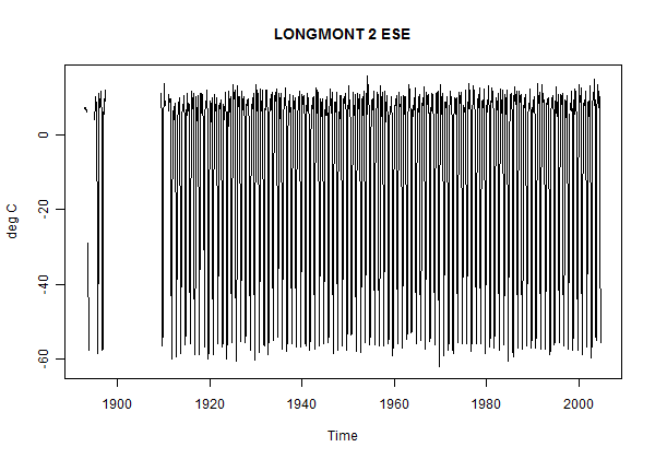
In a surprising number of records, the “seasonally adjusted” station data in the Berekely archive contains wildly incorrect data. Gary shows a number of cases, one of which, Longmont 2ESE, outside the nest of climate scientists in Boulder CO, is said to have temperatures below minus 50 deg C in the late fall as shown below:


Figure 1. Longmont 2 ESE plotted from BEST Station Data.

This is not an isolated incident. Gary reports:

Of the 39028 sites listed in the data.txt file, arbitrarily counting only sites with 60 months of data or more, 34 had temperature blips of greater
than +/- 50 degrees C, 215 greater than +/- 40 C, 592 greater than +/- 30 C, and 1404 greater than +/- 20 C. That is quite a large number of faulty temperature records, considering that this kind of error is something that is so easy to check for. A couple hours work is all it took to find these numbers.

In the engineering world, this kind of error is not acceptable. It is an indication of poor quality control. Statistical algorithms were run on the data without subsequent checks on the results. Coding errors obviously existed that would have been caught with just a cursory examination of a few site temperature plots. That the BEST team felt the quality of their work, though preliminary, was adequate for public display is disconcerting.

Gary also observed a strange ringing problem in the data.

I observed earlier that I had been unable to replicate the implied calculation of monthly anomalies that occurred somewhere in the BEST algorithm in several stations that I looked at (with less exotic results.) It seems likely that there is some sort of error in the BEST algorithm for calculating monthly anomalies as the problems are always in the same month. When I looked at this previously, I couldn’t see where the problem occurred. (There isn’t any master script or road map to the code and I wasn’t sufficiently interested in the issue to try to figure out where their problem occurred. That should be their responsibility.)

Locations
Even though GHCN data is the common building block of all the major temperature indices, its location information is inaccurate. Peter O’Neill see has spot checked a number of stations, locating numerous stations which are nowhere near their GHCN locations. Peter has notified GHCN of many of these errors. However, with the stubbornness that it is all too typical of the climate “community”, GHCN’s most recent edition (Aug 2011) perpetuated the location errors (see Peter’s account here.)

Unfortunately, BEST has directly used GHCN location data, apparently without any due diligence of their own on these locations, though this has been a known problem area. In a number of cases, the incorrect locations will be classified as “very rural” under MODIS. For example, the incorrect locations of Cherbourg stations in the English Channel or Limassol in the Mediterranean will obviously not be classified as urban. In a number of cases that I looked at, BEST had duplicate versions of stations with incorrect GHCN locations. In cases where the incorrect location was classified differently than the correct location, essentially the same data would be classified as both rural and urban.

I haven’t parsed the BEST station details, but did look up some of the erroneous locations already noted by Peter and report on the first few that I looked at.

Peter observed that Kzyl-Orda, Kazakhstan has a GHCN location of 49.82N 65.50E, which was over 5 degrees of separation from its true location near 44.71N 65.69E. BEST station 148338 Kzyl-Orda is also at GHCN 49.82N 65.50E. Other versions (124613 and 146861) are at 44.8233 65.530E and 44.8000 65.500E.

Peter observed that Isola Gorgona, Italy had GHCN location of 42.40N 9.90E more than one degree away from its true location of 43.43N, 9.910E. BEST station 148309 (ISOLA GORGONA) has the incorrect GHCN location of 42.4N 9.9E.

The same sort of errors can be observed in virtually all the stations in Peter’s listing.

I realize that the climate community is pretty stubborn about this sort of thing. (Early CA readers recall that the “rain in Maine falls mainly in the Seine” – an error stubbornly repeated in Mann et al 2007.) While BEST should have been alert to this sort of known problem, it’s hardly unreasonable for them to presume that GHCN had done some sort of quality control on station locations during the past 20 years, but this in fact was presuming too much.

These errors will affect the BEST urbanization paper (the amount of the effect is not known at present.)

Collated A1B Model Runs

The other day, Gavin Schmidt stated that the amplification factor over land for tropospheric trends to surface trends for GISS models was only 0.95. A reader reported that an amplification factor of 1.1 had been reported in an article by Pielke Sr et al, relying on a pers comm. Some readers expressed frustration over the lack of documentation of a seemingly important number.

In our analysis of Santer et al 2008, Chad Herman did an enormous amount of work benchmarking an algorithm to extract synthetic satellite information and then extracting results for A1B models.

This collation has wider application than our article e.g. for verifying Schmidt’s assertion about amplification factor. While the underlying data is at PCMDI, huge data sets have to be downloaded and processed to extract the relatively small data sets that are of interest for downstream analysis.

I’ve made the data available as R-files at http://www.climateaudit.info/data/chadh/GLOBAL/sat/ and http://www.climateaudit.info/data/chadh/TROPICS/sat/. The objects are in files land.tab, ocean.tab, loti.tab but the name of the object in each case is “runs”. Each matrix is 3000x37x3. By month from (1850,1) to (2099,12). 57 A1B runs summarized in http://www.climateaudit.info/data/chadh/info.chad.tab. R-objects can be downloaded easily using download.file(…..,destfile, mode=”wb”); load(destfile). Each object is about 3 MB in size.

I’ve also made Chad’s collation to 17 tropospheric levels available in corresponding directories named “TA” instead of sat. The structure is the same but each matrix is 3000x57x17 and is about 17 MB in size.

I’ll show how to use these objects in a companion post examining Gavin Schmidt’s assertion about amplifcation factors.

B model runs showing synthetic satellite runs are fundamental to a variety of analyses.

Closing Thoughts on BEST

In the 1980s, John Christy and Roy Spencer revolutionized the measurement of temperature data through satellite measurement of oxygen radiance in the atmosphere. This accomplishment sidestepped the intractable problems of creating (what I’ll call) a “temperature reconstruction” from surface data known to be systemically contaminated (in unknown amounts) by urbanization, land use changes, station location changes, measurement changes, station discontinuities etc etc.

Also in the 1980s, Phil Jones and Jim Hansen created land temperature indices from surface data, indices that attracted widespread interest in the IPCC period. The source data for their indices came predominantly from the GHCN station data archive maintained by NOAA (who added their own index to the mix.) The BEST temperature index is in this tradition, though their methodology varies somewhat from simpler CRU methods, as they calculate their index on “sliced” segments of longer station records (see CA here) and weight series according to “reliability” – the properties of which are poorly understood (see Jeff Id here.)

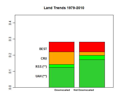
The graphic below compares trends in the satellite period to March 2010 – the last usable date in the BEST series. (SH values in Apr 2010 come only from Antarctica and introduce a spurious low in the BEST monthly data.) Take a look – comments follow.


Figure 1. Barplot showing trends in the satellite period. (deg C/decade 1979-Mar 2010.) Left – “downscaled” to surface; right – not downscaled to surface.

The BEST and CRU series run hotter than TLT satellite data (GLB Land series from RSS and UAH considered here), with the difference exacerbated when the observed satellite trends are “downscaled” to surface using the amplification factor of approximately 1.4 (that underpins the “great red spot” observed in model diagrams). An amplification factor is common ground to both Lindzen and (say) Gavin Schmidt, who agree that tropospheric trends are necessarily higher than surface trends simply though properties of the moist adiabat. In the left barplot, I’ve divided the satellite trends by 1.4 to obtain “downscaled” surface trends. In a comment below, Gavin Schmidt observes that an amplification factor is not a property of lapse rates over land. In the right barplot, I’ve accordingly shown the same information without “downscaling” (adding this to the barplot in yesterday’s post.) (Note Nov 2, 2011 – I’ve edited the commentary to incorporate this amendment and have placed prior commentary in this section in the comments below.)

The UAH trend over land is 0.173 deg C/decade (0.124 deg C downscaled) and the RSS trend from 0.198 deg C/decade (0.142 deg C/decade). I will examine this interesting property of the Great Red Spot on another occasion, but, for the purposes of this post, defer to Gavin Schmidt’s information on its properties.

The simple barplot in Figure 1 clearly shows which controversies are real and which are straw men.

Christy and Spencer are two of the most prominent skeptics. Yet they are also authors of widely accepted satellite data showing warming in the past 30 years. To my knowledge, even the most adamant skydragon defers to the satellite data. BEST’s attempt to claim the territory up to and including satellite trends as unoccupied or contested Terra Nova is very misleading, since this part of the territory was already occupied by skeptics and warmists alike.

The territory in dispute (post-1979) is the farther reaches of the trend data – the difference between the satellite record and CRU, and then between CRU and the outer limits of BEST.

BEST versus CRU
On this basis, BEST (0.282 deg C/decade) runs about 0.06 deg C hotter than CRU (0.22 deg C/decade). My surmise, based on my post of Oct 31, 2011, is that this results from the combined effects of slicing and “reliability” reweighting, the precise proportion being hard to assign at this point and not relevant for present purposes.

Commenter Robert observed that CRU now runs cooler than NOAA or GISS. In the corresponding 1979-2010, NOAA has a virtually identical trend to BEST (0.283 deg C/decade) also using GHCN data. It turns out that NOAA has changed its methodology earlier this year from one that was somewhat similar to CRU to one that uses Mennian sliced data. (I have thus far been unable to locate online information on previous NOAA versions.)

This indicates that the difference between BEST (and NOAA) versus CRU is probably more due to slicing than to reweighting.


CRU vs Satellites

CRU runs about about 0.03-0.05 deg C/decade warmer than TLT satellite trends over land and about 0.08-0.10/decade warmer in the 1979-2010 period than downscaled satellite data.

Could this amount of increase be accounted for by urbanization and/or surface station quality problems?

In my opinion, this is entirely within the range of possibility. (This is not the same statement as saying that the difference has been proven to be due to these factors. In my opinion, no one has done a satisfactory reconciliation.) From time to time, I’ve made comparisons between “more urban” and “more rural” sites in relatively controlled situations (e.g. Hawaii, around Tucson following a predecessor local survey) and when I do the comparisons, I find noticeable differences of this order of magnitude. I’ve also done comparisons of good and bad stations from Anthony’s data set and again observe differences that would contribute to this order of magnitude. But this is not the same thing as proving the opposite.

In the past, I’ve been wary of “unsupervised” comparisons of supposedly “urban” and supposedly “rural” subpopulations in papers by Jones, Peterson, Parker and others purporting to prove that UHI doesn’t “matter”. Such papers set up two populations – one “urban” and one ‘rural’, purport to show that the trends for each population are similar and claim that this “shows” that UHI is a non-factor in trends. In my examination of prior papers, each one has tended to founder on similar points. All too often, the two populations are very poorly stratified – with the “rural” population all too often containing urban cities, sometimes even rather large cities.

The BEST urbanization paper is entirely in the tradition of prior studies by Jones, Peterson, Karl etc. They purport to identify a “very rural” population by MODIS information and show that they “get” the same answer. Unfortunately, BEST have not lived up to their commitment to transparency in this paper. Code is not available. Worse, even the classification of sites between very rural and very urban is not archived, with the pdf of the paper disconcertingly pointing to a warning that the link is unavailable (making it appear like noone even read the final preprint before placing it online.) Mosher has noted inaccuracies in their location data and observes that there are perils for inexperienced users of MODIS data, Mosher reserving his opinion on whether the lead author of the urbanization paper, a grad student, managed to avoid these pitfalls until he’s had an opportunity to examine the still unavailable nuts and bolts of the paper.

Mosher, who’s studied MODIS classification of station data as carefully than anyone, observes that there are no truly “rural” (in a USHCN target sense) locations in South America – all stations come from environments that are settled to a greater or lesser degree. Under Oke’s original UHI concept, the cumulative UHI effect was, as a rule of thumb, proportional to log(population). If “urbanization” is occurring in towns and villages as well as in large cities – which it is, then the contribution of UHI increase to temperature increase will depend on the percentage change in population (rather than absolute population). If proportional increases are the same, then the rate of temperature increase will be the same in towns and villages as in cities.

If one takes the view that satellite trends provide our most accurate present knowledge of surface trends, then one has to conclude that the BEST methodological innovations (praised by realclimate) actually provide a worse estimate of surface trends than even CRU.

In my opinion, it is highly legitimate (or as at least a null hypothesis) to place greatest weight on satellite data and presume that the higher trends in CRU and BEST arise from combinations of urbanization, changed land use, station quality, Mennian methodology etc.

It seems to me that there is a high onus on anyone arguing in favor of a temperature reconstruction from surface station data (be it CRU or BEST) to demonstrate why this data with all its known problems should be preferred to the satellite data. This is not done in the BEST articles.

“Temperature Reconstructions”

In discussions of proxy reconstructions, people sometimes ask: why does anyone care about proxy reconstructions in the modern period given the existence of the temperature record? The answer is that the modern period is used to calibrate the proxies. If the proxies don’t perform well in the modern period (e.g. the tree ring decline in the very large Briffa network), then the confidence, if any, that can be attached to reconstructions in pre-instrumental periods is reduced.

It seems to me that a very similar point can be made in respect to “temperature reconstructions” from somewhat flawed station records. Since 1979, we have satellite records of lower tropospheric temperatures over land that do not suffer from all the problems of surface stations. Yes, the satellite records have issues, but it seems to me that they are an order of magnitude more tractable than the surface station problems.

Continuing the analogy of proxy reconstructions, temperature reconstructions from surface station data in the satellite period (where we have benchmark data) should arguably be calibrated against satellite data. The calibration and reconstruction problem is not as difficult as trying to reconstruct past temperatures with tree rings, but neither is it trivial. And perhaps the problems encountered in one problem can shed a little light on the problems of the other.

Viewed as a reconstruction problem, the divergence between the satellite data and the BEST temperature reconstruction from surface data certainly suggests some sort of calibration problem in the BEST methodology. (Or alternatively, BEST have to show why the satellite data is wrong.) Given the relatively poor scaling of the BEST series in the calibration period relative to satellite data, one would have to take care against a similar effect in the pre-satellite period. However, the size of the effect appears likely to have been lower: both temperature trends in the pre-satellite period and world urbanization were lower in the pre-satellite period.

One great regret about BEST’s overall strategy. My own instinct as to the actual best way to improve the quality of temperature reconstructions from station data is to really focus on quality, rather than quantity. To follow the practices of geophysicists using data of uneven quality – start with the best data (according to objective standards) and work outwards calibrating the next best data on the best data.

They adopted the opposite strategy (a strategy equivalent to Mann’s proxy reconstructions). Throw everything into the black box with no regard for quality and hope that the mess can be salvaged with software. Unfortunately, it seems to me that slicing the data actually makes the product (like NOAA’s) worse product than CRU (using satellite data as a guide). It seems entirely reasonable to me that someone would attribute the difference between higher BEST trend and satellite trends not to the accuracy of BEST with flawed data, but to known problems with surface stations and artifacts of Mennnian methodology.

I don’t plan to spend much more time on it (due to other responsibilities).
[Nov 2 – there’s a good interview with Rich Muller here where Muller comes across as the straightforward person that I know. I might add that he did a really excellent and sane lecture (link) on policy implications a while ago that crosscuts most of the standard divides. ]

A Closing Editorial Comment
Finally, an editorial comment on attempts by commentators to frame BEST as a rebuttal of Climategate.

Climategate is about the Hockey Stick, not instrumental temperatures. CRUTEM is only mentioned a couple of times in passing in the Climategate emails. “Hide the decline” referred to a deception by the Team regarding a proxy reconstruction, not temperature.

In an early email, Briffa observed: “I believe that the recent warmth was probably matched about 1000 years ago.” Climategate is about Team efforts to suppress this thought, about Team efforts to promote undeserved certainty – a point clearly made in CRUTape Letters by Mosher and Fuller.

The new temperature calculations from Berkeley, whatever their merit or lack of merit, shed no light on the proxy reconstructions and do not rebut the misconduct evidenced in the Climategate emails.

[Nov 2. However, in fairness to the stated objectives of the BEST project, I should add the following.

Although I was frustrated by the co-mingling of CRUTEM and Climategate in public commentary – a misunderstanding disseminated by both Nature and Sarah Palin – and had never contested that fairly simple average of GHCN data would yield something like CRUtem, CRUTEM and Climategate have become co-mingled in much uninformed commentary.

In such circumstances, a verification by an independent third party (and BEST qualifies here) serves a very useful purpose, rather like business audits which, 99% of the time, confirm management accounts, but improve public understanding and confidence. To the extent that the co-mingling of Climategate and CRUTEM (regardless of whether it was done by Nature or Sarah Palin) has contributed to public misunderstanding of the temperature records, an independent look at these records by independent parties is healthy – a point that I made in my first point and re-iterate in this post. While CA readers generally understand and concede the warming in the Christy and Spencer satellite records, this is obviously not the case in elements of the wider society and there is a useful function in ensuring that people can reach common understanding on as much as they can. ]

Help Robert Rohde Locate Argentina

Several years ago, CA helped UCAR locate the lost civilization of Chile. UCAR was then receiving weather information from stations for which they were unable to determine latitude or longitude, including many mysterious stations in Chile. UCAR’s problem was complicated by the fact that it was receiving information from stations with locations unknown to them, but even from stations “with no location” whatever. Perhaps the signals were being transmitted faster than the speed of light. At the time, I noted the intriguing “Bogus Station”.

Berkeley has also encountered lost civilizations and even more Bogus Stations. 649 Berkeley stations lack information on latitude and longitude, including 145 BOGUS stations. 453 stations lack not only latitude and longitude, but even a name. Many such stations are located in the country “[Missing]”, but a large fraction are located in “United States”.

One of the weather stations that could not be located was the mysterious “Camp David” station in the United States, which operated between 2004 and 2008.

If any CA readers have any information on the location of Camp David (or for that matter, Argentina), Robert Rohde of the Berkeley project would, I’m sure, be very grateful for the assistance.

Meanwhile, I’m pondering how one goes about calculating spatial autocorrelation between two BOGUS stations with unknown locations (or perhaps even no locations.) Halloween tales from beyond the crypt.