BEST, Menne Slices

A couple of years ago, Matthew Menne of NOAA applied a form of changepoint algorithm in USHCN v2. While changepoint methods do exist in conventional statistics, Menne’s use of these methods to introduce thousands of breaks in noisy and somewhat contaminated data was novel. BEST’s slicing methodology, in effect, implements a variation of Menne’s methodology on the larger GHCN data set. (It also introduces a curious reweighting scheme discussed by Jeff Id here.) With a little reflection, I think that it can be seen that the mathematics of Mennian methods will necessarily slightly increase the warming trend in temperature reconstructions from surface data, an effect previously seen with USHCN and now seen with GHCN. Continue reading

Lampasas in BEST

A couple of years ago, Anthony observed a gross discontinuity at Lampasas TX arising from a change in station location. Let’s see how the Berkeley algorithm deals with this gross discontinuity. Continue reading

Detroit Lakes in BEST

In the 2007 analysis of the GISS dataset, Detroit Lakes was used as a test case. (See prior posts on this station here). I’ve revisited it in the BEST data set, comparing it to the older USHCN data that I have on hand from a few years ago.

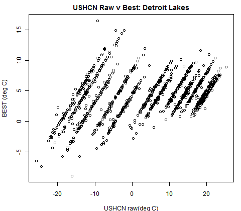
First, here is a simple plot of USHCN raw and BEST versions. The BEST version is neither an anomaly series (like CRU) nor a temperature series (like USHCN). It is described as “seasonally adjusted”. The mechanism for seasonal adjustment is not described in the covering article. I presume that it’s somewhere in the archived code. The overall mean temperature for USHCN raw and Berkeley are very close. The data availability matches in this case – same starting point and same gaps (at a quick look). So no infilling thus far.


Figure 1. Simple plot of USHCN Raw and BEST versions of Detroit Lakes

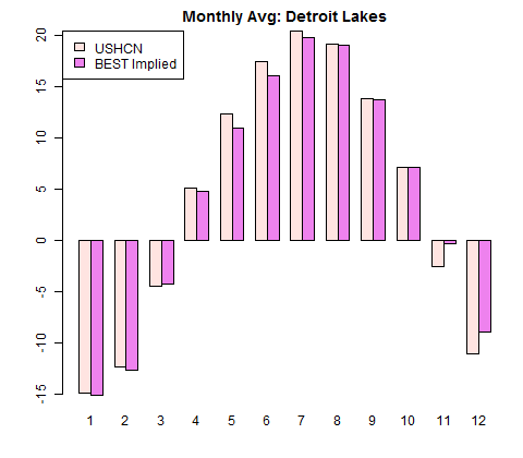
The Berkeley series is not, however, the overall average plus an anomaly as one might have guessed. Here is a barplot comparing monthly means of the two versions. While the Berkeley version obviously has much less variation than the observations, it isn’t constant either (as it would be if it were overall average plus monthly anomaly). I can’t figure out so far where the Berkeley monthly normals come from.


Figure 2. Monthly Averages of two versions.

If one does a simple scatter plot of USHCN raw vs Berkeley, one gets a set of 12 straight lines with near identical slope, one line for each month:

Figure 3. Scatter plot of USHCN raw vs Berkeley

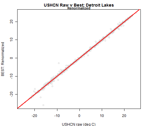
I then tried the following. I subtracted the Berkeley monthly average from each Berkeley data point and added back the USHCN monthly average. This yielded the following:

Figure 4. USHCN raw versus Berkeley (renormalized for each month)

The Berkeley data seems to be virtually identical to USHCN raw data less monthly normals that are different from normals of USCHN raw data plus annual average. The implied monthly averages in the BEST normalized data are shown below. The range of difference is from -2.27 to 1.41 deg C.

My original examination of Detroit Lakes and other stations was directed at whether NASA GISS had software to detect changes – a point that had been then been raised in internet debates by Josh Halpern as a rebuttal to the nascent surface stations project. I used Detroit Lakes as one of a number of type cases to examine this, accidentally observing the Y2K discontinuity. One corollary was that GISS software did not, after all, have the capability of detecting the injected Y2K discontinuity.

It would be interesting to test the BEST algorithm against the dataset with the Y2K discontinuity to see if they can pick it up with their present methodology. At first blush, it looks as though USHCN data is used pretty much as is, other than the curious monthly normals.

[Update: it looks like this data is prior to homogenization.]

BEST Singletons

BEST stated that one of their distinctive skills was their supposed ability to use short station histories.

This seems to include station histories as short as a single data point. In the BEST station data, there are 130 singletons. An example is Cincinnati Whiteoak which has one record as shown below:

# 137532 1 1970.125 12.187 0 28 18
# 137533 1 1966.208 6.575 0 28 18
# 137534 1 1836.042 9.259 0 -99 -99

I wonder how they incorporate such singletons into their program. And why. And why the record is shown as a singleton. I’m 99.9% sure that this is within the data and not an error in my collation as I triple checked. (But this is new data for me and it is not impossible that I’ve made an error somewhere in my collation, but I don’t think so.)

Update -Dmitri observes that the paper says: “A further 0.2% of data was eliminated because after cutting and filtering the resulting record was either too short to process (minimum length ≥6 months)…”. Bill verified the singletons. So they kick the singletons – but the main puzzle remains: are the singletons real in the underlying data? Or are they an artifact of the collation?

Some BEST Tools

Here’s a major complaint about BEST now that I’ve looked at it more closely.

If BEST wanted to make their work as widely available as possible, then they should have done their statistical programming in R so that it was available in a public language. And made their data available as organized R-objects.

I’ve taken a quick look at their code which is in Matlab. I’ve browsed some of the code and it all looks like transliterated Fortran. I haven’t noticed much vector processing and list processing in R style. IMO, one of the great benefits of the vector and list processing features in R is that you can write scripts that clearly self-document what you’re doing as “scripts”. I haven’t seen anything in their code files that looks like the sort of R-script that I would like to see in order to follow the calculations.

I collated the station data and station information into two R-objects for interested readers so that data can be quickly accessed without having to compile rather large data sets.

The station information is uploaded to http://www.climateaudit.info/data/station/berkeley/details.tab. It is a dataframe of 39028 rows containing id, name, lat, long, etc, directly collated from the information in the BEST data. Some tidying of trailing spaces and use of NA has been done. It’s 1.8 MB.

The station data is uploaded to http://www.climateaudit.info/data/station/berkeley/station.tab. It’s organized in a style that I’ve used before: it is a list of 39028 objects, each object being a time series of the station data beginning in the first year of data. I didn’t collate the accompanying information about counts and uncertainty. Interested readers can consult the original data for these. Each of the 39028 objects is given a name corresponding to the id in the details file – which I’ve kept as a character object rather than a number (though it is a number). As an organized R-object, this is 39 MB, as opposed to 618 MB if data.txt in the PreliminaryTextDataset were expanded.

If you want to look at the BEST results for a given station, here’s how to do it quickly (and you want to keep the data in say directory d:/climate/data/berkeley). The example here is Detroit Lakes 1NNE, the subject of a number of posts in connection with Hansen’s Y2K:

destfile="d:/climate/data/berkeley/details.tab" 
download.file("http://www.climateaudit.info/data/station/berkeley/details.tab",destfile, mode="wb")
load(destfile);
nrow(details) #39028

destfile="d:/climate/data/berkeley/station.tab" 
download.file("http://www.climateaudit.info/data/station/berkeley/station.tab",destfile, mode="wb")
load(destfile);
length(station) #39028

details[grep("DETROIT L",details$name),1:5]
#           id                name     lat     long     alt
#144289 144289 DETROIT LAKES(AWOS) 46.8290 -95.8830 425.500
#144298 144298 DETROIT LAKES 1 NNE 46.8335 -95.8535 417.315

u=station[[paste(144298)]]
ts.plot(u,ylab="deg C (Seas Adj)",main="Detroit Lakes 1NNE")


Figure 1. BEST Station Data for Detroit Lakes 1NNE

There are some puzzles about the station data that I’ll discuss in another post.

Update: Nick Stokes reports:
I made a GHCN v2 version of data.txt. It’s here. I had to split into two, bestdata1.zip and bestdata2.zip (to fit site limit). Each is about 11 Mb. Units are 1/10 deg C. [SM note – this is the same data that I collated into an R-list. For R users, you’re far better off using my collation than re-collating from this.]

There is also a zipfile called ALL4inv.zip which has inventories in CSV format of BEST, GHCN, GSOD and CRUTEM3. The fields don’t match GHCN, but may be the best that can be derived from what BEST has published.

There are also lots of KMZ/KML files. The one called ALL4.kmz combines GHCN, GSOD, BEST and CRUTEM3 with a folder structure to show by source and start date.

NASA/UAH Atmospheric Science Seminar

I doubt that there are many people who’ve made as many presentations to NAS panels as they have to university seminars in climate departments. Since I’ve done one of each, I presently qualify. (My only invitation to make a presentation to a university climate department was to Georgia Tech in early 2008. I’ve made a couple of presentations to non-climate seminars e.g. at Ohio State in 2008.)

Tomorrow I give my second – at the NASA/UAH Atmospheric Science Seminar in Huntsville where I’ll be hosted by John Christy.

The presentation will be on proxy reconstructions, not Climategate.

I’ve spent a lot of time in the past few weeks re-examining the issues. Unfortunately, try as I may, I always end up writing right onto the airplane and today is no exception.

First Thoughts on BEST

Rich Muller sent me the BEST papers about 10 days ago so that I would have an opportunity to look at them prior to their public release. Unfortunately, I’ve been very busy on other matters in the past week and wasn’t able to get to it right away and still haven’t had an opportunity to digest the methods paper. (Nor will I for a week or two.)

As a disclaimer, Rich Muller is one of the few people in this field who I regard as a friend. In 2004, he wrote an article for MIT Review that drew attention to our work in a favorable way. I got in touch with him at the time and he was very encouraging to me. I started attending AGU at his suggestion and we’ve kept in touch from time to time ever since. While people can legitimately describe Phil Jones as not being a “nuclear physicist”, the same comment cannot be made of Rich Muller in either sense of the turn of phrase.

The Value of Independent Analysis
The purpose of audits in business is not to overturn the accounts prepared by management, but to provide reassurance to the public. 99% of all audits support management accounts. I’ve never contested the idea that it is warmer now than in the 19th century. If nothing else, the recession of glaciers provides plenty of evidence of warming in the last century.

Nonetheless, it is easy to dislike the craftsmanship of the major indices (GISS, CRU and NOAA) and the underlying GHCN and USHCN datasets. GISS, for example, purports to adjust for UHI through a “two legged adjustment” that seems entirely ad hoc and which yields counterintuitive adjustments in most areas of the world other than the US. GISS methodology also unfortunately rewrites its entire history whenever it is updated. CRU notoriously failed to retain its original separate data sets, merging different stations (ostensibly due to lack of “storage” space, though file cabinets have long provided a low-technology method of data storage. GHCN seems to have stopped collecting many stations in the early 1990s for no good reason (the “great dying of thermometers”) though the dead thermometers can be readily located on the internet.

Even small changes in station history can introduce discontinuities. Over the years, USHCN has introduced a series of adjustments for metadata changes (changes in observation times, instrumentation), all of which have had the effect of increasing trends. Even in the US where metadata is good, the record is still plagued by undocumented discontinuities. As a result, USHCN recently introduced a new method that supposedly adjusts for these discontinuities. But this new method has not been subjected to thorough scrutiny by external statisticians.

The US has attempted to maintain a network of “rural” sites, but, as Anthony Watts and his volunteers have documented, these stations all too often do not adhere to formal standards of station quality.

The degree to which increased UHI has contributed to observed trends has been a longstanding dispute. UHI is an effect that can be observed by a high school student. As originally formulated by Oke, UHI was postulated to be more or less a function of log(population) and to affect villages and towns as well as large cities. Given the location of a large proportion of stations in urban/town settings, Hansen, for example, has taken the position that an adjustment for UHI was necessary while Jones has argued that it isn’t.

Unlike the statistical agencies that maintain other important indices (e.g. Consumer Price Index), the leaders of the temperature units (Hansen, Jones, Karl) have taken strong personal positions on anthropogenic global warming. These strong advocacy and even activist positions are a conflict of interest that has done much to deter acceptance of these indices by critics.

This has been exacerbated by CRU’s refusal to disclose station data to critics, while readily providing the same information to fellow travellers, a refusal. Nonetheless, as I reminded CA readers during CRU’s refusal of even FOI requests, just because they were acting like jerks, didn’t mean that the indices themselves were in major error. Donna Laframboise’s “spoiled child” metaphor is apt.

The entry of the BEST team into this milieu is therefore welcome on any number of counts. An independent re-examination of the temperature record is welcome and long overdue, particularly when they have ensured that their team included not only qualified statistical competence, but eminent (Brillinger).

Homogeneity
They introduced a new method to achieve homogeneity. I have not examined this method or this paper and have no comment on it.

Kriging
A commenter at Judy Curry’s rather sarcastically observed that, with my experience in mineral exploration, I would undoubtedly endorse their use of kriging, a technique used in mineral exploration to interpolate ore grades between drill holes.

His surmise is correct.

Indeed, the analogies between interpolating ore grades between drill holes and spatial interpolation of temperatures/ temperature trends has been quite evident to me since I first started looking at climate data.

Kriging is a technique that exists in conventional statistics. While I haven’t had an opportunity to examine the details of the BEST implementation, in principle, it seems far more logical to interpolate through kriging rather than through principal components or RegEM (TTLS).

Dark Areas of the Map
In the 19th century, availability of station data is much reduced. CRU methodology, for example, does not take station data outside the gridcell and thus leaves large portions of the globe dark throughout the 19th century.

BEST takes a different approach. They use available data to estimate temperatures in dark grid cells while substantially increasing the error bars of the estimates. These estimates have been roundly condemned by some commenters on threads at Judy Curry’s and Anthony Watts’.

After thinking about it a little, I think that BEST’s approach on this is more logical and that this is an important and worthwhile contribution to the field. The “dark” parts of the globe did have temperatures in the 19th century and ignoring them may impart a bias. While I haven’t examined the details of their kriging, my first instinct is in favor of the approach.

The Early Nineteenth Century
A second major innovation by BEST has been to commence their temperature estimates at the start of the 19th century, rather than CRU’s 1850/1854 or GISS’s 1880. They recognize the increased sparsity of station data with widely expanded error bars. Again, the freshness of their perspective is helpful here.(They also run noticeably cooler than CRU between 1850 and 1880.) Here is their present estimate:

The differences between BEST and CRU have an important potential knock-on impact in the world of proxy reconstructions – an area of technical interest for me. “Justification” of proxy reconstructions in Mannian style relies heavily on RE statistics in the 19th century based on CRU data. My guess is that the reconstructions have been consciously or subconsciously adapted to CRU and that RE statistics calculated with BEST will deteriorate and perhaps a lot. For now, that’s just a dig-here.

It’s also intriguing that BEST’s early 19th century is as cold as it is.

BEST’s estimate of the size of the temperature increase since the start of the 19th century is much larger than previous estimates. (Note- I’ll update this with an example.)

The decade of the 1810s is shown in their estimates as being nearly 2 degrees colder than the present. Yes, this was a short interval and yes, the error bars are large. The first half of the 19th century is about 1.5 degrees colder than at present.

At first blush, these are very dramatic changes in perspective and, if sustained, may result in some major reinterpretations. Whereas Jones, Bradley and others attempted to argue the non-existence of the Little Ice Age, BEST results point to the Little Ice Age being colder and perhaps substantially colder than “previously thought”.

It’s also interesting to interpret these results from the context of “dangerous climate change”, defined by the UN as 2 deg C. Under BEST’s calculations, we’ve already experienced nearly 2 deg C of climate change since the early 19th century. While the authors of WG2 tell us that this experience has been entirely adverse, if not near catastrophic, it seems to me that we have, as a species, not only managed to cope with these apparently very large changes, but arguably even flourished in the last century. This is not to say that we would do equally well if faced with another 2 deg C. Only that if BEST estimates are correct, the prior 2 degrees do not appear to have been “dangerous” climate change.

Comparison to SST
They do not compare their land results to SST results. These two data sets have been said to be “independent” and mutually reinforcing, but I, for one, have had concerns that the results are not truly independent and that, for example, the SST bucket adjustments have, to some extent, been tailored, either consciously or subconsciously, so that the SST data cohere with the land data.

Here is a plot showing HadSST overlaid onto the Berkeley graphic. In the very early portion, the shape of the Berkeley series coheres a little better to HadSST than CRUTem. Since about 1980, there has been a marked divergence between HadSST and the land indices. This is even more marked with the Berkely series than with CRUTem.

Station Quality
I have looked at some details of the Station Quality paper using a spreadsheet of station classification sent to me by Anthony in August 2011 and cannot replicate their results at all. BEST reported a trend of 0.039 deg C/decade from “bad” stations (CRN 4/5) and 0.0509 deg C/decade from “good” stations” (CRN1/2) [arrgh – this is fixed to reflect their units of deg C/century]. Using my archive of USHCN raw data (saved prior to their recent adjustments), I got much lower higher trends [arrggh- corected since they reported in deg C/century not,as I assumed deg C/decade], with trends at good stations being lower than at bad stations in a coarse average. The station counts for good and bad stations don’t match to the information provided to me. [Perhaps they’ve applied their algorithm to USHCN stations. Dunno.]

Watts Count

Rohde Count

Rohde Trend

Trend(1950)

Trend (1979)

506

705

0.0388

0.16

0.27

185

88

0.0509

0.15

0.22

As was observed in very early commentary on surface stations results, there is a strong gradient in US temperature trends (more negative in the southeast US and more positive in the west). The location of good and bad stations is not spatially random, so some care has to be taken in stratification.

In my own quick exercises on the topic, I’ve experimented with a random effects model, allowing a grid cell effect. I’ve also experimented with further stratification for rural-urban (using the coarse USHCN classification) and for instrumentation.

On this basis, for post-1979 trends, “rural bad” had a trend 0.08 deg C/decade greater than “rural good”; “small town bad” was 0.07 deg C decade greater than “small-town good” and “urban bad” was the opposite sign to “urban good” : 0.01 deg C/decade cooler.

Stratifying by measurement type, “CRS bad” was 0.05 deg C/dec warmer than “CRS good” while “MMTS bad” was 0.15 deg C warmer than “MMTS good”.

Combining both stratifications, “MMTS rural good” had a post-1979 trend of 0.11 deg C/decade while “CRS urban bad” had a corresponding trend of 0.42 deg C/decade.

Details of the BEST calculation on these points are not yet available, though they’ve made a commendable effort to be transparent and I’m sure that this lacuna will be remedied. I’ve placed my script for the above results online here. (The script is not turnkey as it relies on a spreadsheet on station quality that has not been released yet, but the script shows the structure of the analysis.)

Conclusion
As some readers have noticed, I was interviewed by Nature and New Scientist for their reports on BEST. In each case, perhaps unsurprisingly, the reporters chose to emphasize criticisms. For example, my nuanced criticism of the analysis of the effect of station quality was broadened by one reporter into a sweeping claim about overall replicability that I didn’t make.

Whatever the outcome of the BEST analysis, they have brought welcome and fresh ideas to a topic which, despite its importance, has had virtually no intellectual investment in the past 25 years. I am particularly interested in their 19th century conclusions.
The Spoiled Child

Donna Laframboise’s book on IPCC has now been published. Available at Amazon or as pdf here for $5.

The self-indulgent and petulant behavior of leaders in the climate community is one of the first things that impresses outsiders. Donna aptly uses the metaphor of a “spoiled child” to describe IPCC and the climate community. Her introduction starts:

This book is about a spoiled child. Year after year, this child has been admired, flattered, and praised.

There has been no end of self-esteem-building in his life. What there has been little of, though, is honest feedback or constructive criticism.

When we’re young, our parents ensure that we confront our mistakes. When our ball shatters a neighbor’s window we’re required to apologize – and to help pay for a replacement. What happens, though, if a child is insulated from consequences? What if he hears his parents tell the neighbor that because he’s special and precious he hasn’t done anything that wrong by trampling the neighbor’s flower bed?

The answer is obvious. A child who is never corrected is unlikely to develop self-discipline. A child whom everyone says is brilliant feels no need to strive for excellence. Nor does he have much hope of developing what, in this tale, is the most important quality of all: sound judgment.

The child at the center of this book was brought into the world by two United Nations bodies – one focused on the weather, the other on the environment. Called the Intergovernmental Panel on Climate Change – IPCC for short – this child arrived more than 20 years ago.

Donna’s book builds on her own line of issues about IPCC (which are related to, but, in many respects, distinct from issues discussed here) – the presence of WWF and Greenpeace sympathizers and fellow travelers as IPCC authors, the use of gray environmentalist literature in IPCC (especially WG2, where activist influence is most pronounced).

Recommended.

Notes on RegEM

Quiet blogging lately for a variety of reasons.

In today’s post, I’m going to spend some time parsing RegEM (Truncated Total Least Squares) methodology, in itself hardly a standard technique, but particularly quirky in the Mann et al 2008 implementation. In the analysis leading up to O’Donnell et al 2010, we ported the Tapio Schneider RegEM algorithm in R, and, in the process, modified and improved the algorithm to extract some important diagnostics, including the extraction of weights in the final step of the process – there’s an interesting backstory on this topic in connection with Mann et al 2009 (Science) but that’s for another day. Continue reading

Seminar on Penn State “Inquiry”

William Brune, who acted as a “consultant” to the Penn State Inquiry Committee will be discussing the Mann misconduct “inquiry” in Boulder tomorrow Wednesday, October 5, 2:15 PM (Refreshments at 2:00 PM) at the David Skaggs Research Center, Room 2A305. Directions http://www.esrl.noaa.gov/about/visiting.html

The seminar is a Chemical Science Division seminar entitled “Climategate, Michael Mann, and Penn State’s investigation”:

*********************************************************************
Please note: this special seminar will precede the usual CSD seminar.
There will be a 15 minute break in between the two.
*********************************************************************

The release of emails purloined from the Climate Research Unit at East
Anglia University inflamed the passion and politics that surround climate science. As one of the climate scientists whose emails were released, Professor Michael Mann, who I recruited to Penn State, became a focal point of this passion in the United States.

Intense pressure was put on Penn State to investigate Professor Mann, initiating a process that led to his exoneration eight months later. As Professor Mann’s department head, I was a participant in Penn State’s investigative process. At David Fahey’s request, I will tell what I can about Climategate, Michael Mann, and Penn State’s investigation.

Brune was a consultant to the first stage – the (preliminary) inquiry (report); the second stage report is here.

Some of the findings of the inquiry flew in the face of facts known to thousands – see tagged CA posts here.

Clive Crook elegantly summarized the Penn State process at Atlantic Monthly saying that the reports in which Brune participated would be “difficult to parody”:

The Penn State inquiry exonerating Michael Mann — the paleoclimatologist who came up with “the hockey stick” — would be difficult to parody.

Crook continues:

the report then says, in effect, that Mann is a distinguished scholar, a successful raiser of research funding, a man admired by his peers — so any allegation of academic impropriety must be false.

You think I exaggerate?

This level of success in proposing research, and obtaining funding to conduct it, clearly places Dr. Mann among the most respected scientists in his field. Such success would not have been possible had he not met or exceeded the highest standards of his profession for proposing research…

Had Dr. Mann’s conduct of his research been outside the range of accepted practices, it would have been impossible for him to receive so many awards and recognitions, which typically involve intense scrutiny from scientists who may or may not agree with his scientific conclusions…

Clearly, Dr. Mann’s reporting of his research has been successful and judged to be outstanding by his peers. This would have been impossible had his activities in reporting his work been outside of accepted practices in his field.

If any readers have an opportunity to attend this seminar, reports would be welcome.