"Unprecedented" in the past 153 Years

De’ath et al (Science 2009) here SI received a considerable amount of press at the start of 2009. De’ath et al reported that the there was an “unprecedented” decline in Great Barrier Reef coral calcification:

The data suggest that such a severe and sudden decline in calcification is unprecedented in at least the past 400 years

A climate scientist not involved in the study said that the findings were “pretty scary”. And so on. An occasional Australian reader brought the data set to my attention the other day. There are some interesting aspects to the data set (a collated version of which I’ve placed online in tab-separated csv form here. Original data is online at ncdc/paleo.

[Update; see also https://climateaudit.org/2009/06/12/a-small-victory-for-the-r-philosophy/%5D

Here is an excerpt from De’ath Figure 2 showing the “scary” decline in calcification that the scientists have alerted the public to, of which they observed:

since 1990 [calcification] has declined from 1.76 to 1.51 g cm−2 year−1, an overall decline of 14.2% (SE = 2.3%). The rate of this decline has increased from 0.3% per year in 1990 to 1.5% per year in 2005.


Figure 1. Smoothed calcification for the 20th century,


Figure 2. Smoothed calcification 1572-2005.

I thought that it was a little surprising to see the presentation of trends calculated over such short periods, a practice much criticized in the blogosphere, but I guess that the PRL (Peer Reviewed Literature) – or, at any rate, Science – takes these concerns less seriously. The heavy smoothing is also troubling – Matt Briggs won’t be very happy.

To see the impact of unsmoothed data, I did a simple plot of the average calcification by year over the data set. I understand that the coral data spans a considerable length and that various sorts of adjustments might be justified, but it’s never a bad idea to plot an average. Here are two plots, showing a simple average, first from 1572-2005 and then in the 20th century. Based only on the first plot, one could not say that even the 2004-2005 results were “unprecedented in at least 400 years” – values in 1852 were lower. So I can confirm that the values before adjustment are unprecedented since at least 1852.

Visually, this graph looks to me like calcification has been increasing over time, with a downspike in 2004-5, but, as my critics like to observe, I am not a “climate scientist” and therefore presumably unqualified to see the downward trend that was reported by the Wizards of Oz.


Figure 3. Average Calcification by Year.

Here’s a similar plot for the 20th century also showing the count of sites – which has declined sharply in the past 15 years with only one site contributing nearly all the 2005 values. Curiously, there is a very high correlation (0.48) between calcification and the number of measurements available in a year. The unsmoothed data gives a very different impression that the Science cartoons. Unsmoothed, years up to 2003 were not particularly low; it’s only two years – 2004 and 2005 – that have anomalously low values. But it seems a little premature to conclude that this is a “wide-scale” trend as opposed to a downspike -which occur on other occasions in the record.


Figure 4. Average Calcification by Year, 1900-2005. Also showing the number of sites (2 in 2005).

Now there may well be sensible adjustments to the average. The cores don’t come from the same site and the average latitude may vary. The average age of a core varies by year. These are the sorts of problem that dendros deal – an analogy that the authors don’t mention.

The authors do not actually show averages but “partial effects” plots obtained from the lmer program in the R package lme4. As it happens, I’ve used this very package to make tree ring chronologies – I think that I’ve illustrated this in some older posts. So I think that it’s fair to say that there probably aren’t a whole lot of readers who are better placed than I am to try to figure out how their adjustments are done. But as so often in climate science articles, the methodological descriptions don’t permit replication. I’ve spent some time on this and don’t understand how they constructed their model and, if I can’t, I can’t imagine that many readers will be able to. For example, given the many forms of structuring a linear mixed effects model, in my opinion, the following statement is only slightly more informative than saying that they used “statistics”:

The dependencies of calcification, extension, and density of annual growth bands on year (the year the band was laid down), location (the relative distance of the reef across the shelf and along the GBR), and SST were assessed with linear mixed-effects models (16) [supporting online material (SOM)].

Nor does a statement like the following give usable information on how they actually did the calculation:

Fixed effects were represented as smooth splines, with the degree of smoothness being determined by cross-validation (17 – Wahba, 1983).

If the Supplementary Information laid things out, but it doesn;t. lmer has a huge number of options; without a script, one is just guessing. I can’t imagine that there will be many readers of this article that are both interested in the subject matter and as familiar with the tools as I am. I couldn’t figure out how their model was specified from their material and don’t have enough present interest in the topic to try to reverse engineer it.

In any event, regardless of their claim to have “cross-validated” the smoothing, it sure looks to me like a couple of low closing values have been leveraged into a downward trend, when they might simply be a downspike (or even due to limited sampling.) I haven’t vetted the calculation of trend standard errors, but they look to me like OLS trends without being adjusted for autocorrelation (but that’s just a guess). The leverage of a couple of closing values on the illustrated trend is reminiscent of the Emanuel’s bin-and-pin method (which he recanted), in that there seems to be an undue amount of influence on a couple of closing values.

The existence of a positive correlation between calcification and SST resulted in some intriguing contortions. The authors note that “Calcification increases linearly with increasing large-scale SST”, but nonetheless interpret the present results as evidence that “the recent increase in heat stress episode is likely to have contributed to declining coral calcification in the period 1990-2005”. Go figure.

The data seems rather thin as a basis for concluding “unprecedentedness” and surely it would be prudent for worried Australians to take few more coral samples.

Interestingly, we’ve previously encountered coral data from the Great Barrier Reef, as it was one of the proxies in MBH98, where it was held to be “teleconnected” to weather phenomena throughout the world and used as a predictor of NH temperature. You don’t believe me – look at the SI here.

For some reason, the authors have failed to address the important issue of teleconnections between their coral calcification data and NH climate. In particular, using the technical language preferred by the Community, the inverse of the 2004-2005 coral calcification spike is “remarkably similar” to the 2004-2005 spike in Emanual’s Atlantic hurricane PDI. We’ve had difficulty locating proxies for Atlantic hurricane activity and it looks like we may finally have found one. I recommend to the authors that they forthwith join forces with Mann and Rutherford for the purposes of carrying out a RegEM calculation combining Atlantic hurricanes and Great Barrier Reef coral calcification, as it is likely that this will obtain a skilful reconstruction of Atlantic hurricane PDI. (In order to encourage the authors in this long overdue study, I will waive any obligation on their part to acknowledge that they got the idea from Climate Audit.)

UPDATE June 4: As an exercise, I’ve done some mixed effects models of this data using lmer. CA readers, you can do what peer reviewers at leading science tabloids don’t – you can actually do some lmer runs on the data (I don’t for a minute believe that any Science reviewers bothered.) Here are 6 lines of code that load the data, do a lmer run on a model with two fixed effects: age and latitude and extracts a random effect for the year.

library(lme4)
Data=read.csv(“http://data.climateaudit.org/data/coral/GBR.csv”,sep=”\t”,header=TRUE); dim(Data)
Data=Data[Data$year<2006,] #removes a singleton
Data$yearf=factor(Data$year)
(fm1< -lmer(calcification~ lat+ exp(-age)+(1|yearf) ,data=Data))
chron1= ts(ranef(fm1)$yearf,start=min(Data$year) )
ts.plot(chron1)

I’ve done some experiments and show the effect of the above calculation, as well as the effect of not having an aging factor. In effect, this model “adjusts” for varying contributions from latitude and ages. This is not the same model as used by De’ath et al – I don’t know what their model is, but this is a fairly plausible model and one that I’d consider before feeling obliged to use De’ath-type splines.


Figure 3. Random Effects Model for GBR Calcification.

As one reader observed, there is a very limited population of reefs that have values after 1991 and before 1800. In fact, there are only two such reefs: ABR and MYR. To try to preserve a bit of homogeneity in the data set, I did the same procedures using the restricted data set from only these two sites. This yielded the following random effects chronology, plotted here with counts, showing how limited the data is before 1800 and in 2005. Interestingly, this one looks like a classic Mann hockey stick up to 1980, followed by a sharp decline. Maybe they teleconnect with Graybill strip-bark bristlecones, rather than Atlantic hurricanes.

TTLS in a Steig Context

Many CA readers know a lot about regression and quite a bit about principal components, but I dare say that a much fewer number are familiar with Truncated Total Least Squares (to which the regpar parameter belongs.) We’re seeing interesting interactions between PC=k and regpar=r – and there is little, if anything, in regular statistical literature about this particular interaction in the context of spatially autocorrelated time series. Steig doesn’t cite anything.

Layered onto this methodology is an expectation-maximization algorithm, whose properties are also poorly understood. In our situation, the layering of the RegEM algorithm has the extreme disadvantage of making the underlying linear algebra even more murky. To make matters worse, the RegEM algorithm performs two very different functions: 1) it infills missing values in the station history data (which goes back to 1957); and 2) there is no satellite data prior to 1982 and it extrapolates values before 1982 – a process that is very different conceptually from simple “infilling”.

My underlying perspective on all these problems is that they are a variety of multivariate calibration and that, in order to reduce the algorithms to something remotely resembling a method known off the Island, it is necessary to connect the methods somehow to things described in Brown and Sundberg, which we’ve discussed before. In a Brown and Sundberg (1989) context, I think that RegEM, under any of its guises, can be viewed as “updating” calibration coefficients, a topic that I’ll return to.

For now, I thought that it would be useful to consider a situation where we have both PCs and Truncated Total Least Squares without RegEM and see what it does. As an experiment along these lines, I created a block-matrix structure that was “complete” except for the reconstruction – illustrated below. Let’s assume that we have a complete subset of station data over both the calibration and reconstruction period. In my example analyzed here, I’ve made a “complete” subset by only using stations with at least 240 values (out of 600) and infilling the missing values using Steig RegEM (regpar=3) purely for the sake of argument. In the example here, I’ve used 3 PCs, again purely for the sake of argument.


Figure 1. Steig Data Structure after PC calculation

A Calibration Perspective

The PCs are, of course, derived from the AVHRR data. In calibration terms, we calibrate the PCs versus the station data in the calibration period and use the station data in the reconstruction to derive the PCs. In calibration terms, the PCs are the X-matrix and the station data the Y-matrix. The calibration equation is as follows:

(1) Y=XB+E

yielding the standard OLS estimate for regression coefficients

(2) \hat{B}_{OLS} = (X^T X)^{-1} X^TY = X^TY

since the X matrix is here an orthonormal matrix of PCs.

The maximum likelihood estimate for the reconstruction (following the calibration literature) is:

(3) \hat{X}= Y_{cal} B^T (BB^T)^{-1}

Brown and Sundberg (1987, 1989) observe that the GLS estimate is not the maximum likelihood estimate for calibration, but under many situations isn’t “too far” away from the MLE estimate. Oddly enough, the above procedure is used in MBH, though neither MBH nor the subsequent literature indicate any realization of this. A GLS estimate of the above type doesn’t have any problem with “overfitting” and this part of MBH isn’t particularly objectionable. Ironically, it’s the part that they’ve “moved on” from.

Inverse Calibration

“Regularization” arises as a problem in this literature because Mann’s RegEM switches from “classical” calibration where Y (with q columns) is calibrated against X (p columns) to an “inverse” calibration where X is calibrated against Y with q > p. The inverse calibration creates an “overfitting” problem when X is regressed against Y.

“Total Least Squares” is a form of regression. Like OLS, it yields regression coefficients. The concept is superficially attractive – unlike Ordinary Least Squares”, errors are permitted to exist in the X matrix as well as the y vector. Mechanically, TLS is solved using principal components. An augmented matrix is formed – for simplicity, let’s consider a univariate case where we have a vector X (p=1) and a matrix Y denoted as follows:

(4) \left( \begin{array}{cc} Y & x \end{array} \right)

A singular value decomposition is carried out on this augmented matrix; the TLS coefficients are derived from the eigenvector corresponding to the smallest eigenvalue. The reasoning for this is very pretty as it appeals back to the pre-matrix linear algebra definition of eigenvector.

One of the problems with moving from OLS to Total Least Squares is that people don’t know as much about it. For example, a much higher proportion of CA readers would instantly realize that regressing x against a matrix Y (with say 30-40 columns) is a recipe for problems (“overfitting”). Fewer would realize that this also applies to Total Least Squares. Fierro 1997, the TTLS reference in Steig, observes that, under many common situations, the answers from OLS and TLS are quite close. So if overfitting looks like a problem in OLS, it will be a problem in TLS and vice versa.

Truncated Total Least Squares

There are a couple of strategies for dealing with overfitting in an OLS situation.

“Truncated SVD” is a common one. Rather than inverting (X^T X)^{-1} , only the first k eigenvectors are used in the inversion.

Truncated Total Least Squares is pretty much the same thing – only the truncation occurs in a Total Least Squares algorithm with an augmented matrix. Fierro 1997 describes the TTLS algorithm through language that is summarized in the diagram below, shopwing the decomposition of the eigenvector matrix from SVD on the strong> augmented matrix \left( \begin{array}{cc} Y & x \end{array} \right) described above. In the case illustrated here, the decomposition of the eigenvector matrix (regpar=r=3 in this case) into submatrices for the truncated TLS coefficients which are obtained through the following equation :

(5) \hat{\beta}_{TTLSr}= -V_{11} V_{22}^T   (V_{22} V_{22}^T)^{-1}


Figure 2. Diagram of TTLS Eigenmatrix Decomposition. Dimension of matrices is (n,1)= (n, q+1-r) * (q+1-r,1) * (1,1).

Total Least Squares is a special case of Truncated Total Least Squares in which regpar=q. In that case, the coefficients only involve the (q+1)th eigenvector (which has the smallest eigenvalue) and the TLS coefficients can be expressed as:

(6) \hat{\beta}_{TLS}= -V_{11} /V_{22}

The coefficients for Truncated TLS with regpar=1 are proportional to rows 1:q of the eigenvector corresponding to the PC1. The coefficients for TTLS (regpar=2,…, q-1) are, in a sense, intermediate between the PC1 solution and the TLS solution, yielding a one-parameter arc of line segments, analogous in a sense to the one-parameter arc between PLS and OLS solutions that we’ve observed in previous posts e.g. here – a picture that I personally find very helpful in de-mystifying these things.

Averages from USV^T Expansions
An extremely important property of the above algebra is that TTLSr (TTLS using regpar=r) yields a matrix of coefficients B_{TTLSr} 
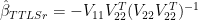
. This is not a magic matrix, but merely one of many possible multivariate methods. To my knowledge, there are no commandments mandating the use of this matrix.

Because the TTLSr relationship can be reduced to a matrix of coefficients B_{TTLSr} , the ultimate Antarctic temperature index (or any regional composite such as the West Antarctic average or indeed any gridcell) proves to be a linear weighting of the underlying station histories. This is something that is not understood by the Team (and in places denied), but it is easily seen from the underlying algebra – algebra which I’ve implemented in my MBH emulation, saving millions if not billions of calculations.

The demonstration below uses the “associative” property of matrix multiplication. First we denote the TTLSr estimate as follows:

(7) \hat{U_r} = YB_{TTLSr}  .

where \hat{U_r} are the reconstructed PCs (using regpar=r). In this context, they correspond to the reconstructed X-matrix in the usual X-Y matrices. In the following lines, I’ll denote here B_{TTLSr} simply as B .

The original PC decomposition of the AVHRR data (denoted below as A ) can be expressed in usual SVD nomenclature, taking care to observe that this SVD decomposition is distinct from the one just done on the augmented matrix, as follows:

(8) A= USV^T

where V in this context is the AVHRR eigenvector (and is a different eigenvector matrix than the augmented matrix used in the calibration). Steig (as in MBH) obtains the reconstructed matrix of Antarctic gridcells \hat{A} by using the reconstructed PCs \hat{U_r} as follows:

(9) \hat{A}= \hat{U_r} S_k V_k^T

where S_k  and V_k are restricted to k=3 columns.

The Antarctic average (denoted here as \hat{\tau} is an average of the gridcells (equal area here by construction), which can be expressed as a right multiplication of the matrix \hat{A} as follows:

(10) \hat{\tau}= \hat{T} 1/\text{m}

where 1 here denotes a vector of 1’s of length m=5509 gridcells. Collecting the terms used to derive \hat{\tau} , we find:

(11) \hat{\tau}= Y B_{TTLSr} S_k V_k^T 1/\text{m}

In other words,

(12) \hat{\tau}= Y \lambda

where Y is the matrix of station data, \lambda is a vector of length q representing weights for each of the stations denoted in the above equation:

(13) \lambda= B_{TTLSr} S_k V_k^T 1/\text{m}

Thus,

(14) \lambda= -V_{11} V_{22}^T (V_{22} V_{22}^T)^{-1} S_k V_k^T 1/\text{m}

using the definitions above for the V matrices.

This can easily be changed into a function of pc and regpar. I plotted the contribution \lambda of each station to the Antarctic average temperature, color coding the contribution by location class: green for the oddly-included islands (Campbell, Macquarie, Orcadas, Signy, Grytviken), cyan for the peninsula (9 stations out of the subset of 30 stations used here) and red for the remainder (16 stations, of which McMurdo and Scott Base are at near duplicate locations.) This yields the following barplot of weights.


Figure 3. Effective weights in Antarctic average of 30 stations with: prior infilling of stations with more than 240 values; regpar=3, pc=3, coefficients from calibration period.

The 1957-2006 trend of this particular reconstruction is 0.061, noticeably less than the Steig trend using regpar=3, pc=3 and similar to values obtained through other methods. I’m not sure why this yields a lower trend than the RegEM’ed method. I’ve got a couple of variations in the method here : (1) the calibration coefficients from the calibration period were not “updated” from information from the reconstruction period. The interpretation of such updating is discussed in Brown and Sundberg 1989 (and isn’t easy); (2) the station data is infilled first, prior to calibration to the PC data and “short” stations weren’t used. Perhaps these lead to a difference.

IMO, it’s extremely important to keep in mind that any of these methods merely yields weights for the stations. This particular calibration ends up with relative low weights for the Peninsula stations, slightly negative weights for the Southern Ocean islands – the usefulness of which has never been clear – and relatively consistent weights for continental stations.

This sort of graph would be a helpful template for understanding what happens with varying regpar and PC. In order to end up with Steig’s trend (nearly double the trend shown here), the weights of high-trend stations have to be increased.

Trends

There’s one more potential simplification that’s useful to keep in mind. The trend of the Antarctic average can be obtained by left multiplying by a structured matrix J – see script below for definition). By expanding \hat{\tau} , we immediately see that the overall trend in /hat{\tau} is simply a linear weighting of the individual station trends multiplied by the vector of weights \lambda .

(15) (J^T J)^{-1} J^T \hat{\tau} = (J^T J)^{-1} J^T X B

Steig’s “Tutorial”

In his RC post yesterday – also see here – Steig used North et al (1982) as supposed authority for retaining three PCs, a reference unfortunately omitted from the original article. Steig also linked to an earlier RC post on principal components retention, which advocated a completely different “standard approach” to determining which PCs to retain. In yesterday’s post, Steig said:

The standard approach to determining which PCs represent to retain is to use the criterion of North et al. (1982), which provides an estimate of the uncertainty in the eigenvalues of the linear decomposition of the data into its time varying PCs and spatial eigenvectors (or EOFs).

I’ve revised this thread in light of a plausible interpretation of Steig’s methodology provided by a reader below – an interpretation that eluded me in my first go at this topic. Whatever the merits of this supposedly “standard approach”, it is not used in MBH98 nor in Wahl and Ammann.

Steig provided the figure shown below with the following comments:

The figure shows the eigenvalue spectrum — including the uncertainties — for both the satellite data from the main temperature reconstruction and the occupied weather station data used in Steig et al., 2009. It’s apparent that in the satellite data (our predictand data set), there are three eigenvalues that lie well above the rest. One could argue for retaining #4 as well, though it does slightly overlap with #5. Retaining more than 4 requires retaining at least 6, and at most 7, to avoid having to retain all the rest (due to their overlapping error bars). With the weather station data (our predictor data set), one could justify choosing to retain 4 by the same criteria, or at most 7. Together, this suggests that in the combined data sets, a maximum of 7 PCs should be retained, and as few as 3. Retaining just 3 is a very reasonable choice, given the significant drop off in variance explained in the satellite data after this point: remember, we are trying to avoid including PCs that simply represent noise.


Figure 1. Eigenvalues for AVHRR data.

As I observed earlier this year here, if you calculate eigenvalues from spatially autocorrelated random data on a geometric shape, you get eigenvectors occurring in multiplets (corresponding to related Chladni patterns/eigenfunctions). The figure below shows the eigenvalues for spatially autocorrelated data on a circular disk. Notice that, after the PC1, lower eigenvalues occur in pair or multiplets. In particular, notice that the PC2 and PC3 have equal eigenvalues.

North et al 1982 observed that PCs with “close” but not identical eigenvalues could end up being “statistically inseparable”, just as PCs with identical eigenvalues. North:

An obvious difficulty arises in physically interpreting an EOF if it is not even well-defined intrinsically. This can happen for instance if two or more EOFs have the same eigenvalue. It is easily demonstrated that any linear combination of the members of the degenerate multiplet is also an EOF with the same eigenvalue. Hence in the case of a degenerate multiplet one can choose a range of linear combinations which .. are indistinguishable in terms of their contribution to the average variance…Such degeneracies often arise from a symmetry in the problem but they can be present for no apparent reason (accidental degeneracy.)

As the reader observes, if you have to take everything in an overlapping confidence intervals, then there are only a few choices available. You can cut off after 3 PCs or 7 PCs – as Steig observes in his discussion. Not mentioned by Steig are other cut off points within North’s criteria: after 1, 9, 10 and 13 PCs, the latter being, by coincidence, the number in Ryan’s preferred version. North’s criterion gives no guidance as between these 4 situations.

In addition, if you assume that there is negative exponential decorrelation, then the eigenvalues from a Chladni situation on an Antarctic shaped disk area as follows – with the first few eigenvalues separated purely by the Chladni patterns, rather than anything physical – a point made on earlier occasions, where we cited Buell’s cautions in the 1970s against practitioners using poorly understood methodology to build “castles in the clouds” (or perhaps in this case, in the snow).


Eigenvalues from 300 random gridcells.

As an experiment, I plotted the first 200 eigenvalues from the AVHRR anomaly matrix as against the first 200 eigenvalues assuming negative exponential spatial decorrelation from randomly chosen gridcells. (I don’t have a big enough computer to do this for all 5509 gridcells and I’m satisfied that the sampling is a sensible way of doing the comparison). A comparison of observed eigenvalues to those from random matrices is the sort of thing recommended by Preisendorfer.


Comparison of Eigenvalues for AVHRR and Random data. Proportion of variance of first 200 eigenvalues shown on log scale .

This is actually a rather remarkable pattern. It indicates that the AVHRR data has less loading in the first few PCs than spatially autocorrelated data from an Antarctic-shaped disk and more loading in the lower order PCs.

The Gracious Communicator

During the 12-hour interval that Steig deigned to permit comments on his “Tutorial” about principal components, he made the following backhanded criticism of blogger communications with him:

[Response: Ryan: Unlike most of your fellow bloggers, you have been very gracious in your communications with me. They could learn something from you.

I don’t know how many bloggers Steig was in communications with, but I was one of them and I regard my communications with Steig as being entirely proper. Given that Steig has tarred a number of people with the above accusation, it would be nice if he acknowledged that my communications, like Ryan’s, were courteous. Below I reproduce my correspondence with Steig to demonstrate this:

On Jan 23, 2009, I emailed Steig as follows:

Dear Dr Steig,
In your article you refer to the development of  “50-year-long, spatially complete estimate of monthly Antarctic temperature anomalies.”  Could I please have a digital copy of this data.  Also I presume that this output was derived from corresponding monthly gridded versions of T_IR and T_B and I would appreciate a copy of these (or equivalent) input data as well. Regards. Steve McIntyre

Steig promptly replied the same day as follows:

Steve
I have always intended to provide all the material on line; I wasn’t allowed to do this before the paper was published. I would have done it already but have been busy answering emails. I should have these up on line next week.
Eric

To which I responded:

Thanks.
“all the material” – It would also be an excellent idea to put your source code up. Using statistical techniques that are not well understood to derive newsy applied results is a bit risky and you should err on the side of caution in making your code available to independent analysis.

It would also serve to defuse people who are instantly suspicious of Mann’s RegEM. This is an application where it seems much more plausible to me than where it’s used to justify bristlecones. I’ve noted this at my blog as a caveat to instantly suspicious readers.
Regards, Steve McIntyre

A couple of days later, Steig broke off communications with the following comment at CA:

If you happen to find any legitimate errors in our work, when you try to duplicate it, I will be delighted to discuss it, provided it is through the venue of the peer-reviewed literature. I will not further respond to queries from Steve McIntyre by email, nor via this blog. I have always given you the benefit of the doubt, but your thinly-veiled accusations of scientific fraud (by association!) have crossed an important ethical line. Shame on you.

Over at RC on Feb 3, he posted the following “gracious” comment”, along with other comments evidencing similar “graciousness”:

To continue with the analogy with financial auditing, let me very clear on what I mean by legitimate: In the business world, auditors 1) don’t publicly accuse a company of withholding data prior to requesting said data; 2) are not self-appointed; 3) have to demonstrate integrity and competence; 4) are regulated. On this point, if you are suggesting that Steve McIntyre be regulated by an oversight committee, and have his auditor’s license revoked when he breaks ethical rules, then we may have something we can agree on.–eric]

I don’t know how many “bloggers” were in email correspondence with Steig, but I certainly do not think that there is anything inappropriate in the language of my email correspondence with Steig.

It’s interesting to read Steig’s peroration to the commentary on his paper on Jan 27 when the ink was barely dry on the paper, data was still unavailable (the AVHRR data only became available in late March and the Comiso data is still unavailable):

All in all, the critical commentary about this paper has been remarkably weak….The poor level of their response is not surprising, but it does exemplify the tactics of the whole ‘bury ones head in the sand” movement – they’d much rather make noise than actually work out what is happening. It would be nice if this demonstration of intellectual bankruptcy got some media attention itself.

http://www.realclimate.org/index.php/archives/2009/01/warm-reception-to-antarctic-warming-story/

I’m not sure how Steig expected people to be able to “work out” his methodology within a few days of publication without data then being available, without any available of source code or a comprehensive and detailed methodological description.

Doubles Squash Profiled

A lengthy feature on doubles squash in today’s Globe and Mail. It’s such a great sport.

The match discussed here was at our club’s finals night. For Toronto readers, in the print edition of the paper, they had a wide-angle photo of the spectators in the gallery – I’m just at the edge of the picture.

Another Bouquet for Geert at KNMI

Geert Jan van Oldenburgh of KNMI develops and, in his part time, maintains excellent KNMI’s Climate Explorer. I recommend that Curt Covey of PCMDI examine whether they should abandon their own much less satisfactory access points.

Hadley Center as well.

The other day, I was interested in deriving a HadISST monthly tropical average. The data of interest to me was ultimately only a few hundred KB if I were able to download the monthly average – which isn’t available in a pre-calculated form. I started logically enough with the Hadley Center HadISST page, which led me to the download page.

The data of interest sits in a gzipped netcdf file (212 MB). I’m fairly handle with NetCDF and downloaded the file, which expanded to over 400 MB. Unfortunately, the file was too big to read into R in my computer and my R session crashed. I was really only interested in data after 1979 and smaller decadal files were available. These were sizes that I could manage. I wrote a little program to read the files, extract the tropical cells and take a tropical average. So far so good. However, the data proved to be in deg C, rather than anomalies. To get an anomaly, I needed to do it all over again, this time concatenating all the decadal files in order to calculate benchmark averages for each cell.

There was nothing conceptually complicated about it, but it would take another couple of hours to do. In taking these sorts of averages, you have to be careful with your array handling to ensure that you don’t make a mistake.

I remembered that Bob Tisdale had plotted some HadISST results and I was 100% certain that he hadn’t gone through this sort of elaborate exercise. Sure enough he’d used KNMI – which I’d used for extracting model data, but hadn’t thought of for HadISST.

Off to the KNMI Climate Explorer webpage. I quickly located the HadISST series, set the radio buttons to extract the TRP data and got the required anomaly series about 40 seconds later. The data handling was done on KNMI’s big computer using tested programs and only the data of interest was sent over the internet.

Another bouquet for Geert Jan’s excellent program.

And if anyone from Hadley Center or PCMDI reads this thread, suck it in and link to KNMI.

Don't Miss Ryan O's Latest

Verification of the Improved High PC Reconstruction

Santer et al 2008 – Worse Than We Thought

Last year, I reported the invalidity using up-to-date data of Santer’s claim that none of the satellite data sets showed a “statistically significant” difference in trend from the model ensemble, after allowing for the effect of AR1 autocorrelation on confidence intervals. Including up-to-date data, the claim was untrue for UAH data sets and was on the verge of being untrue for RSS_T2. Ross and I submitted a comment on this topic to the International Journal of Climatology, which we’ve also posted on arxiv.org. I’m not going to comment right now on the status of this submission.

However, I re-visited some aspects of Santer et al 2008 that I’d not considered previously and found that it was worse than we thought.

In particular, I examined the following assertions that there was no statistically significant difference in lapse rate trends between observations and the ensemble mean. Santer observed that the lapse rate eliminated a considerable amount of common variability, reducing the AR1 autocorrelation and thus narrowing the confidence intervals (which is a fair enough comment):

Tests involving trends in the surface-minus-T2LT difference series are more stringent than tests of trend differences in TL+O, TSST , or T2LT alone. This is because differencing removes much of the common variability in surface and tropospheric temperatures, thus decreasing both the variance and lag-1 autocorrelation of the regression residuals (Wigley, 2006). In turn, these twin effects increase the effective sample size and decrease the adjusted standard error of the trend, making it easier to identify significant trend differences between models and observations.

Santer noted that there were significant differences in lapse rate for the UAH data set but not for the RSS data, about which he said:

there is no case in which the model-average signal trend differs significantly from the four pairs of observed surface-minus-T2LT trends calculated with RSS T2LT data (Table VI).

If RSS T2LT data are used for computing lapse-rate trends, the warming aloft is larger than at the surface (consistent with model results)… When the d∗1 test is applied, there is no case
in which hypothesis H2 can be rejected at the nominal 5% level (Table VI)

In the tropospheric data, we’d noticed that the trend in RSS T2 data was now very close to statistical significance and so it would be worthwhile checking these claims using up-to-date data. (Note that Santer did not mention T2 lapse rates in this summary, though T2 data is referred to in various tables elsewhere.)

As CA readers know, there are three major temperature indices that one encounters in public debate: HadCRU, GISS and NOAA. These were used for comparing troposphere and surface trends in the CCSP report that is a reference point for both Douglass and Santer, as shown in their Table 1 below.


Figure 1. Excerpt from CCSP Report.

As a first exercise, I calculated the lapse rate trend between these three surface indices (collated into TRP averages) and RSS T2LT (and T2, as well as corresponding UAH results.)

Using 2007 data (then available), 4 of the 6 comparisons of RSS data to surface data were statistically significant even with Santer’s autocorrelation adjustment: GISS relative to both T2LT and T2; NOAA and CRU relative to T2. Using data currently available, 5 (and perhaps) 6 comparisons are now statistically significant. (The t-statistic for the 6th, NOAA vs T2LT, is at 1.924.)

Using obsolete data (ending in 1999 as Santer did), the two GISS comparisons were “statistically significant” even with truncated data. The t-stats were 2.7 (T2LT) and nearly 3 (T2) and weren’t even borderline. So what was the basis of Santer’s claim that “none” of the RSS lapse rates trends relative to surface temperatures was “statistically significant”?

Santer didn’t include GISS and NOAA in his comparison!

He deleted the GISS and NOAA composites used by IPCC and others and replaced them by three SST series: ERSST v2, ERSST v3 and HadISST. The ERSST versions had lower trends and these trends were enough lower than NOAA and GISS that the discrepancy between the ERSST versions and RSS was no longer significant. Santer proclaimed victory.

In summary, considerable scientific progress has been made since the first report of the U.S. Climate Change serious and fundamental discrepancy between modelled and observed trends in tropical lapse rates, despite DCPS07’s incorrect claim to the contrary. Progress has been achieved by the development of new T_SST , T_L+O and T2LT datasets,

I have several problems with this supposed reconciliation. In my opinion, Santer should have reported the GISS and NOAA results. He could also have reported the ERSST results, but to simply not report the significant GISS results is hard to endorse, particular when Gavin Schmidt was a coauthor and familiar with GISS.

Secondly, if one sticks to the actual indices in common use, the discrepancy in lapse rate is just as real as ever. If the ERSST versions aren’t actually used in GISS, NOAA or HadCRU, what exactly is accomplished by showing that there is supposedly no statistically significant discrepancy between RSS and a surface version that isn’t used in the composites?

Third, Bob Tisdale observed that the first version of ERSST v3 (back in the old days of October 2008 before they “moved on”) incorporated satellite data in their estimates of SST. If so, then it seems relatively unsurprising that adjusting SST with satellite data reduces the discrepancy between SST and satellite data, but this hardly resolves the situation for data that hasn’t been adjusted by satellites or, for that matter, the unadjusted difference in the original ERSST3.

Fourth, there’s a nice bit of further irony. The low trends of ERSSTv3 apparently aroused protests within the community and the ink was barely dry on the publication of ERSST3 before they moved on. Bob Tisdale reported that, in November 2008, ERSSTv3(now ERSST v3A) was withdrawn and replaced by a new ERSST v3, not using satellites, with a higher trend. The “old” ERSST3 TRP trend up to end 1999 was 0.076 deg C/decade (I calculated this from a vintage gridded version of ERSST 3 that I located at another site); this was less than half the corresponding GISS trend and a little more than 60% of the CRU trend. But the new and improved ERSST3 TRP version presently online at the ERSST3 website (zonal) is 0.126 deg C/decade – a little higher than CRU. If they don’t adjust SST using satellites (and this adjustment seems to have been withdrawn after protests), the Santer reconciliation no longer works 🙂

In summary, contrary to Santer’s claim that none of the lapse rate trends are significant, all of them (or all but one of them) are significant relative to the three major indices using up-to-date data. As I said above, Santer et al 2008 is “worse than we thought”.

ERSST v3 originally used satellite data

"Worse than We Thought"

I’ve just collated ERSST v3b and ERSST v2 versions for the tropics and compared ERSST v3 and ERSST v2 versions. CA readers were undoubtedly ready for adjustments, but, using the technical terminology of the leading climate journals, the adjustments were “worse than we thought”. ERSST v3 lowered SSTs before 1880 by up to 0.3 deg C.


Figure 1. Tropical SST: ERSST v3(B) less ERSST v2

The reference article for ERSST v3 is here, which states in the abstract:

Improvements in the late nineteenth century are due to improved tuning of the analysis methods

Update: I’ve amended this article in light of Ryan O’s comments, with which, on further reading, I agree. The difference between ERSST2 and ERSST3 shown in the above graphic is related to the information in SR Figure 2 shown below. You can sort of see the 0.3 deg C shift in the 19th century in this figure, though it’s not explained. SR Figure 2.

The changes that precipitate the differences are changes in parameters for the Smith-Reynolds “extended reconstruction of SST” (ERSST) algorithm, summarized in the Table below: SR08 Table 1.

What is a bit surprising, I guess, is that 19th century SST estimates are so volatile in respect to the parameters. The analysis reported uses a hurdle of 2 months per year (was 5); 2 years per LF (was 5); 25 deg area (was 15 deg)

Sea Ice Satellite Failure

In case you’ve missed it, WUWT has an excellent post on failure of a sea ice satellite sensor – now taken offline.