The Gift That Keeps On Giving

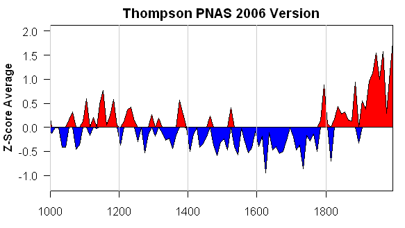
As I mentioned before, Hans Erren’s digitization of the Ababneh Sheep Mountain data has prompted me to pick up the MBH files to re-examine the vexed matter of Mann’s CO2 “adjustment”. Each step is fraught with problems. I’m going to try to pull something together listing the steps in the adjustment and the issues involved – but it makes a very long post. Today I’m going to post on one of the later steps in the process, which will also nicely illustrate a point that bender emphasized: that superimposing HS shapes involves only a a couple of degrees of freedom. The superpositions may or may not be “right”, but they have negligible statistical significance – a point that has completely escaped Wahl and Ammann (for example).

Here’s Figure 1b from MBH99, together with its original caption. It purports to show the difference (grey) between the 75-year smooth of an average of Jacoby chronologies in northern North America and a 75-year smooth of the Mannian PC1 (rescaled somehow). I’ll re-visit this calculation on another occasion. The dashed line purports to show the “secular trend” from the difference of the smooths. Again, I’ll revisit this calculation on another occasion.

Here’s what I want you to pay attention to here: the graphic purports to show “relative variations in atmospheric CO2 …for comparison”. The y-axis is labeled only “Relative Amplitude” – an imprecise term that we see often in the Mannian canon. CO2 values are estimated in ppm – so this graph has required a re-scaling and re-fitting of CO2 measurements to fit onto the graphic. But what were the steps? A point that I’d like readers to bear in mind whenever they see one of these re-centering and re-scaling is that re-centering and re-scaling involve the estimation of 2 coefficients. Univariate linear regression also involves the estimation of 2 coefficients: so the types of concerns and caveats involved in estimation of linear regression coefficients carry forward into the estimation of rescaling and recentering values, even if the proponents don’t discuss it.

logco238.gif
MBH99 Figure 1b. Residual between the smoothed NT [Jacoby] and ITRDB [MBH PC1] series, and its secular trend (retaining timescales longer than 150 years). Relative variations in atmospheric CO2 since AD 1700 are shown for comparison.

From inspection of MBH98 data at the FTP site of Virginia Mann (no longer online but which I have), I have digital versions of the series used in these plots. The CO2 “version” here starts with CO2 from 1610-1995 measured in ppm (I haven’t verified the provenance of this data yet).. Mann sets a “reference” value of 278.5 ppm, which appears to be drawn from minimum values in his data in the 18th century. He then divides the observed values by the reference and takes the log.. Thus x= log (CO2/278.5)

If these values were plotted up, one gets the following graphic.

logco241.gif
Figure 1. Without Rescaling

For the above graphic, there was no effort to rescale the CO2 series to visually match the “residuals”. The most obvious way to re-scale the CO2 to the residual scale is to regress the “target” against the CO2 and then “predict” the target. I do this all the time in experiments and it’s an efficient method. In this case, I didn’t want to change the zero point and so I did the fit without an intercept, just to get a re-scaling coefficient. The code for this type of operation is as follows:

fm=lm(target~logco2-1,data=Z);
predict0=predict(fm,newdata=Z)

These “predicted” values then rescale the log Co2 series to plot in a visually more convenient manner. Good practitioners will typically put a 2nd scale on the other (right) vertical axis so people can tell what’s going on. In this case, a fit based on the period 1700-1980 (and 1700-1995 would be similar) yields the following graphic. This doesn’t look much like the Mannian graphic.

logco239.gif
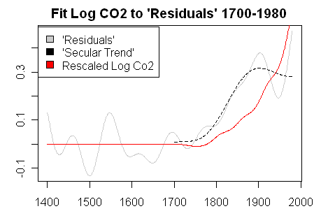
Figure 2. Rescaling based on 1700-1980

The only way that you can re-scale the CO2 series to match the “residuals” as shown in MBH99 Figure 1b is to coerce the fit by limiting the fit to the period 1700-1900. So applying the same re-scaling method, I calculated a re-scaling factor by limiting the regression to the period before 1900 as follows:

fm=lm(target~logco2-1,data=Z[301:501,]);
predict0=predict(fm,newdata=Z)

This yielded the following graphic which is a very close match for the MBH99 Figure 1b (this is not saying that this is “Correct” or that the target “residuals” have any meaning.) I’m just looking at this step.

logco240.gif
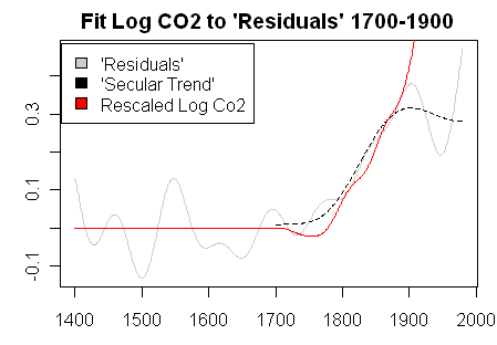
Figure 3. Re-scaling based on 1700-1900

Does this fit have any meaning or significance relative to the fit on the 1700-1980? I don’t think so. From this exercise, Mann concluded in MBH99 the following:

The residual is indeed coherent with rising atmospheric CO2 (Figure 1b), until it levels off in the 20th century, which we speculate may represent a saturation effect whereby a new limiting factor is established at high CO2 levels. For our purposes, however, it suffices that we consider the residual to be non-climatic in nature, and consider the ITRDB PC #1 series “corrected” by removing from it this residual, forcing it to align with the NT series at low frequencies throughout their mutual interval of overlap.

How many issues can one count? If one looks at the “residuals” (whatever they are) there is no leveling off in the 20th century. The “leveling off” occurs only when Mann does a second-stage smoothing. Is the “secular trend” in the residuals something that has any meaning? I ‘d be surprised. And is the residual “coherent” with rising CO2? If you coerce the fit so that the trends match, then it looks coherent. If you don’t coerce the fit, is it coherent? Doesn’t look that way to me. It looks like the residuals increase before the increase in CO2 if one doesn’t coerce the fit to the 19th century.

Does this sort of coerced fit have any statistical meaning? I can’t think of any.

Gleanings on Bona Churchill

In 2002, Lonnie Thompson drilled a 460 meter ice core in a col between Mounts Bona and Churchill in Alaska. As of October 2003, they had analyzed over 5600 samples and concluded that the core covered approximately 2500 years. A presentation was made at AGU in December 2004. The data was not discussed in IPCC AR4 or even in Thompson’s 2006 PNAS article. Actually, not only is the data completely unarchived, to date, there is no journal publication whatever of these results (funded by the National Science Foundation’s Office of Polar Programs grant OPP-0099311).

In mining promotions, whenever results are delayed, you can be 99% sure that they are not good results. Promoters can delay results a little bit hoping that more drilling will get a good hole, but there’s not much discretion. For some time, I’ve noticed the non-reporting of Bona Churchill (which I’ve compared to a similar situation at Sheep Mountain) and surmised that the results were not “good” for Thompson’s viewpoint: otherwise we’d have heard about it. Here’s one such prediction:

Here’s my prediction about dO18 levels at Bona Churchill.: 20th century dO18 levels will be more negative (“colder”) than levels in the early 19th century – the opposite pattern to the pattern that Thompson is promoting for tropical glaciers.

While the results remain unpublished, Follow the Money noted a reference to Bona Churchill in a workshop proceeding here, which contained a PPT presentation (81 MB) by Lonnie Thompson, the abstract to which stated:

Records providing the necessary time perspective may be reconstructed from chemical and physical properties preserved in the regional ice cover and ocean sediments. Comparisons are made among the geographically dispersed, annually dated ice cores records from the Antarctic Peninsula, the tropical Quelccaya ice cap (Peru) and Bona-Churchill (southeast Alaska) over the past 500 years. Decadally averaged δ18O histories demonstrate that the current warming at high elevations in mid- to low-latitudes is unprecedented for at least the last two millennia.

The PPT presentation contained an interesting graphic providing the first information on Bona-Churchill d _{18}O levels. And in sufficient detail to test my prediction. How do you think that I did on my prediction? Continue reading

Co-Winner Best Science Blog

As most of you now know, Climate Audit has been declared co-winner of the 2007 Weblogs Award for Best Science blog (together with Bad Astronomy.) This decision was made with the agreement of all parties.

2007science150.jpg

Some of you have been understandably a little puzzled and seeking to interpret the matter. Here’s a bit of the background. Continue reading

Re-scaling the Mann and Jones 2003 PC1

Hans Erren has digitized the Ababneh Sheep Mountain version and I’m going to show some extremely interesting knock-on results both on MBH98-99 and Mann and Jones 2003. I started in on Mann and Jones 2003, partly for a little variety and partly because the Sheep Mountain impact was particularly strong on this network.

Before I get to analyzing the impact of the Ababneh version on this network, there are some baffling adjustments to the Mannian PC1 that I’ve been unable to figure out and maybe readers can help. I’ve posted up all the relevant materials and some analysis script.

Continue reading

Al Gore and "Dr Thompson's Thermometer" #2

Yesterday, I posted up about “Dr Thompson’s Thermometer” and, thanks to CA readers, some interesting results emerged. A special thanks to Tim Lambert for spotting the provenance of Dr Thompson’s thermometer. The post today will repeat some of yesterday’s material, but will recast it, since we now understand the puzzle much better. In Inconvenient Truth, after a segment discussing glaciers, Gore stands in front of a Hockey Stick graph for the last 1000 years and tells his audience that “Dr Thompson’s thermometer” had shown the inconsequentiality of the Medieval Warm Period and, [in the book Nov 13], that “Thompson’s ice core record [was] one of the most definitive” confirmations of Mann’s Hockey Stick. [The text in the book says:]

Lonnie and his team of experts then examine the tiny bubbles of air trapped in the snow in the year that it fell. They can measure how much CO2 was in the Earth’s atmosphere in the past year by year. They can also measure the exact temperature of the atmosphere each year by calculating the ratio of different isotopes of oxygen which provides an ingenious and highly accurate thermometer. The team can count backward in time year by year – the same way an experienced forester can read tree rings – by simply observing the clear line od demarcation that separates each year from the one preceding it as seen in this unique frozen record. The thermometer to the right measures temperature in the Northern Hemisphere over the past 1000 years. The blue is cold and the red is hot. The bottom of the graph marks 1000 years ago and the current era is at the top.

The correlation between temperature and CO2 concentrations over the last 1000 years – as measured by Thompson’s team – is striking. Nonetheless the so-called global warming skeptics often say that global warming is really an illusion reflecting nature’s cyclical fluctuations. To support their view, they frequently refer to the Medieval Warm Period. But as Dr Thompson’s thermometer shows, the vaunted Medieval Warm Period (the third little red blip from the left below) was tiny in comparison to the enormous increases in temperature in the last half-century – the red peaks at the far right of the graph. These global-warming skeptics – a group diminishing almost as rapidly as the mountain glaciers – launched a fierce attack against another measurement of the 1000 year correlation between CO2 and temperature known as the “hockey stick”, a graphic image representing the research of climate scientist Michael Mann and his colleagues. But in fact scientists have confirmed the same basic conclusions in multiple ways with Thompson’s ice core record as one of the most definitive. (AIT, The Book)

gore_a1.jpg
Figure 1. Scene from AIT, with Gore standing in front of a hockey stick graph.

[added] The transcript here (and I don’t vouch for the transcript) is a little different than the book, but clearly attributes the graphic here to oxygen isotope calculations from Lonnie Thompson:

The ice has a story to tell and it is worldwide. My friend Lonnie Thompson digs cores in the ice. They dig down and they bring the core drills back up and they look at the ice and they study it. When the snow falls it traps little bubbles of atmosphere. They can go in and measure how much CO2 was in the atmosphere the year that snow fell. What’s even more interesting I think is they can measure the different isotopes of oxygen and figure out the very precise thermometer and tell you what the temperature was the year that bubble was trapped in the snow as it fell.

When I was in Antarctica I saw cores like this and the guy looked at it. He said right here is where the US Congress passed the Clean Air Act. I couldn’t believe it but you can see the difference with the naked eye. Just a couple of years after that law was passed, it’s very clearly distinguishable.

They can count back year by year the same way a forester reads tree rings. You can see each annual layer from the melting and refreezing. They can go back in a lot of these mountain glaciers a thousand years. They constructed a thermometer of the temperature. The blue is cold and the red is warm. I show this for a couple of reasons. Number one the so called skeptics will sometimes say “Oh, this whole thing is cyclical phenomenon. There was a medieval warming period after all.” Well yeah there was. There it is right there. There are one there and two others. But compared to what is going on now, there is just no comparison. So if you look at a thousand years worth of temperature and compare it to a thousand years of CO2 you can see how closely they fit together. Now, a thousand years of CO2 data in the mountain glacier.

Readers yesterday observed the irony that the caption on Al Gore’s graphic was inverted with negative values at the top (something that was corrected in the book version.) I observed that I had examined Thompson’s ice core results and had been unable to identify any Thompson versions that corresponded to the Thompson graphic. It turns out that the Gore Hockey Stick has not derived from Thompson data at all; what it represents is a splicing of the MBH99 reconstruction (taken to 10-year averages) and a version of the CRU temperature history overlaid directly and merged with the MBH99 reconstruction. Thus the confirmation of MBH99 is ironically MBH99 itself. Continue reading

Al Gore and Dr Thompson's Thermometer

Surprisingly, I don’t think that I’ve written previously about the Al Gore Hockey Stick. In Inconvenient Truth, after a segment discussing glaciers, Gore stands in front of a Hockey Stick graph for the last 1000 years and tells his audience that “Dr Thompson’s thermometer” had shown the inconsequentiality of the Medieval Warm Period and, [in the book Nov 13], that “Thompson’s ice core record [was] one of the most definitive” confirmations of Mann’s Hockey Stick. [The text in the book says:]

Lonnie and his team of experts then examine the tiny bubbles of air trapped in the snow in the year that it fell. They can measure how much CO2 was in the Earth’s atmosphere in the past year by year. They can also measure the exact temperature of the atmosphere each year by calculating the ratio of different isotopes of oxygen which provides an ingenious and highly accurate thermometer. The team can count backward in time year by year – the same way an experienced forester can read tree rings – by simply observing the clear line od demarcation that separates each year from the one preceding it as seen in this unique frozen record. The thermometer to the right measures temperature in the Northern Hemisphere over the past 1000 years. The blue is cold and the red is hot. The bottom of the graph marks 1000 years ago and the current era is at the top.

The correlation between temperature and CO2 concentrations over the last 1000 years – as measured by Thompson’s team – is striking. Nonetheless the so-called global warming skeptics often say that global warming is really an illusion reflecting nature’s cyclical fluctuations. To support their view, they frequently refer to the Medieval Warm Period. But as Dr Thompson’s thermometer shows, the vaunted Medieval Warm Period (the third little red blip from the left below) was tiny in comparison to the enormous increases in temperature in the last half-century – the red peaks at the far right of the graph. These global-warming skeptics – a group diminishing almost as rapidly as the mountain glaciers – launched a fierce attack against another measurement of the 1000 year correlation between CO2 and temperature known as the “hockey stick”, a graphic image representing the research of climate scientist Michael Mann and his colleagues. But in fact scientists have confirmed the same basic conclusions in multiple ways with Thompson’s ice core record as one of the most definitive. (AIT, The Book)

gore_a1.jpg
Figure 1. Scene from AIT, with Gore standing in front of a hockey stick graph.

[added] The transcript here (and I don’t vouch for the transcript) is a little different than the book, but clearly attributes the graphic here to oxygen isotope calculations from Lonnie Thompson:

The ice has a story to tell and it is worldwide. My friend Lonnie Thompson digs cores in the ice. They dig down and they bring the core drills back up and they look at the ice and they study it. When the snow falls it traps little bubbles of atmosphere. They can go in and measure how much CO2 was in the atmosphere the year that snow fell. What’s even more interesting I think is they can measure the different isotopes of oxygen and figure out the very precise thermometer and tell you what the temperature was the year that bubble was trapped in the snow as it fell.

When I was in Antarctica I saw cores like this and the guy looked at it. He said right here is where the US Congress passed the Clean Air Act. I couldn’t believe it but you can see the difference with the naked eye. Just a couple of years after that law was passed, it’s very clearly distinguishable.

They can count back year by year the same way a forester reads tree rings. You can see each annual layer from the melting and refreezing. They can go back in a lot of these mountain glaciers a thousand years. They constructed a thermometer of the temperature. The blue is cold and the red is warm. I show this for a couple of reasons. Number one the so called skeptics will sometimes say “Oh, this whole thing is cyclical phenomenon. There was a medieval warming period after all.” Well yeah there was. There it is right there. There are one there and two others. But compared to what is going on now, there is just no comparison. So if you look at a thousand years worth of temperature and compare it to a thousand years of CO2 you can see how closely they fit together. Now, a thousand years of CO2 data in the mountain glacier.

Today I want to spend a little time examining this particular graphic, as it has some intriguing mysteries.

Here is a closer view of Dr Thompson’s Thermometer, as Gore describes it. It starts just after 1000 and, according to the graphic, ends in 2000. It is denominated in deg C. The Medieval Warm Period (not labeled in this version, but labeled in the book) is identified as occurring from about 1360-1370. Another interesting detail is that the resolution of Dr Thompson’s Thermometer appears to increase in the 19th century. In the 12th century, the graph looks like it has decadal values (and this is characteristic of Thompson), but the resolution in the 19th and 20th century is more detailed – this change in resolution within a chart is atypical of Thompson’s usual style. Another interesting aspect of the graphic in the 20th century is that the polygon style shows both positive and negative values simultaneously (indicating some error in the plot coloring algorithm).

gore_a2.jpg
Figure 2. Dr Thompson’s Thermometer from Inconvenient Truth. As noted below, the y-axis is labeled incorrectly here, but is corrected in the book. The labels are inverted in the DVD.

Now I’m pretty familiar with Thompson’s work and have discussed it here from time to time – see Thompson category, but I don’t have any idea where Dr Thompson’s Thermometer can be identified in any of his publications. This is not to say that Thompson hasn’t produced graphics that look somewhat like this, but I can’t locate any provenance for Dr Thompson’s Thermometer. (If anyone does know, please tell me and I’ll amend this.) Thompson has published composites of dO18 series standardized to a mean of 0 and standard deviation of 1 (“Z-scores”). In Thompson et al (Clim Chg 2003), Thompson illustrated a “Z-score” composite of 6 cores (3 Andean: Quelccaya, Sajama and Huascaran; 3 Himalayan – Dunde, Guliya, Dasuopu). In Thompson et al (PNAS 2006), a new Z-score composite of 7 cores (adding Puruogangri) was illustrated. The style of the PNAS graphic was quite a bit different. In this case, Thompson archived the plotting data (which are decadal averages, inconsistent with other time series as seen below – and not the same thing as a proper sample archive). However, they do permit the re-plotting of the PNAS version in a style like the AIT graphic, which I’ve done below for comparison.

The grossest features carry forward, but there are some interesting differences in detail, as can be seen by comparing the version below to the AIT version.

gore_a3.gif
Figure 3. Re-plot of “tropical composite” data used in Thompson et al (PNAS 2006)

The PNAS version is denominated in Z-scores: how did this get converted from Z-scores to deg C? I don’t know. I presume that this is done through variance matching or something like that. But surely the calculation needs more justification than that. The IPCC AR4 stated in respect to dO18 from tropical ice cores:

There are very few strongly temperature-sensitive proxies from tropical latitudes. Stable isotope data from high-elevation ice cores provide long records and have been interpreted in terms of past temperature variability (Thompson, 2000), but recent calibration and modelling studies in South America and southern Tibet (Hoffmann et al., 2003; Vuille and Werner, 2005; Vuille et al., 2005) indicate a dominant sensitivity to precipitation changes, at least on seasonal to decadal time scales, in these regions.

Even Thompson himself (in Thompson et al (Science 2000) stated that the Dasuopu core was a proxy for monsoon intensity:

A high-resolution ice core record from Dasuopu, Tibet, reveals that this site is sensitive to fluctuations in the intensity of the South Asian Monsoon.

So what was the basis for Thompson going from Z-scores to deg C? If it was through some elementary variance matching, to my knowledge (and I’ll amend if I’m wrong) no calculation yielding the curve illustrated in AIT has appeared in any peer reviewed literature.

Secondly, there are many differences in detail. Look at the location of the Gore-“Medieval Warm Period” in AIT – a one decade period around 1360; it appears cold in the PNAS version. In the PNAS version, there are some cold downspikes in the 17th century: where are they in the AIT version. The 11th and 12th century MWP in the PNAS version, while not loud by any means, are considerably attenuated in the AIT version: why? It’s not obvious to me.

Dunde Versions
The idea that there would be inconsistent versions of something from Lonnie Thompson is not something that will surprise previous readers. Here is a collation of different “grey” versions of one of the components in the above graphic (Dunde). Dunde was drilled in 1987 and is a staple of multiproxy studies. It has about 3000 samples containing not just dO18 values but relevant dust and chemistry information. Thompson has refused to archive original sample data. I’ve made many efforts to get this data but have been rebuffed by Thompson himself, the National Science Foundation, Science magazine and the National Academy of Sciences (both in their capacity as publishers of PNAS and in their capacity as organizers of the Surface Temperatures panel). This is important data which cannot be duplicated by third parties – Thompson has an obligation to archive all sample information and NSF and the journals have an obligation to require him to archive it: none of them are living up to these obligations. Maybe Al Gore could ask him.

The results of different Thompson versions of Dunde make a spaghetti graph all by themselves. Note that one version with annual data ends at a very low value. This inconsistency is not isolated to Dunde – as you can see from perusing the posts in the Thompson category.


Dunde Versions. Heavy black – Yao et al 2006 (3 year rolling average); thin black – MBH98 (annual); red – PNAS 2006 (5-year averages); blue – Clim Chg 2003 (10-year averages); purple – Yang et al 2002 (values in 50 -year intervals); green – Crowley and Lowery 2000 (original in standardized format, re-fitted here for display by regression fit to MBH98).

Bona Churchill
In 2002, Thompson took a new ice core at Bona Churchill. We haven’t heard anything about it. On previous occasions, e.g. here , I’ve predicted that 20th century values at this site would be lower than 19th century values – using the mining promotion philosophy that if Thompson had had “good” results, we’d have heard about them. The prediction has a little more teeth than that as dO18 values at nearby Mount Logan obtained and already published by Fisher et al went down in the 20th century. In this case, Fisher et al attributed the decline in dO18 to changes in water source provenance. Fair enough – but how then can one be sure that changes in dO18 in the tropics are evidence of global warming as opposed to changes in precipitation (as argued by Vuille as noted above) or regional precipitation.

And what would have happened to Dr Thompson’s Thermometer if Bona Churchill had been averaged in? And, oh yes, can anyone tell me where I can find a publication of Dr Thompson’s Thermometer as illustrated in AIT?

Why is this left and right?

OK, the voting is over. The vote (at closing) was CA 20,242; BA 18,993, but scrutinizing is still taking place. Thanks to everyone who supported Climate Audit. Both blogs obtained an incredible number of votes today and can walk away with both satisfaction and amazement. The volume in the Science blog today seems to have been far larger than any other race. Since mid-morning eastern, both Bad Astronomy and Climate Audit have amassed votes at almost exactly the same frenetic pace.

Prior to this vote, I (and doubtless many CA readers) had been unaware of the Bad Astronomy blog (and other interesting nominees who have undeservedly not attracted the attention that deserved) and I’m sure that this same holds in reverse. I hope that readers of each blog will take the opportunity of this introduction to visit the other site; I’ve added a link to Bad Astronomy in my very short blogroll.

Like many issues, the voting seems to have divided on left-right lines. While I realize that much of my support has come from right-wing sources, I don’t think that the analysis that’s done here is anything that should either comfort right-wing people or offend left-wing people. Sometimes the argument is made that, if Mann’s Hockey Stick were wrong, it means that the climate situation would be actually worse than people think. I ask “left-wing” readers to ponder this for moment: if the errors in Mann’s (and similar studies) result in a disguising of a problem, shouldn’t people concerned about AGW impact be on the cutting edge of attempts to analyze the Hockey Stick and see if there any defects in the analysis? Shouldn’t they be demanding that all the data used in these studies -even Lonnie Thompson’s – be available so that each one of them can be properly analysed?

Back when views on Iraq were more evenly divided, I sometimes compared what I do to being a CIA analyst arguing that sometimes an aluminum tube is just an aluminum tube and not evidence of WMD. That wouldn’t mean that proponents of the war couldn’t argue the matter using different arguments or that the war was or wasn’t justified, or that the subsequent occupation of Iraq was or wasn’t botched. All it means is that policy-makers shouldn’t be basing their decisions on questionable information about aluminum tubes. This was a line of argument that used to rub right-wing people who liked part of my message the wrong way, but I hope that it says something about me.

I’ve said on many occasions that, if I had a big policy job, I would be guided by the views expressed by large institutions. Unlike some “skeptics”, I don’t argue that decisions should be deferred pending perfect certainty. I have business experience and know that people make decisions all the time with uncertainty – you have to. At the same time, if you’re going to make effective decisions, you need to have the best possible information. And I vehemently disagree that scientists can use the “big picture” as a justification for being careless with their details. People should try their hardest to get the details right as well as the big picture.

So for any new readers, who have arrived because of this contest, welcome. To Bad Astronomy, it’s been an interesting way to meet. To Phil Plait, let’s have a beer some time.

PZ Myers at Pharyngula comments on the vote here and Phil Plait of Bad Astronomy here.

David Holland on the Hockey Stick Affair

David Holland has a new and interesting article entiitled “Bias And Concealment In The IPCC Process: The “Hockey-Stick” Affair And Its Implications” in which the proprietor of this blog is mentioned on occasion.

2007 Weblog Poll Closes Nov 8

Update 6.30 pm Eastern: Access to the voting seems to be easier again. BA is more than 250 votes ahead tho.

Bump. climateaudit is running a strong 2nd about 200 votes ahead of last year’s winner (Pharyngula) and about 500 votes behind Bad Astronomy. Polls close Nov 8. You can vote once every 24 hours.

Update: Nov 7 10 am: CA is now over 700 votes ahead of Pharyngula and within 125 votes of Bad Astronomy. It’s a horse race.

2 pm Eastern: after getting to within about 70 votes of Bad Ast in the morning, as others have reported, the voting site has become very very hard to access and Bad Astronomy has lengthened its lead over CA to nearly 200 again. Pharyngula has thrown in the towel and has sent its voters to BA with a malediction against CA. (CA is now over 1100 votes ahead of Pharyngula.) Both blogs are getting a LOT of votes as compared to the general “Best Blog” category – both blogs overtook Michelle Malkin this morning and Arianna Huffington this afternoon.

The Wegman and North Reports for Newbies

In recent discussion of the Weblog 2007 Awards, several commenters at other blogs have argued that our criticisms of the Mannian parlor tricks have been “thoroughly refuted and discarded by climatologists, published in a credible journal”; that “other professionals in the field who also have “looked in great detail at the problem at hand” and have come to the conclusion that rather than McIntyre’s findings being “valid and relevant”, they instead have found them to be “without statistical and climatological merit”; that CA “fluffed on the whole hockey stick thing”. See for example here

Omitted in these references are the fact that the people described as “climatologists published in a credible journal” or “professionals in the field” are none other than Wahl and Ammann, serial coauthors with Michael Mann, students of Mann, who are not independent of the controversy. Indeed, they largely use (without citation or attribution or even acknowledgment to Michael Mann) arguments originally published at realclimate (and already responded to in MM 2005b(EE). Aside from their lack of independence, neither Ammann nor Wahl qualify as statistical authorities. Ammann did his undergraduate work in geology; Wahl in divinity. While this does not exclude them from having potential insight in the matter, it is evidence that one should not necessarily expect a sure grasp of mathematical and statistical issues and that their conclusions cannot be relied upon uncritically, even if Stephen Schneider accepted their article.

Readers interested in a third party view of the matter are far better off consulting the North Report, the Wegman report, (particularly) Wegman’s Reply to Questions and Richard Smith’s account of the 2006 American Statistical Association session. All of these individuals are vastly more eminent than Ammann and Wahl. Wegman, in particular, has been Chair of the National Academy of Sciences Committee on Theoretical and Applied Statistics and is a legitimate statistical expert. His comments on the Wahl and Ammann preprint are very acute and have not received appropriate consideration.

I’ve collated some of these remarks for the benefit of new readers who haven’t been following this particular story. Please read the comments below using the analogy from the previous post: see if any of our criticisms of Mannian parlor tricks have been refuted – as opposed to whether someone arguing that you can re-tool the trick to still saw the woman in half a different way. (And for this latter, pay particular attention to Wegman’s comments on Wahl and Ammann later in the post.) Continue reading