Consensus Report on North American Climate Extremes

NOAA has released a well-manicured and comprehensive report on observed and conjectured changes in North American weather and climate extremes.
cover
The Final Report of CCSP 2008 provides and up-to-date scientific collation of many peer-review studies along with a consensus interpretation like the UN IPCC AR4 reports. Some of the main findings are summarized in the handy “brochure” provided on the website:
I quote here from the NOAA press release

* Abnormally hot days and nights, along with heat waves, are very likely to become more common. Cold nights are very likely to become less common.
* Sea ice extent is expected to continue to decrease and may even disappear in the Arctic Ocean in summer in coming decades.
* Precipitation, on average, is likely to be less frequent but more intense.
* Droughts are likely to become more frequent and severe in some regions.
* Hurricanes will likely have increased precipitation and wind.
* The strongest cold-season storms in the Atlantic and Pacific are likely to produce stronger winds and higher extreme wave heights.

Along with attribution of the above observed changes to human activity, the report provides a likelihood estimate of future changes. Based upon model projections and expert judgment, it goes without saying that it is “very likely” that the extremes will continue into the future.

From the press release on the NOAA website, report co-chair Tom Karl of NCDC explains the motives of this report and goes on to answer the age-old question: is this flood or rain shower or hurricane caused by global warming? It is usually said as a matter-of-fact statement that one individual weather event cannot be attributed to global warming per se. However, it is likely that with global warming, we will see more of these events. Karl says as much,

This report addresses one of the most frequently asked questions about global warming: what will happen to weather and climate extremes? This synthesis and assessment product examines this question across North America and concludes that we are now witnessing and will increasingly experience more extreme weather and climate events.

This is a landmark document coming from NOAA, which has been lambasted in the past for allegedly censoring or silencing its scientists. Yet, it is an amalgamation of differing viewpoints on such issues as hurricanes and climate change, the obvious hot-button concern going forward into the 2008 Atlantic hurricane season. With the terrible Midwest/Iowa flooding (not seen since 1993) ongoing, the report will get plenty of publicity in the same way that Emanuel’s 2005 Nature paper received after Hurricane Katrina. However, before attributing all observed phenomena to unnatural climate changes, we must not forget that natural climate variations exist and generate extremes all the time including plenty of weather systems.  For instance, the tornado numbers as well as the Midwest flooding were largely expected from the record La Nina conditions seen in late 2007 to early 2008. With the continued negative values of the Pacific Decadal Oscillation (PDO) and large uncertainty in future ENSO conditions, natural climate variations are providing plenty of climate extremes all on their own.

table

Earthquakes and global warming

Update [06/19] CBSnews.com and other outlets have dropped the story from their Science headlines and have erased it. Nevertheless, we need to keep an eye on additional contributions from this influential researcher.

It appears the Associated Press needs to do some explaining or at the very least some vetting of its science reporting.  Yet, it is a metaphysical certitude, no pun intended, that the story will be parroted regardless of its veracity.

There have been some attempts to link climate change to earthquakes, volcanic eruptions, and other various geophysical phenomena. However considerable uncertainty surrounds potential mechanisms for such linkages as well as whether we can actually perceive or measure such changes. Recently, an obscure online journal publication (NU Journal of Discovery) article has made it into the press through a release by the author Tom Chalko, an Australian geophysicist. Here is a link to the 2-page published article: Chalko (2008) NU Journal of Discovery

The main finding is that earthquakes have become FIVE times more energetic over the past 20 years, a stunning discovery to say the least. A few hyperbolic statements from the press release:

The research proves that destructive ability of earthquakes on Earth increases alarmingly fast and that this trend is set to continue, unless the problem of “global warming” is comprehensively and urgently addressed…global seismic activity was increasing faster than any other global warming indicator on Earth and that this increase is extremely alarming

The pertinent figure describing the “alarming” trend shows the annual earthquake ratio, which is described in the paper. Also, the trend is predicted to grow in the future.  A simple perusal of the USGS website would easily expose this paper as a complete pile of rubbish:  Common Myths about Earthquakes h/t Jeremy Horpedahl

Although it may seem that we are having more earthquakes, earthquakes of magnitude 7.0 or greater have remained fairly constant throughout this century and, according to our records, have actually seemed to decrease in recent years…A partial explanation may lie in the fact that in the last twenty years, we have definitely had an increase in the number of earthquakes we have been able to locate each year. This is because of the tremendous increase in the number of seismograph stations in the world and the many improvements in global communications.

earthquake

Continuing from the paper:

Results presented in this article indicate that the main danger for humanity on Earth may come not from a slow climate change, but from the rapidly increasing seismic/tectonic activity. In the period of time when the planetary
climate changed by a small fraction of one degree, earthquakes have become 5 times more energetic. How long do we need to wait until someone brings this problem to our awareness?

I have no answer to that question. Thankfully, Chalko provides us with one reference and a hypothesis for this increased tectonic and volcanic activity. NASA researchers (Hansen et al. 2005, Science) state that the Earth absorbs approximately 0.85 +- 0.15 Megawatts per square kilometer more than it emits, an imbalance that is causing the Earth to overheat.

Planetary interior overheating is the most serious consequence of so-called “global warming” and constitutes the main danger for humanity on Earth today.

I am unsure about the peer-review standards of this journal, but my guess is that it is a bit “shaky”.  A simple Google search of the author leads one on a metaphysical search for understanding one’s consciousness.

Estimating Station Biases and Comparing to GISS Homogeneity Adjustments

If you had the task of choosing where to put a climate monitoring thermometer here at the USHCN Climate station of record #469683 in Winfield, WV where would you choose to put it?

Winfield_MMTS_Site_View_South

Certainly the parking lot would not be a good choice. Maybe up in the grassy area behind the security fence? That would be my choice. Winfield is classified as a “rural” station so the grassy area would be a bit closer to the representivity for the area. It would also remove the sensor from the heat sinks of the parking lot and the building.

But then there’s that cabling issue with the MMTS sensor which this station has, it is a bit tough to trench through the parking lot up to the grass. So that leaves only one “logical” choice for placement.

Continue reading

GISS Step 2

Here are some notes and functions on some work that I did last fall trying to benchmark the GISS Step 2 adjustment in a non-US site. My first efforts to follow the written prescription have been unsuccessful. I’m placing some tools and a benchmark case (Wellington NZ) online and perhaps people who are trying to decode Step 2 from the Fortran angle can push this peanut along a little. All discussion is in R,

The script is online here. http://data.climateaudit.org/scripts/station/hansen/step2/step2.txt

I’ve worked through the major chunks below, but you’re better off to cut and paste from the ASCII version as WordPress does odd things to quotation signs.

First here are commands to load functions that I’ve used.

source(“http://data.climateaudit.org/scripts/station/hansen/step1.txt”) #loads hansenq
source(“http://data.climateaudit.org/scripts/station/hansen/step2/functions.txt”)

Step 2A
This is an optional step that I would encourage people to ignore for present purposes since there is nothing at issue here and I’ve saved the files from this step in ASCII form online. This step finds the “rural” stations within 1000 km and then collects their GISS dset1 histories. For completeness, I’m showing the work here.

First here are commands to download two files of GISS dset1 and dset2 versions (scraped Feb 2008 vintage).

loc.giss=”http://data.climateaudit.org/data/giss”
download.file( file.path(loc.giss,”giss.dset1.tab”),”temp.dat”,mode=”wb”); load(“temp.dat”)
download.file( file.path(loc.giss,”giss.dset2.tab”),”temp.dat”,mode=”wb”); load(“temp.dat”)

Next the station information is downloaded

url= file.path(loc.giss,”giss.info.dat”)
stations=read.table(url,sep=”\t”,header=TRUE,fill=TRUE,quote=””)
names(stations)[3]=”name”
pi180=pi/180;R= 6372.795 #earth’s radius in km

A utility function calculating the great circle distance is used:

circledist =function(loc, lat,long,R=6372.795) {
N=length(lat)
if(N==0) circledist=NA else {
pi180=pi/180;
x= abs(long -loc[2])
if (N>1) delta= apply( cbind(x %%360,(360-x)%%360),1,min) *pi180 else delta= min (x %%360,(360-x)%%360) *pi180
loc=loc*pi180; lat=lat*pi180; long=long*pi180
theta= 2* asin( sqrt( sin( (lat- loc[1])/2 )^2 + cos(lat)*cos(loc[1])* (sin(delta/2))^2 ))
circledist=R*theta
}
circledist
}

The function ruralstations locates the “rural” stations within a distance of 1000 km of the target station.

ruralstations=stations[temp1&temp2&temp_rur,c(“id”,”name”,”long”,”lat”,”start_raw”,”end_raw”,”start_adj”,”end_adj”,”dist”,”pop”,”urban”,”lights”)]
#matrix of stations meeting first two screen tests
ruralstations$dist=circledist(loc=c(lat0,long0),lat=ruralstations$lat,long=ruralstations$long)
#calculate circle distance for all stations in first screen
temp=(ruralstations$dist< =1000)&!is.na(ruralstations$dist)
ruralstations=ruralstations[temp,]
#restrict to stations within 1000 km
ruralstations=ruralstations[order(ruralstations[,"dist"]),]
#order by increasing distance
ruralstations$weights= 1- ruralstations$dist/1000
ruralstations
}

This step leaves us with three data sets for onward use: an information set of 4 stations ( here – HOKITIKA AERO, WHENUAPAI, KAITAIA and CHATHAM ISLAND); a data set holding the dset1 and dset2 versions of Wellington NZ and a data set holding the dset1 versions of the 4 rural comparanda – all located at http://data.climateaudit.org/data/giss/step2/ .


STEP 2

Starting from this step, first we read in the comparandum series, the target series and the information.

chron=read.table(“http://data.climateaudit.org/data/giss/step2/compare.dat&#8221;,sep=”\t”,header=TRUE)
chron=ts(chron[,2:ncol(chron)],start=chron[1,1])
target=read.table(“http://data.climateaudit.org/data/giss/step2/target.dat&#8221;,sep=”\t”,header=TRUE)
target=ts(target[,2:3],start=target[1,1])
dset1= target[,1]
dset2= target[,2]
rural=read.table(“http://data.climateaudit.org/data/giss/step2/rural.dat&#8221;,sep=”\t”,header=TRUE)
weights0=rural$weights

Now we count the number of rural stations with at least 3 values. This is done by counting availability and setting the count at NA for values less than 3. Then the range is determined. In this case a range of 1951-1984 is obtained. In this case, dset2 is calculated for 1939 to 1988. Don’t know why this doesn’t reconcile.

count=ts(apply(!is.na(chron),1,sum),start=tsp(chron)[1])
count.adj=count;count.adj[count<3]=NA
#if less than 3 stations, not calculated
M0=range(time(count)[!is.na(count.adj)])
#range of available

Then I calculated the fraction of this range in which there are at least 3 stations (some cases go in and out.) This is not an issue in this example. I haven’t implemented this test yet as there are other conundrums at hand, but will at some point.

Y=ts.union(dset1,count.adj)
temp1=(time(Y)>=M0[1])&(time(Y)=3 in range with count>=3
N3/(M0[2]-M0[1]+1) # fraction of range

Then a “reference” series is calculated, adding in the rural stations in order of increasing length using the Hansen delta-adjustment that we employed in Step 1.

#set up arrays
N=nrow(chron)
W=t(array(rep(weights0,N),dim=c(length(weights0),N) ) )
W[is.na(chron)]=NA
#matrix of weights: at least 3 stations and station available
long0=apply(chron,2,long)
#calculates length of the candidate rural series
order1=order(long0,decreasing=TRUE);index=NULL
#long0[order1] # orders by decreasing length
delta=rep(NA,K);
fixed=NULL; available= 1:K;

#start with the longest series
j0=order1[1];
reference=chron[,j0] #picks longest series to insert
delta[j0]=hansen_delta(chron[,j0], dset1);
#calculates Hansen delta uses Step 1 methods
reference=reference-delta[j0];
reference.seq=reference
weights1=rep(weights0[j0],length(reference));weights1[is.na(reference)]=NA
N=nrow(chron);fixed=j0

#sequentially adds in the rural series
for (k in 2:K) {
j0=order1[k] #chooses the series to be added
delta[j0]=hansen_delta(chron[,j0], reference);#calculates Hansen delta
weights2=W[,j0]
weights1=apply(as.matrix(W[,fixed]),1,sum,na.rm=T)
#g=function(x) g= weighted.mean(x,,1),na.rm=TRUE)

Y=cbind(chron[,j0]-delta[j0],reference); X=cbind(weights2,weights1)
for(j in 1:N) reference[j]= weighted.mean(Y[j,],X[j,] ,na.rm=T)
fixed=c(fixed,j0)
reference.seq=cbind(reference.seq,reference)
}

The reference series is then used in the two-legged adjustments to follow. These operations are bundled in a function called emulate_dset2 which can be called:

id0=”50793436001″
test=emulate_dset2(id0,method=”read”)

This returns the various dset versions and the reference series.

Two-Legged Adjustment

Now collect the dset versions and reference series with placeholders for the adjustments (keeping an index for dates that meet the purported test criteria of 3 comparanda).

Y=ts.union(test$dset1,test$dset2,test$reference,test$reference,test$reference)
dimnames(Y)[[2]]=c(“dset1″,”dset2″,”reference”,”adjustment”,”adjusted”)
Y[,4:5]=NA
temp1= (test$count>=3)&!is.na(Y[,1]);sum(temp1) #patch assumption

Now calculate the two-legged adjustment over the period in which adjusted values have been reported (this particular period selection has not been replicated in this example, so this is a restricted test.) The two-legged adjustment here is done from the difference between the dset1 version for Wellington and the comparandum series (in column 3), using the following implementation of the two-legged procedure as described in the underlying texts:

twoleg=function(x) {
N=length(x)
stat=rep(NA,N)
temp=!is.na(x)
index=(1:N)[temp]
for (i in index[2:(length(index)-1)]) {
z=data.frame(x, abs( (1:N)-i), (1:N)-i) ;names(z)=c(“y”,”abs”,”x”)
fm=lm(y~abs+x,data=z)
stat[i]=ssq(fm$residuals)
}
index0=(1:N)[(stat==min(stat,na.rm=TRUE))&!is.na(stat)]
z=data.frame(x, abs( (1:N)-index0), (1:N)-i) ;names(z)=c(“y”,”abs”,”x”)
twoleg=lm(y~abs+x,data=z)
twoleg}

The adjustment is inserted in the data set as is the adjusted series.

temp=(time(Y)>=M0[1])&(time(Y)< =M0[2]) #patch assumption
Y[!temp,3]=NA
adj0=twoleg(Y[,3]-Y[,1])
Y[temp&!is.na(Y[,1]),4]=fitted(adj0)
Y[,5]=Y[,1]+Y[,4]

The results are illustrated below. The first panel shows the dset1 version for Wellington and the rural reference series calculated above (green). The second panel shows the two-legged fit (green) to the difference between the two series (dashed), compared to the actual adjustment series (solid). Obviously not at all the same. The bottom panel compares the dset2 version to the emulated dset2 using the above adjustment series.
wellin2.gif

In this particular case, the adjustment is not at all close. OF course, there are other issues here that we’ve visited previously: like why, NASA has been unable to locate data for Wellington NZ for nearly 20 years, but that’s a different story.

In choosing this site, I wanted to stay away form sites that had dozens of comparanda in case clues arose from the versions. I got stuck last fall. What I’d like from anybody that’s been able to get GISTEMP to work through this step is to extract working files for Wellington NZ (50793436001) and we’ll see if we can decode the intermediate steps.

I’ve also collated various scripts and programs from GISTEMP step 2 in the order that I think that they are implemented in one file here , but have been unable to get much of a foothold in understanding the actual implementation of the calculations.

Homogeneity Adjustment – Part II

Yesterday I described the work done to the surface station records in Hansen Step 2 in preparation for adjusting urban stations to match the trend of nearby rural stations. The basic substeps are

  1. Deciding which stations are rural and which are urban. The methodology used for most of North America differs from that applied to the rest of the world.
  2. Sorting the rural stations by record length
  3. Identifying rural stations that are near the urban station, where near is defined to be any station within 500km. Failing that, near can be extended to 1000km, or about the distance from New York City to Indianapolis, IN.
  4. After the nearby stations are identified, they are combined into a single series, beginning with the series that has the longest record.
  5. The urban series is subtracted from the combined rural series.

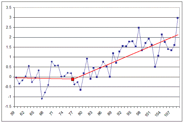
The overlap period of this new series is passed to a FORTRAN program called getfit. The purpose of getfit is to find a fit using regression analysis of a line with a break in slope somewhere in the middle (referred to as the knee). The slopes of the two lines are returned along with the coordinates of the knee. The following image is an example of what this program is trying to do.

knee_example.GIF

Continue reading

An R Package by a CA Reader Solves the Z Problem

CA reader, Nicholas, an extremely able computer analyst, has helped me with a number of problems with downloading data in compressed formats into R. One of the most annoying and heretofore unsolved problems was how to get Z files into R without having to handle them manually – a problem that I revisited recently when I looked at ICOADS data which is organized in over 2000 Z files.

Z files are an obsolete form of Unix compression that is not even mentioned at zlib.com nor was it supported at R. So if you wanted to analyze a Z file in R, you had to download the file, unzip it manually using WinZip or equivalent and then start again.

I presume that this obsolete format fits in a ecological niche with Fortran, an antique computer language (one that I learned over 40 years ago and which, in comparison with a modern language like R, seems about as relevant as medieval Latin). Since most climate scientists appear to live in an ecological niche with Fortran and Unix, many climate data sets are only available in Z files, e.g. USHCN, GHCN, ICOADS, although a number of data sets are available in NetCDF format, which is accessible in R through the ncdf package.

Nicholas figured out how to uncompress Z files and contributed a package “uncompress” to R, which is online and downloadable as of today. You can install R packages easily within a session using the Install Packages button. There are a couple of little tricks in using the package to extract ASCII data so you have to pay close attention to the example. I did a test this morning and it worked like a champ. Here was my trial session (after installing uncompress). The flag in the rawToChar command is set here for Unix lines, which will be the relevant option in most of our applications.

handle < – url("ftp://ftp.ncdc.noaa.gov/pub/data/ushcn/station.inventory.Z", "rb")
data <- readBin(handle, "raw", 9999999)
close(handle)
uncomp_data <- uncompress(data)
Data <- strsplit(rawToChar(uncomp_data), "\n")
Data = unlist(Data)

This returns an ASCII file, which can be handled conventionally using a variety of techniques. For large files, I usually use the substr command to parse columns out, but you could also write the file to a “temp.dat” file and read it using read.fwf or read.table or scan.

Anyway, it’s a great utility!!

PS. I asked any number of people about how to handle Z files in R without having to do it manually and got nowhere. I did learn about a number of annoying Windows mysteries and some interesting R techniques, which I’ll note here as a diary item. It turns out that you can run DOS commands out of R by using the system() command. The following command runs Firefox:
system(paste(‘”c:/Program Files/Mozilla Firefox/firefox.exe”‘,’-url cran.r-project.org’)) #
In order to run particular applications, on my machine in Windows, some would only run in a default directory. So the following command:
system(paste(‘”d:/Documents/gzip.exe”‘,’COPYING’))
dir()[12] # “COPYING.GZ”
system(paste(‘”d:/Documents/gunzip.exe”‘,’COPYING’))
dir()[12] # “COPYING”
worked, but they didn’t work in any other directory. Go figure.

Note – the R function gzfile handles gz files just fine; I was using the gzip.exe program only for testing DOS commands within R.

Homogeneity Adjustment – Part I

My curiosity in the mathematics behind the homogeneity adjustment caused me to finally take a close look at Hansen Step 2. This turned out to be an incredibly torturous task. A quote from a Stephen King short story, The Jaunt, came to mind as I plowed through lines of code: “It’s eternity in there…“. However, I think I’ve decoded enough of the information to begin explaining it in layman’s terms. Part I will deal with the process of preparing the data to be adjusted, while a future, planned post will describe the actual adjustment.

There are a number of programs involved in prepping the data for adjustment. Most are involved in reformatting, splitting, and trimming files. These programs don’t really do anything meaningful to the data, but it is important to understand the input and output file formats in order to follow the real work that takes place later. One prep program, toANNanom.exe, creates the seasonal and annual anomalies we have come to know and love on this blog.

The important program in data preparation is PApars.exe. It is one of the better commented programs in the set, but before the champagne is uncorked at NASA, it should be noted that it is about the only program containing comments. Detracting from the comments that do exist are the utterly confusing variable names and lack of formatting.

With that in mind, following is a summary of the preparation process this program undertakes.

The highlights of this summary are:

  1. Urban adjustments are not consistently based on rural stations from 0km to 1000km. Adjustments are based on stations from 0km to 500km, or on stations from 500km to 1000km, but never both.
  2. Rural stations in the range of 500km to 1000km carry the same weight as stations in the 250km to 500km range.
  3. The USHCN brightness index determines whether or not a station is rural or urban over most, but not all, of North America. For all other stations, the GHCN flag is used.

Continue reading

Upgrading WordPress

The site’s been crashing a lot lately. I’ve had to reboot it almost daily. We’re still on an old WordPress version and need to upgrade. Now that John A’s retired, the site has been on autopilot and needs a little bit of piloting. I would appreciate it if one of the regular readers with computer knowhow would volunteer to do this for me. Add-ons are listed by John A here – this looks a bit stale and I’m checking with John A. Contact me offline – see http://www.climateaudit.org/?page_id=778.

March 2008 Radiosonde Data

Relatively up-to-date radiosonde data is available from the Hadley Center, tropical (20N-20S) is here. Ratpac and Angell are not up to date. The tropical troposphere has been a source of disputes recently, but I haven’t seen any discussion of up-to-date radiosonde data, [Note: Luboš has a current discussion on radiosondes.)

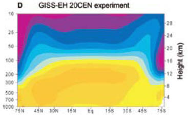
You will recall the diagram illustrating a hot spot around 200 hPA in the tropical troposphere. Here’s a diagram from realclimate which is the first figure in their post entitled “Tropical Troposphere Trends”.

hadat43.gif
Figure 1. Graphic from realclimate said to show the effect of doubled CO2 using GISS Model E.

Here’s a simple plot of tropical 200 hPa radiosonde data to March 2008 from Hadley Center.

hadat42.gif

Only one month in the entire history of the radiosonde record since its commencement in January 1958 had 200 hPa and 150 hPa anomalies below -1.2 deg C. It was March 2008. The trend since January 1979, the start of satellite records, is -0.025 deg C/decade. Yeah, I know that it’s just one month, but it’s still a “record”. It would be interesting to calculate the odds of a negative record on the hypothesis of (say) a positive trend of 0.1 deg C/decade. (Note that these data sets are highly autocorrelated and that ARMA(1,1) coefficients are both significant with an AR1 coefficient of over 0.9 in an ARMA(!,1) model – something that reduces “significance” of any trend quite noticeably).

Note: As observed below, the GISS graphic shows the effect of doubled CO2, while the increase in CO2 levels since 1960 to date has been 20%, and about 15% since the start of satellite records in 1979. On the basis of a logarithmic impact, the first 20% increase accounts for about 26% of the impact; and the 15% increase since 1979 about 20%. So it should be noticeable in either data set. In other posts on radiosonde data, I’ve observed that there are many issues with inhomogeneity in radiosonde data.

More: CCSP 1-1 and HadAT Radiosonde Data

The U.S. Climate Change Science Assessment Report 1-1 , a report to which Douglass et al 2007 were in part responding, contained graphics illustrating both HadAT radiosonde data trends from 1979-99 and GISS projections over the same period, so it’s interesting to compare their results to the updated information here.

First here is a graphic from the CCSP report, which, inter alia, shows their calculations of HadAT radiosone trends for 1979-99, followed by my calculation of the same trends for 1979-March 2008. It’s interesting that the HadAT pattern hasn’t really changed that much even with the incorporation of 10 more years.

hadat44.jpg
hadat45.gif
Top – Original caption: Figure 5.1: Vertical profiles of global-mean atmospheric temperature change over 1979 to 1999. Surface temperature changes are also shown. Results are from two different radiosonde data sets (HadAT2 and RATPAC; see Chapter 3) and from single forcing and combined forcing experiments performed with the Parallel Climate Model (PCM; Washington et al., 2000). PCM results for each forcing experiment are averages over four different realizations of that experiment. All trends were calculated with monthly mean anomaly data. Bottom — HadAt trends.

The CCSP report stated:

The pattern of temperature change estimated from HadAT2 radiosonde data is broadly similar, although the transition height between stratospheric cooling and tropospheric warming is noticeably lower than in the model simulations (Figure 5.7E). Another noticeable difference is that the HadAT2 data show a relative lack of warming in the tropical troposphere,66 where all four models simulate maximum warming. This particular aspect of the observed temperature-change pattern is very sensitive to data adjustments (Sherwood et al., 2005; Randel and Wu, 2006).

Below are their illustrations of GISS model projections 1979-99 compared to HadAt actuals. I’m not in a position to comment authoritatively on these graphics, but here are a couple of points that I find interesting. As I understand it, the top of the tropical tropopause is ∼18.7 km (70 mb). The GISS model shows warming right up to ~ 16 km (100 mb), both in the doubled and 20th century graphics, with cooling in the “blue” color code up to 25 km (25 mb). HadAt radiosonde data shows warming up to only about 12 km (250 mb), “blue” cooling from 12 km (250 mb) to 16 km (100 mb) and “purple” cooling from about 16 km (100 mb) to 25 km (25 mb) and higher.

The actual locus where additional CO2 has an immediate impact is at altitude, as more CO2 causes radiation to space to occur at a higher and colder altitude according to the Houghton heuristic cartoon. Getting the sign wrong in the 12-16 km is definitely a bit inconvenient and is not mere nit-picking and you can see why they are looking so hard at the observations to see if there’s some important inhomogeneity.

 hadat46.jpg  hadat47.jpg

Karl, T. R., Susan J. Hassol, Christopher D. Miller, and Willieam L. Murray. 2006. Temperature Trends in the Lower Atmosphere: Steps for Understanding and Reconciling Differences. Synthesis and Assessment Product. Climate Change Science Program and the Subcommittee on Global Change Research. http://www.climatescience.gov/Library/sap/sap1-1/finalreport/sap1-1-final-all.pdf.

More on Hurricanes

Continues http://www.climateaudit.org/?p=2988