I’m not sure McIntyre knows what ‘splicing’ is. To me it means cutting and joining two ends together. All Mann did was plot instrumental temperatures on the same axes, but he showed the whole record.
Dana Nuccitelli
There still seems to be a lot of confusion among Mann’s few remaining supporters as to why Phil Jones credited the “trick of adding in the real temps” to Mann’s Nature article (MBH98). Today I will review that topic.
Let’s first see what the Great Master himself says about the issue in his book of Fairy Tales:
In reality, neither “trick” nor “hide the decline” was referring to recent warming, but rather the far more mundane issue of how to compare proxy and instrumental temperature records. Jones was using the word trick in the same sense — to mean a clever approach — that I did in describing how in high school I figured out how to teach a computer to play tic-tac-toe or in college how to solve a model for high temperature superconductivity. He was referring, specifically, to an entirely legitimate plotting device for comparing two datasets on a single graph, as in our 1998 Nature article (MBH98) — hence “Mike’s Nature trick.”
With that explanation in hand you don’t need to be Mosher to ask the right question: why on Earth would Jones even mention that “trick”, when he didn’t use it in the WMO cover graph? He didn’t compare reconstructions to the instrumental record as there was no instrumental record plotted in the first place!
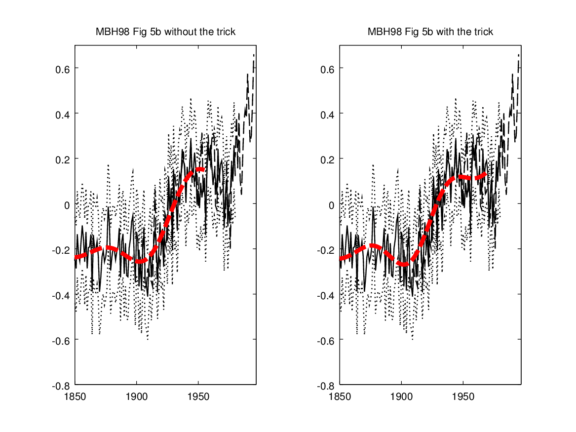
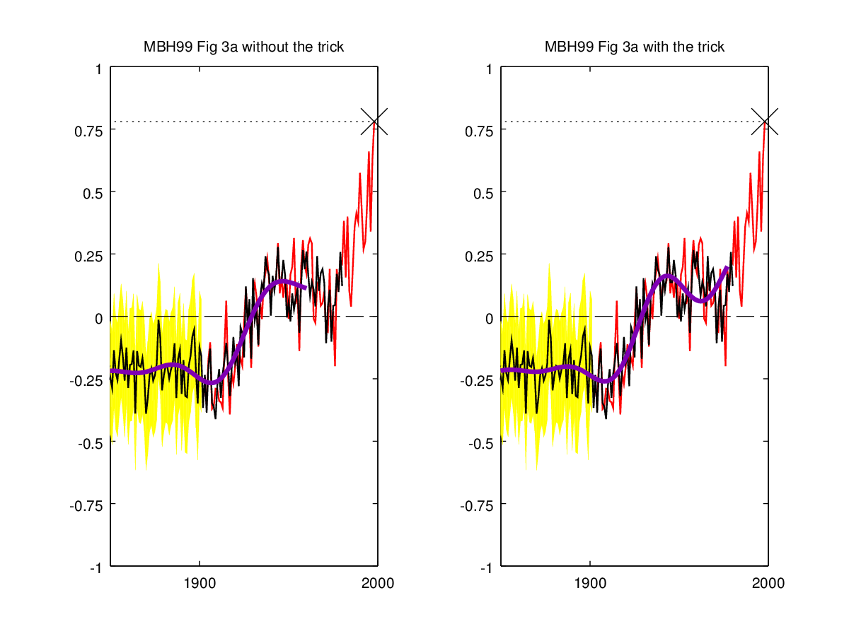
Let’s now see what was possibly known to Jones about the trick in MBH98 at the time of the email. The best known (at least for CA readers) example of the trick usage in MBH98 is obviously in the smoothed reconstruction of Figure 5b. This has been covered here so many times (for the exact parameters, see here), that I just show the “before” and “after” pictures as they seem popular. The MBH98 (Nature) plot (Figure 5b) is in B/W, and it is very fuzzy. That’s why I’ve plotted the smoothed curve in red, but otherwise I’ve tried to replicate the original figure as closely as possible. Here’s the relevant part without and with the trick:
 Here’s also the same for MBH99:
 The MBH98 plot is so blurry that the usage of the trick is actually very hard to spot. It is therefore valid to question if Jones actually
noticed it. In fact, given his track record of technical sophistication, I believe he did not (at least not from MBH98). However, he didn’t need to notice it as there are other more observable cases where the trick was used.
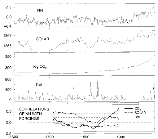
As originally observed by Steve years ago Mann is also extending the proxy record with the instrumental series in the MBH98 Figure 7 (top panel):

That is even clearly stated in the caption:
‘NH’, reconstructed NH temperature series from 1610–1980, updated with instrumental data from 1981–95.
The splicing can be further confirmed from the corresponding data file. There is a slight difference in the plot between the proxy and the instrumental part (solid vs. dotted), but it is important to notice that the instrumental and proxy records do not overlap. Instead the proxy record is clearly extended (“updated”) with the instrumental data.
What is even more important is the use of this trick in the attribution correlations (plotted in the bottom panel). Mann used the extended series in his attribution analysis, which in essence is just windowed correlations between the extended record and various “forcing” time series. In other words, last 15 points in the correlation plot (bottom panel) depend not only from the values of the (uncertain) proxy series but also from the (more certain) instrumental series. So one really shouldn’t be comparing the last 15 points to earlier values as it is a kind of apples to oranges comparison. Especially, the observation in the paper that
The partial correlation with CO2 indeed dominates over that of solar irradiance for the most recent 200-year interval, as increases in temperature and CO2 simultaneously accelerate through to the end of 1995, while solar irradiance levels off after the mid-twentieth century.
seems to be somewhat dependent on the trick. However, there are other more serious problems with the MBH98 attribution analysis, which is likely the reason why we didn’t delve into this more at the time.
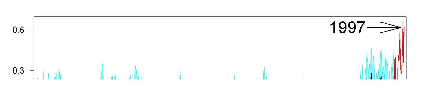
Jones didn’t have to notice even this correlation use of the trick in order to have grounds for attributing the trick to Mike’s Nature article! Namely, MBH98 may have been rather groundbreaking in that it had already an extensive Press Release along with press photos (and FAQ!). One of the photos (Figure 2) has the MBH98 reconstruction plotted. Unfortunately, it seems that the picture is not archived anywhere, and we only have a broken Postscript file available. Luckily the file opens just enough to confirm what is said in the figure caption.
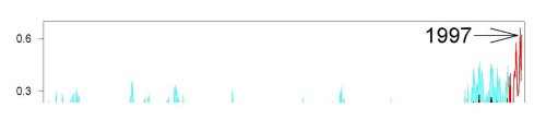
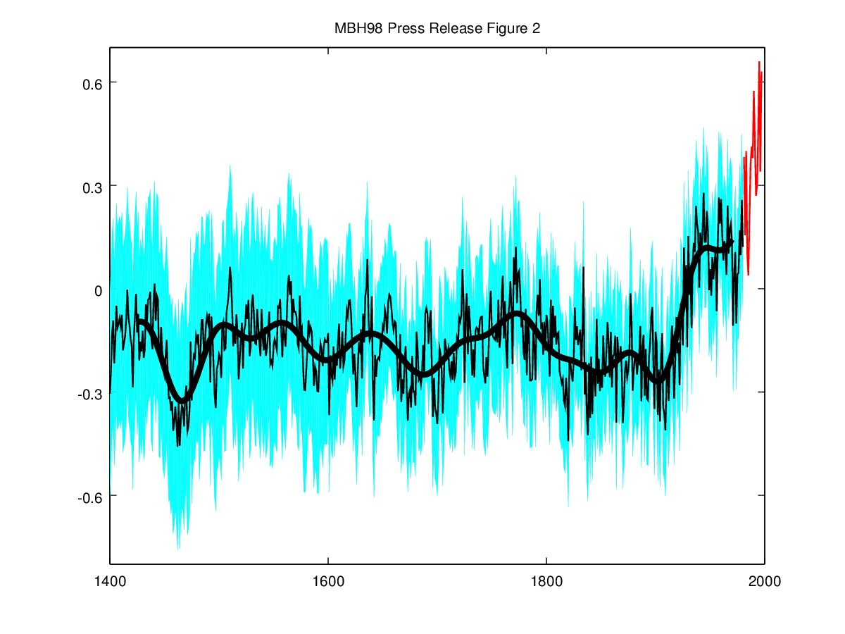
Original caption: Northern hemisphere mean annual temperature reconstruction in °C (thin black line) with 95% confidence bounds for the reconstruction shown by the light blue shading. The thick black line is a 50 year lowpass filter (filtering out all frequencies less than 50 years) of the reconstructed data. The zero (dashed) line corresponds to the 1902-1980 calibration mean, and raw data from 1981 to 1997 is shown in red.
Here’s my replication:

So Mann had plotted the reconstruction from 1400 to 1980 and again extended it (using different color) with the instrumental series for 1981-1997. In other words, as in Figure 7 but unlike in the later plots he did not plot the 1902-1980 part of the instrumental record alongside, i.e., there is no overlap between the reconstruction and the instrumental (and hence they can not be compared).
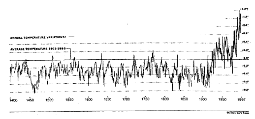
Additionally there exists one even more blatant use of the trick that is somewhat comparable to what Jones did (and Mann approved) in the WMO graph. Namely, five days after the publication of the MBH98, the New York Times published an article (by William K Stevens) titled “New Evidence Finds This Is Warmest Century in 600 Years” featuring the results. The article carried this picture:

Original Caption: ”Warmer Weather, Recently, in Northern Hemisphere” Researchers used thermometer readings and proxy data like tree rings, ice core samples and coral records to trace climate patterns over the past 600 years. The annual variations for those years from the average temperature for the years from 1902 until 1980 for the Northern Hemisphere are shown in the graph. For example, the graph shows that in 1400, the mean temperature was about 0.5 degree Fahrenheit cooler than the average annual temperature from 1902-1980. ANNUAL TEMPERATURE VARIATIONS — FROM RECONSTRUCTED PROXY DATA — THERMOMETER MEASUREMENTS (Source: Dr. Michael E. Mann, Dr. Raymond S. Bradley and Dr. Malcom K. Hughes)
The plotted series has an incredible splicing of the MBH98 reconstruction (1400-1901) with Mann’s instrumental series (1902-1997)! In other words, the 1902-1980 part of the actual reconstruction (or the uncertainty intervals) is nowhere to be seen (replaced by the instrumental). The splicing together with the fact that anomalies are given in Fahrenheits indicates that whoever produced the graph had an access to the actual data (not available in the extensive press kit). It would be interesting, if the NYT journalists, some of them for sure reading this, would dig up their archives for the full story of how the graph was produced and if there were any protests from the authors about this grotesque splicing. Here’s again my replication of the figure without and with the splicing:

For sure Jones had seen the figure as he is quoted in the article.
Other experts pointed to other caveats. One, Dr. Philip Jones of the University of East Anglia in England, questioned whether it was valid simply to extend the proxy record by adding the last 150 years of thermometer measurements to it. He said that would be a bit like juxtaposing apples and oranges.
I don’t blame him for mistaking a 96 years splice with a 150 years splice, but I wonder what or who made him to do a complete U-turn in the validity of the splicing in one and half years time? Finally, it is always good to keep in mind the words from the Great Master a few years later.
[Response: No researchers in this field have ever, to our knowledge, “grafted the thermometer record onto” any reconstruction. It is somewhat disappointing to find this specious claim (which we usually find originating from industry-funded climate disinformation websites) appearing in this forum. Most proxy reconstructions end somewhere around 1980, for the reasons discussed above. Often, as in the comparisons we show on this site, the instrumental record (which extends to present) is shown along with the reconstructions, and clearly distinguished from them (e.g. highlighted in red as here). Most studies seek to “validate” a reconstruction by showing that it independently reproduces instrumental estimates (e.g. early temperature data available during the 18th and 19th century) that were not used to ‘calibrate’ the proxy data. When this is done, it is indeed possible to quantitatively compare the instrumental record of the past few decades with earlier estimates from the proxy reconstruction, within the context of the estimated uncertainties in the reconstructed values (again see the comparisons here, with the instrumental record clearly distinguished in red, the proxy reconstructions indicated by e.g. blue or green, and the uncertainties indicated by shading). -mike]
Here’s the turn-key Octave code for reproducing the figures in this post.
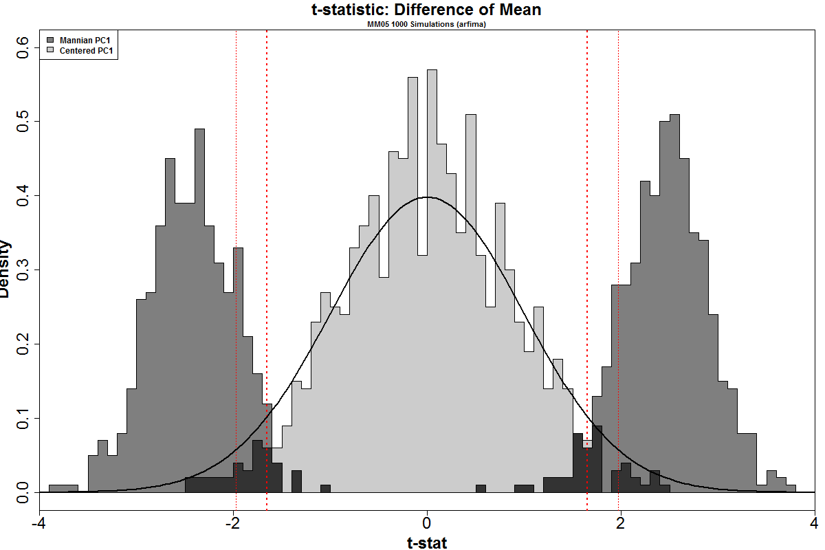







The distribution of the simulated t-statistic for centered PC1s is similar to a high-df t-distribution, though it appears to be somewhat overweighted to values near zero and underweighted on the tails: there are approximately half the values in the 5% and 10% tails that one would expect from the t-distribution. At present, I haven’t thought through potential implications.
The distribution of the simulated t-statistic for Mannian PC1s bears no relationship to the expected t-distribution. Values are concentrated in the tails: 85% of t-statistics for Mannian PC1s are in the 5% tails ( nearly 97% in the 10% tails.) This is what was shown in MM05 and it’s hard to understand why ClimateBallers contest this.
What This Means
The result is that Mannian PC1s “nearly always” (97% in 10% tails and 85% in 5% tails) produce series which have a “statistically significant” difference between the blade (1902-1980) and the shaft (1400-1901). If you are trying to do a meaningful analysis of whether there actually is a statistically meaningful difference between the 20th century and prior periods, it is impossible to contemplate a worse method and you have to go about it a different way. Fabrications by ClimateBallers, such as false claims that MM05 Figure 2 histograms were calculated from only 100 cherrypicked series, do not change this fact.
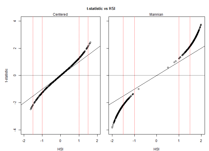
The comparison of the Mannian PC histogram to a conventional t-distribution curve also reinforces the degree to which the Mannian PCs are in the extreme tails of the t-dstribution. As noted above (and see Appendix), the t-stat is monotonically related to the HSI: rather than discussing the median HSI of 1.62, we can observe that the median t-stat for Mannian PC1s is 2.44, a value which is at the 99.2 percentile of the t-distribution. Even median Mannian PC1s are far into the right tail. The top-percentile Mannian PC1s illustrated in Wegman’s Figure 4.4 correspond to a t-statistic of approximately 3.49, which is at the 99.97 percentile of the t-distribution. While there is some difference in visual HS-ness, contrary to Stokes, both median and top-percentile Mannian PC1s have very strong HS appearance.
Stokes is presently attempting to argue that representation of a network through a biased Mannian PC1 is mitigated in the representation of the network, by accommodation in lower order PCs. However, Stokes has a poor grasp on the method as a whole and almost zero grasp of the properties of the proxies. When the biased PC method is combined with regression against 20th century trends, the spurious Mannian PC1s will be highly weighted. In our 2005 simulations of RE statistics (MM05-GRL, amended in MM05 (Reply to Huybers – the Reply containing new material), we showed that Mannian PC1s combined with networks of white noise yielded RE distributions that were completely different than those used in MBH98 and WA benchmarking. (WA acknowledged the problem, but shut their eyes.)
Nor, as I’ve repeatedly stated, did we argue that the MBH hockeystick arose from red noise: we observed that the powerful HS-data mining algorithm (Mannian principal components) placed the Graybill stripbark chronologies into the PC1 and misled Mann into thinking that they were the “dominant pattern of variance”. If they are not the “dominant pattern of variance” and merely a problematic lower order PC, then the premise of MBH98 no longer holds.
Appendix