U of Arizona Scientist Accuses NASA of Another Error

Pseudonymous U of Arizona climate scientist, Atmoz, has stated that the sharp increase of surface temperatures in 2000 in Lampasas TX recently reported at Climate Audit is not due to problems resulting from site relocation, but from an unidentified faulty algorithm (“UFA”) used by NASA.

Atmoz stated

Adjustments made by [NASA] GISS to this station seem to add an artifact that shows spurious warming since the year 2000.

He added:

The GISS temperature for this station has clearly “hockey-sticked” since the year 2000. I do not know the cause of this. But it is clearly a problem / feature of their algorithm and not an artifact in the data due to a station move.

“Amateur” reports on the Lampasas station had previously attributed the sudden increase in temperatures in 2000 to a station relocation from a park-like location to its present location surrounded by asphalt and a west-facing brick building. Atmoz rejects this explanation, saying that the amateurs failed to consider the possibility of a UFA.

Atmoz also reported the discovery of a USHCN station in Montana that is not located in a parking lot and that appears to comply with all WMO standards. Atmoz speculated that this news of contact with a USHCN station meeting all known WMO standards would not be reported at Climate Audit.

A Climate Audit spokesman said that they also welcomed the exciting news of contact and that they would immediately announce contact to their readers. He added that he was skeptical of Atmoz’ hypothesis that the Lampasas events were connected to another UFA at NASA, saying that other explanations still needed to be assessed.

A NOAA spokesman said that the agency had concerns about the news of contact and had already prepared contingency plans, including the potential relocation of the station to a nearby parking lot in Miles City, Montana shown in the picture below.

Atmoz is located in Tucson, Arizona, which pioneered the establishment of weather stations in parking lots long before Lampasas TX. Atmoz’ office overlooks the U of Arizona parking lot that hosts the weather station that has the highest temperature trend increase in the entire US Historical Climatology Network. Tucson is located in southern Arizona, approximately 350 miles to the west of Roswell, New Mexico.

Lampasas, Texas

The www.surfacestations.org project continues to collect new stations, though we could certainly use more help in the midwest, particularly Kansas, Nebraska, Oklahoma, and Texas.

This NOAA USHCN climate station of record #415018 in Lampasas, TX was found to be tucked between a building, and two parking lots, one with nearby vehicles. According to the surveyor, it is right next to the ACE Hardware store on the main street of town. While likely representative of the temperature for downtown Lampasas, one wonders how well it measures the climate of the region.

lampasas_tx_ushcn.jpg
View looking NE

In her survey, volunteer surveyor Julie K. Stacy noted the proximity to the building and parking, which will certainly affect Tmin at night due to IR radiance. Daytime Tmax is likely affected by the large amount of asphalt and concrete in the area around the sensor. The main street of the town (28 ft from US 183) and the ACE Hardware parking lot are visible in this photo below:

lampasas_tx_ushcn_south.jpg
View looking south

Google Earth shows just how much asphalt and buildings there are around the sensor.

According to NCDC’s MMS database, the Lampasas climate station has been at this location since 10-01-2000. Previous location was an observer residence, which appears to have been a park-like location according to MMS location map. The sensor was apparently converted to the MMTS style seen in the photo in 1986, so the move did not include an equipment change. See the complete survey album here.

But the big surprise of just how bad this location is came from the GISS plot of temperature. It clearly showed the results of the move to this location, causing a jump in temperature almost off the current graph scale. Note that before the move, the temperature trend of Lampasas was nearly flat from 1980-2000.

lampasas_tx_ushcn_plot.png
Click to see the full sized GISS record

Given the entropy of the current measurement environment, I have sincere doubts that anyone can create an adjustment that will ascertain an accurate trend from temperature data as badly polluted as this. In my opinion, this station’s post 2000 data needs to be removed from the climate record.

Since there has been some discussion about how well “adjustments” take care of such problems, I thought I’d show you just how well the GISS homogeneity adjustment works with this station.

Here is the GISS plot for Lampasas, TX with the GISS homogeneity applied, I’ve changed the color to red and labeled it to keep them visually separate from the raw data shown in the plot above.

lampasas_giss_homogeneity.png
click the plot to see the original plot from GISS

Now here is the GISS raw data plot with the homogeneity plot overlaid on it:

lampasas_giss_rawhomogen.png

The effect is quite clear. The recent “spurious” measurement remains unchanged, and the past gets colder.

The result? An artificial warming trend for this station that is created by GISTEMP adjustments.

Equal Area Projections

Many climate studies use an equirectangular projection, in which lines of latitude and longitude are equally spaced, to graphically summarize data. An example is the following figure from Hansen et al 1988, discussed here recently under the topic Hansen and Hot Summers:

John Goetz uses the same projection in his recent thread here, Historical Station Distribution

While this projection is handy for plotting locations, it unfortunately distorts areas by a factor of the secant of longitude. The result is that areas near the poles are greatly enlarged, albeit not by as big a factor as in the Mercator projection. The result is that a temperature anomaly near one of the poles, as in the lower panel of Hansen’s graph, will appear to be disproportionately important for average global temperature. Likewise in Goetz’s graphs, stations will appear to be far more sparse than they really are as we move away from the tropics.

In order to prevent this area distortion while retaining a rectangular map, the vertical axis must be compressed by a factor of the cosine of latitude in order to offset the secant effect. This is done in the 1772 Lambert Cylindrical Equal Area projection. The following image is linked from Carlos Furuti’s webpage on map projections:

Unfortunately, the Lambert projection greatly distorts shapes near the poles, and makes features difficult to locate. A much better option for presenting climate data without area distortion is the 1805 Mollweide projection

I posted these graphs earlier as comments (#62, 73) on the Historical Station Distribution thread, but as they were somewhat offtopic there and of interest in their own right, I am reposting them here.

In a comment on that thread (#66), Steve McIntyre has already remarked,

#62. Equi-area projections are used in many contexts. In terms of graphic presentations, you’re 100% right and anything other than equi-areal should be banned from scientific journals.

In practical terms at my level, the only issue is the availability of routines in R (and for someone else Matlab). Doug Nychka of NCAR maintains the R-package fields. He’s very responsive to inquiries. I’ll check the manual and otherwise check with him.

and (#71),

http://cran.r-project.org/doc/packages/mapproj.pdf has a package with equi-area maps.

Somebody should be able to locate parameters that yield a “good” map for representing areas in climate contexts.

Mr. Pete, #76, remarked, “If you modify latitude by sin(lat in radians) you get the simplest equal-area projection. No need to use fancier things for basic display.”

This is what is known as the Sinusoidal projection

I like the Mollweide much better, as it gives far less shape distortion, and uses the available space better: Both are the width of the equator and the height of the prime meridian.

However, Mollweide uses fraction \frac{\pi}{4} = .79 of this box, while the Sinusoidal only uses \frac{2}{\pi} = .64 of this box. Thus, Mollweide gives about 23% more informational area within the same size figure.

The formula for Mollweide is a little complicated, and involves solving a transcendental equation numerically (see above Wikipedia article for formula or Furuti’s site for derivation). However, if Mollweide could solve this with an 1805-vintage analog computer (pencil, paper, compass, straightedge and French curve), a modern digital computer should have no problem with it either.

Data Smoothing and Spurious Correlation

Allan Macrae has posted an interesting study at ICECAP. In the study he argues that the changes in temperature (tropospheric and surface) precede the changes in atmospheric CO2 by nine months. Thus, he says, CO2 cannot be the source of the changes in temperature, because it follows those changes.

Being a curious and generally disbelieving sort of fellow, I thought I’d take a look to see if his claims were true. I got the three datasets (CO2, tropospheric, and surface temperatures), and I have posted them up here. These show the actual data, not the month-to-month changes.

In the Macrae study, he used smoothed datasets (12 month average) of the month-to-month change in temperature (∆T) and CO2 (∆CO2) to establish the lag between the change in CO2 and temperature . Accordingly, I did the same. My initial graph of the raw and smoothed data looked like this:

Figure 1. Cross-correlations of raw and 12-month smoothed UAH MSU Lower Tropospheric Temperature change (∆T) and Mauna Loa CO2 change (∆CO2). Smoothing is done with a Gaussian average, with a “Full Width to Half Maximum” (FWHM) width of 12 months (brown line). Red line is correlation of raw (unsmoothed) data. Black circle shows peak correlation.

At first glance, this seemed to confirm his study. The smoothed datasets do indeed have a strong correlation of about 0.6 with a lag of nine months (indicated by the black circle). However, I didn’t like the looks of the averaged data. The cycle looked artificial. And more to the point, I didn’t see anything resembling a correlation at a lag of nine months in the unsmoothed data.

Normally, if there is indeed a correlation that involves a lag, the unsmoothed data will show that correlation, although it will usually be stronger when it is smoothed. In addition, there will be a correlation on either side of the peak which is somewhat smaller than at the peak. So if there is a peak at say 9 months in the unsmoothed data, there will be positive (but smaller) correlations at 8 and 10 months. However, in this case, with the unsmoothed data there is a negative correlation for 7, 8, and 9 months lag.

Now Steve McIntyre has posted somewhere about how averaging can actually create spurious correlations (although my google-fu was not strong enough to find it). I suspected that the correlation between these datasets was spurious, so I decided to look at different smoothing lengths. These look like this:

Figure 2. Cross-correlations of raw and smoothed UAH MSU Lower Tropospheric Temperature change (∆T) and Mauna Loa CO2 change (∆CO2). Smoothing is done with a Gaussian average, with a “Full Width to Half Maximum” (FWHM) width as given in the legend. Black circles shows peak correlation for various smoothing widths.

Note what happens as the smoothing filter width is increased. What start out as separate tiny peaks at about 3-5 and 11-14 months end up being combined into a single large peak at around nine months. Note also how the lag of the peak correlation changes as the smoothing window is widened. It starts with a lag of about 4 months (2 mo and 6 month smoothing). As the smoothing window increases, the lag increases as well, all the way up to 17 months for the 48 month smoothing. Which one is correct, if any?

To investigate what happens with random noise, I constructed a pair of series with similar autoregressions, and I looked at the lagged correlations. The original dataset is positively autocorrelated (sometimes called “red” noise). In general, the change (∆T or ∆CO2) in a positively autocorrelated dataset is negatively autocorrelated (sometimes called “blue noise”). Since the data under investigation is blue, I used blue random noise with the same negative autocorrelation for my test of random data.

This was my first result using random data:

Figure 3. Cross-correlations of raw and smoothed random (blue noise) datasets. Smoothing is done with a Gaussian average, with a “Full Width to Half Maximum” (FWHM) width as given in the legend. Black circles show peak correlations for various smoothings.

Note that as the smoothing window increases in width, we see the same kind of changes we saw in the temperature/CO2 comparison. There appears to be a correlation between the smoothed random series, with a lag of about 7 months. In addition, as the smoothing window widens, the maximum point is pushed over, until it occurs at a lag which does not show any correlation in the raw data.

After making the first graph of the effect of smoothing width on random blue noise, I noticed that the curves were still rising on the right. So I graphed the correlations out to 60 months. This is the result:

Figure 4. Rescaling of Figure 3, showing the effect of lags out to 60 months.

Note how, once again, the smoothing (even for as short a period as six months, green line) converts a non-descript region (say lag +30 to +60, right part of the graph) into a high correlation region, by the lumping together of individual peaks. Remember, this was just random blue noise, none of these are represent real lagged relationships despite the high correlation.

My general conclusion from all of this is to avoid looking for lagged correlations in smoothed datasets, they’ll lie to you. I was surprised by the creation of apparent, but totally spurious, lagged correlations when the data is smoothed.

And for the $64,000 question … is the correlation found in the Macrae study valid, or spurious? I truly don’t know, although I strongly suspect that it is spurious. But how can we tell?

My best to everyone,

w.

Historical Station Distribution

In his comment to How much Estimation is too much Estimation?, Anthony Watts suggested I create a scatter plot showing station distribution with latitude/longitude. It turned out not to be the ordeal I thought it might be, so I have posted some of the results in this thread. I started with 1885 and created a plot every 20 years, ending in 2005. I deliberately ended with 2005 because this is the final year in the GHCN record prior to the US station die-off of 2006.

Every dot on a plot represents a station, not a scribal record. Stations may be comprised of multiple records. A blue dot represents a station with an annual average that was fully calculated from existing monthly averages. A red dot represents a station that had missing monthly averages for that year, so the annual average had to be estimated. Stations that had insufficient data to estimate an annual average are not shown.

In the case where multiple scribal records exist for a station in the given year, I assigned a blue dot if all records were fully calculated from existing averages, a red dot if at least one record was estimated, and no dot if none of the records could produce an estimate. I believe this errs in the direction of assigning more blue dots than is deserved. Hansen’s bias method mathematically forces estimation to occur during the period of scribal record overlap.

The first plot shows coverage in 1885, five years into the GHCN record.

sc1885.gif

Continue reading

How much Estimation is too much Estimation?

Back in September when I was busy trying to figure out how Hansen combined station data, I was bothered by the fact that he used annual averages as the basis for combining scribal records (via the “bias method”) rather than monthly averages, which are readily available in the records that he uses. In my thinking, the use of monthly averages would provide twelve times the number of data points to use for combining records. I thought this particularly important when MCDW records were combined with older records, because the period of overlap tended to only be about four years. Forty-eight data points must be better than four, correct?

Even worse, we learned at the time that the first annual average in every scribal record is estimated. This is because the annual average is calculated from the seasonal averages, and the winter season (DJF) uses the December temperature from the previous year. Unfortunately, the previous year’s December temperature is not included in the first year of a scribal record, so it must be estimated. And because December must be estimated, the resulting DJF is an estimate, as is the resulting annual temperature. In the end, MCDW records tend to be combined with older records using three actual annual averages and one estimated average, instead of using forty-eight actual monthly averages.

As I worked through the puzzle there seemed to be a lot of estimating going on, more than just the beginning of a scribal record. There are a lot of “999.9” monthly values in Hansen’s data (this equates to the “-9999” entries in the raw GHCN data), but he still manages to calculate a lot of annual averages. As we later learned, Hansen’s estimation algorithm enables him to estimate an annual average when up to six monthly averages are missing. Following are three examples of his estimation algorithm at work. I had downloaded the data for the stations below on August 31, and at that time each station already had an estimate for 2007. Compare the estimate with the actual value calculated at the end of 2007:

Bagdarin: estimated -4.88 (May, Aug-Nov missing), recent estimate -4.39 (May data still missing)
Erbogacin: estimated -4.05 (Feb, Aug-Nov missing), actual -4.71 (all months available)
Budapest-Lori: estimated 13.57 (Aug-Nov missing), actual 12.66 (all months available)

Recently, I began wondering just how much estimation is going on. On February 7 I downloaded the raw GHCN data (v2.mean.Z) from the NOAA FTP site to see if I could get a handle on how much estimation Hansen does by examining the frequency of missing monthly data. Hansen does not use every single record from this dataset, but he does use almost all of them. Thus, an analysis of the GHCN data should provide a close approximation of how much estimation Hansen does. Yes, I am estimating the amount of estimation. It was either that or scrape the data off GISS, and frankly I don’t have the patience for that.

I think you will find the results of this analysis interesting. Continue reading

Unthreaded #31

Can I recommend that contributors to Unthreaded conversations use the message board instead?

Update: Several people have reported problems seeing CA properly or posting comments. Apparently this is something to do with corrupt cookies in your browser. Deleting the ones relating to climateaudit.org appears to fix the problem

Off to Georgia Tech

I’m going to Georgia Tech for a couple of days at the kind invitation of JEG (Julien Emile-Geay) and Judith Curry. I’ll be presenting at their Friday afternoon EAS seminar series (http://www.eas.gatech.edu/school/seminars/) (3:30 to 4:30), which is geared towards a broad scientific audience. In addition, I’ll be spending time with each of the protagonists, plus the students of the Hockey Stick class, plus two dinners out. So it should be fun.

I’ve given invited presentations to a National Academy of Sciences panel, a subcommittee of the House Energy and Commerce Committee, an AGU Union session, but I’ve never given a presentation to a university seminar before. So this will be my first university seminar presentation.

It will also be my first presentation to climate scientists at a university. (Despite the wide coverage, I’ve only been invited to give one presentation to a university class – to Sinan Unur’s economics class.)

I think that I’m detecting a bit of a change in attitude among some climate scientists, especially younger ones. I’ve mentioned previously that a couple of young scientists at the 2006 AGU said that they thought that I had pretty much killed the Hockey Team studies and that the only way forward was through new and much improved data – which might take 10-20 years – something that I suspect is correct. This was obviously not the official viewpoint subsequently expressed in IPCC chapter 6 (but even there, as we now see from the Review Editor comments, there were some concerns on this section.) In 2006, they required that their identities be kept confidential.

At the 2006 AGU session, an enraged Malcolm Hughes said that there were so many errors in my presentation that he didn’t know where to start. If I’d been a little more alert in my repartee, I’d have suggested that he start by archiving his bristlecone data, but on my feet before an audience, I’m not Winston Churchill.

At the 2007 AGU, as I mentioned before, I was pleased by the very cordial attitude of several of the biggest names in paleo-oceanography. A lot of people came to my poster, mostly to introduce themselves and to encourage me.

JEG and Judith Curry have both been welcome visitors to this blog and, while they don’t necessarily agree with very much that I say, they’ve been brave enough to defend the proprietor of this blog to third parties, which I appreciate.

Young scientists are by nature probing their science – that’s what makes things “self-correcting”. Despite my calendar age, I’m relatively new at this particular game – I’ve been doing this about the same length of time as a grad student or post-doc. In lots of ways, I have more in common with young scientists than middle-aged scientists keen on defending their corpus.

Although I’m stepping on an airplane this afternoon (snow permitting), I’m still wrestling with what I’m going to say. I’ve been given a title designed to cover any eventuality: “Climate reconstructions of the past millennium : statistical considerations”. I haven’t really done much on the HS front for a while; the counterattacks in Wahl and Ammann 2007, Mann et al 2007 and Juckes et al 2007, didn’t raise any issues that I found interesting. One of the Nature reviewers in 2004 (who was probably Jolliffe) said of Mann’s response that he was particularly unimpressed with their attitude that by “shouting longer and louder they must be right”. Wahl and Ammann, in particularly, merely lengthened Mann’s 2004 reply submitted to Nature (though they nowhere even acknowledge Mann).

When I re-visited matters HS in preparation for the Georgia Tech presentation, I found myself drawn to three lines of thought, all of which have been discussed at the blog, but not all of which are easy to present to a general audience.

First, I found myself wanting to go back and discuss the linear algebra involved in reconstructions, showing how reconstructions could be placed in a more general statistical context (for example, that MBH98 could be simplified to weighting the proxies by correlation and that, in turn, was equivalent to Partial Least Squares.) And that there were all kinds of multivariate methods, with RegEM not being any sort of magic recipe. It’s hard to imagine anything less interesting to third parties than some linear algebra, but I’ve developed some relationships that I think are quite pretty and I’d like to give it a try. I’ll mull it over on the plane.

Second, on the basis that people accepted that statistical precautions were actually required for Team reconstructions, I fond myself wanting to review some of the econometric discussion of “spurious regression”. Many of the issues in dispute in proxy reconstructions were fought over long ago in econometrics, which confronted the problem of high correlation statistics (in Juckes’ terms, 99.999% significant) between series that had no possible connection – Yule’s famous example of the relationship between mortality and the proportion of C of E marriages or Hendry’s later example explaining inflation in terms of cumulative rainfall. For recons based on bristlecones or the Yamal reconstruction, the $64 question is whether the relationships that underlie Team studies are spurious or not. In this respect, the econometrics literature is far more aware of the risks of data mining – and, in particular, of cumulative data mining.

I found a great segue from these issues to some very specific proxy series that I think that I should discuss from Greene’s article on data mining:

But testing in un-mined data sets is a difficult standard to meet only to the extent one is impatient. There is a simple and honest way to avoid invalid testing. To be specific, suppose in 1980 one surveys the literature on money demand and decides the models could be improved. File the proposed improvement away until 2010 and test the new model over data with a starting date of 1981.

It’s impossible not to confront this with the IPCC AR4 statement in respect to divergence:

the possibility of investigating these issues further [a limit on the potential to reconstruct possible warm periods in earlier times] is restricted by the lack of recent tree ring data at most of the sites from which tree ring data discussed in this chapter were acquired.” (p. 473)

and then to show some slides and results from Almagre, which, among other things, showed that Colorado dendros could have a morning Starbucks and update bristlecones in the same day, a possibility that we’ve not proved for California, but which I suspect to be true there as well.

At this point, the inconsistency between versions at key sites (Sheep Mountain, Tornetrask, Polar Urals) becomes much more than a nit. In each case, there is a widely used version with a modern period that is warmer than the MWP (Graybill at Sheep Mountain, Briffa at Tornetrask and Briffa at Polar Urals). In each case, subsequent data has eliminated the modern-medieval differential (Ababneh 2006, 2007 at Sheep Mt; Grudd 2006, 2008 at Tornetrask and Schweingruber’s 1998 data at Polar Urals (in Esper 2002). In each case, later more ecological studies (Miller et al 2006 in California; Naurzbaev et al 2004 in Siberia) raise questions about the interpretations of the earlier studies.

In the ice core area, some dO18 series go up in the 20th century, some go down. I’m not sure that you can deduce very much.

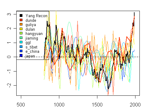
Loehle did a new collection of data showing an MWP, but you don’t even need to add a new proxy compilation into the brew. You can get MWPs merely by taking variants of the key data sets in the canonical studies.

People can huff and puff all they like about multivariate methods, and, while there are many interesting statistical issues, at the end of the day, the results are being driven by the data and until the data is stable in individual localities, I don’t think that there’s much that can be concluded. And this means not just collecting more and new data, but reconciling completely to prior data, reconciling to ecological information in the area, better data recording, better data archiving.

If I keep writing this post any longer, I may actually figure out what I’m going to say.

Anyway, I’m looking forward to the trip.

Curry Reviews Jablonowski and Williamson

Jablonowski and Williamson is here. Judith’s review follows. Continue reading

IPCC and the Dunde Variations

There’s not much in climate science that annoys me more than the sniveling acquiescence of government bureaucrats in Lonnie Thompson’s flouting of data archiving policies. To his credit, Thompson has collected unique data. To his shame, Thompson has failed to archive data collected as long as 20 years ago. This would be bad enough if the versions were consistent in all publications on Dunde. But Thompson seems to have tinkered with his results over the years so that there has been an accumulation of inconsistent versions, compromising any ability to properly use this unique data. Needless to say, mere compromising of the data hasn’t stopped climate scientists from using Thompson data.

From time to time, as an exercise, I experiment with the different versions of the data, rather like a manuscript scholar looking at variations in medieval copies of ancient manuscripts to try to reconstruct the original manuscript. Today I noticed something odd even for climate “science” data. I had originally picked up this file because I was interested in the impact of consecutive smoothing and scaling of Thompson data in one of the important contributors to the modern proxy canon, the Yang et al 2002 China reconstruction, illlustrated in IPCC AR4 Box 4 below and a component of virtually every reconstruction since Mann and Jones 2003(e.g. Moberg et al 2006, Osborn and Briffa 2006, Hegerl et al 2007, Juckes et al 2007). The IPCC illustration is shown below, with the Yang composite being the maroon series (E Asia) ending at just over 3 sd units.

yang_258.jpg
IPCC AR4 Box 6.4 Figure 1

The Yang series was originally created as a composite of 9 heterogeneous Chines proxy series, two of which were Thompson ice core dO18 (Dunde, Guliya). There are a couple of Yang versions, somewhat differently weighted. While Loehle critics have been quick to (correctly) notice that many contributing series end in mid-20th century, the ending of half the Yang series in mid-century has not been given equal attention. Only 4 of 9 series continue to 1990, of which two are the two Thompson ice cores, which end up dominating the results by the close. The next figure plots the 9 Yang proxy series, together with the composite (also re-scaled), as a spaghetti graph of scaled series. One of the interesting aspects of the re-scaling of the composite (which was done in the IPCC graphic) is that none of the individual components are at 3 sd units at the close. The E China documentary series is only at about 0.5 sd units.

yang_259.gif

To show a little better detail, here is the 1850-2000 portion of the data blown up. Notice the very high closing value of the re-scaled Dunde series and the great smoothness of the Dunde data used here.

yang_260.gif

The smoothness of the Dunde data used here contrasts with the smoothness in other data sets – here’s a spaghetti graph that I’ve shown previously. Obviously it’s not that the underlying Dunde data is all that smooth; it’s that Yang et al 2002 has used a “grey” version available in 50 year intervals, the most recent values being …1840, 1890, 1940, 1990. The use of closing values of smoothed series has come up in other contexts – Loehle critics were quick on this issue. Have you noticed these critics being equally attentive to the Yang data? Didn’t think so. If this 50-year version were (absurdly) to be used, then presumably it should end in 1965 rather than 1990, which, by itself, would have a noticeable impact on the closing 1990 uptick of the Yang composite.

Yang’s use of this smoothed 50-year version shows once again the impact of Thompson’s abysmal archiving practices. Had Thompson properly archived his data, then Yang would presumably have used a sensible version of the data.

There are also some interesting statistical issues raised here. Look at what Yang is averaging. The Dunde data has been changed into 50-year averages; other series are at 10-year resolution. Yang converted the smoothed series back to 10-year series – without the original decadal resolution. The scaling process used by Yang (and typical of climate science) made no allowance for the prior smoothing in calculating the standard deviation. Thus the amplitude of the Yang Dunde version ended up being inflated, relative to the other series. The Yang Composite (with inflated contributions of smoothed series), in Briffa’s hands, is once again scaled to unit standard deviation. Again, this is a much smoother series than (say) the West Greenland series and ends up with low-frequency variation being inflated relative to the West Greenland series. Although the Yang Dunde version shown below (purple) looks like it has minimal variation relative to the other versions, this version ends up yielding a 3 sd unit contribution to the IPCC spaghetti graph. Hey, it’s climate “science”.

yang_261.gif
Figure 3. Dunde Versions.

As I was parsing through this, I thought that it would be interesting to plot the various Thompson versions from annual scale up i.e. first plot only those versions with annual detail, then gradually smooth each one comparing to smoothed versions on an apples-to-apples basis. This resulted in something very unexpected.

First here is a plot of three versions at 3-year smooth (using two annual versions here and one 3-year smooth.) One is a smooth of the grey Dunde version in the MBH98 archive; the other two are digitizations of figures from Yao et al 2006 (Figure 6, Figure 4). The most striking difference is obviously the date of peak 20th century dO!8 values – more on this in the next graph.

yang_263.gif

In the next graph, I’ve increased the smooth to 5 years, adding in the PNAS version (already in 5-year intervals.) In a scribal sense, the Thompson’s PNAS 2006 version appears to be identical to 5-year averages of the grey data used in MBH98 (with the last few years not used) – confirming that the grey MBH98 version can be treated as the annual version of PNAS data. Unfortunately the Yao et al 2006 version has a different result (and yes, Thompson, is a coauthor of Yao et al 2006 as well.) One version has peak dO18 values in the 1950s and one in the 1930s. So here we have the remarkable spectacle of Thompson publishing different results in the same year (2006). And no one cares. Even though NAS requires data to be archived, Ralph Cicerone, who had personally reviewed Thompson’s article, did not require Thompson to archive the underlying data to reconcile the difference – even after a formal complaint. And climate “scientists” don’t care.

yang_269.gif

I’ve posted this sort of observation before. Here’s the new point. In the next plot, I went to 10-smoothing, adding in the Climatic Change 2003 version in its original form (10-year averages.) Once again, as you see, the smoothed MBH98 grey version and the PNAS versions track one another relatively closely with the Yao 2006 version being different. The Climatic Change 2003 version is different again – the differences around 1700 are especially noticeable.

yang_266.gif

You say- well, you’ve already observed that there are different versions, so what? Here’s what intrigued me. The Climatic Change 2003 version is intermediate in date between the similar MBH98 and PNAS 2006 versions. So it doesn’t appear that Thompson has consistently implemented some changes. The 2003 version (Clim Chg) implemented a lot of changes from the 1998 version (MBH grey version), but the 2006 PNAS version seems to have reverted back to the 1998 version, abandoning the 2003 changes. The Yao et al 2006 version looks like it might be related to the 2003 edition, but who can say with certainty?

No composite should be constructed using the 50-year Dunde version. The Yang et al 2002 China composite should not be used – indeed even Phil Jones avoided its use in Jones and Mann 2004. But the strong uptick in the Yang Composite has been too tempting a poison fruit for climate scientists, and has been willing consumed in Moberg et al 2005; Osborn and Briffa 2006; Hegerl et al 2007; Juckes et al 2007 and IPCC AR4.

YAO Tandong, Zexia LI, Lonnie G. THOMPSON, Ellen MOSLEY-THOMPSON, Youqing WANG, Lide TIAN, Ninglian WANG, Keqin DUAN, 2006. d18O records from Tibetan ice cores reveal differences in climatic changes, Annals of Glaciology 43 2006 1-7.