Polar Urals Update and Jones et al 1998

I showed a little while ago the impact of the Polar Urals update on the Briffa 2000 reconstruction – using it instead of the Yamal substitution resulted in an MWP index higher than the 20th century.

Today I’ve done the same calculation for Jones et al 1998, this time substituting the Polar Urals update using additional 1998 information (from Esper et al 2002) for the earlier Briffa version. I’d more or less surmised this, but the beauty of using the Esper version is that I don’t have to argue or justify my RCS calculation, since Esper’s already done it.

With the Polar Urals update, the 20th century Jones et al 1998 index is no longer higher in the 20th century than the MWP. This is from merely replacing one series with an update used in a later multiproxy study.
Continue reading

More on Mongolia

Rob Wilson wrote in today pointing out that D’Arrigo et al 2006 had obtained a correlation to gridcell temperature of 0.58 for the Jacoby Mongolia site chronology, working from original data and not relying on hand-me-down data from Mann and Jones. This is actually higher than the 0.25 reported by Mann and Jones for annual correlation, which, regardless of whatever is the "correct" answer, is a disquieting difference for a simple calculation between a gridcell temperature series and a tree ring site chronology – a calculation which should reconcile exactly.

However, it turned out that this correlation was not to the actual gridcell containing the Sol Dav site (48N, 98E) but to the northeast contiguous gridcell 100-105E, containing Irkutsk, Russia. So this rises an interesting question about the effect of "picking" from 9 candidate gridcells, as the results vary dramatically from gridcell to gridcell. Continue reading

Another blog update

As a test, a couple of changes have been made to the blog as a result of some pathetic pleading by our commentators:

1. If you cast your eyes to the right hand side, you will see that the recent comments are sorted into threads. This is to prevent one popular thread from flooding the recent comments so that no others can be seen. A maximum of five different threads can appear with their own list of recent comments.

2. Commenters can now put inline images into comments using the tag < img src="http://url-to-image&quot; style="width: 800px; height: 600px;" />. Please do not put in images larger than 800×600 without using the width: and height: parameters so as not to have the pictures disappear partially under the sidebar, or cause any other nasty things to happen.

If the image is smaller than 800×600 then you can omit the style="width: 800px; height: 600px;"

I need hardly add that any abuse of this facility to post inappropriate images will result in banning without warning regardless of the commenters self-perceived expertise in climate science or personal philosophy of freedom of expression.

As an example, (and note: I’ve put an extra space between the < and img so that it won’t be interpreted as a tag, but you’ll have to leave it out), the code
< img src="http://home.casema.nl/errenwijlens/co2/polyakov.gif&quot; />
will produce

These facilities have been added as a test – Steve may decide to withdraw them if he feels they are detrimental.

Jacoby in Mongolia

Trying to check even simple things like the correlation of individual Osborn and Briffa 2006 series to gridcell temperature always leads to complications. Today I’ll look at the situation with respect to Jacoby’s Sol Dav, Mongolia series, one of the 6-7 mainstays of Hockey Team reconstructions.

Needless to say, nothing can be confirmed. Instead of a claimed correlation of temperature of 0.40, I can only confirm a correlation of 0.03. (This is without considering degrees of freedom – there are only 5 decades of records.) Additionally, it seems that Osborn and Briffa 2006 have rested their conclusions about temperature correlations on data obtained by scanning an article, rather than using original data, in this case, seemingly using a scanned version from Mann and Jones when a digital version from Esper should theoretically have been available to them.
Continue reading

Bristlecones, Foxtails and Temperature

The relationship of bristlecone/foxtails to gridcell temperature is something that I’ve discussed at length, but, surprisingly, I’ve never illustrated it at the blog. This is a type of relationship that, in some ways, is well suited to blogs. It’s simple to discuss; it’s important. It would be amply illustrated and discussed in business feasibility studies for equivalent issues, but one tends to simply cite the statistics rather than illustrate them in detail in an academic article.

I was reminded of this relationship both by re-visiting Osborn and Briffa and by an interesting recent presentation by John Christy. Despite the claims of Osborn and Briffa, I am simply unable to verify their claims of a significant relationship. Their statistical presentation appears to have neglected the most elementary considerations, such as calculating a t-statistic as a method of assessing significance in light of degrees of freedom.

Read and weep. Continue reading

Making Hockey Sticks the Jones Way

I discussed Fisher’s Greenland dO!8 proxy yesterday and thought that it would be interesting to discuss its particular function in hockey stick manufacture in Jones et al 1998. Each hockey stick is, after all, made by a master craftsman. The Greenland dO18 is one of only 10 series in Jones et al 1998. Let’s see if we can figure out exactly what its particular function in making a good hockey stick and why it was chosen. Continue reading

Greenland

Here’s an example of how one can wander off curious little by-ways in trying to replicate Hockey Team materials. I’m working on the seemingly simple task of testing the correlations to gridcell temperature in Osborn and Briffa 2006. One of the series – a "quiet" series – is Fisher’s "West Greenland dO18 Stack". Also with Svalbard in the news so to speak, and Jean S posting up about Norwegian temperatures, I thought it would be interesting to look at some Greenland temperatures as well. Continue reading

Rutherford 2005 and the Divergence Problem

Rutherford et al 2005 (the et al being half the Hockey Team: Mann, Bradley, Hughes, Briffa, Jones, Osborn) is a re-statement of the MBH98 network (flawed PCs and all) and the Briffa et al 2001 network using RegEM. I haven’t figured out exactly what the properties of the RegEM method are as compared to other multivariate methods, but that’s a story for another day. This is the article where they first put forward the idea that the verification r2 is a "flawed" statistic.

While one could seek to estimate verification skill with the square of the Pearson correlation measure (r2), this metric can be misleading when, as is the case in paleoclimate reconstructions of past centuries, changes are likely in mean or variance outside the calibration period. To aid the reader in interpreting the verification diagnostics, and to illustrate the shortcomings of r2 as a diagnostic of reconstructive skill, we provide some synthetic examples that show three possible reconstructions of a series and the RE, CE, and r2 scores for each (supplementary material available online at http://fox.rwu.edu/~rutherfo/supplements/jclim2003a)

In our discussion of verification statistics, we’ve not argued that a verification r2 is sufficient for model success, only that it’s necessary. So their illustration has nothing to do with any actual argument that we’ve ever made. But, hey, they’re the Hockey Team. Their illustration of the above paragraph showed the following "synthetic" example where there is high verification r2 with poor model behavior.

Figure 1. verifexample.pdf top panel from Rutherford et al 2005 SI

It seems hard to imagine a real-world model where you would actually get an r2 of 1 and lose track of the mean level so badly. Actual statisticians (as opposed to “I am not a statistician” statisticians) use other methods to test for situations like this – a Durbin-Watson statistic would have picked up this sort of situation effortlessly. There’s no real need for the Hockey Team to re-invent time series statistics. If they think that they’ve proved something about the r2 statistic, they should submit it to a real statisticl journal and not just push it by Andrew Weaver at Journal of Climate. It’s embarrassing that the Journal of Climate, which has published much sophisticated and interesting material in the past, should, under Andrew Weaver’s watch, publish such a juvenile sketch.

However, for today’s little irony, they really didn’t need to invent a synthetic example. I’ll rotate this example, just to get your eye in (although the comparison I’m about to give is pretty obvious). Here you see a case where the divergence is upwards.


Figure 1 rotated 180 degrees

Now here is Figure xx from Rutherford et al, showing one of their reconstructions which has MXD data in it and the resultant "divergence problem". There seems to be some high-frequency coherence which would help the r2 (but the r2 is not JUST a high-frequency statistic as the diverging trend will penalize the r2 statistic.) A Durbin-Watson statistic would pick up the divergence effortlessly – or simply looking at the plot wouldn’t do any harm. So Rutherford, Mann et al. didn’t need to invent a synthetic example, they could have just used their own reconstruction with MXD data.

Figure 3. From Rutherford et al 2005.

If the point of their synthetic example was to say that such cases are flawed, then surely they had an obvious example right at hand. They could have said – here’s the MXD data, it demonstrates what happens with flawed models.

But this is the Hockey Team, so they handle it differently. Remember the Briffa MXD reconstruction, which had the same divergence problem. They truncated it in 1960 and snipped off the embarrassing bits at the end. This was done for the first time in IPCC TAR (I reported this last May: you had to blow up the graphic to see the truncation). In the article cited by IPCC (Briffa 2000), there was no truncation. It occurred in print in a later article (Briffa et al JGR 2001, not cited in TAR).

Rutherford has archived a number of reconstructions from this article both at his website (where I’m blocked) and at WDCP. If you examine them, you’ll see that he’s done the same trick. The digital data is truncated. None of the series contain digital data for the series illustrated above with the closing downtrend; they are all truncated, nearly all of them to 1960.

Has an MXD-based reconstruction shown any ability to measure warm periods? Who knows? They sure haven’t provided any evidence so far.

Now let’s suppose hypothetically that IPCC 4 AR had a spaghetti graph and that both the Briffa et al 2001 reconstructions and a Rutherford et al 2005 reconstruction were in it. Do you suppose that they would show the entire series, complete with "divergence" in the late 20th century? Or do you suppose that they would obtain "consensus", so to speak, by censoring the post-1960 values of these series so that the reconstructions all appear to go up in the late 20th century? A hypothetical question, of course.

Briffa 2000 and Yamal

If you actually look at the medieval proxy index of the "other" studies (Briffa 2000, Crowley and Lowery 2000, Esper et al 2002, Moberg et al 2005), the medieval proxy index is usually just a razor’s edge less than modern proxy index – just enough that the study can proclaim with relief that the modern values exceed all values in the past millennium. However, there’s a lot of data handling that is a lot like accounting and there are decisions that are like accounting decisions. If the profit is very slim, wise investors know that there were might have been some decisions where choices were made to get the accounts into the black, which might equally have gone the other way.

My view of the "other" studies is that the relative levels of the medieval and modern proxy index are very non-robust and dependent on a very few series – bristlecones for example. Another issue of this type is the substitution of the Yamal series for Polar Urals, once the Polar Urals update showed a high MWP value. In February of this year, after about 2 years of trying, I got some data from Esper on the Polar Urals Update and posted a few posts on this topic a few months ago. See Polar Urals: Briffa versus Esper Polar Urals Spaghetti Graph

I got a bit off this topic during the NAS Panel and some other issues, but I re-visited this with a quick and interesting calculation. Of all the reconstructions, Briffa 2000 is by far the easiest as you don’t have to run the gauntlet of weird methods. The measurement data for key sites (Tornetrask, Yamal and Taimyr) is unavailable but there is still analysis that can be done without a complete file.

Briffa 2000 uses 7 canonical series – Tornetrask, Yamal dba Polar Urals, Taimyr, Yakutia, Jasper aka Alberta aka Athabaska, Mongolia and the Jacoby treeline composite. Most of these recur in every subsequent study and all the "other" studies can be said to reflect slight variations of this composite. Briffa does a simple average of available data. His series are archived here
so emulating Briffa 2000 is a matter of minutes rather than months (other than the measurement data.)

In my earlier posts, I was pretty sarcastic about the substitution of the hockey-stick shaped Yamal series for the high-MWP Polar Urals Update as being opportunistic at best and about the Polar Urals spaghetti graph – if you had spaghetti at a single site, how come all the multiproxies seem to agree so well?

But did this "matter"? Let’s check out the impact of the single substitution of the Polar Urals Update (as used in Esper) back into the Briffa 2000 roster. Recall that Briffa et al (Nature 1995) was about the Polar Urals, claiming that the old version showed that 1032 was the coldest year of the millennium. So Briffa knew all about the Polar Urals site (which has been used directly or as the aka Yamal) in every study.

The Briffa 2000 reconstruction, as shown below, has a highish MWP, whichis just a titch less than the modern values. The medieval values (averaged) are just a titch lower than 20th century and some years look as high.


Figure 1. Briffa 2000 reconstruction.

Now let’s the review the bidding, by showing the difference between the Polar Urals update and the Yamal substitution – the one with a pronounced MWP, the other with a pronounced 20th century, otherwise quite a bit in common. But hardly a very "robust" method when two nearby sites yield such contradictory results.


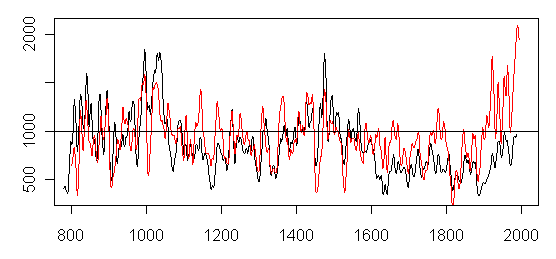
Figure 2. Black – Polar Urals; red- Yamal.

Now here is the result of simply making one subsitution. The relative position of the modern and MWP periods are reversed and reversed substantially – this is with the subsitution of just one series.


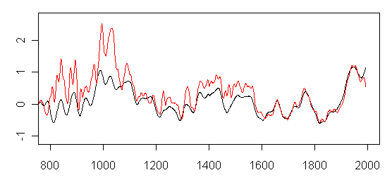
Figure 3. Briffa 2000-type reconstruction, with Polar Urals update.

Yeah, I know that they say that they couldn’t calibrate the Polar Urals Update and "had" to do the substituion, but somehow Esper managed to do a calibration and there is a lot of similarity to Yamal so the calibration couldn’t be all that bad. (How does Esper ensure that the MWP stays below modern levels? Of his 8 or so MWP series, he has not one but two foxtail series, which help his accounting).

By the way the Polar Urals Update has nearly double the correlation to gridcell temperature as Yamal In this connection, I checked the reported correlation to gridcell temperature from Osborn and Briffa 2006 at Science for Yamal and they are incorrect. I even got the temperature data as used by Osborn and Briffa and the correlation still doesn’t match, but that’s for another day.

If you can get such different results merely by substituting Polar Urals Update for Yamal, how can you assign "confidence intervals" to such a reconstruction. When results depend on such seemingly minor accounting decisions, you have to examine each accounting decision as each decision may be material,

More on MBH98 Figure 7

There’s an interesting knock-on effect from the collapse of MBH98 Figure 7 (see here and here). See update from UC in May 2011 below in which he did a “bit-true” replication.

We’ve spent a lot of time arguing about RE statistics versus r2 statistics. Now think about this dispute in the context of Figure 7. Mann "verifies" his reconstruction by claiming that it has a high RE statistic. In his case, this is calculated based on a 1902-1980 calibration period and a 1854-1901 verification period. The solar coefficients in Figure 7 were an implicit further vindication in the sense that the correlations of the Mann index to solar were shown to be positive with a particularly high correlation in the 19th century, so that this knit tightly to the verification periods.

But when you re-examine Mann’s solar coefficients, shown again below, in a 100-year window, which is a period that is sized more closely to the size of the calibration and verification periods, the 19th century solar coefficient collapses and we have a negative correlation between solar and the Mann index. If there’s a strong negative correlation between solar and the Mann index in the verification period, then maybe there’s something wrong with the Mann index in the verification period. I don’t view this as an incidental problem. A process of statistical “verification” is at the heart of Mann’s methodology and a figure showing negative correlations would have called that verification process into question.

There’s another interesting point when one re-examines the solar forcing graphic on the right. I’ve marked the average post-1950 solar level and the average pre-1900 solar level. Levitus and Hansen have been getting excited about a build-up of 0.2 wm-2 in the oceans going on for many years and attributed this to CO2. Multiply this by 4 to deal with sphere factors and you need 0.8 wm-2 radiance equivalent. Looks to me like 0.8 wm-2 is there with plenty to spare.

I know that there are lots of issues and much else. Here I’m really just reacting to information published by Mann in Nature and used to draw conclusions about forcing. I haven’t re-read Levitus or Hansen to see how they attribute the 0.2 wm-2 build-up to CO2 rather than solar, but simply looking at the forcing data used by Mann, I would have thought that it would be extremely difficult to exclude high late 20th century solar leading to a build-up in the oceans as a driving mechanism in late 20th century warmth. In a sense, the build-up in the ocean is more favorable to this view as opposed to less favorable.

None of this "matters" to Figure 7. It’s toast regardless. I’m just musing about solar because it’s a blog and the solar correlations are on the table.

UC adds [may 2011]

With window length of 201 I got bit-true emulation of Fig 7 correlations. Code in here. Seems to be OLS with everything standardized (is there a name for this?), not partial correlations. These can quite easily be larger than one.

The code includes non-Monte Carlo way to compute the ‘90%, 95%, 99%
significance levels’. The scaling part still needs help from CA statisticians, but I
suspect that the MBH98 statement ‘The associated confidence limits are approximately constant between sliding 200-year windows’ is there to add some HS-ness to the CO2 in the bottom panel:

FIg7 bottom panel

(larger image )

This might be outdated topic (nostalgia isn’t what it used to be!). But in this kind of statistical attribution exercises I see a large gap between the attributions (natural factors cannot explain the recent warming!) and the ability to predict the future: