As I re-examined the IPCC TAR spaghetti , I noted that there was considerable evidence in Figure 2-21 that the Maestro himself is in the house and we should therefore be prepared for the unexpected.
There is an interesting replication problem in the TAR spaghetti graph where I’d welcome ideas. Here’s the TAR spaghetti graph (their Figure 2-21). On the right is a blow-up of the right side, which I’ve shown before. In the blow-up, you’ll notice that the Briffa MXD series and two other dark-colored series come into the blade of the hockey stick, but only two series come out. Hey, it’s the Team and you have to watch the pea under the thimble. The Briffa MXD series in this graphic ends about 1960, In the citation (Briffa 2000), it continues on to 1994 with a very large divergence. But more on this on another occasion. I want to focus on a smaller problem right now.
The smoothing in these series was said to have been done using a 40-year Hamming filter with 25-years end-point padding. Briffa would have used a gaussian filter. The use of a Hamming filter indicates to me that the Maestro is in da house.
[Update Aug 29, 2014/ Jean S: Steve’s surmise was correct. The CG1 letter 0938108842.txt reveals that the figure below was plotted by Ian Macadam based on data prepared by Mann. Additionally, notice a small detail that went unnoticed at the time: although the full (black) and the latitude restricted (blue) versions of MBH9X are very similar, the full version has the Swindlesque S-curve (as termed in the next post) in the 20th century where as the latitude restricted version resembles more like an upside-down U. The reason is that the trick was not used for the latitude restricted version, and that curve is essentially showing how the end of the MBH99 smooth would look like without the trick.]
 |
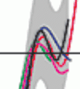 |
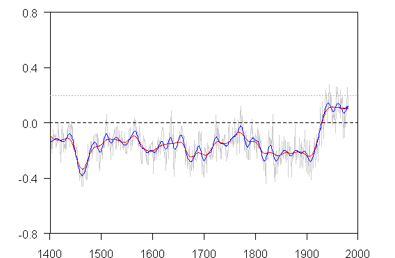
Figure 2-21 from IPCC TAR. Comparison of warm-season (Jones et al., 1998) and annual mean (Mann et al., 1998, 1999) multi-proxy-based and warm season tree-ring-based (Briffa, 2000) millennial Northern Hemisphere temperature reconstructions. The recent instrumental annual mean Northern Hemisphere temperature record to 1999 is shown for comparison. .. All series were smoothed with a 40-year Hamming-weights lowpass filter, with boundary constraints imposed by padding the series with its mean values during the first and last 25 years.
Below is a plot of the Jones 1998 and MBH99 series downloaded from WDCP MBH99 Jones98 using a 40-year Hamming filter (See script below) and 25-year end-period padding. I’ve used the native Jones 1998 centering as archived and re-leveled the MBH99 version by subtracting the difference between the MBH instrumental means between 1902-1980 (The native version ) and 1961-1990 (the IPCC version), a re-leveling of 0.165 deg C.
This results in a variety of small and medium-sized discrepancies:
1. the smooths of the Jones 1998 versions don’t match as the emulation is a little smoother than the IPCC version. For example, , if you look at the 19th century portion of the Jones series, there’s a little up-bump in the IPCC version in the 19th century that is smoothed in the emulation using Hamming 40-year smooth.
2. the smooths of the MBH99 versions don’t match, but in this case there’s an opposite discrepancy, as the emulation is a little smoothed than the IPCC version. In the 13th century, in my emulation, there are 3 bumps using a 40-year Hamming filter, while in the IPCC version, there are two bumps.
3. the MBH re-leveling using the instrumental mean differences doesn’t work. The late 11th century high is further from the zero line in the emulation than in the IPCC version.
4. But the most interesting difference is in the modern portion of the MBH series. In my emulation, the far right hand portion levels off with even a slight decline, while in the IPCC version, it has a high in the 1930s, a Swindle-esque decline in the 1960s and ends on an increase. Using the difference of means to re-level, the 0 mark isn’t reached by MBH. So their re-leveling amount was not equal to the difference in the instrumental means. If it’s not the difference of instrumental means, then what was it?
These replication difficulties are more good evidence that the Maestro is in da house.

Figure 2. 40-year Hamming filter applied to archived versions of MBH99 and Jones 98.
Through some experimentation, I can get a fairly close replication of the IPCC version of Jones 1998 by using a truncated 50-year truncated gauss filter, as shown below. The other mysteries remains. Ideas welcomed. Maybe Bob Ward can explain the provenance of this figure. The good part is going to be re-visiting the Briffa series.

Jones 1998 smoothed with 50-year truncated gauss filter; MBH99 with 40-year Hamming filter as before, re-leveled by 0.16 deg C).
UPDATE: The IPCC smooth is visually identical to the smooth in MBH99, which is shown below (the smooth is a little hard to read but it’s there and it visually matches the IPCC version). It’s described in MBH99 as a 40-year smooth with no further particulars.

Figure from MBH99.
Theres another version of this smooth on the NOAA website in connection with Mann et al 2000, shown below here. IT shows the smooth fairly clearly.

From NOAA website in connections with Mann et al 2000.
Here’s a straightforward implementation of a 40-year Hamming filter on the MBH data in the same format as the NOAA version (1400-1980 here which is a little easier to read,) Aside from the 20th century being a type of plateau to gentle decline – lacking the mid-century decline observable in the smoothed version, the replicated smooth does not reach the same values as shown in the MBH smooth. For example, their smooth ends at a value of 0.2, while the emulation levels off at 0.1, Here I’ve plotted actual MBH reconstruction values without swamping them with an instrumental overlay as in the MBH graphic. It’s very difficult to see how the reconstructed values can by themselves – regardless of filter – close at a value of 0.2 deg C. I experimented with a shorter filter to see if the characteristic shape of the MBH smooth could be replicated – nope, Also the level of the 20th century doesn’t reach the MBH smooth levels.
There was an exchange between Mann and Soon et al over end-point padding. Three of the most standard boundary methods for showing a smooth are: no padding; padding with mean over (Say) half the bandwidth; reflection. Mann has used a Mannian method in which he reflects vertically about the last value. In the graphic below, I’ve shown the Mannian method as well and it makes negligible difference in this case. You can barely see the tweak at the end. So end-period methodology has nothing to do with it.
Emulation of MBH smooth using 40-year Hamming filter (red); 20-year Hamming filter (blue)
As an experiment, I tried grafting the post-1980 instrumental record onto the reconstruction and see what that did to the smooth (through end-value influence.) (On an earlier occasion last year, we observed that MBH98 Figure 7 included a graft of the instrumental record onto the reconstruction, By doing this, I was able to get the closing value up to the level of the MBH smooth, but the shape of the 20th century record still didn’t match.

Experiment with graft of MBH99 1981-1998 instrumental values
So I tried one more variation: I grafted the instrumental record for 1902-1998 onto the reconstruction up to 1901. This further improved the replication of the MBH smooth version, but the exact topology of the MBH smooth version remains elusive.

Splicing instrumental record for 1902-1998 to reconstruction up to 1901.
As to whether Mann grafted the instrumental record onto the reconstruction in the calculation of the MBH smooth version illustrated in IPCC TAR, Mann himself commented on the more general issue of grafting instrumental records onto reconstructions as follows:
No researchers in this field have ever, to our knowledge, “grafted the thermometer record onto” any reconstruction. It is somewhat disappointing to find this specious claim (which we usually find originating from industry-funded climate disinformation websites) appearing in this forum.


Nature Blog Withdraws Invitation
Yesterday I mentioned that we had been invited to make a post at the Nature blog. The invitation was withdrawn today. On May 10, we received the following invitation:
We immediately accepted the invitation. On May 11, von Storch and Zorita posted more personal criticism, to which I did not respond, because of the apparent opportunity to post our view of the matter in more temperate terms. On May 14, I mentioned this invitation on the blog yesterday. One day later on May 15, I received the following message:
The curious viewpoint of von Storch and Zorita in this blog entry has hardly been “hashed out” at length elsewhere. There have been only two posts to the von Storch thread during the past week, which have hardly “dominated” discussion at their blog. Since the issue has not “dominated” discussion at the blog, it is hard not to wonder whether someone higher up in the Nature organization specifically intervened to ask the blog editor to withdraw our invitation and to further wonder whether Nature received any communications urging that this invitation be withdrawn.