Buckets and Engines

Here is a remarkable graphic from a new publication, Kent et al 2007, showing the distribution of SST measurements between buckets and engine inlets from 1970 on. I think that this evidence has great significance for the Folland and Parker SST adjustment, which is one of the most fundamental Team adjustments. I’ll discuss this more when I have time, but was struck by the graphic sufficiently to want to post it up immediately. I’m sure that some of you can figure out where this is going.

sstbucket.gif
Kent et al 2007 Figure 2.f FIG. 2. Annual average numbers of observations per month in ICOADS for 1970—2004, stratified by the availability of measurement method metadata. The known methods for air and dewpoint temperatures and pressure [(a)—(e)] are all from Pub. 47, whereas those for SST [(f)—(h)] are from Pub. 47 or ICOADS.

References:
Kent, E.C., S.D. Woodruff and D.I. Berry, 2007: WMO Publication No. 47. metadata and an assessment of observation heights in ICOADS. J Atm Oceanic Tech 24. url
Folland and D. E. Parker, 1995, CORRECTION OF INSTRUMENTAL BIASES IN HISTORICAL SEA SURFACE TEMPERATURE DATA, Q.J.R. Meteorolol. Soc. 121, 319-367 here

ICOADS SST Data

There is an enormous online archive of SST measurements, which would be well worth someone looking at, to get a feel for what the raw data looks like.

Swindle and Mid-20th Century Cooling

It’s pretty amazing to see how enthusiastic climate scientists have been in checking the information in Swindle as compared with their virtually complete acquiescence with Inconvenient Truth. I guess it depends whose ox is being gored.

Since we’ve been looking at gridcell issues, I took a look at the temperature graphic in Swindle which has caused a lot of controversy. (I can’t analyse everything in the world, but this was pretty accessible.) Like others, I asked them for the source of their graphic and they co-operated with my request. Their data derived from a Hansen version, but the graphic artist made a plotting error in the horizontal axis which had the effect of dilating the second half of the second 20th century. They say that they corrected the graphic for the 2nd screening and sent me a copy of the new graphic, which reconciles to a Hansen version.

In the course of checking the Swindle graphic, I re-read the original Hansen articles, including Hansen and Lebedeff 1987, where the following remarkable graphic occurs in their Figure 7, showing 64-90N temperature (you know – “polar amplification” except it doesn’t occur in the Antarctic). This showed a very sharp decline in temperatures from 64-90N from 1940 through to the 1960s, with temperatures in the mid-1980s still well short of the values in the 1930s-1940s.

hansen_64.png
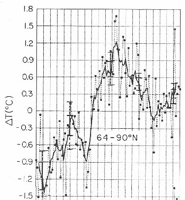
Figure 1. Excerpt from Hansen and Lebedeff 1987, showing 64-90N temperature. The horizontal plot is from 1880 to 1985 (as seen in the full Figure 7 of the original article shown here )

Now this is Hansen and Lebedeff 1987. While Hansen has continued to report the 64N-90N zone in his supplementary information, to my knowledge, Hansen never again illustrated the 64-90N results in graphical form. Accordingly, I downloaded the current GISS information (script in first post below) and produced the following graph. The two points marked for 1937 and 1938 are the values for 1937 and 1938 from Hansen and Lebedeff 1987. Both have been reduced by approximately 0.4 deg C in the present GISS version – rather extreme examples of a pattern. 2005 was the first year in which 64-90N values exceeded the former 1938 value – see dotted line – (indeed, 2003 was the first year that exceeded the “adjusted” 1938 value). Other zones show a steadier increase, but I would have though that this would be a type example of CO2 “fingerprint”, but this region does seem to show a pronounced mid-century cooling, with recovery to levels of the late 1930s occurring only in the last couple of years.

hansen4.gif
Figure 2. 64-90N from Hansen 64-90N zone downloaded today. Thick – 5 year running mean (often used by Hansen). Points are selected values from Hansen and Lebedeff 1987. Dotted line compares 1938 value from Hansen and Lebedeff 1987 to other values.

Code:

###LOAD VERSIONS
##GISS.ZONAL
url< -"http://data.giss.nasa.gov/gistemp/tabledata/ZonAnn.Ts+dSST.txt&quot;
fred<-readLines(url)
## 24N 24S 90S 64N 44N 24N EQU 24S 44S 64S 90S
##Year Glob NHem SHem -90N -24N -24S -90N -64N -44N -24N -EQU -24S -44S -64S Year
## [10] "1880 -25 -26 -24 -31 -19 -27 -83 -37 -19 -18 -19 -20 -26 ***** 1880"

temp<-as.numeric(substr(fred,1,4))
fred<-fred[!is.na(temp)]
temp<-(substr(fred,88,92)=="*****")
substr(fred,88,92)[temp]<-" NA"
write.table(fred,"temp.txt",quote=FALSE,row.names=FALSE,col.names=FALSE)
html_handle <- file("temp.txt", "rt");
test <- read.table(html_handle)
close(html_handle); unlink("temp.txt");
#id<-scan(url,skip=8,n=16,what="")
#"Year Glob NHem SHem -90N -24N -24S -90N -64N -44N -24N -EQU -24S -44S -64S Year"
id<-c("year","GLB","NH","SH","24-90N","24S-24N","24-90S","64-90N","44-64N","24-44N","0-24N","0-24S","24-44S","44-64S","64-90S","year2")
names(test)<-id
test<-test[,1:15]; test[,2:15]<-test[,2:15]/100
giss<-test

##COMPARE NO HIGH LATS
par(mar=c(3,3,1,1))
plot(giss$year,giss[, "64-90N" ],type="l",xlab="",ylab="",col="grey60")
lines(giss$year,filter(giss[, "64-90N" ],rep(.2,5) ),col="black",lwd=2)
points(xy.coords(1937:1938,c(1.6,1.7)),pch=19,cex=.7)
#information from Hansen and Lebedeff 1987 Figure 7
abline(h=1.7,lty=3)

ClimateAudit updated

I’ve just upgraded the WordPress software to the latest version (2.12), so I’d appreciate any feedback as to anything wrong/missing/not working.

I’ve decided to update the software fairly regularly, but not be right on the bleeding edge. We were on version 1.5.0.3 for a long time but useful plug-ins for WordPress 2 wouldn’t work, and the step-change when I did upgrade was rather large.

Fortunately I didn’t upgrade to version 2.11, which had been compromised by a hacker who had put in remote exploits to the source code. I intend to let new versions bed-in (ie let others spot the bugs) before I install them.

I’d also like to express my appreciation for the developers of WordPress, who have put a lot of time and effort into making WordPress the best blogging software out there.

Bill Gray and the Atlantic Meridional Mode

Bill Gray was credited by Chris Landsea in his WMO and WTC presentations as the person who discovered the link between El Nino and Atlantic hurricanes. He recently suggesting a connection between Atlantic hurricanes and fluctuations in the world ocean conveyor. Judith Curry told the WSJ that Gray has “brain fossilization” and “nobody except a few groupies wants to hear what he has to say.” AT CA, she said:

I am not going to critique Gray’s paper, it is beyond rational critcism, i will save technical comments for such an unlikely event as any of this actually ever gets published. Bill Gray is not a player in the scientific debate, his ideas reflected in the paper referred to at RC are so flawed that they are unpublishable.

Gavin Schmidt had a hissy fit at realclimate – Gray and Muddy Thinking

Fast forward a few months later. The new big thing in Atlantic hurricanes is their connection with something called the Atlantic Meridional Mode (Vimont and Kossin 2007; Kossin and Vimont 2007). I’ll present some maps below comparing the Atlantic Meridional Mode to Bill Gray’s diagrams. You decide whether Judith Curry and Gavin Schmidt should be spitting and having hissy fits at Bill Gray or not. Continue reading

The East Side Debate

Transcript for the debate between Lindzen, Stott and Crichton versus Somerville, Schmidt and Ekurzwei on the motion “Global Warming is Not Crisis” is transcript online here. mp3 here

Entry and exit polls were taken and the Lindzen et al side – in a minority prior to the debate – was in a majority after the debate.
Continue reading

Hansen Calls IPCC Adjustments "Ad Hoc" and of "Dubious Validity"

A while ago, I made a couple of posts on CRU adjustments to 19th century SST estimates based on their speculations about the use of canvas and wooden buckets. (While I’ve posted some questions about land temperature records, there is a far more pressing need to wade through SST procedures. My earlier posts were here and here. At the time, I quoted Parker, Folland and Jackson [1995] as follows:

Overall global warming in SST between the 1860s and the 1970s is about 0.3 °C greater in the present analysis than in Folland et al. (1984), mainly owing to reduced early corrections applicable under the assumption of the predominant use of wooden buckets (Section 3).

There are some graphics in the original post that are worth re-examining. Today I happened to read Hansen et al 1993 (Clim Chg 25, 186), Commentary on the Significance of Global Temperature Records. It said:

Also, “corrections” for changes in the composition of buckets used to draw the water (IPCC, 1992) are ad hoc and of dubious validity.

Well put.

Yes, this condemnation was of IPCC 1992 (not IPCC 4AR) , but these adjustments are still used by CRU and IPCC. By the way, Phil Jones did not cite Hansen et al 1993 in IPCC 4AR. Check out my earlier description of the “corrections” that Hansen condemned here and here.

References:
Folland, C. K., D. E. Parker, and F. E. Kates. 1984. Worldwide marine temperature fluctuations 1856–1981. Nature 310, no. 5979: 670-673.
Hansen, J., and H. Wilson. 1993. Commentary on the significance of global temperature records. Climatic Change 25, no. 2: 185-191.
Parker, D. E., C. K. Folland, and M. Jackson. 1995. Marine surface temperature: Observed variations and data requirements. Climatic Change 31, no. 2: 559-600

Google and Climateaudit

I’ve noted from time to time that climateaudit.org ranked extremely high on many google searches. One of the ways to find articles here has been to simply use google. I often do it. Today when I googled “climateaudit curry”, I found no link to climateaudit.

I did other experiments with terms that I’ve documented here – “jacoby climate” “briffa climate” – no links to blog comments, although links to pdfs at the blog and a link to RSS feed have survived down the page. A direct search of “mcintyre climateaudit” returns “le blog de s mcintyre”. Quixotic googles like “preisendorfer autocorrelation” returns a couple of pdf’s but not the site.

I was only able to find one google search that returned a climateaudit link – ironically “full true plain disclosure”, where we still rank first (no doubt temporarily) even at google.

Google’s policies on censorship state

Does Google censor search results?

It is Google’s policy not to censor search results. However, in response to local laws, regulations, or policies, we may do so. When we remove search results for these reasons, we display a notice on our search results pages.

Update: As noted below, we blocked robots about a month ago when we were trying various measures to keep the site from crashing and this may be the problem, although you’d think that there would still be search information from before then. We are unblocking the robots and we’ll see whether we get restored to google listings.

Jones and the Great Leap Forward #2

I discussed the China network in Jones et al 1990 which is still cited as key evidence against UHI having a material effect on temperature estimates (even in IPCC 4AR). Shortly after Jones et al was published, Wang et al. 1990 ( W-C Wang, Z, Zeng and T. Karl, Urban Heat Islands in China, 1990. GRL 2377-2380, available here – see pages 197-202 ) re-visited what appears to be precisely the same network. Jones et al 1990 reported that they studied 42 Chinese urban-rural pairs. Two authors are in common between the two articles (Karl, W-C Wang). Wang et al say:

“We used 1954-1983 surface temperature from 42 Chinese urban (average population 1.7 million) and rural station pairs (Average population 150,000) to study the urban heat island effects.”

I’ll show their map below, but this seems likely that this is the same network. But the conclusions are quite different. Continue reading

East Anglia Refusal Letter

Last week, I reported on my progress (or rather lack of progress) in identifying the stations used in Jones et al 1990 on urban heat islands. Here’s the next episode. Continue reading